What is Papuan Asaro Mudmen?

From the river valleys of Papua New Guinea's Eastern Highlands, the Asaro Mudmen forged an aesthetic of radical monochrome: bone-pale figures commanding deep jungle darkness with hollow-eyed masks and ceremonial stillness.
Papuan Asaro Mudmen in brief
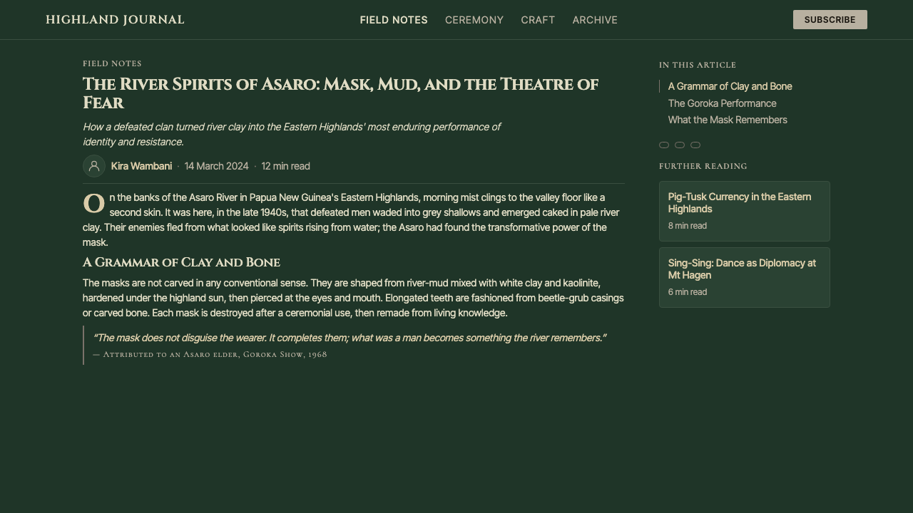
The Papuan Asaro Mudmen aesthetic is rooted in one of the most visually arresting ritual traditions in Melanesia. Performers of the Asaro valley cover themselves head to toe in pale river clay, then don towering baked-clay helmets sculpted with hollow eye sockets, elongated teeth, and asymmetric surface scarring. The result is a figure that occupies the uncanny space between the human and the spectral — neither fully alive nor fully absent.
As a design language, this tradition translates into an aesthetic of extreme high contrast and deliberate monochrome tension. The defining visual relationship is bone-white against deep jungle darkness — a single pale form commanding an otherwise shadowed field. Texture is load-bearing: the cracked, dried quality of fired clay, the irregular surface of dried mud, the roughness of unfinished baked earth. These surface qualities are not decorative accidents but the primary carriers of meaning.
The composition is almost always singular and vertical. A single masked figure, one dominant silhouette, one commanding presence against a recessive background. Symmetry is approximate rather than mathematical — the masks themselves are hand-formed objects with deliberate imperfections. The aesthetic rewards stillness over movement, weight over lightness, confrontation over invitation.
Where does Papuan Asaro Mudmen come from?
The Asaro Mudmen tradition originates in the Eastern Highlands Province of Papua New Guinea, in the river valleys around the town of Goroka. The practice is centuries old in its oral transmission, though systematic documentation began in the 1950s with the intensification of anthropological fieldwork in the region during the late colonial period. The tradition belongs to the broader Highlands sing-sing culture — large ceremonial gatherings in which clans display their identities through costume, body decoration, and performance.
The most widely circulated origin narrative holds that an Asaro clan, fleeing enemies, fell into the Asaro River and emerged covered in pale clay. Their enemies, believing they were spirits of the dead rising from the water, fled in terror. The clan recognized the power of this misidentification and formalized the mud-and-mask disguise as a ritual performance. Whether historically precise or mythologically elaborated, the story captures the core logic of the aesthetic: strategic ambiguity between the human and the supernatural, between the living body and the spectral apparition.
Anthropologist Richard Salisbury documented the Asaro valley populations in the 1950s and 1960s, and ethnographer and photographer Malcolm Kirk produced some of the most widely circulated visual documentation of the Mudmen in the 1970s. Andrew Strathern and Pamela Stewart contributed sustained scholarly attention to the Highlands ceremonial traditions of which the Mudmen are a part, situating the practice within broader Melanesian frameworks of body-as-mask and performance-as-identity.
The Goroka Show, established in 1957 and held annually in the Eastern Highlands capital, became the primary platform through which the Mudmen aesthetic reached international audiences. The Mount Hagen Cultural Show, held in the Western Highlands, similarly brings together hundreds of clan groups in multi-day sing-sing gatherings where body decoration and mask traditions are performed for both local and visiting audiences. Through these festivals and through documentary photography and film, the Asaro Mudmen have become among the most recognizable visual symbols of Papua New Guinea's extraordinary cultural diversity.
What defines the Papuan Asaro Mudmen look?
Monochrome Contrast
The defining visual logic is the collision of near-white against deep shadow. Pale, ashen tones occupy the foreground with total authority while the background recedes into near-black darkness. There are no intermediate tones as focal elements — the design operates in extremes. Accent hues, when they appear at all, are used sparingly and function more as ritual marks than as compositional balance.
Cracked-Earth Texture
Dried and cracked clay surfaces are the material signature of the style. Surface texture is not smoothed away but emphasized — irregular fissures, rough planes, the tactile evidence of drying and hardening. This quality distinguishes the aesthetic from polished monochrome or clean minimalism: the roughness is load-bearing, signaling age, process, and physical presence. Applied in design, it introduces an organic irregularity that resists digital perfection.
Vertical Singular Presence
Compositions center on a single dominant vertical form — one figure, one mask, one commanding element that fills the frame from roughly center to top. The verticality communicates authority and confrontation rather than welcome or harmony. Secondary elements, when present, serve to frame or recede from the central presence rather than to compete with it. Empty space at the margins is not wasted but is understood as the darkness that makes the pale center legible.
Deliberate Imperfection
The masks and body coating of the Asaro Mudmen are hand-formed, asymmetric, and individually varied. No two masks are identical; each carries the evidence of its maker's hand. In design terms, this translates to an aesthetic that values the irregular, the slightly-off-center, and the materially imperfect over the machined and the symmetrical. It is the opposite of the polished grid; edges may be approximate, forms may lean, and the overall impression is of something made rather than generated.
Ritual Stillness
The Mudmen perform in deliberate slow motion — their power comes precisely from their unhurried, controlled movement. In design, this translates to compositions that do not rush the eye. Generous negative space, deliberate pacing between elements, and an absence of busy micro-detail all serve to create the sense that what is present is wholly intentional and demands attention. The aesthetic resists decoration that would accelerate visual scanning.
Masked Anonymity
The helmet-mask erases individual facial expression entirely, replacing the human face with something more archaic and less readable. In design terms, this translates to imagery and visual elements that prioritize archetype over personality, symbol over narrative, presence over biography. Faces, when they appear at all, may be obscured, abstracted, or replaced with mask-like geometries. The viewer confronts a form rather than a person.
Deep-Shadow Background
The backgrounds in this aesthetic are not neutral or white but deeply dark — jungle green shading into near-black, dense shadow suggesting depth and enclosure. The darkness is not emptiness but presence: the background has weight and atmosphere. This distinguishes the style from white-ground monochrome systems. The pale foreground figure is luminous precisely because what surrounds it absorbs light rather than reflecting it.

Who shaped Papuan Asaro Mudmen?
British-Canadian anthropologist Richard Salisbury conducted fieldwork in the Eastern Highlands Province during the 1950s and early 1960s, producing foundational ethnographic accounts of Siane and Tolai peoples neighboring the Asaro valley. His work helped establish the scholarly framework for understanding Papua New Guinea Highlands societies during the critical first-contact era, when outsiders were beginning to systematically document cultures that had had limited prior contact with the industrialized world.
American photographer and ethnographer Malcolm Kirk produced the most widely circulated visual documentation of the Papua New Guinea Highlands sing-sing traditions during the 1970s, including extensive coverage of the Asaro Mudmen. His images — high-contrast, field-documentary in quality, emphasizing the sculptural presence of masked figures against vegetation and shadow — defined the international visual vocabulary of the Mudmen aesthetic and have been reproduced across documentary film, journalism, and cultural publications for decades.
Scottish anthropologist Andrew Strathern, along with his long-time collaborator Pamela Stewart, conducted decades of sustained fieldwork in the Papua New Guinea Highlands beginning in the 1960s. His scholarship — particularly on the Mount Hagen and Melpa peoples — established the analytical frameworks for understanding Highlands ceremonial exchange, body decoration, and the semiotics of performance. His work situates the Mudmen tradition within the broader Melanesian understanding of the body as a surface for identity projection and social communication.
American anthropologist Pamela Stewart, collaborating extensively with Andrew Strathern, has produced major scholarly work on the ritual, cosmological, and performative dimensions of Papua New Guinea Highlands cultures. Her contributions have been particularly significant in documenting the ways in which ceremonial practices like the sing-sing encode social relationships, historical narratives, and cosmological beliefs. The dual-authorship framework she and Strathern established became a model for collaborative ethnographic scholarship in the region.
How do you use Papuan Asaro Mudmen today?
The Papuan Asaro Mudmen aesthetic is not a style of abundance or warmth — it is a style of confrontation, gravity, and singular authority. Applied correctly, it produces work that commands attention through restraint rather than through visual noise. The defining challenge is maintaining the high-contrast tension that gives the style its power without defaulting to the kind of generic dark-mode monotony that has become common in contemporary digital design.
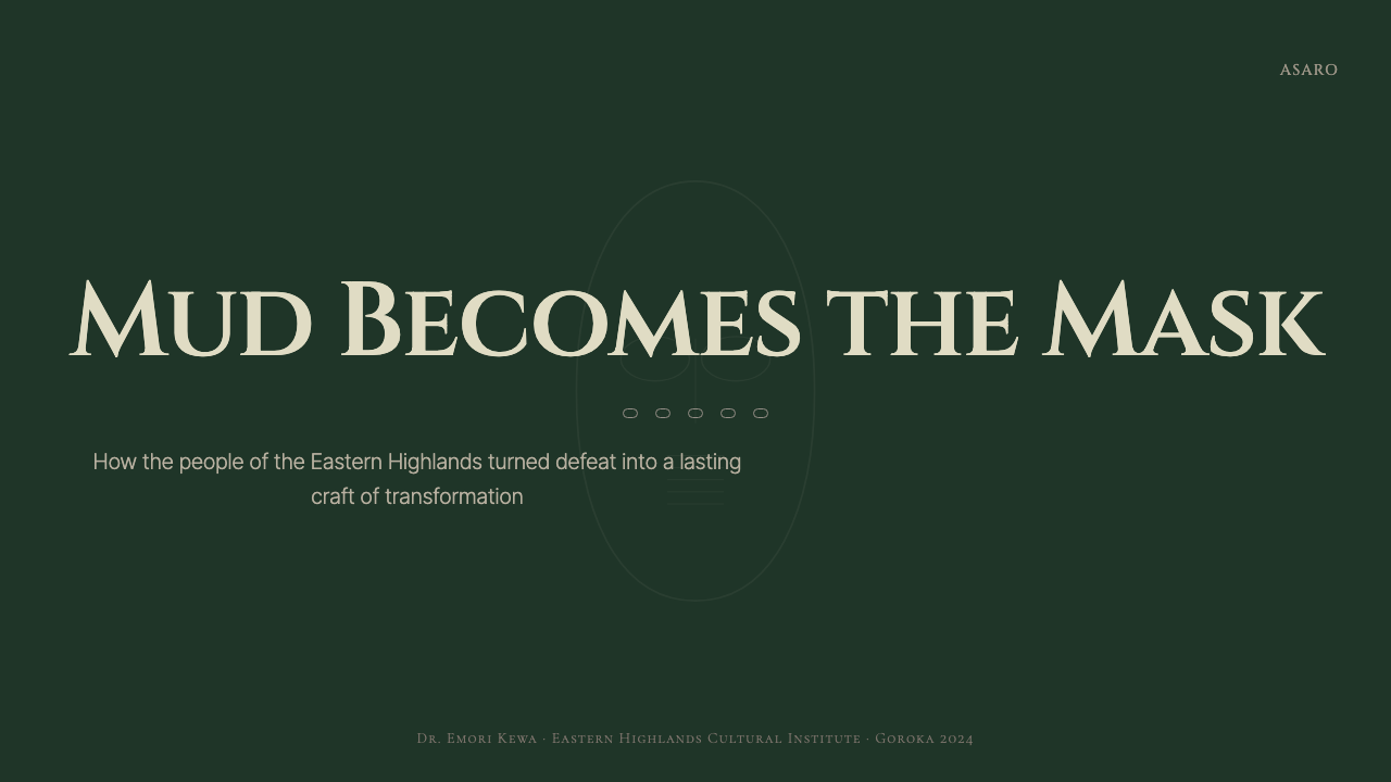
For presentation slides, this aesthetic works with exceptional force on cover pages and transitional breaks. A cover built in this register uses a near-white or bone-pale primary element — a word, a symbol, a cropped organic form — against a background that drops into deep shadow. The pale element should be singular and substantial, not fragmented or detailed. Content slides should inherit the vertical rhythm: one dominant text element per slide, generous surrounding darkness or deep tone, and an absence of decorative borders or gridlines. Data visualizations take on a monolithic quality — charts reduced to their essential geometric structure, rendered in the pale-against-dark relationship, with minimal labeling.
For web interfaces, this aesthetic is best suited to editorial contexts, cultural institutions, and high-end brand applications where deliberate pacing and visual authority are more valuable than conversion-optimized clarity. Dashboard applications can adopt elements of the approach — deep background tones, pale primary indicators, high-contrast type — without committing to the full aesthetic, which can feel oppressive in extended use. Pricing pages benefit from the style's ability to make a single offer feel weighty and definitive rather than comparative and bustling.
For editorial and marketing applications, the style excels in contexts where the subject matter itself carries cultural weight: heritage brands, documentary projects, cultural organizations, and any narrative context that benefits from a sense of depth and historical seriousness. The pale-on-dark relationship suits full-bleed layouts, large-format print, and motion work where the shift from darkness to a revealed pale form can be used to powerful dramatic effect. Marketing materials using this register should resist the temptation to crowd the frame: every additional element dilutes the confrontational authority that is the style's core asset.
A common mistake is applying this aesthetic to contexts that call for accessibility and warmth, then trying to compensate by softening the contrast or introducing warm accent colors. This produces neither the style's power nor the warmth the context needs — it simply creates muddled work. The Asaro Mudmen aesthetic does not soften gracefully. Another frequent error is mistaking the style for general dark-mode design: the critical distinction is that this aesthetic uses darkness as an active presence that gives meaning to what is pale, not simply as a background inversion. When the dark background feels neutral or invisible, the style has been misapplied.
Papuan Asaro Mudmen — FAQ
Is this aesthetic appropriate for commercial brands, or is it too culturally specific?
The aesthetic can be applied ethically and effectively in commercial contexts when it is treated as a visual grammar rather than as direct cultural appropriation. The visual principles — extreme high contrast, pale-on-dark monochrome, textural surface quality, singular vertical presence — have broad applicability independent of their Melanesian origin. What must be avoided is the direct use of mask imagery, ceremonial iconography, or decorative elements drawn from Asaro practice without acknowledgment or context. Brands working in heritage, documentary, outdoor, or cultural institution contexts will find the deepest resonance; brands whose positioning depends on warmth, accessibility, or playfulness will find the register a poor fit.
How does this style differ from standard dark-mode or high-contrast design?
Standard dark-mode design typically inverts a light-background system, replacing white with a dark neutral and swapping text colors. The result is a functional inversion with the same underlying visual logic. The Asaro Mudmen aesthetic is not an inversion — it begins from darkness as a primary condition. The background is not dark gray or very dark blue but something closer to deep organic shadow, with texture and atmosphere. The pale foreground is not simply legible text but a luminous, material presence. The difference is between design that accommodates darkness and design that is constituted by it.
Can texture be applied digitally without looking like a filter or cliché?
Yes, but it requires restraint and intentionality. The most common failure is applying a texture overlay uniformly across a composition — this reads immediately as a filter, which communicates aesthetic laziness rather than craft. Effective digital texture use in this register means introducing irregularity at the structural level: varying the apparent density of a surface slightly across regions, using type that has slight optical irregularity rather than mechanically perfect letterforms, allowing photographic elements to retain grain rather than smoothing them. The goal is that the viewer perceives the texture as a quality of the material rather than as something applied over the top.
How should photography be handled when using this aesthetic?
Photography in this register should be treated as a monolithic element rather than as documentary evidence or atmospheric mood-setting. High contrast is essential: midtones should compress toward either the pale or dark extreme, leaving the image with a sculptural, almost relief-like quality. Color photography can be desaturated toward near-monochrome while retaining the original tonal relationships. Cropping should be deliberate and aggressive — subjects should fill the frame or be cut in ways that emphasize form over context. The subject matter ideally has a similar vertical and singular quality to the masked figure: a face obscured by shadow, a form emerging from darkness, a silhouette against a lit background.
Is this aesthetic suited to typographic-heavy layouts?
The style can support typographic layouts, but it demands strict discipline. The visual logic favors singularity — one dominant element at a time — which means typographic layouts work best when they establish a clear primary hierarchy and allow generous space to function as active darkness around it. Body text should be set with care for legibility against dark grounds; very pale type on very dark backgrounds can strain reading over long passages. The style is better suited to headline-driven or editorial typographic work than to long-form reading experiences. Mixed-weight type hierarchies — a large, open headline against deep shadow, followed by compact body text in a well-lit panel below — can satisfy both the aesthetic's needs and practical readability.
Related design styles
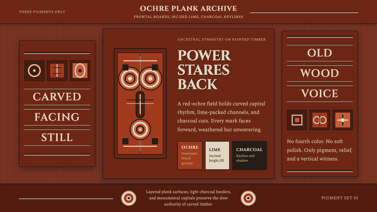 Sepik Spirit BoardThree-pigment power. Ochre, lime, and charcoal lock into frontal carved symme…
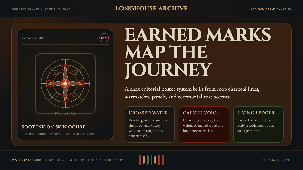 Dayak Borneo Tattoo (Iban)A living journey ledger. Soot lines, ochre panels, and rust rosettes feel han…
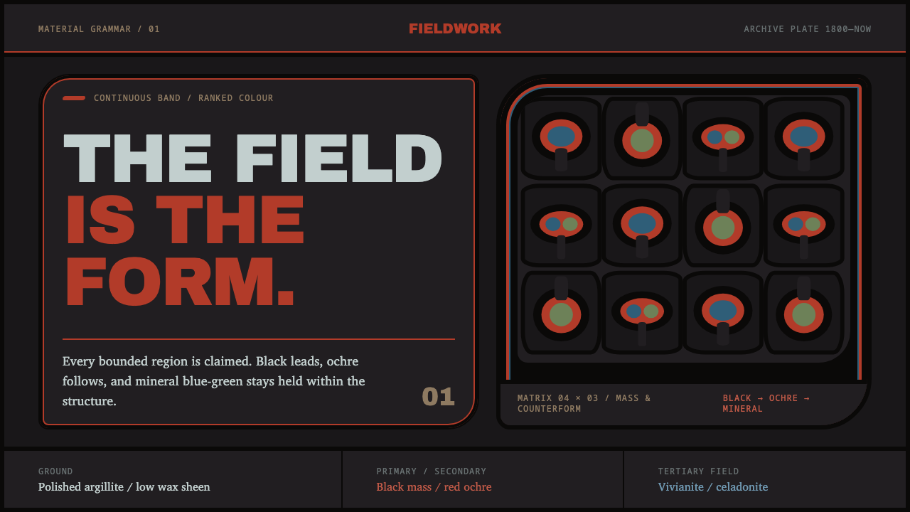 Haida FormlineEvery field is claimed. Black bands lead ochre and mineral blue-green through…
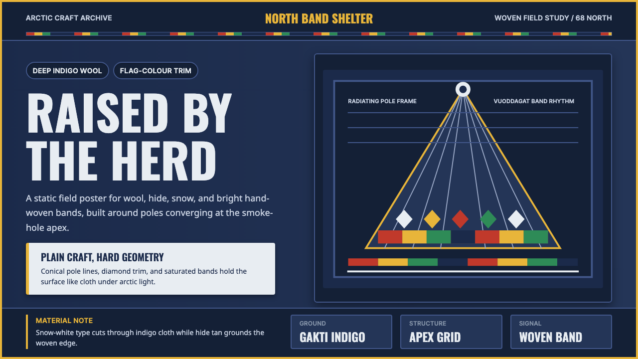 Sámi LavvuArctic craft stays bold. Indigo wool, Oswald type, and woven flag bands conve…
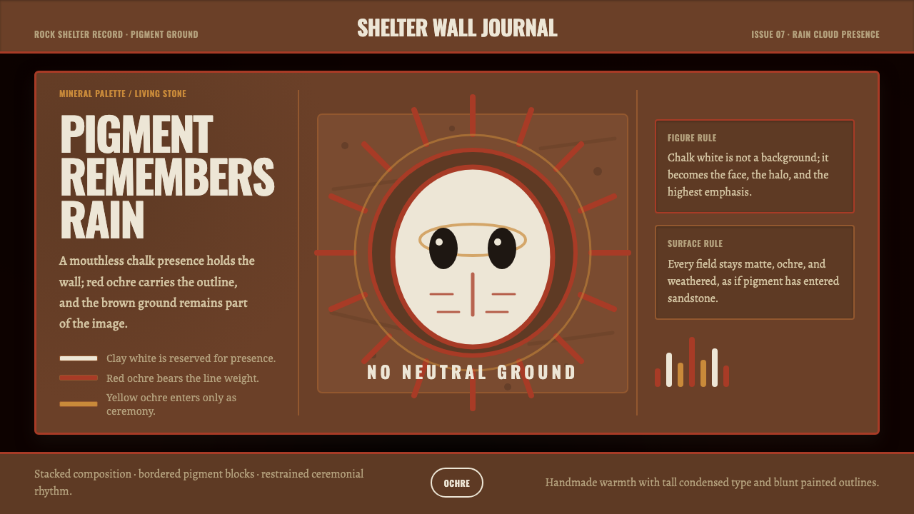 Aboriginal Wandjina KimberleyAncestral presence in stone. Chalk white haloes and red ochre outlines sit on…
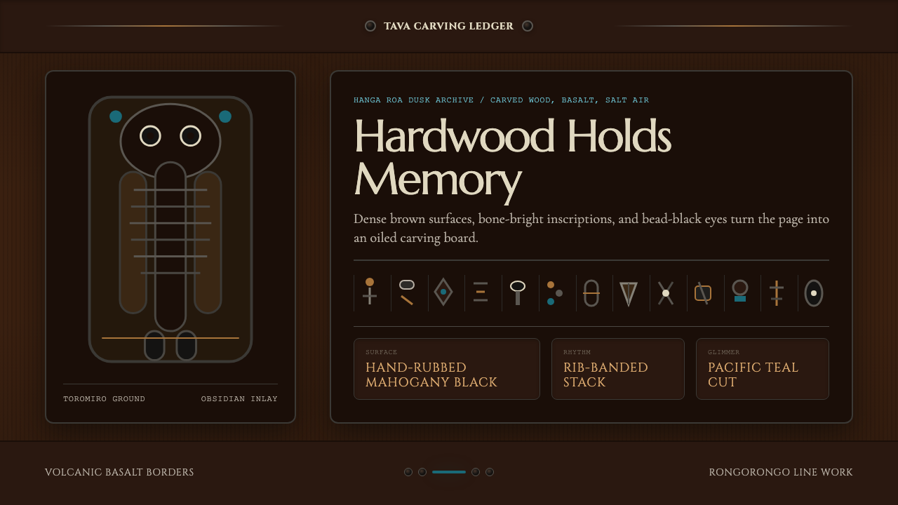 Chilean Rapa Nui Toromiro (Easter Island)Ancient weight, dusk-lit. Toromiro brown, Cinzel capitals, rib bands, obsidia…