What is Timor-Leste Tais Buna?
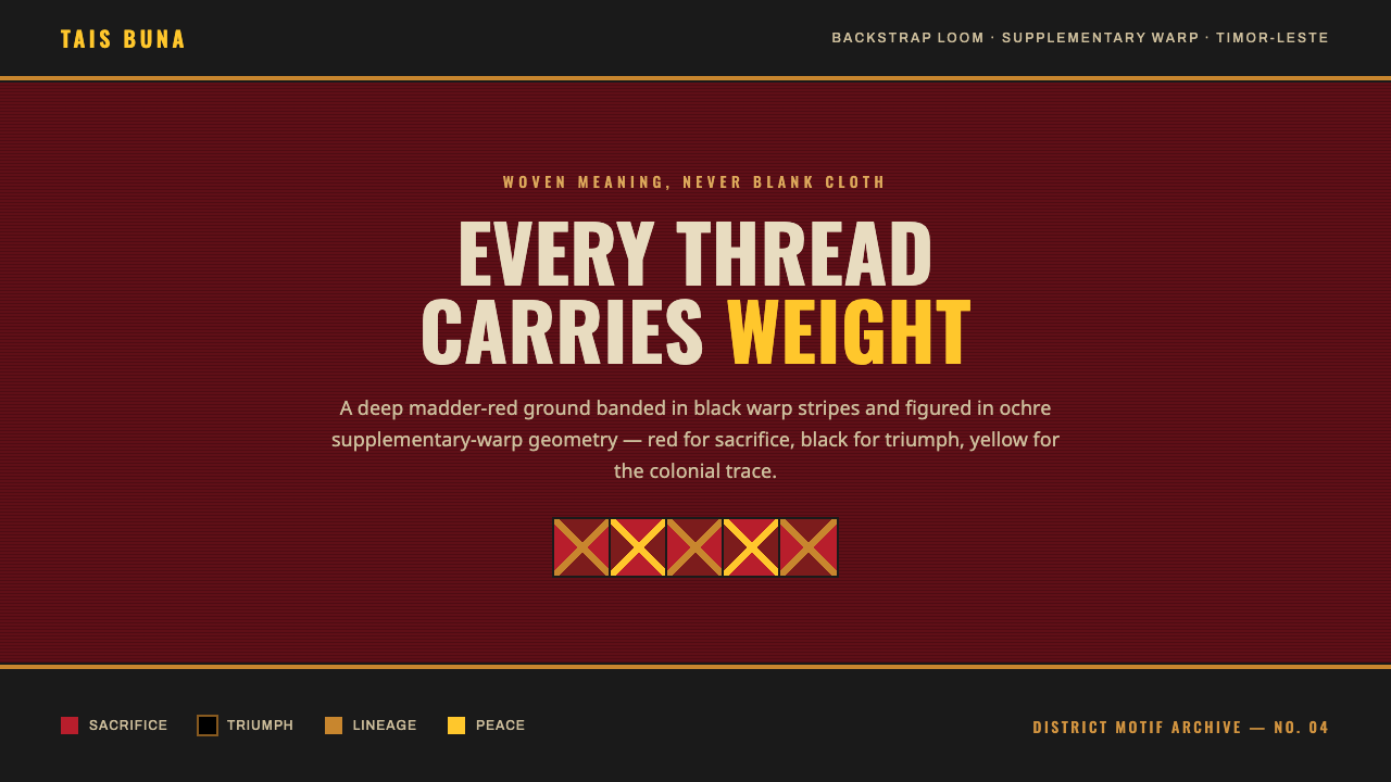
Timor-Leste tais buna is woven meaning made visible: a madder-red field, black warp bands, and ochre geometry carrying memory, sacrifice, triumph, and peace.
Timor-Leste Tais Buna in brief
Tais buna is the supplementary-warp patterned cloth of Timor-Leste, woven by village women on the backstrap loom. Its visual identity is not a printed pattern applied after the fact. Pattern, color, and structure are made together through the act of weaving, so the cloth reads as a field of accumulated decisions rather than a neutral surface carrying decoration. Geometric motifs are associated with particular districts, giving the textile a local visual language as well as a shared national presence.
The cloth is often paired with futus warp-ikat, another woven language in which pattern emerges through prepared and dyed warp threads. Buna, however, foregrounds supplementary-warp figure: bands, marks, and geometric forms appear as deliberate additions within the woven ground. This distinction matters for contemporary interpretation. A tais buna-inspired composition should feel constructed, banded, and embedded in a textile field, not merely decorated with isolated motifs floating on an empty background.
Its colors are symbolic rather than incidental. Red signifies sacrifice and liberation; black signifies triumph; yellow recalls the remnants of colonialism; white signifies peace. In the design system derived from this source material, deep natural-dye madder red establishes the ground, black warp stripes create order and rhythm, and ochre geometry forms the principal figure. The governing idea is fullness: nothing should feel like blank cloth. Even quiet areas should retain the sense of dyed material, woven structure, and held meaning.
Where does Timor-Leste Tais Buna come from?
The source material places tais buna in Timor-Leste, in Southeast Asia, and identifies it as a living tradition documented through district-specific motifs from 1950 to 1990. That framing is important: this is not a historical style frozen at a single point in time, but a continuing textile practice whose meaning depends on making, place, and recognition. The relevant origin is therefore both regional and social. Tais buna belongs to village weaving knowledge and to the visual distinctions maintained across districts.
Its technical foundation is the backstrap loom. This loom situates weaving in a direct relationship between maker, body, tension, thread, and pattern. The source material specifically identifies village women weavers and backstrap-loom buna masters as the key figures of the tradition. Their work makes the textile inseparable from skilled labor: the patterned field is not an abstract grid but the result of controlled warp, supplementary figure, and repeated hand judgment.
Tais buna sits alongside Austronesian warp-ikat textiles and is often paired with futus warp-ikat. The pairing shows that the cloth participates in a broader textile vocabulary while retaining a distinct supplementary-warp character. Warp-ikat emphasizes prepared, dyed warp threads; buna emphasizes figured additions within the warp structure. A design interpretation should preserve this relationship as a contrast between underlying field and inserted geometry, rather than collapsing every mark into one uniform ornamental layer.
The palette also belongs to a civic and historical register through national-flag color symbolism. Red carries sacrifice and liberation, black triumph, yellow the remnants of colonialism, and white peace. These meanings give the visual system ethical and historical weight. A contemporary use should not treat the palette as exotic color styling. It should acknowledge that the red ground, dark banding, ochre figure, and occasional light relief are a symbolic arrangement rooted in Timor-Leste rather than a freely interchangeable decorative scheme.
What defines the Timor-Leste Tais Buna look?
Dyed Ground
The defining ground is a deep natural-dye madder field. It should feel material and saturated with presence, as though color has entered the cloth rather than been laid over it. This red is not a neutral background for content. Because it signifies sacrifice and liberation, it carries the visual and emotional weight of the composition. Large uninterrupted areas can be used, but they should read as woven ground, not as empty digital space.
Warp Banding
Black warp stripes organize the field through repetition and tension. They are structural bands, not casual decorative rules. Against the red ground, black brings the meaning of triumph while establishing direction, interruption, and cadence. The bands should remain visibly related to the textile field: they work best as a rhythm that crosses or anchors the composition, rather than as unrelated borders around individual interface elements.
Supplementary Geometry
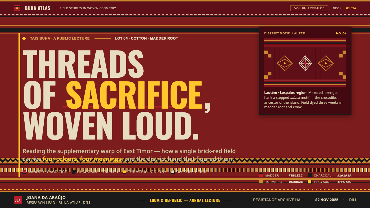
Ochre geometric figures are the principal visible motif. Their character comes from being figured into the cloth, so they should appear deliberate, compact, and integrated with surrounding banding. Diamonds are especially central to the supplied visual description, but their use should suggest woven geometry rather than generic decorative pattern. The figure has a role in the field: it punctuates, gathers attention, and makes the ground legible as a crafted surface.
No Blank Cloth
The system rejects the idea of an inert, unused field. Every surface carries the weight of dyed and woven meaning. This does not require filling every area with dense motifs; it requires that quiet space still belong to the cloth. A restrained region can remain mostly red, but it should be held in relation to banding, geometry, or the implied continuity of woven structure rather than behaving like generic negative space.
District Identity
Geometric motifs are unique to each district. This makes pattern a carrier of place, not simply a repeatable visual asset. In a broad public-facing interpretation, the appropriate approach is to preserve the principle of localized distinction: motifs should feel specific, bounded, and meaningful. Avoid treating a district-linked geometry as a universal texture that can be scattered indiscriminately across unrelated surfaces or products.
Symbolic Contrast
The palette gains force from the relationship among its meanings. Red is sacrifice and liberation; black is triumph; yellow is the colonial remainder; white is peace. A successful composition lets these roles remain legible through emphasis and restraint. The colors should not be treated as interchangeable accents chosen only for visual variety. Their contrast should feel purposeful, with the red ground and dark warp order carrying the strongest structural presence.
Who shaped Timor-Leste Tais Buna?
Village women weavers are identified in the source material as central makers of tais buna. Their role places the textile in lived village practice rather than in anonymous manufacture. Through the backstrap loom, they carry forward the relationship among dyed ground, warp structure, geometric figure, and district-specific motif.
Backstrap-loom buna masters embody the specialized knowledge of supplementary-warp patterning. The source material names them as key figures because buna depends on more than a palette or a motif library: it depends on knowing how figure is integrated into a tensioned woven field. Their craft is the reason the visual system should be understood as structural rather than merely ornamental.
District motif traditions are the collective visual authorities behind the geometric language of tais buna. The source material states that each district has distinctive motifs, making locality an essential part of recognition. This collective dimension cautions designers against extracting geometry from its setting and presenting it as a culturally blank global pattern.
How do you use Timor-Leste Tais Buna today?
For presentation slides, tais buna works best when the cover behaves like a textile field rather than a poster with a pattern pasted on top. Let the madder-red ground establish the emotional register, use black banding to create a clear path for the title, and reserve ochre geometry for a concentrated area of attention. The title should remain calm and readable against the cloth-like structure. Avoid making every text block compete with a different motif; the woven field should frame the message, not overwhelm it.
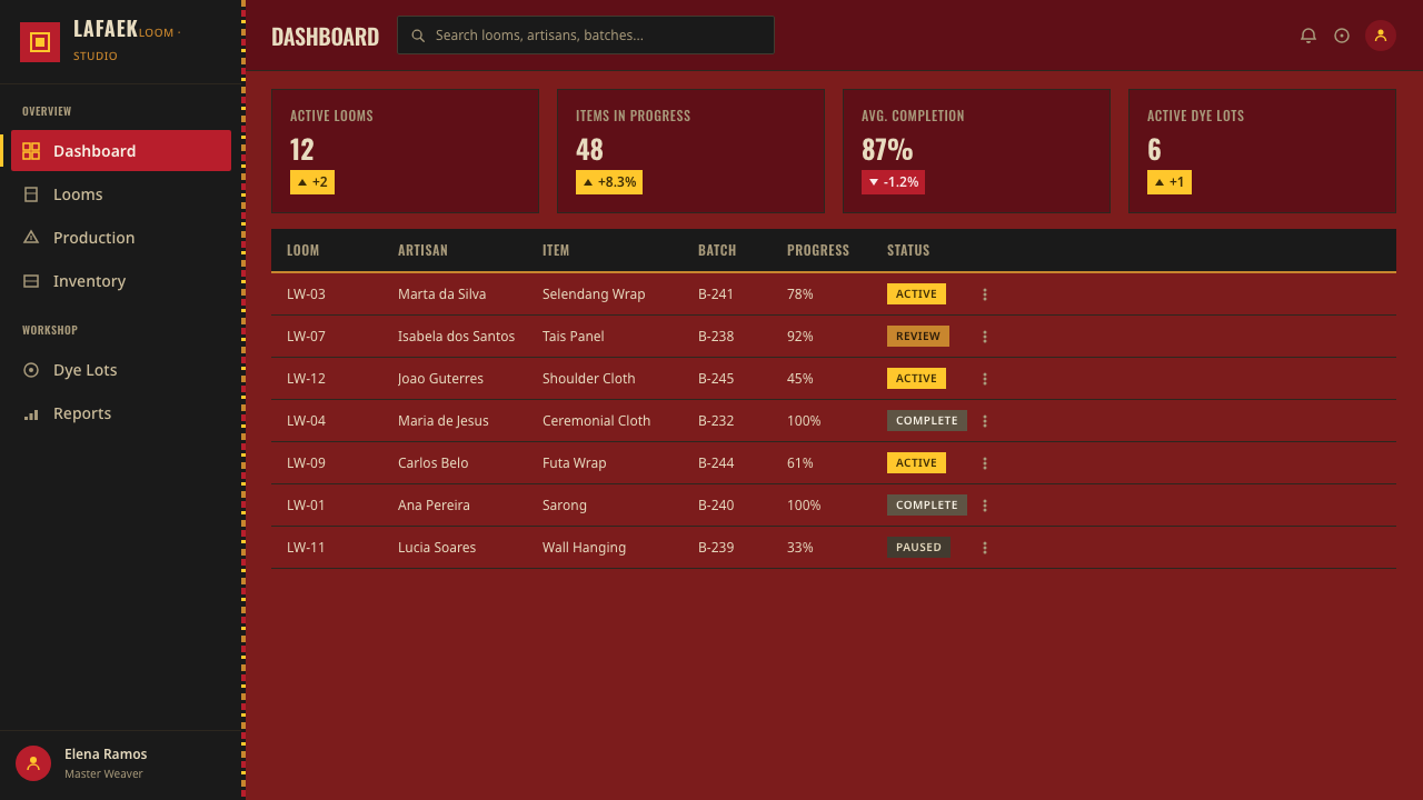
Content and data slides should translate the style through hierarchy rather than through constant ornament. Use banding to separate topic zones, motif clusters to mark key moments, and a quiet area of the red ground for explanatory text. Charts can adopt the symbolic palette when their categories have a clear relationship to the story, but they should remain legible as charts first. Treat the geometry as a framing and emphasis device, not as a substitute for labels, axes, or explanation.
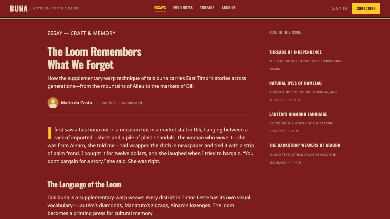
For web interfaces, the system suits dashboards, cultural archives, editorial platforms, and pricing or membership pages that need a strong sense of identity. A deep textile ground can establish a page or section, while black bands define navigation areas, dividers, or stable content regions. Ochre geometry can identify primary actions, selected states, or significant metrics. Keep interaction language direct and readable so that the textile reference adds atmosphere and structure without reducing usability.
For editorial and marketing work, use the style to create a sense of held narrative. A feature article can open on a red woven field, then use black bands as section markers and geometric forms as anchors for quotations, captions, or key statements. Campaign materials should allow the symbolism to remain visible: red can carry the principal story, black can establish confidence and resolution, yellow can signal historical tension, and white can provide moments of peace. The result should feel like meaning embedded in material, not heritage reduced to surface flavor.
The common mistake is to reduce tais buna to a red background plus scattered diamonds. That removes the relationship among village weaving, backstrap-loom structure, district-specific motifs, supplementary-warp figure, and symbolic color. Another mistake is making the interface visually crowded in the name of avoiding blank cloth. Fullness does not mean indiscriminate density. The better approach is to create an underlying woven order, use motifs with intention, and leave quieter areas visibly connected to the same meaningful field.
Timor-Leste Tais Buna — FAQ
Is tais buna simply a geometric pattern style?
No. Its geometry is part of supplementary-warp weaving on the backstrap loom, and motifs are unique to particular districts. The pattern is therefore connected to technique, place, and makers. A respectful design interpretation begins with the woven-field logic and district-linked specificity, rather than treating diamonds or stripes as free-floating decorative assets.
What do the colors mean in this system?
Red signifies sacrifice and liberation, black signifies triumph, yellow signifies the remnants of colonialism, and white signifies peace. These meanings are part of national-flag color symbolism named in the source material. In use, color should support an intentional hierarchy and narrative rather than function as a random set of contrasting accents.
What is the relationship between buna and futus warp-ikat?
The source material states that tais buna is often paired with futus warp-ikat. Both belong to a woven visual language, but the supplied description identifies buna as supplementary-warp patterned cloth. For design work, this suggests a useful distinction between an underlying dyed and structured field and geometric figure deliberately integrated within it.
Can this visual language be used in a modern dark interface?
Yes, provided the interface preserves readability and does not turn symbolic color into visual noise. The source material already describes a deep madder-red field with black warp stripes and ochre geometry, which can create a powerful dark, material atmosphere. Let text and interactions remain clear, and use motifs to organize attention rather than cover every available surface.
What should designers avoid when drawing on tais buna?
Avoid presenting district-specific motifs as anonymous global decoration, and avoid using the palette without its symbolic context. Also avoid flattening the textile into a generic background plus repeated icons. The strongest work respects the contribution of village women weavers and buna masters by preserving the sense that color, banding, geometry, and cloth structure belong to one woven act of meaning.
Related design styles
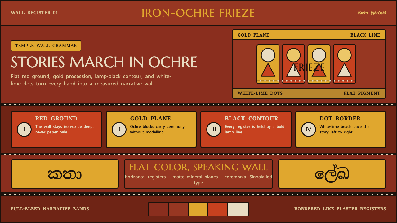 Kandyan Temple Mural FriezeTemple-wall gravity. Red ochre, gold planes, black contours, white-dot regist…
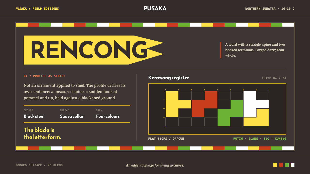 Acehnese Rencong MotifA blade that reads as a word. Flat kerawang red, white, green and yellow lock…
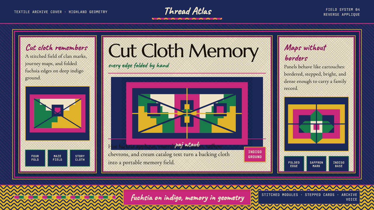 Hmong Paj Ntaub (Flower Cloth)Memory is geometric. Fuchsia applique on indigo forms stepped maze panels.
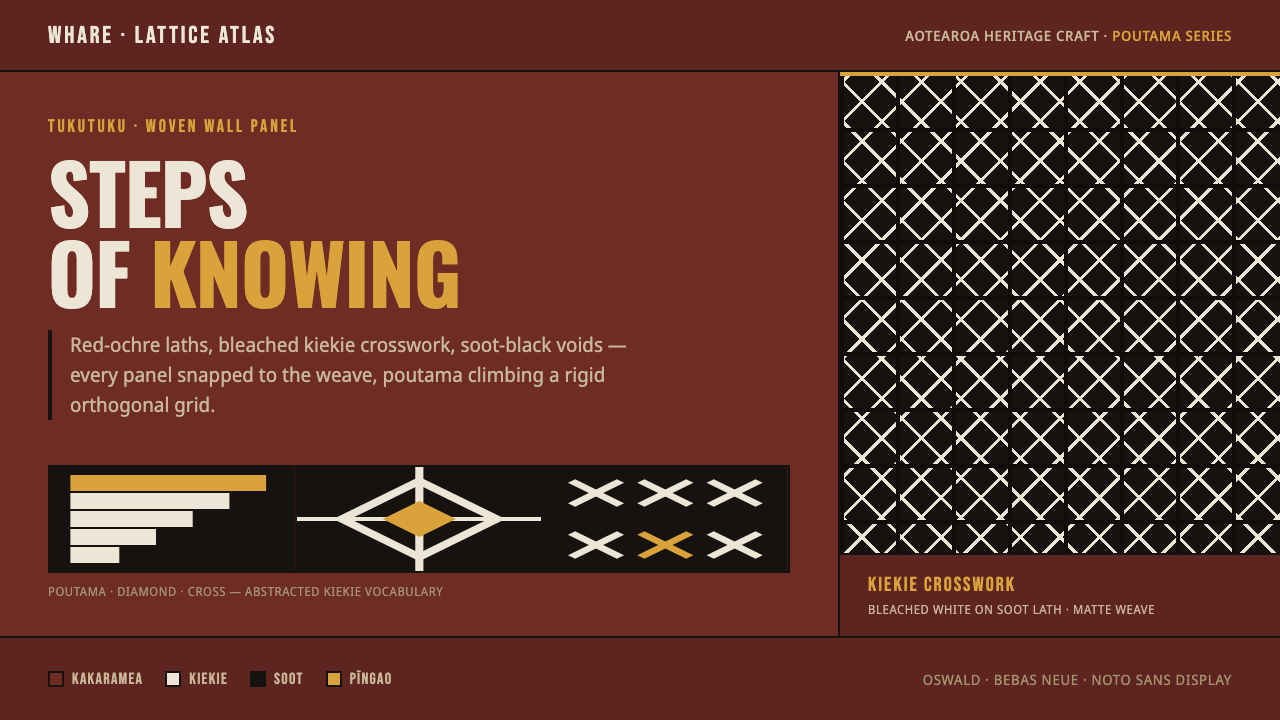 Māori Tukutuku PanelTukutuku weave, rendered strict. Bleached kiekie crosswork laces poutama step…
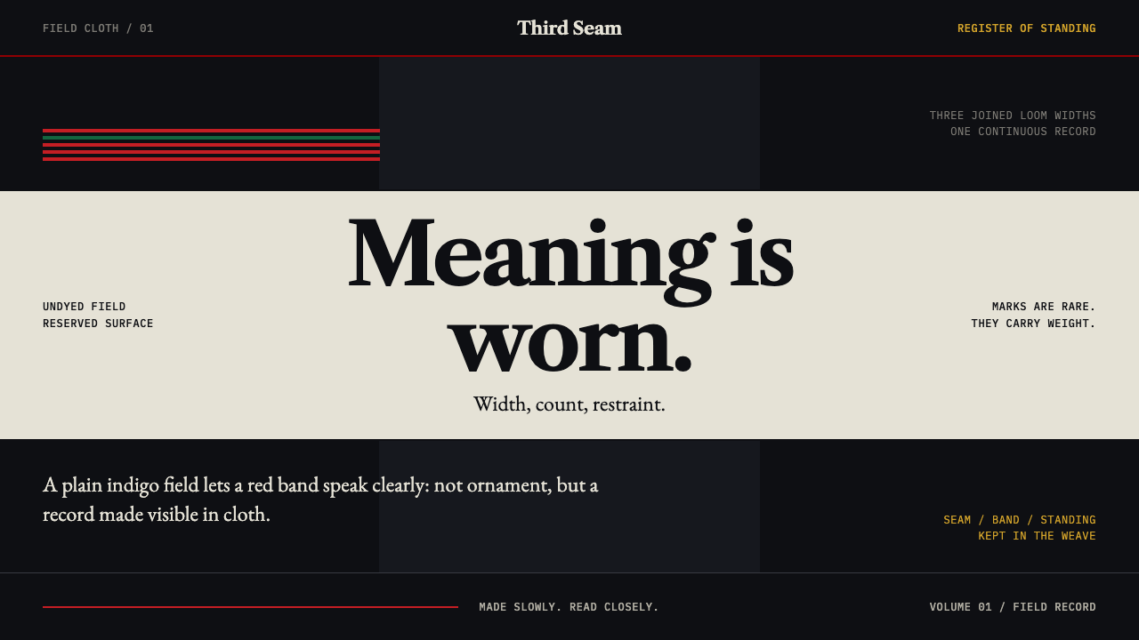 Naga Angami ShawlEvery stripe bears standing. Indigo seams frame rare red bands and one earned…
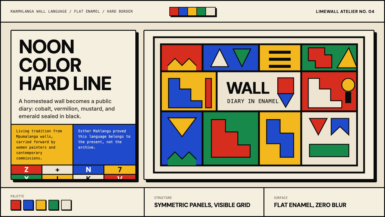 South African Ndebele House PaintNoon color, hard border. Vermilion, cobalt, mustard and emerald lock into a w…