What is Acehnese Rencong Motif?
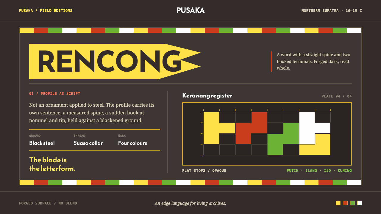
The rencong is a blade that reads as a word, and its design language answers with black forged steel, four flat colours and letterforms that carry the shape.
Acehnese Rencong Motif in brief
The Acehnese Rencong Motif is a design language drawn from two connected sources: the rencong, the short curved dagger of Aceh, and Kerawang Gayo, the ornament system of the Gayo highlands in northern Sumatra. Its visual signature is a black ground carrying exactly four flat colours, red, white, green and yellow, each laid at full strength and never blended, with shapes that read as letters before they read as decoration.
The idea at its centre is that the blade is not decorated with writing. It is writing. Morphology research at the Aceh Museum reads the whole silhouette of the rencong as huruf gundul, unpointed Arabic letters, spelling Bismillah: a straight spine, then a sudden hook at the pommel and another at the tip. Shape carries the message, and surface ornament comes second.
The design system takes two documented facts literally. The first is a black ground, like forged and blackened steel. The second is Kerawang Gayo's four motif colours, no more and no fewer. The result is a dark, graphic and calligraphic style: heavy and ceremonial, strict about colour, with ornament running in bands along edges and gathering at corners instead of blooming as a centred medallion.
Where does Acehnese Rencong Motif come from?
The rencong belongs to the Aceh Sultanate and to the long period from the sixteenth to the nineteenth century that ran through the Aceh War of 1873 to 1904. It is a short curved dagger, and it is both a weapon and a statement of identity. The blade is forged and then etched and blackened. Versions made for nobles were fitted with bands of suasa alloy or gold, and hilts of ivory or buffalo horn, with Quranic verses often carved into the hilt.
What makes the rencong unusual as a design object is how its form is read. The Aceh Museum's morphology research treats the profile of the blade itself as Arabic calligraphy without dots, huruf gundul, spelling Bismillah. The straight spine and the two sudden hooks, at pommel and at tip, are the strokes of the script. This places the rencong inside the tradition of Islamic calligraphic metalwork, where the letter is not an inscription added to an object but the very reason the object has its shape.
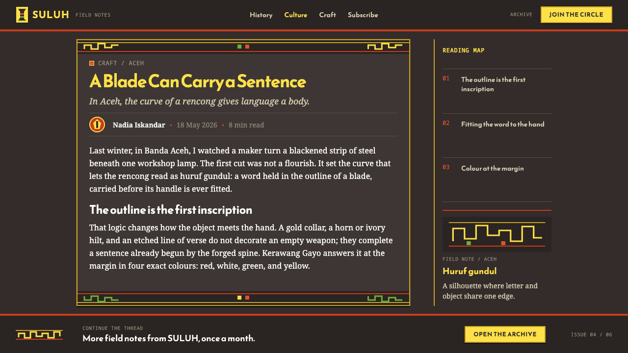
The ornament that accompanies it comes from the Gayo highlands. Kerawang Gayo is a documented system with a black ground and exactly four motif colours, red, white, green and yellow, laid flat and opaque. The record lists Acehnese kasab, the tradition of gold-thread embroidery, as a neighbouring practice, and the three together describe a regional culture in which surface, metal and script are closely tied. The motifs run as borders and corner groups, a way of ordering ornament that leaves the main field quiet.
The period closes with the Aceh War, and the people named in the record, Sultan Iskandar Muda, Sultanah Safiatuddin, Teuku Umar and Cut Nyak Dhien, span the court and the resistance. That is the context a designer inherits when working with this style: an object that signalled rank, faith and defiance at once. The design system carries that gravity forward by keeping to three disciplines, black forged steel as the ground, four colours at full strength, and letterforms that bear the outline.
What defines the Acehnese Rencong Motif look?
Black Steel Ground
The field is black, in the manner of forged and blackened steel, and everything else sits on it. This makes the style dark by origin rather than by option: colour reads as inlay and ornament against a heavy, quiet surface. The ground is not a neutral backdrop but the blade itself, and it gives the whole system its ceremonial weight.
Four Colours, Never Blended
The motif palette is exactly four colours: red, white, green and yellow. Each is laid flat and opaque at full strength, with no gradients, no tints and no transparency effects. Because nothing is mixed, every colour remains a distinct sign, and a fifth hue would break the system. The discipline is what makes the palette feel traditional rather than merely bright.
The Blade as Word
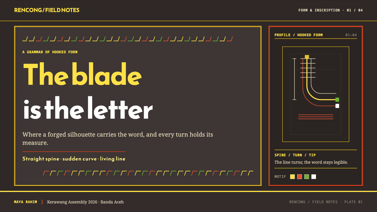
The strongest shapes in the system behave like letters. A straight spine that ends in a sudden hook, repeated at pommel and tip, is the rhythm of the script that spells Bismillah. Silhouette therefore does the work that decoration would do elsewhere. In practice this means bold, calligraphic outlines with sharp turns, and shapes that carry meaning through their contour before any pattern is added.
Bands Along Edges, Groups at Corners
Ornament is arranged along the edges of an object and collected at its corners, never as a single centred medallion. This leaves the central field open and quiet, and lets the border do the framing. For layouts it translates into edge strips, corner clusters and frames, and into the confidence to leave large dark areas with nothing on them.
Script on the Hilt
Quranic verses are often carved into the hilt, so writing appears twice: once as the silhouette of the blade and again as inscription. Lettering in this style is therefore treated with reverence, set with care and kept legible and uncrowded. It is an element of structure and meaning, not a texture to be scattered across a surface for atmosphere.
Richness from Materials
Nobles' rencong were fitted with suasa alloy or gold bands and hilts of ivory or buffalo horn. Their richness came from contrast between materials and from careful craft, not from adding more colours or more pattern. In a design system this suggests a restrained hierarchy: a few precise accents set against a dark ground, with prestige expressed through finish and proportion.
Who shaped Acehnese Rencong Motif?
Iskandar Muda is named in the record as a key figure of the Aceh Sultanate, whose seventeenth-century reign is remembered as a high point of Acehnese power. He stands for the court setting in which rencong with precious fittings signalled rank, and in which the refinement of metalwork and ornament had a political as well as an aesthetic role.
Safiatuddin appears among the key figures as a ruling queen of the Aceh Sultanate. Her presence in the record is a reminder that the culture behind these objects was shaped by women as well as warriors, and that the courtly world which valued blackened steel and flat, bright ornament was never a purely masculine one.
Teuku Umar is listed among the key figures of the period and is remembered for resistance in the Aceh War, which ran from 1873 to 1904. The war is the horizon of the tradition: the late phase in which the rencong, a ceremonial and symbolic object, was also a marker of the people who carried it into conflict.
Cut Nyak Dhien is another key figure of the Aceh War era named in the record. Together with Teuku Umar she gives the style its closing note: the same objects and ornament that belonged to court ceremony also belonged to a society defending itself, which is why the style reads as serious and not merely decorative.
How do you use Acehnese Rencong Motif today?
This style is dark and ceremonial, so it works best where gravity, craft and cultural depth are wanted. Using it well begins with respect for what the shapes mean: the silhouette of the rencong is a religious inscription as well as a form, and the motifs belong to living Acehnese and Gayo traditions. Keep the three structural rules in view, a black ground, four flat colours at full strength, and shape carried by outline rather than by surface effects.
For presentation slides, a cover can be an almost fully black field with a bold, calligraphic shape and a narrow band of the four colours running along one edge, with the title set in clear, uncrowded type. Content slides work as dark panels with edge bands and corner groups, leaving the centre quiet. Data slides are a natural fit because the four motif colours map neatly onto four series: flat, opaque bars or segments, each in one colour, set against black.
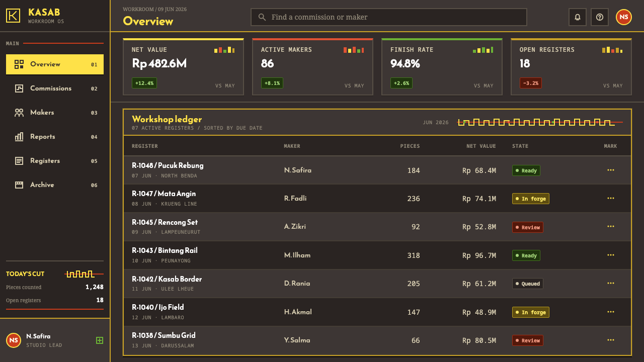
For web interfaces, the style suits dark-mode dashboards, cultural and heritage sites, and products that want an authoritative tone. The four colours can take simple roles, with red for warnings, green for success, yellow for caution and white for neutral emphasis, always flat and never blended into gradients. Cards can be framed by edge bands rather than filled with ornament, and navigation can stay typographic and spare, so the ornament appears only where it frames something.
For editorial and marketing work, the border-and-corner logic gives magazine pages and landing pages a distinctive structure. A feature spread can use a band along one edge and a cluster at a corner, with generous black space for the text. Marketing pages can alternate large dark fields with a single motif strip, and use the calligraphic silhouette as an anchoring shape, as long as the content has a real connection to the tradition and credit is given.
The most common mistake is treating the motifs as generic exotic ornament. Blending the four colours into gradients, adding a fifth hue, placing a centred medallion in the middle of the page, or scattering inscription-like shapes as background texture all strip the system of what makes it coherent. A related error is to turn the dark ground into a light one, which removes the central fact of the style. Restraint, and a clear understanding of the source, are what keep it credible.
Acehnese Rencong Motif — FAQ
Why does this style feel like calligraphy rather than ornament?
Because its source object is read that way. Morphology research at the Aceh Museum interprets the entire profile of the rencong as huruf gundul spelling Bismillah, with a straight spine and sudden hooks at pommel and tip as the strokes. The design system follows that logic, so strong shapes carry meaning through their outline, and surface decoration is secondary instead of primary.
Why exactly four colours, and can I add a fifth?
Four is the documented count of motif colours in Kerawang Gayo: red, white, green and yellow, laid flat and opaque on a black ground. The limit is the point, because each colour stays a distinct sign only when nothing is mixed in. Adding a fifth, or blending two of them, weakens the system. If extra variety is needed, vary shape, scale and placement before reaching for a new colour.
Is it appropriate to use these motifs in a commercial project?
It can be, with care. The rencong's silhouette is read as a religious inscription, and the motifs belong to living Acehnese and Gayo traditions, so they suit projects that have a genuine link to that culture or want to treat it respectfully. Avoid using the shapes as throwaway decoration or in contexts that would trivialise them, and credit the source tradition where possible.
Can I use a light background instead of black?
The black ground is one of the two documented facts the system takes literally, so a light version stops being this style. If a light surface is unavoidable, such as for print or accessibility reasons, keep black as the dominant structural colour through panels and bands, and keep the four motif colours flat and unblended. Treat it as a derivative rather than the real thing.
How is this different from generic Islamic geometric patterns?
Generic geometric patterns usually tile a surface evenly. This style is organised differently: the main shape is a silhouette read as script, ornament runs as bands along edges and groups at corners, and colour is limited to four flat tones on a black ground. It is a specific regional system, from Aceh and the Gayo highlands, not an all-purpose pattern language.
Related design styles
 Naga Angami ShawlEvery stripe bears standing. Indigo seams frame rare red bands and one earned…
 Timorese Tais (Backstrap Loom)Identity woven in darkness. Indigo ground, vermilion bands, saffron stripes,…
 Fijian Masi (Bark Stencil)Stencil memory stays sharp. Soot black and burnt coral strike bark-fibre band…
 Fon Applique Banner AbomeyRoyal cloth speaks plainly. Flat saffron, green and indigo silhouettes on bla…
 Hmong Paj Ntaub (Flower Cloth)Memory is geometric. Fuchsia applique on indigo forms stepped maze panels.
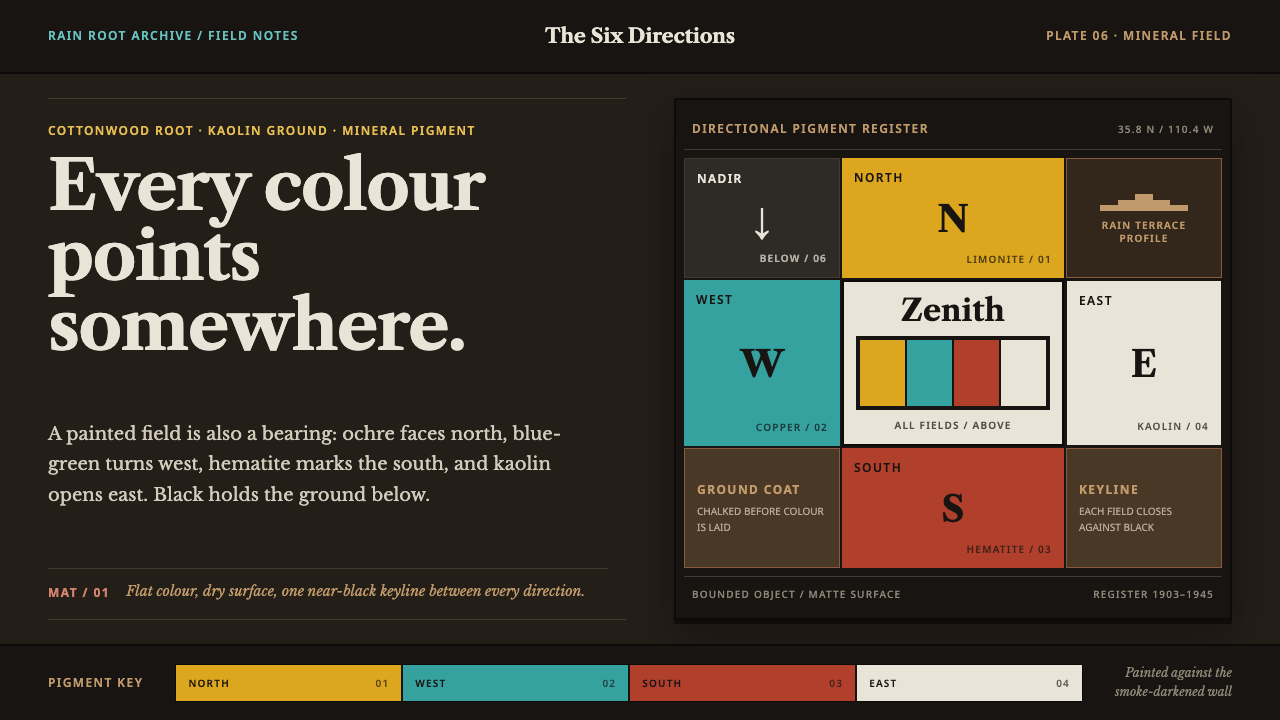 Hopi Katsina TihuEvery colour is a direction. Matte mineral fields meet in smoke-black keyline…