What is Sumba Hinggi?
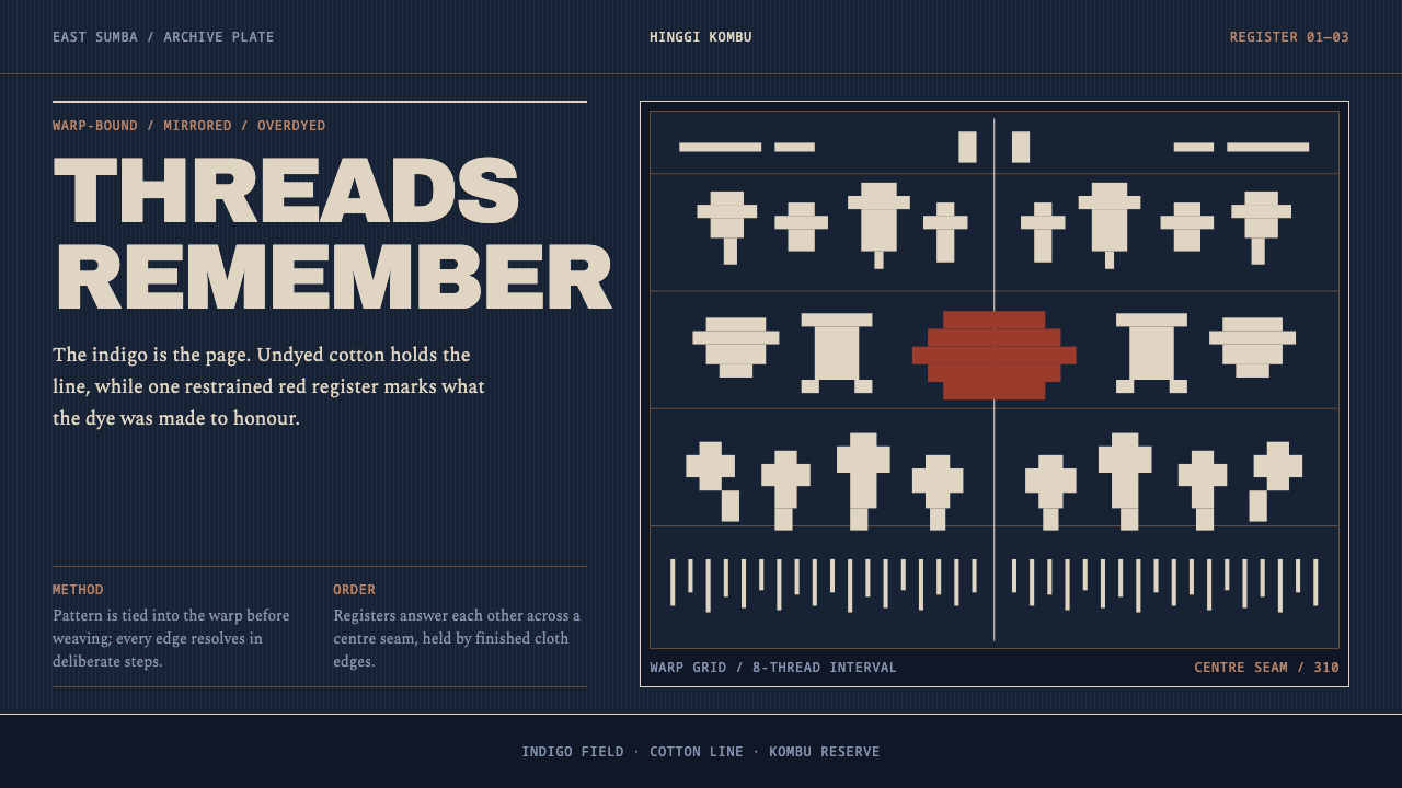
The hinggi of East Sumba is a cloth that behaves like a ledger: indigo as the page, undyed cotton as the only line, and a rare red kept for the people and the occasions that earned it.
Sumba Hinggi in brief
A hinggi is the mantle worn by a man of East Sumba, one cloth over the shoulder and another at the waist, and it is made by warp ikat. In this technique the pattern is tied and dyed into the threads before a single weft thread is thrown, so that every figure arrives already stepped, already mirrored and already fixed. The weaver does not draw on the cloth; she prepares the threads so that the cloth, when woven, reveals its own picture.
As a design style, Sumba Hinggi takes that cloth literally. The overdyed indigo is the page, not a background behind the content. The undyed cotton is the drawing, and it is the only line there is. The red, kombu red, is rare and reserved. The result is a dark theme of unusual severity: near-black indigo holding stepped cream figures and, very occasionally, a single band of warm red.
The figures are familiar from the cloth itself: skull trees, horses, cockatoos, lobsters and standing lions. They are arranged in horizontal bands, one above the other, and the whole composition is symmetrical about the central seam. There are no shadows, no rounded corners and no loose decoration scattered across the surface. The cloth ends in a fringe, and so does the layout, with a clean termination rather than a flourish.
Where does Sumba Hinggi come from?
The tradition belongs to East Sumba, in the Lesser Sunda Islands of Indonesia, and the cloths that anchor this style date from before 1900 through the early twentieth century, with museum-documented examples from the late 1800s. Warp ikat is part of the wider Austronesian textile tradition, in which patterns are tied into the warp threads before dyeing. Sumba, an island of dry grassland and stone villages, developed one of the most distinctive versions of it: very large cloths, built from bands, with figures drawn from the island's animals and its funerary imagery.
The cloth is also a religious object. The Marapu ancestor religion of Sumba gives textiles a role in connecting the living and the dead, and the hinggi is bound up with funerals, where cloth is given, exchanged and wrapped around the body. Funerary textile exchange is one of the lines through which cloth circulates among families, and a large hinggi is a statement of rank as well as of skill. It is for this reason that the figures on it are less decorative than iconographic: the skull tree stands for the place where the heads of defeated enemies were once displayed, and the animals and creatures that march in bands each carry associations of power, status and the passage between worlds.
Colour carries the same hierarchy. Indigo is laid on again and again until the ground approaches black, and the pale figures are the places where the tied threads resisted the dye. Red, made from a root dye of the madder family, appears only in the most prestigious cloths. A three-colour hinggi kombu, with its red band, belonged to the Maramba, the nobility, and to the funerals of great men. The Maramba houses of Rende and Kanatang are named in the source material as the holders of this privilege, and a cloth carrying red was effectively a public statement about who its wearer was.
Western scholarship recorded these meanings in the twentieth century. Marie Jeanne Adams studied the textile designs of East Sumba as a system of meaning, and Janet Hoskins wrote about the place of cloth in ritual and exchange on the island. This design system draws on those descriptions as much as on the cloths themselves. It treats the hinggi not as exotic texture but as a disciplined information format: a grid of bands, a limited palette, a rule about where red may appear and a rigid symmetry. That is the sense in which cloth becomes an archive.
What defines the Sumba Hinggi look?
Indigo as the Page
The ground is a deep, repeatedly overdyed indigo that approaches black but stays blue at the edges of perception. It is the page itself, not a backdrop to be decorated, so everything else on the layout is either cut out of it or laid directly upon it. The effect is dense and quiet, a dark theme with the gravity of dyed cloth rather than the glow of a screen.
Undyed Cotton Is the Only Line
Every figure, border and letter is drawn in a single warm cream, the colour of undyed cotton. There are no greys, no tints and no gradient between ground and mark. This limits the visual vocabulary to two states, dyed and undyed, and gives each shape an unusual crispness: forms are either present or absent, never half-lit.
Kombu Red, Reserved
The red is a warm, brick-like colour made from a root dye, and it is used the way it was used on the cloth: rarely, and to mark rank. In a layout it may colour a single band, a status marker or one decisive figure, never body text and never a whole section. Its power depends on scarcity. Used freely, it turns from a sign of nobility into ordinary decoration.
Stepped Figures
Because the pattern is tied into individual threads, every outline climbs in small steps rather than flowing in curves. Horses, birds, trees and lions are built from stair-stepped edges, and diagonals are formed by regular offsets. In a digital layout this becomes a preference for angular, thread-grid geometry: stepped icons, notched borders and diagonals made of repeated small shifts instead of smooth strokes.
Banded Registers
The composition is built from horizontal bands stacked from top to bottom, each with its own repeated motif and its own width. Some are broad figural registers, others narrow bands of borders and rhythm. A layout in this style behaves in the same way: content sits in clearly separated strips, each with one job, and the reader moves through them in order like reading a long scroll.
Mirror Symmetry at the Seam
The cloth is symmetrical about the central seam, with each half mirroring the other. This is a stricter symmetry than the casual balance of most layouts, and it gives the design its ceremonial stillness. Headings are centred or set on the axis, motifs repeat in mirrored pairs, and asymmetry is a deliberate event rather than a drift.
No Shadow, No Rounding, Fringe at the End
Nothing on the cloth is lit from a direction, so the design has no shadows. Nothing is rounded, because the weave does not allow it. And the composition does not simply stop: it resolves into a fringe, a row of loose threads that finishes the object. In a layout this suggests a footer that resembles a fringe, with a row of simple repeating marks, rather than a solid block or an abrupt end.
Who shaped Sumba Hinggi?
Adams is an anthropologist who studied the textile designs of East Sumba as a system of meaning, treating motifs not as arbitrary ornament but as a coded language of status, ancestry and ritual. Her approach underlies this design's whole attitude: that a pattern is information, and that each band and figure in a layout should therefore be there for a reason that can be explained.
Hoskins is an anthropologist whose work on Sumba describes the role of cloth in ritual life and in the exchange of gifts between families, including the circulation of textiles at funerals. Her writing helps explain why red is rationed and why a large cloth is a social statement. It supports the design principle that colour is a scarce resource with rules attached.
The Maramba are the nobility of East Sumba, and the houses of Rende and Kanatang are named in the source material as the holders of the privilege of the three-colour hinggi with its red band. They stand for the social logic behind the style: red and the most elaborate cloths were reserved for the great, and the cloth recorded that reservation in public. The design inherits it as a rule that a rare colour must mean something.
How do you use Sumba Hinggi today?
Sumba Hinggi is a dark, ceremonial and highly structured style, and it works best where content deserves to be treated as a record. Its strengths are gravity, order and a tight economy of colour. Applying it well means committing to the three-part palette logic, indigo, cream and rare red, and to the banded, symmetrical structure that makes the cloth readable.
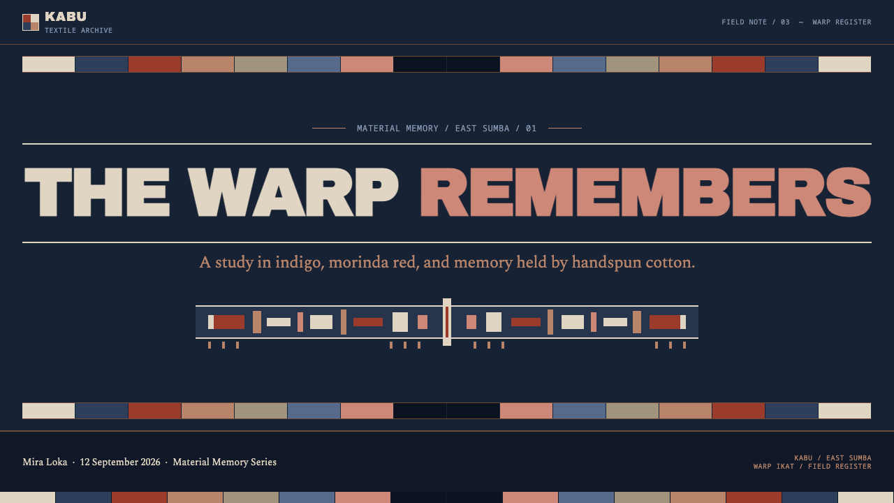
For presentation slides, a cover can be a near-black indigo field with a single cream band across it, a centred title and a thin row of stepped motifs at the base like a fringe. Content slides should be built from horizontal bands, with each band carrying one idea. Data slides can use cream bars on the dark ground, with the one important value in the reserved red. Avoid filling the slide with imagery: the bands and the stepped motifs are the imagery.
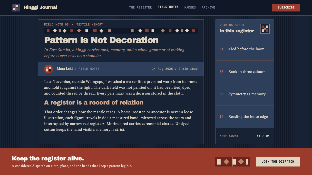
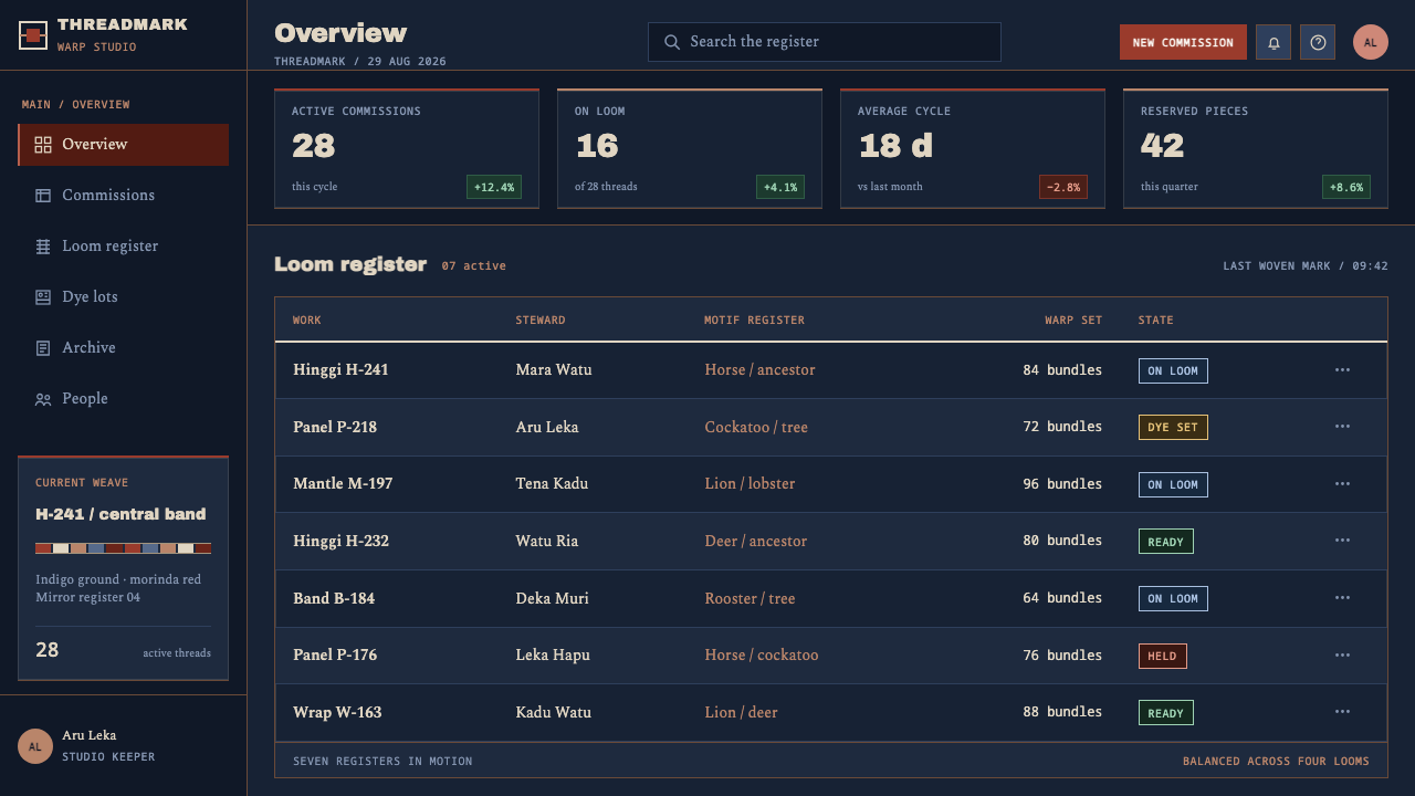
For web interfaces, the style suits archives, catalogues, museum and collection sites, knowledge bases and dark-mode dashboards that want a sense of authority. Use stacked full-width strips as sections, a centred axis for headings and calls to action, and cream for all interactive affordances. Use the red for the single most important state, such as a primary action or an alert, and nowhere else. Corners stay square and surfaces stay flat.
For editorial and marketing work, the style fits heritage brands, cultural institutions, long-form features about craft, textiles, anthropology and memory, and exhibitions. Section breaks can be patterned bands, and a closing fringe of repeated marks can end an article. Marketing pages should rely on rhythm and symmetry rather than on photographs, and let the rare red mark the one offer or fact the visitor should not miss.
The most common mistake is to scatter the red. Once red appears in several places the palette stops meaning anything and the style slides into generic dark-mode decoration. A second mistake is to soften the cloth, with rounded cards, glows or gradients on the indigo, which contradicts a design built on dyed and undyed thread. A third is to treat the figures as mere pattern fill: the motifs should be few, repeated deliberately and placed in registers, not sprinkled as texture.
Sumba Hinggi — FAQ
What is warp ikat, and why does it shape the whole style?
Warp ikat is a textile technique in which the warp threads are tied and dyed in a planned pattern before weaving begins. Because the pattern exists in the threads before the cloth does, its figures are fixed, stepped at the edges and symmetrical. The design style takes those constraints as rules: it uses two main states, dyed and undyed, avoids curves and soft shading, and arranges everything in strict bands, since the cloth itself could not do otherwise.
Why is red used so sparingly?
On the original cloths, red was a mark of nobility and of the funerals of great men, so it could not be used casually. The design keeps that logic: red appears once or twice per layout, to mark the single most important element. Scarcity is what gives it meaning. If every button, heading and icon is red, the page has nothing left to say with it.
Is this a dark mode, or a dark theme in its own right?
It is a dark theme in its own right. A conventional dark mode inverts a light design and softens contrast for comfort. Sumba Hinggi starts from the dark ground and treats it as the material of the page, with cream as the only drawing line. It has no light variant, and it does not try to feel cosy: its character comes from gravity, symmetry and restraint.
Can the style use photographs or illustrations?
Sparingly. The style's native imagery is the stepped figure built from cream on indigo, so photographs are best treated as exceptions: converted to a two-tone cream-on-indigo treatment, cropped into a band, or shown in a museum-like frame. Full-colour photographs sitting directly on the indigo undermine the two-state logic, and decorative illustration competes with the motifs the style already provides.
Where does the Sumba Hinggi style struggle?
It struggles in contexts that need lightness, humour or soft friendliness, such as children's products, casual consumer apps and food or wellness brands. Its strict symmetry and dark gravity can also feel heavy in tools that demand long hours of casual use. It is strongest where seriousness, heritage and order are the point, and where the content is worth being presented as a record.
Related design styles
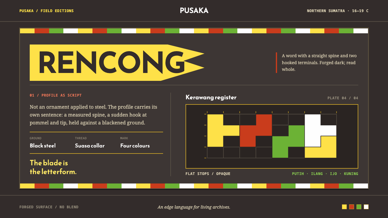 Acehnese Rencong MotifA blade that reads as a word. Flat kerawang red, white, green and yellow lock…
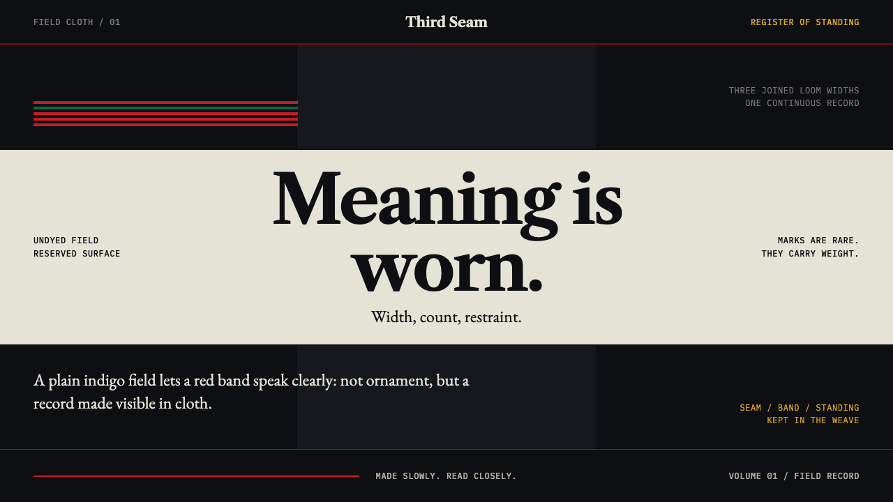 Naga Angami ShawlEvery stripe bears standing. Indigo seams frame rare red bands and one earned…
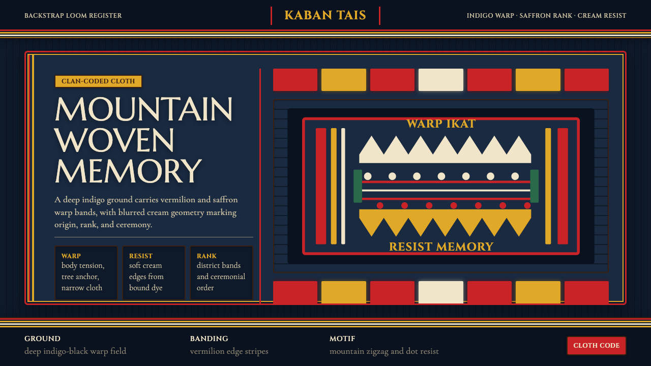 Timorese Tais (Backstrap Loom)Identity woven in darkness. Indigo ground, vermilion bands, saffron stripes,…
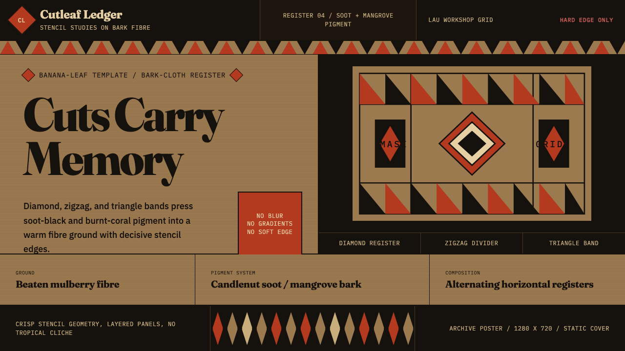 Fijian Masi (Bark Stencil)Stencil memory stays sharp. Soot black and burnt coral strike bark-fibre band…
 Fon Applique Banner AbomeyRoyal cloth speaks plainly. Flat saffron, green and indigo silhouettes on bla…
 Hmong Paj Ntaub (Flower Cloth)Memory is geometric. Fuchsia applique on indigo forms stepped maze panels.