What is Naga Angami Shawl?
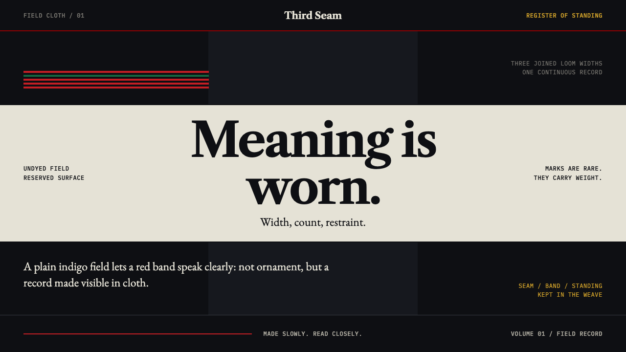
Every stripe on an Angami shawl carries standing — an indigo-black cloth, a few red and green bands, and one undyed white field that only an earned wearer may use.
Naga Angami Shawl in brief
Naga Angami Shawl is a design style drawn from the woven shawls of the Angami Nagas of the Naga Hills in Nagaland, north-east India. Its visual language is a dense indigo-black field, narrow seams, broad red and green bands set near the borders, and an undyed white centre that carries a few painted black marks. It belongs to the tradition of Naga backstrap-loom weaving and to the family of painted median-band shawls of the Naga region.
The principle is that nothing on the cloth is free. On an Angami shawl the width of a band and the number of stripes tell a viewer the wearer's age, marital status and standing among the elders. Ornament here is a rule system, not decoration: marks are rare, they are earned, and each one has to be explainable.
On screen that becomes a dark, quiet interface in which a plain field does most of the work. Colour is withheld, so when a red band or a white panel appears it means something. The style rewards products that have real status, levels or permissions to express, and it punishes any design that scatters accents for atmosphere.
Where does Naga Angami Shawl come from?
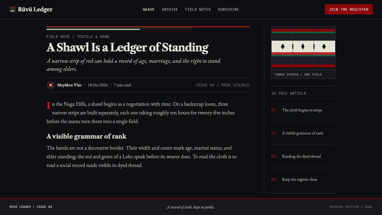
An Angami shawl is made on a backstrap loom, which the weaver tensions against the body, and it is woven in three narrow strips. The strips are then seamed together into one dense indigo-black cloth. The labour is stated plainly in the tradition: about ten hours of weaving for every twenty-five inches of strip. A finished shawl therefore carries many days of work, and that cost is part of what the cloth communicates. Nothing about the arrangement can be casual.
The cloth is a social document. Broad red and green bands sit near the borders of the men's shawl, the Lohe. The women's shawl, the Loramhoushü, is built differently: handpicked black motifs are placed between black and red stripes. Band width and stripe count encode age, marital status and elder standing, so a shawl can be read the way a uniform is read, by anyone who knows the code. The dark ground and the coloured bands come from the tradition's dyeing practice, which the sources name as indigo and Athuo plant dyeing.
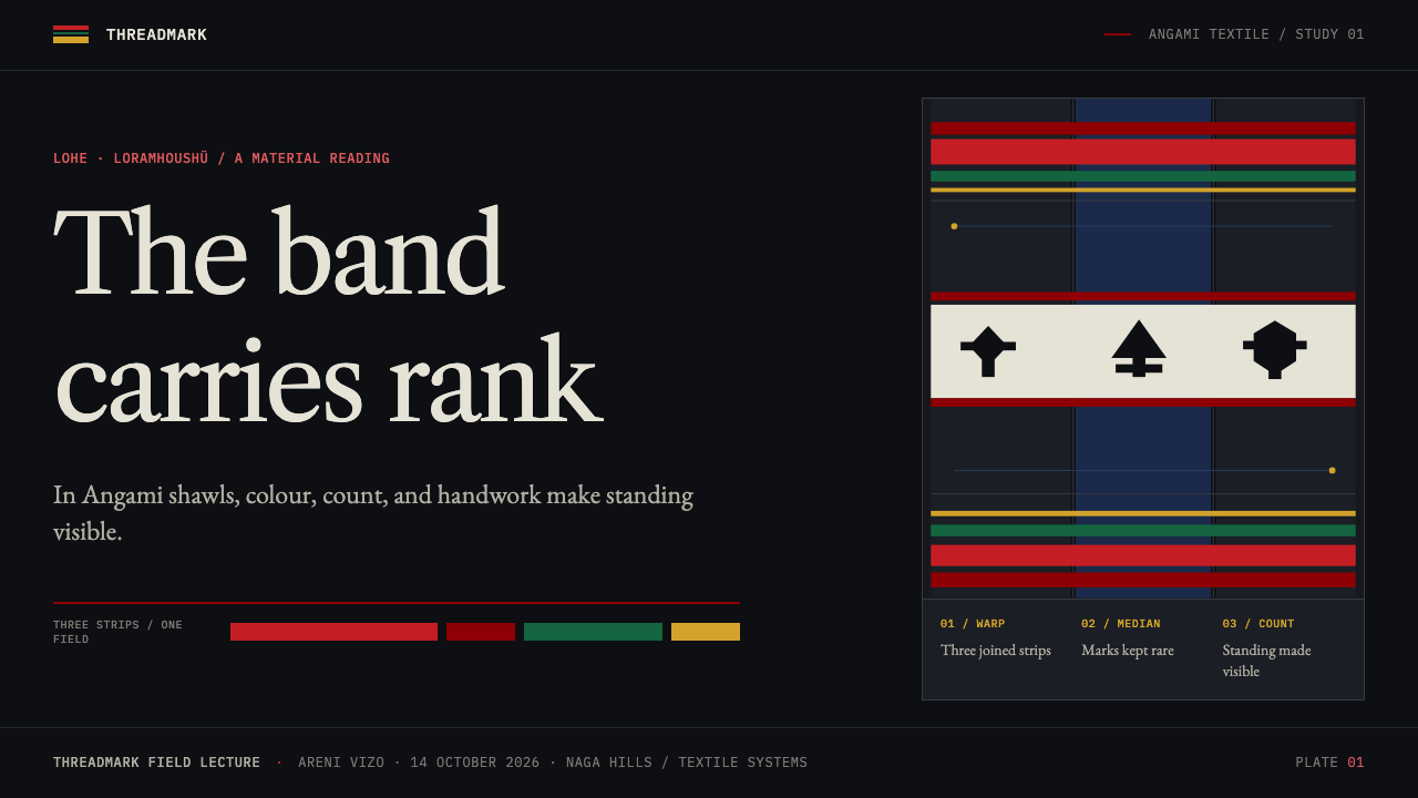
The most restricted element is the centre. Only a man who has earned it may wear the undyed white centre strip, and it is painted in black with a fixed vocabulary of marks: the mithun, the tiger, the elephant, the spear and human heads. These stand for wealth, strength, ability and valour. The white is not a neutral background. It is a privilege, and on a cloth that is otherwise nearly black, a pale field means that the wearer has earned a place to be seen.
Much of what is written about these rules comes from colonial-era ethnography of the 1900s to the 1920s, in which observers such as J. H. Hutton and R. G. Woodthorpe documented the shawls of the Naga Hills. The tradition itself is older than that documentation and has been worn continuously since. That continuity matters for design. This is a living code, not an archive, and the style is best used with a clear sense that its grammar belongs to the people who still wear it.
What defines the Naga Angami Shawl look?
Indigo-black field
The ground is a dense indigo-black, a blue so deep it reads as black until light catches it. Large dark areas dominate, and they are quiet and heavy rather than glossy. This is a dark style by nature: the field is the cloth, and every other element is a mark on it. Interfaces built this way feel weighty, enclosed and serious, with very little visual noise.
Seams and stripes as structure
The cloth is made from three narrow strips seamed together, and the seams are part of the design. Stripes run in parallel lines whose spacing and width mean something. In layout terms, rules and dividers are structural statements, not trim: they separate groups, mark levels and set rhythm. Every line should be able to answer the question of what it separates.
Rare red and green bands
Broad red and green bands sit near the borders of the men's shawl, and red is the rarest and strongest of the colours. Colour is a ration, not a mood. Use it for status, thresholds and the single thing a viewer must not miss. If red appears everywhere, it stops meaning anything, and the field loses the contrast that gives each band its standing.
The earned white field
The undyed white centre strip is the one large light area on an otherwise dark cloth, and only a man who has earned it may wear it. In a composition it is used once. It marks the top rank, the verified state, the headline result. Because dark dominates everything around it, the white reads as authority rather than as background.
Painted black marks
On the white strip the marks are painted in black: mithun, tiger, elephant, spear and human heads, standing for wealth, strength, ability and valour. They are few, bold and symbolic, and they are placed in the strip, not strewn across the cloth. In design, the lesson is a small, fixed emblem set where each symbol claims one meaning and appears only where that meaning has been earned.
Tone-on-tone handwork
The women's shawl carries handpicked black motifs between black and red stripes. Black on near-black is a quiet detail that rewards a close look. It teaches a second register for the system: fine, low-contrast pattern work for secondary content, held below the threshold of the primary bands, visible on attention but never competing with the stripes.
The weight of labour
Ten hours of weaving for every twenty-five inches of strip makes density a statement. A shawl is slow, and nothing on it is cheap. The interface equivalent is a considered rhythm: generous but heavy spacing, few components, no ornament that could be removed without loss. The system should feel made, not generated, and every element should look as though it cost something.
Who shaped Naga Angami Shawl?
A colonial-era observer whose ethnographic work of the early twentieth century helped document the shawls of the Naga Hills and the conventions around them. His record is one of the sources through which the status rules of Naga cloth are known beyond their communities.
Another colonial-era observer named alongside Hutton in the documentation of Naga weaving. Together the two stand for the outside view of the tradition: careful records of cloths and their meanings, made by people who were not part of the code they were describing.
The makers of the shawls, working on the backstrap loom in three narrow strips and seaming them into one cloth. Their method is the origin of the system's structure: strips, seams and a field that can only be made slowly, with each band placed deliberately.
The shawl records elder standing, alongside age and marital status, which is the standing the elders hold and confer. They are the readers of the cloth's code, and the reason a white field cannot simply be claimed: it has to be earned within the community.
How do you use Naga Angami Shawl today?
Naga Angami Shawl is a dark, rule-bound style for products whose content really is ranked. It works when there are levels, roles, ranks or permissions to show, and it fails when the design only wants a rich dark look. Apply the grammar, which is a plain field, rare marks and stripes that each mean something, not the surface of the cloth.
For presentation slides, a cover sits on the indigo-black field with the title in a pale neutral and a single broad red band near one edge. Content slides use thin parallel stripes as section dividers and level markers. A data slide keeps charts dark and quiet, reserves red for the one number that matters, and uses the white field only once, for the headline figure or the conclusion that has earned it.
For web interfaces, the style fits dark dashboards, membership systems, role and permission screens, and progress or achievement views. Tier differentiation is natural: stripe count or band width can mark a level, and the single white panel can mark the top tier or a verified account. Navigation stays plain and typographic. Buttons are flat and quiet, with red reserved for destructive or critical actions.
For editorial and marketing work, it is a good fit for craft, textile, heritage and status-driven stories. A long article can run on the dark field with striped section breaks, and a campaign page can place one white panel for the main claim. Keep the emblem set small and fixed so that a symbol never appears without its meaning being earned on that page.
The common mistake is decoration: sprinkling red bands and white panels across a layout for atmosphere. Every accent must be justified by something real. A second mistake is to turn the painted marks into a pattern or an icon set. They are reserved symbols of wealth, strength, ability and valour on a cloth where they must be earned, and using them as wallpaper empties them. Take the stripe logic and make your own earned marks.
Naga Angami Shawl — FAQ
Can I use the mithun, tiger, elephant and spear motifs in my design?
It is better not to. On an Angami shawl these painted marks sit on the white centre strip, which only a man who has earned it may wear, and they stand for wealth, strength, ability and valour. Copying them as decoration strips them of that rule. The more useful thing to borrow is the grammar: a plain field, rare marks and standing that has to be earned, expressed in your own symbols.
Why is this a dark style?
Because the cloth is dark. Three narrow strips are seamed into one dense indigo-black field, and every other element, from the red and green bands to the white centre, is a mark on that field. The darkness is also what gives the rare light areas their authority: a white panel reads as earned precisely because the surrounding ground is so heavy.
How many accent colours should a layout use?
Very few. The men's shawl carries broad red and green bands near the borders, and red is the rarest. A layout in this style should lead with the dark field, bring in one band colour for a clear purpose, and treat the white field as a single, non-repeating event. If you cannot say what an accent means, remove it.
What kind of products does it suit?
Products with real hierarchy to express: membership tiers, permission systems, rank and progress views, credentials, and heritage or craft brands that want weight rather than polish. It suits dark dashboards and long-form storytelling well. It suits playful or purely decorative products badly, because the style depends on every mark being meaningful.
Related design styles
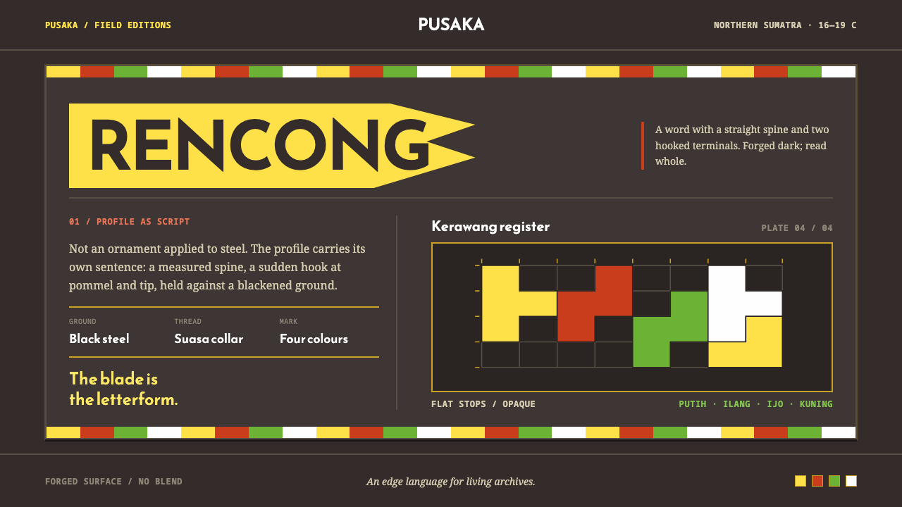 Acehnese Rencong MotifA blade that reads as a word. Flat kerawang red, white, green and yellow lock…
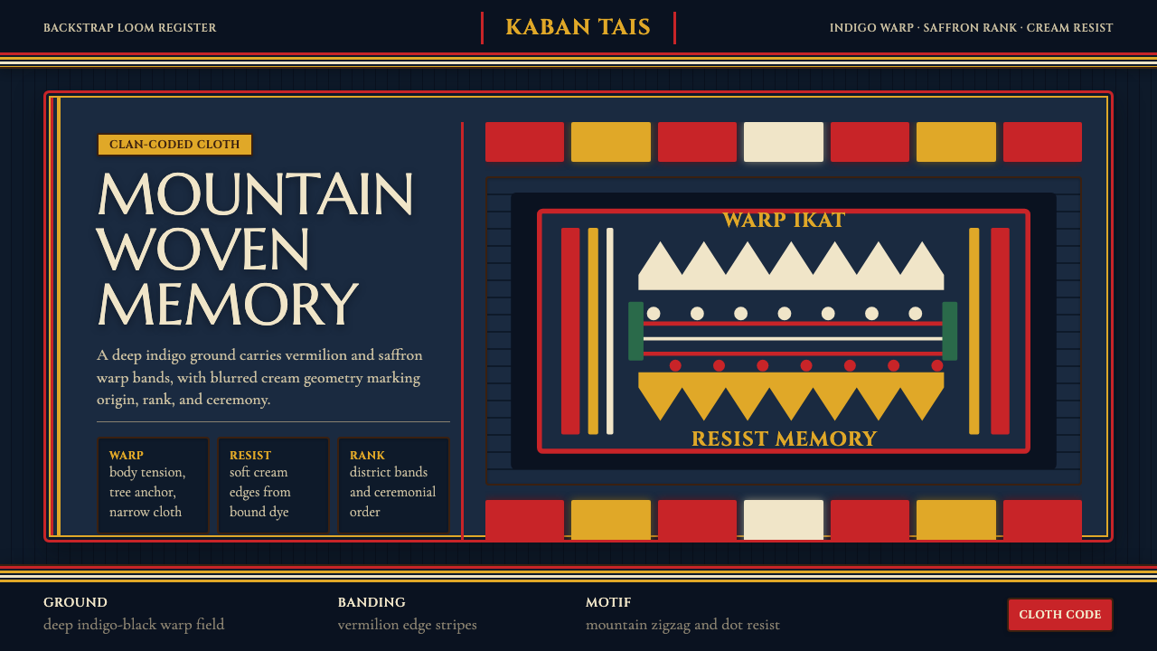 Timorese Tais (Backstrap Loom)Identity woven in darkness. Indigo ground, vermilion bands, saffron stripes,…
 Fijian Masi (Bark Stencil)Stencil memory stays sharp. Soot black and burnt coral strike bark-fibre band…
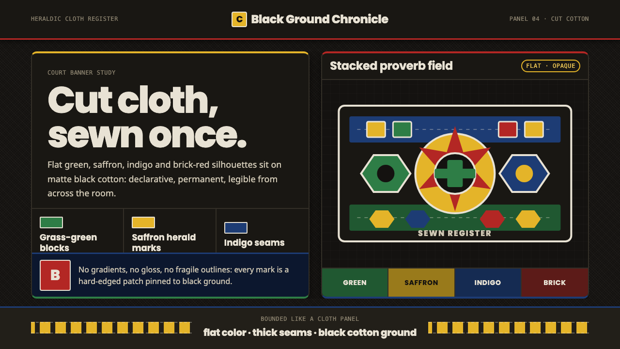 Fon Applique Banner AbomeyRoyal cloth speaks plainly. Flat saffron, green and indigo silhouettes on bla…
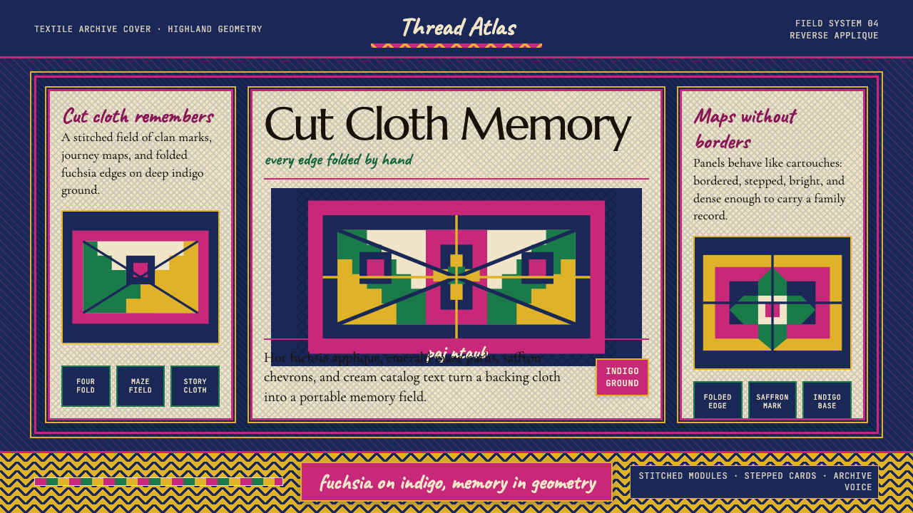 Hmong Paj Ntaub (Flower Cloth)Memory is geometric. Fuchsia applique on indigo forms stepped maze panels.
 Hopi Katsina TihuEvery colour is a direction. Matte mineral fields meet in smoke-black keyline…