What is Fon Appliqué Banner?
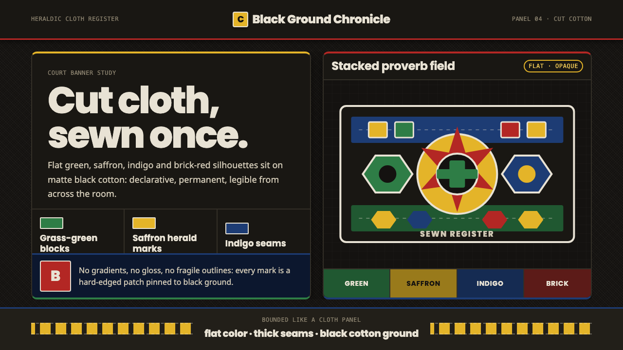
Royal cloth speaks plainly: bright cotton silhouettes on black, carrying the memory of a court through shape, color, and stitch.
Fon Appliqué Banner in brief
Fon Appliqué Banner is a court-textile language from the Kingdom of Dahomey, where hereditary appliqué guilds in Abomey recorded royal history and power through bright cotton silhouettes sewn onto cloth. Its imagery draws from animals, warriors, kings, and proverbs, turning fabric into a surface for public memory and authority.
This is the black-ground variant of that tradition. Deep black cotton becomes the field, while grass-green, saffron, indigo, brick-red, and off-white shapes sit above it as opaque, poster-like blocks. Nothing is modeled with shading; each form appears as though it was cut once, placed with purpose, and stitched down permanently.
The style is forceful because it is materially direct. Color does not dissolve into atmosphere, silhouettes do not imitate natural volume, and the cloth does not pretend to be paper or paint. The result feels heraldic and declarative: a banner that communicates through instantly legible figures, strong contrast, and the visible logic of construction.

Where does Fon Appliqué Banner come from?
The tradition belongs to the Kingdom of Dahomey and is rooted in the court culture of Abomey, in present-day Benin, West Africa. Its documented setting is pre-1900 royal art, where cloth was not merely a domestic material but a public surface capable of carrying history, status, and power. The name Fon Appliqué Banner identifies both its cultural setting and its banner-like visual authority.
Hereditary guilds of appliqué artisans served the royal court from workshops in Abomey. Their practice depended on a clear sequence of material decisions: bright plain-weave cotton was selected, cut into recognizable silhouettes, and stitched onto a solid cloth ground. The process made the image inseparable from the labor that produced it. Every figure was assembled rather than painted, and every seam helped turn an isolated shape into a durable record.
The subject matter connected the textile to royal narration. Animals could occupy the field as powerful signs; warriors and kings could embody courtly authority; proverbs could compress a larger lesson into a visual form. The result was a textile tradition that joined heraldic banner-making with West African appliqué practice. Its visual language is therefore both symbolic and practical: it must be recognizable at a glance, but it is also built from cloth, cutting, overlap, and stitch.
The black-ground version intensifies this inherited logic. Deep black cotton gives the appliquéd forms a continuous stage, allowing saffron, green, indigo, brick-red, and off-white to read as deliberate emblems rather than blended decoration. The darkness is not a soft atmosphere or a dramatic gradient; it is the ground itself. Against it, each opaque silhouette retains the authority of a piece of cloth fixed in place for good.
What defines the Fon Appliqué Banner look?
Black Cotton Ground
The deep black cotton ground is the style’s visual anchor. It creates a continuous field behind every appliquéd shape and gives the banner its nocturnal, ceremonial presence. The ground should feel like cloth rather than a digital void: solid, tactile in implication, and unwavering beneath the brighter forms.
Flat Saturated Color
Color arrives as plain, opaque cloth. Grass-green, saffron, indigo, brick-red, and off-white are kept visually distinct, with no atmospheric blending or modeled transitions. The palette is vivid but disciplined: each hue must read as a separate fabric piece and carry its own presence against black.
Silhouette as Language
The central form is the silhouette: an animal, warrior, king, or compressed proverb made legible through contour. Detail is subordinate to recognition. Shapes should have a decisive outer edge, a readable pose, and enough internal restraint that the image communicates before the viewer studies its construction.
Cut Cloth Construction
The image should reveal that it was assembled from cut cotton, not rendered from light. Overlap, edge, and stitch are part of the visual grammar. Even when translated into a digital layout, forms should feel pinned or sewn into place, with their boundaries treated as decisions rather than soft transitions.
Royal and Heraldic Force
The composition carries the authority of a banner. Figures should feel emblematic rather than incidental, arranged to declare identity, history, or power. This does not require ornamental framing; the force comes from the contrast between the black field and the compact, brightly colored symbols placed upon it.
Unshaded Surface
Every appliquéd form remains opaque and unshaded. There are no soft highlights, simulated folds, or gradients trying to make the cotton appear photographic. The absence of modeled depth keeps the visual system close to its material premise: a piece of cloth cut into a sign and sewn down for good.

Who shaped Fon Appliqué Banner?
The hereditary Fon royal appliqué guilds are the central makers named in this tradition. Serving the court from Abomey workshops, they transformed plain-weave cotton into silhouettes of animals, warriors, kings, and proverbs. Their importance lies not in a single signature style but in the continuity of a specialized textile practice tied directly to royal history and power.
The court artisans of Dahomey gave the work its narrative and ceremonial purpose. Their appliqué images functioned as more than surface decoration: they recorded royal history and power through figures that could be recognized, remembered, and carried on cloth. The banner’s directness begins with this public role.
The Abomey Hountondji lineage workshops are identified as a named workshop lineage within the source tradition. Their inclusion emphasizes that this was a situated practice, maintained through inherited knowledge and working communities rather than an abstract decorative vocabulary detached from place, material, and court service.
How do you use Fon Appliqué Banner today?
For presentation slides, use the banner logic across the whole sequence. A cover can place a single large animal, warrior, king, or proverb silhouette against black, with the title treated as a clear supporting mark. Content slides should preserve broad breathing room and let each idea occupy a distinct cloth-like field rather than crowding several symbols together. Data slides can translate charts into appliqué-like shapes: solid bars, compact emblems, and opaque color blocks whose meaning remains legible without gradients or simulated depth.
For web interfaces, the style suits dashboards, pricing pages, and other products that need strong recognition and decisive hierarchy. Keep the black ground continuous, use saffron or brick-red for primary actions, and let green or indigo distinguish categories or states. Panels should feel like sewn pieces placed onto a shared cloth, while labels remain plain and readable. Avoid turning every control into a decorative emblem; the banner language is strongest when symbols carry information and the surrounding field stays quiet.
For editorial and marketing work, Fon Appliqué Banner supports a memorable alternation between dense black fields and vivid symbolic inserts. An article can use a large opening silhouette, short blocks of text, and section transitions marked by a new color or figure rather than ornamental rules. A campaign page can treat a proverb or animal as its central mark, allowing the visual identity to feel ceremonial and locally grounded while remaining immediate and poster-like.
The common mistake is to imitate only the dark background and bright palette while adding soft shadows, gradients, glossy surfaces, or excessive texture. That turns cut cloth into generic digital decoration. Another mistake is to use many unrelated silhouettes at equal prominence. Preserve the hierarchy of a banner: one clear figure or message leads, supporting shapes remain subordinate, and every color block appears to have been cut and sewn for a reason.

Fon Appliqué Banner — FAQ
Is Fon Appliqué Banner a painted or illustrated style?
No. Its defining premise is appliqué: bright plain-weave cotton is cut into silhouettes and stitched onto a solid cloth ground. A digital interpretation can borrow the visual language, but it should preserve the feeling of assembled opaque pieces rather than imitate brushwork, lighting, or painted volume.
Why is the ground black?
The approved theme describes a black-ground variant in which deep black cotton supports the brighter appliquéd forms. Black provides a continuous ceremonial field and makes saffron, green, indigo, brick-red, and off-white read as distinct emblems. It should remain a solid ground, not a smoky atmosphere.
What kinds of imagery belong in the style?
The source tradition names animals, warriors, kings, and proverbs. These subjects work because they can be reduced to strong, recognizable silhouettes and can carry royal history or power. Abstract decoration without a narrative or emblematic role is less aligned with the style’s stated purpose.
Can I add shadows, gradients, or realistic fabric folds?
They should be avoided. The black-ground variant is defined by flat, opaque, unshaded color blocks, as though each shape had been cut and sewn down once and permanently. Adding modeled lighting or realistic folds weakens the material honesty and makes the work feel rendered rather than appliquéd.
Related design styles
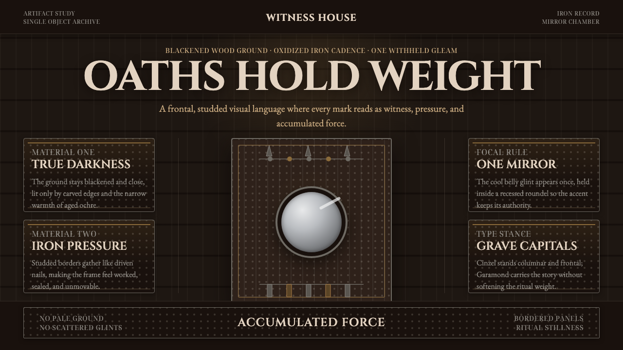 Kongo Nkisi Nkondi FigurePower accumulates in darkness. Black wood, iron studs, and one mirror glint h…
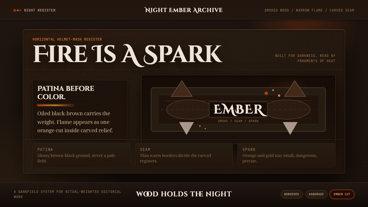 Senufo Firespitter MaskRitual darkness has heat. Smoked wood tones hold back tiny orange-gold sparks.
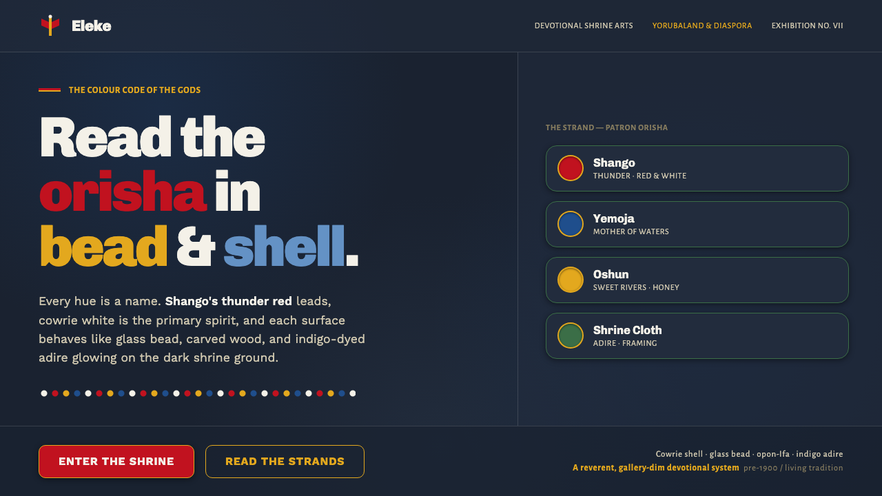 Yoruba Orisha ShrineThe colour code of the gods. Shango-red beadwork and cowrie white glow on dar…
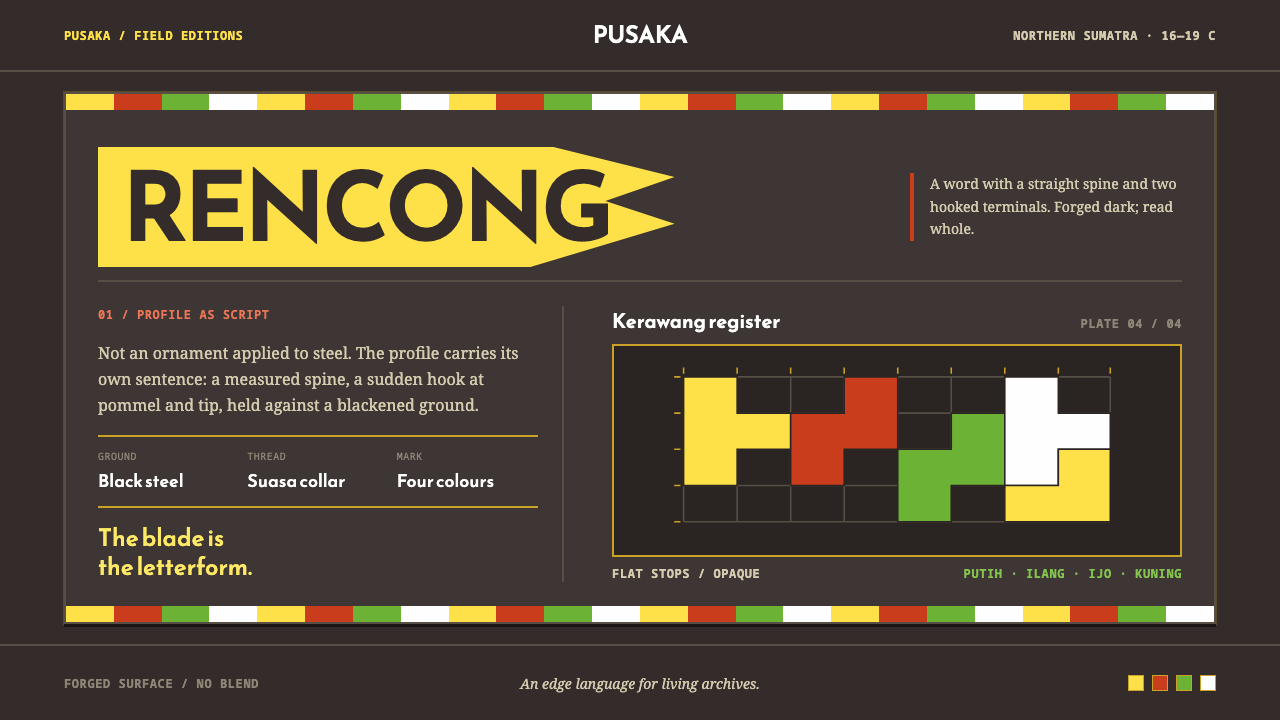 Acehnese Rencong MotifA blade that reads as a word. Flat kerawang red, white, green and yellow lock…
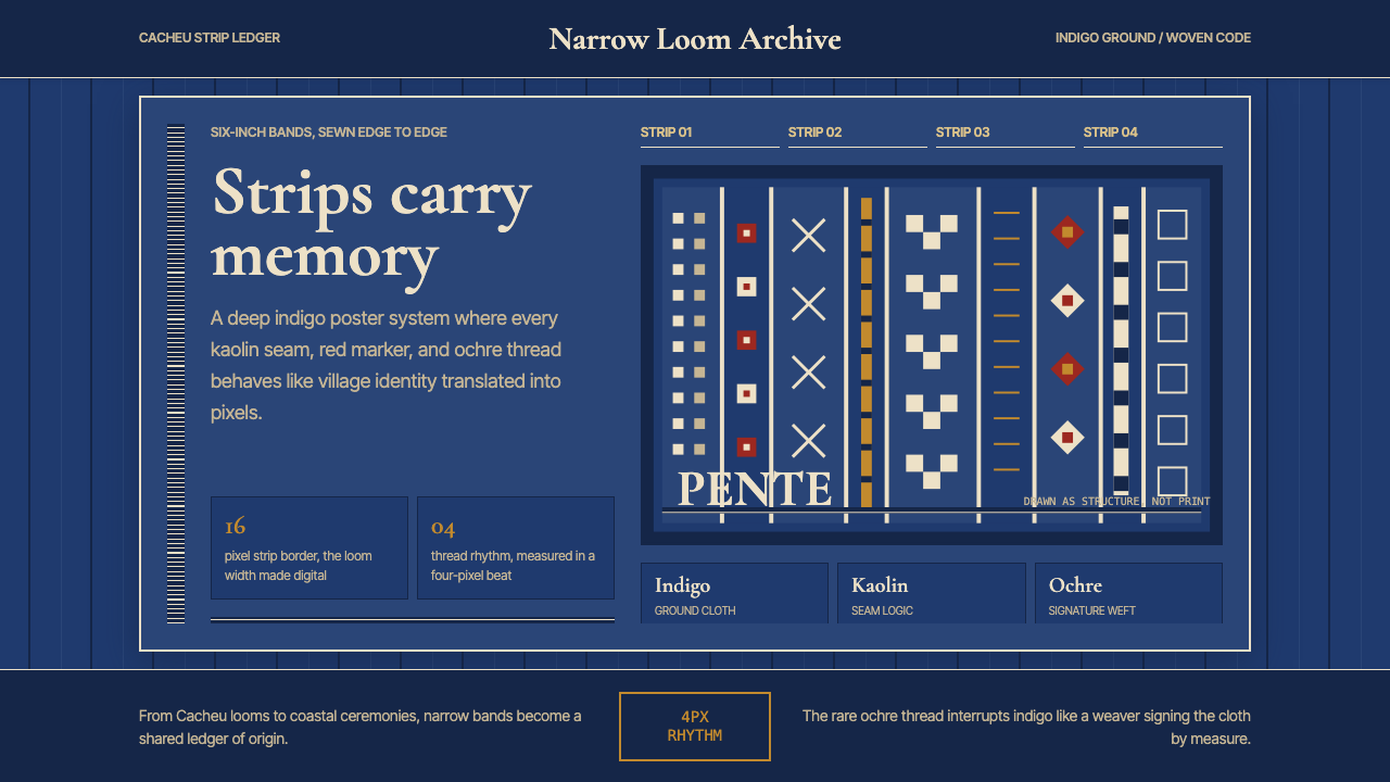 Bissau-Guinean Pano de PenteIndigo remembers. Narrow bands and kaolin seams turn weave grammar into pixel…
 Fijian Masi (Bark Stencil)Stencil memory stays sharp. Soot black and burnt coral strike bark-fibre band…