What is Yoruba Orisha Shrine?
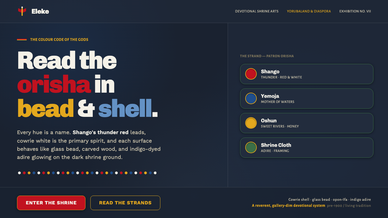
Yoruba Orisha Shrine design draws its force from a living devotional language: vivid sacred color, bead and shell brilliance, carved wood, and indigo depth held in deliberate tension.
Yoruba Orisha Shrine in brief
Yoruba orisha shrine art is the devotional material culture surrounding the orisha: a visual and tactile world of sacred colors, cowrie shells, glass beads, carved divination trays, and indigo-dyed adire cloth. It belongs to a living tradition rooted in Yorubaland, encompassing present-day Nigeria and Benin, and sustained across diaspora communities. Its visual intensity is not incidental decoration. Color, material, and surface presence make devotion legible.
The system is recognizable through strong contrasts held against a saturated, dark shrine-like ground. Shango’s red-and-white thunder axe establishes a charged red-and-white relationship; Yemoja is associated with ocean blue; Oshun with honey-gold. Cowrie white appears with unusual brightness against dark indigo-wood, while beadwork turns color into rhythm, sequence, and concentrated points of attention.
As a digital design language, Yoruba Orisha Shrine should be understood as an interpretation of material qualities rather than a generic ornamental theme. Surfaces should evoke the firmness of carved wood, the gathered luminosity of shells and beads, and the depth of resist-dyed cloth. The result is dark but not muted: every accent arrives with the clarity of a named presence.
Where does Yoruba Orisha Shrine come from?
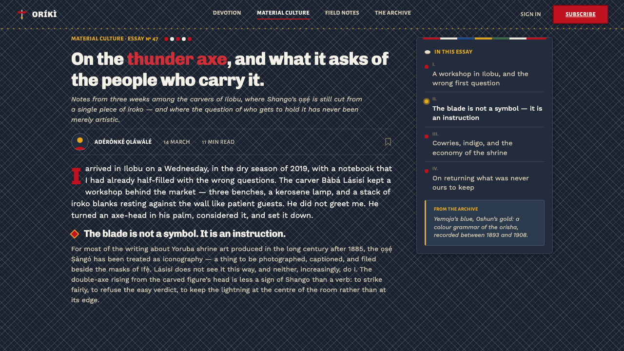
Yoruba Orisha Shrine belongs to a pre-1900 living tradition with deep precolonial roots and continuous contemporary devotional practice. Its region is Yorubaland in Nigeria and Benin, together with a wide diaspora. That continuity matters: shrine art is not a closed historical style awaiting revival, but material culture connected to ongoing religious life.
The tradition gathers several related practices rather than relying on one isolated art form. Orisha and Ifa devotional and shrine arts provide the religious setting; Yoruba beadwork, including elekes, provides concentrated color and patterned accumulation; adire textile traditions contribute indigo depth and resist-dyed surface logic; and Opon-Ifa divination-tray carving contributes carved wood as a sacred structural presence.
Its makers and custodians include orisha devotees, babalawo and iyalorisha priesthood, Yoruba carvers, and Yoruba beadworkers. These are not interchangeable roles. Together they describe a devotional ecology in which ritual knowledge, material skill, color, carved form, and careful maintenance meet. A shrine language is therefore made through relationships among people, objects, and practices, not through an autonomous visual formula.
For contemporary design, the appropriate lesson is restraint as much as intensity. The digital adaptation can learn from dark indigo-wood grounds, signal-strong orisha colors, shell-like white, bead-like repetition, and cloth-like pattern. It should not claim to replace the shrine, stand in for ritual practice, or flatten distinct devotional meanings into a decorative moodboard.
What defines the Yoruba Orisha Shrine look?
Dark Indigo-Wood Ground
The foundational field is saturated and dark, recalling the interior depth of a carved-wood shrine and the density of indigo-dyed adire cloth. It is not an empty black backdrop. It should feel absorbent, warm, and materially present, so that shells, beadwork, text, and sacred color appear to emerge from it rather than float above it.
Named Orisha Color
Color is the principal signal system. Shango’s red leads with force, and white is a named primary spirit presence beside it; Yemoja’s ocean blue and Oshun’s honey-gold offer distinct devotional associations. Use these colors as concentrated declarations, not as a broad rainbow treatment. Their force depends on separation, contrast, and a dark field that gives each one room to speak.
Cowrie White
Cowrie white is a luminous counterweight to the indigo-wood ground. It should read as shell: compact, clean, and visibly brighter than ordinary interface text or neutral decoration. Used sparingly, it can mark focal language, dividers, small symbols, and quiet ceremonial pauses. Its value is not softness but clarity.
Beadwork Rhythm
Glass beadwork suggests repetition with intent. Repeated accents, grouped marks, short ornamental runs, and patterned sequences can create the sense of elekes without turning every surface into visual noise. The important quality is gathered rhythm: elements feel threaded, placed, and related, rather than scattered as arbitrary confetti.
Carved Structure
Carved divination trays and shrine wood suggest a structural approach to framing. Panels, borders, rules, and emblematic areas should feel cut, incised, or held within a material boundary. Edges can be decisive and weighty, but should not imitate generic luxury ornament. The visual purpose is containment: making a surface feel prepared for attention.
Adire Surface Logic
Adire contributes a sense of dyed depth rather than smooth digital polish. Pattern should feel embedded in the ground, as though it has resisted, absorbed, or revealed color through material process. Keep it subordinate to hierarchy and content. A cloth-like field works best when it enriches the dark ground without competing with the named colors.

Who shaped Yoruba Orisha Shrine?
Orisha devotees sustain the devotional setting in which shrine objects, colors, and materials are meaningful. Their presence is essential to understanding this tradition as living practice rather than as a collection of visual motifs. Any digital interpretation should preserve that distinction by treating references with specificity and care.
Babalawo and iyalorisha priesthood belong to the key custodial roles named within the tradition. Their inclusion locates shrine art within religious knowledge and practice, rather than in surface styling alone. It also connects carved divination trays and shrine materials to a context of care, interpretation, and devotion.
Yoruba carvers give carved wood and Opon-Ifa divination trays their material authority. In a design reading, their work reminds us that framing, incision, and dense dark surfaces can carry meaning through craft. The reference is not permission to copy sacred objects, but an invitation to learn from material decisiveness.
Yoruba beadworkers are central to the elekes tradition and to the visual logic of concentrated color. Their work demonstrates how repeated small units can become ceremonial presence: color is not merely applied, but assembled. Digital systems can borrow this lesson through disciplined grouping, sequence, and contrast.
How do you use Yoruba Orisha Shrine today?
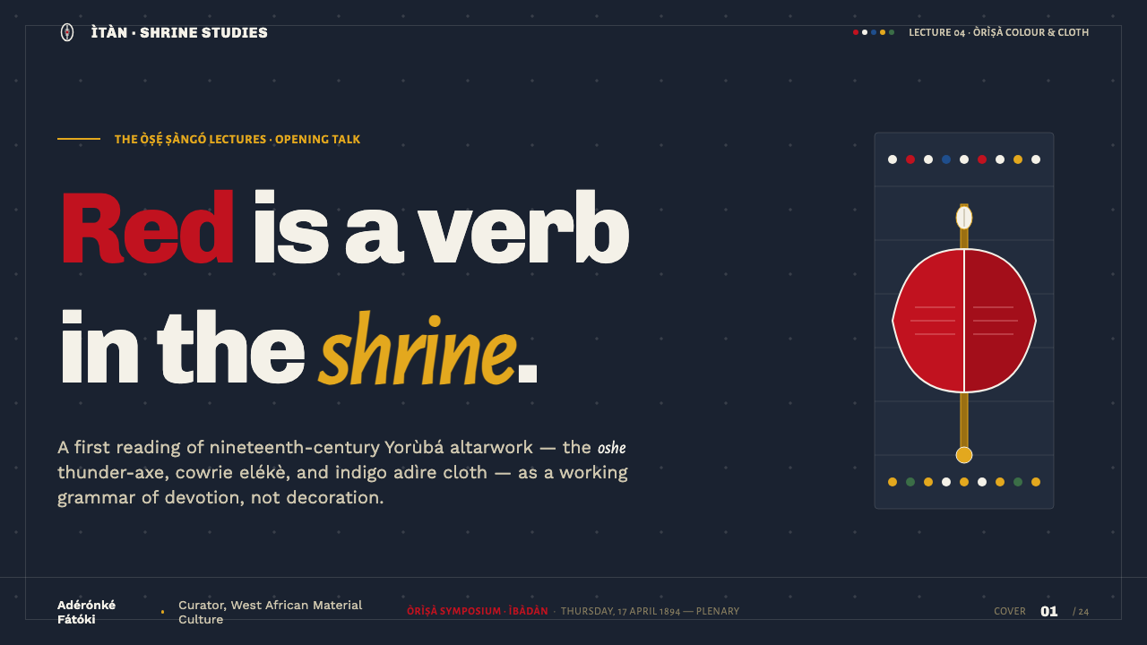
For presentation covers, use the shrine-like dark field as a stage for one dominant orisha color and a small amount of cowrie white. A title should feel placed with ceremonial attention rather than centered by habit. Let bead-like marks, a carved boundary, or a restrained adire field support the composition, while preserving a large area of visual stillness.
Content slides should work through clear layers: a strong title, calm explanatory text, and a limited number of signal accents. For data slides, treat charts as structured offerings of information rather than colorful decoration. One leading color can identify the principal story; white can clarify labels and reference points; blue or honey-gold can distinguish a secondary relationship only where that distinction is meaningful.
In web interfaces, this language suits dashboards, collection views, and pricing pages that need authority, depth, and memorable hierarchy. Use dark indigo-wood grounds for major frames, then create readable content zones through shell-white text, carved separators, and controlled bead-like indicators. Interactive emphasis should be explicit and concentrated rather than spread across every control.
For editorial and marketing work, the style can give articles, campaigns, and cultural-program pages a rich sense of entrance. Build long-form reading around an open dark ground, disciplined text columns, and occasional color events. Marketing sections can alternate between quiet carved panels and vivid moments of red, blue, honey-gold, or white, provided each transition serves narrative focus rather than spectacle.
The most common mistake is reducing the tradition to dark blue plus bright red. That loses the material and devotional logic that gives the palette its force. Avoid indiscriminate shell, bead, textile, or sacred-object imagery; avoid placing every named color in every composition; and avoid treating the shrine reference as generic mysticism. Strong work uses fewer signals, names their role clearly, and keeps the living tradition visible in the care of its interpretation.
Yoruba Orisha Shrine — FAQ
Is Yoruba Orisha Shrine a historical style or a living practice?
It is a living devotional tradition with deep precolonial roots, described here as continuous in current practice. That is why it should not be handled like a closed archive style. Design can learn from its material language, but should avoid implying ownership, ritual authority, or complete representation.
Why is the background so dark?
The dark ground refers to the saturated interior of a carved-wood shrine and to indigo-dyed adire cloth. Its role is active: it creates depth, gives cowrie white its glow, and lets Shango’s red, Yemoja’s ocean blue, and Oshun’s honey-gold arrive as distinct signals.
Should every orisha color appear in one layout?
No. The source language describes colors as named and signal-strong, which makes selective use more convincing than total display. Let one color lead a composition, use white as a clarifying counterpoint where appropriate, and introduce another named color only when it creates a real informational or compositional distinction.
How can beadwork be referenced without making the design busy?
Use beadwork as rhythm, not wallpaper. Group small marks into short sequences, reserve them for boundaries or meaningful states, and allow dark space around them. The goal is the feeling of gathered, threaded color rather than a field of unrelated decorative dots.
What makes an interpretation respectful?
Respect begins with recognizing the source as devotional material culture connected to living communities. Keep references specific, avoid generic mysticism, do not copy sacred objects as empty ornament, and describe the result as a digital interpretation of color, beadwork, shells, carving, and cloth rather than as the tradition itself.
Related design styles
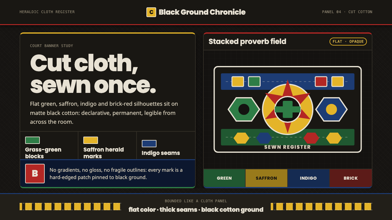 Fon Applique Banner AbomeyRoyal cloth speaks plainly. Flat saffron, green and indigo silhouettes on bla…
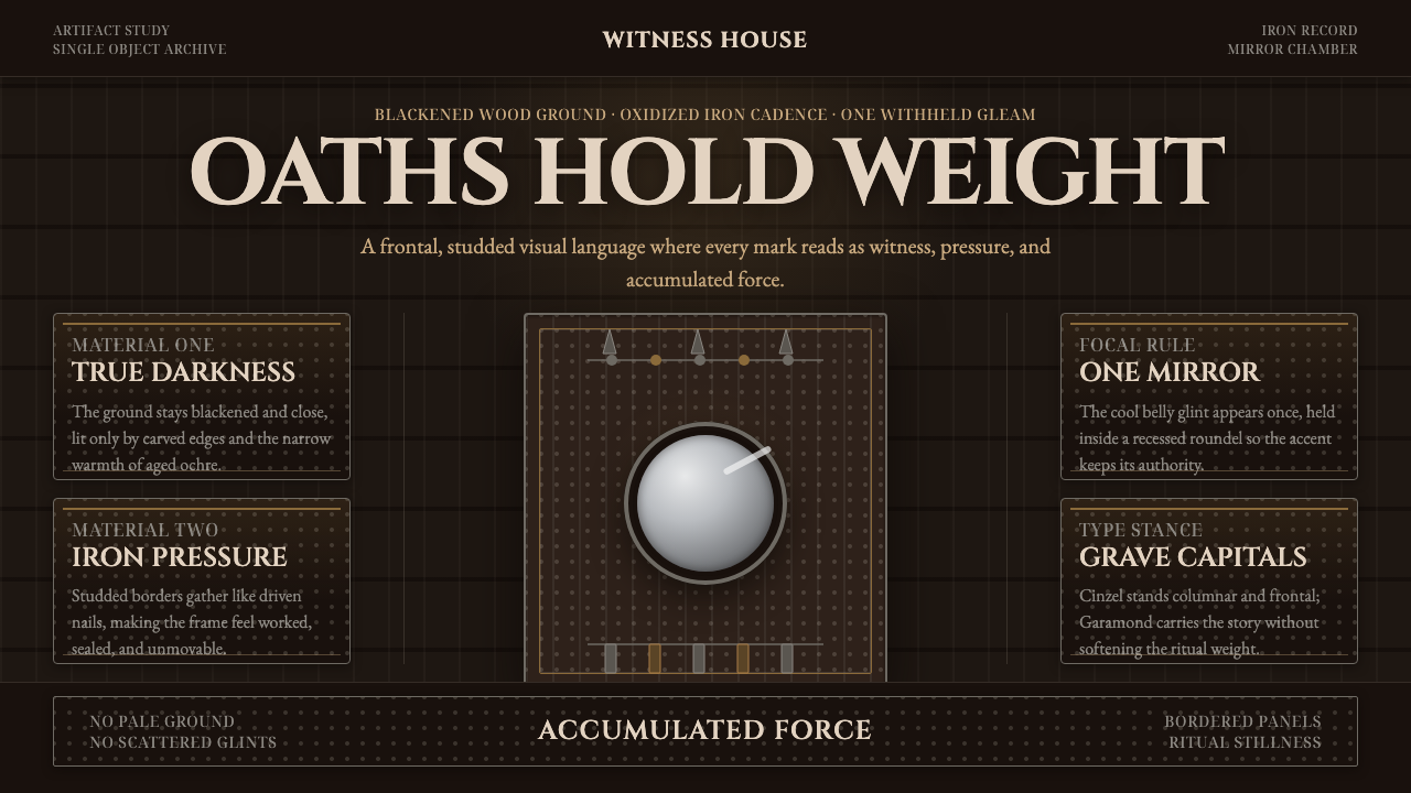 Kongo Nkisi Nkondi FigurePower accumulates in darkness. Black wood, iron studs, and one mirror glint h…
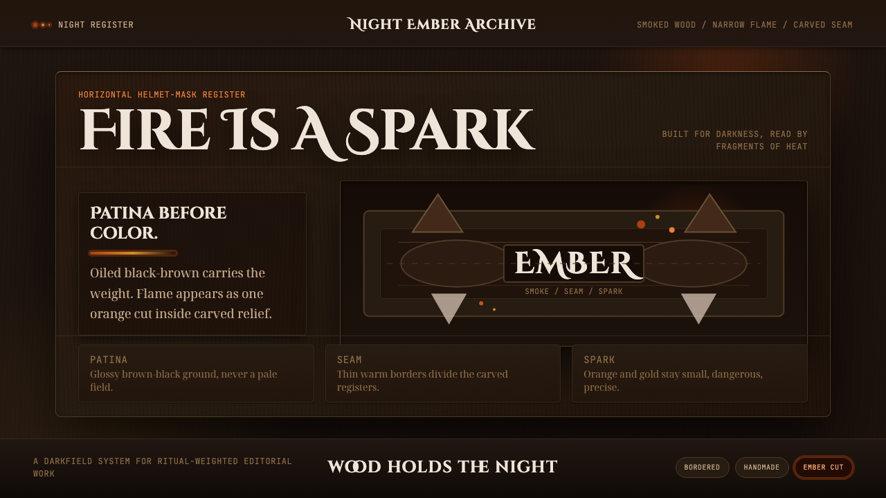 Senufo Firespitter MaskRitual darkness has heat. Smoked wood tones hold back tiny orange-gold sparks.
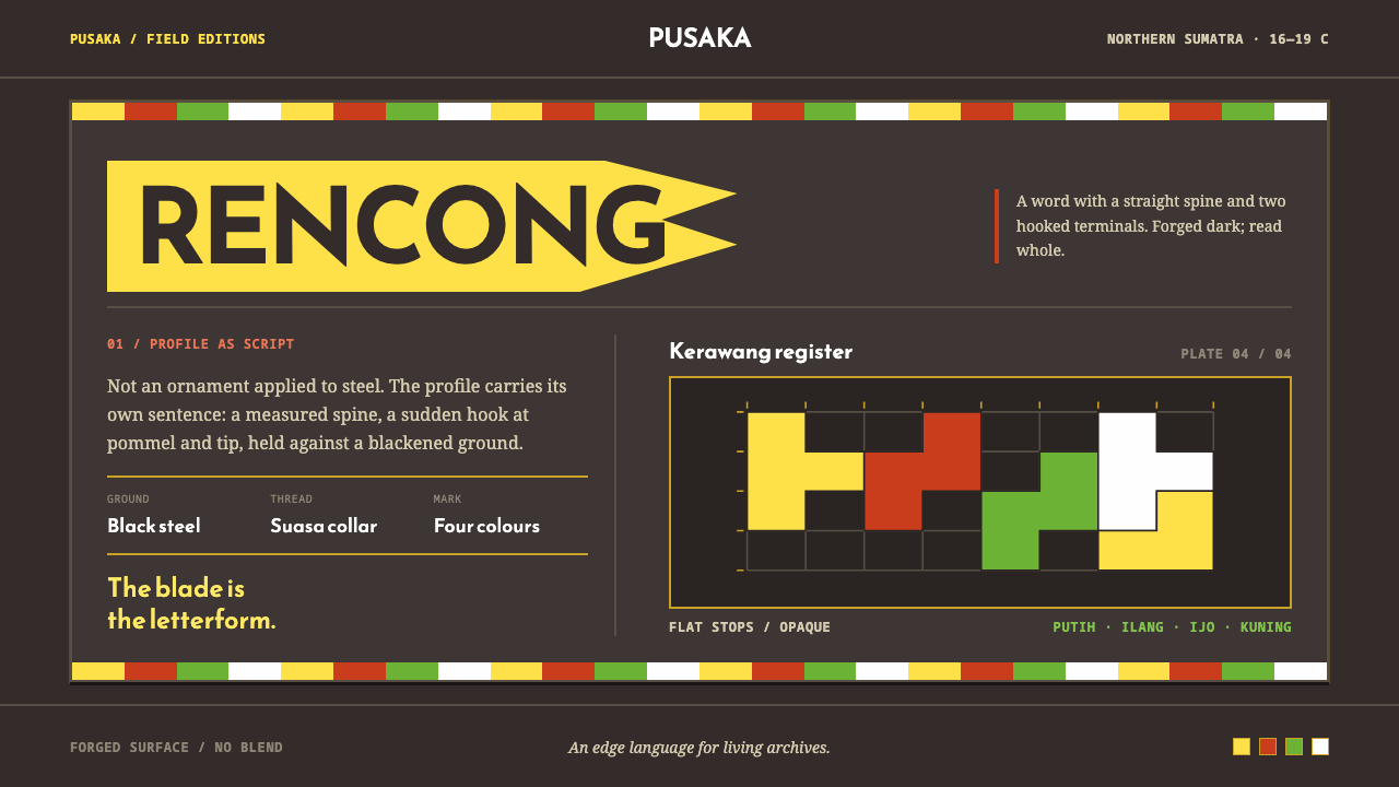 Acehnese Rencong MotifA blade that reads as a word. Flat kerawang red, white, green and yellow lock…
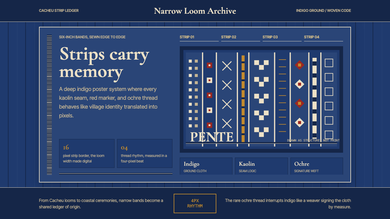 Bissau-Guinean Pano de PenteIndigo remembers. Narrow bands and kaolin seams turn weave grammar into pixel…
 Fijian Masi (Bark Stencil)Stencil memory stays sharp. Soot black and burnt coral strike bark-fibre band…