What is Māori Tukutuku Panel?
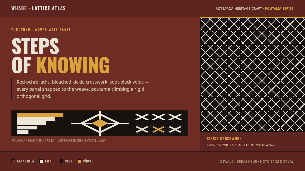
Tukutuku turns architecture into memory — red-ochre laths, bleached crosswork, and poutama steps locked into a disciplined Māori meeting-house grid.
Māori Tukutuku Panel in brief
Tukutuku are woven lattice wall panels set between the carvings inside a Māori wharenui, or meeting house. Their visual language is built from vertical kākaho reeds and horizontal kaho laths, with patterns laced through the structure in bright pīngao sedge and bleached kiekie. The result is neither painted ornament nor loose textile decoration: it is an architectural surface whose pattern, material, and setting belong together.
The defining motifs are poutama stairsteps, diamonds, and crosses. Poutama carries the ideas of climbing, learning, and inheritance, so the repeated step is more than a graphic device. It gives the panel a sense of ordered movement upward, while the crossing lines make knowledge and continuity feel physically woven into the wall. The pattern is legible because its structure is disciplined, not because it is visually busy.
This design system translates that craft logic into a dark digital language. Deep red ochre becomes the lath ground, bleached white becomes the kiekie crosswork, soot black becomes the void between woven elements, and sand yellow appears only as a restrained pīngao accent. Everything is orthogonal, matte, and tightly organized, so the interface reads as a constructed panel rather than a surface decorated with cultural motifs.
Where does Māori Tukutuku Panel come from?
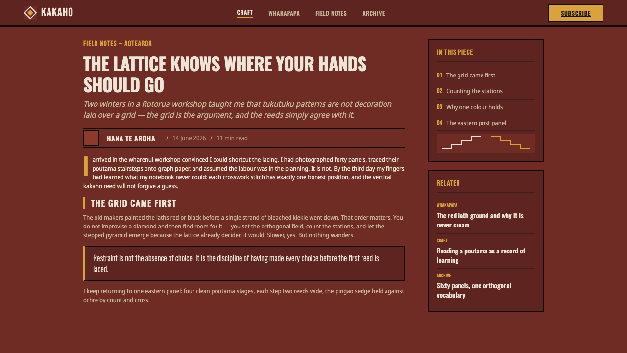
The tukutuku tradition belongs to Māori wharenui art in Aotearoa, New Zealand, within the wider cultural region of Oceania. The tradition predates 1900 and continues as part of the meeting-house environment. Its location is essential: tukutuku panels occupy the spaces between carvings, creating a woven field that participates in the visual and architectural identity of the wharenui.
The construction begins with a framework of vertical kākaho reeds and horizontal kaho laths. The laths are painted red or black, establishing a dark structural ground. Bright pīngao sedge and bleached kiekie are then laced through that framework to form recognizable patterns. The palette is therefore inseparable from the making process: red and black belong to the supporting structure, while white and sand-yellow emerge through the woven material.
Tukutuku are associated with a carving-and-lattice tradition rather than an isolated surface style. The panels and carvings share the interior of the wharenui, so the lattice provides rhythm and continuity between more dimensional forms. Weavers working in pairs are identified as key participants in the tradition, emphasizing that the work is a collaborative practice as well as a visual language.
The poutama motif gives the tradition a particularly clear symbolic center. Its stepped form expresses climbing, learning, and inheritance, turning repetition into a statement about movement through knowledge and generations. The digital system preserves that relationship between structure and meaning: its rigid grid is not merely a technical scaffold, but a way to let every crossing, interval, and step feel deliberate.
What defines the Māori Tukutuku Panel look?
Red-Ochre Lath Ground
The ground is deep red ochre, recalling the painted kaho laths that support the physical panel. It should feel structural rather than atmospheric: a dense field of horizontal and vertical members, with the warmth of red held inside a dark, architectural register. Black can interrupt the ground as voids, making the lath logic visible through contrast.
Bleached Crosswork
Bleached white kiekie forms the most visible woven layer. Its role is defined by crossing, lacing, and repetition rather than by broad decorative fields. White strands should read as material passing through a framework, producing a crisp rhythm of intersections and openings. The contrast is strong, but the surface remains matte and tactile instead of luminous.
Poutama Geometry
Poutama stairsteps provide the system with directional movement. The stepped rhythm can organize a page, mark progress, or create a visual path through content, while diamonds and crosses supply alternate woven forms. These motifs should remain readable as constructed patterns, never dissolving into arbitrary abstraction. Their meaning depends on repeated order.
Orthogonal Grid
The digital translation is locked to a rigid orthogonal grid, echoing the relationship between vertical reeds and horizontal laths. Alignment should feel physical and interdependent: headings, panels, separators, and content blocks meet on shared lines. Diagonal movement belongs inside the woven motifs, while the larger composition remains controlled by the straight framework.
Matte Woven Surface
Surfaces are flat, matte, and reed-like. The system avoids polished gloss and theatrical depth because the intended reference is woven material, not illuminated glass or carved stone. Slight shifts between red, black, white, and sand yellow can establish layers, but the layers should remain graphic and tactile. Texture supports the sense of material; it should never overpower the pattern.
Restrained Pīngao Accent
Sand yellow is reserved for the pīngao accent and should remain rare enough to feel intentional. It can identify a route, a selected state, or a small point of emphasis within the darker field. When yellow spreads across the composition, it loses its relationship to the woven sedge and turns into generic brightness. Its power comes from scarcity.
Who shaped Māori Tukutuku Panel?
The source identifies tukutuku weavers working in pairs as key figures in the tradition. Their collaborative practice is reflected in the panel itself: a pattern is produced through interdependence between vertical and horizontal members, and through the coordinated lacing of colored materials. The digital system should preserve that sense of joined labor by making its elements align, cross, and support one another.
Tukutuku belong to the wider wharenui carving-and-lattice tradition. Their significance comes partly from their position between carvings, where the woven panels create continuity across the meeting-house interior. This relationship discourages treating the pattern as a detachable ornament. It is better understood as an architectural field that connects neighboring forms.
Poutama is the stepped symbolism at the heart of the system. Its meaning is associated with climbing, learning, and inheritance. In a digital composition, the motif can guide progression and hierarchy, but it should not be reduced to a decorative zigzag. The step matters because it carries an ordered movement through knowledge and continuity.
How do you use Māori Tukutuku Panel today?
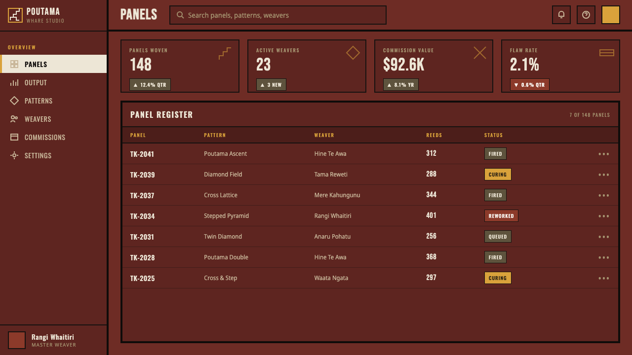
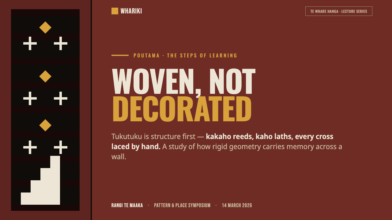
For presentation slides, use the red-ochre lath ground as a strong cover field, with a clear white poutama path or crosswork structure carrying the title. Content slides should behave like assembled panels: headings, text, and visual blocks align to the same orthogonal framework, while black voids create breathing room. Data slides can use stepped sequences, diamonds, and crosses as organizing devices, with sand yellow reserved for the most important comparison or active point.
For web dashboards, the system suits interfaces that need a dark, structured, and highly legible environment. Treat cards as woven modules rather than floating glass surfaces. Red ochre can establish the main frame, white can carry labels and active structure, and black can separate dense regions. Status or selection states may use sand yellow, but the accent should remain narrow so that the dashboard continues to feel like a disciplined panel.
For pricing pages, use the lattice logic to distinguish plans without turning every tier into a separate color world. Keep the page grounded in red ochre, white, and black, then use repeated steps or crossing rules to show progression between offers. A highlighted plan can receive the pīngao accent, while the remaining plans rely on alignment, contrast, and panel structure. The result should feel firm and crafted rather than glossy or promotional.
For editorial and marketing work, tukutuku provides a strong visual language for stories about learning, continuity, craft, architecture, and cultural inheritance. A cover can pair a large stepped motif with a concise headline and generous dark field. Inside the article, crosswork can mark transitions, diamonds can frame metadata, and red-ochre bands can separate sections. Marketing pages benefit from the style's material clarity when the product wants to appear deliberate, grounded, and built to last.
The common mistake is to use Māori-inspired shapes as free-floating decoration while ignoring the panel's structural logic and cultural meaning. Avoid scattering poutama steps, crosses, or diamonds across unrelated surfaces, flooding the layout with sand yellow, or adding glossy effects that contradict the matte woven reference. The system works when pattern, material, hierarchy, and symbolism support one another.
Māori Tukutuku Panel — FAQ
What are tukutuku panels?
Tukutuku are woven lattice wall panels placed between carvings inside a Māori wharenui, or meeting house. They are built from vertical kākaho reeds and horizontal kaho laths, then patterned with pīngao sedge and bleached kiekie. Their purpose in this design system is not to provide a loose decorative reference, but to translate the panel's structural relationship between material, architecture, and pattern into a digital interface.
What materials and colors define the style?
The source material names kākaho reeds, kaho laths, bright pīngao sedge, and bleached kiekie. The digital palette follows their described logic: deep red ochre for the lath ground, bleached white for the woven crosswork, soot black for voids, and a restrained sand yellow for pīngao emphasis. The surfaces should remain flat, matte, and woven-reed-like.
What does the poutama motif represent?
Poutama is a stepped motif associated with climbing, learning, and inheritance. Its repeated rise creates a visual sense of progression, but the motif should not be treated as a generic staircase or zigzag. In this system, its meaning is strongest when the steps organize content or guide movement through a composition while remaining visibly connected to the larger woven grid.
Can this style work in a dark interface?
Yes. The system is already conceived around a deep red-ochre ground, soot-black voids, and strong bleached-white crosswork. A dark interface should preserve that material hierarchy rather than treating darkness as a generic background. Keep the woven structure crisp, let white carry essential information, and use sand yellow sparingly so that it remains a meaningful accent instead of becoming a second dominant palette.
How can the design avoid becoming a superficial cultural pastiche?
Keep the relationship between structure and symbol intact. Use the orthogonal grid, the lath-like ground, the crossing logic, and the restrained palette as a connected system. Poutama should organize movement or hierarchy rather than appear as random ornament. Most importantly, do not separate the motifs from their wharenui and woven-lattice context; the style is strongest when it communicates construction, continuity, and deliberate collaboration.
Related design styles
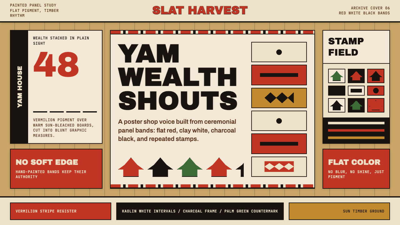 Trobriand Yam House PaintPainted wealth speaks loud. Vermilion bands and black stamp silhouettes hit t…
 Fijian Masi (Bark Stencil)Stencil memory stays sharp. Soot black and burnt coral strike bark-fibre band…
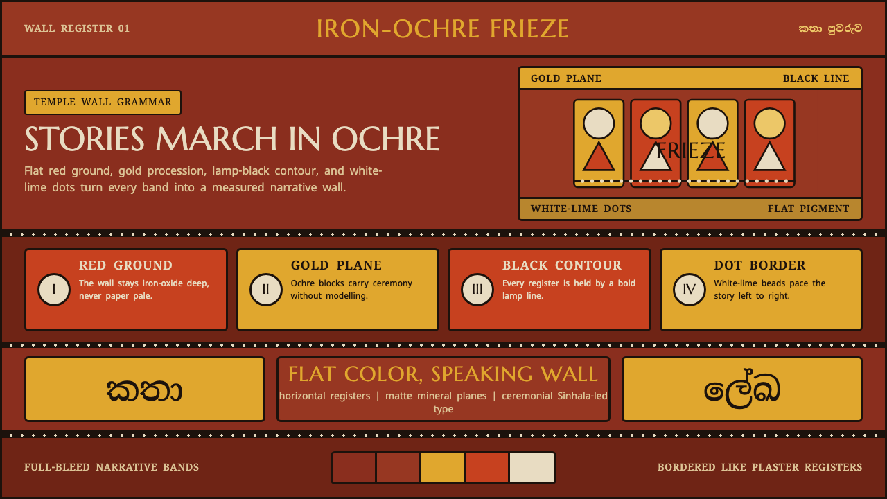 Kandyan Temple Mural FriezeTemple-wall gravity. Red ochre, gold planes, black contours, white-dot regist…
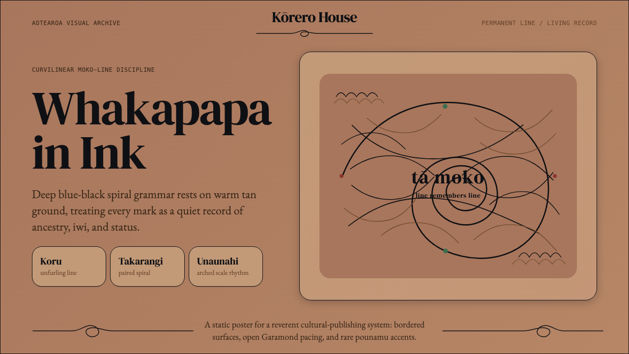 Māori Tā Moko (Facial Tattoo)Ancestry feels carved. Blue-black spirals on tan ground carry a restrained Ga…
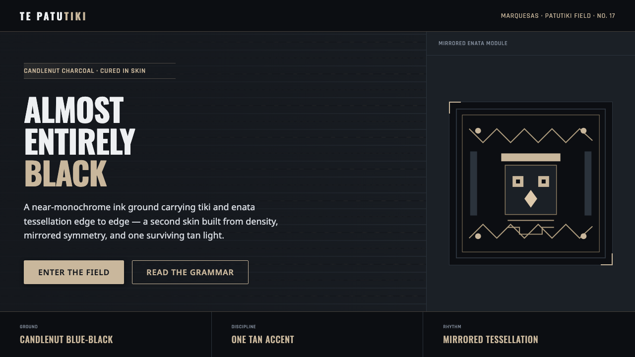 Marquesan Tatu PatternDensity as authority. Tiki and enata tessellation inked into blue-black, lit…
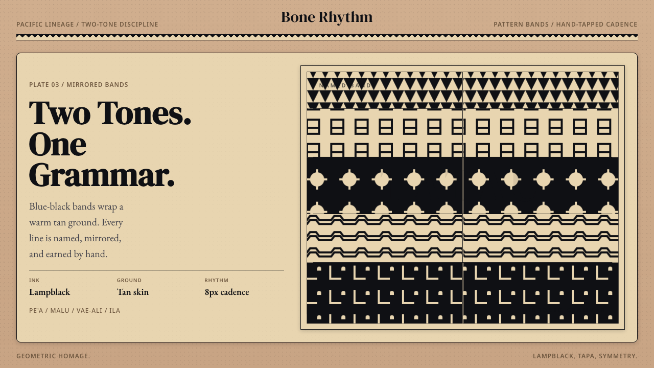 Samoan Tatau (Traditional Tattoo)Strict two-tone discipline. Tan ground, blue-black bands, hand-tapped symmetr…