What is Marquesan Tatu Pattern?
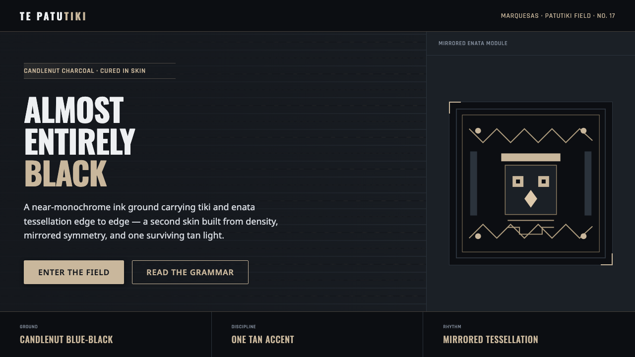
Marquesan patutiki turns density into authority — tiki faces, enata figures, and banded geometry pressed into blue-black ink, with one candlenut-tan accent to make the darkness speak.
Marquesan Tatu Pattern in brief
Marquesan patutiki is an ancient tattoo tradition from the Marquesas Islands of French Polynesia, documented by early navigators before 1900 and revived in modern Polynesia. Its visual language is exceptionally dense: tiki faces, enata figures, banded grids, and repeated geometric marks are packed together until the tattoo reads as an almost continuous blue-black surface.
The tradition is defined less by isolated symbols than by the relationship between symbols. Motifs are arranged in tessellated fields, mirrored structures, and bands that create rhythm across the body. Negative space is deliberately scarce, so authority comes from accumulation, repetition, and the controlled pressure of pattern rather than from a single emblem.
This design system translates patutiki into a near-monochrome interface language. Blue-black becomes the dominant ground, dense geometry supplies structure, mirrored symmetry keeps the visual field coherent, and a single candlenut-tan accent carries highlights, selected labels, or moments of emphasis. The result should feel inked, continuous, and intentionally weighty.
Where does Marquesan Tatu Pattern come from?
The historical home of patutiki is the Marquesas Islands in French Polynesia. The tradition belongs to a wider Polynesian motif culture, but the approved source identifies Marquesan practice specifically through its dense vocabulary of tiki faces, enata figures, and banded geometric fields.
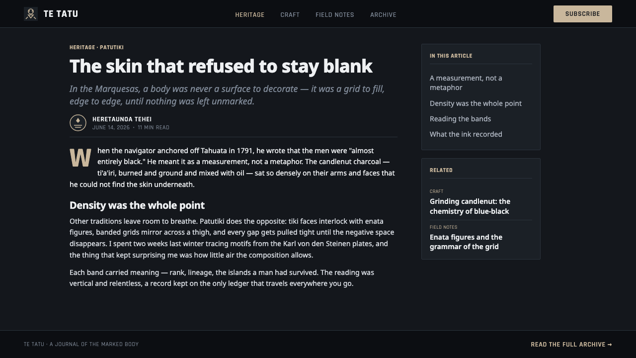
Early navigators documented the tradition before 1900. In the eighteenth century, some described tattooed bearers as almost entirely black, a phrase that captures the visual effect of the practice more than any single motif does. The impression came from the thick accumulation of charcoal-dark marks across the body.
The pigment was made from candlenut charcoal mixed with oil, producing a solid blue-black reading on skin. That material origin is central to the design translation: the dark field should feel like pigment gathered into a surface, while the candlenut-tan accent recalls the warm source of the charcoal without competing with the ink.
The tradition was carried by Marquesan tuhuka, the tattoo masters, and by patutiki bearers whose bodies held the completed pattern vocabulary. In modern Polynesia, patutiki has been revived as a living motif tradition. This design system does not reproduce a specific tattoo; it distills the source material into a contemporary visual system built around density, tessellation, symmetry, and restrained contrast.
What defines the Marquesan Tatu Pattern look?
Blue-Black Ground
The dominant field is a solid blue-black, derived from the appearance of candlenut charcoal pigment mixed with oil. It should read as an inked surface rather than a neutral dark theme: deep, compact, and slightly warm in its material association. Light elements are therefore strongest when kept sparse and intentional.
Density
Density is the system's primary statement. Motifs are packed into fields with minimal negative space, allowing small marks to accumulate into a larger authority. The effect should not become visual noise; repeated forms need consistent spacing, scale, and orientation so the surface feels intentional rather than crowded.
Tiki and Enata
Tiki faces and enata figures provide the recognizable human presence within the pattern field. They should remain legible as motifs while participating in the surrounding geometry. Used together, faces supply focal identity and figures create rhythm, turning a symbolic vocabulary into a continuous visual fabric.
Tessellation and Bands
The composition is built from tessellated units and banded grids rather than loose scattered icons. Bands can divide information into ranked zones, while repeated units make transitions feel joined. The pattern is strongest when edges align and fields lock together like interdependent pieces of one carved surface.
Mirrored Symmetry
Mirrored symmetry provides control inside the density. It gives faces, figures, and geometric units a stable axis, making a busy field easier to read without reducing its intensity. Symmetry should organize the pattern, not make every page mechanically identical; variation can occur inside a consistent mirrored framework.
Candlenut-Tan Accent
A single candlenut-tan accent breaks the blue-black field and carries the system's hierarchy. It is best reserved for highlights, active states, key figures, or a small number of navigational signals. Its scarcity matters: if the accent spreads everywhere, the visual logic shifts from ink density to ordinary multicolor contrast.
Who shaped Marquesan Tatu Pattern?
The tuhuka are the Marquesan tattoo masters identified in the source material. In this design system, their role is represented through disciplined construction: dense fields, repeated motifs, banded organization, and the sense that every mark belongs to a larger pattern rather than existing as casual decoration.
Patutiki bearers are the people whose bodies carried the completed tattoo vocabulary. The historical descriptions of their nearly black appearance explain why this style treats coverage and accumulation as meaningful visual forces. The bearer is not an incidental surface; the body is the field through which the pattern becomes continuous.
Early navigators documented Marquesan patutiki before 1900 and described its extreme visual density. Their accounts are the source of the enduring image of bearers appearing almost entirely black. In the design language, that observation becomes a principle of concentrated ink, restricted contrast, and pattern that reads as a unified surface.
How do you use Marquesan Tatu Pattern today?
Marquesan Tatu Pattern is most effective when treated as a structural system rather than a decorative skin. Let density establish authority, let bands create hierarchy, and let the limited accent explain where attention should go. The pattern should feel continuous across a composition, with motifs joining one another instead of appearing as unrelated ornaments.
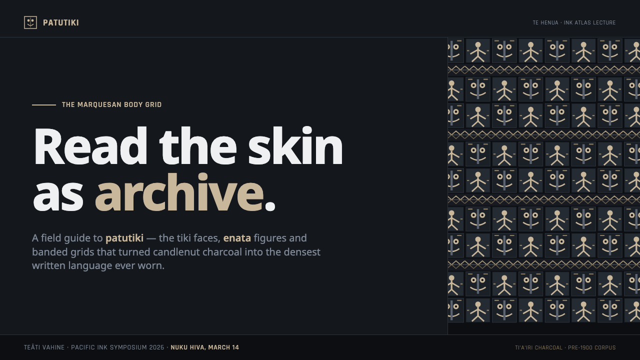
For presentation slides, the cover can use a near-solid blue-black field with one large tiki or enata-derived form emerging through the candlenut-tan accent. Content slides should introduce more breathing room while retaining banded alignment and repeated geometric marks. Data slides can treat charts as tessellated structures: bars, segments, or labels become part of the pattern field, with the accent reserved for the most important finding.
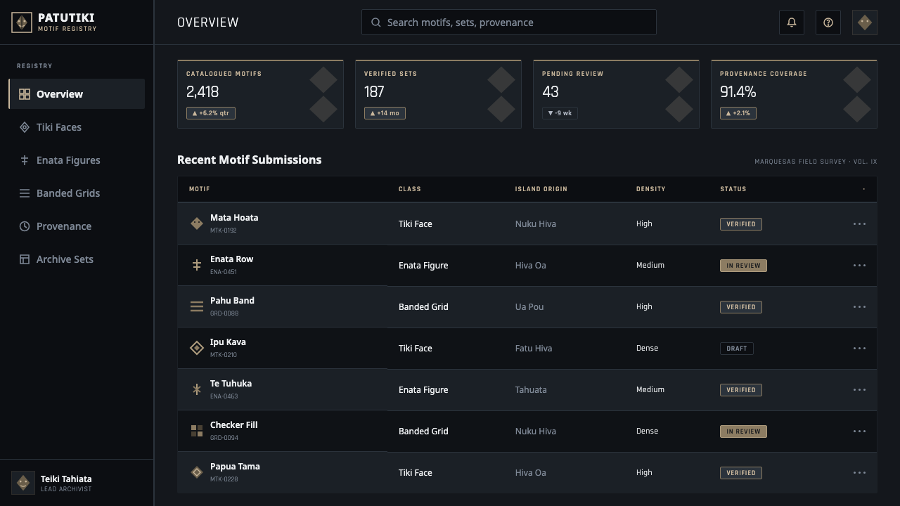
For web interfaces, the style suits dashboards and pricing pages that need a strong sense of authority and controlled hierarchy. Use the blue-black ground for navigation or major panels, keep repeated motifs aligned along bands, and use candlenut tan for active states, selected plans, or decisive metrics. Dense patterning should frame information, not sit behind every sentence and reduce legibility.
For editorial and marketing work, the system supports covers, campaign posters, cultural features, and brand stories that benefit from a concentrated visual voice. A dark page can carry a large patterned field, while a narrow text area remains comparatively calm. Marketing calls to action work best as rare warm interruptions within the ink surface, not as a continuous row of competing highlights.
The common mistake is to treat the style as a license for indiscriminate complexity. Filling every region with unrelated tiki faces, enata figures, and accents weakens the authority that density is meant to create. Keep the motif vocabulary coherent, reserve the warm accent, and allow the pattern to operate through repeated structure rather than through constant novelty.
Marquesan Tatu Pattern — FAQ
What is Marquesan patutiki?
Patutiki is an ancient Marquesan tattoo tradition from the Marquesas Islands of French Polynesia. Its visual vocabulary includes tiki faces, enata figures, banded grids, dense geometric fields, and very limited negative space. Early navigators documented the tradition before 1900, and it has been revived in modern Polynesia.
Why is the pattern so dense?
Density is both the defining visual fact of patutiki and the central principle of this design system. The accumulation of marks creates a nearly continuous blue-black surface, while repeated motifs and bands keep that density organized. The goal is concentrated authority, not random visual clutter.
What colors belong to this style?
The system is near-monochrome: blue-black is the dominant ground, and candlenut tan is the single supporting accent. The accent can identify highlights, active states, selected plans, or key data. Introducing many unrelated colors changes the system from material ink logic into a conventional multicolor interface.
Can the style be used for a modern dashboard or pricing page?
Yes, when density is confined to framing, navigation, or major structural zones. Dashboards can use bands and mirrored alignment to organize panels, while pricing pages can reserve candlenut tan for the selected plan or primary action. Text and metrics still need calmer areas so the pattern supports hierarchy instead of competing with it.
How can the pattern remain readable when negative space is minimal?
Use consistency as the substitute for open space. Repeated motifs should share a clear scale and orientation, bands should align, and mirrored structures should establish stable axes. Reserve the candlenut-tan accent for a small number of meaningful signals, and place longer text outside the most concentrated pattern fields.
Related design styles
 Fijian Masi (Bark Stencil)Stencil memory stays sharp. Soot black and burnt coral strike bark-fibre band…
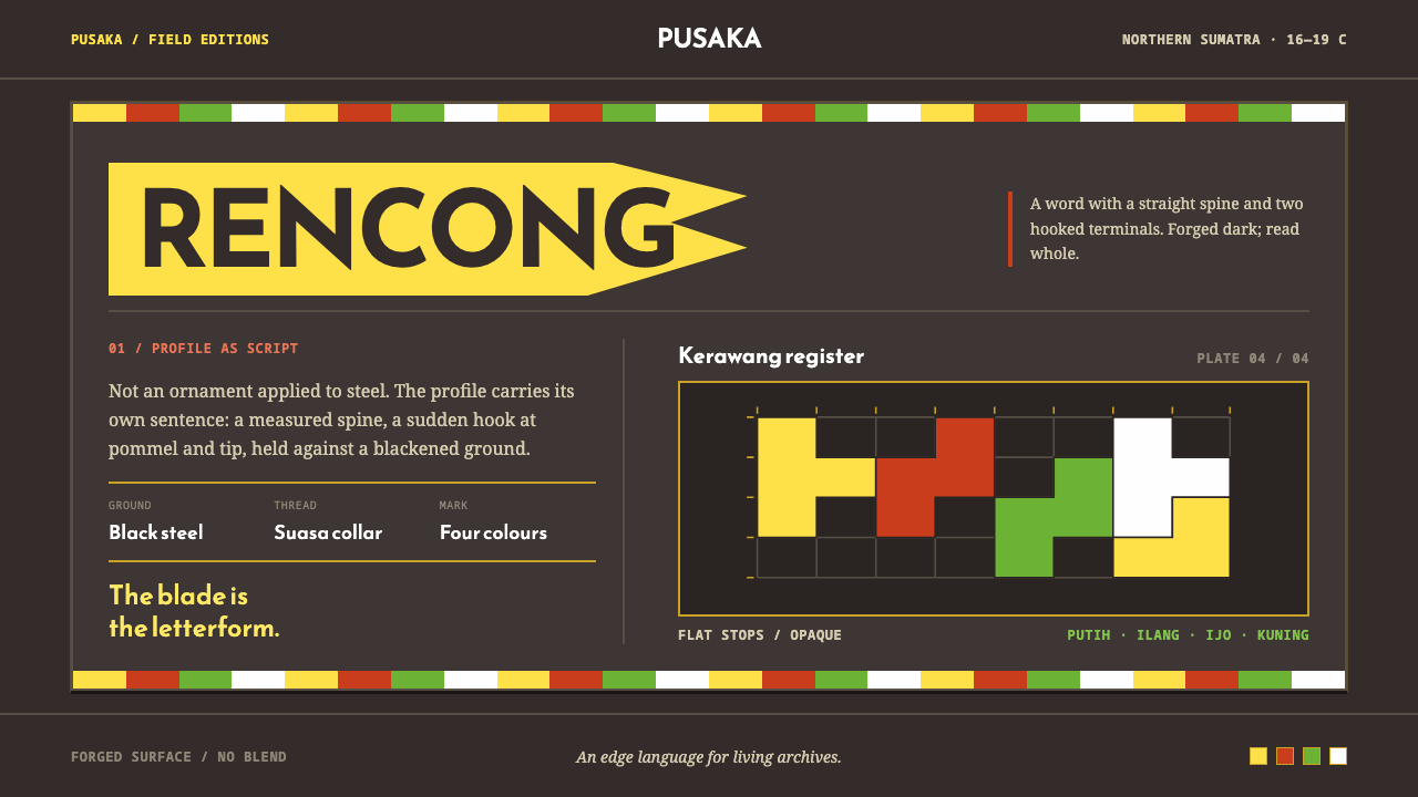 Acehnese Rencong MotifA blade that reads as a word. Flat kerawang red, white, green and yellow lock…
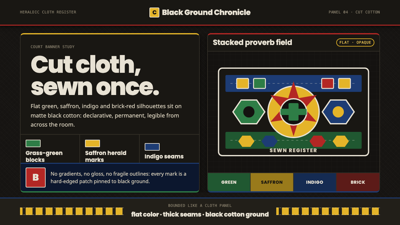 Fon Applique Banner AbomeyRoyal cloth speaks plainly. Flat saffron, green and indigo silhouettes on bla…
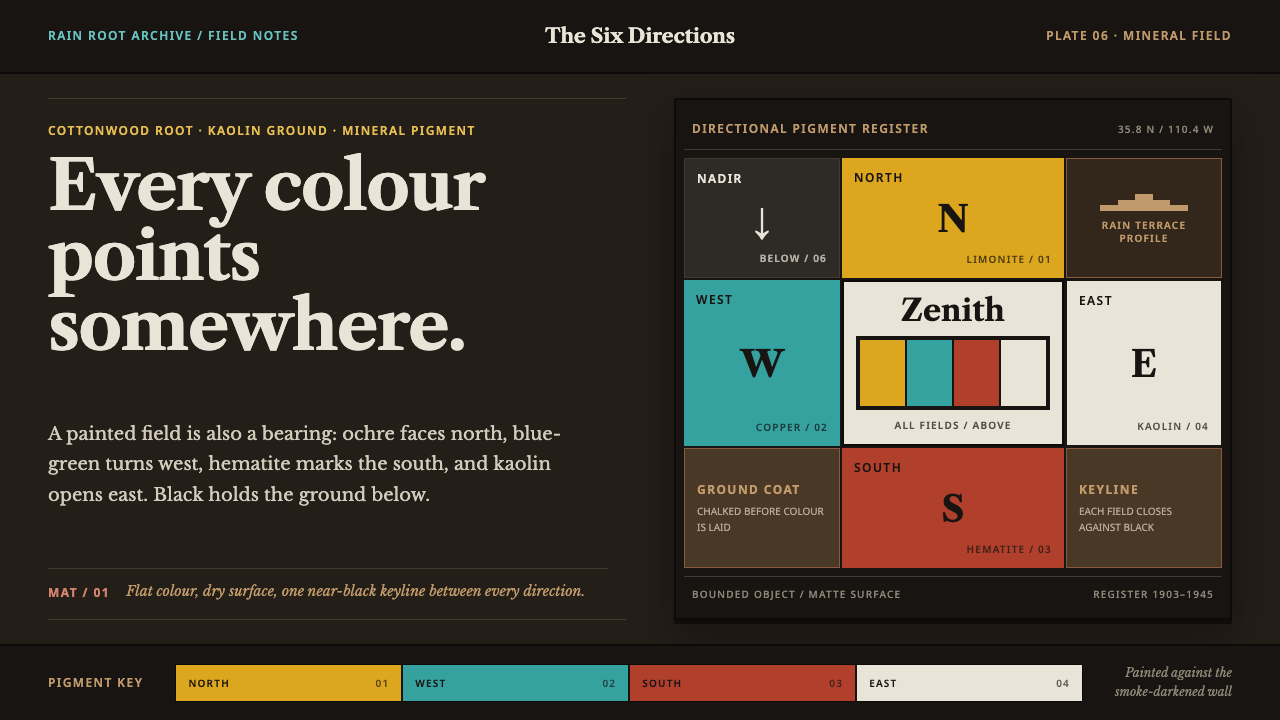 Hopi Katsina TihuEvery colour is a direction. Matte mineral fields meet in smoke-black keyline…
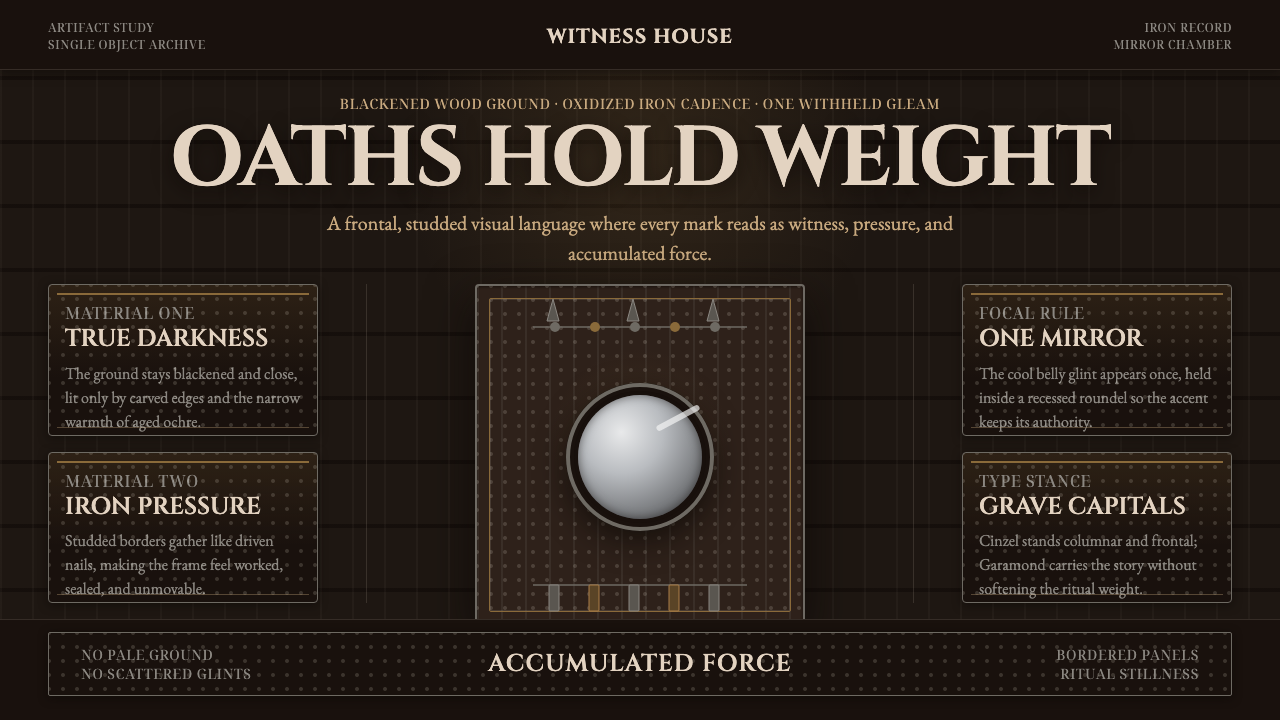 Kongo Nkisi Nkondi FigurePower accumulates in darkness. Black wood, iron studs, and one mirror glint h…
 Māori Tā Moko (Facial Tattoo)Ancestry feels carved. Blue-black spirals on tan ground carry a restrained Ga…