What is Hopi Katsina Tihu?
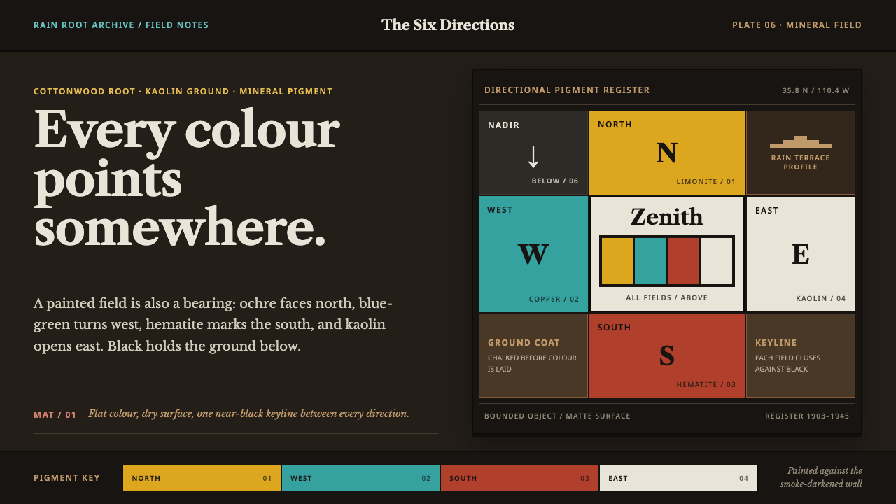
Every color is a direction. Flat mineral fields meet at a smoke-black keyline, and the wall behind them is dark with decades of hearth smoke.
Hopi Katsina Tihu in brief
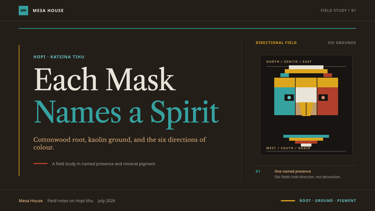
A tihu, commonly known outside Hopi communities as a katsina doll, is a carved and painted figure built from a single piece of cottonwood root, finished with a chalky white ground and flat mineral pigment. The system this design draws from treats color as cardinal notation rather than free decoration: yellow marks north, blue-green marks west, red marks south, white marks east, and black marks the nadir, the point beneath. Every color block on the page is doing directional work, not merely filling space.
Visually, the defining move is flat, hard-edged color fields separated by a black keyline — never blended, never given a soft transition, never glossed to suggest depth. Each field reads as a distinct, named color rather than a shade within a gradient, and the black line doing the separating is as structurally important as the colors it divides.
The ground itself is not a neutral gallery backdrop. It is dark — the color of a wall darkened by years of hearth smoke inside a mesa-top dwelling, which is also, not coincidentally, the same direction the black nadir color points to. Type in this system draws on the plate lettering used in the earliest ethnographic documentation of the subject, giving the whole system the feel of a page from a field record rather than a tourist souvenir.
Where does Hopi Katsina Tihu come from?
The tihu tradition is rooted in the religious and agricultural life of the Hopi people of the mesas of north-eastern Arizona, particularly the communities of Oraibi and Walpi. Cottonwood root was chosen deliberately: it is a tree that seeks out water in an arid landscape, a fitting material for a people whose agricultural year turns entirely on the arrival of rain, and carving it into a tihu was understood as giving physical form to a spiritual presence rather than producing a decorative object.
The mineral-pigment painting tradition that defines the visual system predates 1900, part of a broader Southwest Pueblo material culture in which color carried fixed cardinal meaning across ceremonial objects, not only tihu. Kaolin clay provided the chalky white ground beneath the paint, and ground mineral and plant pigments supplied the yellow, blue-green, red, white, and black used to mark each direction, applied in flat coats rather than blended washes.
The documentation that shaped how outsiders came to see this material was produced in 1903, when the ethnologist Jesse Walter Fewkes published plates recording the tihu tradition in detail — plates whose typeface and page conventions this design system deliberately borrows, treating the visual record as archival rather than decorative.
Carving continued to evolve through the twentieth century; the period from roughly 1930 to 1945, sometimes called the Early Action era, saw carvers such as Wilson Tawaquaptewa produce tihu with greater dynamism and movement than earlier, more static forms. Outside the carving tradition itself, figures such as Barry Goldwater — who assembled and later donated a significant collection — played a role in bringing tihu to wider public and institutional attention during the twentieth century.
What defines the Hopi Katsina Tihu look?
Directional Color
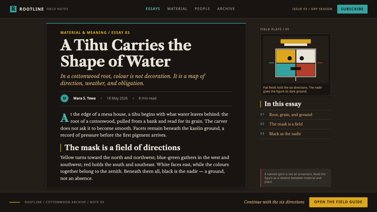
Each of the five core colors is tied to a fixed cardinal or vertical direction — yellow to north, blue-green to west, red to south, white to east, and black to the nadir. A composition assigns color by this logic rather than by aesthetic preference, meaning a color choice always carries a specific, non-arbitrary meaning within the system.
Flat Mineral Fields
Color is applied as flat, opaque, hard-edged fields rather than blended washes or graded tones. Because the source pigments are ground minerals rather than dyes, each field reads as slightly chalky and matte, with no gloss or reflective sheen — a texture that distinguishes it clearly from any glossy or gradient-based color system.
Black Keyline
Every color field is separated from its neighbor by a black outline rather than by a direct color-to-color edge. The keyline functions structurally, not decoratively — it is what allows adjacent flat colors to sit next to each other without visually bleeding, and it is drawn with the same weight and confidence throughout a composition.
Smoke-Darkened Ground
The background ground is dark, evoking the smoke-blackened interior walls of a mesa-top dwelling rather than a neutral white gallery backdrop. This choice ties the ground itself back into the directional color logic, since the dark ground echoes the same nadir direction that black marks in the color system.
Documentary Typography
Type draws on the letterforms used in the 1903 ethnographic plates that first documented this tradition in print — a period serif face associated with careful field record-keeping rather than a decorative or theatrical display typeface. This keeps the overall system reading as archival documentation rather than as tourist-facing decoration.
No Gradient, No Gloss
The system categorically excludes any blended transition between colors and any glossy or reflective surface treatment. Every visual decision reinforces flatness and directness, consistent with the idea that each color is a fixed marker of meaning rather than a rendered simulation of light or material.

Who shaped Hopi Katsina Tihu?
Tawaquaptewa carved during the twentieth century's Early Action era, roughly 1930 to 1945, a period when tihu carving moved toward greater dynamism and physical movement compared with earlier, more static forms. His work represents a significant stylistic development within the ongoing carving tradition, extending the directional color and flat-field painting system into more animated figures.
Fewkes was the ethnologist whose 1903 published plates provided the first detailed documentation of the tihu tradition, recording forms, colors, and directional meanings in a systematic visual record. This design system's typography deliberately references the plates' period lettering, treating that documentary record as a direct visual source rather than an incidental historical footnote.
Goldwater assembled a significant collection of tihu during the twentieth century and later donated it, playing a role in bringing wider public and institutional attention to the tradition outside Hopi communities. His involvement sits alongside the carving lineage itself as part of the broader twentieth-century history of how this material became known beyond its originating context.
How do you use Hopi Katsina Tihu today?
This is a directional, symbolic color system before it is a decorative one, and applying it well means preserving that logic rather than treating the five-color set as a generic warm palette to recolor freely. The strongest contemporary uses keep each color assigned a consistent role across a whole piece, echoing the way direction determines color in the original tradition rather than letting color choices drift by panel or slide.
For presentation slides, the system works well for any content organized around fixed categories or stages — a five-part framework, a status system, a set of regions or phases — because the flat, keylined color fields naturally support one-color-per-category thinking. A cover slide can use a single bold flat field against the dark, smoke-toned ground with a black keyline framing the title block; content slides should assign one consistent color per category throughout the deck rather than reusing the palette decoratively across unrelated elements.
For web interfaces, the flat-field-plus-keyline approach translates directly into status indicators, category tags, and iconography for dashboards where quick, unambiguous recognition matters more than subtlety — each state or category gets one flat, matte color bounded by a dark keyline, with no gradient states to interpret. The dark, smoke-toned ground works well as a dashboard's base surface, since it already reads as considered and intentional rather than as an unfinished dark-mode afterthought.
In editorial and brand contexts, the system's flatness and directional logic support a confident, non-naturalistic illustration style — flat mineral-toned shapes with black keylines can render figures, icons, or diagrams without any attempt at photographic or painterly realism, which keeps the tone documentary and dignified rather than playful or cartoonish.
The most common mistake is lightening the ground to a neutral white or pastel to make the palette feel more 'friendly,' which removes the smoke-dark context the whole color logic depends on and turns a directional, meaningful system into a generic five-color decorative scheme. A second common mistake is blending or gradient-filling the color fields for a softer, more contemporary look — doing so erases the flat, hard-edged quality that is the system's core visual signature.
Hopi Katsina Tihu — FAQ
Why does each color correspond to a specific direction rather than being chosen freely?
Because in the tradition this design draws from, color is a form of notation, not decoration — yellow, blue-green, red, white, and black each mark north, west, south, east, and the nadir respectively, a system shared across Southwest Pueblo ceremonial material culture more broadly. A tihu's coloring communicates orientation and meaning the way a compass rose or a legend communicates meaning on a map; treating the five colors as an interchangeable decorative set discards the entire point of the system.
Why is the background dark rather than a neutral white?
The dark ground references the smoke-blackened interior walls of the mesa-top dwellings where tihu traditionally hung — a specific, real surface rather than an arbitrary mood choice — and it is not coincidental that this darkness echoes the same nadir direction that black already marks within the five-color system. A white or pastel background would remove that grounding reference and flatten the palette into a generic warm color scheme.
Can the black keyline be replaced with a thin gray line or removed entirely for a cleaner look?
Doing so undermines the system structurally, not just stylistically. The black keyline is what allows adjacent flat mineral colors to sit next to each other without visually bleeding into one another, and its weight and confidence are part of what keeps every field reading as a distinct, deliberately assigned color rather than a soft-edged shape. A thinner or removed line tends to make the composition look unfinished rather than cleaner, because the flat color fields were never designed to carry their own edges.
Does this system only make sense for content that literally has five categories?
No — the underlying discipline (assign one flat, keylined color to one meaning, and keep that assignment consistent throughout a piece) is transferable to systems with fewer or more categories, as long as the core habit is preserved: color as a fixed label rather than a free aesthetic choice, applied in flat, hard-edged fields rather than blended tones. The five-color, five-direction set is the historical source, not a hard requirement for every application.
Is it respectful to use this system's color logic outside its original ceremonial context?
This calls for care and specificity. The directional color meanings and the tihu form itself belong to Hopi religious and cultural practice, and specific figures represent particular spiritual beings that should not be reproduced casually or out of context. Design work that draws on the system's more general structural lessons — flat mineral-toned fields, black keylines, a fixed color-to-meaning assignment, a documentary rather than decorative tone — should do so while crediting the source clearly and avoiding the reproduction of specific tihu forms or figures outside their proper cultural setting.
Related design styles
 Fijian Masi (Bark Stencil)Stencil memory stays sharp. Soot black and burnt coral strike bark-fibre band…
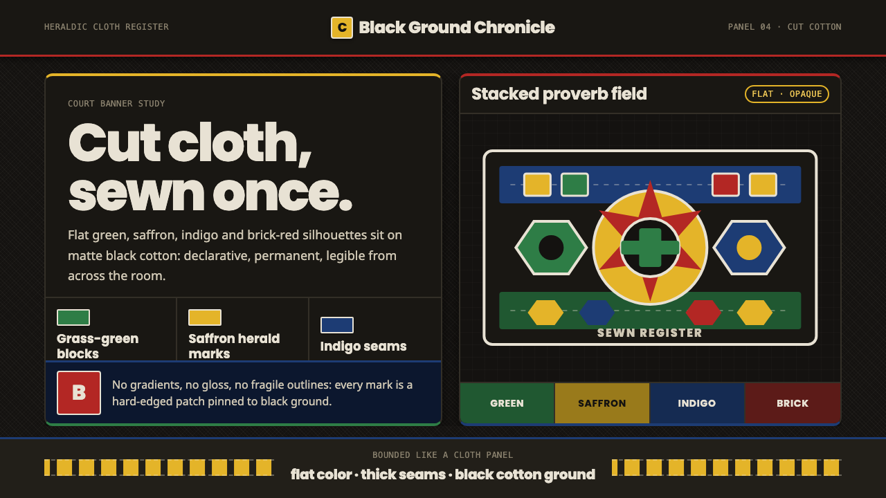 Fon Applique Banner AbomeyRoyal cloth speaks plainly. Flat saffron, green and indigo silhouettes on bla…
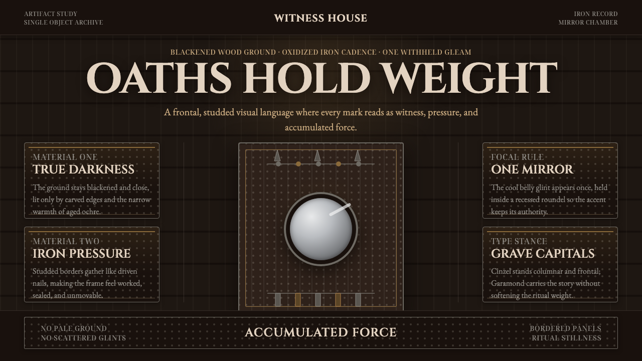 Kongo Nkisi Nkondi FigurePower accumulates in darkness. Black wood, iron studs, and one mirror glint h…
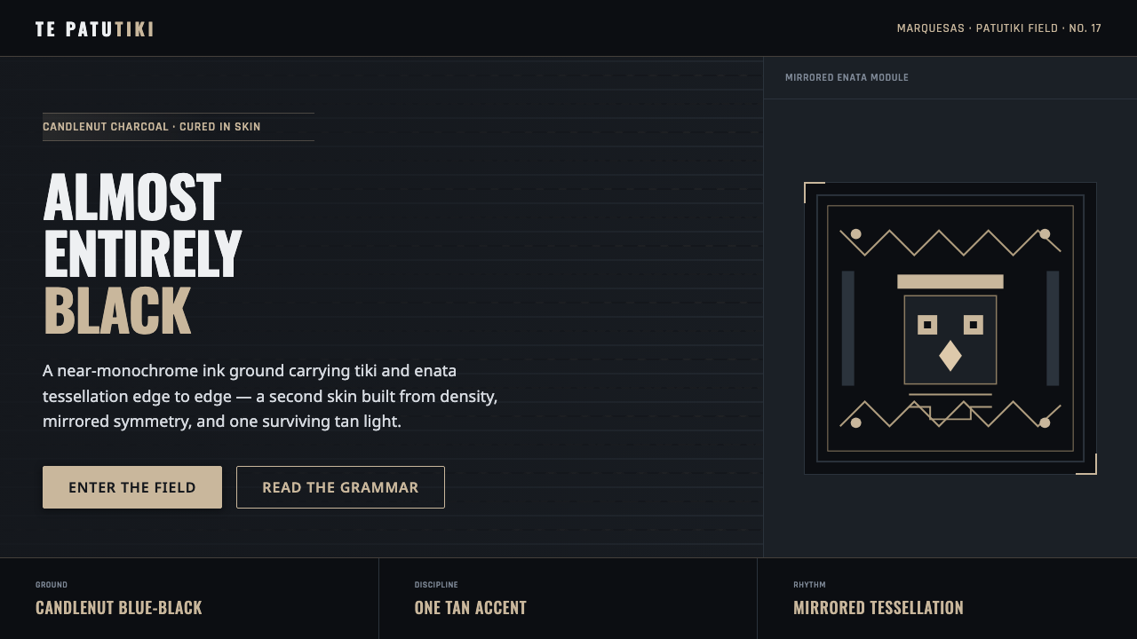 Marquesan Tatu PatternDensity as authority. Tiki and enata tessellation inked into blue-black, lit…
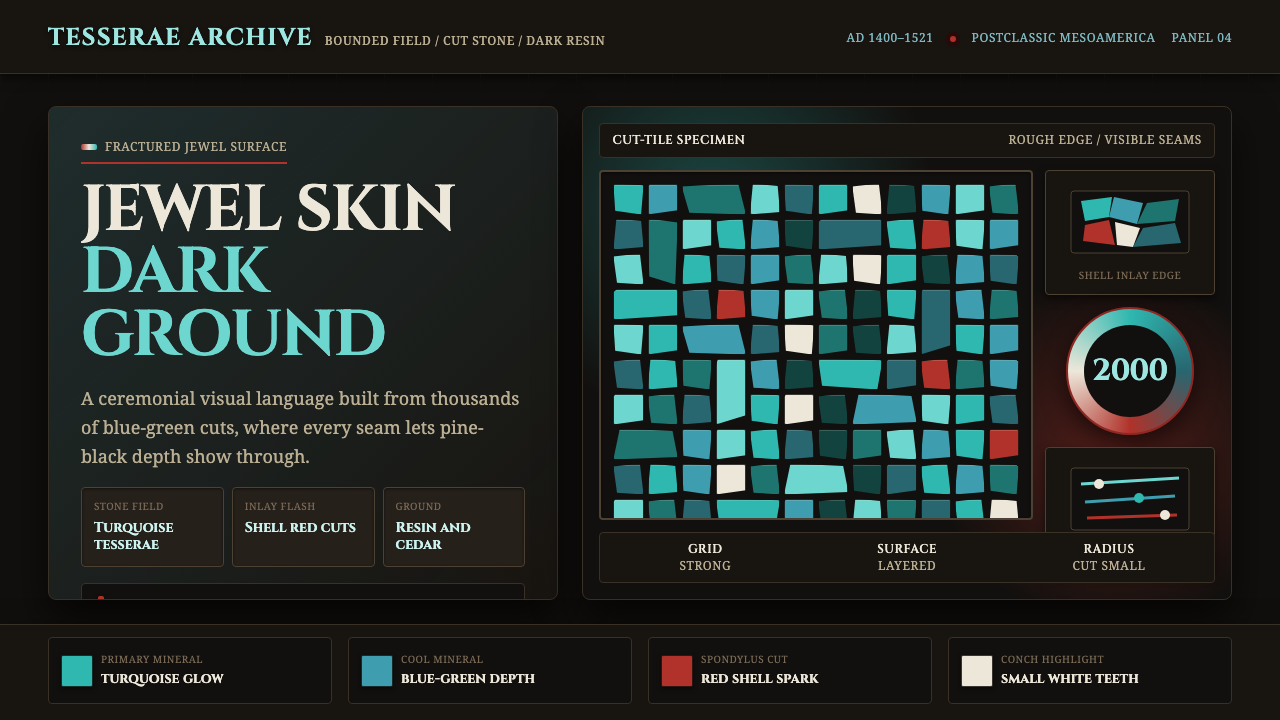 Mixtec Turquoise MosaicDarkness wears a jewel skin. Turquoise tesserae crack open with red and shell…
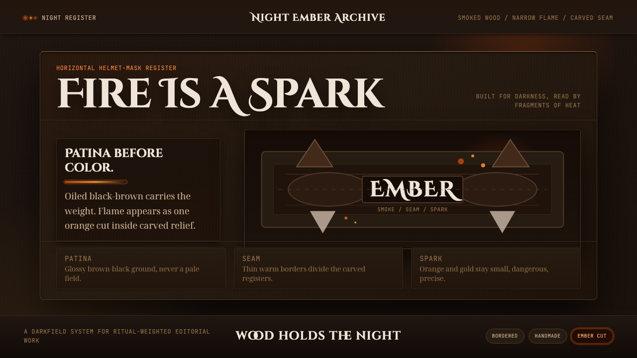 Senufo Firespitter MaskRitual darkness has heat. Smoked wood tones hold back tiny orange-gold sparks.