What is Kandyan Temple Mural Frieze?
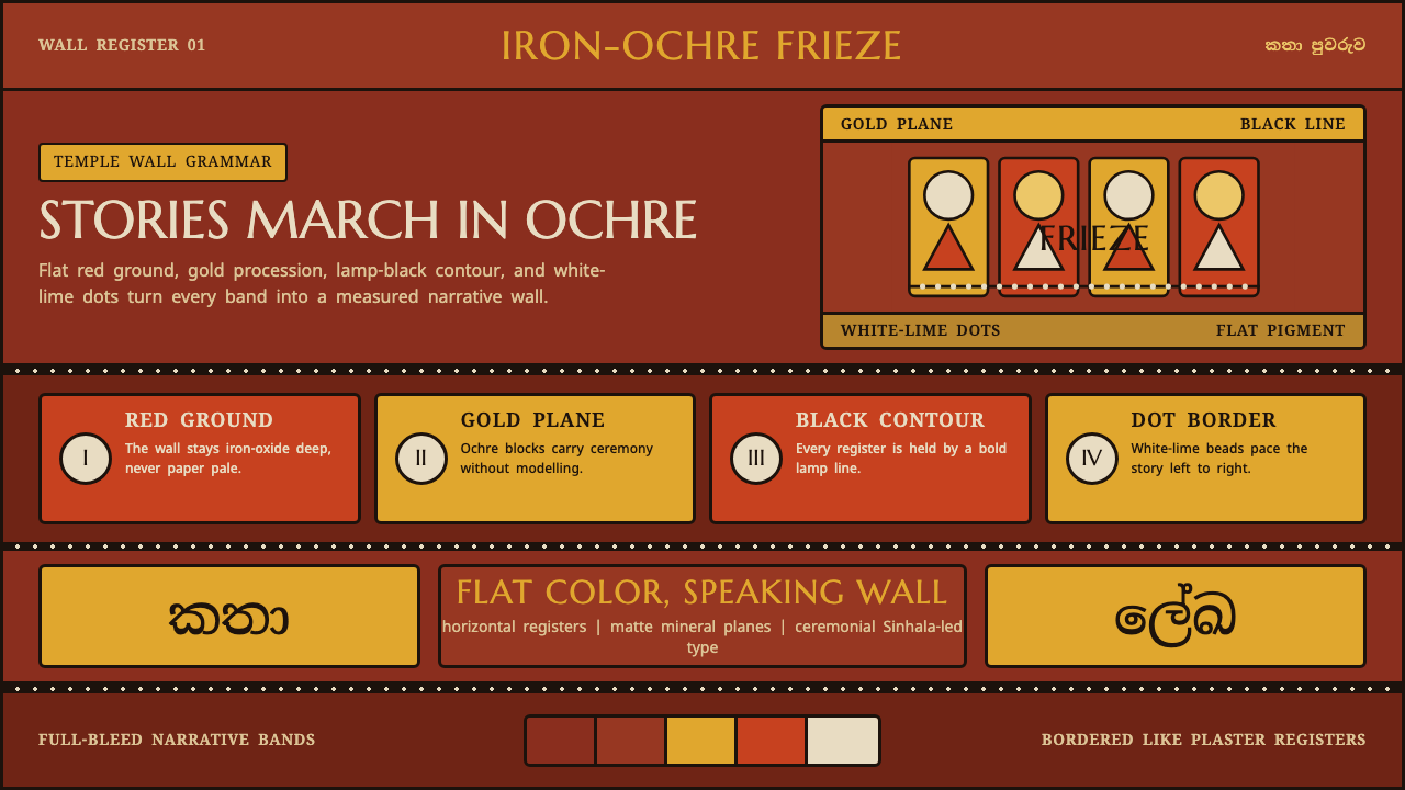
Kandyan Temple Mural Frieze brings the grave, processional rhythm of an eighteenth-century Sri Lankan temple wall into a dark interface language.
Kandyan Temple Mural Frieze in brief
Kandyan Temple Mural Frieze draws from the continuous horizontal narrative paintings made for Buddhist temples in eighteenth-century Kandy during the Kandyan, or Nayakkar, period. At Degaldoruwa and Dambulla, anonymous painters covered interior walls with jataka birth-stories arranged as unfolding friezes. The paintings do not ask the viewer to enter an illusionistic scene; they ask the eye to travel along a painted wall, encounter by encounter.
Its visual grammar is emphatically flat. Golden-ochre figures appear in side profile against a deep red-ochre iron-oxide ground. Black contours hold every body, garment, and painted plane in place, while vermilion and yellow areas create changes of emphasis without dissolving into modeled light. White-lime dots mark the borders between registers, giving the narrative a measured, almost architectural rhythm.
As an interface style, the system preserves that sense of temple-wall gravity. The page acts as the red-ochre ground; gold and vermilion panels become painted fields; heavy black outlines establish boundaries; and dotted borders organize information into horizontal bands. Its effect is ceremonial rather than decorative: every panel feels placed, bounded, and part of a larger procession.
Where does Kandyan Temple Mural Frieze come from?
The source context is eighteenth-century Kandy in Sri Lanka, identified with the Kandyan and Nayakkar period. Its temple frescoes belong to a Sinhala Buddhist narrative-painting tradition centered on jataka birth-stories. The subject matter is therefore inseparable from sequence: rather than isolating a single emblem or scene, the wall carries a continuing account across successive horizontal registers.
Degaldoruwa and Dambulla are the named sites in this visual lineage. Their murals establish the central formal conditions of the style: a deep iron-oxide red-ochre ground, golden-ochre side-profile figures, broad black contours, flat red and yellow fields, and white-lime dotted edges between registers. These are not independent ornamental ingredients. Together they make a wall legible as a continuous painted surface.
The painters are anonymous, which matters for how the style should be understood. The visual language is not presented as the signature of an individual artist; it is a temple mural practice supported by Buddhist patrons of the Nayakkar era. In contemporary adaptation, that calls for attention to the system of ground, contour, register, and narrative movement rather than the extraction of a single exoticized motif.
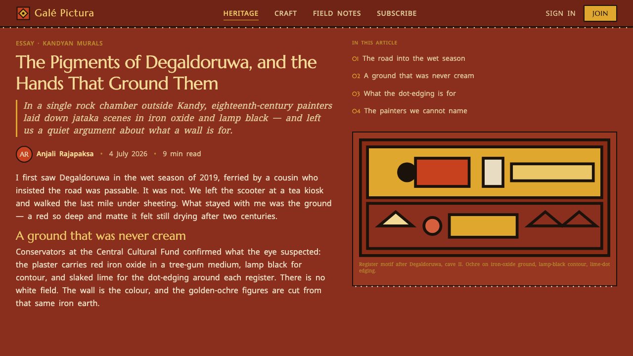
The interface translation should therefore remain close to the mural’s structural logic. A dark red-ochre field establishes continuity before content begins. Bordered panels operate as painted compartments rather than floating cards, and dotted separations retain the cadence of lime-edged registers. Typography enters as a contemporary reading layer, led by Sinhala Noto with Marcellus for Latin display, without competing with the wall-like composition.
What defines the Kandyan Temple Mural Frieze look?
Ground and Atmosphere
The dominant ground is deep red ochre associated with iron oxide. It creates enclosure, warmth, and visual gravity before any panel or figure appears. Treat it as a continuous field, not a casual background, so the composition reads as one wall rather than a collection of unrelated modules.
Flat Painted Planes
Gold, golden ochre, vermilion, red, and yellow operate as discrete painted planes. They change hierarchy through adjacency and area, not through tonal modeling. Preserve clear fills and decisive transitions; the style loses its mural character when color begins to imitate volume or atmosphere.
Black Contour
Bold lamp-black contour is the system’s primary boundary-making device. It gives panels, figures, and ornamental fields a shared visual authority. The line should feel painted and assertive, never incidental: it separates neighboring colors, prevents the dark ground from swallowing forms, and makes each component readable at a glance.
Profile and Procession
The source murals use golden-ochre figures in flat side profile, moving through continuous jataka narratives. In adaptation, this suggests lateral composition, repeated silhouettes, and reading paths that travel across the page. Motion should feel processional and sequential rather than cinematic or spatially immersive.
Dotted Registers
White-lime dots edge and separate registers. Their role is organizational as much as decorative: they announce a threshold without becoming a heavy barrier. Use a steady dotted cadence to divide narrative bands, metadata areas, or panel groups, keeping the dots visibly hand-marked in spirit rather than mechanically ornamental.
No Perspective or Softening
The mural language rejects perspective and shading. Forms sit on the wall’s surface instead of receding through it, and borders remain explicit rather than softened by atmospheric effects. Contemporary work should keep depth subordinate to structure: layered fields may overlap, but they should still read as placed planes.
Who shaped Kandyan Temple Mural Frieze?
The anonymous painters associated with the temple walls at Degaldoruwa and Dambulla are the primary makers behind this visual vocabulary. Their importance lies in the integrated system they produced: continuous jataka friezes, side-profile figures, iron-oxide grounds, black contour, flat color, and dotted register edges. The style should be credited to this mural practice rather than reduced to an individual authorial signature.
Buddhist temple patrons of the Nayakkar era form the other named human context for the murals. Their presence locates the work in a temple setting and in a Buddhist narrative tradition. For modern use, this is a reminder that the visual gravity of the style comes from a wall-based, story-bearing setting, not from a freely interchangeable decorative palette.
The jataka birth-stories are the narrative subject that gives the frieze its continuity. Their role is formal as well as thematic: they require scenes to unfold across neighboring areas of wall. In a digital translation, this supports layouts that reveal related information in ordered bands and preserves the sense that each section belongs to an ongoing visual account.
How do you use Kandyan Temple Mural Frieze today?
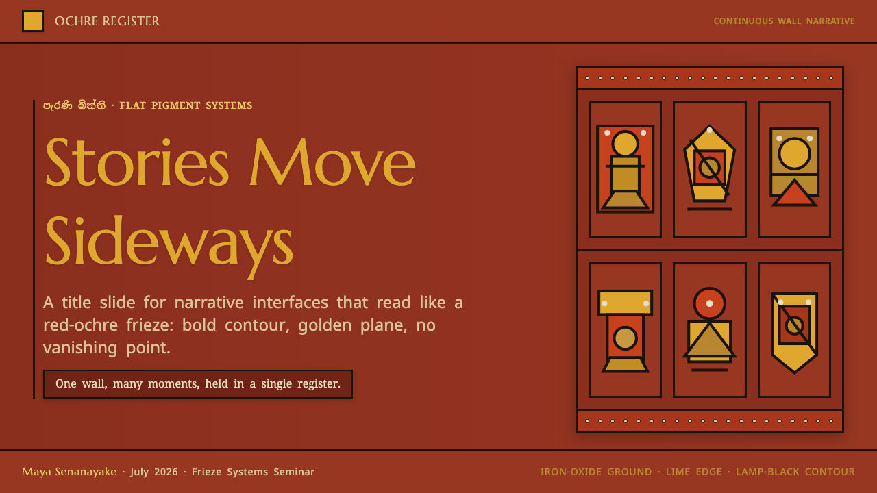
For presentation covers, establish the red-ochre ground first, then let one gold or vermilion panel carry the title in a strong display treatment. A black outline should make the title field feel painted onto the wall. Keep the composition lateral and calm, with dotted register edges used to introduce secondary information rather than scattering many competing accents.
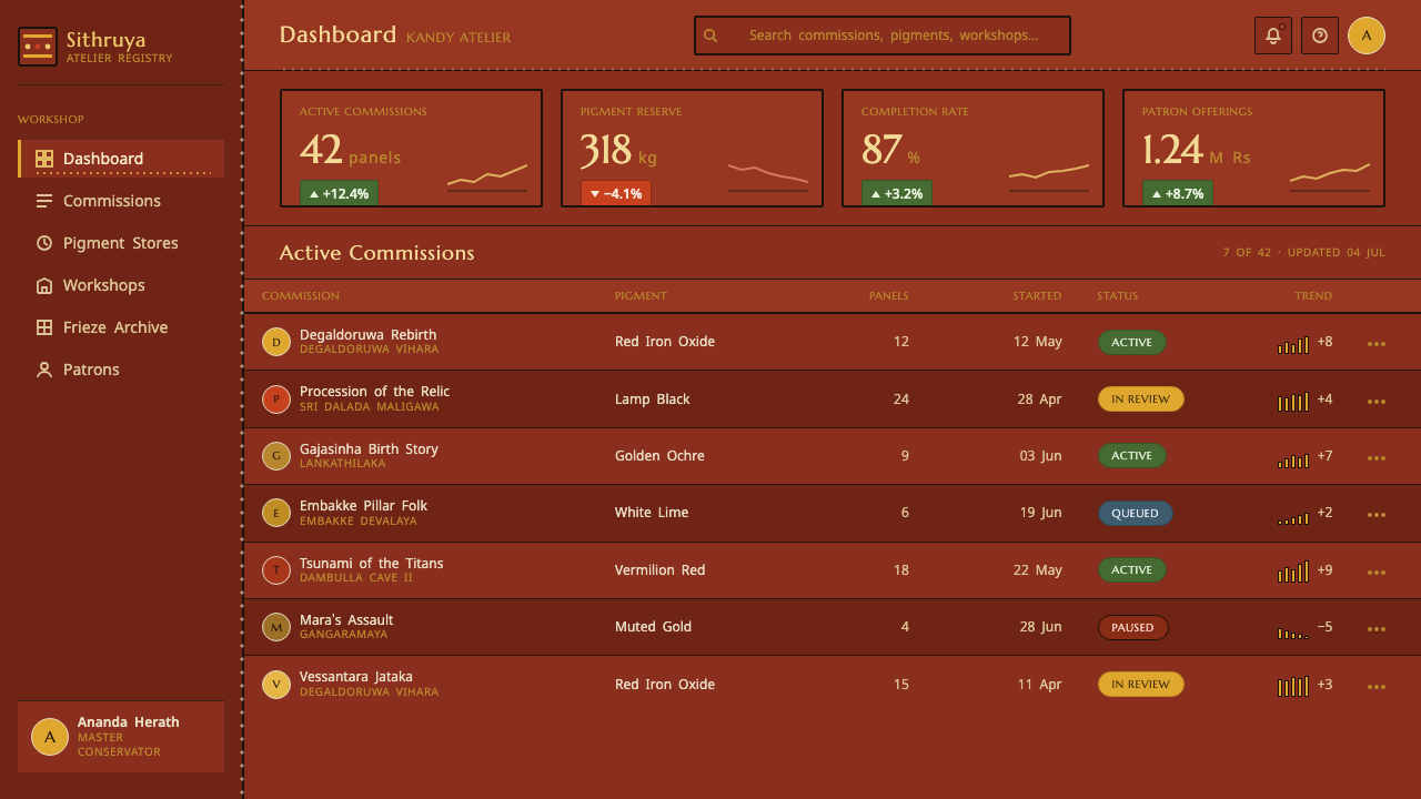
For content and data slides, work in horizontal bands. One band can hold a section heading, another can carry a short explanation, and a third can present grouped values or labels as flat outlined fields. Data should remain diagrammatic: use the contrast between gold, vermilion, yellow, and the dark ground to distinguish categories, while black contour preserves legibility and white dots mark transitions.
For web interfaces, the style is most useful where a dashboard, collection, archive, or pricing structure benefits from strong grouping. Let the page ground remain continuous across sections, use outlined gold and vermilion panels for meaningful states or tiers, and treat dotted borders as register dividers. Sinhala-led Noto typography should carry Sinhala reading comfortably, while Marcellus can reserve Latin display text for headings and prominent labels.
For editorial and marketing work, use the frieze principle to create a deliberate reading journey. A landing page can progress through narrative bands instead of a stack of interchangeable cards; an article can set chapter markers inside outlined fields and use dotted rules for transitions. The common mistake is using red, gold, black, and white merely as a dramatic palette. Without flat planes, firm contour, lateral sequence, and restraint around depth, the result becomes generic dark ornament rather than a wall-derived system.
Kandyan Temple Mural Frieze — FAQ
Is this style intended to reproduce a temple mural literally?
No. It is an interface translation of the source material’s structural language: red-ochre ground, flat gold and vermilion fields, black contour, white dotted registers, and horizontal narrative movement. A faithful application does not need to copy a mural scene. It should preserve the relationships that make the wall read as a coherent painted system.
Why are outlines so important in this system?
The bold lamp-black contour binds otherwise separate flat fields into one visual language. Against a deep red-ochre ground, it keeps gold, vermilion, red, and yellow areas distinct and gives panels the authority of painted compartments. Replacing it with soft boundaries removes the source material’s decisive wall-surface quality.
Can the style support dense information?
Yes, when density is organized as registers rather than as floating fragments. Horizontal bands, outlined panel groups, and dotted thresholds provide a clear sequence for headings, labels, explanations, and grouped data. The important constraint is that every division should reinforce the larger wall-like order instead of introducing a new decorative treatment.
How should Sinhala and Latin text coexist here?
Use Sinhala-led Noto as the primary reading voice where Sinhala content is present, and let Marcellus carry Latin display text such as major headings. The distinction should clarify script roles, not create typographic spectacle. Both scripts need to sit inside the same outlined, banded composition so typography remains part of the mural-derived system.
Related design styles
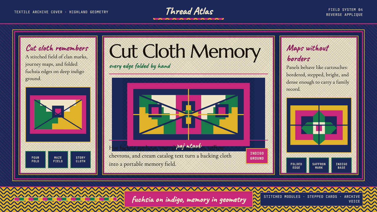 Hmong Paj Ntaub (Flower Cloth)Memory is geometric. Fuchsia applique on indigo forms stepped maze panels.
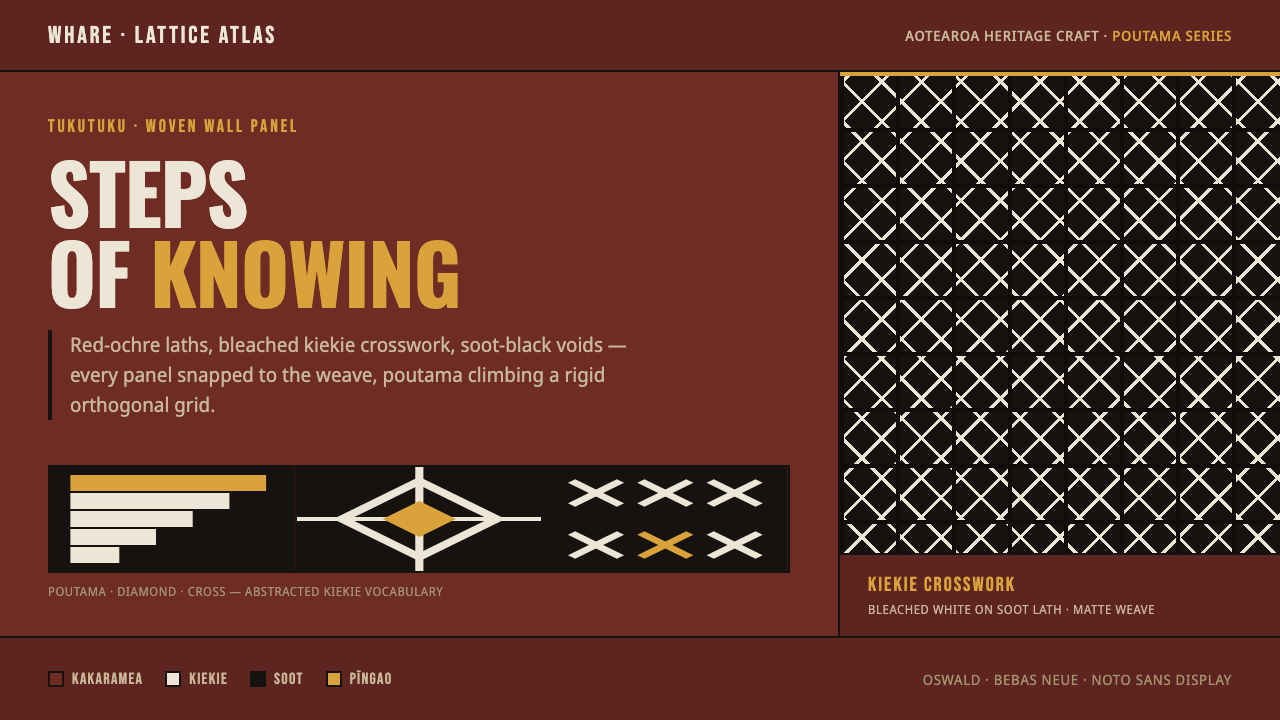 Māori Tukutuku PanelTukutuku weave, rendered strict. Bleached kiekie crosswork laces poutama step…
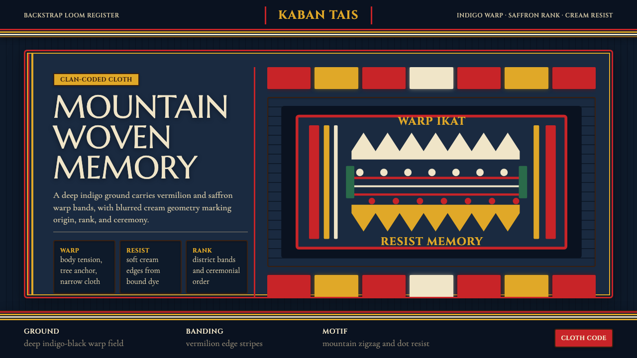 Timorese Tais (Backstrap Loom)Identity woven in darkness. Indigo ground, vermilion bands, saffron stripes,…
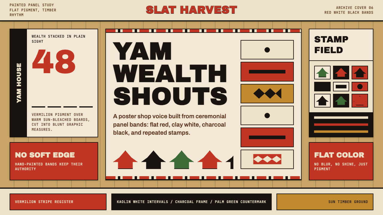 Trobriand Yam House PaintPainted wealth speaks loud. Vermilion bands and black stamp silhouettes hit t…
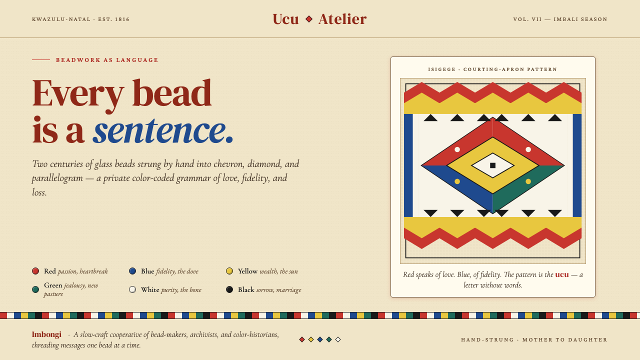 Zulu Beadwork (KwaZulu-Natal)Every bead is a sentence. Saturated glass primaries strung into chevron and d…
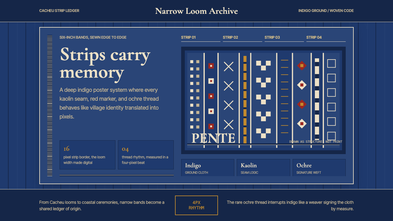 Bissau-Guinean Pano de PenteIndigo remembers. Narrow bands and kaolin seams turn weave grammar into pixel…