What is South African Ndebele House Paint?
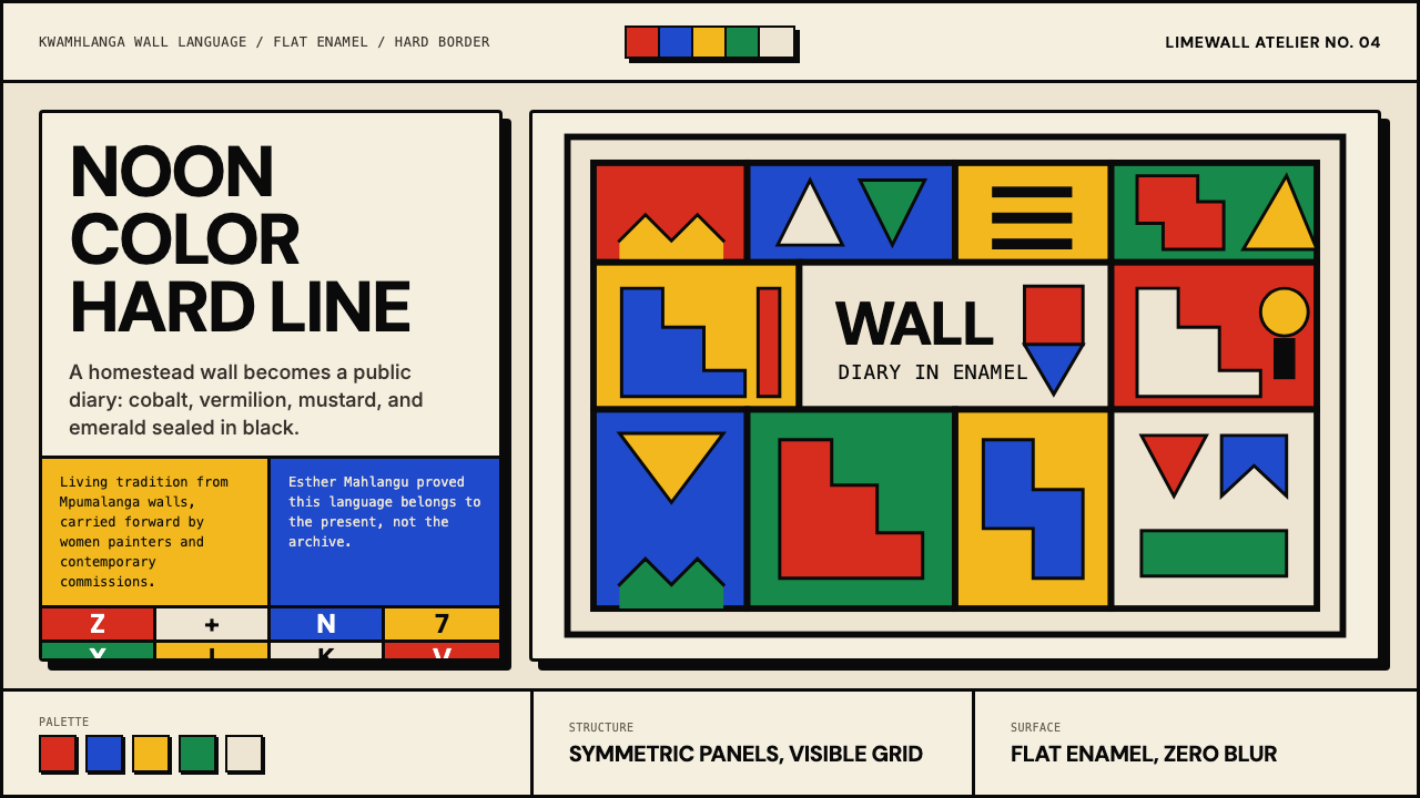
Ndebele women turned homestead walls into bold geometric statements — saturated color locked in hard black lines, a living tradition that crossed from KwaMhlanga to a BMW hood and beyond.
South African Ndebele House Paint in brief
South African Ndebele house painting is a visual tradition practised by Ndebele women in which the exterior walls of domestic compounds are covered in geometric patterns using flat, saturated enamel color bounded by thick black outlines. The forms are bold and angular — staircase chevrons, half-stars, elongated rectangles, and stylized renditions of modern objects such as airplanes, razor blades, and light bulbs — all hard-edged against a lime-washed white ground.
The aesthetic impact is immediate and unambiguous. Color is used at full saturation: vermilion, cobalt, mustard yellow, and emerald green appear side by side with no tonal graduation, no blending, and no decorative shading. Black outlines of considerable weight define every shape and prevent colors from bleeding into one another. The white wall beneath acts as the organizing ground, providing the high-contrast foil that makes the palette's intensity readable rather than chaotic.
Unlike many historical decorative traditions, Ndebele wall painting has always been a living practice open to contemporary references. Patterns evolved alongside the twentieth century, incorporating motifs from the industrial and consumer worlds that entered daily life. This willingness to absorb new imagery while preserving structural rigor — the hard line, the flat fill, the geometric grammar — gives the tradition a quality that designers recognize as inherently modern: a visual system that can metabolize the present without losing its internal logic.
Where does South African Ndebele House Paint come from?
The Ndebele people — specifically the Southern Ndebele, also known as the Ndzundza Ndebele — inhabit the Mpumalanga and Limpopo provinces north-east of Pretoria. Their wall-painting tradition is documented from at least the 1940s, though oral accounts and material evidence suggest the practice is considerably older. The paintings were created by women, passed from mother to daughter, and their execution was both a practical skill and a mark of cultural identity and social standing.
The tradition gained particular intensity during the apartheid era. Following a period of violent land dispossession in the nineteenth century and then the rigid spatial controls of the apartheid state in the twentieth, Ndebele women used wall painting as a visible form of cultural assertion. Painting a homestead was a refusal of invisibility. The bold geometric schemes — increasingly elaborate and colorful as enamel paints replaced traditional earth pigments from the mid-twentieth century onward — became a form of public declaration in a system designed to suppress African cultural expression.
The shift from traditional ochre-based earth pigments to commercial enamel paints in the mid-twentieth century was transformative. Industrial enamel produced colors of a saturation and durability that earth pigments could not match: the vermilions, cobalts, and emeralds that define the style's contemporary identity became available and were adopted with evident enthusiasm. The black outline, traditionally rendered in a thick stroke, became even more definitive as painters gained access to consistent, opaque pigments. The white lime-washed ground remained constant, a structural choice as much as an aesthetic one.
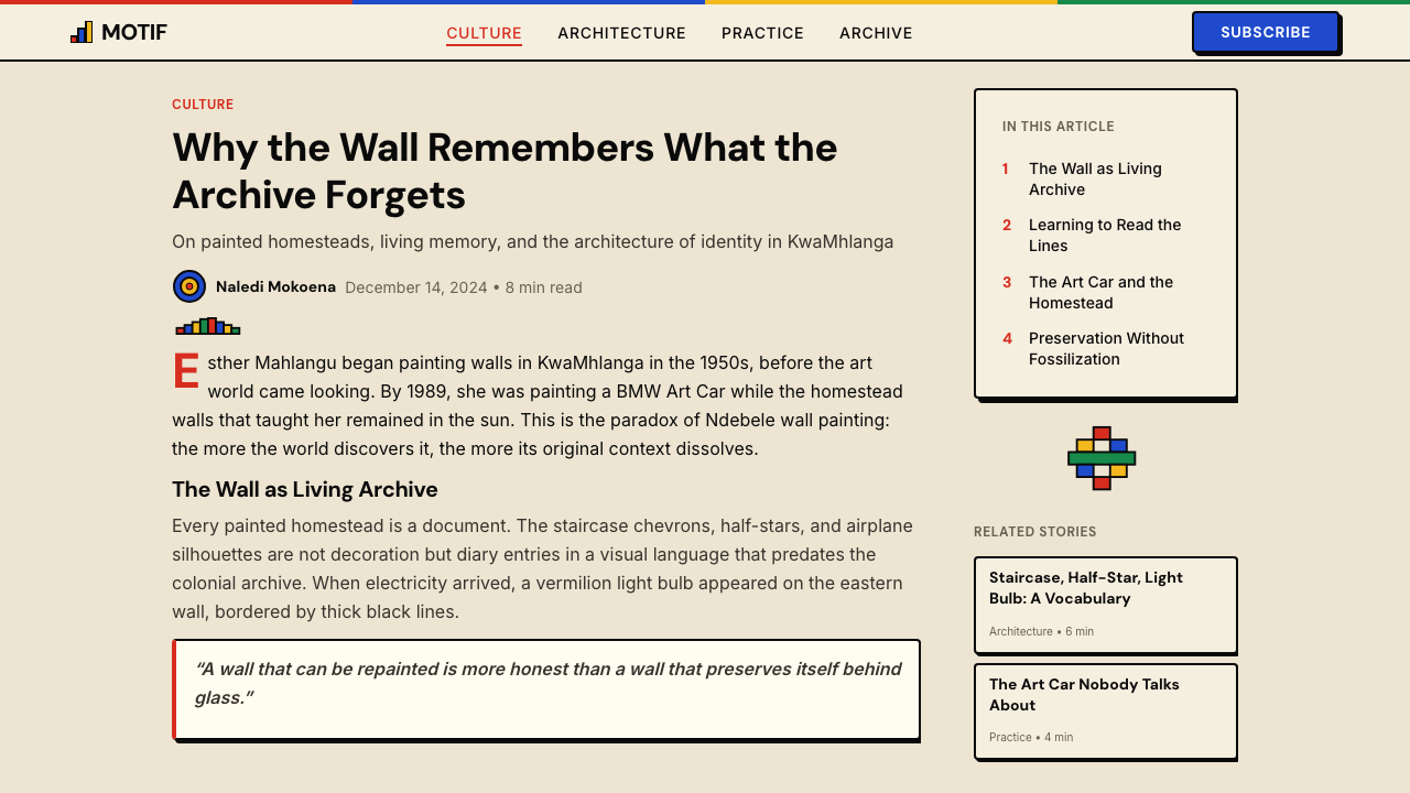
In 1991, Esther Mahlangu — a master painter from KwaMhlanga, Mpumalanga — was commissioned by BMW to paint a 525i as part of the BMW Art Car series, joining a roster that included works by Andy Warhol, Roy Lichtenstein, and David Hockney. Mahlangu's car brought the Ndebele visual language to an international audience in a single, unmissable gesture. The commission demonstrated that the aesthetic was fully capable of operating at the scale and in the context of international contemporary art — that it was not a folk curiosity but a coherent, exportable visual system. Mahlangu went on to receive numerous international commissions and honorary doctorates, and is now recognized as the tradition's most globally visible ambassador.
Post-apartheid South Africa has brought increased institutional recognition to the tradition, though the actual practice of house painting in rural Mpumalanga has declined as younger generations move to urban environments. Photographer Margaret Courtney-Clarke documented the painted homesteads extensively in the 1980s and 1990s, creating an essential archive. Architect Peter Rich worked with Ndebele community members on projects that engaged the visual tradition in a contemporary spatial context. Today the aesthetic circulates widely in South African design, textile production, and international fashion and brand contexts.
What defines the South African Ndebele House Paint look?
Color at Full Saturation
The Ndebele palette operates at maximum saturation: vermilion, cobalt, mustard yellow, and emerald green are used at their most intense, without tinting, shading, or tonal graduation. This is not the restrained accent color of most Western design systems but color as a primary structural element, given equal weight to form and line. The intensity is made legible by the organizing white ground and the containing black outline rather than by any internal modulation of the hues themselves.
The Hard Black Outline
Every shape in Ndebele wall painting is bounded by a thick, unbroken black outline. This line is not incidental — it is the structural principle of the entire system. Without it, the saturated colors would compete and blur; with it, each shape reads as a discrete, sovereign form regardless of what color abuts it. The outline also functions as a unifying element across the composition, giving the wall a quality closer to stained glass or cloisonné metalwork than to conventional painting.
Geometric Grammar
The vocabulary of forms is angular and repetitive: staircase chevrons, half-stars, elongated rectangles, triangular wedges, and stepped diagonal bands. These shapes are organized in registers — horizontal bands stacked across the wall — or in symmetrical panels flanking doors and windows. The geometry is strict; curved forms and organic shapes are absent. Even when modern imagery such as an airplane or a light bulb is incorporated, it is reduced to angular, geometric silhouette consistent with the system's overall visual grammar.
White Ground as Active Element
The lime-washed white wall is not a passive background but an active compositional element. It functions as a fifth color — the coolest and most recessive in the palette — providing the high-contrast foil without which the saturated hues would lose their impact. Negative space within the painted panels, where the white ground is allowed to show through geometric cutouts, is as considered as the painted forms themselves. The white organizes reading direction and prevents visual fatigue across a large painted surface.
Flat Fill, Zero Shading
Color within each shape is applied as a uniform flat fill with no gradient, no shadow, no highlight, and no internal variation. The aesthetic effect is closer to graphic design or printed textile than to fine art painting traditions. This flatness is not a limitation but a principle: depth and spatial reading are created by the arrangement of geometric forms and the contrast between them, not by any simulation of three-dimensional lighting. The result is a visual language that works at any scale, from a palm-sized ceramic to a full compound wall.
Contemporary Motif Absorption
One of the tradition's most distinctive qualities is its willingness to incorporate imagery from contemporary material culture — industrial objects, vehicles, consumer goods — while immediately translating them into the system's angular, flat geometric terms. An airplane becomes a chevron-winged silhouette; a light bulb becomes a stepped teardrop form bounded in black. This capacity for absorption without loss of structural identity is what gives the tradition its forward momentum and prevents it from being merely a historical archive.
Bilateral Symmetry Within Asymmetric Compositions
Individual panels and motifs within Ndebele compositions typically exhibit internal bilateral symmetry — a half-star on the left mirrors the half-star on the right of a doorway, geometric bands repeat across a wall section — yet the overall composition across a full compound facade rarely achieves perfect global symmetry. Different walls of the same homestead carry different schemes. This local symmetry within global variation gives the walls a quality of organized complexity: ordered up close, dynamic at a distance.

Who shaped South African Ndebele House Paint?
Born in 1935 in KwaMhlanga, Mpumalanga, Mahlangu learned wall painting from her mother and grandmother, entering a tradition she would eventually carry to a global stage. Her 1991 BMW Art Car commission — for which she covered a 525i in the full Ndebele visual language — brought the tradition to an audience that included museums, art fairs, and international media. She went on to paint a tail fin for British Airways in 1997, create works for institutions including the Smithsonian, and receive honorary doctorates from several universities. Mahlangu is now in her nineties and continues to paint, and is universally recognized as the tradition's most significant contemporary ambassador.
A master painter from KwaMhlanga and a contemporary of Mahlangu, Ndimande was instrumental in sustaining and teaching the tradition within her community. Her work was documented in international exhibitions during the 1980s and 1990s as part of broader scholarly and curatorial attention to South African indigenous art forms. Ndimande represents the community-level continuity that underlies the individual recognition received by painters like Mahlangu — a reminder that the tradition is sustained by many practitioners, not a single star.
South African photographer Courtney-Clarke undertook extensive fieldwork in Ndebele communities during the 1980s, producing the landmark book Ndebele: The Art of an African Tribe (1986) that documented the painted homesteads and their makers in systematic detail. Her work is the most significant archival record of the tradition at its peak, capturing compositions that no longer exist in their original form as the compounds have changed or been demolished. For designers, architects, and cultural institutions engaging with the Ndebele visual system, Courtney-Clarke's photographs remain the primary historical reference.
South African architect Peter Rich collaborated with Ndebele communities on a series of architectural projects that sought to bring the tradition's visual and spatial sensibilities into contemporary built form. His Mapungubwe Interpretation Centre (2009) and associated projects explored how indigenous Southern African geometries could structure a fully functional contemporary building — not as superficial pattern application but as a generative spatial logic. Rich's practice represents one of the most rigorous attempts to translate the Ndebele visual tradition into the discipline of architecture.
How do you use South African Ndebele House Paint today?
The Ndebele visual system is more specific in its demands than many historical styles: it requires commitment to full-saturation color, hard black outlining, flat fill, and geometric structure simultaneously. Applied halfheartedly — with toned-down colors, softened outlines, or organic shapes — it loses its character entirely and becomes generic cultural decoration. Used with fidelity to its structural logic, it produces work of exceptional boldness and visual confidence.
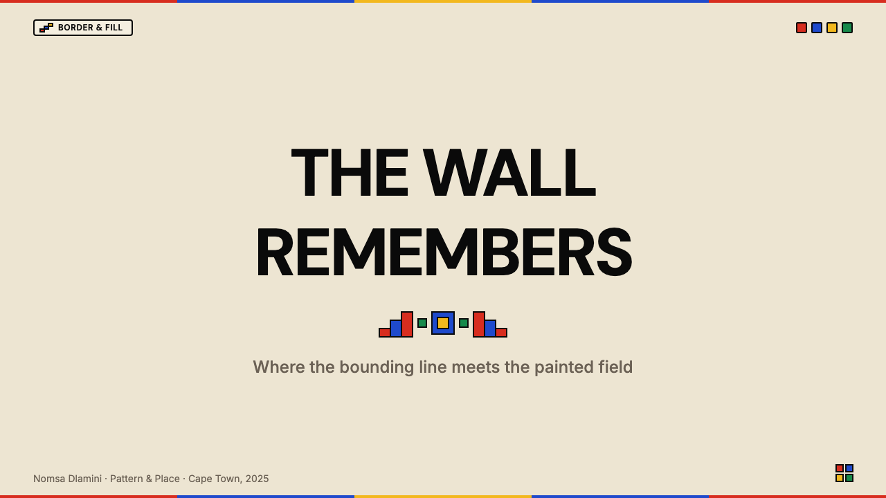
For presentation slides, the Ndebele approach works best on cover pages and section dividers where graphic impact is the primary goal. A cover built on this system uses the white ground generously, anchors one quadrant with a saturated geometric panel bounded in black, and sets the title in high-contrast type against the remaining white field. Section dividers benefit from a narrow horizontal register of geometric pattern — a staircase chevron band, for instance — used as a bold graphic element rather than a decorative frame. Data and content slides are better kept closer to the white ground, using the palette's colors as solid fills for chart elements, icon backgrounds, or category tags, with black used for all body text and structural rules.
For web interfaces, the aesthetic is well suited to landing pages, hero sections, and brand identity elements where a strong sense of cultural distinctiveness and visual energy is an asset. Full-page applications work when the geometric structure is maintained rigorously — a dashboard that applies the color palette loosely while using gradients and rounded shapes will read as a superficial gesture rather than a coherent design system. The hard-outline principle, translated to UI, means solid borders rather than box shadows for card components; the flat-fill principle means solid background colors rather than gradient overlays. Navigation and interactive elements benefit from the geometric vocabulary: stepped indicators, angular progress bars, and hard-cornered modals are more consistent with the system than soft, rounded equivalents.
For editorial and marketing applications, the style brings an immediate sense of energy, cultural weight, and graphic clarity that is difficult to achieve with more neutral design languages. A marketing page built on Ndebele principles uses full-width geometric bands as section dividers, alternates between white-ground and color-ground registers, and reserves black-outlined geometric shapes for the most important calls to action. The palette's intensity means that typographic hierarchy must be managed primarily through scale and position rather than color differentiation — when everything can be vivid, color alone cannot signal importance.
A common mistake is treating the Ndebele palette as license to use all four signature colors at once, at full saturation, across the entire layout simultaneously. In the tradition itself, individual panels typically lead with one or two dominant colors; the full palette accumulates across an entire compound wall, not within a single composition. In digital and print applications, the same discipline applies: one color leads, one accents, and the others appear in contained, structurally anchored blocks. The black outline must also be maintained consistently — omitting it in some places while using it in others creates an incoherent hybrid, and reducing its weight to a thin line loses the visual energy that makes the system work.
South African Ndebele House Paint — FAQ
Is Ndebele wall painting a religious or ceremonial practice?
The tradition has both social and symbolic dimensions but is not primarily religious in character. Historically, the painting of homestead walls was connected to rites of passage — a mother might paint in preparation for her son's initiation ceremony — and to assertions of household status and cultural identity. The specific meanings of individual motifs were not always fixed or universal across communities; much of the symbolism was local and personal. During the apartheid era, the practice took on additional political significance as a form of visible cultural resistance. Today the tradition is understood primarily as a living art form and marker of cultural heritage rather than a ceremonial necessity.
How does Ndebele wall painting differ from other African geometric traditions like Kuba or Kente?
All three are rigorous geometric traditions but they operate on different structural principles and in different media. Kuba textiles from the Democratic Republic of Congo use interlocking geometric patterns at smaller scale with a high degree of surface density, typically in natural earth tones on raffia cloth. Kente from Ghana is a woven tradition built on the interaction of warp and weft colors, producing diagonal stripe and step patterns at the structural level of the weave itself. Ndebele wall painting is distinguished by its scale (entire building facades), its use of extremely high-saturation industrial enamel color, and above all by the hard black outline that gives every shape a bounded, graphic quality found in neither Kuba nor Kente.
Can this style work on dark backgrounds?
The traditional ground for Ndebele wall painting is white — lime-washed and luminous — and the system is calibrated to work against that specific foil. A dark inversion is possible but requires significant recalibration. On a dark or black ground, cobalt and emerald can hold their presence, but mustard yellow becomes aggressive at high saturation, and vermilion can lose definition against near-black. More critically, the black outline — the structural spine of the system — loses its separating function entirely on a dark ground since it no longer provides contrast with the background. Replacing the outline with a white or cream equivalent is one solution, but it changes the visual character substantially. A dark-ground Ndebele application works better when it reduces the number of active colors to two and leans into the composition's geometric boldness rather than its full chromatic intensity.
Is it appropriate for a brand outside South Africa to use this aesthetic?
This is a live question in contemporary design practice, and it does not have a simple answer. The tradition belongs to a specific community — the Ndebele people — and was used partly as a form of cultural resistance during a period of active oppression. Using the visual system as neutral decoration without acknowledgment of that context is a form of cultural extraction that most design professionals now recognize as problematic. Engagement that involves collaboration with Ndebele artists, attribution of the tradition's origin, licensing agreements with community organizations, or active benefit-sharing is a different matter. The key distinction is between treating the aesthetic as anonymous texture available for appropriation and treating it as a visual language with known authors, a specific cultural geography, and a living community of practitioners.
What makes Ndebele wall painting feel contemporary rather than historical?
Several properties conspire to keep the tradition visually current. The hard-border, flat-fill, high-saturation system anticipates properties that screen-based digital design arrived at independently: flat fills reproduce cleanly on screens, hard borders maintain legibility at small sizes, and saturated discrete colors work across a wide range of display environments. The tradition's capacity to absorb modern imagery without changing the grammar also mirrors how contemporary design systems evolve. Finally, the tradition was never frozen: it continues to be made by living practitioners who bring contemporary sensibilities to it, ensuring that the work being created today is of the present, not a reconstruction of the past.
Related design styles
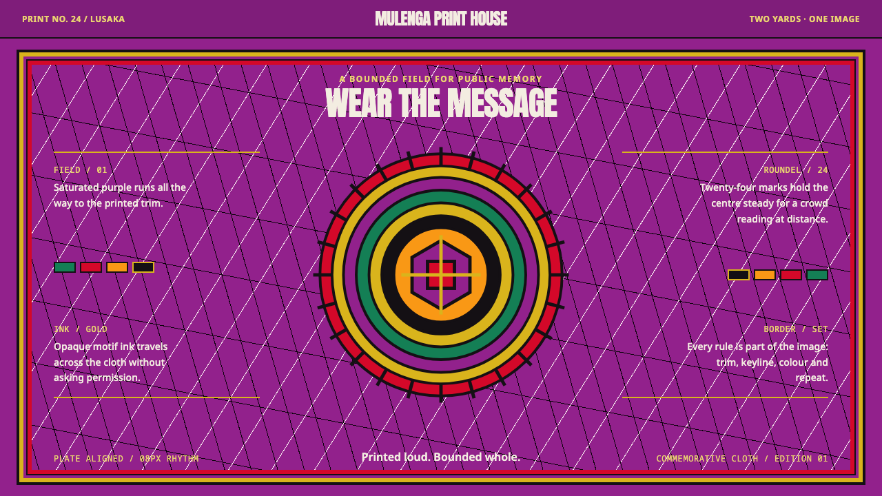 Zambian ChitengePublic memory refuses to whisper. Gold roundels and flag blocks strike across…
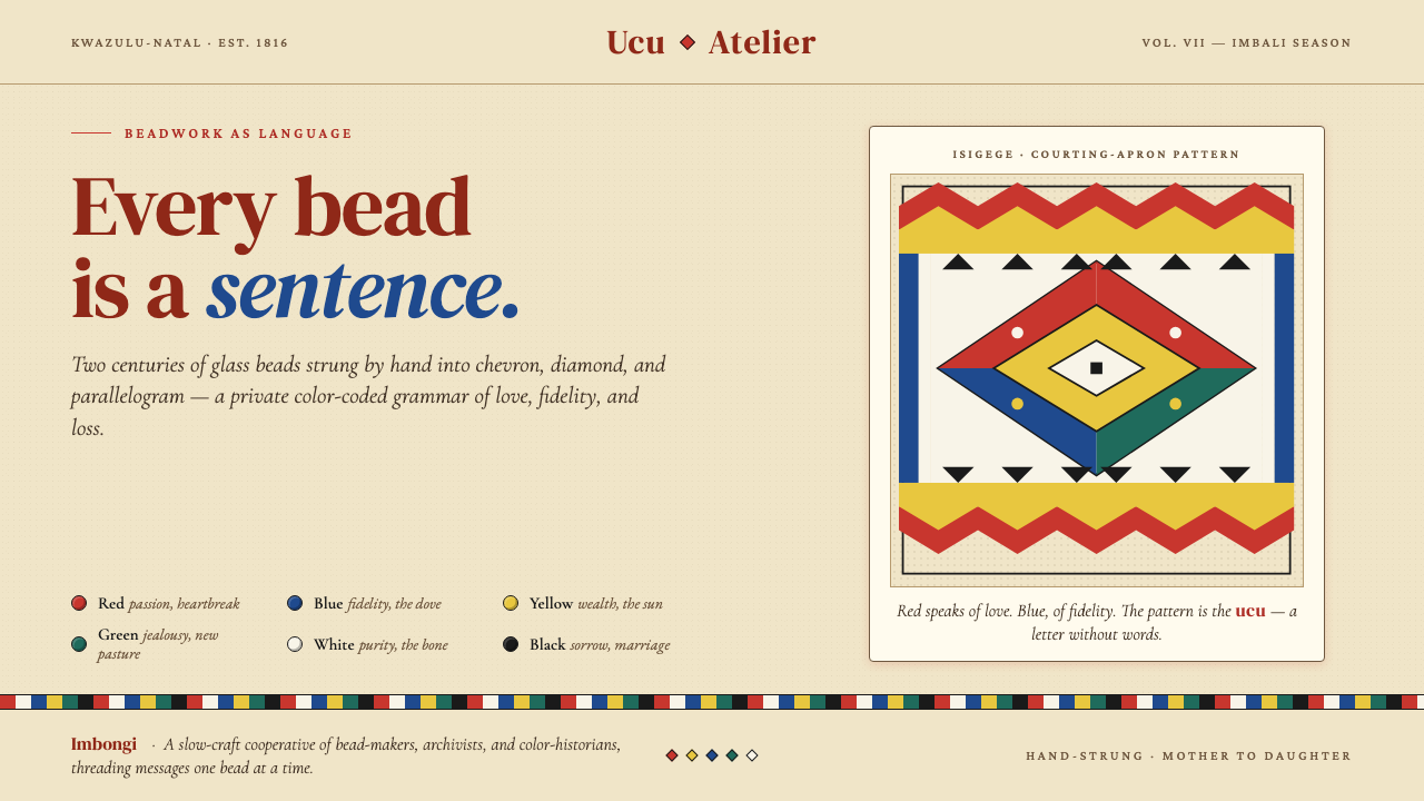 Zulu Beadwork (KwaZulu-Natal)Every bead is a sentence. Saturated glass primaries strung into chevron and d…
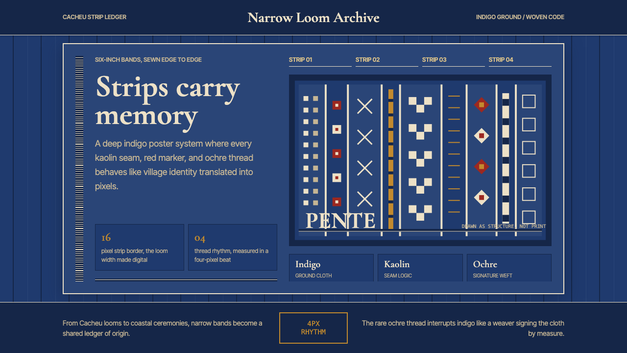 Bissau-Guinean Pano de PenteIndigo remembers. Narrow bands and kaolin seams turn weave grammar into pixel…
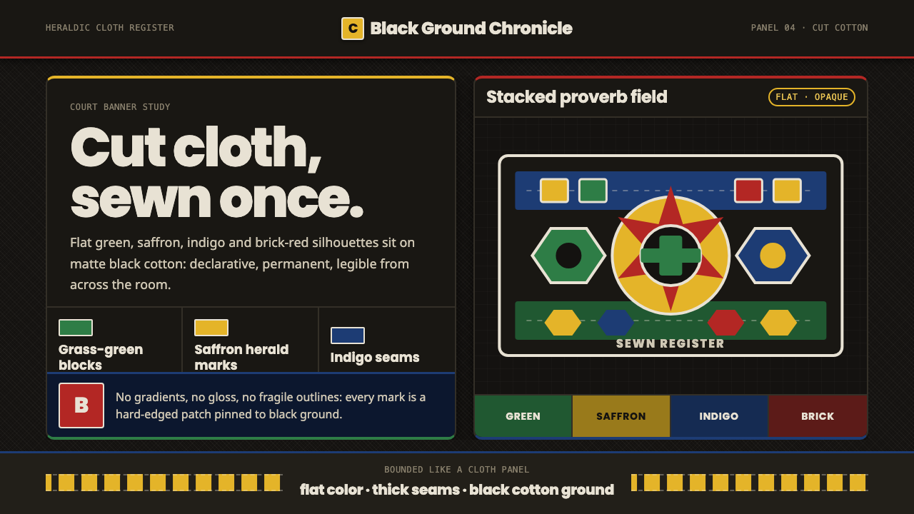 Fon Applique Banner AbomeyRoyal cloth speaks plainly. Flat saffron, green and indigo silhouettes on bla…
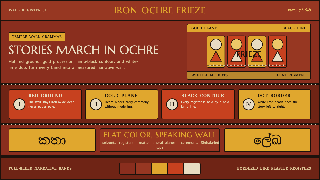 Kandyan Temple Mural FriezeTemple-wall gravity. Red ochre, gold planes, black contours, white-dot regist…
 Kongo Nkisi Nkondi FigurePower accumulates in darkness. Black wood, iron studs, and one mirror glint h…