What is Taller de Gráfica Popular?
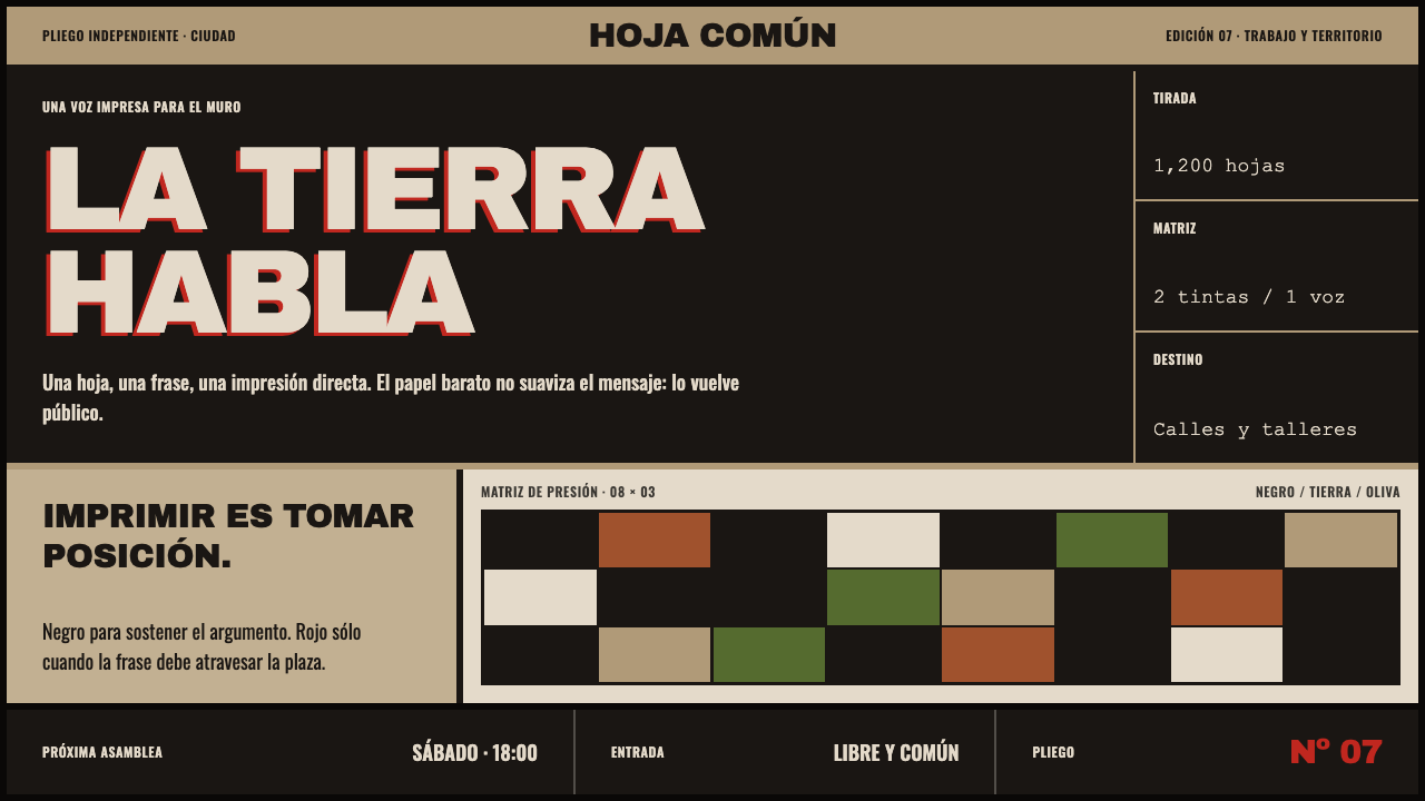
Taller de Gráfica Popular carved its arguments straight into linoleum — carbon-black figures shouting off newsprint gone the color of tea, with red spent only on the words that had to land.
Taller de Gráfica Popular in brief
Taller de Gráfica Popular — the Popular Graphic Workshop — was a printmakers' collective that worked out of Mexico City from 1937 to 1977, with its most prolific years running through the 1950s. Its members produced linocuts, woodcuts, and other relief prints in the service of political causes: labor organizing, land reform, literacy, and opposition to fascism. The workshop did not think of itself as a fine-art studio producing collectible editions; it thought of itself as a print shop that happened to make art, turning out posters, broadsides, and illustrated pamphlets meant to be pasted on walls, handed out at rallies, and read by people who would never set foot in a gallery.
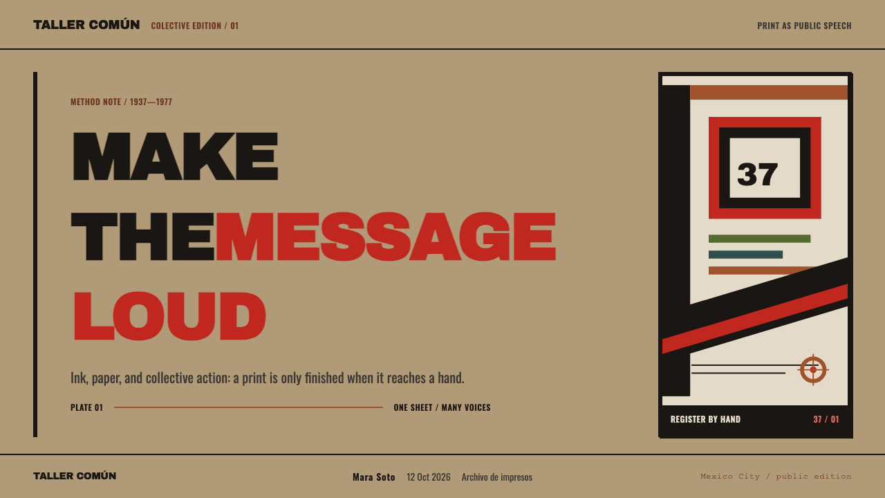
That audience shaped the visual language completely. A message aimed at people who might not be able to read the caption underneath an image has to be legible as pure shape from across a plaza. So the workshop's printmakers cut hard: one figure, rendered as a few connected masses of solid black rather than a field of fine cross-hatching; one line of shouted text, usually hand-cut lettering rather than typeset; and a composition cropped tight by the edge of the sheet, so the subject feels like it is pushing against the paper's boundary rather than floating in a comfortable field of white space. Nothing in a Taller de Gráfica Popular print is there to be admired for its subtlety. Everything is there to be read at a glance and remembered.
Six decades have added a second layer to that visual system that the printmakers never designed on purpose: the cheap wood-pulp newsprint they used, chosen because it was the only paper affordable in the quantities a political campaign required, has oxidized into a warm tan-brown. This design system treats that aged, acid-browned sheet as the actual ground of the composition rather than restoring it to imagined white — carbon black sits on top of it as the dominant mass, red is rationed out only for the words that need to land hardest, and secondary earth tones borrowed from the same aged palette — ochre, olive, slate — appear rarely enough that each one still reads as a decision. Edges are gouged rather than drawn, the black and red printing plates sit a hair off true register, and nothing in the system is rounded.
Where does Taller de Gráfica Popular come from?
Taller de Gráfica Popular formed in Mexico City in 1937, when a group of printmakers reorganized the remains of a dissolved political-arts organization, the League of Revolutionary Writers and Artists, into a dedicated graphic workshop. The timing placed the group squarely inside a decade when Mexican political life and Mexican visual art were unusually close to each other — a period in which artists across the country had already made the case, through large-scale public art and popular print, that visual work could be a direct instrument of political argument rather than a decorative afterthought to it. The new workshop took that premise and pushed it toward the cheapest, fastest, most reproducible medium available: the relief print.
For the next four decades the workshop operated less like a gallery and more like a shop that any allied organization — a union, a peasant league, an anti-fascist committee — could commission. Members worked collaboratively and often anonymously on a given job, prioritizing speed and legibility over individual authorship. Linocut and woodcut were the tools of choice because they required no printing press beyond what the workshop could operate itself, they could be run off cheaply in large numbers, and a block, once cut, could be inked and re-inked for years of use. The workshop's most productive stretch ran through the 1950s, by which point its prints had become one of the most recognizable graphic vocabularies in the country.
The workshop's core group included the printmaker Leopoldo Méndez, whose sustained organizational commitment helped keep the collective functioning across decades of shifting political weather, and Luis Arenal, one of the founding members who helped set its early direction. Pablo O'Higgins, a printmaker who had trained and worked within Mexico's broader mural and popular-art circles, brought a related sensibility for large-scale, immediately legible public imagery into the workshop's print practice. Elizabeth Catlett, an American-born printmaker and sculptor, became closely associated with the workshop's circle and extended its visual concerns — the dignity of labor, the specific experience of women and working people — into her own celebrated body of prints and sculpture.
What makes the workshop's prints read as a coherent design system today is something none of its members set out to create: time itself. The wood-pulp newsprint the workshop relied on for affordability was never meant to last; it was meant to be handed out and used up. Acid within the paper has spent the intervening decades slowly browning every surviving sheet to a warm tan, so that a print made to be an urgent, disposable object of its moment now arrives to contemporary eyes as an aged artifact — carbon-black masses and rationed red sitting on a ground that history, not the printmaker, colored in.
What defines the Taller de Gráfica Popular look?
Color
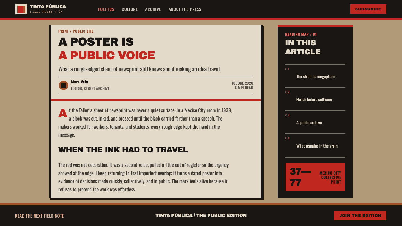
The palette is deliberately narrow: carbon black carries almost the entire weight of a composition, red is spent only on the phrase that has to land, and a small supporting range of earth tones — ochre, olive, slate — appears rarely enough that each instance registers as a decision rather than a habit. Nothing in the palette is bright for its own sake; every color is rationed against the urgency of the message it is carrying.
Ground and Surface
The base is not white paper but the warm tan-brown of newsprint that has aged and oxidized over decades. Treating that browned surface as the canonical ground — rather than restoring it to a clean white — keeps the aesthetic tied to the physical object the tradition actually produced, and gives every dark mass laid over it a slightly warmer, less clinical contrast than pure black on pure white would.
Carving and Line
Every mark reads as gouged rather than drawn. Lines have the slightly irregular edge of a hand-guided blade cutting through a resistant material rather than the perfectly smooth path of a pen or a vector curve, and solid black areas carry faint texture from the carving tool rather than sitting as a flat, uniform fill. This is a system built from subtraction — what remains is what the hand did not cut away.
Composition and Crop
A single figure or a tightly reduced group carries the entire image, rendered as a few connected masses rather than an elaborated scene. The subject is cropped hard by the edge of the sheet, so it feels like it is pressing against the frame rather than floating inside a comfortable margin. There is no background to speak of — anything not essential to the argument is cut away entirely, leaving the ground itself to do the work a background illustration would otherwise do.
Type and Slogan
Text, where it appears, is a single shouted line rather than a block of explanatory copy — a slogan, a name, a date, a demand. Lettering is hand-cut into the same block as the image, so it shares the same slightly irregular edge and the same carved weight as the figures around it, rather than sitting apart as typeset copy layered on top.
Registration
Where a second color is printed from a separate block, it is allowed to sit slightly off true alignment with the black underneath it — a visible, characteristic trace of printing by hand rather than by precision machine. That small misalignment is kept as a feature of the system rather than corrected away, because it is one of the clearest signals that a mark was pulled from a press and not generated by a perfectly repeatable process.
Corners and Frame
Every shape in the system is hard-edged; there are no rounded corners anywhere, on cards, buttons, or containers. The reasoning follows directly from the medium: a carved block produces straight cuts and sharp points far more naturally than soft curves, and rounding a corner would contradict the visible logic of a print pulled from gouged linoleum.
Who shaped Taller de Gráfica Popular?
Méndez was among the workshop's central organizing figures, and his sustained commitment helped keep the collective functioning across four decades of shifting political conditions in Mexico. Working primarily in linocut and woodcut, he helped establish the workshop's core visual approach — solid black masses, minimal color, and compositions built to be read instantly rather than studied at length — and his prints addressing labor, land, and historical memory remain among the collective's most widely reproduced work.
O'Higgins brought into the workshop a sensibility shaped by Mexico's broader mural and popular-art circles, where large-scale, immediately legible public imagery was already an established practice. His prints extended that same commitment to clarity and scale into the smaller, more distributable format of the linocut, helping the workshop's output move fluidly between wall-sized public statements and pamphlet-sized political material.
Arenal was one of the workshop's founding members and helped set its early direction at a moment when the group was still defining what a politically committed print collective could look like in practice. His involvement in the workshop's formative years anchored it within the broader current of socially engaged printmaking that the collective would sustain for the following four decades.
Catlett, an American-born printmaker and sculptor, became closely associated with the workshop's circle and carried its concerns — the dignity of labor, and the specific experience of women within it — into her own celebrated body of prints and sculpture. Her work is frequently cited as a bridge between the workshop's Mexican political printmaking tradition and broader international conversations about socially engaged art.
How do you use Taller de Gráfica Popular today?
Taller de Gráfica Popular's visual system transfers well to any context that needs to argue rather than merely inform, because its entire grammar is built around forcing attention onto one point at a time. Applying it means understanding what the aged, high-contrast surface is doing — carrying a single urgent statement against a warm, worn ground — rather than simply desaturating a layout and adding a splash of red.
On presentation slides, the style suits a cover or a section-break slide especially well: a single cropped, high-contrast image or icon rendered as solid black masses against the warm tan ground, paired with one short, bold-set line of text rather than a paragraph. Content slides should resist the urge to fill space — one idea per slide, rendered in heavy black type, with red reserved for the single number or phrase that matters most. Data slides work best as blunt, high-contrast bar or step charts rather than delicate line graphs, since the whole system depends on shapes that read from a distance.
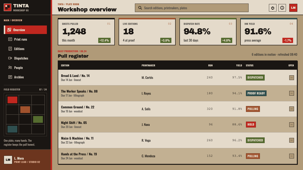
For web interfaces, the palette and contrast level suit landing pages, campaign sites, and any dashboard section built around a call to action rather than dense browsing — a warm off-white or aged-paper background, near-black text and structural lines, and red used exclusively for the primary button or the one alert that needs to be seen first. Card and panel edges should stay hard-cornered rather than rounded, and borders should feel slightly uneven rather than machine-precise, echoing the carved edge of a linocut block.
In editorial and marketing contexts, the system rewards restraint in exactly the way the original prints did: a headline treated as the one shouted line, a single strong image cropped tight to the frame, and body copy kept visually quiet so it does not compete with the statement above it. Full-bleed sections that alternate between the warm ground and near-black panels can carry the same one-idea-at-a-time rhythm across a longer page.
The most common mistake is treating this as a generic 'distressed' or 'grunge' texture pack — adding scratches and noise everywhere without respecting the rationing that makes the original work. Authentic use keeps red scarce and meaningful, keeps compositions cropped to a single subject rather than busy with decorative texture, and never lets the aged ground become an excuse to blur contrast; the system depends on the black staying as decisive and legible as it was when it was cut.
Taller de Gráfica Popular — FAQ
Is this the same as Mexican muralism?
They are related but not identical. Taller de Gráfica Popular shared the same era and many of the same political commitments as Mexico's large-scale public mural painting, and some of its members moved in overlapping circles with that broader movement. But the workshop worked at a fundamentally different scale and through a different medium: relief printing on paper, meant to be reproduced cheaply and distributed widely, rather than a single unique painted surface fixed to a wall. Where a mural argues from a public building, a Taller de Gráfica Popular print argues from a pasted-up poster or a handed-out leaflet.
Can this style work for a brand that has nothing to do with politics?
Yes, if what is borrowed from the original is legibility and urgency rather than the specific political content. The system is genuinely useful anywhere a message needs to cut through noise and be understood in an instant — a product launch, a sale deadline, a single key statistic — because its entire grammar was built to solve exactly that problem. What should not be borrowed casually is the aged, worn surface as pure decoration divorced from that function; the texture only earns its place when it is still doing the work of making one message land hard.
Why does the palette stay so narrow instead of using a full range of colors?
Because the original prints were produced under real material constraints — a limited number of ink colors, cut from separate blocks that each had to be carved, inked, and printed by hand — and those constraints became part of the visual argument. A message printed in carbon black with one rationed color reads as more urgent and more decisive than the same message printed in a wide, competing color range, precisely because scarcity signals that every color choice was deliberate. Expanding the palette for its own sake undoes the thing that makes the system work.
Does the aged, browned ground reproduce well on a bright digital screen?
It reproduces very well, because the underlying logic — high contrast between a dominant dark mass and a warm, muted ground — is exactly what makes an image legible on screens of any brightness or quality. The style was, in effect, stress-tested for legibility from the beginning, since the original prints had to be readable from across a plaza. Keeping the ground warm rather than stark white, and keeping black genuinely dark rather than a soft gray, preserves that legibility on a screen just as it did on cheap newsprint.
Where does this style struggle?
It struggles wherever the desired feeling is gentle, luxurious, or quietly ambient — spa and wellness brands, premium lifestyle products, anything that wants to feel unhurried. The system's entire purpose is urgency: it wants the viewer to stop, read one thing, and act. Applied to a context that wants the opposite effect, the hard black masses and cropped compositions can read as aggressive or even alarming rather than confident. The style earns its keep in contexts that genuinely have something urgent to say.
Related design styles
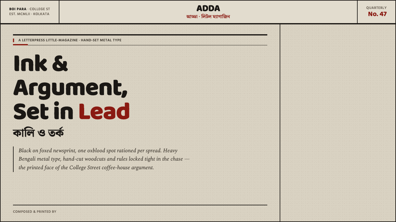 Kolkata Adda LetterpressAustere print, alive with argument. Baloo Bengali type and oxblood rules bite…
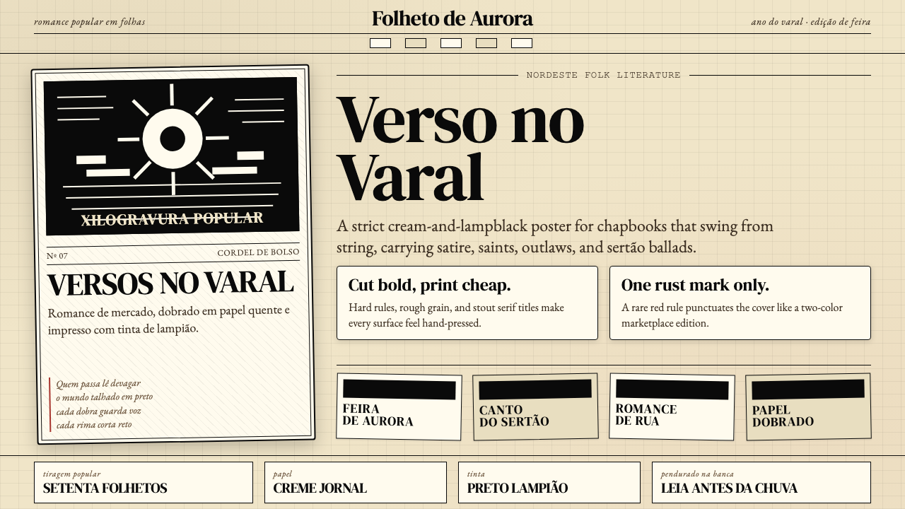 Brazilian Cordel (Northeast Folk Literature)Folk poetry, cut in lampblack. Cream newsprint, bordered chapbooks, one rust-…
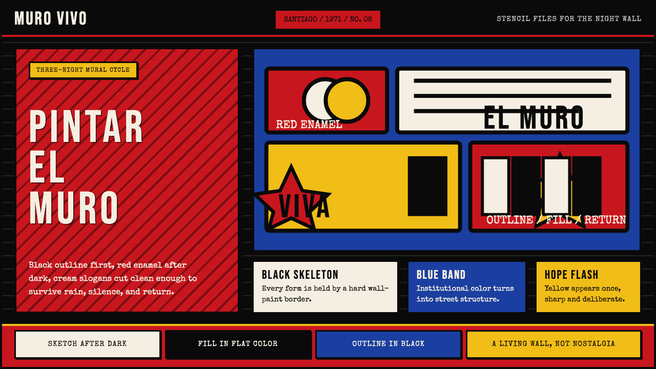 Chilean BRP Ramona Parra 1971Resistance stays alive. Blood red panels, black outlines, and stencil type re…
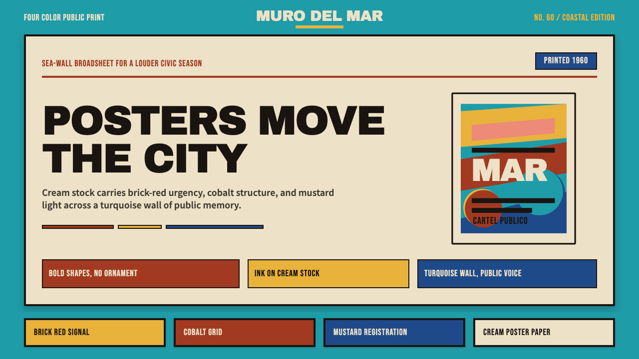 Cuban Malecón 1960 PosterPublic voice in flat ink. Turquoise wall, cream stock, brick red and cobalt b…
 Egyptian Political PosterState power shouts. Red poster grids, black keylines, kufic type, gold-green…
 Puerto Rican Bomba & PlenaNight festival dignity. Drum-red stripes and cream Playfair type on deep trop…