What is Brazilian Cordel (Northeast Folk Literature)?什么是 Brazilian Cordel (Northeast Folk Literature)?
Brazilian Cordel turns lampblack ink and cream newsprint into folk epics — woodcut portraits of outlaws and saints swinging from marketplace strings across the Northeast sertão.巴西 Cordel 用灯黑墨与奶油新闻纸铸就民间史诗——草莽义贼与圣徒的木刻肖像,在东北塞尔陶集市的细绳上随风摇曳。
Brazilian Cordel (Northeast Folk Literature) in briefBrazilian Cordel (Northeast Folk Literature) 速览
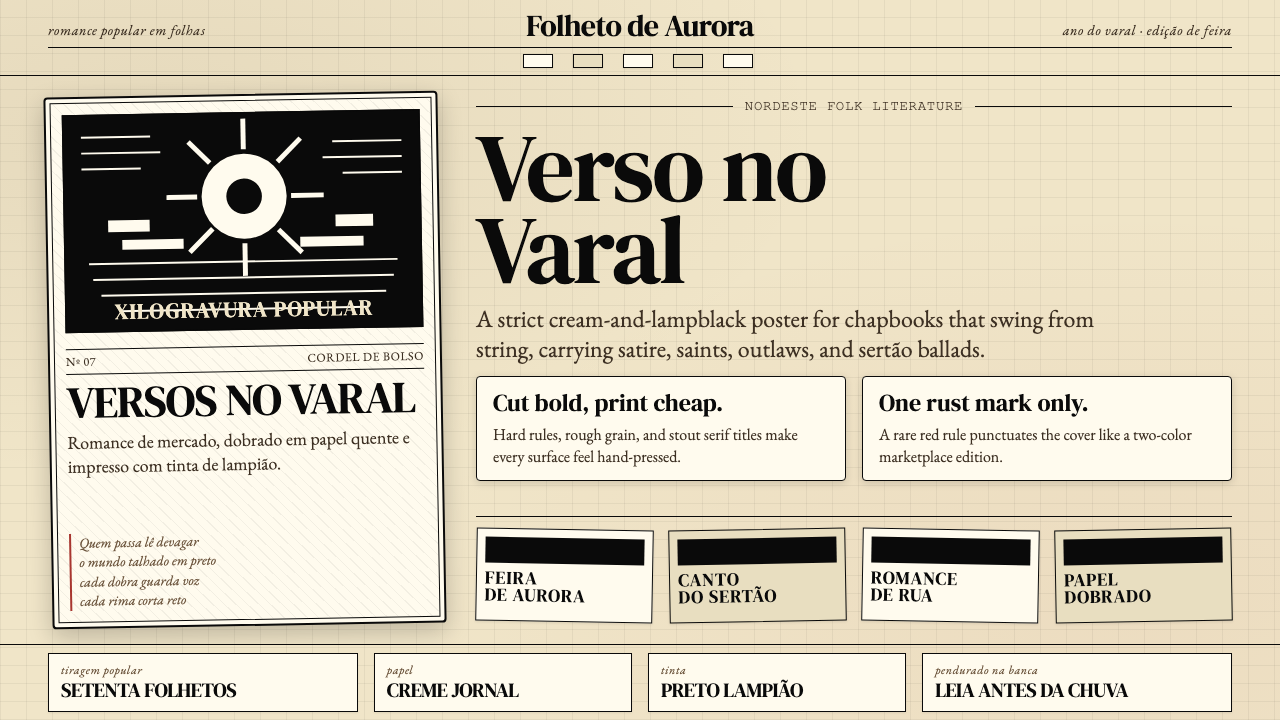
Brazilian Cordel — formally known as Literatura de Cordel — is the illustrated chapbook tradition of Brazil's Northeast, where small folded paper pamphlets of narrative ballads, religious tales, and satirical verse were sold at market stalls, hung in rows from lengths of twine (cordel means 'string' in Portuguese). Each booklet's cover bears a bold black-and-white woodcut: a cangaceiro outlaw frozen mid-pose, a sertão landscape of cactus and dry river beds, a crowned saint, or a monster from popular legend. Inside, the verse runs in six-line stanzas with ABCBDB or ABCBCB rhyme schemes, printed in chunky letterpress type on paper that is cheap by design.巴西 Cordel(正式名称为 Literatura de Cordel,即「绳上文学」)是巴西东北部的插图小册子传统。小幅折叠的纸质册子载着叙事叙事民谣、宗教故事与讽刺诗歌,悬挂在集市摊位的细绳上出售——cordel 在葡萄牙语中正是「绳」的意思。每本小册子的封面都有一幅粗犷的黑白木刻:cangaceiro 草莽义贼定格的身影,仙人掌与干涸河床点缀的塞尔陶旷野,戴冠的圣徒,或来自民间传说的怪兽。内页诗歌以六行诗节排列,押 ABCBDB 或 ABCBCB 韵脚,以厚重的铅字印在刻意廉价的纸张上。
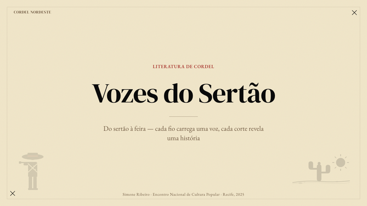
The aesthetic is one of enforced economy made beautiful. The palette is built from two tones: lampblack ink pressed into cream or off-white newsprint, with the rarest rust-red accent appearing on two-color covers. There are no photographs, no airbrushed gradients, no polished illustrations — only the hand-cut woodblock line, honest about every nick of the chisel. The type is a sturdy, upright serif, set tight and bold, commanding the eye the way a market barker commands a crowd. The whole visual system communicates that the content is urgent, populist, and immediate.这套美学是被迫的节俭升华为美的产物。色彩建立在两个色调之上:灯黑墨压入奶油色或米白色新闻纸,仅在双色封面上偶有锈红点缀出现。没有照片,没有气刷渐变,没有精细插图——只有手工刻版的线条,坦诚地保留每一道凿刀的痕迹。字体是粗壮挺直的衬线体,排得紧密而厚重,以集市叫卖者号令人群的方式命令视线。整套视觉系统传达的信息是:内容紧迫、属于平民、即时当下。
UNESCO recognized Cordel literature as Intangible Cultural Heritage of Humanity in 2018, acknowledging a tradition that has functioned simultaneously as oral memory, illustrated journalism, political commentary, and folk theology. As a design vocabulary, Cordel carries the authority of genuine necessity: every formal choice — the two-tone restriction, the woodcut grain, the folded paper edge — emerged from the realities of a printing economy serving a rural, largely oral-culture audience. That rootedness in material constraint is exactly what makes the aesthetic so distinctive and so resistant to superficial imitation.2018 年,联合国教科文组织将 Cordel 文学列入人类非物质文化遗产,认可了这一同时承担口述记忆、图文新闻、政治评论与民间神学功能的传统。作为设计词汇,Cordel 携带着真实必要性所赋予的权威:每一个形式选择——双色限制、木刻纹理、折纸边缘——都源自服务农村、以口述文化为主的受众的印刷经济现实。这种对材料约束的深深扎根,恰恰是这套美学如此独特、如此难以被肤浅模仿的原因所在。
Where does Brazilian Cordel (Northeast Folk Literature) come from?Brazilian Cordel (Northeast Folk Literature) 从何而来?
The roots of Cordel reach back across the Atlantic. The Portuguese brought the folheto — a small printed pamphlet of popular verse — to Brazil during the colonial era, drawing on a European chapbook tradition that itself descended from the romanceiro, the body of oral narrative poetry common across the Iberian Peninsula since the medieval period. In Portugal, these booklets circulated at fairs and markets, sold by street hawkers who often chanted the verses aloud as advertisement. When this form arrived in Brazil, it did not simply transplant itself — it hybridized, absorbing the storytelling rhythms, mythological figures, and social grievances of the Northeast's own oral culture.Cordel 的根脉横跨大西洋。葡萄牙人在殖民时代将 folheto——一种小型印刷民间诗歌册子——带入巴西,这一形式本身源自欧洲小册子传统,更追溯至中世纪以来流行于伊比利亚半岛的口述叙事诗歌总集 romanceiro。在葡萄牙,这些小册子在集市与市场上流通,由街头小贩售卖,他们往往将诗句高声吟唱以招揽顾客。当这一形式抵达巴西时,它并非简单移植,而是发生了杂交:吸收了东北部自身口述文化的叙事节奏、神话人物与社会积怨。
The tradition flourished in the arid interior of the Northeast — the sertão — during the latter half of the nineteenth century, a region defined by periodic drought, cattle culture, messianic religious movements, and the rise of the cangaceiro bandits who would become Cordel's most enduring folk heroes. The city of Juazeiro do Norte in Ceará became a spiritual and commercial center, partly because of the cult following of the priest Padre Cícero, whose miracles and controversies generated enormous demand for printed religious tracts in the Cordel format. From the 1880s through the early twentieth century, poet-printers set up small operations in Recife, Fortaleza, and across the interior, producing thousands of titles on hand-operated presses.这一传统在十九世纪下半叶于东北部干旱内陆——塞尔陶——蓬勃生长。这片土地以周期性干旱、牧牛文化、弥赛亚宗教运动以及成为 Cordel 最持久民间英雄的 cangaceiro 匪帮的崛起为标志。塞阿拉州的茹阿泽鲁杜诺尔特市成为精神与商业中心,部分原因在于神父帕德雷·西塞罗的崇拜潮流——他的神迹与争议催生了对 Cordel 格式宗教传单的巨大需求。从 1880 年代至二十世纪初,诗人兼印刷师在累西腓、福塔雷萨及整个内陆地区设立小型作坊,以手摇印刷机生产数千种题目。
The golden age of Cordel ran from roughly the 1920s through the 1970s. During this period, the form developed its canonical visual identity: standardized booklet dimensions, the convention of hanging pamphlets from string at market stalls (which gave the tradition its name), and the woodcut cover image as the primary attention-getter in a marketplace where many buyers were functionally illiterate and chose their reading matter by the image. The woodcut artists — often the same poet-printers — developed a visual shorthand of instantly readable characters and scenes: the half-moon hat of the cangaceiro, the halo of the saint, the curling tail of the devil, the wings of the angel.Cordel 的黄金时代大约从 1920 年代延续至 1970 年代。在这一时期,这一形式发展出其经典视觉身份:标准化的小册子尺寸,将小册子悬挂在集市细绳上的惯例(这一惯例赋予了这一传统的名称),以及木刻封面图像作为在许多购买者尚不能流利阅读的市场环境中吸引注意力的主要手段——顾客以图选书。木刻艺术家——往往与诗人印刷师是同一人——发展出一套瞬间可读的人物与场景视觉速记:cangaceiro 的半月帽,圣徒的光环,魔鬼卷曲的尾巴,天使的翅膀。
By the 1970s and 1980s, urbanization and the spread of radio and television eroded the mass-market role of Cordel. But the form did not disappear — it transformed. Younger artists, particularly in the academic and gallery context of Rio de Janeiro and São Paulo, began treating Cordel woodcuts as a fine-art medium. Museums collected original blocks. Scholars documented the full corpus. Contemporary Cordel artists now work in dialogue with that archive, using the visual vocabulary of the tradition to address current social and political subjects, and the form's UNESCO recognition has secured both institutional support and renewed popular interest.到 1970 至 1980 年代,城镇化以及广播与电视的普及侵蚀了 Cordel 的大众市场角色。但这一形式并未消失,而是发生了转型。较年轻的艺术家,尤其是在里约热内卢与圣保罗的学院与画廊语境中,开始将 Cordel 木刻作为纯艺术媒介对待。博物馆收藏原版刻版,学者整理完整文献档案。当代 Cordel 艺术家如今在与这一档案的对话中工作,运用传统的视觉词汇回应当下的社会与政治议题。联合国教科文组织的认可则为这一形式确保了机构支持与重新焕发的大众兴趣。
What defines the Brazilian Cordel (Northeast Folk Literature) look?Brazilian Cordel (Northeast Folk Literature) 的视觉特征是什么?
Two-Tone Palette双色色板
Cordel operates with an extreme restriction: lampblack ink on cream or off-white newsprint is the default and the rule. The ground is warm — aged paper rather than pure white — and the ink is dense and flat, without tonal gradation. A rust-red accent appears on the most elaborate covers as a second color, used for borders, rules, or to flood a background panel behind the main woodcut. No other color enters the system. This two-tone discipline is not a stylistic choice but a production reality that became an aesthetic identity: cheap printing meant one or two ink passes, and the warmth of the newsprint ground became the visual signature of populist authenticity.Cordel 在极度限制中运作:灯黑墨印在奶油色或米白色新闻纸上,这既是默认值也是规则。底面是温暖的——像陈年纸张而非纯白——墨色浓实而平坦,没有色调层次的渐变。锈红色作为第二色出现在最精心制作的封面上,用于边框、装饰线,或在主木刻图像背后填充背景色块。没有其他颜色进入这套系统。这种双色纪律并非风格选择,而是生产现实升华为美学身份:廉价印刷意味着一两次走墨,而新闻纸底面的温暖色调成为平民真实性的视觉标志。
Woodcut Imagery木刻图像
The woodcut is Cordel's defining visual element: a cover image carved directly into wood or linoleum, inked, and pressed onto paper. The technique produces a characteristic visual texture — solid black masses broken by white relief lines, edges that are slightly ragged from the grain of the wood, forms that simplify complex figures into readable silhouettes. Cordel woodcuts are never fine or delicate; they are bold, immediate, and readable at arm's length in an outdoor market setting. Faces are expressive but schematic. Bodies carry symbolic attributes — the outlaw's hat, the saint's halo — rather than realistic detail. The grain of the woodblock is a visible, welcomed element of the surface.木刻是 Cordel 最具决定性的视觉元素:将图像直接雕刻在木块或油毡版上,上墨后压印在纸张上。这一技法产生了标志性的视觉肌理——实心黑色块面被白色浮雕线打断,边缘因木料纹理而略显粗糙,形体将复杂图形简化为可读的剪影。Cordel 木刻从不精细或纤弱;它们粗犷、直接、在户外集市环境中隔着手臂的距离也清晰可读。面孔富有表情但趋向图式。身体携带象征性属性——义贼的帽子,圣徒的光环——而非写实细节。木版纹理是画面表面可见且受欢迎的组成部分。
Declarative Border and Rule宣示性边框与装饰线
Cordel covers are almost always framed by a bold rectangular border, often doubled or tripled as a series of concentric lines, sometimes with corner ornaments in a simple geometric or floral form. This border performs a clear function: it marks the chapbook as a complete, intentional artifact — a contained world — and distinguishes the image area from the text area. Interior pages use horizontal rules to separate sections of verse. These structural lines are never decorative in a refined sense; they are the typographical equivalent of the woodcut — thick, direct, and legible at a glance.Cordel 封面几乎总是被粗重的矩形边框环绕,通常是双线或三线同心排布,有时附有简单几何或花卉形式的角隅装饰。这一边框执行明确的功能:将小册子标记为一个完整的、有意而为的制品——一个自足的世界——并将图像区域与文字区域区分开来。内页以水平线分隔诗节。这些结构性线条从不是精致意义上的装饰;它们是与木刻等价的字体学手段——粗厚、直接、一眼可读。
Upright Serif Typography挺立衬线字体
The type used in Cordel publications is consistently a sturdy, upright serif — the kind of letterpress face suited to heavy inking on absorbent paper. Letter spacing is tight, and lines are set with minimal leading, packing as many stanzas as possible onto a small page. Titles are set large and bold on the cover, often in two or three sizes to create a rough hierarchy: the poem's main title at the largest size, the poet's name below it, and a subtitle or thematic label smaller still. There is no italic for emphasis; bold weight and capitalization do all the hierarchical work.Cordel 出版物使用的字体始终是粗壮挺立的衬线体——那种适合在吸墨纸上重墨印刷的铅字字面。字间距紧密,行距设定极小,在小幅页面上尽可能多地容纳诗节。封面标题以大号粗体设定,通常分两到三个尺寸建立粗粝的层级:最大号的诗歌主标题,下方是诗人姓名,再下方是副标题或主题标签。没有斜体用于强调;加粗字重与大写字母承担全部层级区分工作。
Folded Paper Format折叠纸张形态
Cordel chapbooks are small and folded — typically eight or sixteen pages formed from a single sheet folded and cut, or several sheets nested together. The physical format carries meaning: the pamphlet is cheap enough to be disposable, small enough to carry in a pocket or hang from a string, and self-contained enough to be read in a single sitting. This format establishes a visual proportioning system — the tall, narrow page — that governs all the compositional decisions inside. Margins are narrow because paper is not wasted; images occupy as much of the cover as the border allows.Cordel 小册子小巧而折叠——通常由单张或数张纸折叠裁切而成,形成八页或十六页。这一实体形态携带意义:册子足够廉价可随时丢弃,足够小巧可放入口袋或挂在细绳上,足够完整可在一次坐下中读完。这一形态建立了一套视觉比例系统——高窄的页面——支配内部所有的构图决策。页边距窄,因为纸张不容浪费;图像在边框允许的范围内占据尽可能多的封面面积。
Populist Directness平民式直接性
Every visual choice in Cordel communicates immediately, without mediation. The woodcut images are readable from several feet away; the cover title announces its subject without teasing or withholding. There is no visual complexity for its own sake, no ambiguity of reading direction, no element that requires familiarity with design conventions to decode. This directness is structural: the audience for Cordel pamphlets historically included buyers with limited formal literacy who navigated the marketplace by image and word-of-mouth. The visual system had to work at arm's length, in strong sunlight, for an audience in motion.Cordel 的每一个视觉选择都直接传达,无需中介。木刻图像在数英尺之外清晰可读;封面标题直截了当地宣告主题,不设悬念,不作遮掩。没有为自身而存在的视觉复杂性,没有阅读方向的歧义,没有需要熟悉设计惯例才能解码的元素。这种直接性是结构性的:Cordel 小册子历史上的受众包括正式识字能力有限、依靠图像与口耳相传在市场中导航的购买者。这套视觉系统必须在隔臂之遥、强烈日光下、为运动中的受众发挥作用。
Surface Texture as Authenticity表面肌理即真实性
In Cordel, the visible traces of making — the woodgrain in the cut, the slight unevenness of ink distribution, the rough paper edge of the folded pamphlet — are not defects but authenticating marks. They signal handmade production, local origin, and human labor in a way that smooth, mechanically perfect surfaces cannot. Contemporary designers applying Cordel as an aesthetic must decide how to handle this: the goal is not to fake distress or artificially age a surface, but to understand that the original visual warmth came from real material constraints, and to find contemporary equivalents that carry similar honesty — slightly irregular line weights, visible paper texture, ink that reads as pressed rather than rendered.在 Cordel 中,制作过程的可见痕迹——刻版中的木料纹理,墨色分布轻微的不均匀,折叠册子粗糙的纸张边缘——不是缺陷而是真实性的印记。它们以光滑、机械完美的表面无法做到的方式,标示着手工生产、本地起源与人工劳动。当代设计师将 Cordel 作为美学应用时,必须决定如何处理这一问题:目标不是伪造做旧感或人为地使表面陈旧,而是理解原始的视觉温度来自真实的材料约束,并找到当代等价物——略微不规则的线条粗细、可见的纸张肌理、读起来像压印而非渲染的墨色。
Who shaped Brazilian Cordel (Northeast Folk Literature)?谁塑造了 Brazilian Cordel (Northeast Folk Literature)?
Widely regarded as the founding figure of Brazilian Cordel, Leandro Gomes de Barros was born in Paraíba in 1865 and began publishing pamphlets in Recife around 1893, eventually producing over a thousand titles across his career. He established the canonical form of the Cordel booklet — its meter, its rhyme schemes, and its cover conventions — and proved that popular poetry could sustain a viable commercial printing operation in the Northeast. His subjects ranged from local political satire to adaptations of European adventure stories and original tales of supernatural encounter. The scale and influence of his output earned him the informal title 'King of the Cordel poets,' and virtually every subsequent poet worked in his shadow.被广泛视为巴西 Cordel 奠基人物,莱昂德罗·戈麦斯·德·巴罗斯 1865 年生于帕拉伊巴州,约 1893 年起在累西腓开始出版小册子,整个职业生涯中最终出版了逾千种题目。他确立了 Cordel 小册子的规范形式——其韵律、押韵方案与封面惯例——并证明民间诗歌能在东北部支撑一个可持续运营的商业印刷事业。他的题材涵盖从地方政治讽刺到欧洲冒险故事改编,再到原创超自然遭遇叙述。他产出的规模与影响力为他赢得了「Cordel 诗人之王」的非正式称号,此后几乎每一位诗人都在他的阴影下工作。
João Martins de Athayde was born in Paraíba in 1880 and became the most commercially successful Cordel publisher of the early twentieth century, establishing a printing operation in Recife that dominated the Northeast market for decades. He was a shrewd businessman as well as a poet — he purchased the rights to Leandro Gomes de Barros's catalog after that poet's death in 1918, effectively inheriting custodianship of the canonical Cordel archive. His editions standardized the physical format and printing quality of the chapbook across the region. His business model — direct distribution to market vendors, low unit price, high volume — became the template for Cordel commerce through most of the twentieth century.若昂·马丁斯·德·阿萨伊迪 1880 年生于帕拉伊巴州,成为二十世纪初最具商业成功的 Cordel 出版商,在累西腓建立的印刷事业主导东北市场数十年。他既是精明的商人,也是诗人——1918 年莱昂德罗·戈麦斯·德·巴罗斯去世后,他购买了后者作品集的版权,实际上成为 Cordel 规范档案的托管人。他的版本在整个地区统一了小册子的实体形态与印刷质量。他的商业模式——直接分销给市场摊贩、单价低廉、高量生产——成为整个二十世纪 Cordel 商业的模板。
José Francisco Borges, known universally as J. Borges, was born in Bezerros, Pernambuco, in 1935 and is the woodcut artist most responsible for elevating Cordel's visual dimension from craft anonymity to recognized art form. Self-taught, he began carving woodblocks in the 1960s and quickly developed a visual style of exceptional inventiveness — densely populated compositions, fluid human figures in dynamic poses, elaborate fantastical scenes combining religious, political, and folkloric elements. His prints were exhibited internationally from the 1970s onward, collected by major museums, and recognized with the Brazilian state's highest cultural honors. J. Borges demonstrated that Cordel woodcuts could bear as much artistic weight as any printmaking tradition, and his work is the reference point for understanding the visual language at its most developed.若泽·弗朗西斯科·博尔赫斯,人称 J. Borges,1935 年生于伯南布哥州贝泽罗斯,是最终将 Cordel 视觉维度从无名工艺提升为公认艺术形式的木刻艺术家。他自学成才,于 1960 年代开始雕刻木版,迅速发展出一种非凡创造力的视觉风格——人物密集的构图,流动而充满动势的人体姿态,融合宗教、政治与民间元素的精心奇幻场景。从 1970 年代起,他的版画在国际间展出,被主要博物馆收藏,并获得巴西国家最高文化荣誉。J. Borges 证明了 Cordel 木刻能够承载与任何版画传统同等的艺术分量,他的作品是理解这套视觉语言发展至最成熟阶段的参照点。
Expedito Sebastião da Silva, known as Mestre Noza, was born in Juazeiro do Norte, Ceará, in 1911 and became one of the most revered wood sculptors and engravers associated with the Cordel tradition. Working in the shadow of Padre Cícero's religious cult that made Juazeiro a pilgrimage city, Mestre Noza produced religious and devotional imagery that fused folk Catholicism with the formal vocabulary of Cordel woodcut. His work represents the tradition's deep entanglement with Northeast popular religiosity — the same figures that appear on Cordel covers as printed characters were, in his hands, carved in three dimensions as objects of veneration. He was recognized by the Brazilian government as a living master of popular culture before his death in 1999.埃克斯佩迪托·塞巴斯蒂昂·达·席尔瓦,人称梅斯特雷·诺扎,1911 年生于塞阿拉州茹阿泽鲁杜诺尔特,成为与 Cordel 传统相关联的最受尊崇的木雕师与版刻师之一。在使茹阿泽鲁成为朝圣城市的帕德雷·西塞罗宗教崇拜的阴影中工作,梅斯特雷·诺扎创作了将民间天主教与 Cordel 木刻形式词汇融合在一起的宗教与虔诚图像。他的作品代表了这一传统与东北部民间宗教性的深度纠缠——在印刷作品的封面上作为图像角色出现的同一批人物,在他手中被立体雕刻为供奉的器物。他在 1999 年去世之前被巴西政府认定为民间文化的活态传承大师。
How do you use Brazilian Cordel (Northeast Folk Literature) today?今天怎么用 Brazilian Cordel (Northeast Folk Literature)?
Cordel is a style built on genuine scarcity, which means applying it correctly requires discipline about what to include as much as skill in execution. The system's power comes from the two-tone palette, the woodcut-like visual weight, and the warm paper ground — disturb any one of these and the coherence collapses. Before adding color, adding texture, or adding visual complexity, ask whether the addition serves the communication or dilutes the aesthetic economy that makes Cordel legible and arresting.Cordel 是一套建立在真实匮乏之上的风格,这意味着正确应用它需要在取舍上保持纪律,这与执行技巧同等重要。这套系统的力量来自双色色板、木刻般的视觉分量以及温暖的纸张底面——破坏其中任何一项,整体的连贯性就会崩塌。在添加颜色、添加纹理或增加视觉复杂性之前,先问这一添加是服务于传达还是稀释了使 Cordel 清晰而摄人的美学经济性。
For presentation slides, Cordel works with particular force on cover slides and chapter dividers. A cover should commit fully to the system: a warm cream or aged-paper ground, a large woodcut-style illustration or a bold geometric woodcut motif centered or weighted to one side, a thick rectangular border, and a title set in a heavy upright serif at commanding scale. The title should declare, not suggest. Content slides carry the system through typographic restraint — sturdy serif type, generous space between text blocks, horizontal rules as section dividers rather than colored bands. Data slides take on an illustrated quality: bar charts and area charts treated as graphic objects, colored only in the two-tone palette, with annotations set as if printed from a letterpress.在演示文稿中,Cordel 在封面页与章节分割页上具有特别的冲击力。封面应当完全投入这套系统:温暖的奶油色或陈年纸张底面,一幅大型木刻风格插图或粗犷的几何木刻母题居中或偏置一侧,厚重的矩形边框,以及以厚重挺立衬线体大号设定的标题——要宣告,而非暗示。内容页通过字体排印的克制延续这套系统:粗壮衬线体,文字块之间留有充分空间,以水平线而非彩色色带作为章节分隔。数据页呈现出插图品质:柱状图与面积图被当作图形对象处理,仅以双色色板着色,注释设定得如同来自铅字印刷机。
For web interfaces, Cordel is most effective on pages designed for emotional impact rather than dense interaction — editorial landing pages, cultural institution sites, campaign microsites, or brand storytelling contexts. A Cordel-informed dashboard would use a warm off-white background, black as the dominant text and border color, rust-red reserved for primary calls to action or critical alerts, and an illustrated or woodcut-textured hero element as the focal point. Navigation is best kept typographic and minimal: the visual weight budget is occupied by the woodcut imagery, and competing UI chrome will undermine the composition. Pricing pages can use the bold-border, two-tone-panel approach — alternating cream and near-black sections — to create a strong rhythm without requiring additional color.对于网页界面,Cordel 在为情感冲击而非密集交互设计的页面上最为有效——编辑类落地页、文化机构网站、活动专题微站,或品牌叙事场景。一个 Cordel 风格的仪表板会使用温暖的米白色背景,黑色作为主导文字与边框色,锈红色专门保留给主要行动号召或关键警示,以及一个插图或木刻肌理风格的焦点英雄元素。导航最好保持字体化与极简:视觉分量的预算被木刻图像占据,竞争性的 UI 装饰会破坏构图。定价页可以使用粗边框、双色面板的方式——奶油色与近黑色区块交替——在无需额外颜色的情况下制造强烈的节奏感。
For editorial and marketing work, Cordel gives designers a clear structural logic: the image declares, the border contains, the type explains. An editorial layout following this logic places the dominant woodcut-style image large and above the fold, uses the border or a heavy ruled line to mark the transition from image to text, and keeps the body text in a readable upright serif at a comfortable measure. Marketing materials benefit from the poster sensibility of the tradition: a single bold image, a single bold claim, a single call to action, all held within a bordered field. The rust-red accent appears once — on the call to action or a critical label — and not again. This restraint is the discipline that separates Cordel-informed work from decorative pastiche.对于编辑与营销内容,Cordel 为设计师提供了清晰的结构逻辑:图像宣告,边框包容,文字解释。遵循这一逻辑的编辑版面将主导性的木刻风格图像大幅置于折叠线以上,以边框或粗重横线标记从图像到文字的过渡,正文以舒适行宽的可读挺立衬线体排设。营销物料从这一传统的海报感中获益:一个粗犷的图像,一个粗犷的主张,一个行动号召,全部包含在一个有边框的区域内。锈红色强调只出现一次——在行动号召或关键标签上——不再重复。这种克制是将有 Cordel 内涵的作品与装饰性仿作区分开来的纪律所在。
The most common mistake when applying Cordel is the addition of color beyond the two-tone system. A third color — even a neutral — breaks the visual logic that gives the palette its strength. Equally damaging is the substitution of a smooth digital illustration for a properly textured woodcut-style image: Cordel's visual power depends on the visible evidence of pressure and tool, and a clean vector drawing, however stylized, reads as illustration rather than Cordel. Similarly, replacing the upright serif with a casual or decorative typeface removes the typographic seriousness that anchors the composition. The style is difficult to modernize through softening — every softening decision (rounder type, softer lines, lighter borders) moves the work toward folk pastiche and away from the populist urgency that is Cordel's actual emotional register.应用 Cordel 时最常见的错误是在双色系统之外添加颜色。第三种颜色——哪怕是中性色——会打破给色板带来力量的视觉逻辑。同样具有破坏性的是用光滑的数字插图替代具有适当肌理的木刻风格图像:Cordel 的视觉力量依赖于压力与工具的可见证据,一幅干净的矢量图,无论多么风格化,读起来是插图而非 Cordel。类似地,将挺立衬线体替换为休闲或装饰性字体,会移除锚定构图的字体排印严肃性。这种风格很难通过柔化来现代化——每一个柔化决定(更圆润的字体、更柔和的线条、更浅的边框)都会把作品推向民俗仿作,远离平民紧迫性——而那才是 Cordel 真正的情感音域。
Brazilian Cordel (Northeast Folk Literature) — FAQBrazilian Cordel (Northeast Folk Literature) · 常见问题
Is Cordel the same as other Latin American folk-print traditions?Cordel 与其他拉丁美洲民间印刷传统是同一回事吗?
Cordel shares the broader chapbook tradition with related forms across Latin America and the Caribbean, and its Portuguese roots connect it to the European broadside tradition. But it is distinct from Mexican lotería imagery, from Chilean arpillera textile narrative, and from Argentine gaucho literature in ways that go beyond geography. The specific combination of woodcut cover, folded-pamphlet format, regular verse meter, and marketplace distribution by hanging from string is particular to the Brazilian Northeast. The color discipline — lampblack on cream with rust-red as the sole accent — is also specific and is one of the most immediately recognizable markers of the tradition's authenticity versus adjacent folk-art influences.Cordel 与拉丁美洲和加勒比地区的相关形式共享更广泛的小册子传统,其葡萄牙语根脉将它与欧洲单页印刷传统相连接。但它与墨西哥摇号游戏图像、智利拼布叙事挂毯以及阿根廷高乔文学的区别,远不止地理层面。木刻封面、折叠小册子形态、规律诗歌韵律以及将册子悬挂于细绳上的集市分销方式的特定组合,是巴西东北部所独有的。色彩纪律——奶油色上的灯黑墨、仅以锈红为唯一点缀——同样是特定的,是区别这一传统的真实性与相邻民间艺术影响最直接可辨认的标志之一。
How do I apply Cordel without making the design feel like a costume?如何应用 Cordel 而不让设计显得像在穿戏服?
The distinction between authentic Cordel-informed work and folk pastiche comes down to structure versus decoration. Cordel's visual choices were structural — the two-tone palette was all the printing operation could afford, the border contained the image within a small format, the upright serif was the standard letterpress face available. When a designer applies the Cordel aesthetic, the most authentic results come from treating those choices as structural decisions with reasons behind them, not as decorative patterns applied over a layout. Ask: does this border serve the composition by creating a container? Does the rust-red accent appear exactly once because anything more would destabilize the economy? Does the texture feel like real material pressure, not applied distress?有 Cordel 内涵的真实作品与民俗仿作之间的区别归结为结构与装饰之别。Cordel 的视觉选择是结构性的——双色色板是印刷作坊力所能及的全部,边框在小幅面上包容图像,挺立衬线体是当时可用的标准铅字字面。当设计师应用 Cordel 美学时,最真实的结果来自将这些选择视为背后有理由的结构决策,而非叠加在版面上的装饰图案。问自己:这个边框是否通过创造一个容器来服务构图?锈红色强调是否恰好只出现一次,因为出现更多就会破坏经济性?这种肌理感觉是真实的材料压力,还是人为施加的做旧感?
Can Cordel work in a digital product with interactive elements?Cordel 能用于有交互元素的数字产品吗?
Yes, but the application requires translating physical properties into digital equivalents with care. The two-tone palette translates directly: warm off-white as the ground, near-black as the primary text and border color, rust-red as the single interactive accent. The border convention translates to card components with visible, sturdy borders rather than drop shadows — hard borders rather than floating elevation. The woodcut texture requires the most thought: a full woodcut illustration is appropriate as a hero or feature element, but interface icons should follow the same visual logic — high contrast, simplified form, slightly irregular line weight — without attempting to simulate the full woodcut process on every interactive element. Animation should be minimal and mechanical rather than fluid.可以,但应用需要谨慎地将实体属性转化为数字等价物。双色色板可以直接迁移:温暖的米白色作为底面,近黑色作为主要文字与边框色,锈红色作为唯一的交互强调色。边框惯例转化为带有可见的粗壮边框而非投影的卡片组件——实体边框而非浮动高度。木刻肌理需要最多的思考:完整的木刻插图适合作为英雄或特性元素,但界面图标应遵循同样的视觉逻辑——高对比度、简化形态、略微不规则的线条粗细——而不必尝试在每个交互元素上模拟完整的木刻工艺。动效应当极少且机械,而非流畅。
What is the right way to use texture in a Cordel-inspired design?在 Cordel 风格的设计中,使用肌理的正确方式是什么?
Texture in Cordel is not applied — it is inherent. The grain of the woodblock appears in the image because the ink did not fully cover the wood between relief lines. The slight unevenness of ink on newsprint is a result of the paper's absorbency and the press pressure. When translating this to a designed artifact, the principle is that texture should appear where a real material process would have produced it: in the woodcut illustration, in the paper ground, and in the printed rules and borders — not as an overall filter applied to the entire composition. Applying a uniform paper texture overlay to a flat digital layout is the equivalent of wearing a costume; using a genuinely textured ground and a woodcut-style illustration is the equivalent of dressing in the tradition's actual clothes.Cordel 中的肌理不是施加的——它是固有的。木版纹理出现在图像中,是因为墨水没有完全覆盖浮雕线之间的木料。新闻纸上墨色轻微的不均匀是纸张吸墨性与印刷压力的结果。将这一点转化为设计制品时,原则是:肌理应当出现在真实的材料工艺会产生它的地方——在木刻插图中、在纸张底面中、在印刷线条与边框中——而不是作为叠加于整个构图的全局滤镜。在扁平数字版面上应用统一的纸张肌理叠加,等同于穿着戏服;使用真正有肌理的底面与木刻风格插图,等同于穿着这一传统真实的服装。
How does Cordel handle type hierarchy without multiple typefaces or colors?Cordel 如何在不使用多种字体或颜色的情况下处理字体层级?
Cordel achieves hierarchy through size, weight, and spacing — the same tools available to any typographer working under production constraints. A Cordel cover uses three or four type sizes: the poem title at the largest scale, a descriptive subtitle smaller, the poet's name smaller still, and a publisher mark or location detail at the smallest scale. All are set in the same typeface family, distinguished only by size and sometimes weight. Interior pages use the distinction between verse stanzas and section headers through size and a horizontal rule rather than color or typeface change. The horizontal rule — a thick black line — does the work that color would otherwise do, creating visual stops and starts that guide the reader through the content.Cordel 通过字号、字重与间距实现层级——这也是任何在生产约束下工作的排印师可用的工具。一个 Cordel 封面使用三到四个字号:诗歌标题用最大号,描述性副标题稍小,诗人姓名再小,出版商标记或地点信息用最小号。所有文字均用同一字体家族排设,仅通过字号、有时通过字重加以区分。内页通过字号与水平横线而非颜色或字体变换来区分诗节与章节标题。水平横线——一条粗重的黑色线条——承担了颜色本可承担的工作,制造视觉的停顿与起始,引导读者穿越内容。
Related design styles相关设计风格
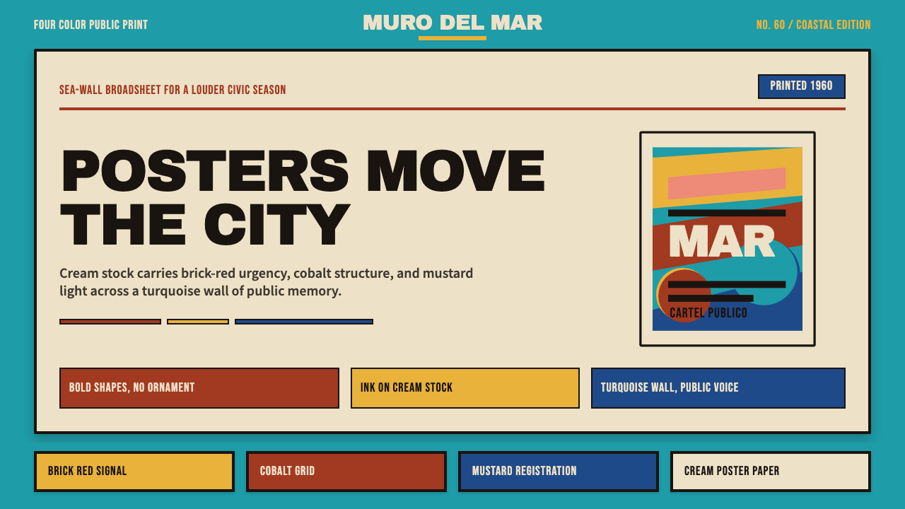 Cuban Malecón 1960 PosterPublic voice in flat ink. Turquoise wall, cream stock, brick red and cobalt b…平面油墨的公共之声:绿松石墙、奶油纸、砖红与钴蓝色条。
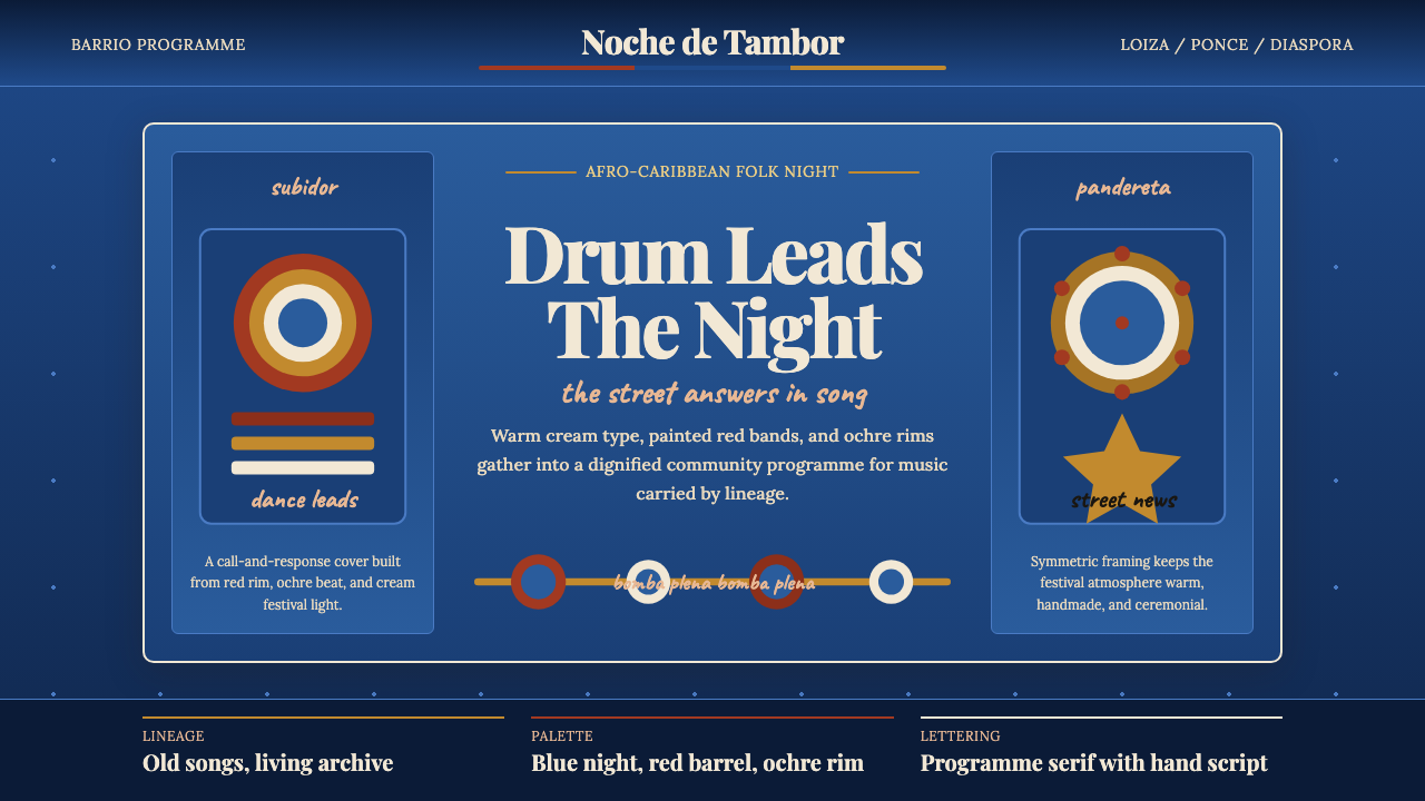 Puerto Rican Bomba & PlenaNight festival dignity. Drum-red stripes and cream Playfair type on deep trop…夜祭般庄重:深蓝底、鼓红条纹与暖白 Playfair 字体。
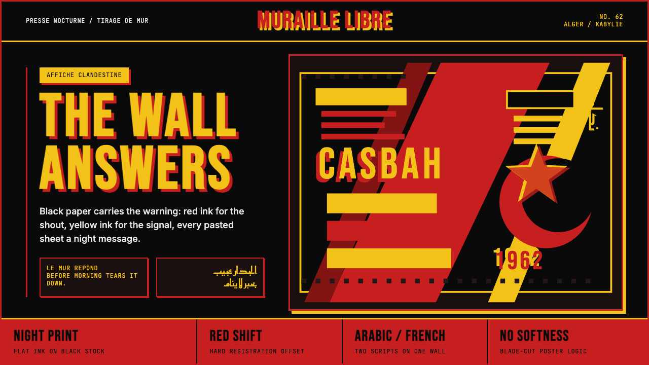 Algerian Casbah Poster (1954–1962)Every surface is a manifesto. Blood red, warning yellow, and stencil type hit…每个表面都是宣言:血红、警示黄与模板字撞上黑色新闻纸。
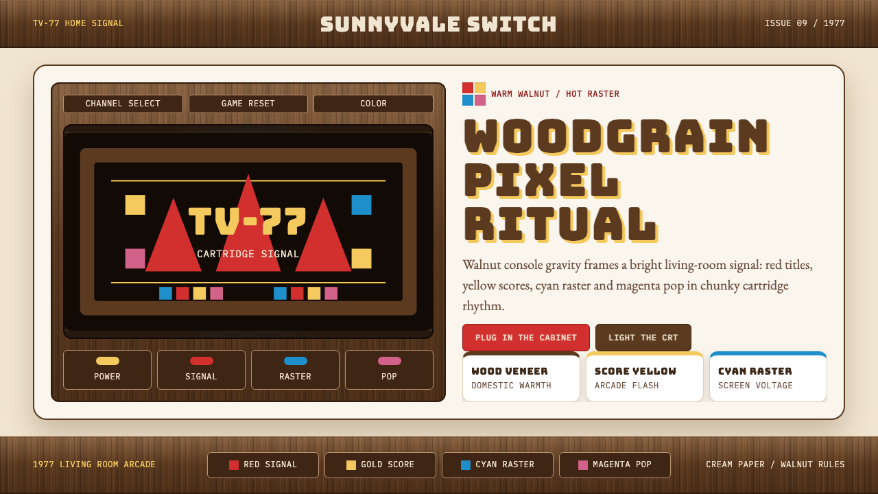 Atari 2600 (Woodgrain)Woodgrain meets raw pixels. Walnut panels frame Bungee type and CMYK raster b…木纹遇上生猛像素:胡桃木面板包裹Bungee字与CMYK色块。
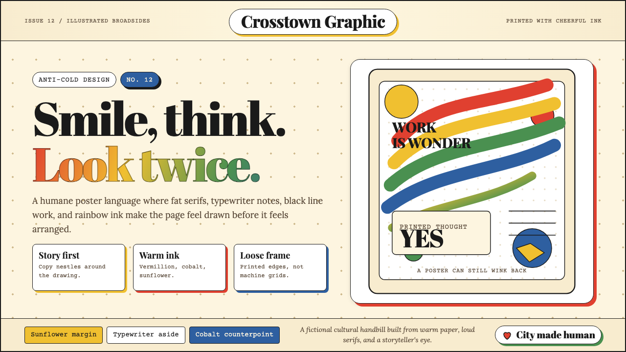 Milton Glaser / Push PinWarm counter-Swiss joy. Vermillion, cobalt and sunflower arcs orbit fat serif…温暖地反叛瑞士冷感:奶油纸上朱砂、钴蓝、向日葵弧线环绕粗衬线。
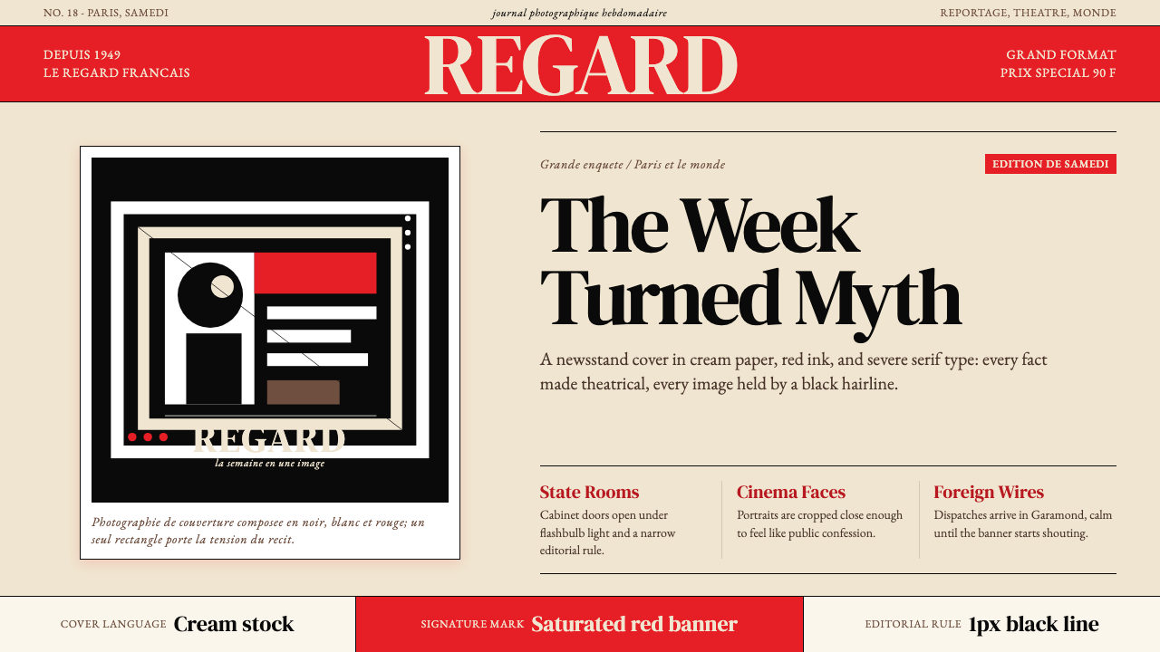 Paris MatchThe cover shouts in one red slab. Cream paper, serif headlines, and black rul…一块红色横幅在呐喊。奶油纸、衬线标题与黑色细线制造戏剧。