What is Paris Match?什么是 Paris Match?
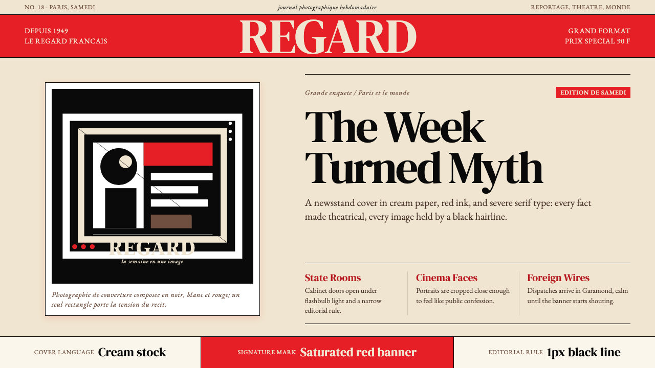
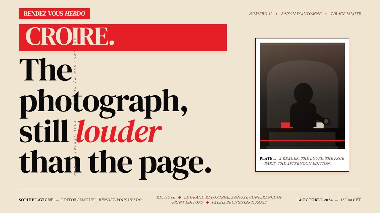
One saturated red banner, a single dramatic portrait, and the certainty that the cover must stop you cold — that is the Paris Match visual contract, unchanged since 1949.一条饱和的红色横幅、一张戏剧性的肖像,以及封面必须让你驻足的笃定——这是《巴黎竞赛》自1949年起从未改变的视觉契约。
Paris Match in briefParis Match 速览
Paris Match is the visual language of French photojournalism elevated to a design system: cream grounds, a single monolithic slab of saturated red as wordmark, classical French serif headlines, hairline rules, and a generous, unhurried sense of typographic spacing. Every spread reads as though it has been composed on a light table by someone who understood that restraint, deployed correctly, creates more drama than decoration ever could.《巴黎竞赛》的视觉语言是法国摄影新闻提炼为一套设计体系的产物:奶油色底面、以饱和红色构成的整块文字商标、古典法式衬线标题、细如发丝的分割线,以及宽裕而从容的字间距。每一个跨页都像是由某位懂得克制之力的人在透光台上精心构图——正确运用的克制,制造的戏剧感远胜于任何装饰。
At its core, the style is built on the tension between two forces: the absolute calm of cream paper and refined serif type, and the single, almost violent intrusion of the Paris-Match red. That red does not decorate — it commands. It is the one element that breaks the editorial composure, and it is precisely because everything else is so controlled that the red can carry the full weight of the cover's emotional impact.在本质上,这套风格建立于两种力量的张力之间:奶油纸张与精炼衬线字体构成的绝对平静,以及那一条带有几分暴力感的巴黎竞赛红的单一入侵。那块红色不是装饰——它是命令。它是唯一打破编辑沉着的元素,而正因为其余一切如此受控,那块红色才能承载封面全部的情感冲击力。
The result is a design grammar that feels simultaneously archaic and permanently modern. Because it draws on the traditions of classical French print culture — the broadsheet, the literary magazine, the illustrated weekly — it carries the authority of an institution. Because it is structured around the photograph, an image medium that is always contemporary, it never feels like pastiche. It is, in Roland Barthes's reading, a system that naturalizes ideology through the very ordinariness of its visual conventions.最终形成的设计语法,同时散发着古老感与永久的当代性。它援引古典法国印刷文化的传统——号外、文学杂志、图文周刊——因而带有机构的权威。它又以照片为核心,而摄影是一种永远处于当下的媒介,因此它从不显得是在刻意仿古。在罗兰·巴特的解读中,这是一套通过视觉惯例的普通性来使意识形态自然化的系统。
Where does Paris Match come from?Paris Match 从何而来?
Paris Match was founded in 1949 by Jean Prouvost, a textile industrialist turned press magnate who had already run several influential French newspapers and magazines. The title revived a pre-war sports weekly, but Prouvost reconceived it entirely as a photojournalism vehicle in the model of Life and Picture Post — a large-format weekly that would use photography not merely as illustration but as the primary language of reportage. The magazine's founding coincided with the postwar rebuilding of French cultural life and with the emergence of a new generation of photographers working in the documentary tradition.《巴黎竞赛》于1949年由让·普鲁沃创办。这位由纺织业大亨转型的新闻媒体大亨,此前已经营过多份颇具影响力的法国报刊。他复活了一份战前的体育周刊的名称,但将其彻底改造为以《生活》(Life)和《图片邮报》(Picture Post)为范本的摄影新闻媒介——一本大开本周刊,将摄影不仅用于插图,而是作为报道的主要语言。创刊之时,正值法国战后文化生活重建期,也是新一代纪实风格摄影师崭露头角之时。
The visual identity that emerged in those first years was not the product of a single art director's manifesto but of the accumulated logic of French editorial print culture. The cream-toned paper stock, the classical serif wordmark, the red banner across the masthead — these were refinements of conventions already present in French illustrated journalism, but Prouvost's team crystallized them into something coherent and repeatable. By the mid-1950s, the Paris Match cover formula was fully legible: a single strong photograph, a red wordmark slab at top, a cover line in bold serif, and almost nothing else.那些创刊年份里成形的视觉识别,并非某位艺术总监宣言的产物,而是法国编辑印刷文化积累逻辑的结晶。奶油色调的纸张、古典衬线文字商标、刊头处的红色横幅——这些都是法国图文新闻业既有惯例的提炼,但普鲁沃的团队将它们凝练为一种连贯而可重复的体系。到1950年代中期,《巴黎竞赛》的封面公式已完全清晰可辨:一张强有力的单幅照片、顶部的红色文字商标、粗衬线封面导读行,以及几乎空无一物的其余部分。
Roland Barthes gave the magazine its most famous intellectual examination in his 1957 essay collection Mythologies, where a Paris Match cover featuring a young Black soldier saluting a French flag became the central example for his analysis of how mass media images construct myths — how the visual language of a magazine cover can simultaneously present itself as innocent documentation and as ideological argument. Barthes's engagement cemented the magazine's status as a cultural object worthy of serious analysis, not merely a commercial entertainment product.1957年,罗兰·巴特在其随笔集《神话学》中对这本杂志进行了最著名的知识考察。一张《巴黎竞赛》封面——一位年轻的黑人士兵向法国国旗敬礼——成为他分析大众媒体图像如何建构神话的核心例子:杂志封面的视觉语言如何能够同时以无辜的纪录姿态自我呈现,又以意识形态论述的方式运作。巴特的介入确立了这本杂志作为值得严肃分析的文化对象的地位,而不仅仅是一件商业娱乐产品。
The continuity of the Paris Match visual identity across more than seven decades is itself a design achievement. While fashion magazines reinvent their covers every decade and news magazines have undergone radical redesigns, Paris Match has maintained the essential elements — the red slab, the cream field, the serif logotype, the one-image cover — with only cosmetic adjustments. This continuity creates a kind of typographic authority: the design says, implicitly, that what is inside has been deemed worth preserving in the house that has preserved the same cover since 1949. Patrick Mahé, among others, contributed to the editorial stewardship that sustained this consistency into the contemporary period.《巴黎竞赛》视觉识别在七十多年间的延续,本身就是一项设计成就。时尚杂志每十年重塑封面,新闻杂志经历了彻底的改版,而《巴黎竞赛》始终保持着核心元素——红色横幅、奶油色底面、衬线字商标、单幅封面图——仅作局部的微调。这种延续性创造了一种排版上的权威:设计隐含地传达,内页所载的内容被认为值得保存于这个自1949年起守护着同一封面的家园之中。帕特里克·马埃等人的编辑管理为这种一致性延续至当代作出了贡献。
What defines the Paris Match look?Paris Match 的视觉特征是什么?
The Red Slab红色横幅
The defining element of the style is the Paris-Match-red banner that runs across the masthead. This red is not a pastel or a brick tone — it is a fully saturated, assertive primary red that reads as pure signal. It functions as both brand mark and compositional anchor: the eye enters the cover through the red, is deposited at the photograph, and returns to the red before leaving. The red slab appears as a solid rectangle, never as a gradient, never softened by transparency. Its authority depends entirely on its flatness.这套风格最具决定性的元素,是贯穿刊头的巴黎竞赛红色横幅。这种红色既非粉调也非砖红——它是一种充分饱和、带有主张性的纯正红色,读来如同纯粹的信号。它同时充当品牌标记与构图锚点:视线从红色进入封面,在照片处停留,再折回红色之后才离开。这条红色横幅以实心矩形呈现,从不渐变,从不以透明度柔化。它的权威完全依赖于它的平整。
Cream Ground奶油色底面
The background of the Paris Match system is not pure white but a warm, slightly yellowed cream — the tone of quality uncoated paper stock. This warm ground softens the otherwise stark contrast between the red slab and the page, giving the overall composition a sense of aged authority rather than clinical brightness. In interior spreads, the cream ground allows photographs to breathe and body text to remain readable across long stretches without fatiguing the eye.《巴黎竞赛》体系的背景并非纯白,而是带有温度、略微泛黄的奶油色——那是优质非涂布纸张的色调。这种暖色底面柔化了红色横幅与页面之间原本会过于生硬的对比,赋予整体构图一种岁月权威感,而非临床般的明亮。在内页跨版中,奶油底面让照片得以呼吸,也使正文在长段阅读中保持易读性,不令眼睛疲劳。
Classical Serif Typography古典衬线排版
Where many photojournalism magazines have shifted toward sans-serif modernism, Paris Match has consistently favored serif letterforms with classical French editorial proportions — high contrast between thick and thin strokes, moderate bracketed serifs, and a sense of engraved precision. Headlines are set large and with generous letterspacing, giving each word sculptural presence on the page. Subheadings and body text maintain the serif register throughout, creating a typographic environment that feels like a high-quality newspaper rather than a lifestyle magazine.在许多图文新闻杂志已转向无衬线现代主义之时,《巴黎竞赛》始终偏爱具有古典法式编辑比例的衬线字形——笔画粗细之间的高度对比、适度带括弧的衬线脚,以及一种雕版般的精确感。标题字号大、字间距宽裕,赋予每个词在页面上以雕塑般的存在感。副标题与正文全程保持衬线体系,营造出一种高品质报纸而非生活方式杂志的排版氛围。
The Single-Portrait Cover单幅肖像封面
The Paris Match cover formula concentrates its visual argument in one photograph, almost always a portrait or a single decisive image rather than a collage or montage. The photograph fills most of the cover field, with the red wordmark slab overlapping the top edge and a single cover line at the bottom or side. This economy creates compositional simplicity that reproduces at any scale — on a newsstand, in a thumbnail, on a billboard. The cover is designed to be read from across a room.《巴黎竞赛》的封面公式将其视觉论点集中于一张照片——几乎总是一幅肖像或一张决定性的单幅影像,而非拼贴或蒙太奇。照片占据封面绝大部分区域,红色文字商标横幅与顶部边缘叠压,底部或侧边只放一行封面导读。这种简约创造出在任何尺寸下都清晰再现的构图——在报亭展架上、在缩略图中、在广告牌上。这个封面是为了让人从房间那头一眼读懂而设计的。
Hairline Rules and Structural Lines细线与结构性线条
Interior spreads use thin rules — lines that are present but do not shout — to separate columns, mark section boundaries, and organize metadata. These rules are black, drawn at the minimum weight that remains visible on the cream ground, and used only where they perform a clear organizational function. They are never decorative. The discipline of using the thinnest possible line that still works gives Paris Match interiors their quality of restrained precision — a feeling that the page has been set by someone who trusted the white space to do most of the work.内页跨版使用细线——那种存在却不呐喊的线条——来分隔栏目、标记版块边界、组织元数据。这些线条为黑色,以奶油底面上仍可辨认的最小字重绘制,且只在执行明确组织功能时才使用,从不作装饰之用。使用能奏效的最细线条的自律,赋予《巴黎竞赛》内页以克制精确的品质——一种页面由一位信任留白去完成大部分工作之人所排版的感觉。
Generous Typographic Spacing宽裕的字间距
Paris Match headlines are tracked more openly than the norm for tabloid or newsprint journalism — letters breathe, words have separation, and the overall effect is closer to a literary review than a daily paper. This generous spacing is part of what gives the magazine its sense of class: it signals that the reader is not being rushed, that the material warrants careful attention, that there is room on this page. The spacing also creates optical clarity in large serif display text, separating characters that might otherwise crowd each other at headline scale.《巴黎竞赛》的标题字间距比小报或新闻印刷业的惯例宽裕得多——字母有呼吸,词间有间隔,整体效果更接近文学评论而非日报。这种宽裕的间距是这本杂志品位感的组成部分:它暗示读者无需仓促,内容值得细心对待,页面上有空间容纳它。宽裕的间距也在大号衬线展示文字中创造出视觉清晰度,将在标题字号下原本可能相互拥挤的字符分隔开来。
Controlled Drama克制的戏剧性
The overriding compositional principle of Paris Match is the management of drama through constraint. The cover achieves its emotional impact not by using many bold elements but by using one — the red — and surrounding it with everything calm. Interior pages transfer this logic: a full-bleed photograph on one side, text on white on the other, with no visual noise competing for attention. The style teaches that restraint is not absence of drama but its prerequisite.《巴黎竞赛》的核心构图原则是通过约束来管理戏剧性。封面的情感冲击力,不是靠使用多个粗犷元素取得的,而是靠只使用一个——那块红色——并以一切平静将其围绕。内页将这种逻辑延续:一侧是满版出血的照片,另一侧是白底上的文字,没有任何视觉噪声争夺注意力。这套风格告诉我们:克制不是戏剧性的缺席,而是它的前提。
Who shaped Paris Match?谁塑造了 Paris Match?
Prouvost was the founding publisher of Paris Match and the primary architect of its editorial concept. A textile heir who had purchased and transformed several French press titles before the war, he understood that the post-1945 reading public had been shaped by photographic journalism in a way that made image-led storytelling the natural form for a mass weekly. His decision to commit fully to the photograph as the primary editorial unit — not as decoration for text, but as the text itself — established the fundamental logic that the visual style has served ever since. His publishing acumen also ensured the magazine's commercial viability, which was the condition of its aesthetic continuity.普鲁沃是《巴黎竞赛》的创始发行人,也是其编辑理念的主要设计者。这位战前已购入并改造多份法国报刊的纺织业继承人,深刻理解战后的读者大众已被摄影新闻业塑造成这样一种形态:以图像为主导的叙事是大众周刊最自然的形式。他全力押注于将照片作为首要编辑单元的决定——不是文字的装饰,而是文字本身——确立了视觉风格此后始终服务于的根本逻辑。他的出版商业眼光也确保了杂志的商业可行性,而这正是其美学延续性的前提条件。
Barthes did not design Paris Match, but his analysis of it in Mythologies (1957) shaped how the magazine's visual language has been understood and taught ever since. His close reading of a single cover — identifying how the composition of image, red banner, and logotype worked together to naturalize a particular ideological message — established the practice of treating magazine covers as semiotic systems rather than mere commercial products. For designers, Barthes's Mythologies offers a master class in how the most apparently simple visual arrangements carry enormous argumentative freight, and his engagement with Paris Match specifically demonstrated that photojournalism aesthetics were worthy objects of serious formal analysis.巴特并非《巴黎竞赛》的设计者,但他在《神话学》(1957年)中对这本杂志的分析,塑造了此后人们理解和讲授这本杂志视觉语言的方式。他对一张封面的细读——识别出图像、红色横幅与字商标的构图组合如何共同作用,使一种特定的意识形态信息自然化——确立了将杂志封面视为符号学系统而非单纯商业产品的实践。对设计师而言,《神话学》提供了一堂关于看似最简单的视觉排布如何承载巨大论辩重量的大师课;他对《巴黎竞赛》的具体介入也证明了,摄影新闻美学是值得严肃形式分析的对象。
Mahé served as a long-tenured editorial director of Paris Match and is one of the key figures in the contemporary stewardship of the magazine's visual identity. His role during his tenure was to maintain the essential visual grammar — the red, the cream, the serif, the single image — while adapting the formula to the changed conditions of celebrity culture, digital reproduction, and the compressed attention economy of the late twentieth and early twenty-first centuries. The fact that the Paris Match cover remained structurally legible in an era when most magazine covers became visually cacophonous is in large part a testament to the editorial discipline exercised by directors of his generation.马埃曾长期担任《巴黎竞赛》编辑总监,是当代这本杂志视觉识别守护工作中的关键人物之一。他在任期间的职责是维护核心视觉语法——红色、奶油色、衬线字体、单幅影像——同时让这套公式适应名人文化变迁、数字复制条件以及二十世纪末至二十一世纪初注意力经济压缩的新处境。在大多数杂志封面变得视觉嘈杂的年代,《巴黎竞赛》封面仍保持结构上的可读性,这在很大程度上归功于他那一代编辑总监所施加的编辑自律。
Cartier-Bresson was not affiliated exclusively with Paris Match, but the magazine's reliance on his decisive-moment documentary photography — and on the broader tradition of humanist photojournalism he exemplified — shaped its visual identity as profoundly as any typographic decision. The Paris Match cover formula depends on the existence of photographs that are formally strong enough to command a full cover without explanation: a single image that contains its own argument. Cartier-Bresson's work established the aesthetic standard for that kind of image, and his approach to composition — the instinctive geometric framing of a fleeting real moment — is embedded in how Paris Match has always understood what a cover photograph should be.卡地亚-布列松并非独家供稿于《巴黎竞赛》,但这本杂志对他的「决定性瞬间」纪实摄影——以及他所代表的更广泛的人道主义摄影新闻传统——的依赖,对其视觉识别的塑造深度不亚于任何排版决定。《巴黎竞赛》的封面公式依赖于一种照片的存在:形式上强悍到足以无需解释地统治整张封面——一张自身包含完整论点的单幅影像。卡地亚-布列松的作品确立了这类影像的美学标准,而他对构图的理解方式——对转瞬即逝的真实时刻的本能几何取景——深深嵌入了《巴黎竞赛》始终以来对封面照片应当是什么的理解。
How do you use Paris Match today?今天怎么用 Paris Match?
The Paris Match aesthetic is one of the most sophisticated editorial systems available to contemporary designers because it is built on a principle that never dates: restraint in everything except the one thing that matters. Applying it well requires identifying what that one thing is in your specific context — the hero image, the pricing tier, the product name, the data headline — and then building everything else in the composition to serve that single focal point rather than compete with it.《巴黎竞赛》的美学是当代设计师可资借鉴的最成熟编辑体系之一,因为它建立于一条永不过时的原则:在一切事物上克制,唯有那一件最重要的事除外。正确应用它,需要在你的具体语境中识别出那件最重要的事是什么——主视觉图像、定价等级、产品名称、数据标题——然后让构图中的其余一切服务于这个单一焦点,而非与之竞争。
For presentation slides, the Paris Match approach works at its best on cover slides and section dividers where a single strong image or concept needs to land with authority. A cover slide following this logic would use a cream or near-white background, set the presentation title in a large classical serif with open tracking, and add a single horizontal red bar — not as a decorative element but as a compositional anchor at the top or bottom edge. Content slides should strip away all visual decoration: text hierarchy communicated through serif size and weight alone, no colored text beyond black and the red accent, and generous margins that give the content room to breathe. Data slides translate the formula into a diagrammatic register — clean axis labels, minimal gridlines, bars and lines colored in the style's palette of deep red against cream, with one highlighted data series in place of the cover's single hero photograph.在演示文稿中,《巴黎竞赛》的方法在封面页和章节分隔页上表现最佳——在那些需要单一强有力的图像或概念以权威感落地的地方。遵循这种逻辑的封面页,会使用奶油色或近白色背景,以宽字间距的大号古典衬线字体设置演示文稿标题,并添加单条红色水平条——不作装饰之用,而是在顶部或底部边缘充当构图锚点。内容页应剥除所有视觉装饰:文字层级仅靠衬线字号与字重传达,除黑色与红色强调外无其他彩色文字,宽裕的页边距给内容以呼吸空间。数据页将这套公式转化为示意图式的语域——清洁的坐标轴标签、极简的网格线、以深红对奶油的风格色板着色的柱条和折线,以一个高亮数据系列替代封面的单幅主角照片。
For web interfaces, the style is well suited to editorial platforms, digital magazine products, long-form reading experiences, and cultural institution websites where gravitas and legibility are required values. A Paris Match-derived interface would use a warm off-white background, set all body text in a high-contrast serif with generous line height, and reserve the red exclusively for navigation highlights, active states, and calls to action — never for decorative accents. The masthead or header area should reproduce the cover's logic in miniature: a red element, a logotype in classical serif, and a clear field of open space below it. Photography, where it appears, should be treated as full-bleed or sharply cropped — never with drop shadows or rounded corners that would soften the image's authority.对于网页界面,这种风格非常适合编辑平台、数字杂志产品、长阅读体验,以及需要庄重感与易读性的文化机构网站。一个派生自《巴黎竞赛》的界面,会使用温暖的米白色背景,以高对比度衬线字体配合宽裕的行高排版所有正文,并将红色严格保留给导航高亮、活跃状态与行动号召——从不用作装饰性点缀。页眉或标题区域应以缩小版封面逻辑复现:一个红色元素、一个古典衬线字商标,以及其下清晰的开放空间。照片(若出现)应以满版出血或利落裁切呈现——绝不添加投影或圆角,那会削弱图像的权威。
For editorial design and marketing work, Paris Match offers a template for high-authority brand communication where the product is positioned as a serious, culturally significant voice. A print or digital article layout would use wide outer margins for pull-quotes or metadata, with the body text column set at a comfortable but disciplined measure. Section breaks should be marked with a red rule or a red initial capital rather than a decorative ornament. Marketing pages work especially well when they commit fully to the single-hero-image principle: one full-page or full-width image, one headline, one red element, and nothing else above the fold. The impulse to add supporting content, multiple call-to-action buttons, and secondary photography directly contradicts the logic of the style.对于编辑设计与营销传播工作,《巴黎竞赛》为高权威品牌沟通提供了一个模板,适用于将产品定位为严肃、具有文化分量的声音的场合。印刷或数字版文章版式,会使用宽阔的外边距放置引语或元数据,正文栏以舒适但自律的行宽排版。段落分隔应以红色细线或红色首字大写标记,而非装饰性元素。营销页面在完全践行单一主角图像原则时效果最佳:一张全页或全宽图像、一行标题、一个红色元素,首屏折叠线以上别无他物。添加辅助内容、多个行动号召按钮和次要照片的冲动,与这套风格的逻辑直接相悖。
The most common mistake when working in the Paris Match idiom is diluting the red. Because the system depends on a single saturated element breaking the calm of everything around it, any secondary use of the red — as a text highlight, as a button background, as a divider color throughout the page — immediately undermines the cover's logic by making the red ordinary. The red should appear exactly once per composition, or in a tightly controlled hierarchy where secondary uses are clearly subordinate. A related error is filling the cream field with content: the white space around the Paris Match masthead is not emptiness, it is the mechanism by which the red and the photograph become extraordinary. Remove the calm and the drama disappears with it.在《巴黎竞赛》语汇中工作时最常见的错误是稀释那块红色。由于整套体系依赖于一个饱和元素打破其周围一切的平静,对红色的任何二次使用——作为文字高亮、按钮背景、贯穿全页的分隔线颜色——都会立即破坏封面逻辑,使红色变得平凡。红色每个构图中应该恰好出现一次,或者在一个严格受控的层级中,次要用法清晰地处于从属地位。一个相关的错误是用内容填满奶油色底面:《巴黎竞赛》刊头周围的白色空间不是空洞,而是使红色和照片变得非凡的机制。抹去平静,戏剧性也随之消失。
Paris Match — FAQParis Match · 常见问题
Is Paris Match style appropriate for brands outside editorial and journalism?《巴黎竞赛》风格适用于编辑与新闻业之外的品牌吗?
Yes, but with important caveats. The style transfers well to any brand context where authority, cultural seriousness, and a long heritage are desired values — luxury goods, cultural institutions, financial services, premium hospitality. It works less well for brands that need to project friendliness, playfulness, or accessibility. The cream-and-red palette reads as prestigious but also as slightly serious or even severe; contexts that require warmth or approachability may find the style at odds with its communication goals. The test is whether the brand genuinely wants to be read the way Paris Match reads — as an institution that has earned the right to make you stop, look, and take it seriously.可以,但有重要注意事项。这套风格能很好地迁移到任何权威感、文化严肃性与悠久历史是期望价值的品牌语境——奢侈品、文化机构、金融服务、高端酒店。它在需要传达亲切、活泼或平易近人感的品牌中表现欠佳。奶油与红色的色板读来高贵,但也略显严肃甚至严厉;需要温暖感或亲近感的场合,可能会发现这套风格与其传播目标相抵触。检验标准是:这个品牌是否真的希望以《巴黎竞赛》的方式被读解——作为一家已赢得让你驻足、观看、认真对待它的权利的机构。
How does Paris Match style differ from generic 'editorial' design?《巴黎竞赛》风格与泛泛的「编辑风」设计有何不同?
Generic editorial design tends to borrow surface conventions — serif type, cream backgrounds, clean layout — without committing to the specific hierarchy and discipline that makes Paris Match work. The critical differences are: the absolute primacy of the single red element (most editorial designs scatter color accents throughout the page), the commitment to a single hero image per composition (most editorial designs layer several images), and the quality of the white space (Paris Match treats negative space as load-bearing structure, not as a gap between elements). The style is not 'serif plus cream' — it is the specific logic of one overwhelming element surrounded by total restraint.泛泛的编辑风设计往往借用表面惯例——衬线字体、奶油色背景、整洁版式——却未能践行使《巴黎竞赛》奏效的特定层级与自律。关键区别在于:单一红色元素的绝对主导地位(大多数编辑风设计将彩色点缀散布全页)、每个构图中对单一主角图像的坚守(大多数编辑风设计叠加多张图像),以及留白的品质(《巴黎竞赛》将负空间视为承重结构,而非元素之间的缝隙)。这套风格不是「衬线字体加奶油色底面」——它是一个压倒性的元素被彻底克制所包围的特定逻辑。
Can this style work in a digital dark-mode interface?这套风格能在数字暗色模式界面中运用吗?
A dark inversion is possible but structurally compromised. The Paris Match system depends on the cream ground as a neutral field that allows both the red slab and the photograph to assert themselves without competition. On a dark background, the red loses some of its capacity to stand alone — it reads as one of several high-contrast elements rather than as the single exception to a calm rule. A dark variant works best when the saturation of the red is increased slightly to compensate, the photography is treated as very high contrast to maintain the single-hero effect, and all secondary text is kept in a warm near-white rather than a cool grey. The result will be more aggressive than the canonical light version — which may or may not be appropriate depending on context.深色反转版本在结构上是可行的,但会有所损失。《巴黎竞赛》体系依赖奶油色底面作为中性背景,让红色横幅和照片在无竞争的环境中各自表达。在深色背景上,红色失去了一部分独立存在的能力——它读来像是多个高对比度元素之一,而非对平静规则的唯一例外。深色变体最有效的做法是:略微提高红色的饱和度以补偿,将照片处理为极高对比度以维持单一主角效果,并将所有次级文字保持在温暖的近白色而非冷灰色。结果会比经典浅色版本更具攻击性——这可能适合或不适合特定语境。
What is the role of photography in this design system, and how should images be selected?摄影在这套设计体系中扮演什么角色?应如何选择图像?
Photography is not decorative in the Paris Match system — it is the primary content delivery mechanism, and the typographic and color system exists to frame and elevate it. Image selection is therefore the most critical design decision in the system. A Paris Match-derived composition requires a photograph that is compositionally self-sufficient: it should have a clear subject, strong internal contrast, and enough formal resolution that it reads as a complete statement without needing explanatory text. Images that depend on captions to be understood, images with busy or undifferentiated backgrounds, and images with ambiguous subjects all break the system's logic. The ideal image contains within itself the same quality the red slab has in the overall composition: one overwhelming thing, surrounded by clarity.摄影在《巴黎竞赛》体系中不是装饰品——它是首要的内容传递机制,排版与色彩体系的存在是为了框定和提升它。因此,图像选择是这套体系中最关键的设计决策。一个派生自《巴黎竞赛》的构图,需要一张构图上自给自足的照片:它应当有清晰的主体、强烈的内部对比,以及足够的形式完整性,使其无需说明文字就能被读解为一个完整的陈述。依赖图说才能被理解的图像、背景繁乱或无差异的图像、主体模糊的图像,都会打破这套体系的逻辑。理想的图像在自身内部包含着红色横幅在整体构图中所具备的品质:一件压倒性的事物,被清晰所包围。
Is it possible to use this style without the red — for instance, in a brand with a different primary color?能否在不使用红色的情况下应用这套风格——例如,品牌主色为其他颜色?
The structural logic of Paris Match is transferable to other primary accent colors, but the substitution changes the register significantly. The Paris Match red works because red is the most physiologically activating color in the spectrum — it commands attention before the eye has made a conscious decision to look. A blue or green substitution will produce a composition that is structurally similar but tonally much calmer, losing some of the visceral urgency that defines the original. A yellow substitution risks becoming visually unstable on a cream ground. If a brand requires a different accent color, the approach should preserve the essential logic — one dominant accent, total restraint everywhere else, a single hero element — while accepting that the emotional temperature of the result will be cooler and more refined than the original. The system works; the drama may be reduced.《巴黎竞赛》的结构逻辑可以迁移至其他主强调色,但替换会显著改变风格的格调。巴黎竞赛红之所以奏效,是因为红色是色谱中最具生理激活性的颜色——它在眼睛做出有意识决定之前就命令注意力。以蓝色或绿色替换,会产生结构上相似但情感基调上平静得多的构图,失去定义原作的那种直觉性紧迫感。以黄色替换在奶油底面上有视觉失稳的风险。若品牌需要不同的强调色,应保留核心逻辑——一个主导强调色,其余一切彻底克制,一个单一主角元素——同时接受结果的情感温度会比原作更冷峻、更精炼。这套体系仍然奏效;戏剧性可能有所降低。
Related design styles相关设计风格
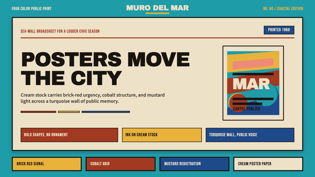 Cuban Malecón 1960 PosterPublic voice in flat ink. Turquoise wall, cream stock, brick red and cobalt b…平面油墨的公共之声:绿松石墙、奶油纸、砖红与钴蓝色条。
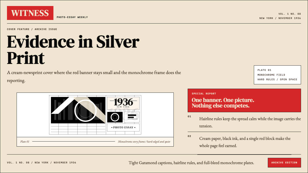 LIFE Magazine (Red-Banner)Photojournalism stripped bare. One red banner, cream newsprint, stark black p…摄影报道被剥到最简。红横幅、米色纸底与黑白版面。
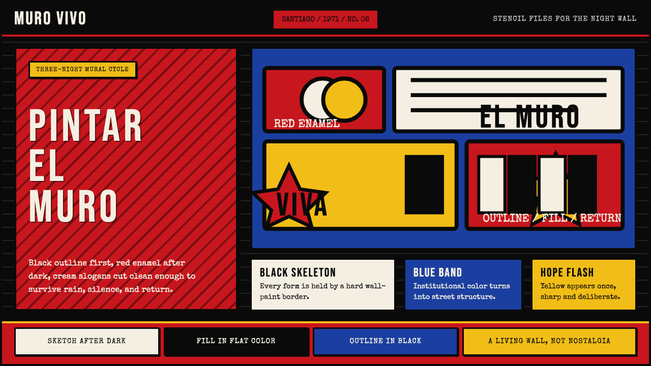 Chilean BRP Ramona Parra 1971Resistance stays alive. Blood red panels, black outlines, and stencil type re…抵抗仍在呼吸:血红墙面、粗黑轮廓与模板字重建街墙。
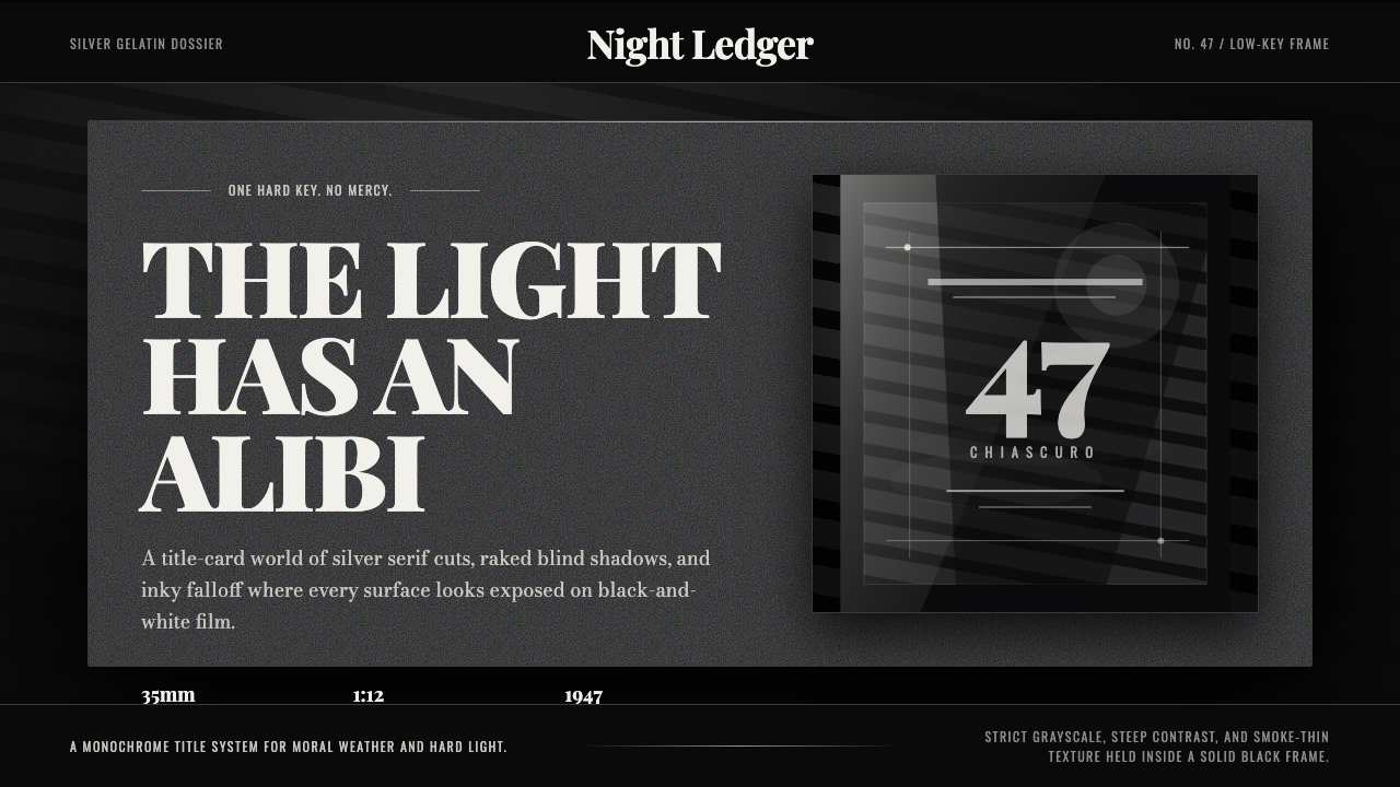 Film Noir ChiaroscuroLight is the crime. Silver serif cards, blind stripes, and grain carve drama…光就是罪证。银色衬线、百叶窗斜影与胶片颗粒从黑场刻出戏剧。
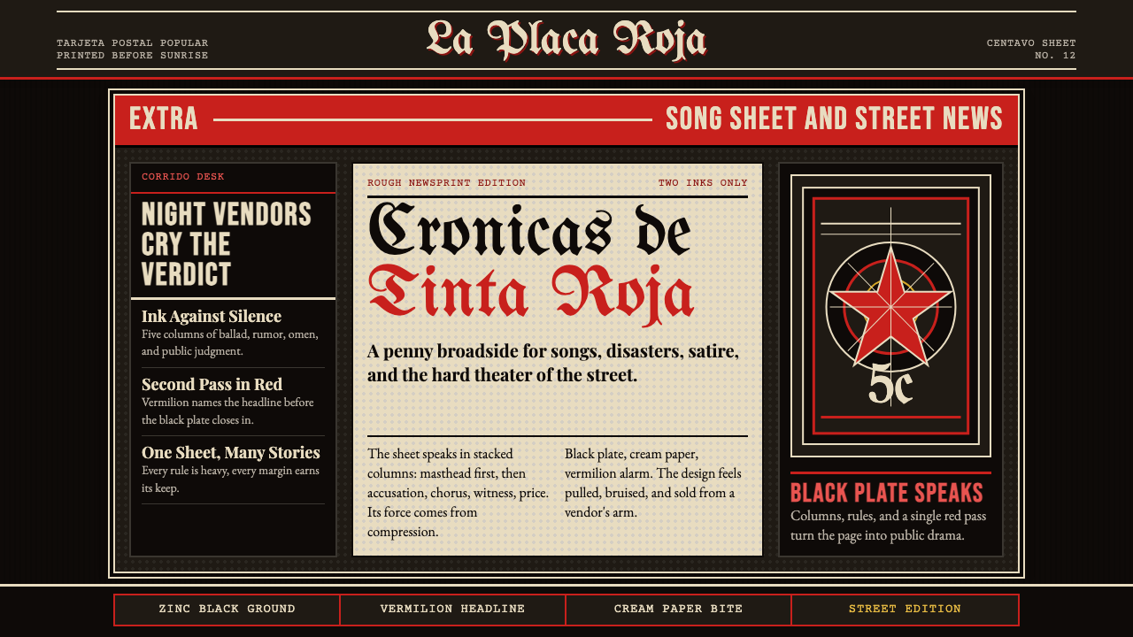 Mexican Tarjeta Postal (Posada Engraving 1900)Tabloid drama in two inks. Fraktur mastheads, vermilion rules, and cream news…双色小报式戏剧:哥特报头、朱红分隔线与粗粝新闻纸。
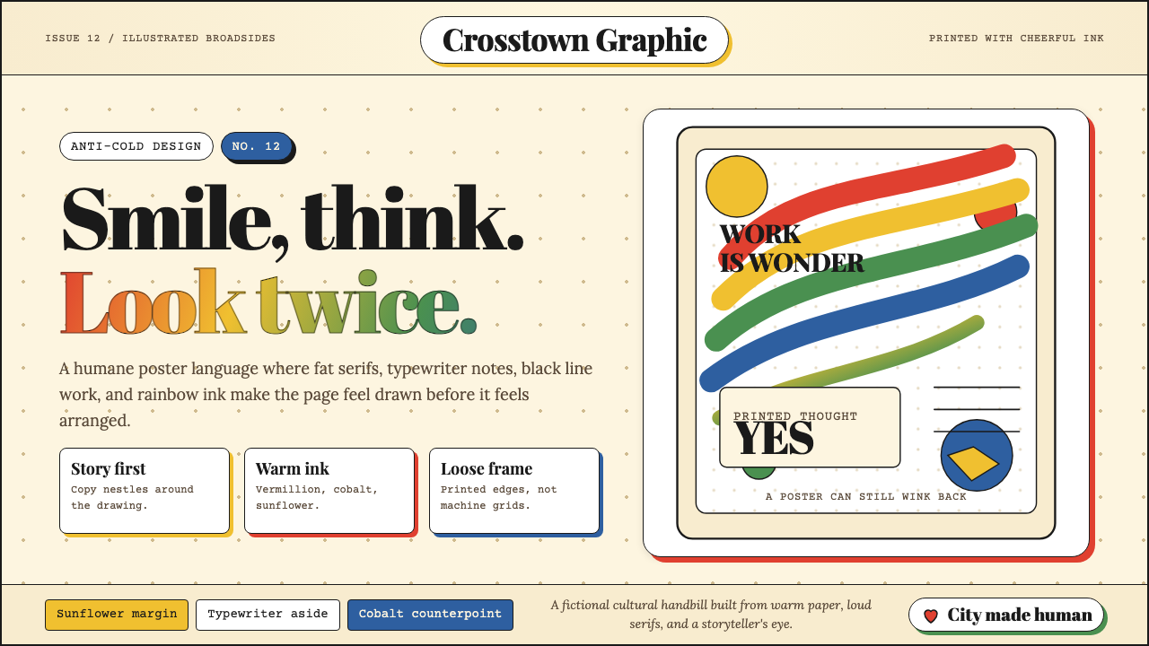 Milton Glaser / Push PinWarm counter-Swiss joy. Vermillion, cobalt and sunflower arcs orbit fat serif…温暖地反叛瑞士冷感:奶油纸上朱砂、钴蓝、向日葵弧线环绕粗衬线。