Design style guide设计风格指南
What is Cuban Malecón 1960 Poster?什么是 Cuban Malecón 1960 Poster?
From the workshops of revolutionary Havana, the Cuban poster movement of the 1960s proved that radical politics and radical beauty could share the same sheet of silkscreened paper.从革命哈瓦那的丝网印刷工坊里,1960年代的古巴海报运动证明了:激进的政治与激进的美,可以共享同一张海报纸。
Cuban Malecón 1960 Poster in briefCuban Malecón 1960 Poster 速览
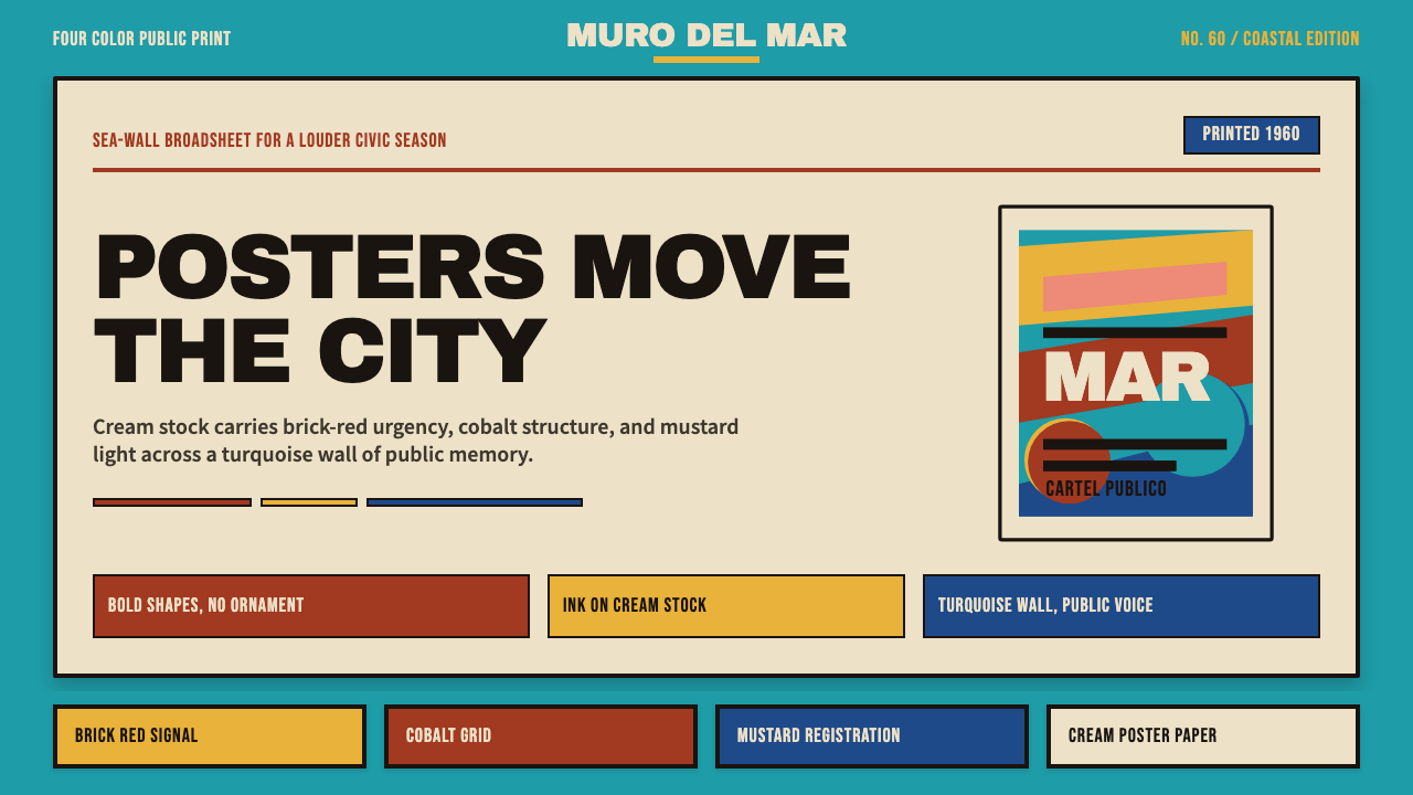
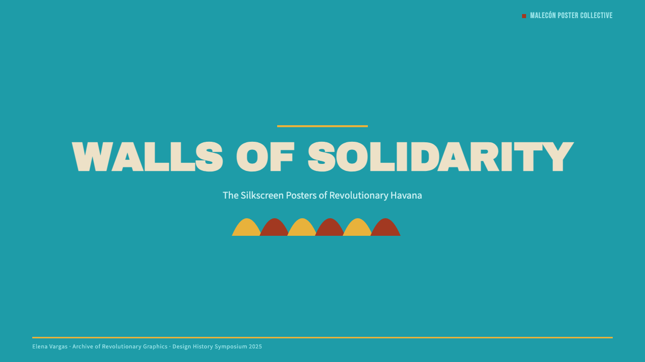
Cuban Malecón 1960 Poster is a graphic design style rooted in the silk-screened posters produced by Havana's revolutionary print workshops during the 1960s and early 1970s — considered the golden era of Cuban graphic design. The style is defined by bold flat shapes, handcrafted lettering, a palette centered on turquoise, brick red, cobalt blue, and cream, and a pictorial economy that reduces complex ideas to essential silhouettes.古巴马雷贡1960海报风格,根植于1960至70年代初哈瓦那革命印刷工坊所产出的丝网海报——那是古巴平面设计的黄金时代。这种风格以大胆的平面色块、手工刻制的字体、以绿松石色、砖红、钴蓝与奶油色为核心的色板,以及将复杂思想提炼为本质剪影的图像经济为标志。
What makes this style distinctive is the productive constraint that gave birth to it. Working with four-color silkscreen on cream poster stock, designers had to solve every communicative challenge through flat ink and decisive form. The result was a visual language in which a single angled stripe, a boldly blocked face, or a stark typographic slogan could carry the weight of an entire political argument. Decoration for its own sake was never an option — the press run would not allow it.这种风格最独特之处,在于催生它的那种富有成效的约束。设计师们在奶油色海报纸上以四色丝网印刷作业,必须通过平面油墨和果断的造型解决所有传达难题。结果是一套视觉语言:一道倾斜的色条、一张大胆色块化的面孔、或一句简洁的排印口号,都能承载整个政治论点的重量。纯装饰性的元素从来不是选项——印刷条件不允许。
Today the style reads as optimistic, confrontational, and graphic in the truest sense: images that communicate before the viewer consciously reads them. Its vocabulary — the sea-wall turquoise, the layered flat bars of color, the confident sans lettering — carries an emotional charge that transcends its political origins and speaks to any context where boldness and clarity are primary virtues.今天这种风格读来乐观、对抗性十足,且具有最真实意义上的图形性:图像在观者有意识地阅读之前就已完成传达。它的视觉词汇——海堤般的绿松石色、层叠的平面色条、自信的无衬线字体——承载的情感能量已超越其政治起源,向任何以大胆与清晰为首要美德的场景发言。
See the Cuban Malecón 1960 Poster design system →查看 Cuban Malecón 1960 Poster 完整设计系统 →
Where does Cuban Malecón 1960 Poster come from?Cuban Malecón 1960 Poster 从何而来?
The visual movement now called Cuban poster art was born from a specific institutional moment: the founding of ICAIC (Instituto Cubano del Arte e Industria Cinematográficos) in 1959, the year of the Cuban Revolution's triumph. ICAIC's mandate was to produce film posters for revolutionary Cuba's cinema programme, and its directors — uncommonly — gave their designers almost total creative latitude. Rather than commissioning conventional illustrative film art, they invited designers to interpret each film as a graphic problem. The results were revolutionary in both senses of the word.如今被称为古巴海报艺术的这场视觉运动,诞生于一个具体的机构时刻:1959年ICAIC(古巴电影艺术与工业学院)的创立,那正是古巴革命胜利之年。ICAIC的使命是为革命古巴的电影项目制作宣传海报,而其领导者出人意料地给予设计师几乎完全的创作自由。他们没有委托传统的插图式电影美术,而是邀请设计师将每部影片作为一个图形问题来解决。结果在两重意义上都是革命性的。
A second workshop, OSPAAAL (Organization of Solidarity with the Peoples of Africa, Asia and Latin America), took the poster form global. Founded in 1966, OSPAAAL produced its Tricontinental solidarity posters — printed in Havana and mailed internationally in multiple languages — to support liberation movements across three continents. These posters, which went directly to foreign recipients in folded form, had to communicate across language barriers and cultural contexts, which forced the designers toward an even more universal visual grammar: flat shapes that needed no caption, color contrasts that announced themselves from across a room.另一个工作坊OSPAAAL(非洲、亚洲和拉丁美洲人民团结组织)则将海报形式推向了全球。成立于1966年的OSPAAAL制作了其“三大洲团结海报”——在哈瓦那印刷,以多种语言邮寄至世界各地——以支持三大洲的解放运动。这些以折叠形式直接寄达海外受众的海报,必须跨越语言障碍和文化背景进行传达,这迫使设计师走向更为普世的视觉语法:无需说明文字的平面形状,从房间另一端就能宣告自身的色彩对比。
The material conditions of Cuban printing shaped the aesthetic in ways that became inseparable from the style's identity. Cuba's economic situation after the Revolution, and particularly after the United States trade embargo tightened in the early 1960s, meant that foreign printing supplies were scarce. Designers worked with whatever inks and stocks were available, and the characteristic cream ground of Cuban posters was often simply the natural color of the available paper. The constraint of working with four or five flat colors pushed designers toward solutions that would look weak in any other system but became, under those conditions, a distinctive signature.古巴印刷的物质条件以一种与风格身份密不可分的方式塑造了美学。革命后古巴的经济状况,尤其是1960年代初美国贸易禁运收紧后,外国印刷物资极度匮乏。设计师们使用一切可得的油墨和纸张,古巴海报特有的奶油底色往往只是可用纸张的天然颜色。在四五种平面色的约束下工作,推动设计师走向那些在任何其他体系中都可能显得软弱、但在此条件下成为独特签名的解决方案。
The style flourished between approximately 1960 and 1973, with the most internationally recognized work concentrated in that first decade. As printing technology changed and political conditions in Cuba shifted through the 1970s, the workshop output became more conventional. But the posters of the peak years — collected, exhibited, and studied worldwide — established a graphic vocabulary that has proved as durable as any modernist movement of the twentieth century.这种风格大约在1960至1973年间达到巅峰,最具国际影响力的作品集中于最初的十年。随着印刷技术的变化和1970年代古巴政治条件的转变,工坊的产出逐渐趋于常规。但鼎盛年间的那些海报——被全球收藏、展览与研究——建立了一套图形词汇,其持久性足以比肩二十世纪任何现代主义运动。
What defines the Cuban Malecón 1960 Poster look?Cuban Malecón 1960 Poster 的视觉特征是什么?
Color色彩
The palette draws from the physical world of Havana itself: the turquoise of the Malecón sea wall, the brick red of aging colonial facades, the cobalt blue of the Caribbean sky, and the warm cream of the poster stock. These four hues rarely appear together at full force — typically, one or two dominate and the others provide sharp punctuation. Mustard yellow and warm black enter as secondary elements. Every color is flat, unshaded, and fully saturated, applied as solid fields that abut cleanly at hard edges. The overall effect is sun-drenched and immediate, more like a Caribbean afternoon than a European printshop.色板直接取材于哈瓦那的物质世界:马雷贡海堤的绿松石色、老旧殖民建筑立面的砖红色、加勒比天空的钴蓝色,以及海报纸的温暖奶油色。这四种色调很少同时全力出场——通常一种或两种主导全局,其余提供尖锐的点缀。芥末黄和暖黑作为次要元素加入。每种颜色都是平面的、无阴影的、充分饱和的,以硬边整洁接合的实色块形式铺陈。整体效果阳光充沛而直接,更像加勒比的午后,而非欧洲印刷工坊。
Flat Silhouette and Shape平面剪影与形状
Every figure, object, and motif is reduced to its most recognizable flat silhouette. The human face becomes a mask of two or three tones; a rifle becomes a stark angular form; a dove becomes a simple white wing shape against a dark ground. This radical reduction was partly a practical response to silkscreen's limitations and partly an aesthetic conviction: the essential form communicates more forcefully than the detailed rendering. Overlapping flat shapes create depth without illusion, and the interaction between those shapes — positive against negative, light against dark — does the compositional work that tonal modeling does in naturalistic traditions.每个人物、物体和母题都被简化为最具辨识度的平面剪影。人脸变成两三个色调的面具;步枪变成刚硬的角状形态;鸽子变成深色底面上简洁的白色翅膀形状。这种激进的简化,一半是对丝网印刷局限性的实践回应,一半是美学信念:本质形态的传达力比详细描绘更为强劲。叠压的平面形状制造深度而不制造幻觉,这些形状之间的互动——正形对负形、明对暗——完成了自然主义传统中靠色调塑造来完成的构图工作。
Typography and Lettering字体排印与手工刻字
Cuban poster typography exists on a spectrum from hand-cut lettering to bold geometric sans-serifs. The hand-cut tradition — where the designer carved letters directly into the silkscreen stencil — produced letterforms with a slightly irregular, organic energy that distinguishes Cuban work from the colder precision of European modernism. When mechanical typefaces are used, they tend toward the blocky and compressed, set at large scale to anchor the composition rather than to deliver information in the conventional reading sense. Text in this system is a visual object first and a linguistic message second.古巴海报的字体排印,从手工刻制字体到粗犷的几何无衬线字体,跨越一个宽广的谱系。手工刻制传统——设计师直接在丝网模板上雕刻字母——产生了略带不规则、有机能量的字形,这使古巴作品区别于欧洲现代主义的冷峻精确。当使用机械字体时,它们倾向于方块状和紧缩形,以大尺度铺陈来锚定构图,而非以传统阅读意义上的方式传递信息。在这个体系中,文字首先是视觉对象,其次才是语言信息。
Diagonal Composition对角线构图
Where European modernist posters often favored strict horizontal-vertical grids, Cuban posters embrace the diagonal as a primary compositional tool. Angled bars of color, figures leaning into the picture plane, text set at an oblique angle — all of these devices introduce movement and urgency into what would otherwise be a static rectangular field. The diagonal implies forward momentum, which suited the revolutionary subject matter and distinguished Cuban work from the more authoritative, frontal quality of Soviet-influenced design.欧洲现代主义海报常偏好严格的水平-垂直网格,古巴海报则将对角线作为主要的构图工具。倾斜的色条、向画面平面倾身的人物、以斜角排列的文字——所有这些手法在本来静态的矩形画面中引入了运动感与紧迫感。对角线暗示前进的动力,这与革命题材契合,也使古巴作品区别于受苏联影响的设计那种更具权威感、更正面的气质。
Political Optimism in Composition构图中的政治乐观主义
Despite — or perhaps because of — the difficult circumstances of their production, Cuban posters are visually optimistic. Compositions open upward: figures reach, gaze, or stride toward the upper portion of the frame. Color choices lean warm and energetic rather than somber. Even when subject matter is solemn — commemorating a fallen revolutionary, protesting an atrocity — the graphic treatment tends toward bold affirmation rather than mourning. This upward-reaching quality is a specific cultural and political inflection that separates Cuban poster work from the angrier visual traditions of protest art in other national contexts.尽管——或许正因为——其生产条件的艰难,古巴海报在视觉上是乐观的。构图向上敞开:人物向画面上方伸展、凝视或迈步。色彩选择倾向温暖而充满能量,而非阴郁。即使题材庄严——纪念牺牲的革命者,抗议某一暴行——图形处理也倾向于大胆的肯定而非哀悼。这种向上的品质是一种特定的文化与政治语调,使古巴海报作品区别于其他国家背景下的愤怒抗议艺术传统。
International Solidarity Vocabulary国际团结的视觉词汇
OSPAAAL's output in particular developed a set of recurring visual symbols that functioned as an international solidarity language: the clenched fist, the map silhouette, the rifle carried upright, the dove transformed into geometric abstraction. These symbols were chosen for their legibility across cultures — a fist means resistance whether you read Spanish, Arabic, or Vietnamese. The Cuban poster tradition thus developed both a local aesthetic and a genuinely transnational symbol set, which is part of why the imagery feels simultaneously rooted and universal.OSPAAAL的产出尤其发展出一套作为国际团结语言的反复出现的视觉符号:握紧的拳头、地图剪影、垂直举起的步枪、被几何抽象化的鸽子。这些符号因其跨文化可读性而被选择——拳头意味着抵抗,无论你读西班牙语、阿拉伯语还是越南语。古巴海报传统因此同时发展出一种地域美学和一套真正跨国的符号集,这也是为什么这些图像既感觉有根、又感觉普世。
Handmade Energy手工能量
Even when Cuban posters are geometrically ambitious, they retain a handmade quality that digital reproduction or offset printing would have smoothed away. Slight variations in ink density, the slight irregularity of a stencil edge, the warmth of cream paper visible through a transparent color layer — all of these small imperfections are part of the visual language. When applying this style digitally, the challenge is to preserve that organic energy without resorting to artificial texture overlays, by making deliberate rather than mechanical decisions about form.即使古巴海报在几何上雄心勃勃,它们仍保留着一种手工质感,这是数字复制或胶版印刷会抹平的东西。油墨密度的细微变化、模板边缘的轻微不规则、透明色层下可见的奶油纸温度——所有这些小小的不完美都是视觉语言的组成部分。以数字方式应用这种风格时,挑战在于保留这种有机能量,而不借助人工纹理叠加,而是通过对形态做出深思熟虑而非机械性的决定来实现。
See the Cuban Malecón 1960 Poster design system →查看 Cuban Malecón 1960 Poster 完整设计系统 →
Who shaped Cuban Malecón 1960 Poster?谁塑造了 Cuban Malecón 1960 Poster?
Rostgaard is among the most internationally recognized of the Cuban poster designers, producing work for both ICAIC and OSPAAAL that balanced visual immediacy with conceptual sophistication. His posters for film and solidarity campaigns are distinguished by a compositional boldness that simplified without reducing — a figure could be rendered in three flat tones and still carry extraordinary psychological presence. His work helped establish the specific emotional register of Cuban poster art: urgent without being shrill, political without being didactic.罗斯特加德是国际上最广为人知的古巴海报设计师之一,为ICAIC和OSPAAAL创作了大量兼顾视觉直接性与概念深度的作品。他为电影和团结运动所作的海报以构图的大胆著称,简化而不削减——一个人物可以用三个平面色调呈现,仍然具有非凡的心理存在感。他的作品帮助确立了古巴海报艺术特有的情感基调:紧迫而不尖锐,政治而不说教。
Beltrán brought a strongly geometric sensibility to Cuban poster design, working with a precision that sometimes distinguished his work from the more organic tendency of his peers. Having studied in New York and absorbed influences from Swiss International Style and American modernism, he synthesized those traditions with the flat-color, high-contrast imperatives of Cuban silkscreen. His work on cultural and political posters demonstrated that the Cuban poster vocabulary was not a single fixed style but a set of shared constraints within which individual voices could develop distinct approaches.贝尔特兰为古巴海报设计带来了强烈的几何感性,以一种精确性使他的作品与同辈更具有机倾向的风格相区别。曾在纽约求学并吸收瑞士国际主义风格和美国现代主义影响的他,将这些传统与古巴丝网印刷的平面色、高对比度要求综合在一起。他在文化与政治海报上的作品证明,古巴海报词汇不是单一固定的风格,而是一套共享约束,个体声音可在其中发展出各自不同的表达。
Muñoz Bachs was the preeminent designer of ICAIC film posters through much of the golden era, producing work of remarkable range — from playful and vernacular for children's films to dramatically austere for political cinema. Where many Cuban poster designers leaned toward the monumental, Muñoz Bachs was equally comfortable with wit and lightness, producing compositions that could be charming without sacrificing graphic conviction. His prolific output across more than a decade established the ICAIC film poster as a cultural artifact in its own right, separate from the films it advertised.穆尼奥斯·巴赫斯是黄金时代大部分时期ICAIC电影海报的首席设计师,创作了风格跨度极大的作品——从儿童电影的玩趣与世俗,到政治电影的戏剧性简峻。许多古巴海报设计师倾向于纪念碑式风格,而穆尼奥斯·巴赫斯则同样擅长机智与轻盈,创作出既迷人又不失图形信念的构图。他超过十年的丰富产出,使ICAIC电影海报成为独立于其所宣传影片之外的文化产物。
Martínez occupied a unique position in Cuban graphic culture as a painter who moved fluidly between fine art and applied design. His poster work drew on the visual logic of pop art — repeated imagery, serial portraiture, flat photographic tone — and fused it with the urgency of the Cuban political context. His iconic images of Che Guevara, composed from repeated photographic silhouettes in multiple colors, proposed an alternative to the heroic-realist portrait tradition and anticipated, or paralleled, Andy Warhol's celebrity serializations by connecting them to a specifically revolutionary iconography.马丁内斯在古巴图形文化中占据独特地位,作为一位在纯艺术与应用设计之间自由穿梭的画家。他的海报作品借鉴了波普艺术的视觉逻辑——重复图像、系列肖像、平面摄影色调——并将其与古巴政治语境的紧迫性融合在一起。他以多色重复摄影剪影构成的切·格瓦拉标志性图像,提出了一种对英雄现实主义肖像传统的替代,并与安迪·沃霍尔的名人序列化形成对照或并行,同时将其与特定的革命图像学相连接。
The Tricontinental solidarity posters produced by OSPAAAL between 1966 and the late 1970s were rarely attributed to individual designers in the Western sense — they were workshop products, the result of collective practice within an institutional framework. This anonymity is itself significant: it reflects a political commitment to collective authorship that stood in deliberate contrast to the signature-driven culture of Western commercial design. The OSPAAAL posters are among the most widely distributed works of graphic design in history, mailed to subscribers in dozens of countries and collected by museums on every continent.OSPAAAL在1966至1970年代末间制作的三大洲团结海报,在西方意义上极少归属于个人设计师——它们是工坊产品,是机构框架内集体实践的成果。这种匿名性本身具有意义:它反映了一种对集体作者身份的政治承诺,有意与西方商业设计的签名文化形成对比。OSPAAAL海报是历史上发行最广泛的平面设计作品之一,被邮寄给数十个国家的订阅者,并被各大洲的博物馆收藏。
How do you use Cuban Malecón 1960 Poster today?今天怎么用 Cuban Malecón 1960 Poster?
The Cuban Malecón 1960 Poster style translates with particular power to contexts where the goal is immediate visual impact combined with a sense of cultural seriousness. Understanding what the system is doing — using flat saturated color to create hierarchy, using silhouette to communicate before the viewer reads a word, using diagonal movement to suggest forward momentum — is more important than copying individual stylistic gestures.古巴马雷贡1960海报风格在追求即时视觉冲击与文化庄重感兼具的场景中,具有特别强劲的表现力。理解这个体系在做什么——用平面饱和色创造层级,用剪影在观者阅读任何文字之前就完成传达,用对角线运动暗示向前的动力——比复制个别风格手势更为重要。
For presentation slides, the style works best on covers and section-opening spreads. A cover built in this idiom might feature a bold cropped silhouette in turquoise or brick red against a cream ground, with the title set in heavy compressed lettering at a large scale that reads as a visual element before it reads as text. Content slides should avoid trying to replicate the poster's visual density — instead, take the palette's economy: one dominant color per slide, flat bars used as section markers rather than decorative flourishes, and generous white or cream space that lets each element breathe. Data visualizations gain character when bar charts and ring charts are treated as flat geometric objects in the poster palette, without gradients or shadow.在演示文稿中,这种风格最适合封面和章节开篇。以这种语言建构的封面,可以在奶油底面上呈现一个大胆裁切的绿松石或砖红剪影,标题以粗重紧缩的字体大尺度铺陈,先作为视觉元素被读到,然后才作为文字被读到。内容页应避免试图复制海报的视觉密度——转而借鉴色板的节俭:每张幻灯片一种主导色,平面色条用作段落标记而非装饰点缀,充裕的白色或奶油色留白让每个元素得以呼吸。当柱状图和环形图被当作海报色板中的平面几何对象处理时,无需渐变或阴影,数据可视化便获得了独特的气质。
For web interfaces and dashboards, the style's flat-color discipline and strong tonal contrast provide excellent scaffolding for information hierarchy. Navigation and primary actions can take the brick red or cobalt blue that signals urgency or action; neutral surfaces work in cream or near-white; interactive elements get the saturated palette while static text stays in warm black. The approach works particularly well for mission-driven organizations, cultural institutions, social platforms, or any product where the design needs to communicate conviction as well as information.对于网页界面和仪表板,这种风格的平面色纪律与强烈的色调对比为信息层级提供了出色的骨架。导航和主要操作可取砖红或钴蓝,传达紧迫或行动信号;中性表面用奶油色或近白色;交互元素获得饱和色板,而静态文字保持在暖黑色调。这种处理对使命驱动型组织、文化机构、社交平台,或任何设计需要同时传达信念与信息的产品尤为有效。
In editorial and marketing contexts, the poster idiom's boldness suits campaign materials, event graphics, and any situation where the design needs to compete for attention in a visually crowded environment. Full-bleed section openers with a single large silhouette and minimal text, color-blocked layouts that alternate between turquoise-and-cream and brick-red-and-black, and typographic treatments that use scale contrast as the primary hierarchy device all draw directly from the source tradition. The style is equally applicable to printed materials, social media graphics, and digital editorial layouts, since flat color and hard-edge shapes reproduce reliably across media.在编辑和营销场景中,海报语言的大胆适合活动宣传材料、事件图形,以及任何设计需要在视觉拥挤的环境中争夺注意力的情形。满版单一大剪影配极简文字的章节开篇、在绿松石-奶油与砖红-黑之间交替的色块布局、以尺度对比作为主要层级手段的排印处理——这些都直接取材于原始传统。由于平面色和硬边形状在不同媒介上都能可靠再现,这种风格同样适用于印刷材料、社交媒体图形和数字编辑版式。
A common mistake is treating the palette as interchangeable — using the turquoise, red, cobalt, and mustard simultaneously and at equal weight, resulting in visual noise rather than the composed urgency of the original work. In authentic Cuban poster design, compositions are typically dominated by one or two colors, with the others appearing as sharp accents or informational punctuation. Similarly, softening the style by adding gradients, drop shadows, or rounded corners undermines its core logic. The style's power comes from commitment: flat is flat, the edge is where it is, and the color does not fade.一个常见的错误,是将色板视为可互换的——同时以等量分量使用绿松石、红色、钴蓝和芥末黄,结果产生的是视觉噪音而非原作品那种沉稳的紧迫感。在真实的古巴海报设计中,构图通常由一种或两种色彩主导,其余作为尖锐的点缀或信息性标点出现。同样,通过加入渐变、投影阴影或圆角来柔化风格,会破坏其核心逻辑。这种风格的力量来自承诺:平面就是平面,边缘就在它所在的地方,色彩不会消退。
See the Cuban Malecón 1960 Poster design system →查看 Cuban Malecón 1960 Poster 完整设计系统 →
Cuban Malecón 1960 Poster — FAQCuban Malecón 1960 Poster · 常见问题
How does Cuban poster style differ from Soviet Constructivism, which it superficially resembles?古巴海报风格与表面上相似的苏联构成主义有何不同?
The resemblance is real but the differences are significant. Soviet Constructivism (1920s) was primarily concerned with geometry as a rational, machine-age value — forms derived from industrial process, type treated as engineered information. Cuban poster art inherited that geometry but inflected it with a warmer, more humanist sensibility: figures are present and emotionally specific, the palette includes the warmth of tropical color, and the diagonal movement gives compositions an urgency that Constructivism's more architectonic layouts rarely achieved. Cuban work is also more painterly in its surface — the handmade quality of silkscreen is embraced rather than overcome. Think of Constructivism as the engineering drawing and Cuban poster as the mural.相似是真实的,但差异同样显著。苏联构成主义(1920年代)主要关注几何作为理性的、机器时代价值的体现——形态源自工业过程,字体被当作工程化信息处理。古巴海报艺术继承了那种几何,但以更温暖、更具人文主义的感性加以变调:人物在场且情感具体,色板包含热带色彩的温度,对角线运动赋予构图一种紧迫感,这是构成主义更具建筑性的版面布局很少达到的。古巴作品在表面上也更具绘画性——丝网印刷的手工质感是被拥抱而非被克服的。可以把构成主义想象成工程图纸,把古巴海报想象成壁画。
Can this style work for commercial or non-political brands without feeling like appropriation?这种风格能用于商业或非政治品牌而不显得像是文化挪用吗?
Yes, with a clear-eyed understanding of what you are borrowing. The Cuban poster style is a formal visual language — flat color, silhouette, diagonal composition, bold typography — and those formal properties are separable from the political content of the original work. What you are borrowing is the graphic logic, not the political ideology. That said, the style carries strong cultural associations that will register with culturally aware audiences. Using it for contexts that have some genuine affinity with its values — collective action, cultural confidence, anti-corporate aesthetics, public communication — feels more coherent than applying it to, say, luxury goods or private financial products, where the tonal mismatch would undermine the design's credibility.可以,但需要清醒地理解你在借用什么。古巴海报风格是一套形式视觉语言——平面色彩、剪影、对角线构图、大胆排印——这些形式特性与原作品的政治内容是可分离的。你借用的是图形逻辑,而非政治意识形态。话虽如此,这种风格承载着强烈的文化联想,文化敏感的受众会感知到。将其用于与其价值观有某种真实亲和力的场景——集体行动、文化自信、反企业美学、公共传播——比将其应用于奢侈品或私人金融产品更具连贯性;在后者中,语调上的不匹配会削弱设计的可信度。
How should photography be handled within this style?在这种风格中应该如何处理摄影图像?
Cuban poster art of the 1960s was primarily hand-drawn and silkscreened, so photography was not a native element of the style. When photography is used in contemporary applications of this aesthetic, the approach should push images toward flatness: high-contrast duotone treatment in two of the palette's colors, aggressive silhouetting against a flat ground, or combining photography with flat color overlays that reduce the image to near-silhouette. The goal is to make photography behave like the style's other elements — flat, decisive, and defined by edge rather than tonal gradation. Full-color naturalistic photographs sitting beside flat graphic elements will produce a tonal mismatch that reads as stylistic incoherence.1960年代的古巴海报艺术主要是手绘和丝网印刷的,因此摄影并非这种风格的原生元素。当摄影在这种美学的当代应用中被使用时,应当将图像推向平面化:以色板中两种颜色的高对比度双色调处理、在平面底色上的激进剪影处理,或将摄影与平面色彩叠加结合、将图像简化至接近剪影的状态。目标是让摄影表现得像风格的其他元素——平面、果断、以边缘而非色调渐变来定义。全彩自然主义照片与平面图形元素并置,会产生色调上的不匹配,读来像是风格上的不连贯。
Is this style appropriate for dark-background layouts?这种风格适合深色背景的版面吗?
Dark-ground versions of Cuban poster design do exist historically — some OSPAAAL posters used black or very deep color as a ground — and they work well when handled with discipline. The key shift when inverting to a dark ground is that the cream or warm white that normally anchors the palette must be replaced by a light value from within the palette itself, typically a pale turquoise or warm off-white. The turquoise and cobalt hues tend to lose their distinctiveness against very dark grounds unless their relative values are carefully managed. The style's power on dark grounds is at its greatest when a single bright element — a cream silhouette, a brick-red bar — is isolated against black, rather than trying to maintain all four palette colors simultaneously.深色底面的古巴海报设计历史上确实存在——一些OSPAAAL海报使用黑色或极深的颜色作为底色——处理得当时效果很好。反转至深色底面的关键变化是:通常锚定色板的奶油色或暖白色,必须被色板内部的浅色调替代,通常是浅绿松石色或温暖的近白色。绿松石和钴蓝色在极深底色上容易失去相互之间的可辨性,除非对它们的相对明度进行仔细管理。这种风格在深色底面上的力量,在单一明亮元素——奶油色剪影、砖红色条——被孤立于黑色背景前时最为强大,而非试图同时维持所有四种色板颜色。
What distinguishes authentic applications of this style from pastiche?真实应用这种风格与风格模仿之间的区别在哪里?
Authentic application means understanding the compositional logic rather than just sampling the visual elements. The Cuban poster tradition built its power through economy — one strong image, one strong idea, all other elements subordinated. Pastiche typically shows through overloading: too many colors at full saturation, too many graphic elements competing, textures applied to add vintage feel rather than emerged from process, or the palette applied to a layout that is fundamentally still organized by conventional Western commercial grid logic. The test is whether the composition would survive as a black-and-white silhouette — if the design's strength comes from its form rather than its color, it has absorbed the style's real lesson. If removing the color would reveal a conventional layout with Cuban colors sitting on top, it has not.真实的应用意味着理解构图逻辑,而非仅仅抽样视觉元素。古巴海报传统的力量建立在节俭之上——一个强有力的图像,一个强有力的想法,所有其他元素都从属于此。风格模仿通常通过过载而暴露:太多颜色同时以全饱和度出现,太多图形元素相互竞争,纹理被添加以制造复古感而非从过程中自然涌现,或色板被应用于一个根本上仍由传统西方商业网格逻辑组织的版面。测试方法是:这个构图以黑白剪影的形式是否依然成立——如果设计的力量来自其形态而非色彩,它就真正吸收了这种风格的核心课题。如果去除色彩后暴露出的是一个套着古巴颜色的传统版面,那就没有。
Related design styles相关设计风格
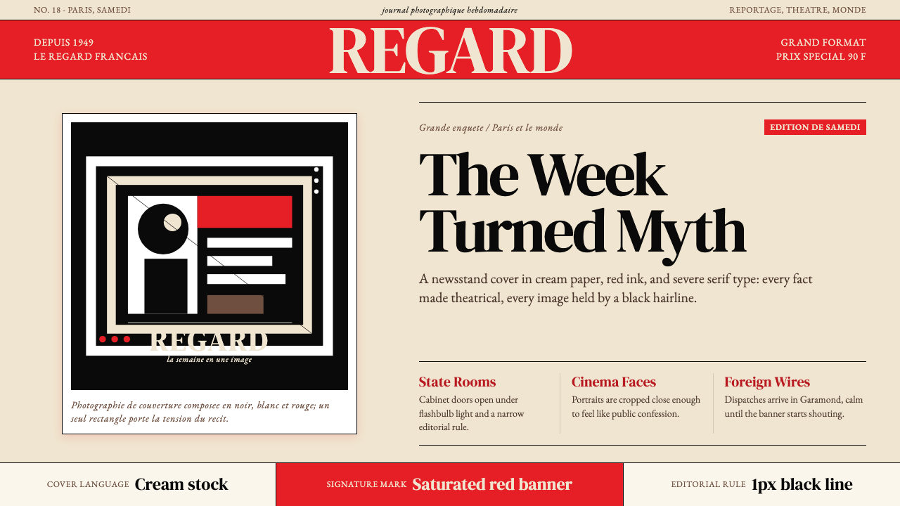 Paris MatchThe cover shouts in one red slab. Cream paper, serif headlines, and black rul…一块红色横幅在呐喊。奶油纸、衬线标题与黑色细线制造戏剧。
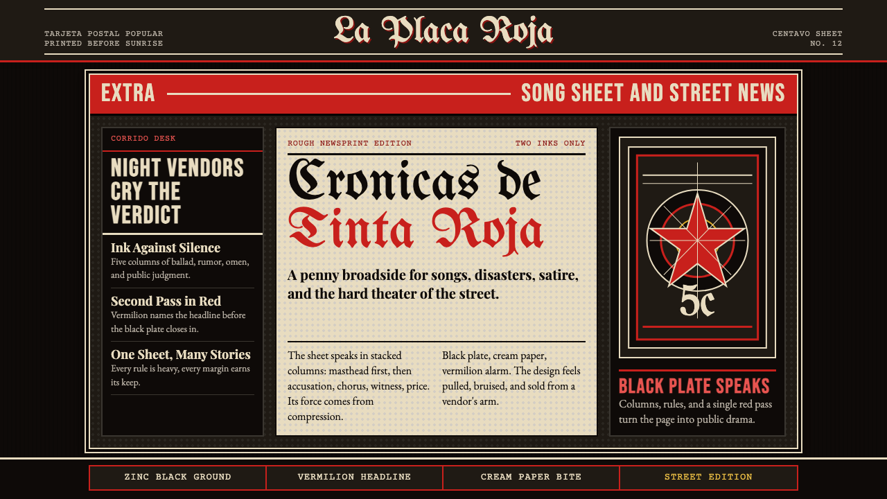 Mexican Tarjeta Postal (Posada Engraving 1900)Tabloid drama in two inks. Fraktur mastheads, vermilion rules, and cream news…双色小报式戏剧:哥特报头、朱红分隔线与粗粝新闻纸。
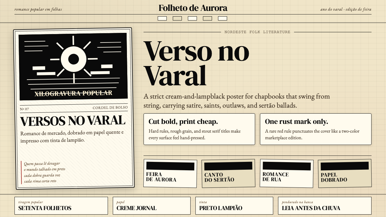 Brazilian Cordel (Northeast Folk Literature)Folk poetry, cut in lampblack. Cream newsprint, bordered chapbooks, one rust-…民间诗被灯黑刻出:奶油新闻纸、黑框小册与一笔锈红。
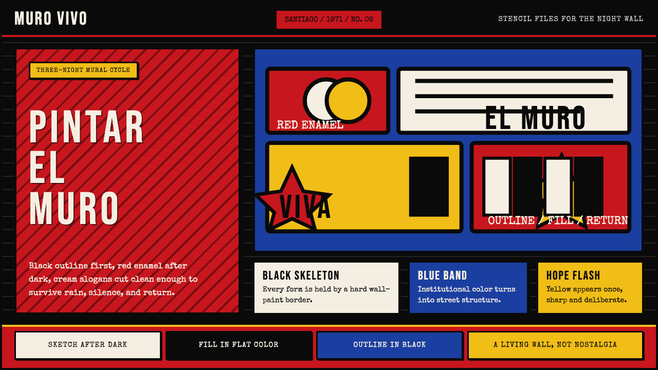 Chilean BRP Ramona Parra 1971Resistance stays alive. Blood red panels, black outlines, and stencil type re…抵抗仍在呼吸:血红墙面、粗黑轮廓与模板字重建街墙。
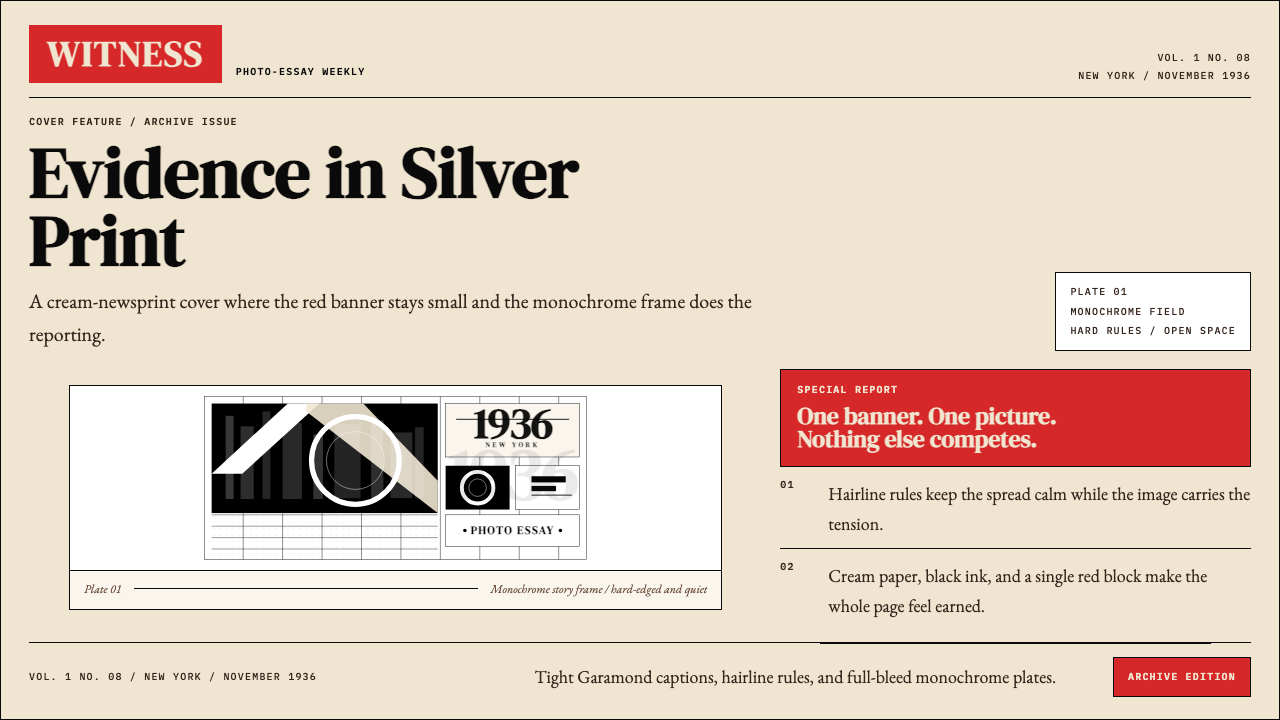 LIFE Magazine (Red-Banner)Photojournalism stripped bare. One red banner, cream newsprint, stark black p…摄影报道被剥到最简。红横幅、米色纸底与黑白版面。
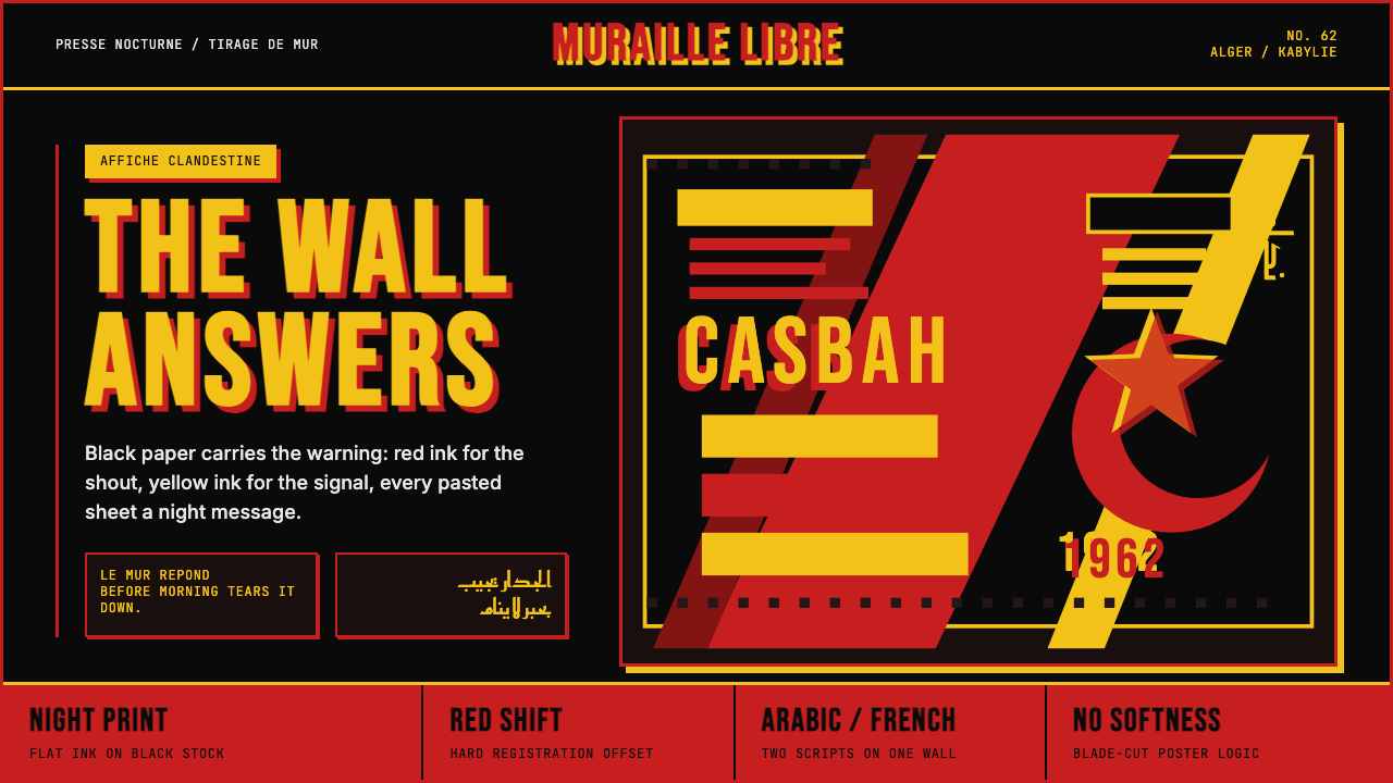 Algerian Casbah Poster (1954–1962)Every surface is a manifesto. Blood red, warning yellow, and stencil type hit…每个表面都是宣言:血红、警示黄与模板字撞上黑色新闻纸。