What is Puerto Rican Bomba & Plena?
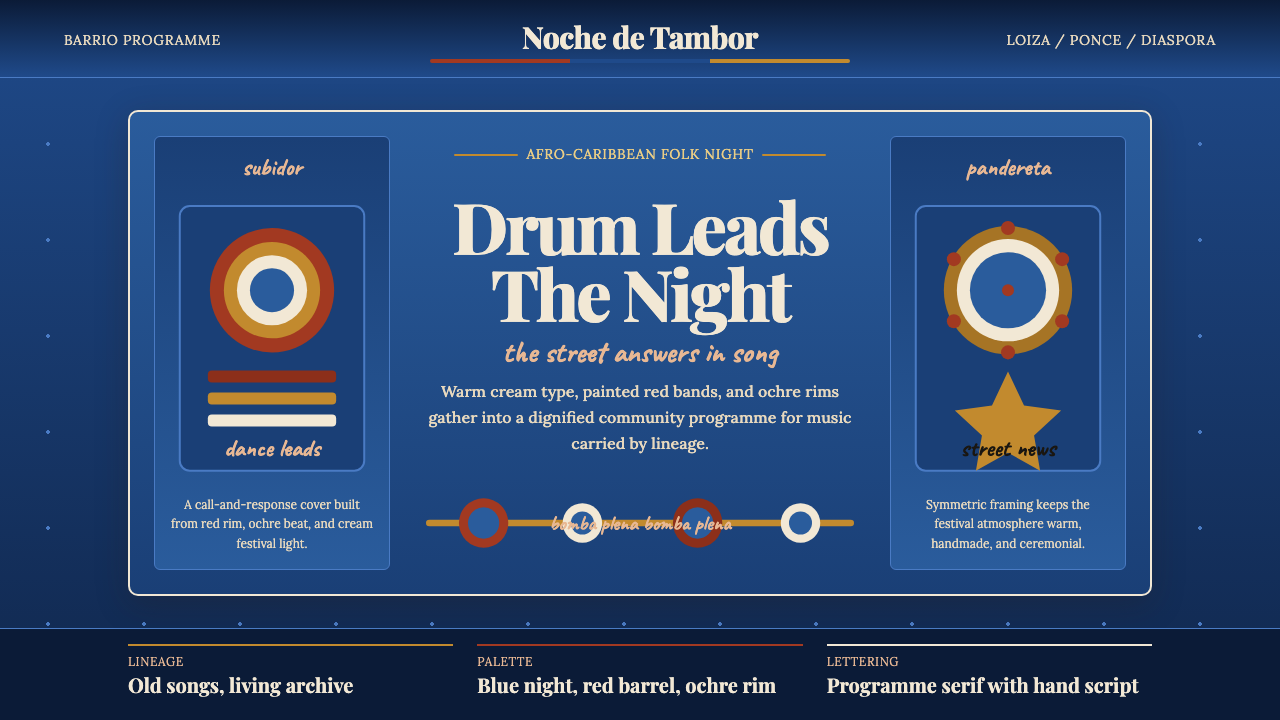
Bomba and plena carry four centuries of Afro-Puerto Rican defiance into every drum stroke — a visual world of blood-red barrels, tropical-night blue, and hand-lettered dignity.
Puerto Rican Bomba & Plena in brief
Puerto Rican Bomba and Plena design is a visual identity rooted in two of the island's oldest Afro-Caribbean musical traditions. Bomba is a drum-and-dance form whose call-and-response between dancer and percussionist dates to the 17th century; plena emerged around the early 1900s as a kind of sung street newspaper, carried on handheld frame drums called panderetas. Together they form a cultural continuum that the island's design vernacular has absorbed across festival posters, community murals, record sleeves, and ceremonial costumes.
The aesthetic is unmistakable: deep Caribbean-night blue as the dominant ground, accents of drum-red that echo the painted barrel drums central to bomba, and warm cream or ochre-gold type that reads like hand-lettering in lamplight. Ornament is not rejected here — it is celebrated, but it is always purposeful, drawn from the repertoire of the vejigante mask carver, the seamstress who constructs layered petticoat skirts, and the calligrapher who letters a barrio wall. The overall sensibility is dignified folk-programme: the graphic equivalent of a community gathering that is both sacred and joyful.
This design tradition sits at the intersection of African drumming culture, Spanish colonial folk arts, and the Caribbean diaspora experience. It does not belong to high-modernism or to any single commercial studio tradition; it grew from the streets of Loíza Aldea and Ponce and was carried into New York City by the Boricua diaspora, where it survived and evolved through a mid-century cultural revival that reclaimed bomba and plena as symbols of Puerto Rican identity rather than vestiges of the past.
Where does Puerto Rican Bomba & Plena come from?
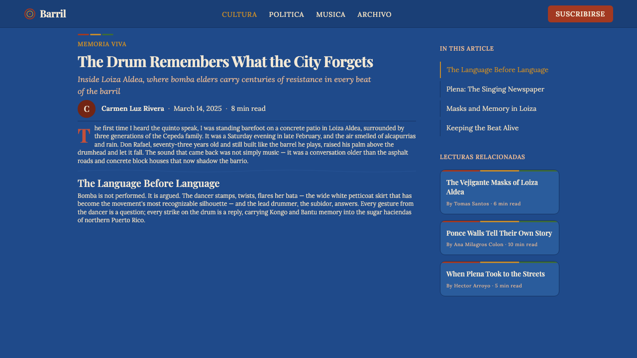
Bomba's roots lie in the enslaved African communities of Puerto Rico's sugar-growing coastal towns, particularly Loíza Aldea on the island's northeastern shore, which became the heartland of the tradition. The earliest documented gatherings in the 17th century were clandestine — spaces where enslaved people could maintain African rhythmic languages, social structures, and a form of embodied resistance. The barrel drum itself, the barril de bomba, was constructed from locally available materials: rum barrels, goat or cow skin, and whatever hardware could be sourced. The drums were painted, often in deep reds and earthy pigments, giving them a visual identity that became inseparable from the tradition.
Plena took a different path. Emerging in the Ponce neighborhood of La Joya del Castillo in the early 1900s, it is often attributed to the influence of John Clark, a Barbadian immigrant, and his partner Juana Díaz. Where bomba is drum-centered and ceremonial, plena is more portable and journalistic: a chorus with handheld panderetas narrating current events, scandals, disasters, and community life in the rhyming verse of the copla. Its graphic tradition flows from the handbills and printed verse sheets that circulated through Puerto Rican barrios, and from the hand-painted signage of popular fiestas.
The mid-20th century brought a crucial revival. Musicians like Rafael Cortijo and singer Ismael Rivera brought bomba and plena out of working-class neighborhoods and into mainstream Puerto Rican cultural consciousness, recording landmark albums in the 1950s and 1960s that gave the tradition a new, dignified public face. The Cepeda family — particularly Modesto Cepeda and his lineage — became custodians of bomba's authentic practice, running cultural schools and workshops in Santurce that kept the barrel-drum tradition alive through and beyond the revival. Tito Curet Alonso, one of Puerto Rico's most celebrated composers, wrote plenas and boleros that cemented these traditions in the island's popular imagination.
The visual identity of the tradition solidified during this revival period. Festival posters, record covers, and community cultural center graphics began to cohere around a shared palette — the tropical-night blue that evokes outdoor evening celebrations, the drum-red of the barriles, the cream type of the hand-lettered programme. Vejigante masks, particularly those from Loíza with their coconut-shell construction and multicolored horn-horns, and those from Ponce with their papier-mâché and brilliant contrasting colors, added a carnival dimension to the graphic vocabulary. By the time the diaspora carried these traditions to New York's South Bronx and East Harlem, the visual language had become a recognizable shorthand for Boricua cultural pride.
What defines the Puerto Rican Bomba & Plena look?
Color
The palette centers on three anchors: a deep tropical blue that reads like a Caribbean sky an hour after sunset, a drum-red derived from the painted barrels of bomba, and warm cream or ochre-gold used for type and ornamental detail. These three hold the composition together with the gravity of a festival banner. Secondary accents — a flash of coral, a burst of verdant green — appear only in carnival contexts such as vejigante mask reference, never as structural color. The overall key is dark and warm, evoking lamplight and community, never the cool neutrality of a corporate palette.
Typography
Type in this tradition carries the warmth of hand-lettering even when set in a digital typeface. High-contrast display serifs — letterforms with clear thick-thin stroke variation — are favored for headlines and titles, echoing the tradition of hand-painted festival signage. Body text is set generously, with open line spacing that allows the eye to rest, as if reading a printed programme by candlelight. Decorative initial capitals and small ornamental flourishes at section endings reference the folk-typography of the printed copla sheets that circulated bomba and plena lyrics.
Ornament and Pattern
Unlike modernist traditions that strip ornament away, this design system treats pattern and decoration as carriers of meaning. The vocabulary is specific: repeating diamond and chevron shapes drawn from the painted surfaces of the barril de bomba, floral motifs derived from the vejigante mask's coconut-shell petal construction, and symmetrical folk-medallion arrangements that echo the printed borders of traditional Puerto Rican devotional art. Ornament is always rhythmic — it has the pulse of a clave pattern — and it frames content rather than overwhelming it.
Texture and Surface
The style embraces the grain and imperfection of physical materials rather than the smooth flatness of pure digital design. A slight paper texture underlying type, the roughness of a woodblock-printed edge, the organic irregularity of a hand-stamped motif — these qualities signal authenticity and craft. This is not a nostalgic effect applied for decoration; it is a structural choice that recalls the physical origins of the tradition in community print shops and hand-lettered walls, and that distinguishes the aesthetic from slick corporate work.
Composition and Rhythm
Layouts in this tradition are organized like musical phrases rather than architectural grids. There is a strong vertical spine — derived from the upright posture of the barrel drummer — but the composition breathes outward from it asymmetrically, with type, ornament, and image in a conversation that mirrors the call-and-response structure of bomba itself. Negative space is generous but never empty; it holds the silence between drum strokes. Festival poster compositions often place the most important information at the center-upper zone, with ornamental borders containing and dignifying the whole.
Figuration and Costume
Human figures appear in this design tradition as silhouettes or stylized depictions in motion — the dancer's flared skirt mid-turn, the drummer's arms raised, the vejigante's mask-face forward. Costume detail is essential rather than decorative: the white layered petticoat skirt of the bomba dancer, the vejigante mask's horns, the pandereta held at a specific angle all carry cultural information. Figures are never generic; they reference specific roles within the tradition and would be recognized as such by anyone who participates in it.
Light and Atmosphere
The dominant atmosphere is that of a night festival: warm artificial light falling on faces, the glow of lanterns against a deeply saturated evening sky, the excitement and dignity of an outdoor communal gathering. This translates visually into a preference for warm foreground elements against cool, dark backgrounds — cream type glowing on night blue, red accents that seem to pulse like drumbeats. The effect is theatrical without being overwrought, ceremonial without being cold.
Who shaped Puerto Rican Bomba & Plena?
Modesto Cepeda is the patriarch of the Cepeda family, Puerto Rico's most celebrated bomba dynasty. The family has kept the tradition alive through decades of performance, teaching, and cultural advocacy in Santurce, San Juan. Modesto and his children and grandchildren have run cultural workshops that train new generations of bomba practitioners in both the musical and choreographic aspects of the tradition, ensuring that the barrel-drum form survives not as a museum piece but as a living community practice with its own visual and material culture.
Rafael Cortijo was the bandleader and percussionist who brought bomba and plena from the margins of Puerto Rican cultural life into the mainstream in the 1950s. His ensemble, with singer Ismael Rivera, produced recordings that introduced these traditions to audiences who associated them primarily with rural or lower-class culture, recasting them as sources of national pride. Cortijo's visual presentation — his band's stage dress, album cover design, and promotional photography — helped establish a dignified aesthetic for these traditions in popular media.
Ismael Rivera, known as 'El Sonero Mayor', was the voice that defined plena's modern sound. His collaborations with Cortijo produced some of the tradition's most enduring recordings, and his stage presence — the way he engaged audiences, his physical expressiveness, his command of clave and narrative phrasing — became a model for subsequent generations of plena singers. Rivera's persona, dressed and presented with a particular street-dignified elegance, contributed directly to the visual iconography of the tradition.
Tito Curet Alonso was Puerto Rico's most prolific composer in the Afro-Caribbean popular tradition, writing hundreds of songs for performers including Celia Cruz, Cheo Feliciano, and many others. His lyrics elevated bomba and plena subjects — community life, Afro-Puerto Rican identity, social critique — to a literary register that commanded respect. As a journalist and cultural figure in San Juan, he embodied the plena tradition's roots in popular journalism, and his cultural legacy continues to define what serious engagement with this tradition looks like.
Though not a single person, the vejigante mask-making tradition represents a collective authorship of the visual identity of Puerto Rican Carnival, particularly at Ponce and Loíza. Ponce's papier-mâché masks with their proliferating horns and brilliant contrasting colors, and Loíza's coconut-shell masks with their more contained petal-horns, each embody a different regional visual grammar. The artisans who maintain these traditions — families who pass mask-making techniques down through generations — are the visual designers of these festivals, and their work has directly shaped the ornamental vocabulary of Bomba and Plena-derived design.
How do you use Puerto Rican Bomba & Plena today?
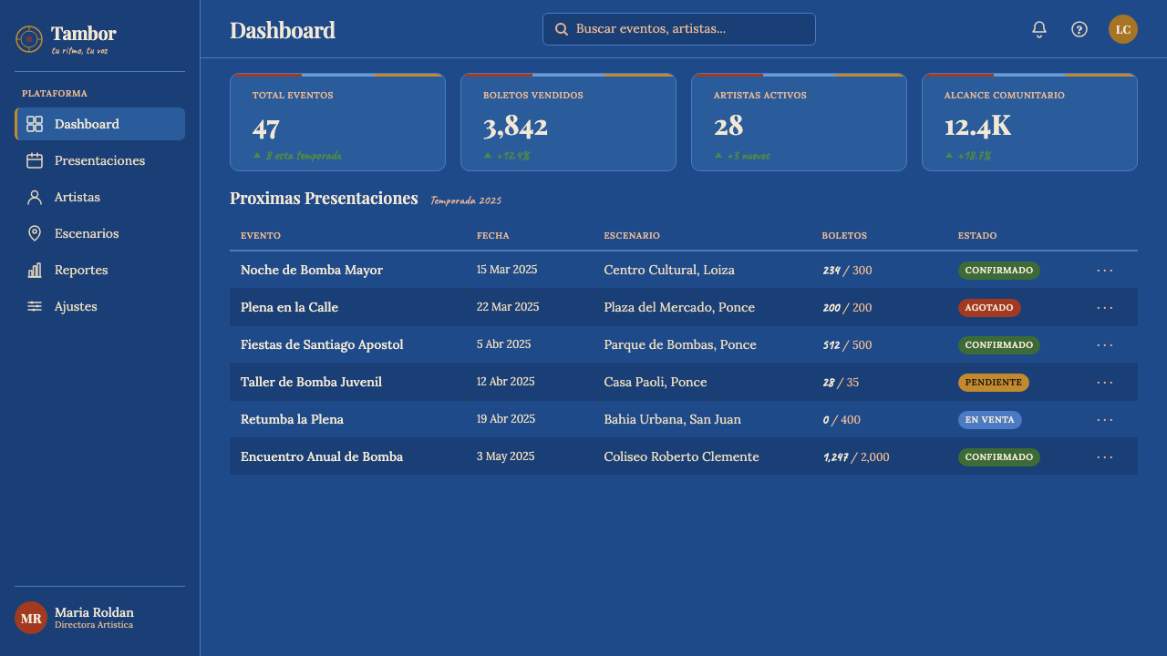
Applying Bomba and Plena design correctly requires understanding its emotional register: this is a style built for community and ceremony, for events that matter to a specific people in a specific place. It works best when the content itself has genuine cultural warmth, historical depth, or a celebration of collective identity. It does not suit cold, abstract, or purely transactional contexts — a financial dashboard or a SaaS pricing page would feel incongruous unless the product itself is deeply rooted in cultural community.
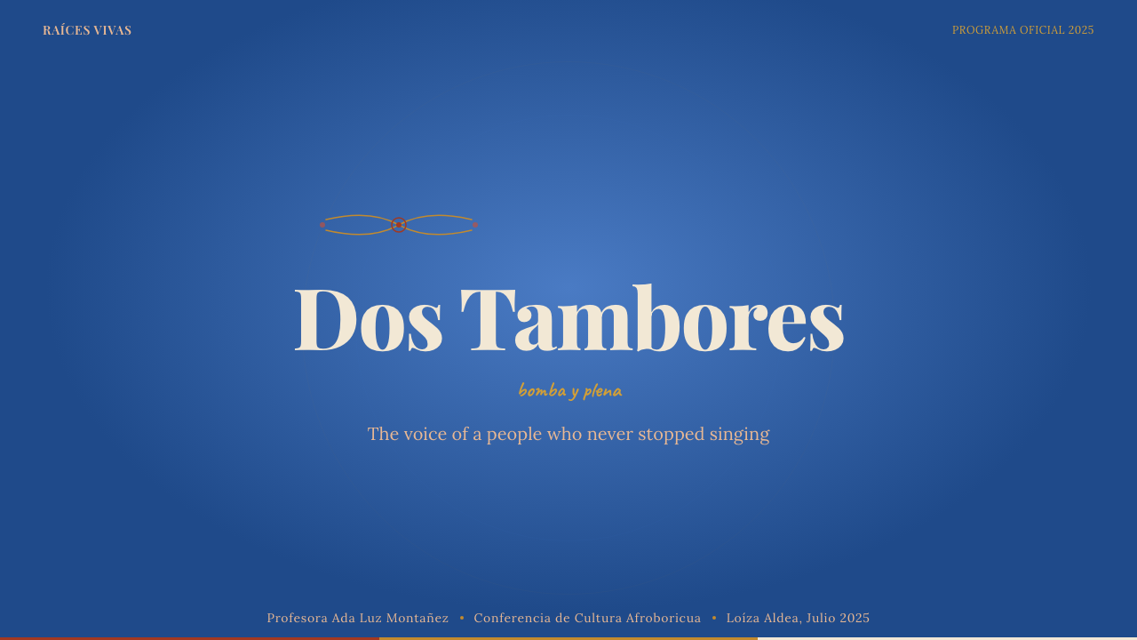
For presentation slides, the style excels on event programs, cultural institution materials, and any cover that calls for dramatic authority. A cover slide benefits enormously from a deep blue field with cream type centered over a symmetrical folk-medallion ornament in drum-red. Section divider slides work well with a bold horizontal band of drum-red carrying white type, evoking the painted stripe on a barril. Data slides should be treated sparingly in this style — if charts are necessary, they should be rendered in the core palette with the data values as the only variable, not as colorful complexity. The style is strongest where information is qualitative and narrative rather than quantitative.
For web interfaces, this aesthetic suits cultural institutions, arts organizations, festival websites, and heritage brands. The approach: use the deep blue as the hero background, cream or warm white for primary content areas, drum-red exclusively for calls to action and primary navigation indicators. Ornamental borders and decorative rules between sections reference the festival-poster tradition without overwhelming the functionality. Text must be given generous line spacing and wide margins — the programme-book aesthetic depends on room to breathe. Mobile layouts should preserve the ornamental header element as an anchor even when the multi-column grid collapses.
For editorial and marketing work, the style produces powerful cover imagery for cultural magazines, annual reports for arts organizations, and campaign materials for events celebrating Afro-Caribbean heritage. A full-bleed deep blue cover with a large stylized figure silhouette and cream display type creates immediate visual authority. Spread layouts can use the left page as a full-color ornamental field and the right as a text-primary content area, a structure that mirrors the two-sided nature of bomba's call-and-response. Marketing materials should resist the temptation to add unrelated colors or contemporary minimal UI elements — the style's power comes from its internal consistency.
The most common mistake when applying this style is treating it as generically 'Latin' or 'tropical' and reaching for bright greens, hot pinks, or generic Caribbean clichés. This design tradition is specific: it comes from barrel drums, petticoat skirts, coconut masks, and night festivals in specific Puerto Rican towns. The colors and ornaments have sources. Using a generic tropical palette while invoking the style's gravity misreads the tradition as decoration rather than identity. The second common mistake is overloading ornament — the tradition uses pattern rhythmically, which means rests are as important as beats. Leave significant areas of deep blue undecorated so the ornamental elements can breathe and register as intentional rather than compulsive.
Puerto Rican Bomba & Plena — FAQ
Is this style appropriate for brands with no connection to Puerto Rican culture?
This question deserves a serious answer rather than a simple yes or no. The visual language of Bomba and Plena design is deeply rooted in specific cultural practices, histories of resistance, and community identity. Using it without any connection to that context risks what is often called cultural appropriation — borrowing the aesthetic surface of a tradition whose deeper meaning you do not share. For brands or projects with a genuine connection to Afro-Caribbean culture, Puerto Rican heritage, or the specific communities from which this tradition came, the style is entirely appropriate and in fact honoring. For others, the wiser approach is to study what makes this aesthetic powerful — its rhythmic structure, its use of color as emotional weight, its balance of dignity and joy — and to draw those structural lessons into a design language that is authentically your own.
How does this style differ from other Caribbean design traditions?
Caribbean design is not monolithic, and Bomba and Plena's visual language is distinct from, say, Haitian Vodou-derived aesthetics, Trinidadian Carnival design, or Cuban son and rumba poster traditions. The most important distinctions for this style are the night-festival palette (deep blue dominant rather than midday tropical brightness), the specific ornamental vocabulary drawn from the barril drum and vejigante mask rather than from other traditions, the dignified folk-programme sensibility rather than a purely exuberant carnival energy, and the dual character — bomba's ceremonial gravity coexisting with plena's journalistic wit. These specific qualities set it apart within the broader Caribbean visual field.
Can this style work in a light-background context, or does it require the dark blue ground?
The deep blue ground is the tradition's canonical register, but a light-background variant is possible and historically exists in the printed-copla tradition, where plena lyrics were circulated on cream or white handbills with dark type and spot-color decoration. A light variant works best when it retains the drum-red accent as a dominant structural color and uses ornamental borders and warm cream fields to maintain the folk-programme warmth. What tends to fail is a fully light, cool, minimal version — strip out the dark ground, the warmth, and the ornament simultaneously, and you remove everything that makes this aesthetic specific rather than generic. The style's identity lives in its deep atmospheric key.
How should photography be handled within this design system?
Photography, when used, should be treated as a warm tonal element rather than a naturalistic document. The tradition's historical relationship with photography comes through festival and performance photography — images of drummers in action, dancers mid-turn, carnival processions — and these images work best when they are given rich, warm toning that aligns with the deep blue and drum-red palette, cropped into bold shapes, or silhouetted against the ground color. Cold, desaturated, or strongly editorial-style photography in the contemporary sense tends to work against the style's warmth. Black-and-white archival images work well when given a warm tonal wash, honoring the historical depth of the tradition.
What distinguishes an authentic application of this style from a superficial pastiche?
An authentic application understands that every visual choice in this tradition has a source. The drum-red comes from painted barriles. The deep blue comes from outdoor night festivals under Caribbean skies. The ornamental language comes from vejigante masks and devotional folk art. The typographic warmth comes from hand-lettered community signage and printed copla sheets. When these elements are deployed with knowledge of their origins, they carry cultural weight. When they are assembled as a mood board of 'Puerto Rican vibes' without that knowledge, the result tends to be decoratively correct but spiritually empty — it looks right but does not resonate. The depth test is simple: does the design honor the dignity of the tradition, or does it use its surface energy as an exotic backdrop for something else entirely?
Related design styles
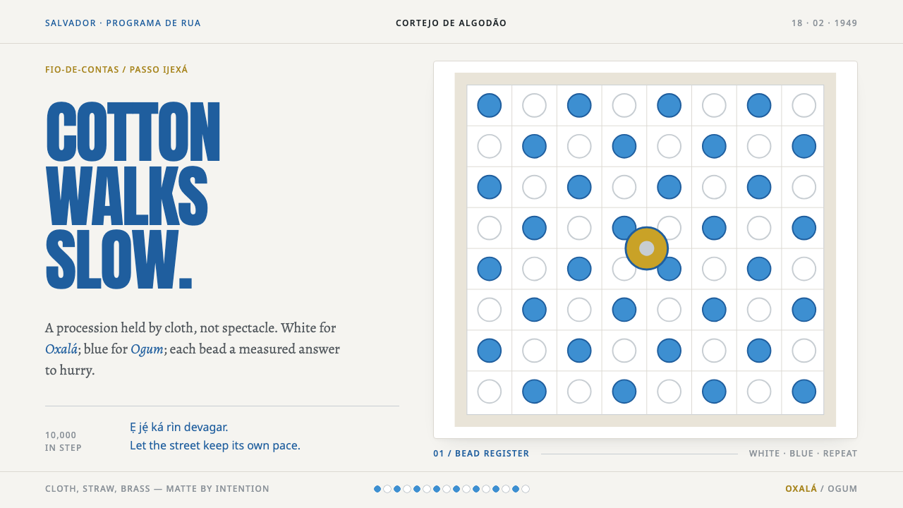 Afoxé Filhos de GandhyA procession that refuses to hurry. Cotton white and bead blue repeat in a me…
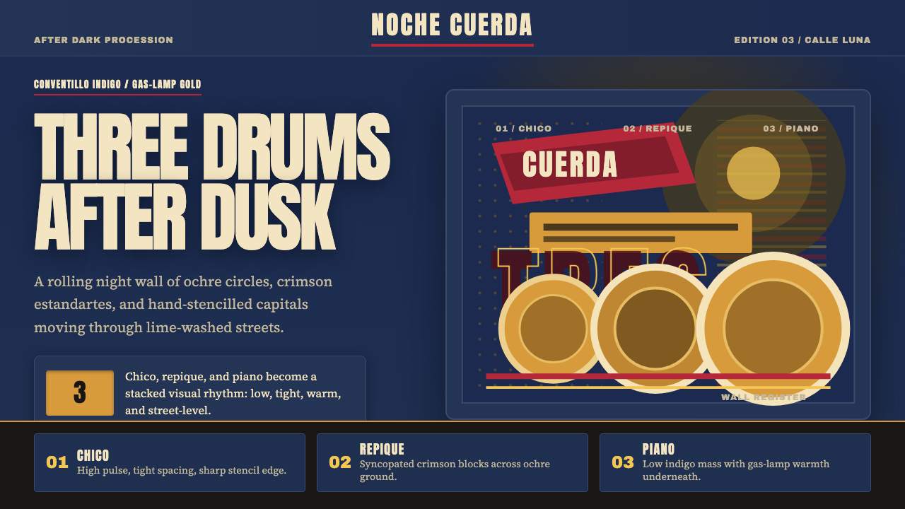 Uruguayan Candombe LlamadasCandombe after dark. Indigo ground, ochre drum circles, crimson banner type.
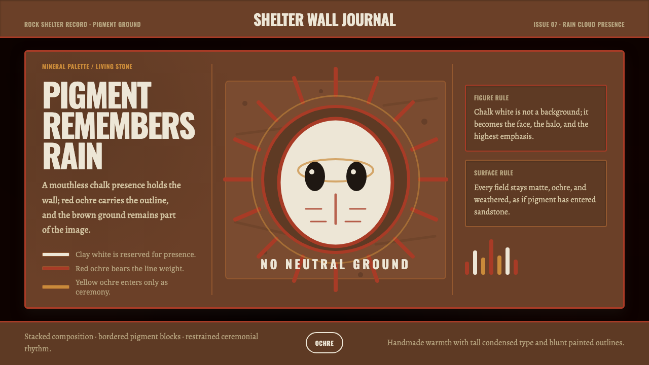 Aboriginal Wandjina KimberleyAncestral presence in stone. Chalk white haloes and red ochre outlines sit on…
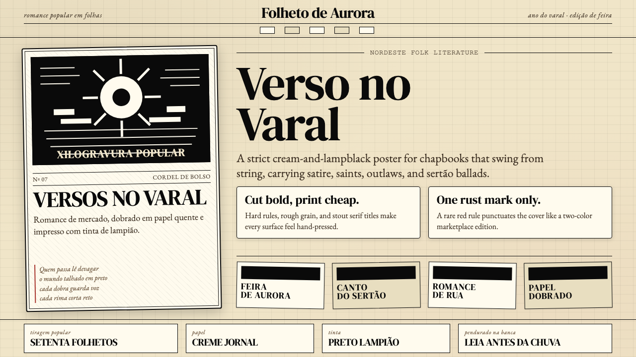 Brazilian Cordel (Northeast Folk Literature)Folk poetry, cut in lampblack. Cream newsprint, bordered chapbooks, one rust-…
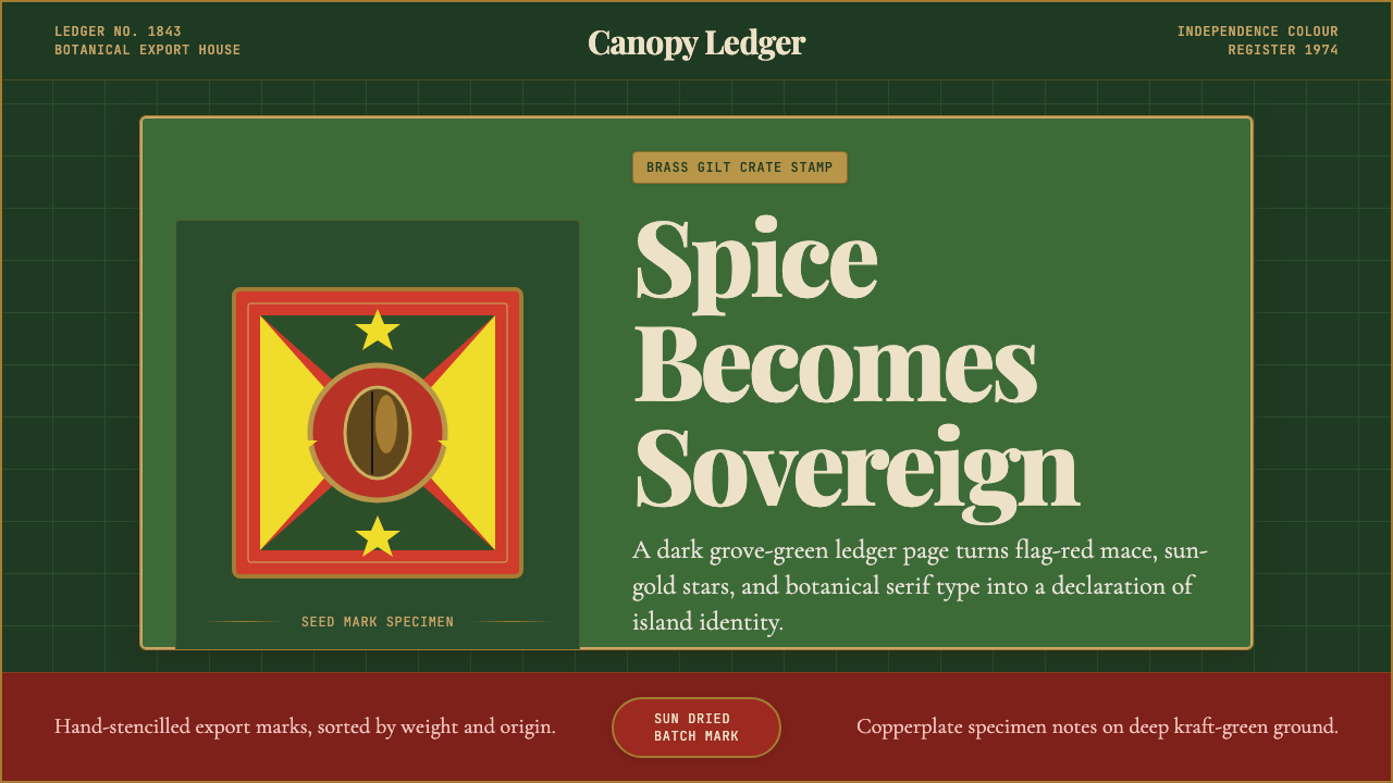 Grenadian Spice & Nutmeg FlagSpice becomes sovereign. Grove green, flag red, brass borders, and serif ledg…
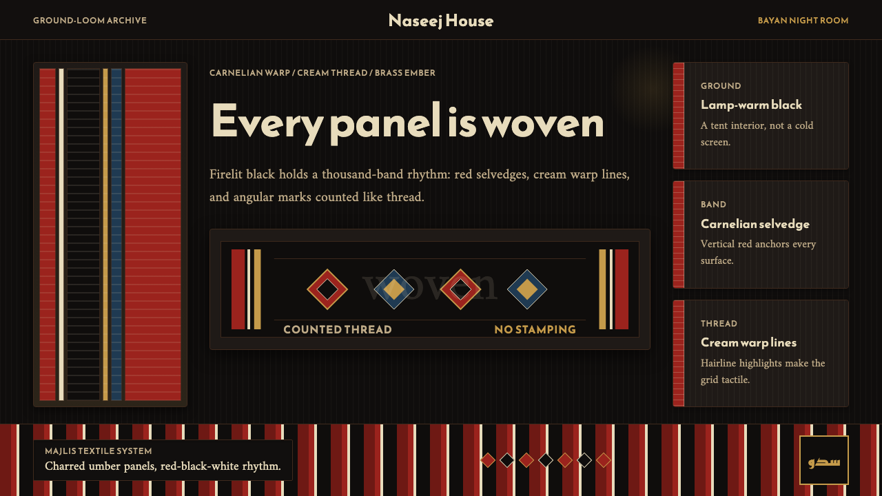 Kuwaiti Sadu Bedouin WeaveFirelit craft, not dark mode. Carnelian bands and cream warp lines make each…