Design style guide设计风格指南
What is Belizean Garifuna Punta?什么是 Belizean Garifuna Punta?
Born from exile and shaped by drum, punta is the heartbeat of the Garifuna people — a design voice that carries Caribbean night, hand-drum heat, and the fierce pride of a culture that refused to disappear.蓬塔诞生于流放之中,由鼓声塑造——加里富纳人的心跳,一种设计声音,承载着加勒比深夜、手鼓热度,以及一个拒绝消亡的文化的骄傲。
Belizean Garifuna Punta in briefBelizean Garifuna Punta 速览
Belizean Garifuna Punta is a design language rooted in the cultural world of the Garifuna — an Afro-Indigenous people settled along the Caribbean coast of Belize, Honduras, Guatemala, and Nicaragua. It draws its visual energy from the punta dance tradition: fast, percussive, communal, and charged with the rhythmic interplay of primero and segunda hand-drums, turtle-shell shakers, and call-and-response singing in the Garifuna language.伯利兹加里富纳蓬塔是一套植根于加里富纳文化世界的设计语言。加里富纳人是非裔原住民后裔,定居于伯利兹、洪都拉斯、危地马拉和尼加拉瓜的加勒比海岸。这套视觉语言的能量源自蓬塔舞传统:快节奏、打击性、具有强烈社群感,充满primero与segunda手鼓、龟壳沙锤以及加里富纳语呼应唱和的律动交织。
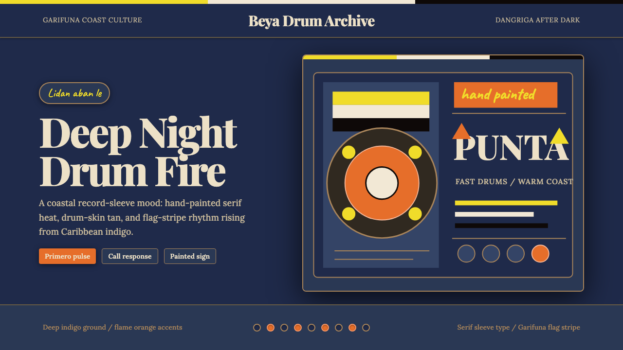
At its core, the style is built around deep-night indigo grounds, the warm tan of drum skin, and a bold flame-orange that pulses through composition like a beat. This is not a polished or corporate aesthetic — it evokes the hand-painted signage of coastal towns like Punta Gorda and Dangriga, the photographic warmth of recording-era album sleeves, and the expressive directness of community murals. Typography leans on strong serif letterforms that carry a declarative weight, grounded in the tradition of flag and banner lettering.这种风格的核心围绕深夜靛蓝底色、鼓皮暖棕与如鼓点般在构图中跳动的烈焰橙。这不是一种精致的企业美学——它唤起蓬塔戈尔达和丹格里加等海岸城镇的手绘招牌、录音时代唱片封套的影像温度,以及社区壁画的直白表达力。字体选择倾向于带有宣示性力量的衬线字形,根植于旗帜与横幅文字的排印传统。
The result is a style simultaneously ancient and alive — one that holds historical memory without becoming a museum piece. Its darkness is not mournful but atmospheric; its warmth is not decorative but grounded in a living culture. It is a visual system that communicates presence, resilience, and the deep cultural confidence of people who have kept their language, music, and identity intact across three centuries of displacement.最终呈现的是一种既古老又鲜活的风格——承载历史记忆却不沦为博物馆陈列品。它的黑暗不是哀伤,而是氛围;它的温暖不是装饰,而是扎根于一种活着的文化。这是一套传递存在感、韧性以及一个民族深沉文化自信的视觉系统——这个民族在三个世纪的流离失所中,完整保存了自己的语言、音乐和身份认同。
See the Belizean Garifuna Punta design system →查看 Belizean Garifuna Punta 完整设计系统 →
Where does Belizean Garifuna Punta come from?Belizean Garifuna Punta 从何而来?
The story of the Garifuna begins in the seventeenth century on the island of St. Vincent in the eastern Caribbean, where Carib and Arawak Indigenous peoples had intermingled with African survivors of slave shipwrecks. The resulting community — later called Black Caribs by European colonizers, and Garifuna by themselves — developed a distinct language and culture that fused West African, Amerindian, and Caribbean elements into something wholly new. For over a century they resisted British colonial expansion, and their military resistance was among the most sustained of any Indigenous or African-descended group in the Caribbean.加里富纳人的故事始于十七世纪的东加勒比圣文森特岛。在那里,加勒比族和阿拉瓦克族原住民与非洲奴隶船沉船幸存者相互融合。这个由此形成的族群——后被欧洲殖民者称为“黑加勒比人”,自称“加里富纳”——发展出一种独特的语言与文化,将西非、美洲原住民与加勒比元素融合成前所未有的新形态。一个多世纪以来,他们抵抗英国殖民扩张,是加勒比地区抵抗最为持久的原住民或非洲裔群体之一。
In 1797, following a prolonged conflict, British forces deported the Garifuna population from St. Vincent to the Bay Islands of Honduras — a deliberate act of exile intended to scatter and dissolve a community that had refused submission. Instead, the Garifuna spread along the Central American coast, founding towns on the shores of what are now Belize, Honduras, Guatemala, and Nicaragua. November 19, 1802 is commemorated as Garifuna Settlement Day in Belize — the date the first settlers arrived at the settlement of Dangriga — and remains one of the most important cultural observances in Belizean national life.1797年,在长期冲突之后,英国军队将加里富纳人从圣文森特驱逐至洪都拉斯海湾群岛——这是一次蓄意的流放行动,意图驱散和瓦解这个拒绝臣服的族群。然而,加里富纳人沿中美洲海岸扩散,在今日伯利兹、洪都拉斯、危地马拉和尼加拉瓜的海岸建立定居点。1802年11月19日在伯利兹被定为加里富纳定居日——第一批定居者抵达丹格里加的日期——至今仍是伯利兹国家生活中最重要的文化纪念活动之一。
Within this displaced community, music and dance became the primary vehicle for cultural transmission. Punta is the form most directly identified with Garifuna identity: performed at wakes, celebrations, and communal gatherings, it is driven by the primero and segunda hand-drums (each tuned to a different pitch), the húnguhúngu (turtle shell rattle), and maracas, with call-and-response vocals in the Garifuna language. Its rhythm is fast and intensely physical — punta dancing involves rapid, controlled hip movement and is considered both a social form and a spiritual practice connected to ancestor communication.在这个流离失所的族群中,音乐与舞蹈成为文化传承的主要载体。蓬塔是与加里富纳身份最直接相关的形式:它在守灵、庆典和社区集会中演奏,由primero与segunda手鼓(各自调定至不同音高)、húnguhúngu(龟壳沙锤)和沙球驱动,配以加里富纳语的呼应唱和。其节奏急促而极具身体性——蓬塔舞蹈包含快速而有控制的髋部运动,被视为既是社交形式,又是与祖先沟通的灵性实践。
The contemporary reach of Garifuna culture owes much to the work of musicians who bridged tradition and global audiences. Andy Palacio, the guitarist and singer from Barranco, Belize, became the most internationally recognized Garifuna artist through his 2007 album Wátina, produced with Ivan Duran on the Stonetree Records label. The album brought together Garifuna elders including the singer Paul Nabor and reached listeners far beyond Belize, winning international recognition and leading to UNESCO proclamation of Garifuna language, dance, and music as Intangible Cultural Heritage of Humanity in 2001. Painter and musician Pen Cayetano pioneered the Punta Rock genre in the early 1980s, fusing traditional punta rhythms with electric guitar to create a form of pop music rooted in Garifuna identity. Honduran guitarist Aurelio Martínez continued this tradition of fusion and advocacy into the 2010s, representing Garifuna culture on international stages.加里富纳文化在当代的广泛传播,在很大程度上归功于那些在传统与全球受众之间搭建桥梁的音乐人。来自伯利兹巴兰科的吉他手兼歌手安迪·帕拉西奥,以2007年在Stonetree Records厂牌由伊万·杜兰制作的专辑《Wátina》,成为国际上最广为人知的加里富纳艺术家。这张专辑汇集了包括歌手保罗·纳博尔在内的加里富纳长者,触达伯利兹以外的广大听众,赢得国际认可。联合国教科文组织于2001年宣布加里富纳语言、舞蹈和音乐为人类非物质文化遗产。画家兼音乐人彭·卡耶塔诺在1980年代初期开创了蓬塔摇滚流派,将传统蓬塔节奏与电吉他融合,创造出一种植根于加里富纳身份的流行音乐形式。洪都拉斯吉他手奥雷利奥·马丁内斯将这一融合与倡导的传统延续至2010年代,在国际舞台上代表加里富纳文化发声。
What defines the Belizean Garifuna Punta look?Belizean Garifuna Punta 的视觉特征是什么?
Color Field色彩场域
The dominant ground is a deep-night indigo — the blue-black of the Caribbean coast after dark, absorbing light rather than reflecting it. Against this field, a flame-orange functions as the percussive accent: warm, insistent, and energetic, it carries the visual equivalent of the lead drum. A drum-skin tan bridges the two poles, providing a mid-tone warmth that softens the contrast and evokes the physical material of the instruments themselves. The overall palette reads as deeply saturated but never garish — it is night music rendered in color.主导底色是深夜靛蓝——加勒比海岸入夜后的蓝黑色调,吸收光而非反射光。在这片底色之上,烈焰橙充当打击性强调色:温暖、执着、充满能量,传递着相当于主鼓的视觉力度。鼓皮棕褐连接两个极端,提供一种中间调的温暖,软化对比,唤起乐器本身的物质质感。整体色板读来高度饱和却毫不刺眼——这是用色彩呈现的夜间音乐。
Typography字体排印
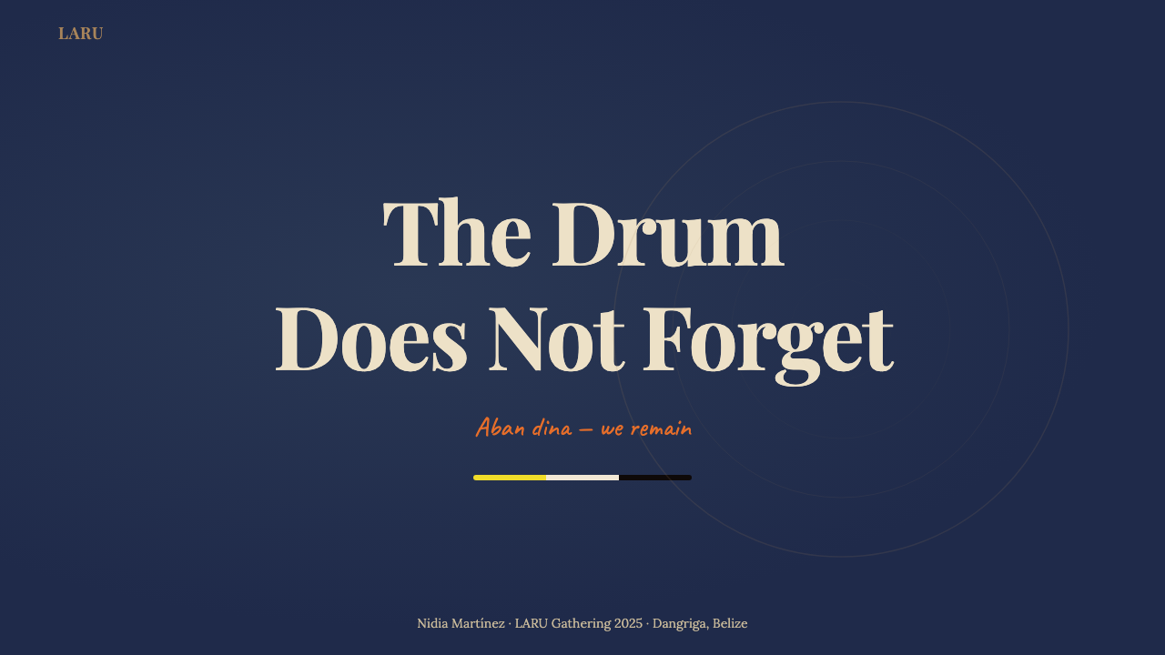
Letterforms lean toward robust, declarative serifs — the kind found on hand-painted tropical signage, political placards, and record sleeve lettering. The type has physical weight and legibility at a distance, suggesting something meant to be announced rather than whispered. Hierarchy is established through dramatic size shifts: a headline that commands the composition is set many times larger than supporting text, with the flame-orange reserved for words or phrases that carry the emotional core of the message. Capitals appear frequently, reinforcing the proclamatory register.字形倾向于粗壮而宣示性的衬线体——那种在热带手绘招牌、政治标语和唱片封套上可以找到的风格。字体具有实体分量和远距离可读性,暗示某种意在宣告而非低语的内容。层级通过戏剧性的尺寸跳跃来建立:主导构图的标题比辅助文字大出许多倍,烈焰橙保留给承载信息情感核心的词语或短语。大写字母频繁出现,强化宣言式的语调。
Textural Warmth质感温度
Unlike purely flat digital aesthetics, this system carries a sense of material surface — the slight roughness of hand-applied paint, the grain of photographic film, the warmth of analog reproduction. This is not achieved through artificial noise filters but through color choices that evoke warmth and craft: the tan tones, the slightly impure oranges, the indigo that reads as dyed rather than printed. The visual texture is one of physical making — something touched and shaped by human hands rather than generated on a screen.与纯粹的平面数字美学不同,这套系统携带一种材料表面感——手工涂绘的轻微粗粝、胶片的颗粒质感、模拟复制的温度。这不是通过人工噪点滤镜实现的,而是通过那些唤起温度与手工感的色彩选择:棕褐色调、略带杂质的橙色、读来像是染制而非印刷的靛蓝。视觉质感是一种物理制造的质感——某种被人手触摸和塑造的东西,而非在屏幕上生成的结果。
Rhythm and Repetition节奏与重复
Composition mirrors the call-and-response structure of punta music. Visual elements are arranged in rhythmic repetition — horizontal bands, stripe motifs drawn from the Garifuna flag, repeated geometric accents — that create a sense of forward momentum. The layout does not rest in static balance; it pulses. Areas of density alternate with areas of release, mimicking the dynamic variation of drum-driven music. This rhythmic quality distinguishes the style from decorative Caribbean pastiche, which tends toward symmetrical, static arrangement.构图镜像了蓬塔音乐的呼应唱和结构。视觉元素以节奏性重复排列——水平色带、源自加里富纳旗帜的条纹母题、反复出现的几何强调——制造前进动势。版面不在静态平衡中休止;它搏动着。密集区域与释放区域交替出现,模拟鼓点驱动音乐的动态变化。这种节奏性将这套风格与装饰性的加勒比仿制品区分开来——后者往往倾向于对称静态的排布。
Cultural Signifiers文化符征
The visual system draws on legible cultural references without reducing them to exoticism. The horizontal stripes of the Garifuna flag — black, white, and yellow — appear as structural elements within compositions, used as dividers, backgrounds, or framing devices. The drum form itself occasionally appears as a silhouette or abstract shape rather than a literal illustration. Coastal landscape references — the horizon line, the night sky, the texture of sand and sea — provide spatial depth without relying on representational photography.这套视觉系统援引清晰可辨的文化参照,而不将其简化为异域情调。加里富纳旗帜的水平条纹——黑、白、黄——作为结构性元素出现在构图中,用作分割线、背景或框架装置。鼓的形态有时以剪影或抽象形状而非直白插图的方式出现。海岸景观参照——地平线、夜空、沙与海的质感——提供空间深度,而不依赖具象摄影。
Darkness as Presence黑暗即存在
The dark ground is not a stylistic choice borrowed from contemporary dark-mode convention — it is thematic. The deep indigo night is where punta is performed: at wakes, at open-air celebrations, on the coast under a Caribbean sky. The darkness carries meaning: it is the context in which the culture has preserved and transmitted itself for generations. When flame-orange and tan appear against this ground, they do not merely provide contrast — they represent fire, warmth, and the human presence that persists through the night.深色底色不是从当代深色模式惯例借来的风格选择——它是主题性的。深夜靛蓝是蓬塔表演的场所:守灵时、露天庆典上、加勒比天空下的海岸边。黑暗承载意义:这是这种文化在数代人中保存和传承自身的语境。当烈焰橙和棕褐在这片底色上出现时,它们不仅仅提供对比——它们代表火焰、温度,以及在漫漫长夜中持续存在的人类存在。
Hand-Made Energy手工能量
The aesthetic sensibility draws from vernacular craft rather than institutional design. This means embracing visual decisions that feel direct and intentional rather than refined and neutral: type that sits with authority rather than retreating into elegance, color relationships that are bold enough to be read by firelight, layouts that prioritize immediate communication over subtle sophistication. The influence is the tradition of hand-painted signage, printed broadsheets, and community murals — work made by people for their community, not by studios for clients.美学感性汲取自民间手工艺而非制度化设计。这意味着拥抱那些感觉直接而有意的视觉决策,而非精致中性的那种:字体以权威姿态落地而非退入优雅,色彩关系大胆到足以在火光下被阅读,版面优先即时传达而非微妙的精巧性。影响来源是手绘招牌、印刷传单和社区壁画的传统——人们为自己的社区创作的作品,而非工作室为客户制作的东西。
See the Belizean Garifuna Punta design system →查看 Belizean Garifuna Punta 完整设计系统 →
Who shaped Belizean Garifuna Punta?谁塑造了 Belizean Garifuna Punta?
Born in 1960 in the Garifuna fishing village of Barranco in southern Belize, Andy Palacio became the defining voice of Garifuna music for an international audience. Initially trained as a schoolteacher, he pursued music through the 1980s and 1990s, contributing to the early Punta Rock movement before deepening his engagement with traditional Garifuna forms. His 2007 album Wátina, produced with Ivan Duran and featuring elders including the elderly singer Paul Nabor, was widely recognized as a landmark recording. Palacio died in January 2008, weeks after suffering a stroke, but Wátina continued to reach new audiences and cemented his legacy as the artist who brought Garifuna culture most fully into global consciousness.安迪·帕拉西奥1960年生于伯利兹南部的加里富纳渔村巴兰科,成为加里富纳音乐面向国际受众的定义性声音。他最初受训为教师,在1980至1990年代追求音乐,参与了早期蓬塔摇滚运动,后来深入探索传统加里富纳形式。他2007年与伊万·杜兰共同制作、邀请保罗·纳博尔等长者参与的专辑《Wátina》被广泛认为是一张里程碑式录音。帕拉西奥于2008年1月中风后数周离世,但《Wátina》持续触达新的受众,巩固了他作为将加里富纳文化最充分带入全球意识的艺术家的遗产。
Pen Cayetano is the Belizean musician and visual artist credited with founding Punta Rock in the early 1980s. Frustrated by the older generation's conservatism around traditional punta, Cayetano began incorporating electric guitar and a rock-music sensibility into the drum-driven form, creating a hybrid that became enormously popular among young Garifuna and Belizeans generally. His visual art — largely self-taught, bold in color, and figurative in subject — documents Garifuna community life with the same directness that characterizes his musical approach. He represents the creative principle at the heart of this design style: cultural continuity through transformation, not preservation through stasis.彭·卡耶塔诺是伯利兹音乐人兼视觉艺术家,被认为是1980年代初蓬塔摇滚的创始人。对老一辈在传统蓬塔方面的保守主义感到不满,卡耶塔诺开始将电吉他和摇滚乐感性融入这种鼓声驱动的形式,创造出一种在年轻加里富纳人和伯利兹人中广受欢迎的混合形态。他的视觉艺术——大部分自学成才、色彩大胆、题材具象——以与他的音乐方式同等的直接性记录加里富纳社区生活。他代表了这套设计风格核心的创意原则:通过转化实现文化延续,而非通过固守实现保存。
Ivan Duran is the producer and founder of Stonetree Records, the Belizean independent label he established in the 1990s that became the primary platform for Garifuna and Belizean music reaching international audiences. His work with Andy Palacio on Wátina demonstrated a production philosophy that placed traditional Garifuna performance at the center while creating recordings of international quality. Duran's aesthetic sensibility — visible in the visual language of Stonetree album covers — balances documentary warmth with crafted presentation, a balance that informs the design style associated with this tradition. He has continued producing Garifuna artists and advocating for the music's preservation and dissemination.伊万·杜兰是制作人,也是Stonetree Records的创始人——这家他在1990年代创立的伯利兹独立厂牌成为加里富纳和伯利兹音乐触达国际受众的主要平台。他与安迪·帕拉西奥在《Wátina》上的合作展示了一种制作哲学:将传统加里富纳表演置于中心,同时创作具有国际水准的录音。杜兰的美学感性——在Stonetree唱片封套的视觉语言中清晰可见——在纪录片式的温度与精心打磨的呈现之间取得平衡,这一平衡滋养了与这一传统相关的设计风格。他持续制作加里富纳艺术家的音乐,倡导这种音乐的保存与传播。
Aurelio Martínez is a Honduran Garifuna guitarist, singer, and political figure who has been among the most active international ambassadors for Garifuna culture in the 2000s and 2010s. His music fuses the rhythmic foundation of traditional punta with Afrobeat, blues, and reggae influences, producing a sound that is simultaneously rooted and globally inflected. As a member of the Honduran National Congress, he has also worked to defend Garifuna territorial rights against displacement — connecting the culture's survival to its people's material conditions in ways that echo the historical reality from which the style draws its depth.奥雷利奥·马丁内斯是洪都拉斯加里富纳吉他手、歌手和政治人物,在2000至2010年代是加里富纳文化最活跃的国际大使之一。他的音乐将传统蓬塔的节奏基础与非洲节拍、蓝调和雷鬼影响融合,产生一种既深植传统又具有全球色彩的声音。作为洪都拉斯国会议员,他也致力于捍卫加里富纳的领土权利,抵抗驱逐——将这种文化的生存与其人民的物质条件联系起来,呼应了这套风格从中汲取深度的历史现实。
How do you use Belizean Garifuna Punta today?今天怎么用 Belizean Garifuna Punta?
Applying Belizean Garifuna Punta to contemporary design work requires understanding what the visual system is doing at a structural level: it uses darkness as an atmospheric container, warmth as a signal of life and presence, and rhythmic repetition as a compositional organizing force. These are not decorative choices — they are arguments. Successful application means committing to those arguments rather than borrowing the palette and leaving the logic behind.将伯利兹加里富纳蓬塔应用于当代设计工作,需要在结构层面理解这套视觉系统在做什么:它以黑暗作为氛围容器,以温暖作为生命与存在的信号,以节奏性重复作为构图组织力量。这些不是装饰性选择——它们是论点。成功的应用意味着承诺这些论点,而不是借用色板后抛下逻辑。
For presentation slides, the style excels at high-stakes contexts where emotional impact matters as much as information delivery: cultural advocacy, artistic proposals, event promotion, and community storytelling. A cover slide works best with a strong typographic composition — a single headline phrase in large, declarative serif type against deep indigo, with a flame-orange accent on the key word. Content slides should use the dark ground consistently, organizing information into clear rhythmic bands rather than isolated cards or bullet lists. Data slides can employ the stripe motif as a background element, with bar charts and proportional figures rendered in the palette's three core tones to create visual hierarchy through color.对于演示文稿,这种风格在情感冲击力与信息传递同等重要的高风险场景中表现出色:文化倡导、艺术提案、活动推广和社区叙事。封面页最适合强烈的排印构图——深靛蓝底色上大号宣示性衬线字体的单一标题短语,关键词以烈焰橙强调。内容页应当持续使用深色底色,将信息组织成清晰的节奏性色带,而非孤立的卡片或项目列表。数据页可以将条纹母题作为背景元素,用色板的三个核心色调呈现柱状图和比例数字,通过颜色创造视觉层级。
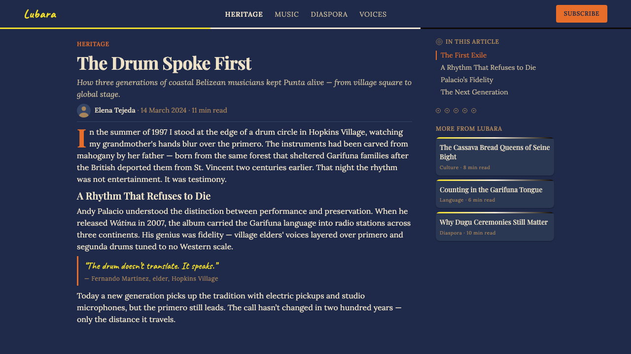
For web interfaces, the style is well-suited to landing pages, event sites, cultural institution pages, and music-related platforms where atmosphere and identity take precedence over functional neutrality. The approach: hold the deep-indigo ground through hero sections and featured content areas, use a lighter neutral or tan for body-content zones to maintain readability at length, and deploy flame-orange exclusively for calls to action, links, and the single most important phrase on each page. Navigation should be typographic, with generous spacing that allows the dark ground to breathe between elements.对于网页界面,这种风格非常适合登陆页、活动网站、文化机构页面以及音乐相关平台——在这些场景中,氛围和身份认同优先于功能中立性。方法如下:在英雄区和特色内容区保持深靛蓝底色,为正文内容区使用更浅的中性色或棕褐色以保持长篇阅读的可读性,烈焰橙专门用于行动号召、链接和每页最重要的单个短语。导航应当是字体性的,元素间保持充裕间距,让深色底色在它们之间呼吸。
For editorial and marketing work — album artwork, cultural program covers, festival materials, brand identity for artists or organizations with roots in Afro-Caribbean traditions — the style's directness and warmth make it highly distinctive. Print applications benefit from the palette's naturally high contrast: text in warm tan or flame-orange against indigo reads at even small sizes, and the stripe motifs work as structural dividers across both portrait and landscape formats. In marketing contexts, the hand-made energy of the style signals authenticity and community rather than corporate polish — a valuable signal for brands where cultural credibility matters.对于编辑和营销工作——唱片作品、文化项目封面、节庆材料、非裔加勒比传统根源的艺术家或组织的品牌形象——这种风格的直接性和温度使其高度独特。印刷应用受益于色板天然的高对比度:在靛蓝底色上,暖棕或烈焰橙的文字在小字号下依然清晰,条纹母题在纵向和横向格式中都可作为结构性分割线。在营销语境中,这种风格的手工能量传递真实性和社群感,而非企业抛光——对于文化公信力至关重要的品牌来说,这是宝贵的信号。
A common mistake when working with this system is treating the flame-orange as an accent color to be used generously throughout a layout. In punta music, the lead drum punctuates rather than saturates; the orange should work the same way — appearing at specific moments of emphasis and then returning to the warmth of the indigo and tan. Similarly, using a contemporary sans-serif typeface in place of the declarative serif breaks the cultural register of the style: the serif carries historical weight and hand-craft reference that a neutral grotesque cannot replicate.使用这套系统时一个常见错误是将烈焰橙作为一种可以在版面中大量使用的强调色。在蓬塔音乐中,主鼓是点缀而非饱和;橙色应当以同样的方式运作——在特定的强调时刻出现,然后退回到靛蓝和棕褐的温度中。同样,用当代无衬线字体取代宣示性衬线字体,会打破这种风格的文化语调:衬线字体承载着历史重量和手工艺参照,这是中性的哥特体无法复制的。
See the Belizean Garifuna Punta design system →查看 Belizean Garifuna Punta 完整设计系统 →
Belizean Garifuna Punta — FAQBelizean Garifuna Punta · 常见问题
Is this style appropriate for brands without Garifuna cultural roots?没有加里富纳文化根源的品牌适合使用这种风格吗?
The question deserves honest consideration. Belizean Garifuna Punta is a living cultural tradition, not a historical artifact, and its visual language carries specific meaning for a community that has actively preserved it through sustained adversity. Using it thoughtfully — to amplify Garifuna voices, to create platforms that serve the community, or to honestly engage with Caribbean and Afro-Indigenous cultural heritage — is meaningfully different from applying it as a decorative exotic backdrop with no cultural connection. The more distant the brand from the culture, the more important it is to consider what the visual language is communicating and whether that communication is honest.这个问题值得诚实思考。伯利兹加里富纳蓬塔是一种活着的文化传统,而非历史文物,其视觉语言对于一个在持续逆境中主动保存它的社群承载着特定意义。深思熟虑地使用它——扩大加里富纳声音、为服务社群的平台创造条件,或诚实地参与加勒比和非裔原住民文化遗产——与将其作为与自身毫无文化关联的装饰性异域背景来使用,有着实质性的区别。品牌与这种文化的距离越远,就越需要考量这套视觉语言在传达什么,以及这种传达是否诚实。
How does this style differ from other Caribbean-inspired design aesthetics?这种风格与其他加勒比灵感设计美学有何不同?
Most Caribbean-inspired aesthetics in contemporary design draw from tourist-facing, resort, or festival imagery: bright turquoise and coral, tropical foliage, loose painterly textures, and a general atmosphere of leisure and warmth. Garifuna Punta is night-facing rather than day-facing: deep indigo rather than turquoise, flame rather than pastel, percussive rhythm rather than decorative pattern. It has the weight of cultural memory rather than the lightness of vacation imagery. The darkness and the declarative typography set it distinctly apart from both the colorful folk-craft traditions of other Caribbean cultures and the sun-bleached lightness of resort aesthetics.当代设计中大多数加勒比灵感美学汲取自面向旅游者的度假村或节庆图像:明亮的青绿和珊瑚色、热带植物、松散的绘画质感,以及休闲与温暖的整体氛围。加里富纳蓬塔是面向夜晚而非白昼的:深靛蓝而非青绿,火焰而非粉彩,打击性节奏而非装饰性图案。它承载文化记忆的重量,而非假期图像的轻盈。这种黑暗和宣示性的字体排印,使它明确区别于其他加勒比文化的彩色民间工艺传统和度假村美学的阳光漂白的明亮感。
Can the style work in a light-ground version?这种风格能做成浅色底色版本吗?
Technically yes, but with significant cost to the style's integrity. The deep-indigo ground is not arbitrary — it is the atmospheric condition from which all other elements derive meaning. A light-ground inversion that uses white or cream as the base with indigo and orange as accents becomes something closer to a generic Caribbean-inspired palette than to the specific cultural register of punta. If a light ground is required by the application context — for extended reading comfort in a document, for example — the recommendation is to reserve the dark-ground treatment for hero elements, covers, and high-emphasis sections, and use the light ground only for body-content zones where the dark palette would impair readability.技术上可以,但对这种风格的完整性有相当大的代价。深靛蓝底色不是任意的——它是所有其他元素从中获取意义的氛围条件。以白色或奶油色为底、以靛蓝和橙色为强调的浅色底色反转版本,会变成比蓬塔特定文化语调更接近通用加勒比灵感色板的东西。如果应用场景需要浅色底色——例如,文档中扩展阅读的舒适度——建议将深色底色处理保留给英雄元素、封面和高强调区块,仅在深色色板会损害可读性的正文内容区使用浅色底色。
What makes the stripe motif culturally specific rather than generically decorative?是什么让条纹母题具有文化特殊性而非通用装饰性?
The horizontal stripes in this visual system reference the Garifuna flag: black (for the people's African heritage), white (for peace and the spiritual dimension of Garifuna culture), and yellow (for the prosperity of the land). Used as structural elements — as section dividers, background bands, or framing devices — they carry this specific referential weight. The distinction from generic stripe decoration lies in how they are deployed: not as pattern fill or surface ornament, but as compositional structure with directional energy. When the stripes organize a layout, they are doing the same work they do on the flag — asserting presence, defining space, and marking identity.这套视觉系统中的水平条纹参照加里富纳旗帜:黑色(代表人民的非洲遗产)、白色(代表和平与加里富纳文化的精神维度)、黄色(代表土地的繁荣)。作为结构性元素使用——作为段落分割线、背景色带或框架装置——它们承载着这种特定的指涉重量。与通用条纹装饰的区别在于它们的部署方式:不是作为图案填充或表面装饰,而是作为具有方向性能量的构图结构。当条纹组织一个版面时,它们在做旗帜上同样的工作——宣示存在、定义空间、标记身份。
How should imagery be handled within this design system?在这套设计系统中,图像应如何处理?
Photography within this system works best when it carries the same atmospheric qualities as the palette: warm-toned, slightly grain-forward, and shot in conditions that evoke performance or community rather than studio isolation. Images treated with warm analog-film color grading sit more naturally in the system than clean, color-corrected digital photographs. Silhouette treatment — figures or objects isolated against the deep-indigo ground — creates a powerful visual register that balances the typographic weight of the compositions. Abstract illustration, if used, should draw from simple geometric shapes rather than detailed figurative work: drum forms, wave patterns, horizon lines. The system resists both generic stock photography and over-produced commercial imagery, favoring images that feel made rather than purchased.在这套系统中,摄影图像在承载与色板相同氛围品质时效果最佳:暖色调、略带颗粒感,在唤起表演或社群而非工作室隔离感的条件下拍摄。经过暖色模拟胶片调色处理的图像,比干净的数字色彩校正照片更自然地融入这套系统。剪影处理——人物或物体在深靛蓝底色上的孤立——创造出强有力的视觉语调,与构图的排印重量形成平衡。抽象插图若被使用,应从简单的几何形状而非详细的具象作品中汲取:鼓的形态、波浪图案、地平线。这套系统抵制通用素材摄影和过度制作的商业图像,偏爱那些感觉是被制作而非被购买的图像。
Related design styles相关设计风格
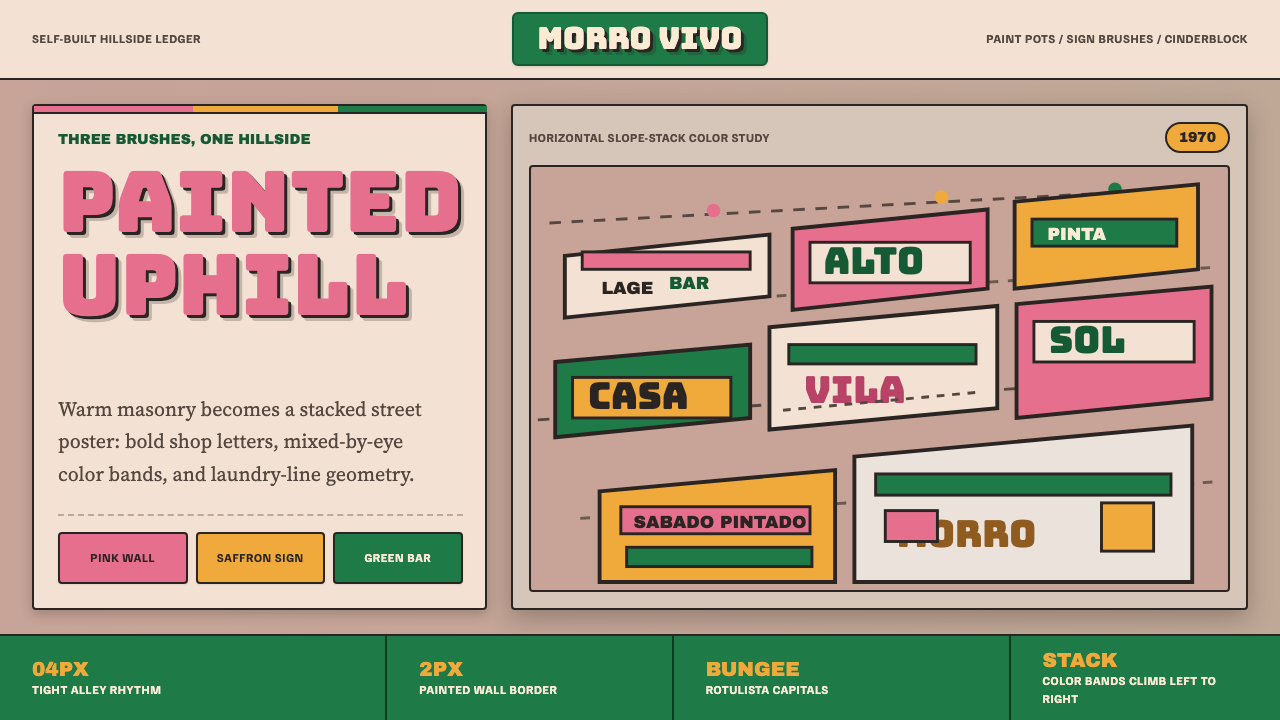 Brazilian Favela Rocinha 1970sHand-built warmth. Pink, saffron and green stripes climb cinderblock in rotul…手建的温热:粉红、藏红花黄与绿色条带沿空心砖攀升,配招牌字。
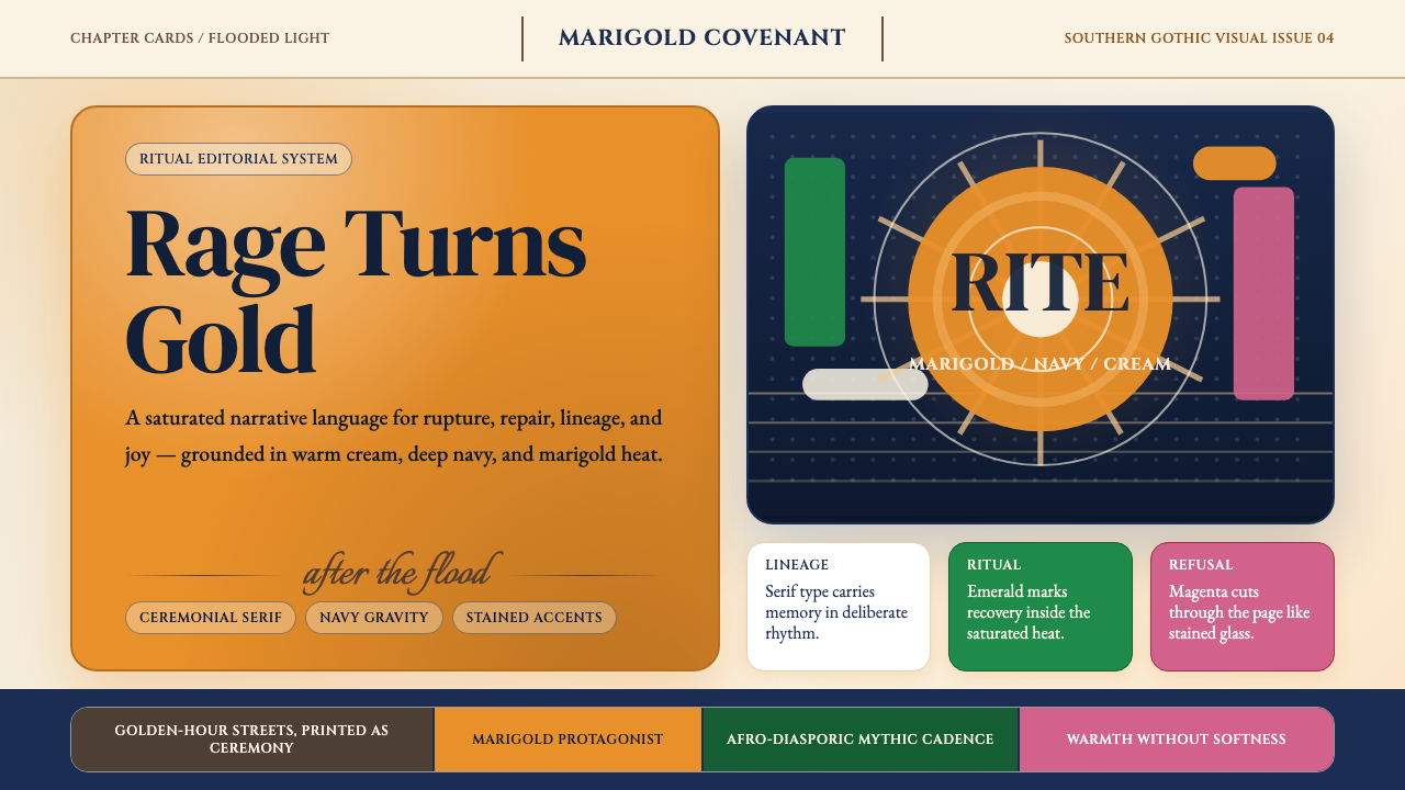 Beyoncé — LemonadeMythic heat refuses restraint. Marigold blocks, navy gravity, serif ceremony.神话般热度拒绝收敛。金盏黄块面、深海军蓝与仪式衬线成形。
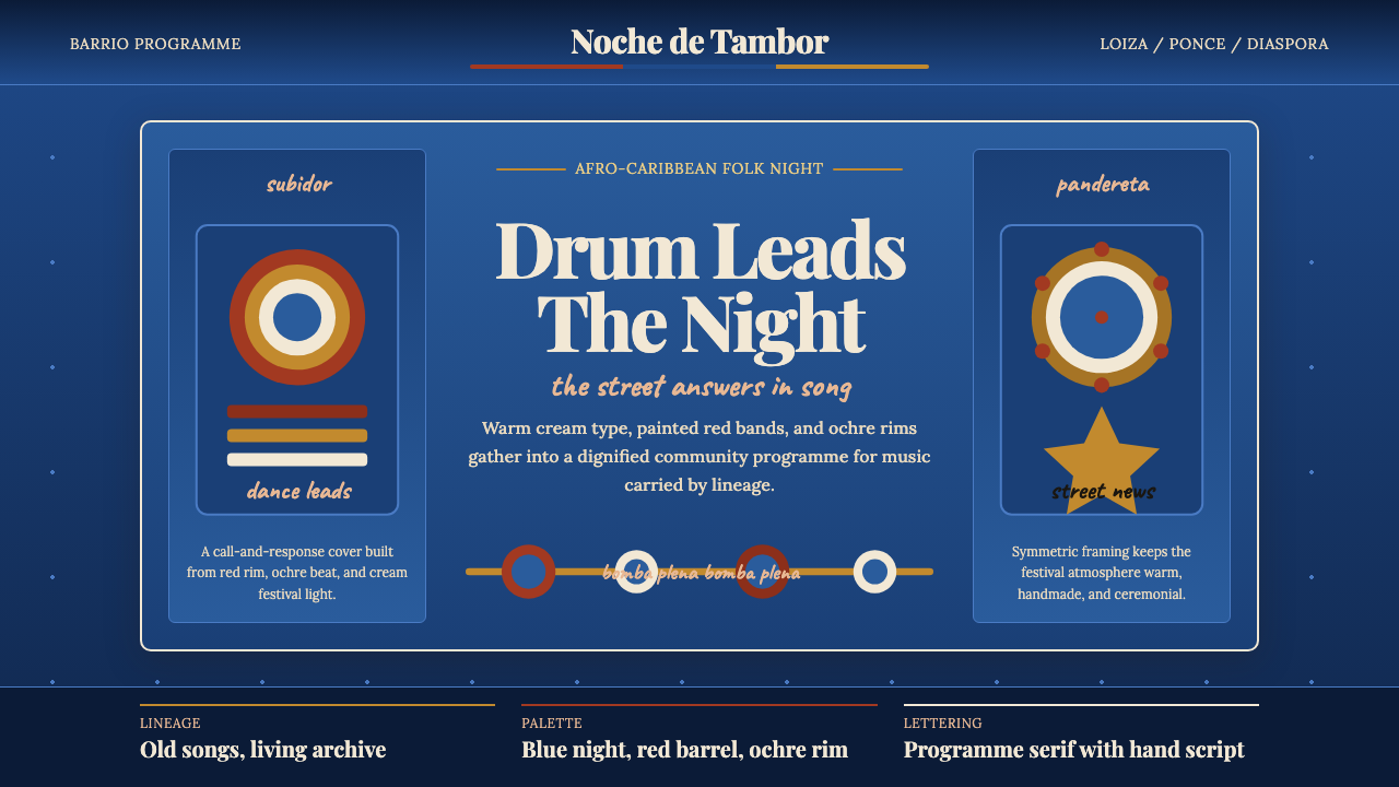 Puerto Rican Bomba & PlenaNight festival dignity. Drum-red stripes and cream Playfair type on deep trop…夜祭般庄重:深蓝底、鼓红条纹与暖白 Playfair 字体。
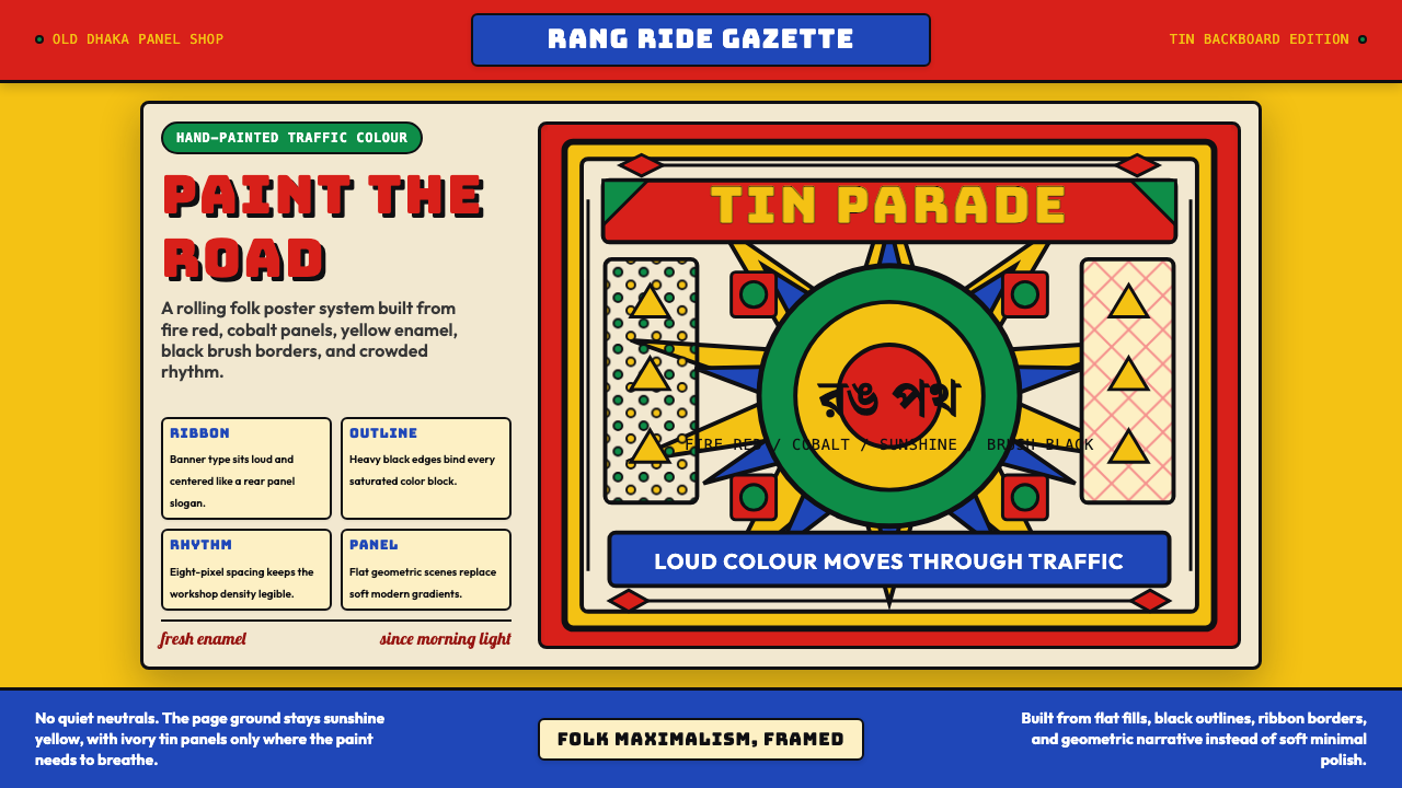 Bangladeshi Rickshaw Painting (Dhaka)Traffic shouts in color. Fire red, cobalt blue, and yellow panels lock into b…交通用色彩呐喊:火红、钴蓝与日光黄被黑边框锁住。
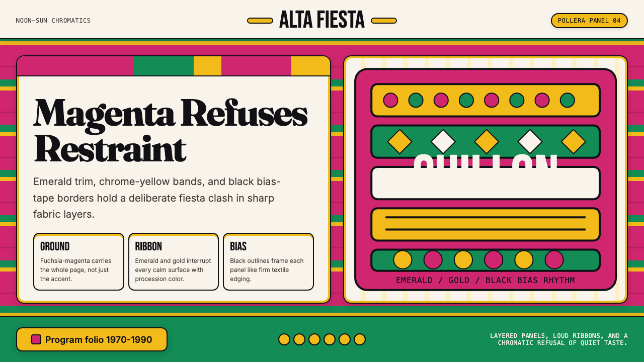 Bolivian Pollera Fiesta MagentaChromatic defiance. Magenta ground, emerald bands and black outlines clash li…色彩拒绝克制:品红底、翡翠带、黑滚边制造节庆撞色。
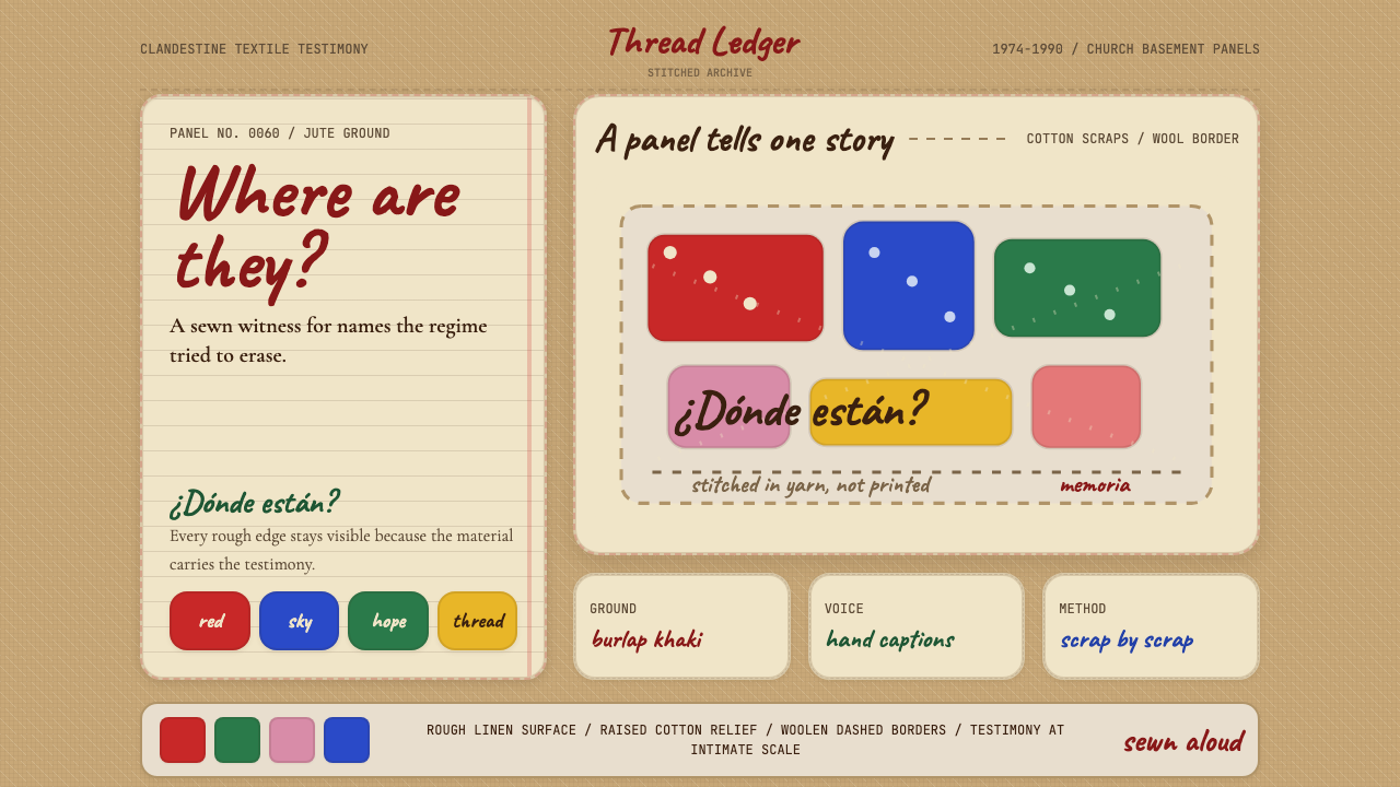 Chilean Arpillera (Pinochet Resistance)Witness sewn, not spoken. Burlap khaki, Caveat captions, and red cotton block…见证被缝上布面。麻布卡其、手写标题与红色棉布块承载控诉。