What is Martín Fierro Magazine?
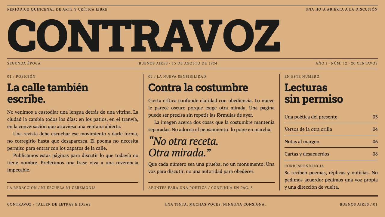
Martín Fierro Magazine presses one black ink into browned newsprint: a fat slab masthead, ruled columns packed to the edge of the sheet, and a single pen drawing doing the work of a second colour.
Martín Fierro Magazine in brief
Martín Fierro Magazine is a design style modelled on a Buenos Aires fortnightly of 1924, the voice of the Argentine avant-garde. It is a newspaper that argues. A heavy, bracketed slab masthead runs the full width of the sheet, a letterspaced grotesque subtitle sits beneath it, a hairline box holds the date and issue, and the columns below are packed tight and divided by rules that run the full depth of the page. It is a front page more than a poster, designed to be read in the hand as well as seen from a distance.
Everything is printed in one black ink on cheap paper, and the style treats that limit as its identity. There is no second colour, no gradient and no photograph. One large pen-and-ink drawing per spread does the work that a second colour would otherwise do. The paper is a warm, aged grey-brown, and the browning belongs to the object: it is the paper itself getting old, not a vintage filter laid over a new design.
The overall impression is loud, dense and confident. It is the look of printed argument: text set tight, hierarchy built from size and weight alone, and a masthead that announces itself like a shout across a room. Nothing is refined or precious, and that roughness is the point.

Where does Martín Fierro Magazine come from?
Martín Fierro was a fortnightly, not a fine-press object. From February 1924 it came off the presses of Imp. Araujo Hnos., at Rivadavia 1731 in Buenos Aires, in one black ink on cheap stock, with a print run approaching 20,000. Its second series ran from 1924 to 1927 and comprised 45 numbers issued in 37 deliveries. The constraints of the printer, the paper and the budget decided how it looked. With only ink and paper to work with, the magazine had to do everything through type, line and arrangement.
The people mattered as much as the press. Evar Méndez directed it, and the writers included Jorge Luis Borges and Oliverio Girondo, with Xul Solar drawing the caricatures and illustrations. The title borrows the name of Argentina's best-known gaucho poem, and the group's mixture of experiment and local pride became known as martinfierrismo, which the tradition also describes as avant-garde criollismo. It carried the loudest writing in Buenos Aires, and its design had to hold that volume on one colour of ink.
Ultraísmo, the avant-garde current associated with Borges, supplied the literary attitude: metaphor over narrative, compression over ornament, and a taste for the new and the urban. In print, that attitude turned into typographic decisions. The masthead is massive because the magazine wanted to be seen. The subtitle is letterspaced and narrow, almost clerical, in contrast. The date and issue are boxed in thin rules, like a newspaper's formal record, and the columns stretch to the edge of the sheet because wide margins would have been a luxury on this stock.
Time added the last layer. Surviving originals have aged from a light, warm grey to the colour of tea, and that colour is now inseparable from how the magazine is remembered. Curio's system keeps it, but as a ground colour chosen deliberately rather than as distressing: flat, even and honest. The masthead, the rules and one large drawing do the rest, and the result is a newspaper that still looks as though it is arguing.
What defines the Martín Fierro Magazine look?
Slab masthead
A fat, bracketed slab title, set flush across the full measure, is the loudest object on the page. Its weight, width and heavy serifs can be read from across a room. It is treated as a banner and not as a logo: it fills the width instead of sitting politely in a corner.
Letterspaced grotesque subtitle
Beneath the masthead, a narrow sans-serif line with open letter spacing names the publication's purpose. Its coolness against the heaviness of the slab creates the contrast that makes a masthead feel designed, and the open spacing makes the line read as a label rather than a headline.
Hairline-boxed dateline
The date and issue sit inside a box of fine rules, like an official stamp. It is the one place in the layout that feels formal and quiet, and it supplies the sense that this is a periodical with a schedule and a record.
Packed ruled columns
Text runs in tight, multi-column blocks, with column rules running the full depth of the sheet from head to foot. White space is minimal. Hierarchy comes from size and weight alone, and the density is what gives the page its energy. Gutters between columns are narrow and always carry a rule, so the eye follows a clear channel from top to bottom.
One ink
The whole page is one black ink on one paper tone. Emphasis comes from reversing, enlarging or thickening, never from colour. That makes every weight and every ruled line carry more meaning, because there is nothing else to say it with. Reversed white-on-black blocks serve as the single strongest emphasis.
One large drawing per spread
A single large pen-and-ink drawing, often a caricature, takes the place of all other imagery. It is bold in line, flat in tone and drawn to be seen across a spread. One strong image replaces a gallery of small ones, and it does the work a second colour would have done.
Aged-paper ground
The ground is a light warm grey tending to tea-brown, a colour the paper arrived at over time rather than a texture added for effect. It is applied flat, without stains, grain or wear, so the page reads as a document and not as a costume.

Who shaped Martín Fierro Magazine?
Méndez was the magazine's director and its organising force, the person who kept a loose group of writers and artists producing a regular periodical. As editor he stands for the practical side of the style: deadlines, columns, a print budget and the discipline of coming out on time. His presence is a reminder that the design is shaped by the logistics of a periodical as much as by ideas.
Xul Solar drew the caricatures and illustrations. His drawings supply the one large image on a spread, and his line carries the playfulness and strangeness that an otherwise severe page allows itself. One large drawing, set against dense text, is enough to carry a spread.
Borges is among the writers who gave the magazine its voice, and he is linked to Ultraísmo and to martinfierrismo. His taste for compression and metaphor is the literary counterpart of the page's dense columns and short, hard headlines.
Girondo is another of the writers around the magazine, known as a poet of urban modern life. His presence helps explain the page's appetite for the new and the city, and its willingness to shout in print.
How do you use Martín Fierro Magazine today?
Martín Fierro Magazine is a strong choice for content that argues, announces or publishes, and for anyone who wants a design to feel like a printed statement. Its principles are structural: one ink, one paper tone, a banner masthead, ruled columns and one big drawing. Apply those, rather than simply tinting a page sepia. Because the style leaves no room for decoration, every choice of size, weight and rule has to justify itself.
For presentation slides, the cover can borrow the whole front page: a full-width slab title, a letterspaced subtitle, and a boxed line for the date and the occasion. Content slides use two or three ruled columns instead of bullet lists, with one large drawing or diagram on a side. Data slides work in black only, with solid bars, hatching and ruled tables doing the job of colour, and the headline stating the finding in a sentence.
For web interfaces, the style fits editorial homepages, newsletters, manifesto pages, independent publications, cultural organisations and long-form blogs. The navigation can sit in a ruled band like a dateline; story blocks become ruled columns; buttons are plain black rectangles with reversed text. A pricing page can be a simple ruled table, set like a classified column, with no highlighted card and no colour badge. On mobile, the masthead should still span the whole width, with the columns collapsing to one while keeping their rules.
In editorial and marketing work, it suits magazines, literary journals, exhibition catalogues, launch announcements and press kits that want to read like a broadsheet. Lead with the headline, keep copy dense and direct, and use one illustration instead of a photo gallery. When photographs are unavoidable, convert them to high-contrast black and white so that they sit in the same one-ink world as everything else. Headlines can be written as statements rather than labels, since the style rewards a point of view.
The most common mistake is adding colour or modern polish: gradients, soft shadows, generous margins and rounded cards turn an argument into a brochure. The second mistake is treating the paper tone as a filter, with tears, stains, grain and grunge layered on top. The yellowing here belongs to the paper and should stay flat. The third is a delicate masthead; if the title cannot be read from across a room, it is not doing its job.

Martín Fierro Magazine — FAQ
What was Martín Fierro magazine?
A fortnightly published in Buenos Aires from February 1924, directed by Evar Méndez and home to Borges, Girondo and the illustrator Xul Solar. Its second series ran until 1927 in 45 numbers. It was the main platform of the group known as martinfierrismo and printed in one black ink on cheap stock. Its design is therefore the product of constraint, not of taste alone.
What is Ultraísmo?
An avant-garde literary current associated with Borges and with this circle. It favoured metaphor over narrative, compression over ornament and the new, urban world over the old. In the design, it shows up as density, directness and a refusal of decoration that serves no purpose.
Is the yellowed page a vintage effect?
No. Surviving originals have browned because the paper aged, and the style keeps that colour as a flat ground chosen on purpose. It should not be paired with fake stains, tears or grain. The idea is an honest paper tone, not a costume.
Does it work with photography?
Only in a limited way. The magazine's identity rests on a single large pen drawing per spread, so illustration is the natural choice. If photographs are needed, they should be high-contrast black and white, cropped tight and printed in the same ink as the text, never in colour.
How is it different from a generic newspaper template?
Most newspaper templates are neutral and tidy, with comfortable margins and refined type. Martín Fierro is louder and more cramped: a huge slab masthead, columns packed to the sheet's edge, rules running full depth and a single bold drawing. It looks like a movement shouting, not an institution reporting. Think of the difference between a statement and a report.
Related design styles
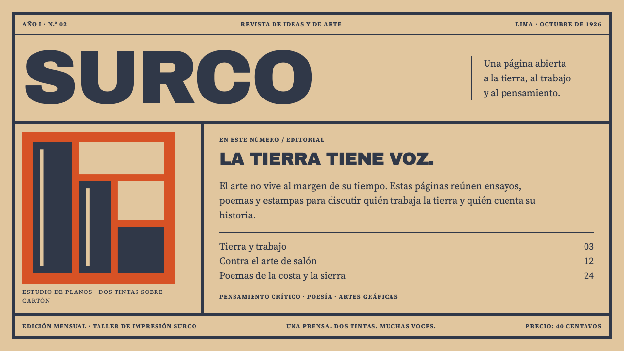 Amauta MagazinePrint with conviction. Vermilion blocks and heavy slate-navy type bite into b…
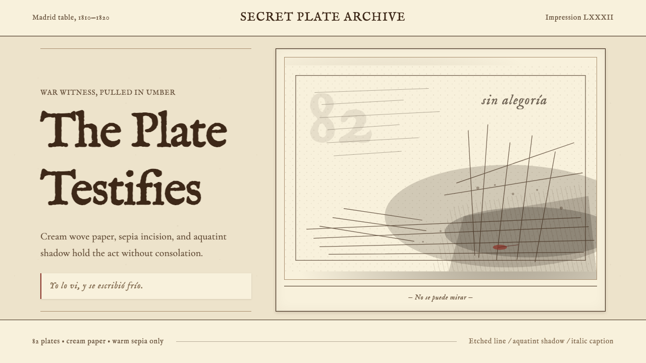 Goya — Disasters of WarWitness without ornament. Cream paper, umber line, aquatint shadow, italic ca…
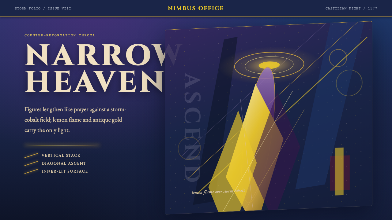 El Greco — Toledo MannerismMysticism strains upward. Storm cobalt, lemon flame, and gold halos pull the…
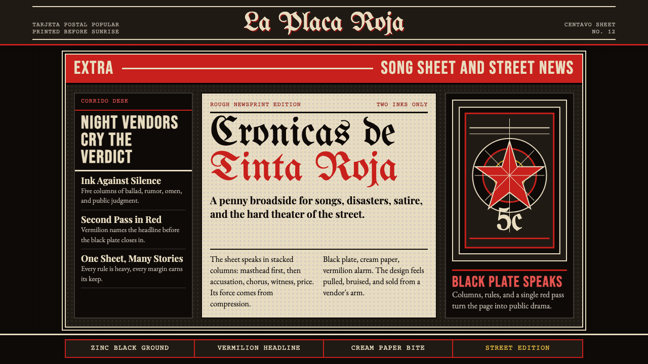 Mexican Tarjeta Postal (Posada Engraving 1900)Tabloid drama in two inks. Fraktur mastheads, vermilion rules, and cream news…
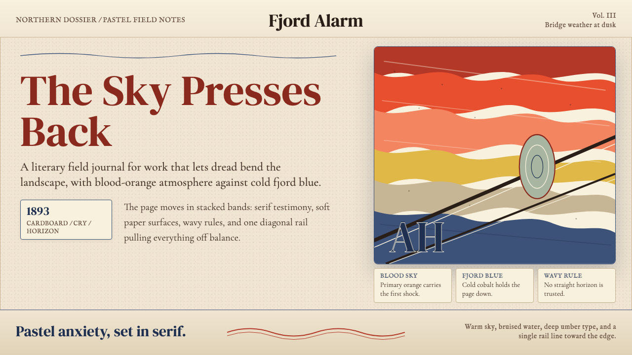 Munch — The ScreamAnxiety bends the page. Blood orange bands, cobalt fjord, and serif type tilt…
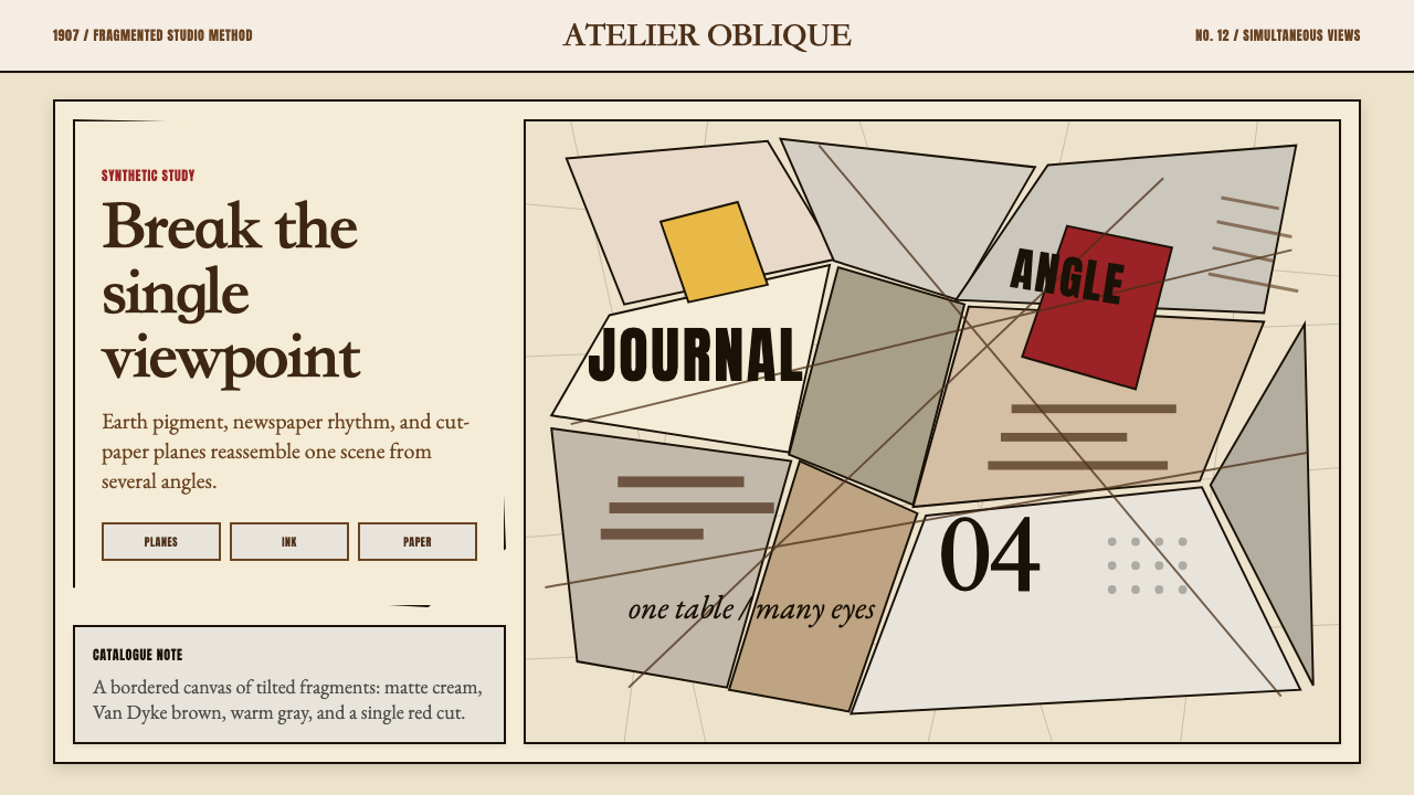 Picasso CubismSingle sight is shattered. Cream collage paper fractures brown-gray planes wi…