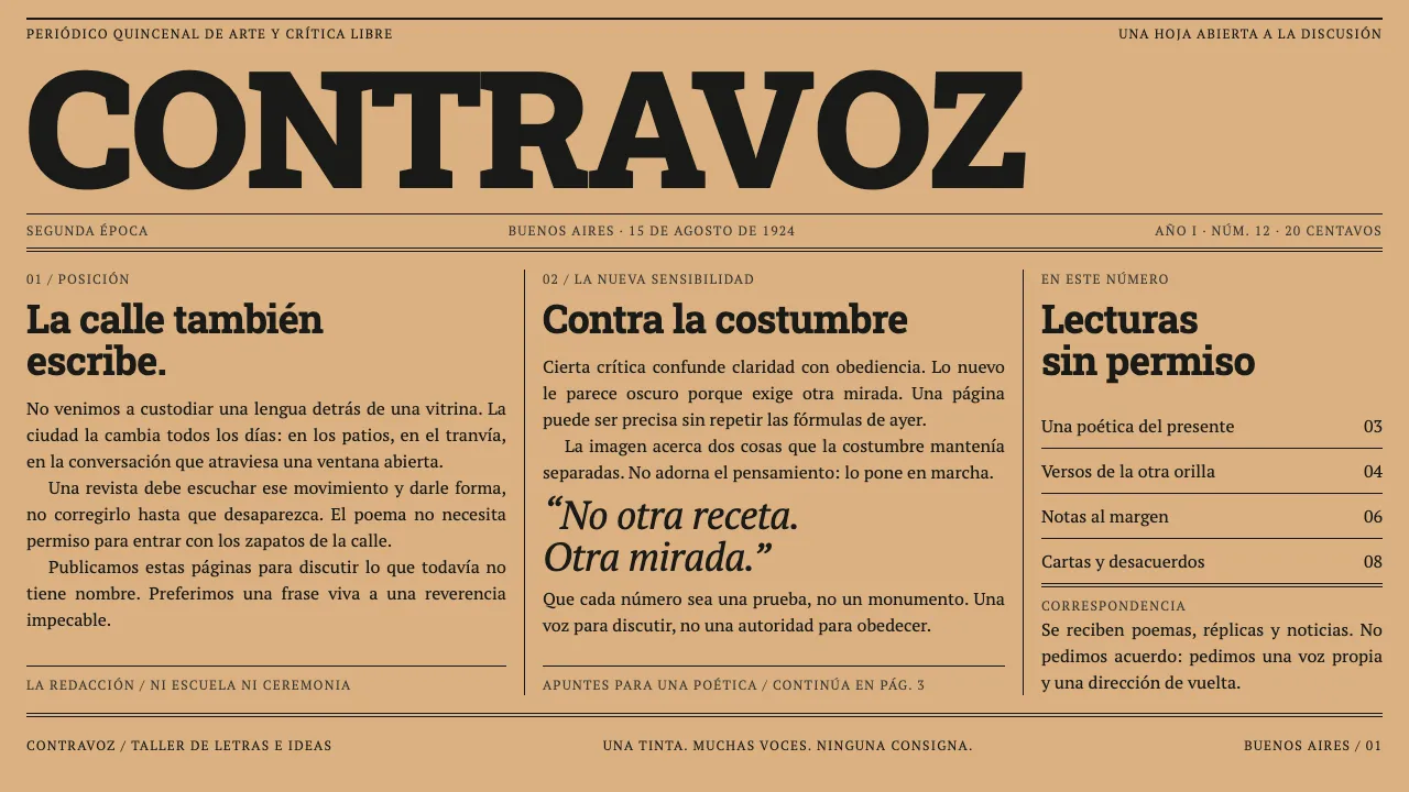
About Martín Fierro Magazine
Martín Fierro was a fortnightly, not a fine-press object. From February 1924 it came off the presses at Imp. Araujo Hnos. on Rivadavia 1731 in one black ink on cheap stock, ran to a print run near 20,000, and carried the loudest writing in Buenos Aires: Borges, Girondo, Evar Méndez as director, Xul Solar drawing the caricatures.
The design follows from the constraint. A fat bracketed-slab masthead flush across the full measure, a letterspaced grotesque subtitle, a hairline-boxed dateline, then columns packed to the edge of the sheet with rules running full depth. One large pen-and-ink drawing per spread does all the work a second colour would have done.
- Origin
- Buenos Aires, Argentina
- Era
- 1924–1927 (segunda época); 45 numbers in 37 deliveries
- Key figures
- Evar Méndez · Xul Solar · Jorge Luis Borges · Oliverio Girondo
- Movements
- Ultraísmo · martinfierrismo · criollismo de vanguardia
Martín Fierro Magazine design spec
Colors
Typography
The other 11 sections — buttons, cards, spacing, motion, techniques and more — open once you unlock. Download the DESIGN.md or send it to your AI in one click. Unlock once, yours forever.
Sign up nowStyles similar to Martín Fierro Magazine
Also inspired by print & type, with a close feel.
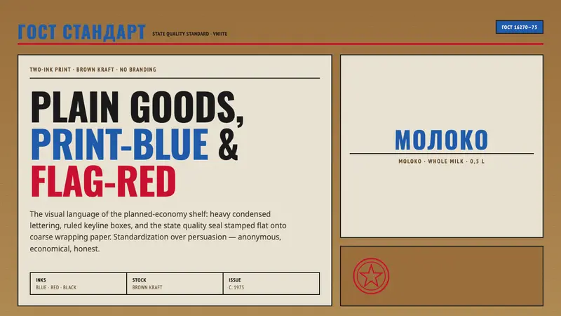 Soviet GOST PackagingAnonymous and strict. Kraft ground, red-blue ink, ruled boxes, condensed type.
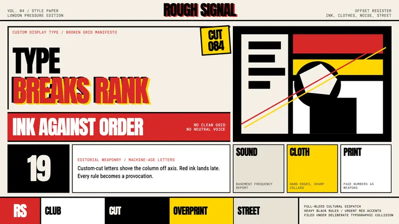 Neville Brody / The FaceType mutinies on paper. Cream stock, black rules, urgent red overprint, broken grids.
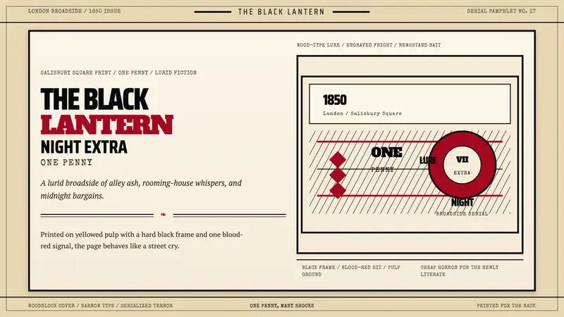 Penny Dreadful Victorian Headline (1850)Cheap terror in full cry. Condensed wood-type, black borders, and one blood-red hit on pulp.
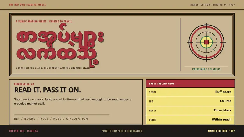 Nagani Book ClubUrgency printed in rules. Buff board, outlined Burmese type, and red-black imprint bars argue at a glance.