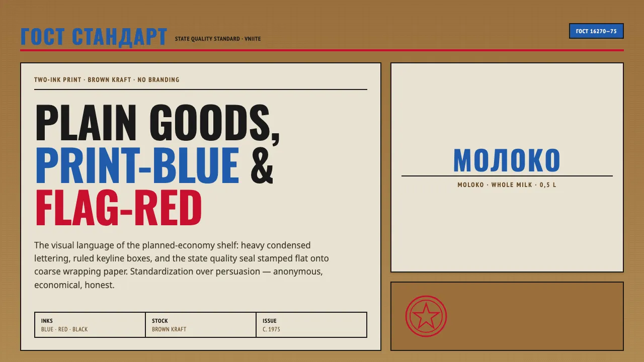
About Soviet GOST Packaging
Soviet GOST packaging is the visual language of the planned economy's grocery shelf: generic milk, salt, and bread sold in two-colour blue-and-red labels printed flat onto coarse brown kraft and waxed wrapping paper. Heavy condensed Cyrillic names, ruled boxes, and the state quality mark replace branding entirely.
Designed anonymously through VNIITE, the state design institute, these wrappers prized standardization over persuasion. The result is a stark, honest utilitarian aesthetic — no photography, no gradients, no ornament — that reads today as accidental brutalist minimalism.
- Origin
- Soviet Union / Eastern Europe
- Era
- 1950–1990 (peak standardized look c. 1975)
- Key figures
- VNIITE (All-Union Scientific Research Institute of Technical Aesthetics) · anonymous state designers
- Movements
- Soviet utilitarian design · GOST standardization · State-institute graphics
Soviet GOST Packaging design spec
Colors
Typography
The other 11 sections — buttons, cards, spacing, motion, techniques and more — open once you unlock. Download the DESIGN.md or send it to your AI in one click. Unlock once, yours forever.
Sign up nowStyles similar to Soviet GOST Packaging
Also inspired by print & type, with a close feel.
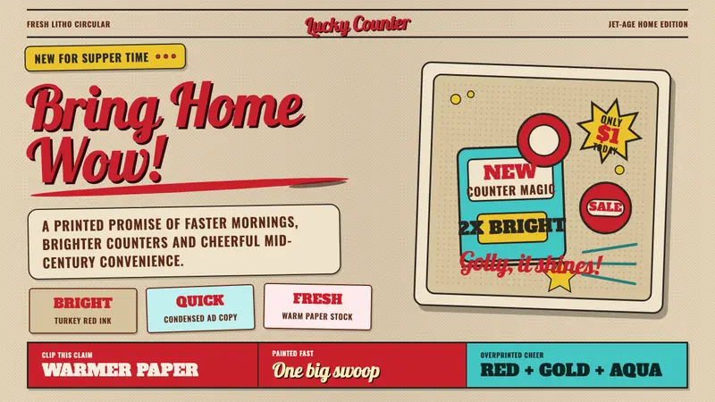 1950s Brush Script AdSells tomorrow in one swoop. Turkey red script, tan paper, starbursts, and halftone dots.
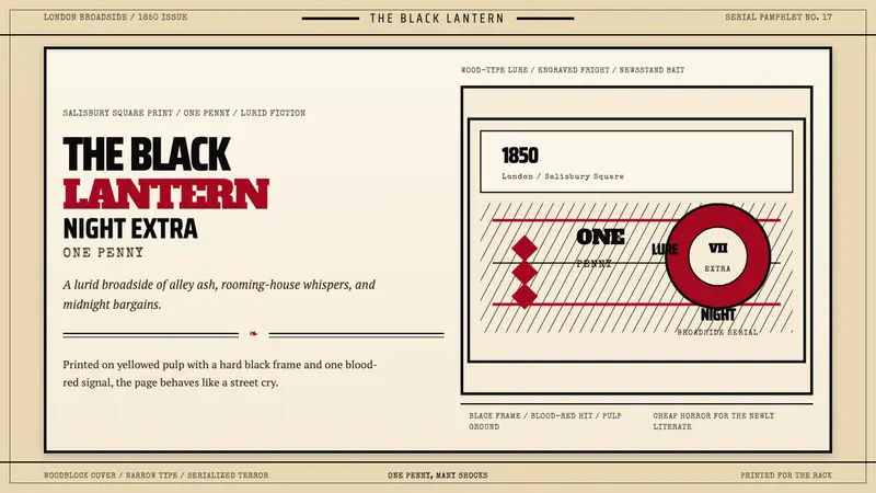 Penny Dreadful Victorian Headline (1850)Cheap terror in full cry. Condensed wood-type, black borders, and one blood-red hit on pulp.
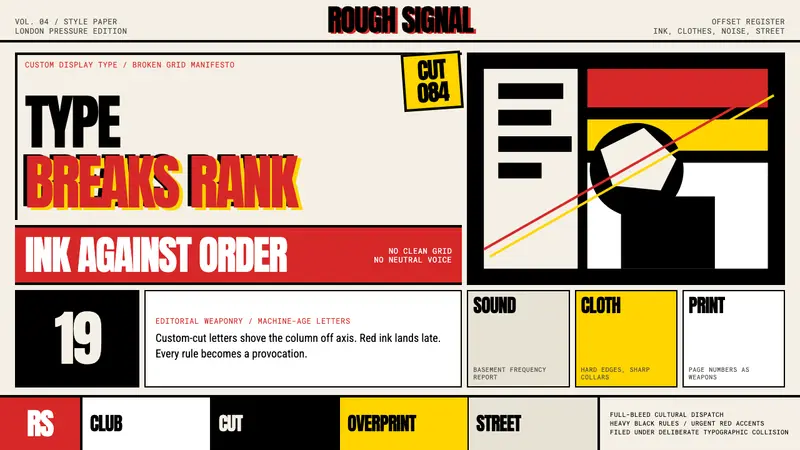 Neville Brody / The FaceType mutinies on paper. Cream stock, black rules, urgent red overprint, broken grids.
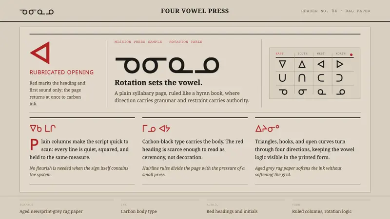 Cree SyllabicsPlain ink has authority. Carbon columns and red rubrication sit on rag-grey paper.