What is Soviet GOST Packaging?
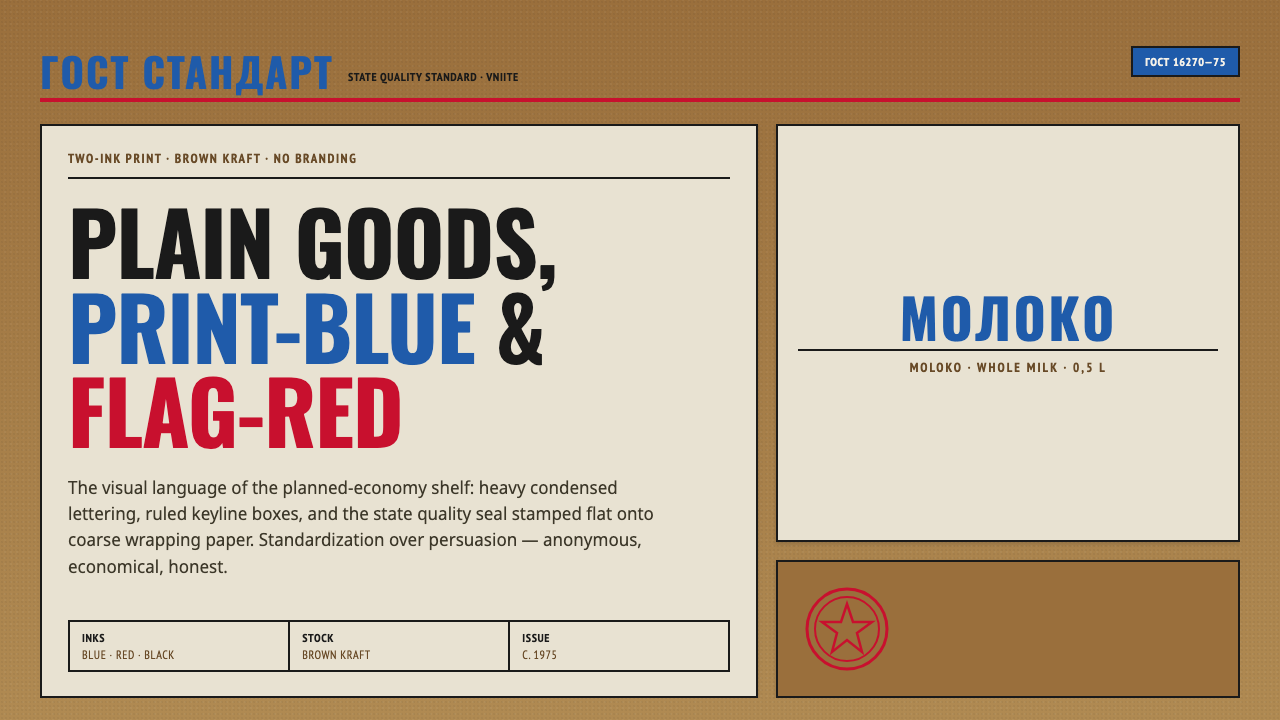
Soviet GOST packaging turned the grocery shelf into a system: kraft paper, red-blue ink, ruled boxes, and names so strict that branding disappeared.
Soviet GOST Packaging in brief
Soviet GOST packaging is the visual language of the planned-economy grocery shelf, associated with the Soviet Union and Eastern Europe from the 1950s through 1990. Generic milk, salt, bread, and other staples appeared in labels printed flat onto coarse brown kraft or waxed wrapping paper. The limited materials and restricted ink palette were not aesthetic gestures added after the fact; they were the visible consequences of a system built around repeatability and standardization.
The central principle was to identify a product clearly rather than persuade a shopper emotionally. Heavy condensed Cyrillic names, ruled boxes, and the state quality mark carried the information that commercial packaging would normally assign to a logo, photograph, slogan, or brand character. A wrapper did not need to promise a lifestyle. It needed to state what the product was and establish that it belonged to an approved system.
Visually, the result is anonymous, strict, and unusually direct. Red and blue ink sit against brown paper, geometric borders divide information, and every surface remains flat. There is no photographic fantasy, soft modeling, gradient, or decorative illustration. Contemporary designers often read this restraint as accidental brutalist minimalism: a style born from institutional utility that now feels deliberate, confident, and highly recognizable.
Where does Soviet GOST Packaging come from?
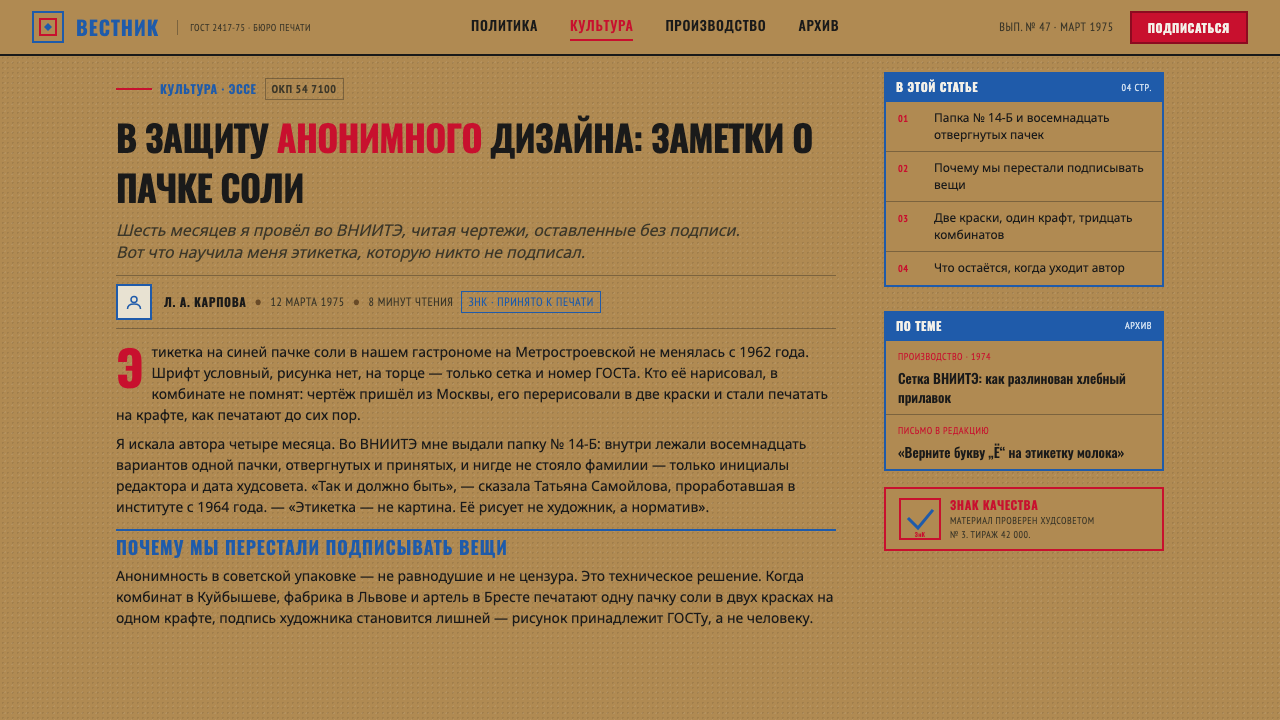
The standardized look belongs to the broad period from 1950 to 1990, with its most recognizable form reaching a peak around 1975. Its setting was the planned-economy grocery shelf, where packaging served a distribution system rather than a competitive field of expressive brands. The recurring use of kraft ground, waxed paper, flat ink, and strict labeling made separate products feel like members of one coordinated public vocabulary.
Design work was associated with VNIITE, the All-Union Scientific Research Institute of Technical Aesthetics, the state design institute named in the source material. Its role places the packaging within a broader practice of state-institute graphics: design was organized as a public and technical task, not as the signature expression of an individual art director. The wrapper therefore presents a system before it presents an author.
GOST standardization supplied the governing logic. The package had to be legible, repeatable, and materially straightforward. Product names, ruled divisions, and the state quality mark formed a compact information structure that could survive the coarse character of the paper and the limitations of two-colour printing. Persuasion was replaced by consistency, and visual distinction came from arrangement rather than decorative abundance.
Anonymous state designers carried this language across ordinary categories, producing a shelf whose coherence was more important than individual recognition. That anonymity is part of the historical character, not an absence of design. By removing personal authorship and commercial theater, the system made the wrapper feel official, durable, and almost architectural. Its later revival comes from this unusual combination of institutional discipline and raw material presence.
What defines the Soviet GOST Packaging look?
Kraft Ground
The brown kraft or waxed paper is an active part of the identity, not a neutral carrier. Its coarse, ordinary surface keeps the package close to the material world of staple goods. Rather than hiding production limits beneath a polished surface, the design lets the ground remain visible and gives the printed information its authority.
Red-Blue Ink
Red and blue provide the principal contrast against the kraft ground. Their force comes from restriction: the colors are not scattered across a decorative palette but assigned to names, divisions, marks, or emphasis. Flat application keeps them poster-like and unmistakable, with no tonal modeling needed to create visual energy.
Condensed Cyrillic
Heavy condensed Cyrillic lettering makes the product name feel like an official declaration. The narrow form concentrates information and gives the label a vertical, industrial rhythm. Type is not a soft voice placed inside a package; it is the package's primary object, carrying identity through weight, compression, and disciplined alignment.
Ruled Boxes
Straight ruled boxes divide the label into clear administrative zones. The border is both frame and instruction: it tells the eye where the product name ends, where supporting information begins, and how the whole surface should be scanned. Hard edges replace ornament and turn organization itself into the visual motif.
State Mark
The state quality mark replaces the reassuring signals of commercial branding. It gives the package an institutional point of reference and reinforces the idea that quality is guaranteed by a standard rather than narrated by a company personality. Its presence makes the wrapper feel authorized, public, and impersonal.
Flat Utility
The system refuses photography, gradients, soft shadows, and ornamental illustration. Forms remain flat, edges remain decisive, and information is carried by type, ink, and enclosure. This is not minimalism achieved by removing details from a luxurious composition; it is utility made visible through the refusal of visual excess.
Who shaped Soviet GOST Packaging?
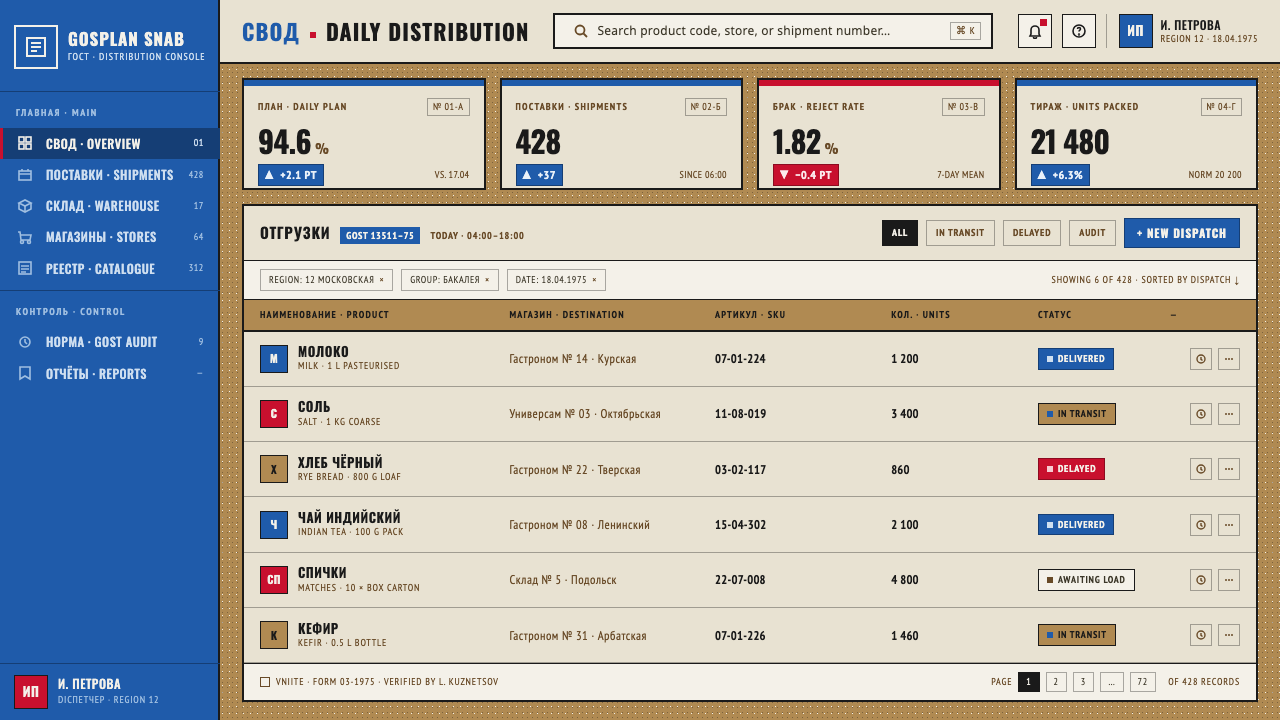
VNIITE, the All-Union Scientific Research Institute of Technical Aesthetics, represents the institutional design culture behind the packaging. Its significance is not a single signature style but the idea that everyday visual communication could be organized through a state design institute, with standardization and technical clarity taking precedence over personal expression.
The anonymous state designers are essential to understanding the visual language. Their lack of public authorship was part of the system's character: wrappers were expected to serve a common standard, not build recognition for an individual designer. Anonymity made consistency feel more important than originality.
GOST standardization functions as the governing figure of the system. It stands for the rules that make labels repeatable, legible, and institutionally coherent across staple goods. In this sense, GOST is not merely a mark on the package; it is the invisible framework that turns many wrappers into one visual language.
How do you use Soviet GOST Packaging today?
For presentation slides, use the style to make the cover feel like an official product label: a kraft-like ground, a dominant condensed title, red-blue structural accents, and a ruled enclosure that gives the page administrative authority. Content slides should organize information through boxes and alignment rather than decorative dividers. Data slides can treat charts as labeled compartments, with color assigned sparingly to distinguish categories or signal emphasis.
For web interfaces, the language suits dashboards and pricing pages that need to feel dependable, systematic, and easy to scan. Use an earthy light background, strong condensed headings, dark text, and red or blue for states, labels, and selected actions. Cards should feel like printed modules with firm borders. A pricing table can resemble a shelf of standardized packages, where each tier is distinguished by naming and structure rather than glossy illustration or persuasive effects.
For editorial and marketing work, Soviet GOST packaging creates a compelling contrast with contemporary brand culture. Articles can use narrow, forceful headlines, boxed metadata, ruled section breaks, and a deliberately visible paper-like ground. Marketing pages can present products as classified goods or official notices, using one consistent red-blue vocabulary across labels, calls to action, and information panels. The tone should remain matter-of-fact; the appeal comes from confidence and restraint.
The approach also works for labels, posters, menus, and information-heavy campaigns where clarity matters more than emotional seduction. Keep the product or message name unmistakable, let the frame perform the organizing work, and allow the material ground to remain present. The strongest results feel standardized without becoming careless: every line and color has a role, while the whole composition retains the quiet force of an anonymous public system.
The common mistake is to borrow only the kraft paper and red-blue palette while adding modern branding habits such as glossy imagery, soft gradients, ornamental icons, or several competing type styles. That produces retro packaging, not GOST-derived design. The essential discipline is anonymity: reduce persuasion, make the name primary, use borders as structure, and let limited materials and flat ink create the character.
Soviet GOST Packaging — FAQ
Is Soviet GOST packaging the same as brutalist minimalism?
Not exactly. Brutalist minimalism is a later description of how the style looks to contemporary eyes, especially its severity, exposed material character, and refusal of ornament. GOST packaging originated in planned-economy standardization and state-institute graphics. Its visual force came from utility and anonymity rather than from a declared artistic movement, which is why accidental brutalist minimalism is the more precise description.
Why is kraft paper so important to the style?
Kraft paper makes the material conditions of the package visible. Its coarse brown ground supports the utilitarian character of staple goods and prevents the design from becoming a polished commercial surface. Because the ink is printed flat onto that ground, the paper participates in the color and texture of the composition rather than disappearing behind it.
Can the style use more than red and blue?
A contemporary adaptation can vary the palette, but the defining effect depends on restriction. Red and blue against a kraft ground create the recognizable tension between official clarity and rough material. Adding many colors, gradients, or decorative tonal changes weakens that logic. If another color is introduced, it should remain subordinate to the structural role of the limited palette.
Does the anonymous approach make the package feel less trustworthy?
Within this visual system, anonymity creates institutional trust rather than personal trust. The package does not ask the buyer to believe in a charismatic brand; it points to standardization, clear naming, and the state quality mark. That approach works when reliability and public utility are the desired messages, but it may feel too cold for products that depend on intimacy, luxury, or personal storytelling.
What makes a modern adaptation feel authentic?
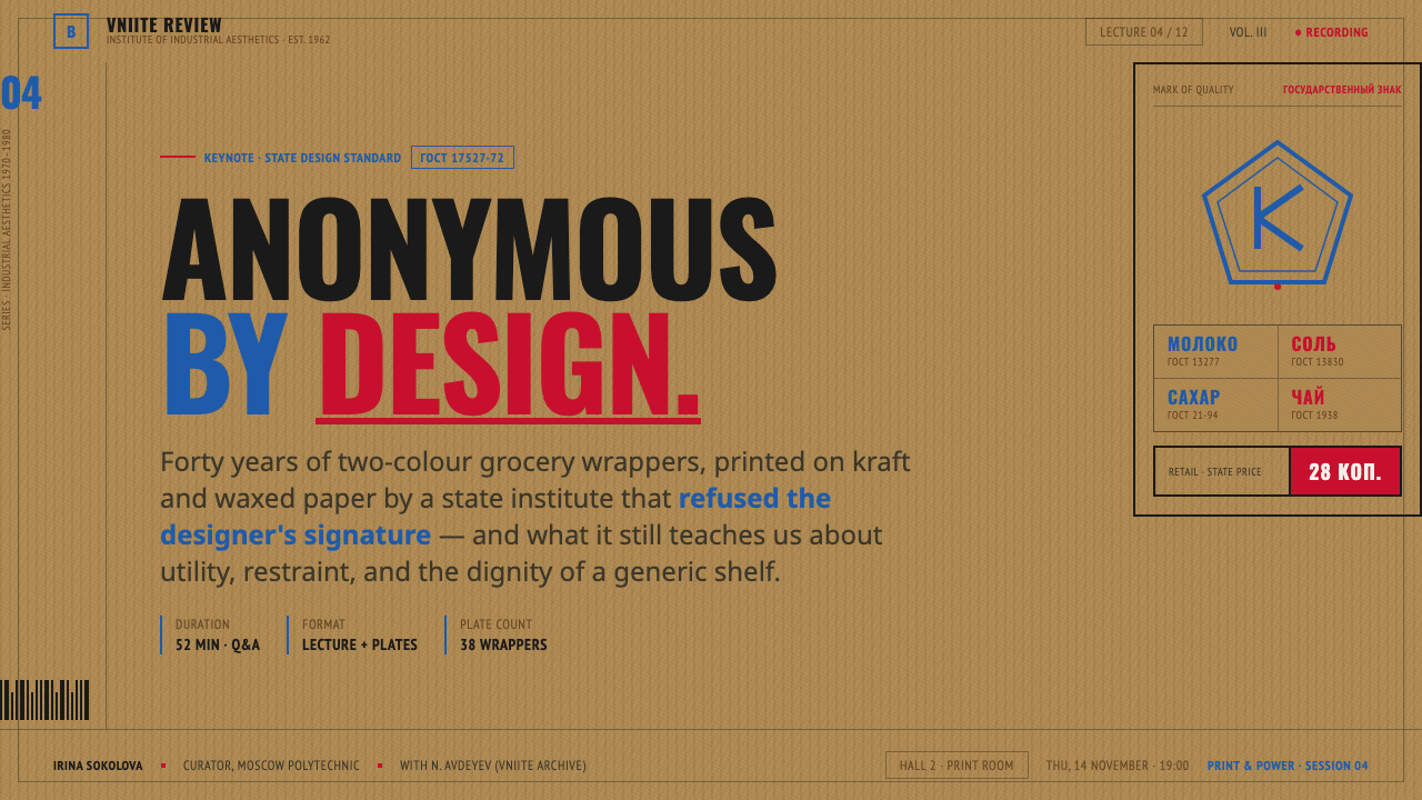
Authenticity comes from carrying over the system of decisions, not from adding nostalgic decoration. Make the product name dominant, use condensed type, organize information with ruled boxes, keep imagery flat or absent, and let the material ground remain visible. Most importantly, design as though the label belongs to a shared standard rather than a private personality. The result should feel anonymous, strict, and useful before it feels fashionable.
Related design styles
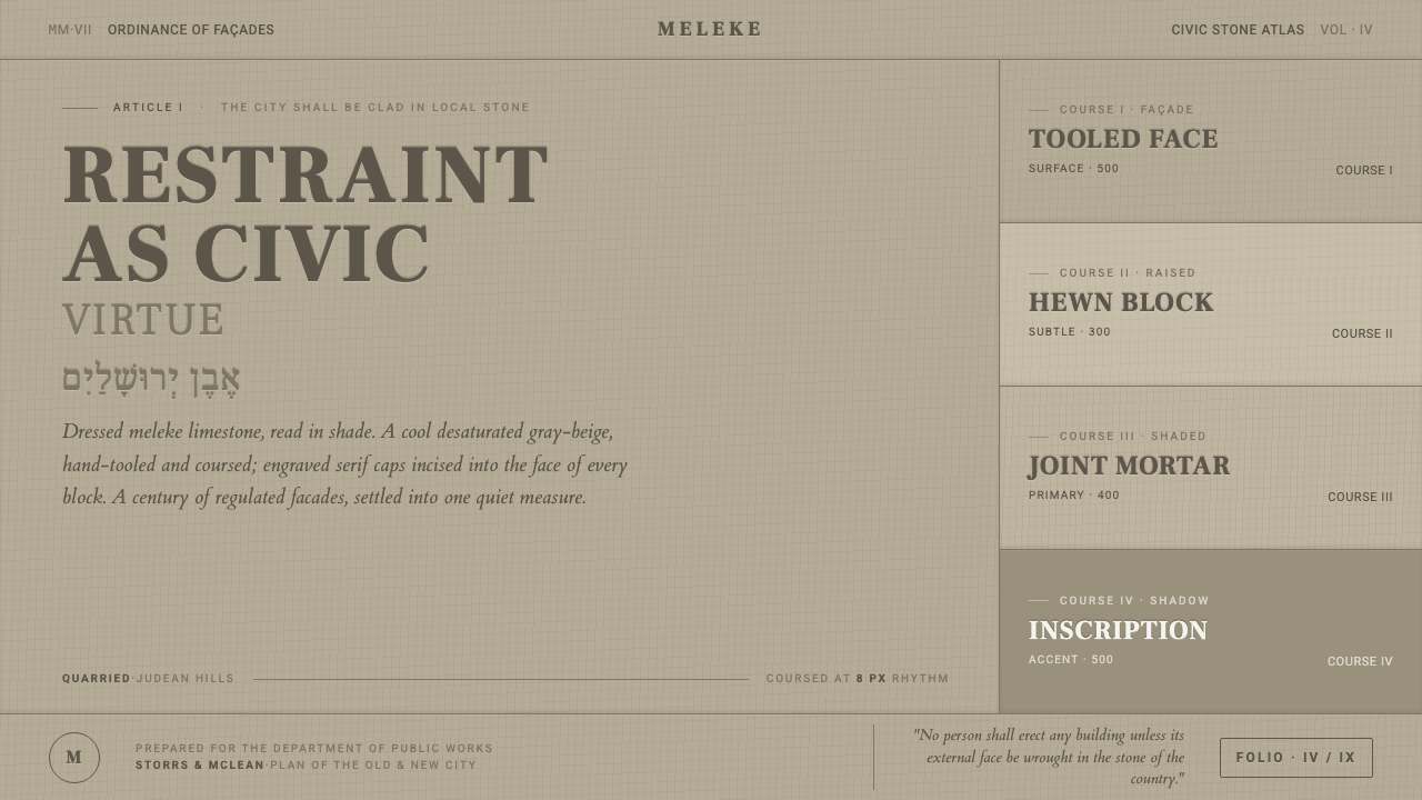 Jerusalem Stone GrayRestraint as civic virtue. Cool dressed-limestone gray-beige, ashlar coursing…
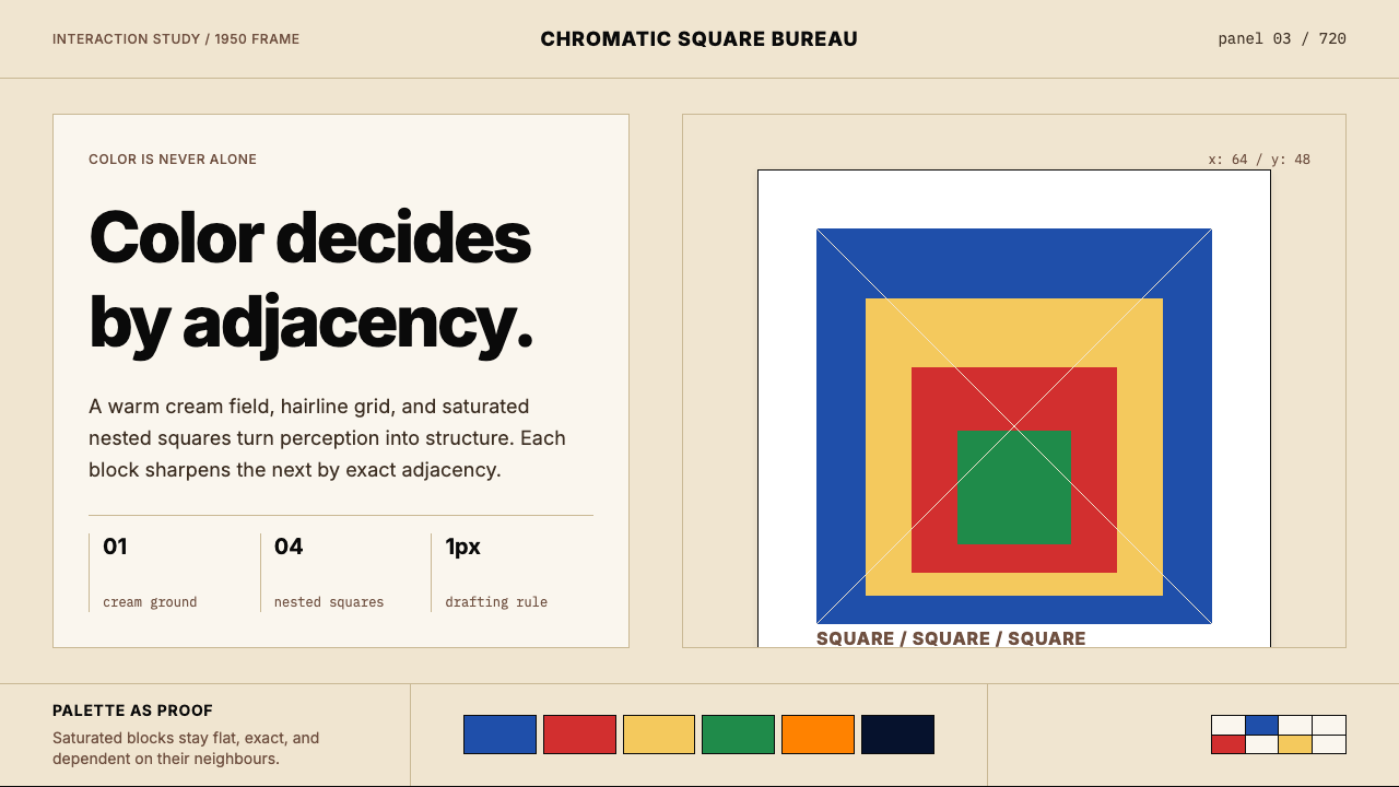 Josef Albers — Homage to the SquareColor becomes event. Warm cream, cobalt-red-yellow nested squares, exact hair…
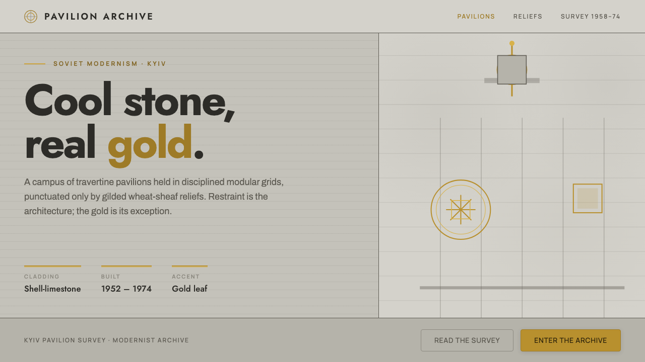 Kyiv VDNH Soviet ModernismRestraint made monumental. Cool travertine grey, geometric Jost type, wheat-s…
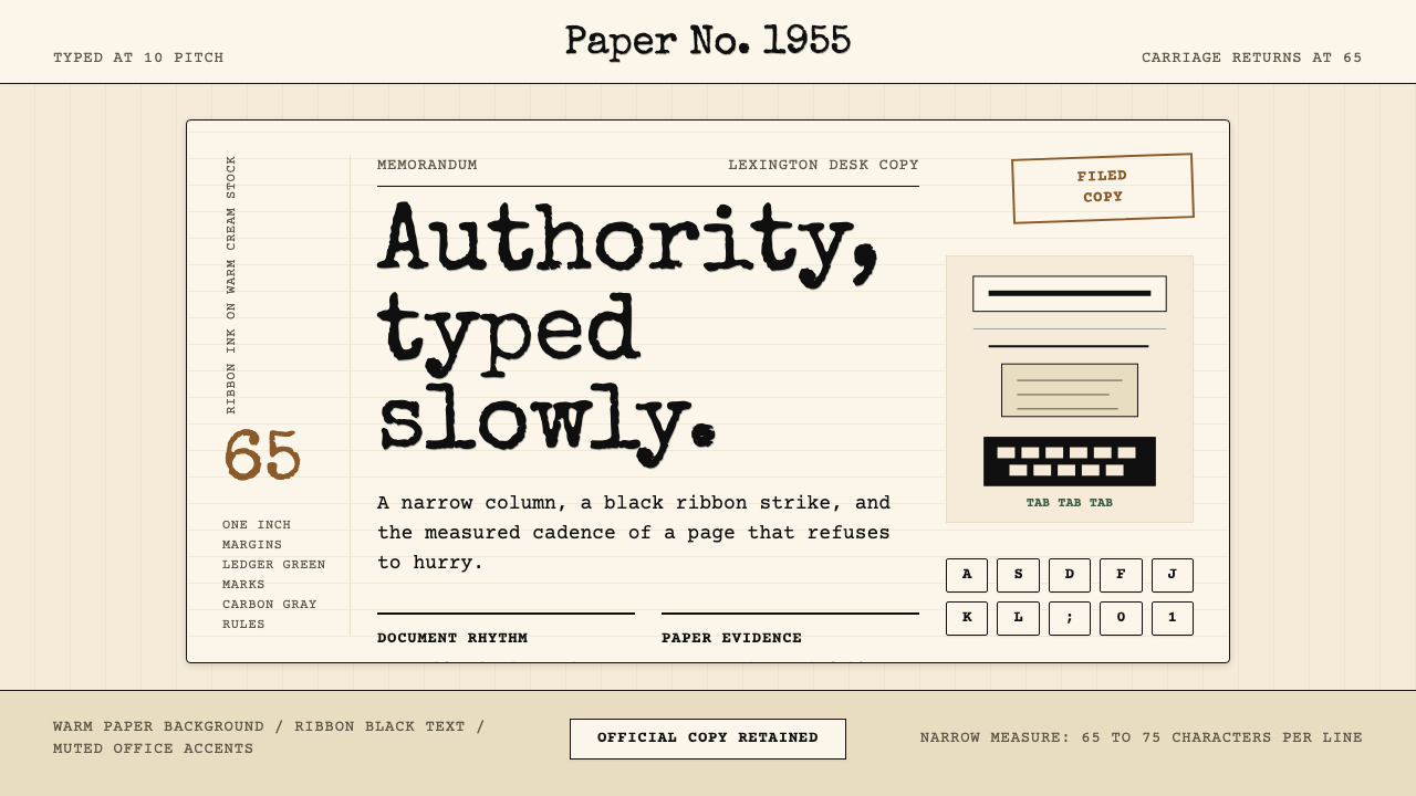 Typewriter Courier (1955)Unhurried authority. Cream paper, ribbon-black monospace, and bordered 65-cha…
 Yugoslav SpomenikMonumentality without figures. Concrete grey-green meets stainless geometry a…
 Aeroflot Soviet AirlineEngineered restraint rules. Silver ground, royal-blue cheatlines, and flat gr…