What is Fiat 126p Maluch?
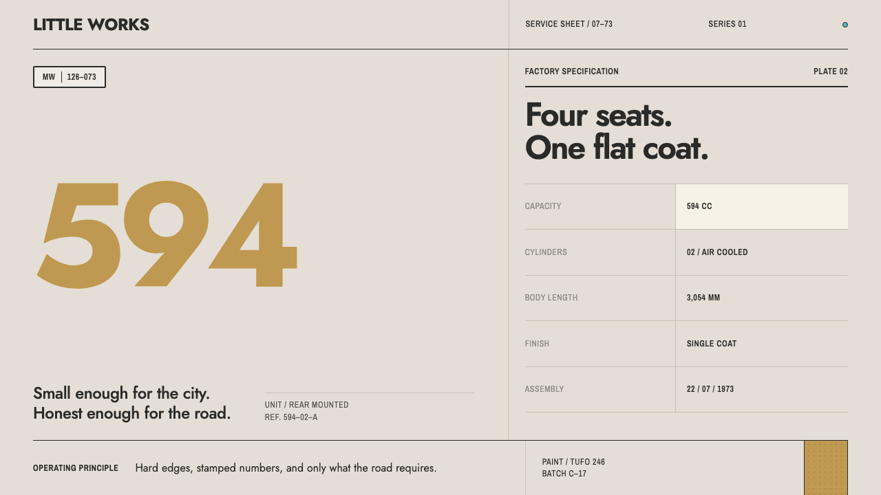
The Maluch was a city car reduced to what a ration could afford, and its look is the same: one flat body colour, hard edges, and part numbers where a logo would go.
Fiat 126p Maluch in brief
Fiat 126p Maluch is a design system built from a single object: the Polish-built Fiat 126p, which began to leave the FSM works at Bielsko-Biała on 22 July 1973. It had a 594cc engine of two cylinders mounted in the back, seats for four if the passengers were friendly, and a body drawn by Sergio Sartorelli as a box with its corners taken off. Poles called it Maluch, 'the little one', and the nickname lasted as long as the car itself, which in the end stayed in production until 2000.
The visual world of the car is surprisingly small and surprisingly coherent. The paint came from a short list of catalogued codes, sprayed as one flat coat with no metallic flake and no clear lacquer on top. The materials around it are black rubber, painted steel and moulded plastic. The lettering is stencilled or pressed into the part. A design system that inherits this world keeps its discipline: a single body colour, hard edges, tightly trimmed corners, and numbers in the place where a brand mark would normally sit.
It is not retro in the usual sense. There is no sun-faded filter, no scratch overlay, no fake chrome. The point is to carry over the way an inexpensive, honestly made object organises itself — everything necessary, nothing applied — and to put that onto a screen without nostalgia or distress. The result is bold but unadorned: a page that looks stamped rather than styled.

Where does Fiat 126p Maluch come from?
The car came from two directions at once. In Italy, Fiat introduced the 126 in 1972 as the successor to the tiny rear-engined 500, carrying forward the logic of city-car rationalism: the largest usable interior from the smallest practical footprint, with every surface doing double duty. The shape was Sergio Sartorelli's — a rectilinear box softened only by trimmed corners, flat panels and no sculpted flourish. It looked like what it was, a machine for moving four people short distances for little money.
In Poland the same design became something larger. The country's communist government, the Polish People's Republic, had agreed to build Fiat designs under licence as the engine of mass motorisation. The 126p, with its 'p' for Polski, was made first at Bielsko-Biała and later also at Tychy, by the factory organisation known as FSM, whose name refers to small-displacement cars. For a great many Polish households it was the first car they could realistically own, acquired after long waits and kept alive through repair, improvisation and a growing store of spare parts. That is why the Maluch carries a double identity: Italian in its drawing, Polish in its use, and licence-built socialist modernity in between.
The paint tells the story of that economy as clearly as the bodywork does. The catalogue offered seven paint codes, sprayed by Polifarb Cieszyn, a paint maker in the south of the country, as flat single coats. With no metallic pigment and no protective clear layer, the surfaces showed their colour straight, without sparkle and without layered depth. This is the palette reference for the system: not a mood board but a swatch card — a closed set of codes, each with a number, each used exactly as it comes.
The long life of the car adds a last layer. The first series ran from 1973 to 1977 and production continued until 2000, so the Maluch outlived the state that had licensed it into existence. A design language drawn from its earliest years is therefore also a language of persistence: parts that kept being stamped and bolted on, lettering that kept being stencilled, a form that never needed refreshing because it was never fashionable in the first place.
What defines the Fiat 126p Maluch look?
One body colour
Each composition commits to a single flat body colour, the way a car leaves the paint shop in one code. The colour is solid and unmodulated, with no gradients, no metallic shimmer and no glossy highlights. The lead colour in this system is a tufo ochre, a warm earthy yellow-brown, and other colours join it as paint codes from a small catalogue, not as a spectrum to be blended.
Hard edges, trimmed corners
The form language is the box with its corners taken off. Panels are rectangular with edges that stop cleanly, and corners are trimmed only slightly, enough to remove the sharpness without making anything look soft or toylike. Rounding here is a tolerance, not a style. Pill shapes, circles and organic blobs are foreign to it.
Part codes where a logo would go
Numbers do the identifying. Where another system would place a wordmark or an icon, this one stamps a part number or catalogue code in blunt, stencil-like lettering. A product name becomes a serial. Pages take on the quality of a spare-parts catalogue: every thing has a number, and the number is the brand.
Honest materials
Black rubber, painted steel and moulded plastic suggest three surface registers: dead black for gaskets, trims and wells; flat painted colour for the body; and a dull dark grey for plastic parts. Surfaces are flat and unlit; they do not shine or reflect. Black is used as a functional material colour — for borders, trim bands and rubber-like separators — and never as a device for drama.
Stencilled and pressed lettering
Type behaves like factory marking: blunt, sturdy, often capitalised, spaced evenly and never ornamented. It reads as something sprayed through a stencil or pressed into a mould, with the slight bluntness that implies. Hierarchy comes from size and position rather than from weight changes or italic flourishes.
Compact, dense layout
The Maluch is small, and its layouts are too: tight margins, close gutters, content packed into the smallest footprint that still reads. Blocks sit directly against one another rather than floating in generous whitespace. The impression is of efficiency under constraint — everything necessary, nothing applied.
No nostalgia, no distress
The system does not age itself. There is no fake wear, grain overlay or sun-bleached tint. The aesthetic is that of a new, cheap, well-made object, seen in the year it was bought. That distinction keeps the style feeling contemporary and stops it from becoming a costume.

Who shaped Fiat 126p Maluch?
Sartorelli drew the Fiat 126 as a box with the corners taken off, a rectilinear body whose beauty lay in economy: flat panels, small trims and no ornament. His shape is the geometric root of this design system, and its lesson is that restraint can itself be an identity. Every trimmed corner and flat plane in the interface descends from his body.
The factory where the first Polish-built Fiat 126p came off the line on 22 July 1973. Its initials refer to small-displacement cars, and its lines, together with later work at Tychy, supplied the stamped, standardised parts whose catalogue numbers give this system its lettering and identification logic. The factory is the reason the design speaks in codes, not in slogans.
The paint works behind the catalogue of seven codes, spraying each as a flat single coat with no metallic pigment and no clear layer. Its colour discipline gives the system its swatch-card palette: a handful of fixed colours, each used as it is, none of them blended. The idea of a palette as a closed catalogue rather than an open spectrum comes from here.
Fiat in Turin supplied the design and the licence. The 126 followed the tiny 500, and with it came the city-car rationalism the Maluch inherited: small footprint, maximum usable space, nothing decorative that did not also do a job. The Polish car is a local life of an Italian idea, and the design system keeps both halves in view.
How do you use Fiat 126p Maluch today?
The Maluch style is strongest where information is practical and objects are plentiful: catalogues, manuals, specifications, parts, inventories. It makes ordinary content feel clearly labelled and fairly priced. It is much weaker when asked to carry glamour, luxury or emotional drama.
A presentation cover can be a single flat field of body colour with a large part number as the title mark and a small descriptive line beneath, like a stamped data plate. Content slides lend themselves to numbered callouts: items keyed to a list the way parts are keyed to an exploded diagram. Data slides do well with plain flat bars and tables in one colour, black rules between rows, and no gradients or three-dimensional effects.
For web interfaces the style suits product catalogues, inventory and logistics dashboards, service-and-repair tools, pricing tables that read like parts lists, and utility products that want to look honest and inexpensive in the best sense. Cards become panels with trimmed corners; buttons are flat and solid in the body colour; part numbers serve as section labels and plan identifiers. Keep one body colour per page and let black do the structural work.
Editorial uses include design-history features on Eastern European industrial design, motoring zines, manuals reissued as books, and brand work for products whose appeal is durability and fair price. Marketing pages can use the 'no logo, just a number' idea as a confident gesture: a plain code is a bolder claim than a slogan. Photography should be flat-lit and unretouched, with objects shown whole and square to the frame.
The most frequent mistake is turning the Maluch into nostalgia: adding grain, scratches, faded tints, vintage badges or 1970s clip-art. That inverts the logic, since the original was new and plain, not old and charming. A second mistake is placing several body colours on one page, as though the seven paint codes were a palette to be mixed. A third is rounding every corner generously; the trimmed-box geometry only works if corners stay almost sharp.

Fiat 126p Maluch — FAQ
Is this a retro or vintage style?
Not in the usual sense. It comes from a 1973 object, but the system reproduces how that object was organised when it was new: flat colour, hard edges, stamped numbers. There is no fake ageing, no sepia and no wear. The aim is to show how an inexpensive, honestly made thing looks on a screen, not to evoke a decade. If it begins to feel like a costume, something has been added that should not be there.
Why use part numbers instead of logos?
Because the original visual world had no room for brand theatre. The car identified itself with stencilled lettering and moulded codes, and that is what the system carries forward. A part number is also honest in a way a logo is not: it says what the thing is and where it fits. On screen it gives pages a catalogue quality and turns identification into something quietly confident.
May I use more than one colour?
As alternatives, yes; as a simultaneous palette, no. A page commits to one body colour, and a different page or section may choose another from the small catalogue. Black appears throughout as a material colour for rubber, trim and rules. This mimics the way each car left the factory in a single paint code from a short list. Mixing several body colours in one view reads as a different, more decorative system.
Is it only for automotive or Polish subjects?
No. The source is one car, but the principles are general: one colour, hard edges, labels over logos, density without clutter. It suits any product that wants to feel practical, durable and fairly priced — tools, hardware, logistics, maintenance, public services. It will not suit products that sell glamour or softness. If your subject is Polish industrial or design history, it is an especially natural fit.
Does the system work on a dark ground?
It is built on light grounds, because a flat body colour needs a plain neutral field around it, the way a car is seen against daylight. On a dark ground the black rubber and trim elements lose their role as separators and the flat colour begins to glow rather than sit. If a dark treatment is unavoidable, keep the single body colour, keep the surfaces matte and avoid any glow effect.
Related design styles
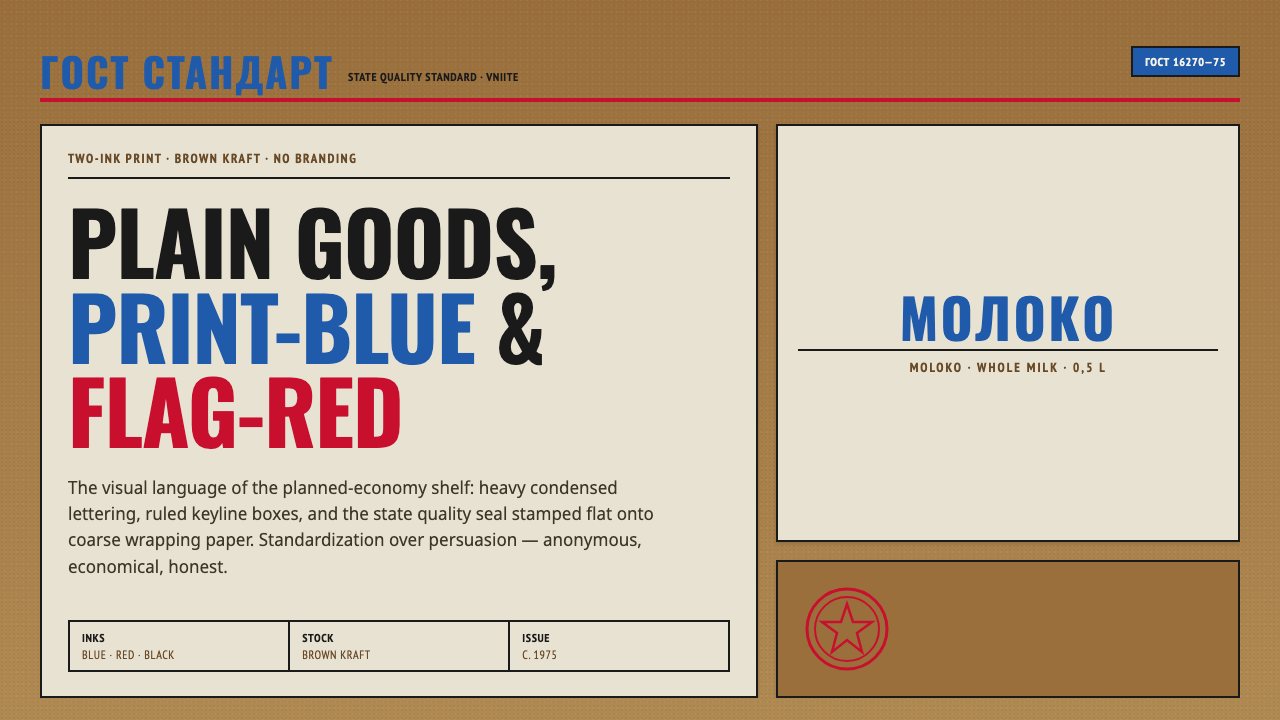 Soviet GOST PackagingAnonymous and strict. Kraft ground, red-blue ink, ruled boxes, condensed type.
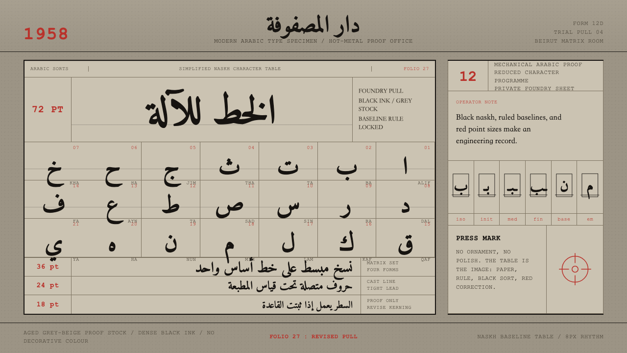 Modern Arabic Type SpecimenDry proof-sheet gravity. Black naskh grids on aged grey-beige, cut by red fol…
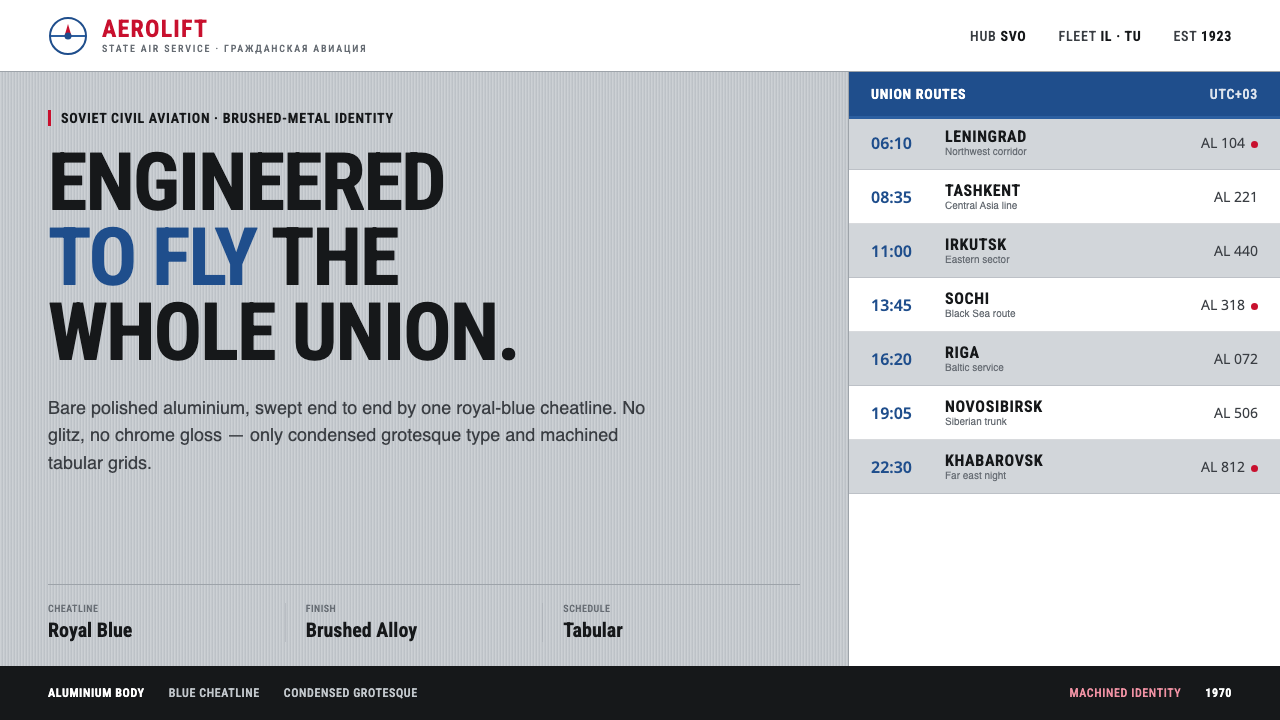 Aeroflot Soviet AirlineEngineered restraint rules. Silver ground, royal-blue cheatlines, and flat gr…
 Apollo Flight PlanEvery second has a line. NASA blue rules and monospaced GET stamps discipline…
 Dieter Rams / BraunQuiet by design. Warm gray, white panels, hairline grids, and one earned gree…
 Feynman Diagram QEDMeaning reduced to strokes. Pale QED lines and TeX serif type float on blue-b…