What is Feynman Diagram QED?
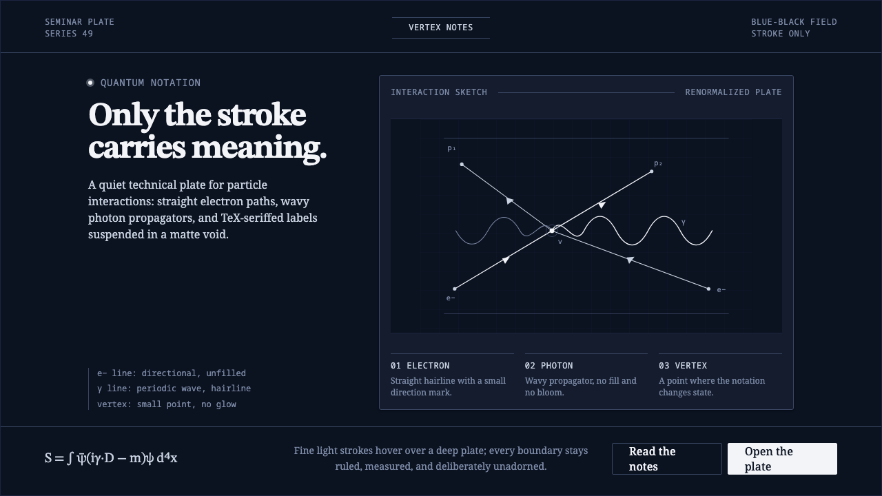
Meaning collapses into linework: pale QED strokes and TeX serif type drift through a blue-black void where every meeting point carries the weight of an interaction.
Feynman Diagram QED in brief
Feynman Diagram QED is a dark, diagrammatic design language built from the chalkboard reading of particle-interaction notation. Its world is a deep blue-black field, its marks are pale and fine, and its visual vocabulary is deliberately narrow: straight lines, wavy lines, meeting points, and serif mathematical type. The result is not an illustration of physics but a graphic system in which the stroke itself carries meaning.
The central grammar is direct. Straight lines stand for electrons, wavy lines for photons, and vertices for moments of encounter. These marks are not decorative symbols placed around an interface; they are the interface’s organizing logic. Their value comes from position, continuity, interruption, and relation. A diagram can therefore feel dense with information while remaining almost empty of surface treatment.
The mood is quiet, exact, and suspended. Pale lines float against a blue-black void without filling, glow, or simulated atmosphere. TeX serif typography introduces the formal character of scientific notation, while generous negative space preserves the sense of a silent blackboard. The style is neither luminous science fiction nor ornamental infographic design. It is a restrained visual skeleton built for legibility and thought.

Where does Feynman Diagram QED come from?
The system begins with Richard Feynman’s 1949 publication of a line-art shorthand for particle interactions in Physical Review. The innovation was representational economy: complex interactions could be read through a controlled vocabulary of lines and vertices rather than through pictorial depiction. The diagram became a compact bridge between abstract theory and visible notation, with every stroke assigned a communicative role.
Its cultural setting is the postwar American theoretical-physics community, with Cornell and Caltech named as important points of reference. QED formalism was cemented through the 1950s, and the visual language belongs to that larger movement toward making mathematical physics precise, transmissible, and structurally readable. The style retains the seriousness of that environment without reproducing its institutional density.
Quantum field theory supplies the conceptual foundation: particles and forces are understood through interactions, relations, and exchanges rather than isolated decorative objects. Mid-century mathematical physics contributes the taste for notation that is economical, exact, and internally consistent. In design terms, this means that composition should feel derived from a system of relations, not assembled from a collection of attractive effects.
TeX scientific typesetting completes the origin story on the typographic side. Its serif forms, mathematical cadence, and disciplined spacing reinforce the impression that language and diagram belong to the same analytical field. The resulting style joins line-art physics with formal typesetting: the diagram explains through marks, while the text clarifies through measured notation and open space.
What defines the Feynman Diagram QED look?
Stroke as Meaning
The stroke is the primary bearer of information. It should remain fine, continuous where continuity matters, and visibly intentional at every turn. A line is not a border around content; it is the content’s semantic instrument. This gives the style an unusual discipline: removing a line may remove meaning, while adding one without purpose weakens the whole system.
Diagrammatic Grammar
Straight lines, wavy lines, and vertices form a compact visual grammar. The distinction between them should remain immediately legible, because their identity comes from behavior rather than ornament. Composition should emphasize relation: paths approach, meet, diverge, or terminate. The diagram feels analytical when its marks appear to follow rules that remain stable across the page.
Blue-Black Void
The ground is not merely a dark background. It establishes the visual condition in which the lines appear suspended, like marks on a quiet quantum blackboard. Blue-black is more atmospheric than absolute black but remains deep enough to preserve the sense of distance. The field should feel continuous and unbroken, giving every pale mark room to exist without competing texture.
Pale Contrast
Contrast comes from a restrained relationship between pale marks and the dark field, not from aggressive brightness. The lines may feel chalk-like, mineral, or softly printed, but they should never become luminous objects. This controlled contrast preserves the reading order of the diagram and keeps attention on connections rather than spectacle.
TeX Serif Typography
Typography should inherit the formal cadence of TeX scientific typesetting. Serif letters provide a human reading rhythm that complements the abstract line system, while mathematical notation can sit beside diagrams without feeling imported from another visual world. Type is precise but not flashy, with hierarchy created through scale, placement, and weight rather than decorative treatment.
Generous Negative Space
Negative space is an active part of the diagram. It separates interaction paths, protects labels, and creates the sensation that marks are floating in a larger field than the immediate composition. Crowding the canvas turns the style into a technical wallpaper. Open space is what allows the notation to remain legible, contemplative, and structurally calm.
No Fill, No Glow
The style depends on refusing effects that pretend to add physical presence. Filled shapes, neon halos, glossy surfaces, and atmospheric bloom all compete with the semantic authority of the stroke. Depth should come from overlap, spacing, and relation, not from simulated lighting. The absence of these effects is not a limitation; it is the condition that keeps the system exact.

Who shaped Feynman Diagram QED?
Feynman is the defining figure of the style’s visual origin. In 1949 he published the line-art shorthand that reduced particle interactions to straight lines, wavy lines, and vertices. A Curio treatment should reflect that economy: his presence belongs in the diagram’s grammar itself, not in a decorative portrait or a heroic visual treatment.
Freeman Dyson is one of the key figures named in the origin material surrounding QED and the postwar theoretical-physics community. Visually, he belongs to the same sparse constellation of notation, relation, and open field. His representation should therefore remain integrated with the system rather than becoming a separate illustrated subject.
Julian Schwinger appears in the approved origin as part of the QED constellation. The style offers no need for biographical ornament around that name. Its most faithful treatment is to place the figure alongside disciplined notation and restrained typography, allowing the intellectual field to be communicated through structure rather than visual spectacle.
Sin-Itiro Tomonaga is likewise named among the key figures associated with the origin of this QED language. In a design application, the name can sit within the same calm typographic and diagrammatic environment as the other figures. Consistency matters more than emphasis: the system should suggest a shared intellectual framework rather than a hierarchy of portraits.
How do you use Feynman Diagram QED today?
For presentation slides, use the blue-black field as a continuous stage across cover, content, and data pages. A cover can hold a sparse cluster of pale interaction lines with the title set in TeX-like serif type. Content slides should let a diagram establish the reading path before explanatory text appears. Data slides benefit from relational diagrams, branching paths, and carefully separated labels rather than filled charts or decorative panels.
For web interfaces, the style suits analytical dashboards, research tools, and pricing pages that need authority without visual noise. Keep navigation typographic, let pale rules and line diagrams organize panels, and reserve stronger contrast for active states or important changes. Cards should feel like notation placed in a field, not raised objects with glossy surfaces. Pricing tiers can be distinguished through line behavior, label placement, and hierarchy rather than a parade of colored fills.
For editorial and marketing work, Feynman Diagram QED creates a strong atmosphere for essays, scientific explainers, technical reports, and products that want to signal rigor. Use wide areas of dark field around a narrow text measure, introduce diagrams as structural interruptions, and let headings sit with generous breathing room. Marketing messages should remain declarative and spare, supported by one memorable interaction diagram instead of layers of imagery.
In educational and technical communication, the style is especially effective when the subject depends on systems, exchanges, or invisible relations. A page can begin with an unlabelled diagram, then add explanatory text as the reader moves through its paths and vertices. The visual language makes abstraction feel tangible without pretending to depict a physical scene.
The common mistake is turning the theme into neon science fiction. Excessive glow, luminous gradients, filled particle shapes, and busy star-field textures destroy the chalkboard restraint that gives the style its identity. Another mistake is treating the lines as decoration while placing ordinary interface content on top. The diagram must organize meaning; if the strokes could be removed without changing how the page is understood, the system has been applied only superficially.

Feynman Diagram QED — FAQ
What is the core visual idea of Feynman Diagram QED?
It reduces meaning to a disciplined line grammar. Straight lines, wavy lines, and vertices describe particle interactions, while a deep blue-black field and TeX serif type provide the surrounding structure. The design should feel analytical and suspended, with no need for illustrative filling or atmospheric effects.
Are the straight and wavy lines merely decorative motifs?
No. In the source system, straight lines represent electrons, wavy lines represent photons, and vertices mark encounters. Their meaning depends on their relationships and placement. If they are used only as atmospheric accents, the central logic of the style has been lost.
Does the style require a dark background?
The deep blue-black ground is central to the approved visual language because it creates the feeling of pale marks suspended in a quantum void. A light variation is possible as an adaptation, but it will change the chalkboard reading and reduce the sense of distance. If the background becomes light, the line grammar and generous negative space must carry much more of the identity.
Why is TeX serif typography important here?
TeX serif typography gives the system its scientific and mathematical cadence. It balances the abstraction of the diagrams with a readable textual voice, allowing notation and prose to occupy the same analytical environment. Decorative display lettering or futuristic interface type would pull the design toward spectacle and away from disciplined inquiry.
What is the most common mistake when applying this style?
The most common mistake is confusing darkness and linework with neon futurism. Glow, luminous gradients, filled forms, and decorative space textures make the image louder but less faithful. The correct test is structural: every stroke should clarify a relation, every label should remain calm, and every empty area should help the diagram breathe.
Related design styles
 Modern Arabic Type SpecimenDry proof-sheet gravity. Black naskh grids on aged grey-beige, cut by red fol…
 Snow Crystal ClassificationSnow as taxonomy, not decoration. Frosted ice-cyan crystals on a near-black d…
 Shark Jaw & DentitionForensic and strictly greyscale. Bone-white serrated dentition floats on a co…
 Bechers Industrial TypologyDeadpan order. Mid-grey ground, Archivo labels, and strict hairline grids rev…
 Bengali Art-House CinemaLight becomes restraint. Near-black ground, silver serif, and Bengali script…
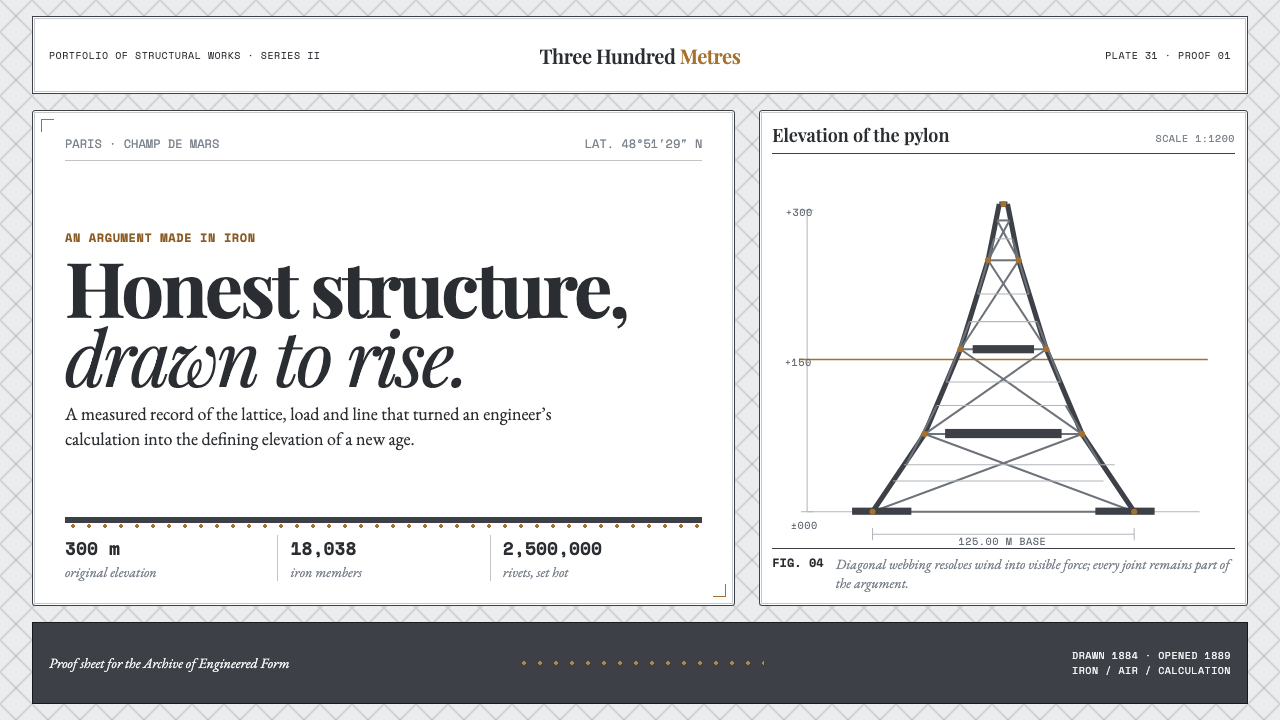 Eiffel Tower (1889)Structure speaks plainly. Graphite lattice, bronze rivets and measured type m…