What is Eiffel Tower (1889)?
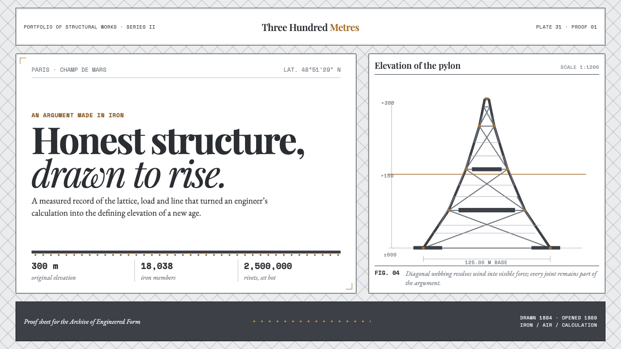
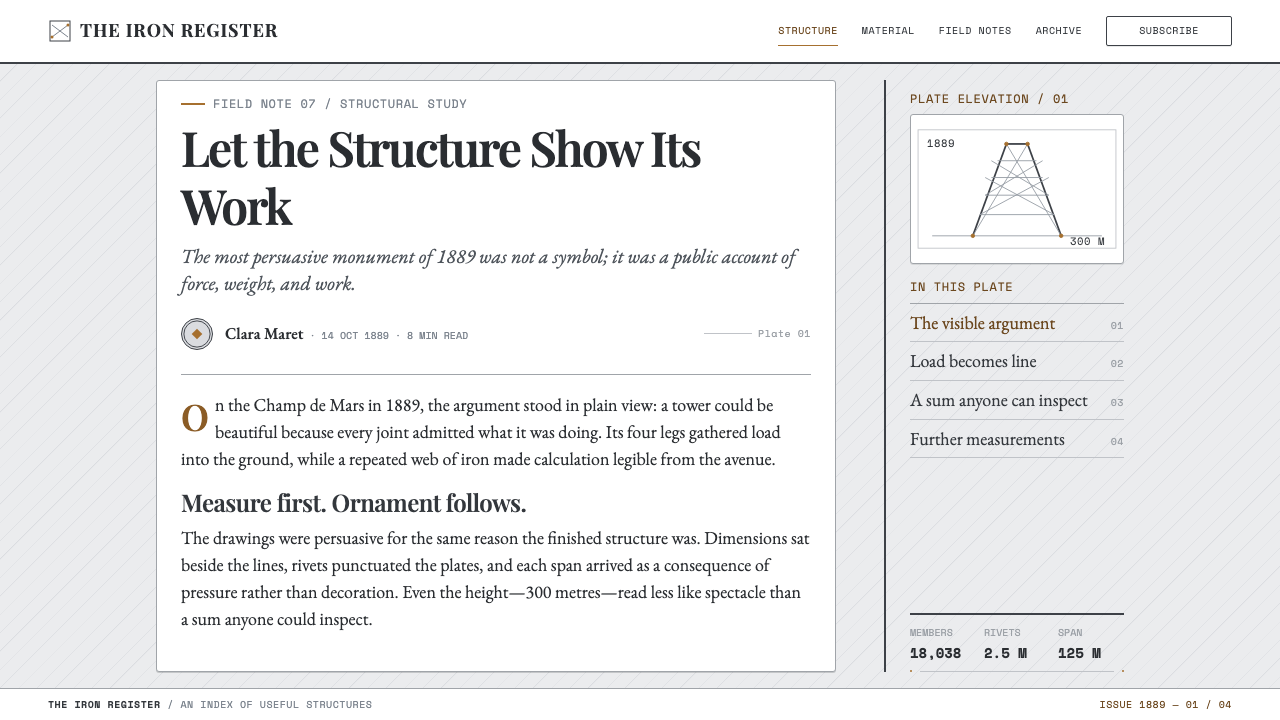
The Eiffel Tower system treats structure as the whole argument — iron-gray diagonals, oxidized-rivet bronze, and draftsman's numbers set with the plain honesty of a page torn from an 1889 engineer's portfolio.
Eiffel Tower (1889) in brief
This is a system that treats engineering honesty as an aesthetic. The color range is narrow and cool by design — pale zinc paper, graphite ink, and a single warm note of oxidized-rivet bronze — because the source material itself was never meant to be colorful. It was meant to be legible, the way a technical drawing is legible: every value doing structural work, nothing added for mood alone.
The organizing logic is the diagonal lattice, the same crosshatched bracing pattern visible in the tower's earliest engineering sketches. Grids in this system are rarely orthogonal; they lean, cross, and repeat at consistent angles, producing a sense of load-bearing structure rather than decorative arrangement. Nothing floats free of this bracing logic — even typographic rules and dividers tend to run at the diagonal rather than the horizontal.
Numbers carry unusual weight here. Spans, tonnages, and rivet counts are set in a draftsman's monospace, aligned the way dimension lines are aligned on a shop drawing. The overall effect is closer to a page from an engineer's presentation portfolio than a nostalgic postcard — a structure so honest about its own construction that it wears its rivets on the outside.
Where does Eiffel Tower (1889) come from?
The tower was designed in 1884 and opened in 1889 as the centerpiece of that year's Exposition Universelle, the world's fair marking the centennial of the French Revolution. It was built from wrought iron rather than the steel that would soon supersede it, using a technique called puddling, which required an enormous quantity of individually fabricated members — roughly 18,000 of them, joined by an estimated two and a half million rivets, each one placed by hand.
The tower's engineering was the work of Maurice Koechlin and Émile Nouguier, two senior engineers at Gustave Eiffel's firm, who produced the first sketches of the lattice structure. Their original design was considered visually harsh by some at the firm, and architect Stephen Sauvestre was brought in to refine its appearance — adding the decorative arches at the base and other proportional adjustments that softened the tower's purely structural silhouette into something more publicly presentable. Gustave Eiffel, whose name the structure carries, championed the project and staked his firm's reputation on its success.
Public reception before construction was famously hostile. A group of prominent French artists and writers signed a public protest against the tower, calling it a 'truly tragic street lamp' and objecting to the imposition of an industrial iron structure on the historic skyline of Paris. Eiffel and his engineers countered this skepticism not with artistic argument but with technical demonstration — publishing detailed engineering data, spans, tonnages, and structural calculations to make the case that the tower's honesty about its own construction was itself the point.
Steel-engraving illustration played a central role in winning over that skeptical public. Crosshatched engraving plates depicting the tower under construction and completed were widely reproduced in the press of the era, translating the structure's iron lattice into a medium — fine parallel and crossed lines built up to suggest tone and depth — that echoed the tower's own diagonal bracing. This visual language, born from the technical printing methods of the period, is the direct ancestor of this system's linework.
What defines the Eiffel Tower (1889) look?
Iron-Gray Palette
Color stays within a narrow, cool range — pale zinc-toned paper, graphite ink, and neutral steel grays — with warmth reserved for a single accent drawn from oxidized rivet bronze. The restriction is functional: this is a palette built to read as engineering documentation, not decoration.
Diagonal Lattice Grid
The organizing structure is a crosshatched diagonal grid, echoing the bracing pattern visible in the tower's earliest engineering sketches. Elements lean and cross at consistent angles rather than sitting on a simple orthogonal grid, producing a sense of load-bearing structure rather than flat layout.
Rivet Bronze Accent
The only warm note in the system comes from the color of an oxidized iron rivet — a muted bronze rather than a bright metallic gold. It is used sparingly, marking points of structural or informational emphasis the way an actual rivet marks a structural joint.
Draftsman's Monospace Numerals
Numbers — spans, tonnages, rivet counts — are set in an even, monospaced style and aligned the way dimension lines align on a shop drawing. Numerals are treated as load-bearing information, not decorative statistics, and are never set in a display or expressive typeface.
Engraved Linework
Illustration and texture favor the crosshatched, fine-parallel-line technique of period steel engraving over photographic or painterly rendering. Tone and depth are suggested by density of line rather than shading or gradient, matching the print technology that originally sold the tower to the public.
Exposed Structure
Nothing hides its own construction. Joints, rivets, and structural members are shown rather than concealed behind a smooth surface — the visual equivalent of the tower's own honesty about wearing its bolts on the outside rather than disguising them.
Who shaped Eiffel Tower (1889)?
Eiffel's engineering firm built the tower and it carries his name; he championed the project publicly against fierce artistic opposition and staked his professional reputation on demonstrating that a purely structural iron form could be both functional and monumental — the argument this entire design system exists to visualize.
Koechlin, a senior engineer at Eiffel's firm, produced the first sketches of the tower's lattice structure in 1884, working out the diagonal bracing logic that remains the tower's — and this system's — defining organizational principle.
Nouguier co-developed the tower's original engineering concept alongside Koechlin, contributing to the early lattice-structure calculations before Stephen Sauvestre was brought in to refine the design's public appearance.
Sauvestre, an architect, was brought in to refine the engineers' original lattice concept, adding the decorative base arches and proportional adjustments that softened a purely structural silhouette into a form the Parisian public — and the era's harshest art critics — could accept.
How do you use Eiffel Tower (1889) today?
This system rewards work that wants to feel engineered, precise, and confident about showing its own structure — applying it well means treating grid and numerals as load-bearing elements, not treating a diagonal pattern as mere decoration.
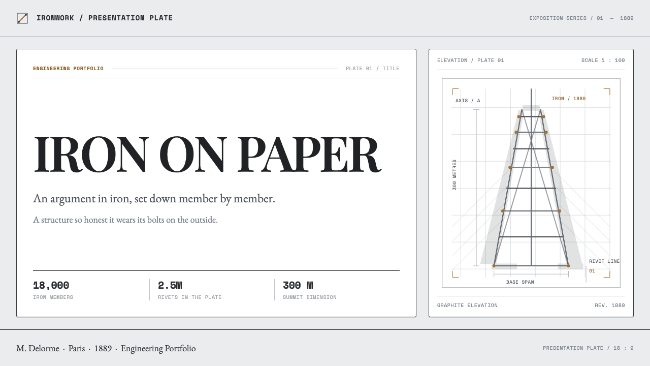
For presentation slides, the style is strongest on cover pages that use a single diagonal lattice motif anchoring one corner, with title text set in the system's monospace numerals treated like a dimension label. Content slides should hold to the diagonal grid consistently rather than switching to an orthogonal layout mid-deck; data slides are a natural home for this style, since spans, counts, and tonnages set in draftsman's type read as authentic rather than decorative statistics.
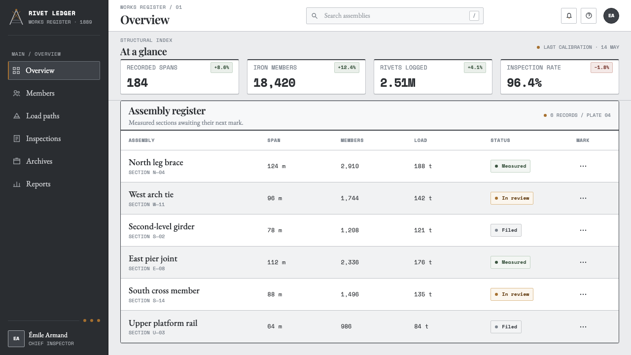
For web interfaces, the palette and grid logic suit engineering, infrastructure, industrial, and technical-product dashboards where credibility and precision matter more than warmth. A near-white or pale-zinc background with graphite text and a single bronze accent for key actions or alerts reads as rigorous; diagonal dividers or corner brackets reinforce the lattice logic without requiring literal tower imagery.
For editorial and marketing work, the system suits long-form engineering history, architecture writing, and brand storytelling built around craftsmanship and structural honesty. Treat pull quotes and section breaks with the crosshatched engraving texture rather than flat rules, and let large numerals — a rivet count, a span, a tonnage — function as pull-quote-scale visual anchors.
The most common mistake is treating this as generic 'industrial' or 'blueprint' styling with cold blue linework and cyanotype color. This system is warmer and more specific than a blueprint: it is iron-gray with a bronze accent, built from engraving and draftsman's numerals rather than cyanotype conventions, and it should read as a 19th-century engineer's portfolio page, not a modern technical schematic.
Eiffel Tower (1889) — FAQ
Why does this system use such a narrow, cool color range?
The palette follows the tower's own material logic: wrought iron and steel-engraving illustration are inherently gray-toned, and the single warm accent comes from the color of an oxidized rivet rather than any decorative choice. The restriction keeps the system reading as engineering documentation rather than a romanticized landmark illustration.
Why was the tower's design so controversial before it was built?
A group of prominent French artists and writers publicly protested the plan, objecting to an industrial iron structure dominating the historic Parisian skyline and calling it a 'truly tragic street lamp.' Eiffel and his engineers responded with technical rather than artistic argument, publishing spans, tonnages, and calculations — the same design instinct that gives this system its numeral-forward, documentation-like character.
Why does the diagonal lattice matter so much to the grid logic?
The diagonal lattice was present in Koechlin's very first engineering sketches and is the actual load-bearing logic of the tower's iron structure, not a decorative pattern applied afterward. Carrying that same diagonal logic into layout grids keeps the system honest to its structural origin rather than treating the lattice as surface ornament.
How is this different from generic 'blueprint' or 'schematic' design?
Blueprint and cyanotype styling is typically cold blue on white, evoking modern technical drafting conventions. This system instead draws on 19th-century steel-engraving illustration — crosshatched linework, iron-gray tones, and a single bronze accent — and reads as an engineer's presentation portfolio from the tower's own era rather than a generic modern schematic.
Does this style suit products unrelated to engineering or architecture?
It transfers well to any product that wants to signal precision, rigor, and structural credibility rather than warmth or playfulness — technical documentation, financial or scientific dashboards, and craftsmanship-focused brands. It is a poor fit for consumer products that depend on approachability or emotional warmth, since the system's severity and numeral-heavy language read as cold in those contexts.
Related design styles
 Feynman Diagram QEDMeaning reduced to strokes. Pale QED lines and TeX serif type float on blue-b…
 Modern Arabic Type SpecimenDry proof-sheet gravity. Black naskh grids on aged grey-beige, cut by red fol…
 Mohs Hardness ScaleRanked by what scratches what. Ten mineral-gray chips on cool chart-white, en…
 Whistler Nocturne TonalismA painting organized like music. One dusk-blue chord, one warm gas-lamp point…
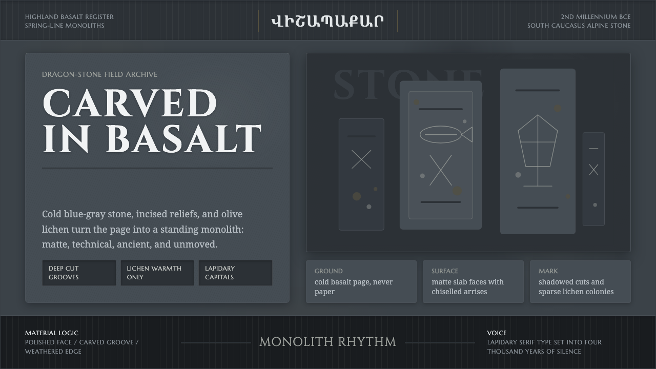 Armenian Vishapakar Dragon StoneAncient, cold, unmoved. Basalt gray slabs, incised grooves, sparse olive lich…
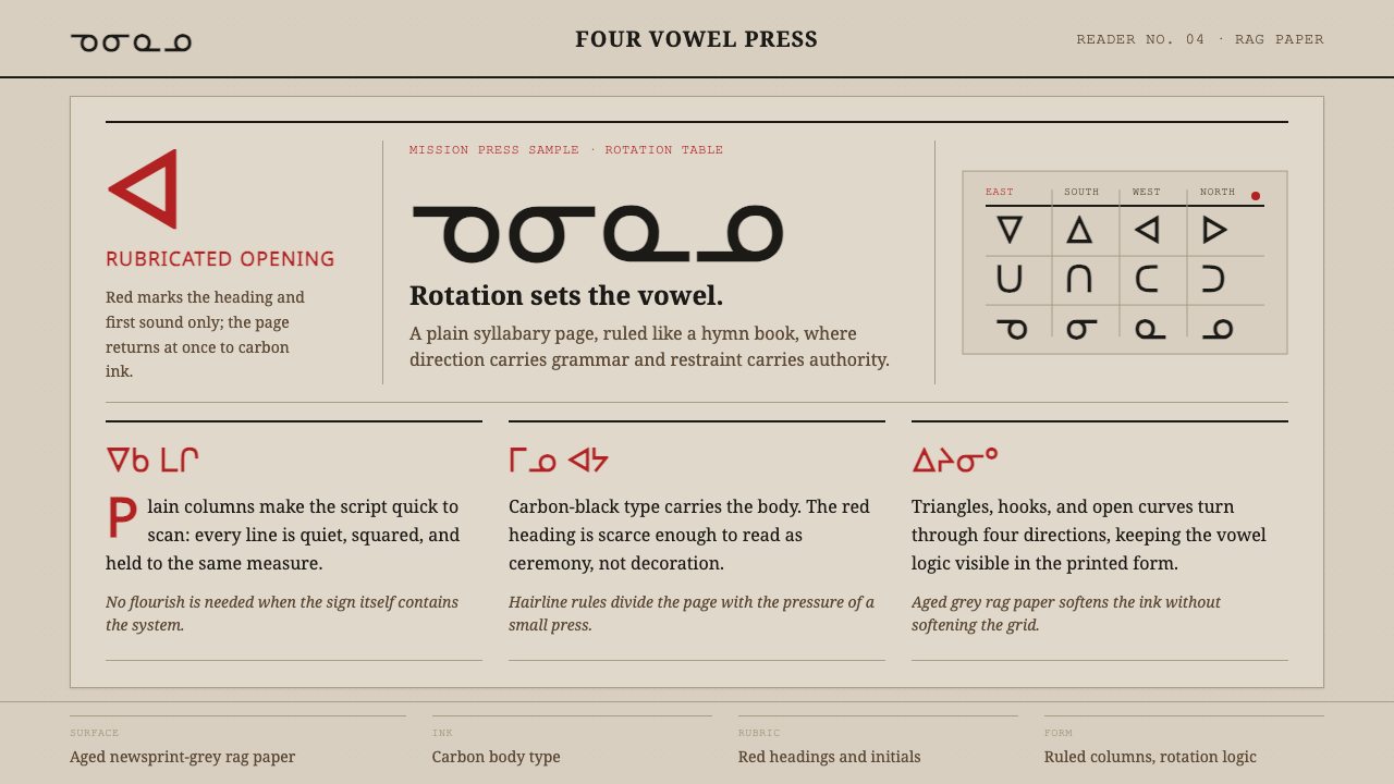 Cree SyllabicsPlain ink has authority. Carbon columns and red rubrication sit on rag-grey p…