What is Serlio Architectural Orders?
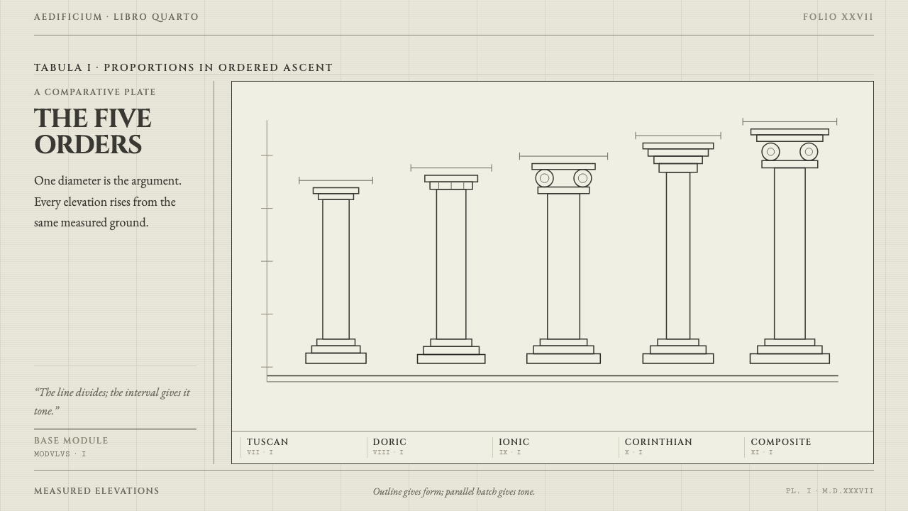
Serlio set the five orders on a single printed page and measured each one in fractions of a column's width — a design language in which order is drawn in line, never filled in tone.
Serlio Architectural Orders in brief
Serlio Architectural Orders is a design language built from a single Renaissance treatise page. Sebastiano Serlio's Regole generali took the five classical orders off the scaffold and onto one printed sheet, ranked from Tuscan to Composite, with every dimension expressed as a fraction of the column's diameter. The plates are woodcuts: a black outline, parallel hatching, and no color anywhere on the sheet. The design system reads that page literally and rebuilds an interface from it.
Its rules are few and strict. Tone comes from line density, never from fill: a darker area is a tighter set of hatch lines, not a gray block. Rules divide the page, and nothing is boxed or shadowed. Roman capitals label, a chancery italic annotates, and the paper stays the pale leaf it always was. Every decision can be traced to what a woodblock and a printing press could do on one sheet.
The result is quiet, scholarly and warm. It is a style where proportion does the work that decoration does elsewhere: a measured column in the margin, a numbered caption in italic, a hairline between sections. Even the faint ghost of text showing through from the back of the paper is treated as part of the page. The style asks the reader to look closely, and then rewards that attention with a sense that every mark is accounted for.
Where does Serlio Architectural Orders come from?
The treatise belongs to the Italian High Renaissance and to the movement the record calls Vitruvianism: the effort to recover and apply the rules of architecture set out by Vitruvius, the ancient Roman author whose writing gave sixteenth-century builders their authority. Serlio's Regole generali, usually counted as the fourth book of his larger work on architecture, was published in Venice in 1537. Its achievement was to turn rules scattered through a text into a comparable set of pictures. The five orders — Tuscan, Doric, Ionic, Corinthian and Composite — could be read side by side on one page, from the sturdiest to the most slender.
The page works because it gives a system rather than a list. Every dimension is a fraction of the column diameter, so one measure governs the base, the shaft, the capital and the entablature. A builder who knows the module can build at any scale. That is the proportional idea the design system keeps: a single unit from which the parts of the layout follow, instead of values chosen one at a time. The record names Baldassare Peruzzi among the figures of the story; he was Serlio's teacher, and his example and drawings stand behind the treatise.
The medium shaped the look as much as the content did. The Venetian printer Francesco Marcolini issued the 1537 book, and its plates were cut in wood. A woodcut is a relief print, inked from raised lines, so the printed image is made only of black line and bare paper; it can carry no soft gray. Tone, shadow and volume must therefore be built from parallel hatching, with density standing in for darkness. And because woodblocks are inked and pressed alongside metal type, text and plate share a page and a rhythm. This is the origin of the system's flat, line-only surfaces and its refusal of gradients.
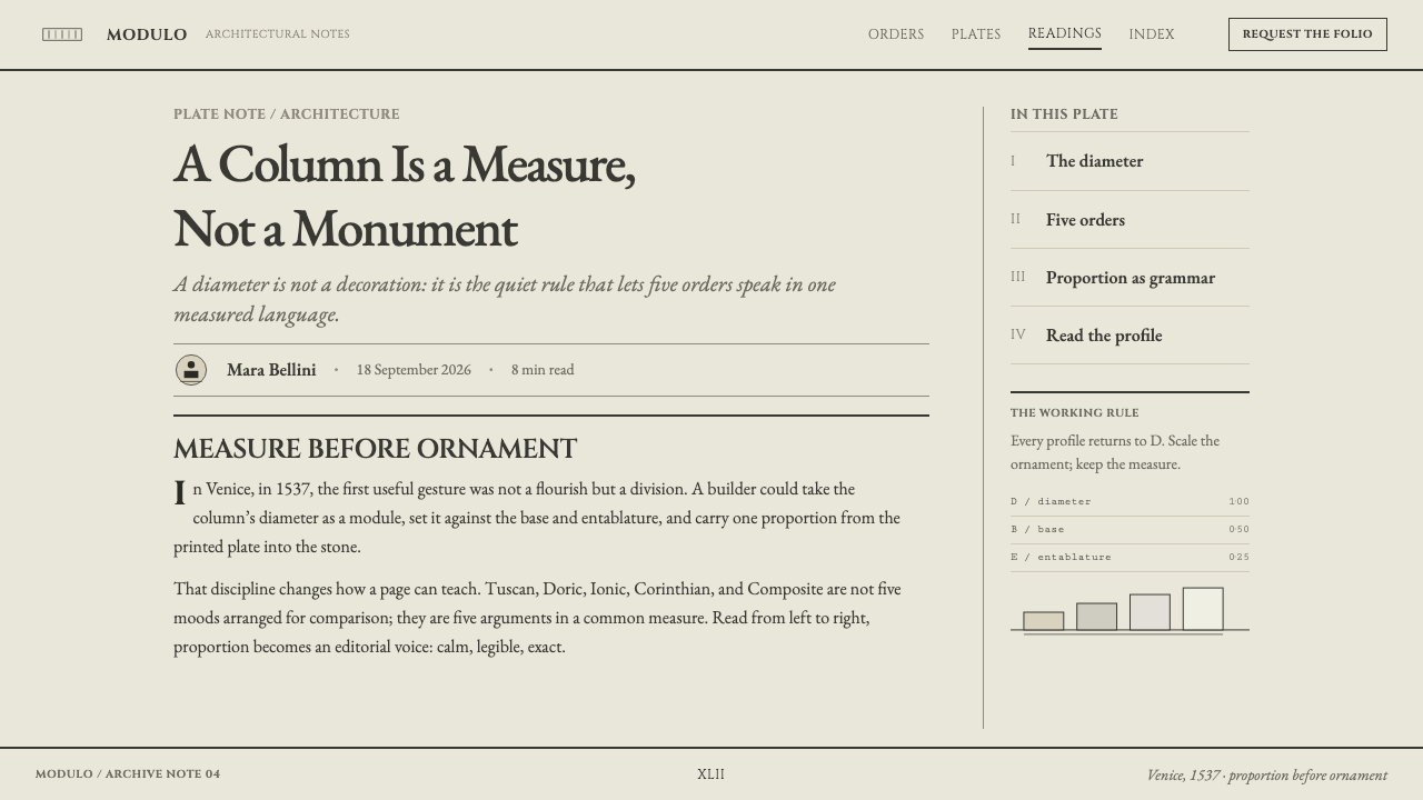
Serlio's career carried the treatise from Venice to the French court, the second locale in the record, and later books appeared in Paris and Lyon, so the dated span of the work runs from 1537 to 1575. The record places it in a treatise-and-plate tradition: a book form in which text and measured illustration are designed together, the plate explaining the paragraph and the paragraph explaining the plate. A design system built on that tradition inherits something useful for interfaces too — a page where explanation and diagram are one thing, each labeled, ranked and ruled in the same hand.
What defines the Serlio Architectural Orders look?
Tone by Line Density
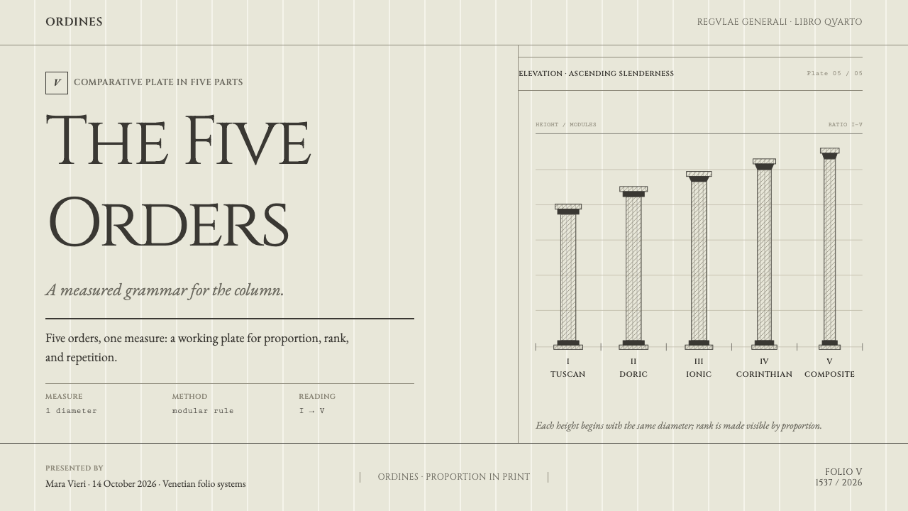
Tone comes from how tightly parallel lines are packed, never from a filled shape. A darker region is a denser hatch, a lighter one is open paper. This is a direct inheritance of the woodcut, which can print only black line and bare sheet. In an interface it means charts, emphasis and depth are drawn with line patterns and spacing, not with gray tints or gradients.
Hairline Rules
Rules divide the page; nothing is boxed, filled or shadowed. A thin line between sections, around a caption or under a heading is the entire vocabulary of separation. The restraint keeps the page flat and legible, and it means that structure is carried by position and proportion, which is the same discipline as the architecture the page describes.
Proportion as Module
Every measurement in the source plates is a fraction of the column diameter, so one unit governs the whole figure. The design system carries that logic into layout: margins, column widths, caption sizes and spacing are expressed as simple ratios of a shared module rather than as values chosen one by one. The page feels settled because its parts are related, not merely placed.
Ranked, Left to Right
The five orders stand in a row from Tuscan to Composite, arranged by slenderness and richness. The page teaches by comparison: the reader sees how one form relates to the next. This ranking is the style's model for any sequence of related options. Items sit side by side on a common baseline, in a deliberate order, so differences are seen rather than described.
Three Voices of Type
Roman capitals are used for titles and for the names of the orders, an italic in the chancery manner for captions and marginal notes, and a Venetian old-style roman for running text. Each voice has a job. Capitals name, italic annotates, roman explains. Capitals are kept to labels and short headings, because a long line of them is slow to read and flattens the hierarchy.
The Pale Leaf
The ground is a warm, slightly yellowed hand-made laid paper, the pale leaf of a sixteenth-century book. It is not a texture laid over white; it is the single color of the page, and the ink sits on it. The faint ghost of the text on the reverse side shows through, and the style keeps that as part of the surface, a reminder that the page has two sides and a physical thickness.
One Ink, No Color
The plates use a single black ink; no color appears on the sheet. Emphasis comes from size, case, italic, rule and spacing, and from the density of hatching. Where an interface needs a functional signal such as a link or focus state, a single understated mark is enough. The page itself remains black on paper, and its authority comes from that discipline.
Who shaped Serlio Architectural Orders?
Serlio is the author of the Regole generali and the figure the style is named for. His lasting contribution was one of arrangement: he gathered the orders into a single, measured, comparable view. His career took him from Venice to the French court, and the record gives the dated span of his treatise as 1537 to 1575. For designers, he is the model of the person who turns scattered rules into a system a reader can use at a glance.
Peruzzi was Serlio's teacher, and the record names him among the key figures of the story. His example and drawings stand behind the treatise, a reminder that the page is the product of a line of practice as much as a single author's invention. In the design system he stands for continuity: a way of working passed down, tested and then set in print.
Marcolini was the Venetian printer who issued the 1537 book. The printer is the hidden author of the style: the decision to cut the plates in wood, to put plate and type on one page, and to rely on line alone shaped everything the design system now imitates. Without the press there would be no hatching convention, and with it no logic for flat, shadowless surfaces.
Vitruvius is the ancient Roman author whose writing on architecture supplied the authority behind Renaissance treatises, and the name attached to the movement called Vitruvianism. Serlio's task was to make that authority visible and usable on a page. The design system inherits the respect for rules, but it carries them lightly: the point is clarity of proportion, not the weight of antiquity.
How do you use Serlio Architectural Orders today?
The Serlio style suits work where explanation, comparison and measured order are the point: documentation and reference sites, specification pages, educational and academic material, publishers, architecture and design practices, archives, and tools that want to feel rigorous and humane at once. It is a light-ground style, quiet in color and rich in typographic structure, and it rewards content that has real hierarchy to show.
On a cover slide, treat the page as a treatise title sheet: a title in Roman capitals above a fine rule, a short line in italic beneath, and perhaps a single hatched drawing standing alone in generous space. Content slides should read as plates with captions; set a heading, one idea, and a small italic note, and divide with thin rules instead of boxes. For data slides, build charts from line patterns, with bars and areas shaded by hatch density in place of gray fills, and label them as a plate would be labeled.
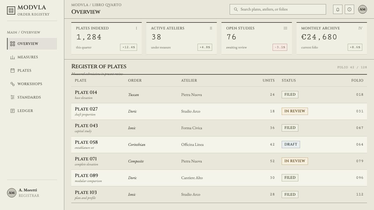
On the web, the pattern is natural for documentation, long guides, knowledge bases and anything that is read rather than skimmed. Build a clear typographic hierarchy, divide sections with hairlines, and put notes in an italic margin column. Dashboards become ledgers: ruled tables with ranked columns. A pricing page can take its cue from the five orders and present tiers as a ranked row from the plainest to the richest, aligned on one baseline, each described by its measured properties rather than by badges and glows.
In editorial and marketing work, the style is a ready-made voice for essays, books, catalogues, and brand stories that rest on craft and ideas. Use a narrow measure, deliberate paragraph spacing, numbered captions and generous margins. Illustrations should be line drawings, engravings or high-contrast black-and-white images that can sit within the hatched visual language. Keep promotional copy sober; the style loses credibility when it shouts.
The most common mistake is to fake the age: gray fills, drop shadows, burnt edges, sepia filters and parchment textures laid over a modern layout. The source is a precise printed page, not an antique prop, and anything that softens its line or tone undermines it. A second mistake is setting long passages in capitals, which are meant for labels. A third is boxing everything in rounded cards; in this system the rule, not the container, does the dividing. If the layout feels decorated, it has drifted away from Serlio.
Serlio Architectural Orders — FAQ
What are the five orders?
They are the Tuscan, Doric, Ionic, Corinthian and Composite orders, the five classical systems of columns and the parts they carry. Serlio ranked them on one page from Tuscan to Composite, running from the sturdiest to the most slender and richly detailed, with every dimension given as a fraction of the column diameter. For design, the lesson is that a family of options can be shown as an ordered, measured row.
Why does tone come from hatching rather than gray?
Because the source plates are woodcuts, printed from raised lines in a single black ink. They can carry black line and bare paper, nothing in between, so every shade has to be built from the density of parallel strokes. Keeping that rule gives the interface a crisp, flat, honest look, and it avoids the muddy softness of gradients and drop shadows that would contradict the page it is based on.
Why does the paper show text through from the back?
Because hand-made paper of the period was thin enough for ink on one side to be faintly visible from the other, and the style treats that show-through as a real property of the page. It is a quiet cue that the page has two sides and a physical thickness. Used sparingly and at very low strength, it adds depth without adding a shadow; used heavily, it harms legibility, so it should stay a whisper.
Is this the same as a generic classical or luxury serif look?
No. Generic classical styling borrows the mood of antiquity through ornament, gold and decorative caps. The Serlio style borrows the logic of a measured printed page: proportion from a module, tone from line, structure from rules, and three clearly assigned voices of type. It is plainer than most classical looks and more demanding. If a design feels grand before it feels ordered, it has moved away from the source.
Can this style use color or work on screens?
The source sheet carries no color, so the safest version of the style is black ink on warm paper, with emphasis made by size, case, italic and rule. On screens that works well, and long reading is comfortable on a pale warm ground. If a product needs a functional signal such as a link or a focus ring, one understated accent used only for interaction is acceptable; the page itself should stay black on paper.
Related design styles
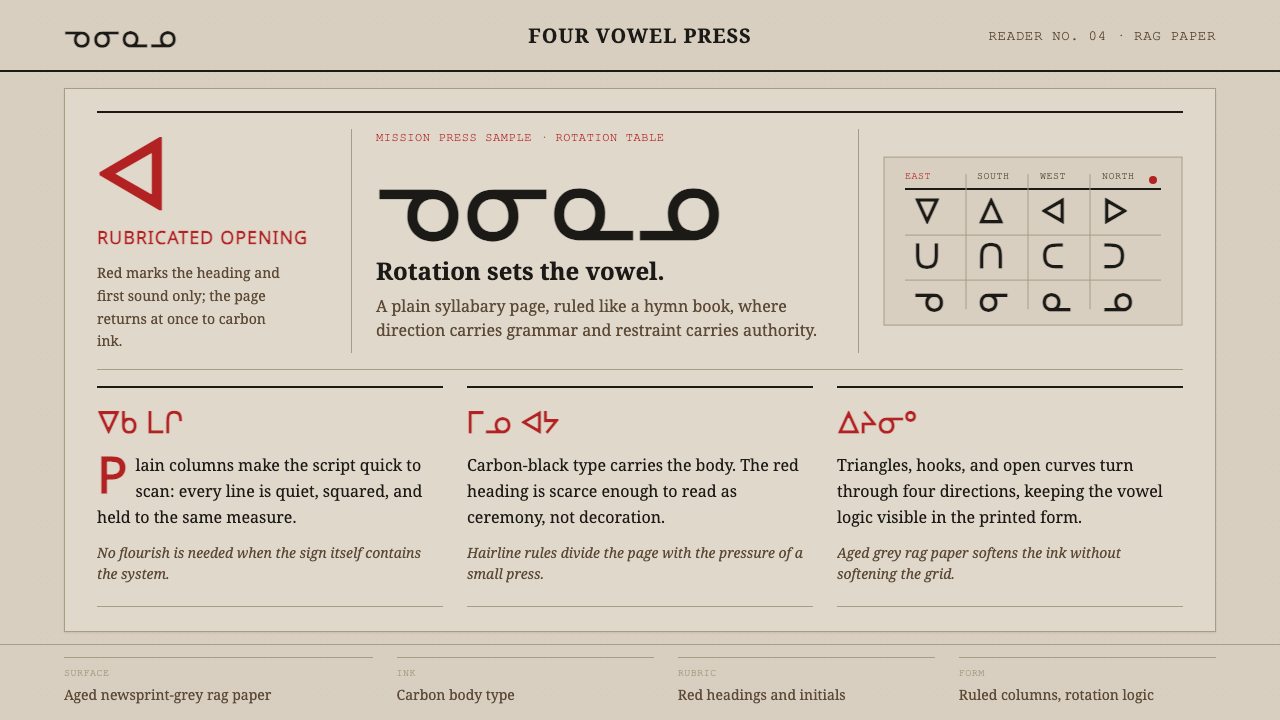 Cree SyllabicsPlain ink has authority. Carbon columns and red rubrication sit on rag-grey p…
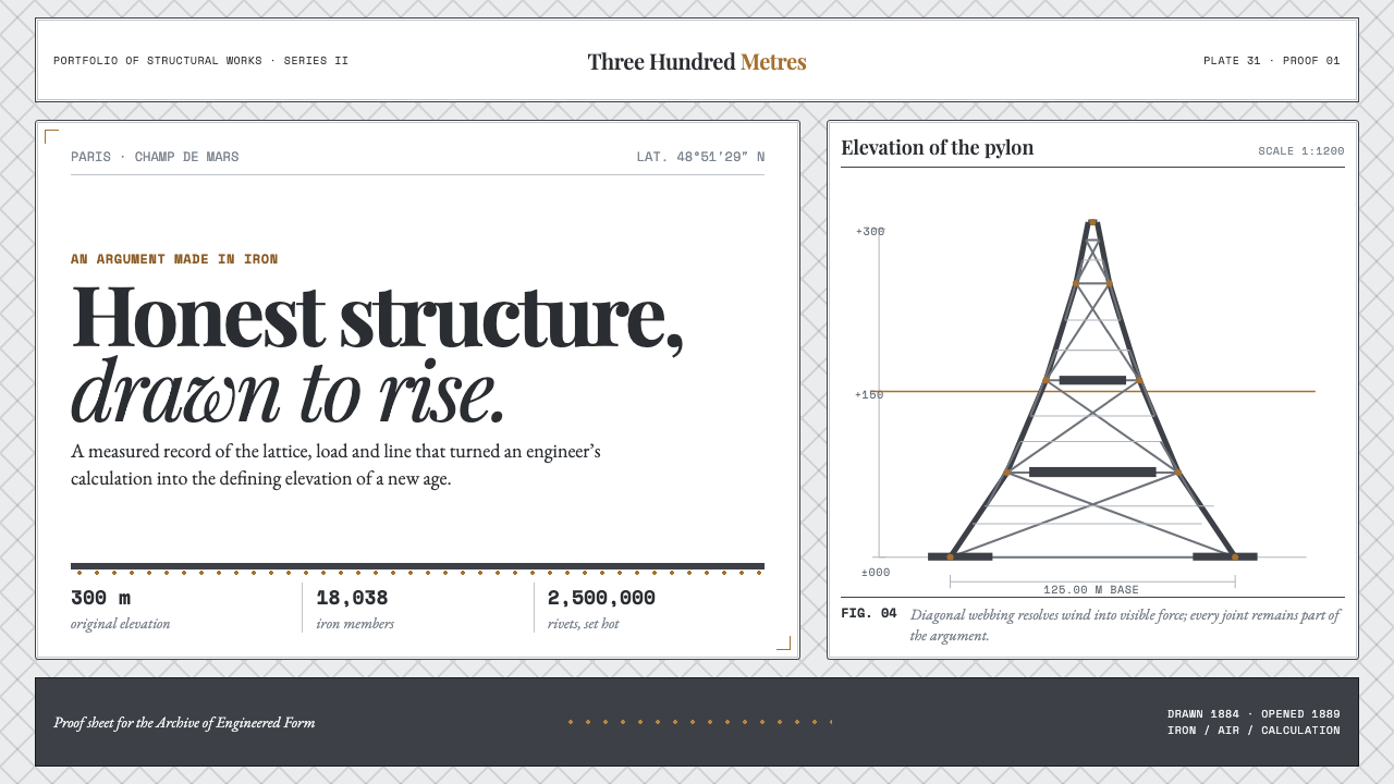 Eiffel Tower (1889)Structure speaks plainly. Graphite lattice, bronze rivets and measured type m…
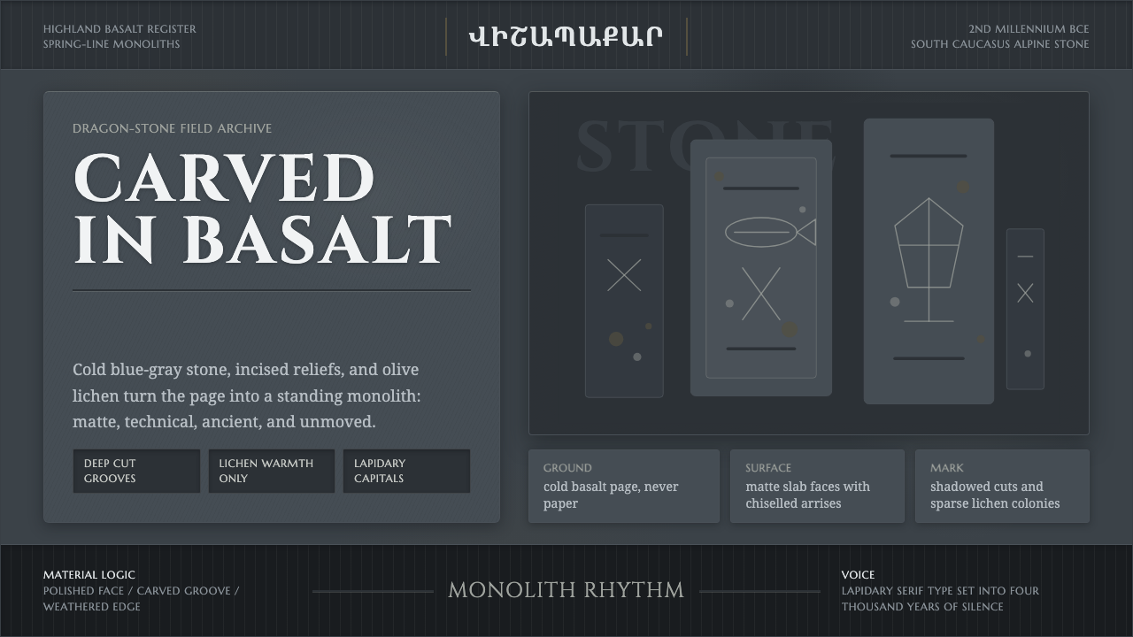 Armenian Vishapakar Dragon StoneAncient, cold, unmoved. Basalt gray slabs, incised grooves, sparse olive lich…
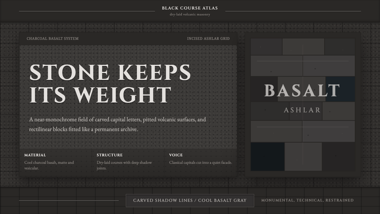 Hauran Basalt StoneMonolith refuses shine. Charcoal Cinzel capitals lock into dry-laid basalt gr…
 Inca Ashlar StoneworkStone becomes the page. Granite-gray planes lock into hairline ashlar seams.
 Kaolin Porcelain Clay PitIndustrial calm in dust grey. Horizontal clay strata break for one milky turq…