What is Cree Syllabics?
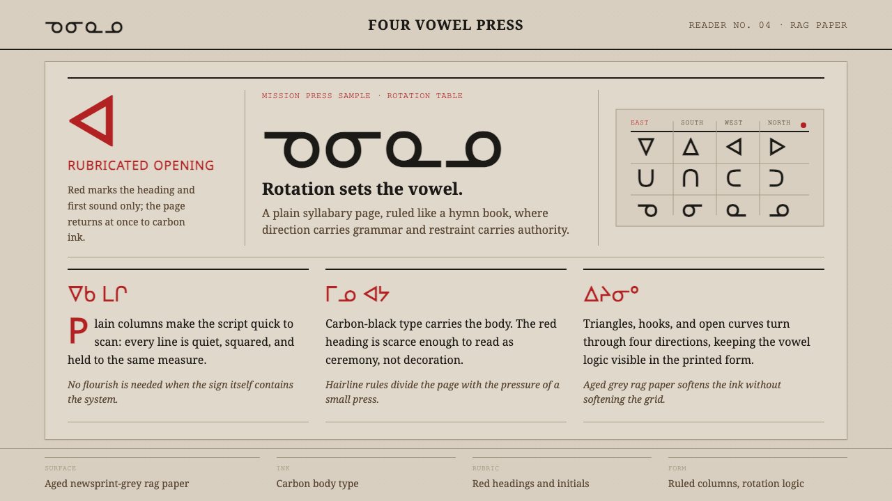
Cree syllabics are a writing system built on rotation — four orientations of the same geometric glyph encode four vowels, creating a page aesthetic of disciplined repetition, carbonblack columns, and the spare authority of missionary letterpress.
Cree Syllabics in brief
Cree syllabics is a geometric abugida devised around 1840 by James Evans, a Methodist missionary at Norway House in what is now northern Manitoba. Each glyph is a simple shape — a triangle, a V-form, a curved arc, or a hook — that encodes a consonant in its underlying form and a vowel through its rotational orientation: one direction for 'a', another for 'e', another for 'i', another for 'o'. This rotation principle means a reader learns a handful of shapes and then reads their orientation, rather than memorizing a separate symbol for each syllable.
The visual character of the system comes directly from its first printed artifact: an 1841 hymn and prayer book produced at Norway House, set in lead type that Evans cast himself from the lining of tea chests. Carbon-black ink on aged rag paper produced a page of intense tonal contrast — dark, column-ruled body text punctuated by red rubricated headings and initials. These rubrications — from the Latin rubrica, 'red ochre' — were a centuries-old European manuscript convention that Evans carried into this new script, marking sacred divisions with chromatic authority.
As a design reference, Cree syllabics offers something rare: a writing system whose aesthetic is inseparable from its logic. The rotation of identical forms produces a natural visual rhythm on the page, an almost woven texture of repeated shapes at varying orientations. Combined with the high-contrast letterpress palette of carbon and red on grey-white rag, this creates a visual language that is simultaneously systematic and handmade, geometric and organic.
Where does Cree Syllabics come from?
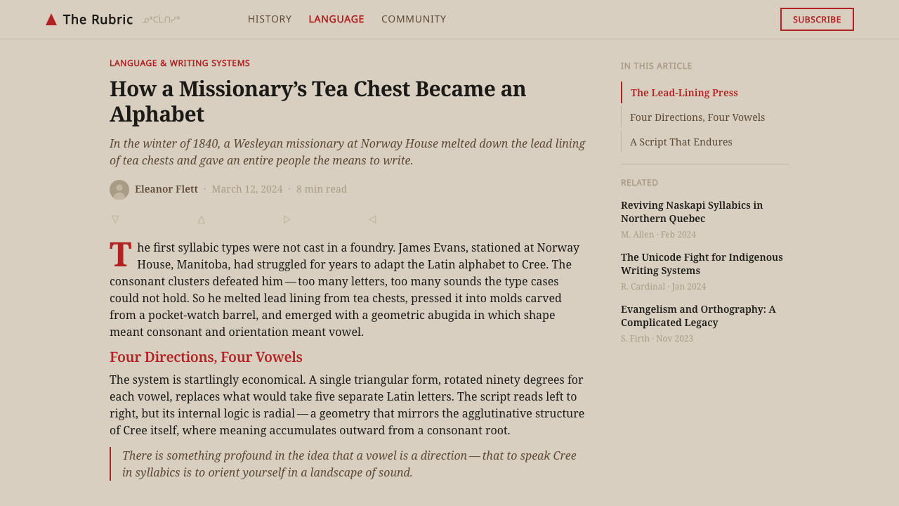
James Evans (1801–1846) arrived at Norway House as a Methodist missionary in 1840, carrying a pressing need: the Cree-speaking communities of the region had no written form of their language. Literacy was understood by Evans and his colleagues as a spiritual necessity — if converts were to read the Bible and hymnal in their own tongue, a practical script had to exist. Evans had earlier experimented with a Roman-alphabet orthography for Ojibwe, but found it cumbersome for syllabic languages. The solution he arrived at for Cree exploited the language's regular consonant-vowel syllable structure: a small repertoire of geometric shapes, rotated through four positions, could represent the entire syllabary.
The practical constraints of Evans's situation shaped the aesthetic indelibly. Norway House had no printing press and no type foundry. Evans improvised: he carved letterforms into wooden blocks, pressed them into lead melted from tea-chest linings, and produced a manual syllabics type. His ink was lamp-black. His paper stock was whatever rag paper was available at the Hudson's Bay Company post. The hymn book printed from these materials in 1841 — a landmark document in the history of Canadian indigenous literacy — established the visual register that became canonical: dense carbon-black syllabics columns, red headings, modest page margins, no decorative illustration.
The script spread rapidly after 1841, carried by missionaries and, crucially, adopted and propagated by Cree communities themselves. By the 1860s, syllabics had been adapted for Ojibwe, Inuktitut, Blackfoot, and other languages, each adaptation extending or modifying the rotation system. In 1865 the British and Foreign Bible Society printed Evans's syllabics at much larger scale in London using conventionally cast type, introducing greater regularity to the letterforms. But the aesthetic origin — the improvised, high-contrast letterpress of Norway House — remained the foundational visual memory of the system.
Today, Cree syllabics survive as an active writing system used by several hundred thousand speakers across northern Canada, particularly in Quebec, Ontario, Manitoba, and Saskatchewan. Unicode standardized the syllabics block beginning in 1999, allowing digital text in the script. The design tradition of carbon-black body text, red rubric markers, and the ruled column format has been carried forward in community newspapers, religious texts, and educational materials printed in syllabics throughout the twentieth and twenty-first centuries.
What defines the Cree Syllabics look?
Rotation Logic
The defining structural feature of Cree syllabics is that vowel identity is carried by the rotational orientation of a glyph, not by a separate character. A triangle pointing upward, rightward, downward, or leftward is four distinct syllables sharing one form. This means a page of syllabics text has an unusual visual texture: the same small set of shapes recurs constantly in varying orientations, producing a woven, rhythmically repeating pattern quite unlike alphabetic or ideographic scripts. The rotation logic is not decorative — it is the grammar made visible.
Carbon and Red
The historic Cree syllabics palette is a strict two-color system: dense carbon black for all body text and structural elements, reserved red for rubricated headings, initial syllables, and section markers. This is not a chromatic palette in the decorative sense — red is purely functional, performing the same role it performed in European ecclesiastical manuscripts: marking the sacred threshold between sections, signaling where a reading begins or a prayer changes. Everything informational runs in carbon black; everything hierarchical runs in red. The rag paper beneath both provides a warm grey-white ground that softens neither ink.
Ruled Column Format
Early syllabics printing used a column layout with light ruling lines — a format inherited from the ledger-book and liturgical-book traditions that missionaries brought to northern Canada. The column grid organizes dense syllabics text into legible blocks, with rulings providing a horizontal anchor that the rotational nature of the glyphs would otherwise lack. This produces a page aesthetic of contained regularity: tight, orderly, disciplined, the text controlled within ruled fields without ornamentation beyond the ruling itself.
Geometric Minimalism
Each syllabics glyph is constructed from a minimal vocabulary of primitive forms: the triangle, the V-shape (a wide or narrow angle), the curve, and the hook. No glyph requires more than a single stroke concept; complex shapes emerge only through rotation and combination. The alphabet is, in this sense, a design system in the strictest meaning — a small number of rules generating a large number of distinct outputs. The visual simplicity of individual glyphs means that massed syllabics text reads as texture before it reads as information, particularly to a reader unfamiliar with the script.
Plain Material Honesty
The original Cree syllabics book was made from what was available: improvised type, lamp-black ink, rag paper. There was no opportunity for embellishment and no tradition of decorative illustration in the immediate context. The result is a visual register defined by the unadorned properties of its materials — the mild tooth of rag paper, the density of carbon ink, the slight irregularity of hand-cast type. This accidental asceticism is part of what gives the system its authority: it looks spare because it is spare, not because someone chose minimalism as an aesthetic position.
Rhythm Through Repetition
Because the syllabics inventory is so small — fewer than forty base glyphs serve the core Cree language — any extended passage of text produces a strong visual rhythm through repetition of the same forms at varying orientations. This is distinct from the visual variation in alphabetic scripts, where each letter is a unique shape. In syllabics, the eye tracks a small number of recurring forms and reads their orientation and size (full syllables versus smaller final consonant markers). The page becomes a kind of rhythmic pattern, more akin to music notation or weaving drafts than to a roman-alphabet paragraph.
Sacred-Functional Hierarchy
The division between carbon-black body text and red rubricated markers is not merely a typographic convention — it encodes a hierarchy of meaning rooted in the liturgical purpose of the original books. Black carries ordinary text; red marks the sacred or structurally critical. This two-tier hierarchy is unusually stable and legible: the eye finds red instantly against the carbon ground, and red is never wasted on anything below the highest structural level. In contemporary applications, this principle translates to a rigorous use of accent color — one secondary color reserved for exactly one tier of meaning, never used decoratively.
Who shaped Cree Syllabics?
Evans (1801–1846) was a British-born Methodist missionary who developed the syllabics script at Norway House around 1840. His solution — using the rotational orientation of geometric shapes to encode vowels — was linguistically elegant and practically efficient: a learner could grasp the whole system in a matter of hours. Evans printed the first syllabics hymn book from improvised materials and distributed it widely. He died young, in 1846, before seeing the full extent of his script's adoption, which spread to Ojibwe, Inuktitut, Blackfoot, and many other languages over the following decades.
The improvised printing operation at Norway House — a Hudson's Bay Company post on the shore of Lake Winnipeg — was the birthplace of syllabics typography. Without access to a commercial foundry, Evans cast type himself from materials at hand, establishing a print tradition defined by resourcefulness rather than refinement. The visual character of the first syllabics books — carbon density, red rubrication, ruled columns on rag paper — was born of these constraints and became the aesthetic standard against which all later syllabics printing has been measured, consciously or not.
The Society's 1865 London printing of the Cree syllabics Bible marked the transition from improvised mission printing to professionally cast type. The conventionally manufactured syllabics type introduced greater geometric regularity to the letterforms — a standardization that extended the script's legibility across different print runs and communities. The Society's involvement also signaled syllabics' entry into the global Protestant missionary printing network, accelerating its adoption and the development of adapted forms for other indigenous languages across the Canadian north.
Beginning in the latter half of the twentieth century, community newspapers published in Cree syllabics — including publications from communities in the James Bay Cree Nation and across Manitoba — carried the original letterpress aesthetic into the offset and later digital printing era. These publications maintained the essential visual hierarchy of dense body text in syllabics with English or French section headers, continuing the two-language, two-register page that the first missionary books established. They are the living bridge between the 1841 hymn book and contemporary syllabics typography.
Unicode's standardization of the Unified Canadian Aboriginal Syllabics block — first encoded in version 2.0 in 1996, substantially extended in version 3.0 in 1999 — was the pivotal event that allowed syllabics typography to enter digital environments without the workaround of custom font encodings. The standardization also forced type designers to engage with the geometric requirements of syllabics: each glyph must remain legible at multiple rotations, a constraint that rewards systematic, geometric type design approaches and penalizes decorative or calligraphic influences.
How do you use Cree Syllabics today?
The Cree syllabics visual system is best understood not as an exotic letterform to borrow but as a set of structural principles: strict two-color hierarchy, geometric formal economy, ruled column organization, and a texture created by rhythmic repetition of simple forms. These principles can be translated into contemporary design without using syllabics glyphs at all — or they can be used to inform typographic layouts that include syllabics text respectfully and legibly.
For presentation slides, the syllabics aesthetic offers a template of remarkable severity. A cover slide should commit to one functional color division: all primary information in deep black or near-black, section labels or key terms in a single reserved accent color used nowhere else on the slide. The background should be warm off-white or light grey, not pure white — recalling the rag-paper ground. Content slides benefit from a strict column structure: text constrained within ruled or implied vertical guides, with no decorative elements beyond the ruling itself. Data slides treated in this register should let the data geometry do the work — bar charts become column fields, categorical colors are limited to a maximum of two.
For web UI and dashboard design, the system's two-tier color discipline is immediately applicable. Reserve one strong accent color exclusively for the highest-priority interactive elements or alerts — not for hover states, not for decorative dividers, only for the thing that most urgently demands the user's attention. All other UI in black on white or white on near-black. Navigation and labels should be typographic, not icon-dependent; the syllabics tradition is a text culture and rewards verbal clarity over visual metaphor.
For editorial and marketing design, the most transferable quality is the page's relationship to the column grid and the ruled line. Body text held to a strict column measure, section breaks marked by a single undecorated rule, hierarchy expressed entirely through size and weight rather than ornamental borders or background fills. Pull-quotes or call-outs can adopt the accent-color role, but only one such element should appear per spread — the red heading in the hymn book is singular, not repeated.
The most common mistake when working with the syllabics aesthetic is treating the two-color system as permission to be vivid. The red in the original books is not a vibrant cherry red — it is a historical red ochre, duller and more mineral than the primaries of a modern color picker. Applied digitally, an accent color that reads as 'cardinal' or 'brick' will be more faithful to the source than a saturated fire-engine red. The second mistake is losing the carbon density of the body text by using softer, greyed-out type — the system's authority comes partly from the sheer weight of its black ink against the warm ground, and diluting that contrast dilutes the whole register.
Cree Syllabics — FAQ
Is using Cree syllabics visuals appropriation?
The visual principles extracted from syllabics printing — two-color carbon-and-red hierarchy, ruled column grids, geometric formal economy — are structural and typographic conventions that have parallels in many other print traditions. Drawing on these principles in design work is different from reproducing the glyphs themselves in a way that simulates a language the designer does not speak, or using syllabics lettering as pure decoration stripped of its communicative function. If actual syllabics text is used in a design, it should be accurate, composed by or with a fluent speaker, and used in a context where it communicates rather than merely decorates.
How does the syllabics system handle numbers and punctuation?
The original syllabics books used Arabic numerals for numbers, borrowing them directly from the European typographic tradition Evans brought with him. Punctuation was similarly borrowed or adapted from European conventions — periods, commas, and colons appeared in early syllabics texts much as they do in English printing of the same period. Later standardization by the Unicode Consortium introduced dedicated syllabics punctuation marks, but in the visual tradition of the original letterpress books, numbers and most punctuation are standard Latin-script forms set alongside the syllabics glyphs.
Does the rotation principle make syllabics harder to set in digital type?
It makes certain design challenges unique. Because glyphs are rotational variants of one another, a syllabics typeface must ensure that a shape remains legible and visually balanced at four orientations — a constraint that rewards symmetrical or near-symmetrical base forms and punishes decorative asymmetries. Early digital fonts often reproduced the forms mechanically from lead-type models; more recent type design work has explored how to adapt syllabics for screen rendering, adjusting stroke weights and curve geometry so that each orientation has equal visual weight at small sizes. For designers working with syllabics type, choosing a contemporary digitally-native face will produce more consistent results than a direct digitization of a historical face.
What is the difference between syllabics and syllabaries?
A syllabary is any writing system in which each character represents a complete syllable — Japanese hiragana and katakana are the most familiar examples. Cree syllabics belongs to a more specific category: the abugida (also called an alphasyllabary), in which a character represents a consonant-vowel pair where the vowel is indicated by a modification to the base consonant form. In Evans's system, the modification is rotational orientation rather than a diacritic mark or a stroke addition. This makes syllabics technically more economical than a full syllabary: fewer base forms are needed because one form, rotated four ways, covers four syllables. In practice, the distinction matters less to designers than the visual result: a dense, textured page of repeating geometric forms.
Can the two-color system be adapted if red is not suitable for a project?
Yes, and the logic of the adaptation matters more than the color itself. The function of red in syllabics printing is to mark the highest structural level — the place where something essential begins or changes. Any color substitution should preserve that functional singularity: one body color (dark, high-mass, present throughout the text), one accent color (reserved strictly for the highest-priority element, appearing rarely). Gold or deep amber can substitute for red in contexts requiring warmth without liturgical associations. A desaturated teal works in contemporary dashboard contexts. What breaks the system is using more than two colors, using the accent color for decoration, or choosing an accent that lacks sufficient contrast against the body color and the background.
Related design styles
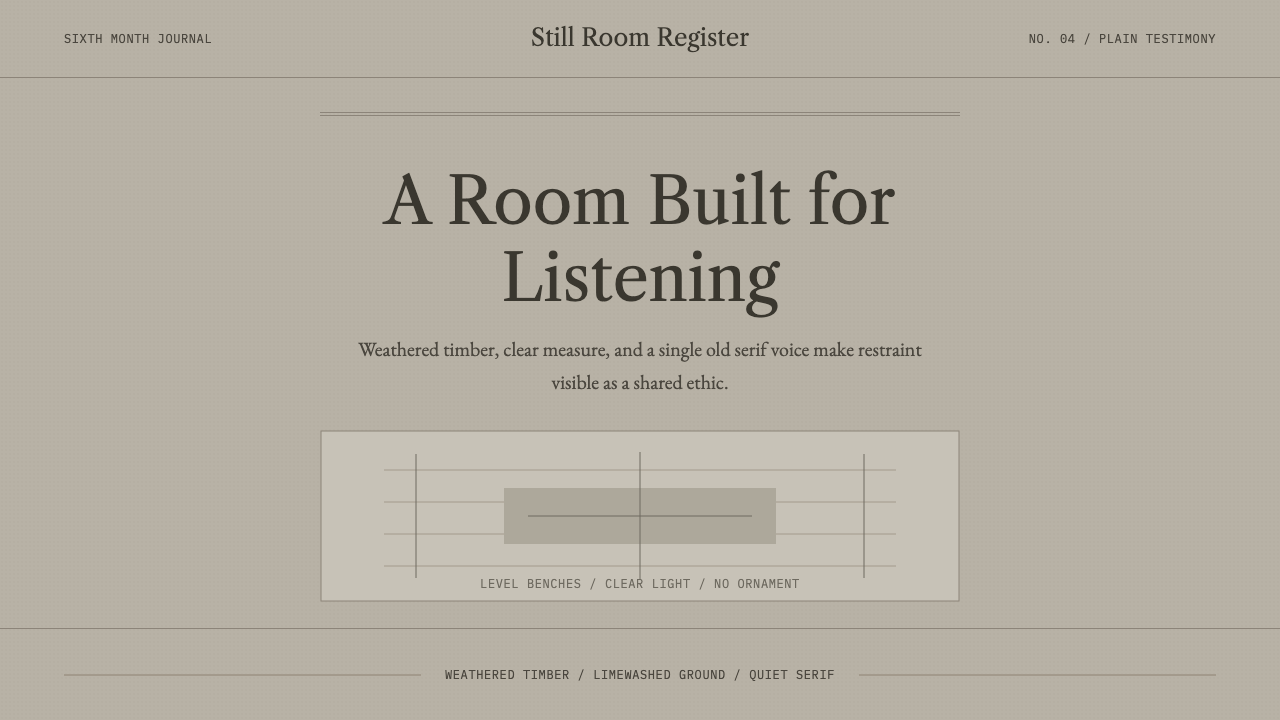 Quaker Plain StyleSilence made visible. Timber gray, Caslon serif, and bench-rule spacing leave…
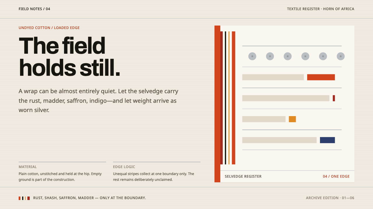 Afar Nomad TextileWeight lives at the edge. Rust and madder selvedges cut across a quiet cotton…
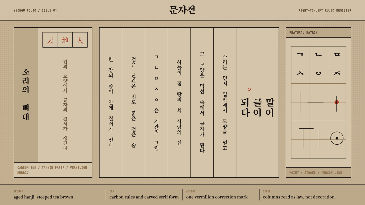 Hangul 訓民正音Ink obeys the grid. Carbon rules, vertical Myeongjo columns, and rare vermili…
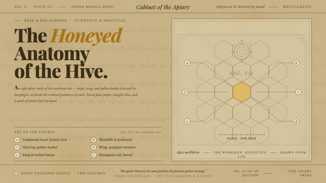 Honeybee Anatomy PlateAn 1886 beekeeping manual, reopened. Amber wash over engraved anatomy, letter…
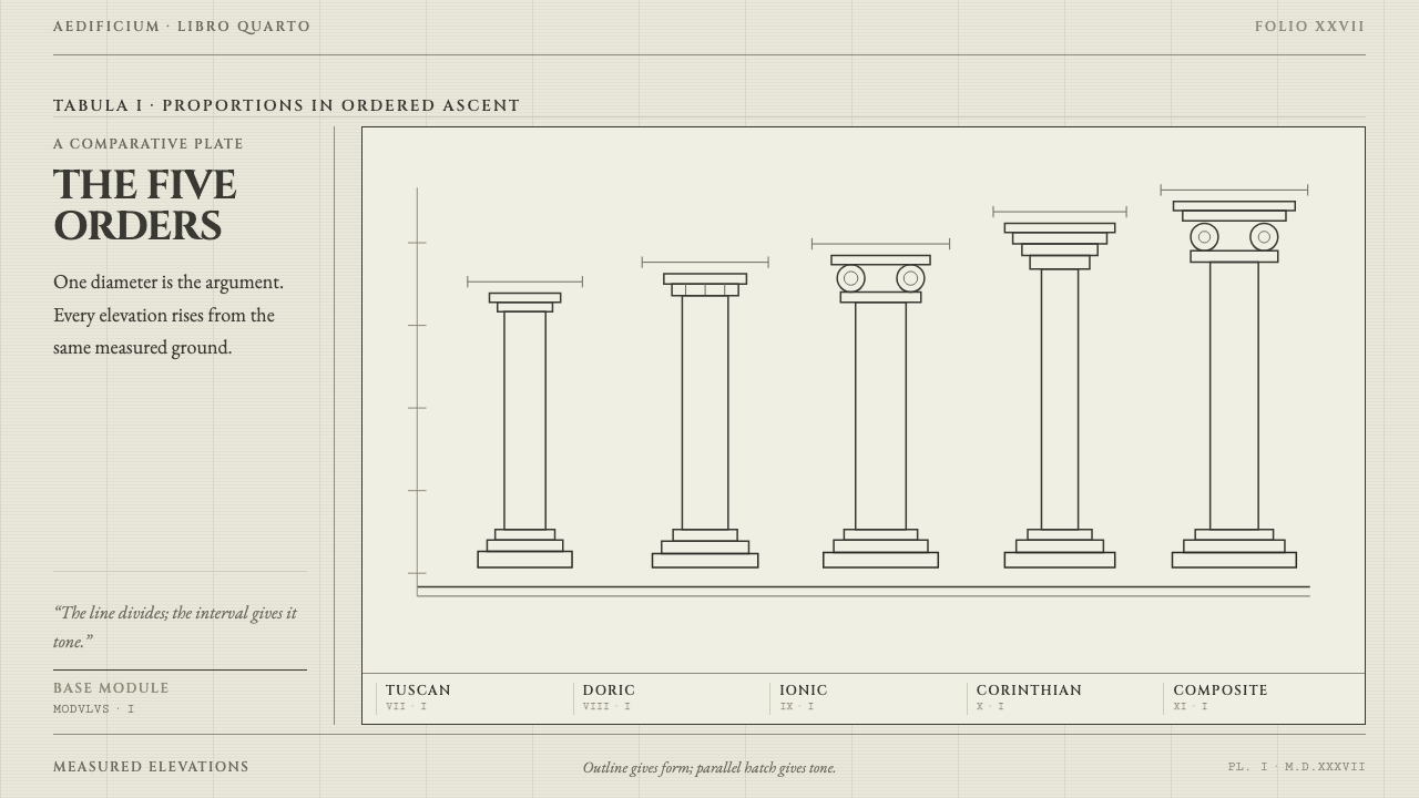 Serlio Architectural OrdersOrder makes the page speak. Warm rag paper, Cinzel capitals, and hatch-built…
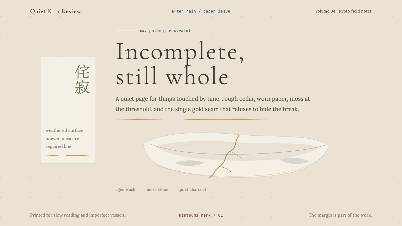 Wabi-SabiStillness makes imperfection whole. Washi beige, moss sage, and a spare gold…