About Cree Syllabics
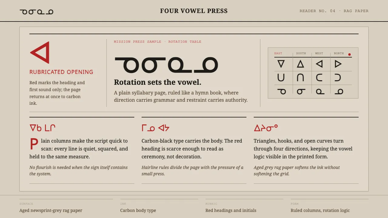
Cree syllabics were devised by the missionary James Evans around 1840 at Norway House, a geometric abugida in which a glyph's rotation sets the vowel — triangles, V-shapes, curves and hooks pointing in four directions. The reference surface is a 19th-century hymn and prayer book printed in carbon black with red rubricated headings on aged newsprint-grey rag paper, the lead type once cast from tea-chest lining.
This system keeps that plain letterpress discipline. Carbon-black body text runs in ruled columns, red is reserved strictly for rubricated headings and initials, and the rotation logic of the glyphs stays legible and unornamented. Nothing is decorative; everything serves the page.
- Origin
- Northern Canada — Norway House, Rupert's Land
- Era
- c.1840 onward; early missionary printing through the 19th century
- Key figures
- James Evans · Hudson's Bay Company mission presses
- Movements
- Canadian Aboriginal syllabic writing · missionary letterpress printing · rotation-based abugida design
Cree Syllabics design spec
Colors
Typography
The other 11 sections — buttons, cards, spacing, motion, techniques and more — open once you unlock. Download the DESIGN.md or send it to your AI in one click. Unlock once, yours forever.
Sign up nowStyles similar to Cree Syllabics
Also inspired by print & type, with a close feel.
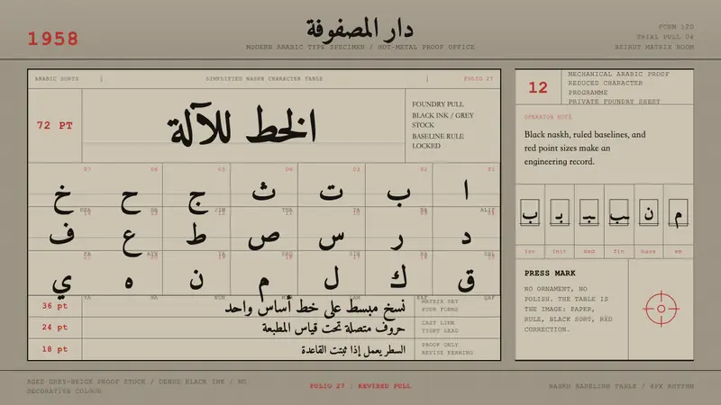 Modern Arabic Type SpecimenDry proof-sheet gravity. Black naskh grids on aged grey-beige, cut by red folio numerals.
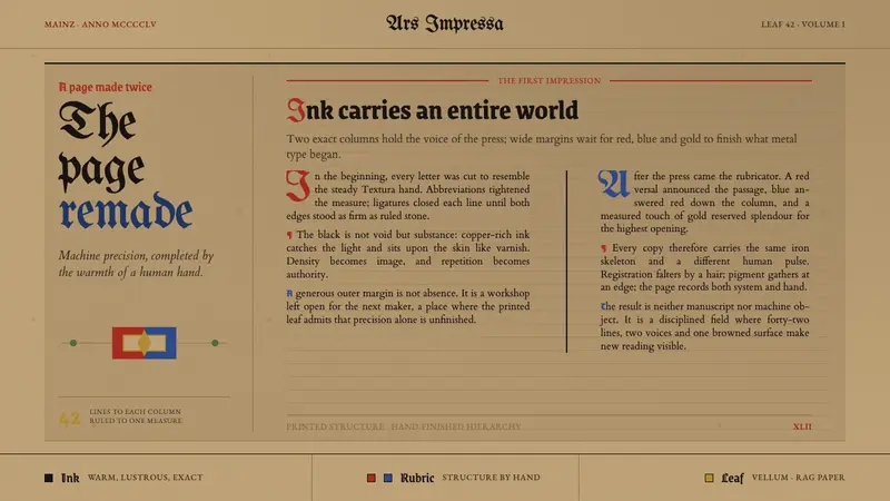 Gutenberg 42-Line BiblePrecision awaits the hand. Dense black columns open into red, blue and gold on browned vellum.
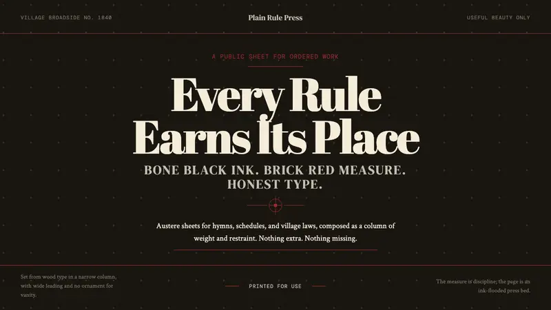 Shaker Broadside PrintAustere by conviction. Bone-black ground, brick rules, and wood-type hierarchy do the work.
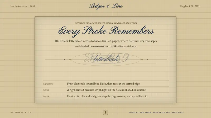 Spencerian PenmanshipLyrical ink, aged by time. Blue-black script rides tobacco-tan ruled paper.