What is Hangul 訓民正音?
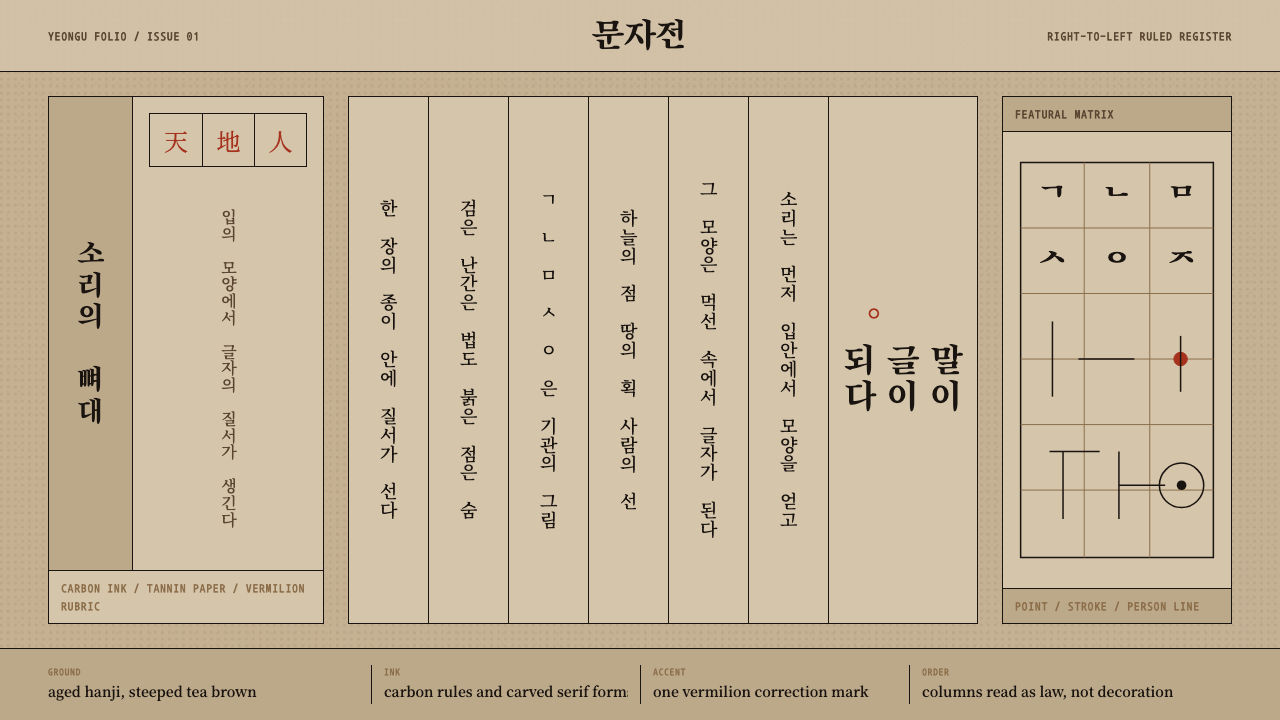
Hangul 訓民正音 renders a 1446 Korean royal treatise as a page of black-frame woodblock printing — vertical carbon-ink columns on tea-brown mulberry paper, broken only by rare strokes of vermilion.
Hangul 訓民正音 in brief
Hangul 訓民正音 is a design system drawn from the Hunminjeongeum Haerye, the 1446 xylograph in which King Sejong of Joseon Korea promulgated a new phonetic alphabet — and, just as importantly, published a scholarly commentary explaining exactly why each letterform looks the way it does. The system does not depict Korea generally or hangul as a modern typeface; it depicts one specific printed artifact: a page of black-framed vertical columns, carbon ink on aged mulberry-bark paper, ruled with the discipline of a legal document rather than the freedom of a manuscript.
Visually, the system reads as an act of printing rather than an act of decoration. Columns run top to bottom and right to left, each confined inside a ruled black frame the way a woodblock's carved gutters would confine it. The ground is not white but the warm, steeped-tea brown of hanji paper that has aged for centuries. Ink is carbon black, unwavering in density. The only interruption to this near-monochrome field is vermilion — used exclusively the way a Joseon-era reader would have used it, as rubrication: punctuation, emphasis marks, the rare scholarly annotation, never as a decorative accent applied for its own sake.
What makes the system distinctive is its restraint under a very specific kind of pressure: the letterforms it displays are themselves a radical invention — hangul characters engineered from the shapes the mouth and tongue make in speech, organized under the cosmological triad of heaven, earth, and person (天地人) — yet the page around them refuses to editorialize. The grid holds the letters the same way it would hold a page of dense classical Chinese commentary. Novelty is expressed in the shapes of the characters, not in the treatment of the page.
Where does Hangul 訓民正音 come from?
Before 1446, Korea had no native script. Educated Koreans wrote in hanja — Chinese characters — a system that recorded literary Chinese with reasonable fidelity but fit the grammar and phonology of spoken Korean poorly. Literacy was, as a direct consequence, the property of a narrow class: those with years to spend memorizing thousands of characters. King Sejong, the fourth ruler of the Joseon dynasty and a monarch with an unusually strong personal interest in linguistics, astronomy, and applied science, regarded this as a solvable problem rather than an inevitable one.
Sejong convened scholars at the Jiphyeonjeon, the Hall of Worthies, a royal research institute he had built into the intellectual engine of his court. Working from first principles of articulatory phonetics, the group designed a script in which each basic consonant letter is a stylized diagram of the vocal organs at the moment that sound is produced — a line for the tongue blocking the throat, a shape tracing the tongue against the palate — and each vowel is built from three elemental strokes representing heaven, earth, and person, the same triad that structured Confucian cosmology. The result was a script that could be taught to a commoner in days rather than years, and that was explicitly designed for exactly that purpose: Sejong's preface states that he created it because ordinary people had things they wished to express but no way to write them down.
The alphabet was promulgated in 1446 under the name Hunminjeongeum, literally 'the correct sounds for instructing the people.' Alongside it, Sejong's scholars produced the Haerye — the 'explanations and examples' commentary — a volume that justified every letterform on phonetic and philosophical grounds, printed by woodblock in the format that gives this design system its visual identity: vertical columns, black rule frames, hanja mixed alongside the new hangul characters, the whole page a working document of a court rather than an aesthetic object.
The Haerye edition survived centuries of use, obscurity, and, at points, active suppression — hangul was for a long period regarded by the yangban aristocracy as a vulgar script unfit for serious scholarship, and it took until the late nineteenth and twentieth centuries to become Korea's primary everyday writing system. The surviving copy was designated South Korea's National Treasure No. 70 and inscribed on UNESCO's Memory of the World register in 1997, formal recognition of a document now understood as one of the most deliberately engineered writing systems in history.
What defines the Hangul 訓民正音 look?
Palette
The ground is not white but a warm, tea-steeped brown — the color of hanji paper that has aged and absorbed centuries of handling. Ink sits at one density: carbon black, applied uniformly with no attempt at tonal variation. Vermilion appears sparingly and with intent, confined to punctuation-like marks rather than fields of color. There is no secondary palette; the entire system runs on the relationship between three fixed values — paper, ink, and rubrication — never a fourth.
Typography
Text sets in a Myeongjo-style serif register — the Korean and East Asian equivalent of a woodblock-derived book face, with the angular, chiseled stroke terminals that come from carving characters into wood rather than drawing them with a brush. Hanja and the newly invented hangul letters sit together on the same baseline grid, treated as equals rather than the new script being showcased or set apart. Scale contrast is minimal; this is a typographic system built for continuous reading of a scholarly text, not for hierarchy-driven display.
Column Grid
The column is the fundamental unit of the layout, not the page or the paragraph. Text runs vertically within black-ruled frames, read top-to-bottom and then right-to-left across the page, the way a physical woodblock's carved gutters would divide and order each strip of characters. The grid is rigid and unapologetic — every column is the same width, every frame line the same weight — because in a woodblock print, the grid is a physical constraint of the carving, not a stylistic choice layered on afterward.
Frame and Rule
Black ruled lines enclose the entire printed field and subdivide it into columns, functioning the way a picture frame or a ledger's ruled margins function — as a boundary that declares where the authoritative content begins and ends. The frame is unornamented: a simple rectangle, occasionally doubled at the outer edge, never scrolled or embellished. Its authority comes from consistency and repetition across the page, not from decorative weight.
Rubrication
Vermilion is reserved for a single function: marking, not decorating. A dot or small circular stroke in red signals punctuation, tonal notation, or scholarly emphasis exactly as a Joseon-era reader or annotator would have applied it by hand after the black ink had dried. Because it appears so rarely against the black-on-brown field, every vermilion mark carries outsized visual weight — the opposite of a system that spreads color evenly for balance.
Surface
The ground reads as hanji — mulberry-bark paper — with the soft fiber texture and irregular, organic edge that distinguishes it from smooth machine-made stock. Age is part of the surface's character: the tea-brown tone is not a flat color fill but implies centuries of handling, storage, and gradual oxidation. This surface quality anchors every other element; the black ink and vermilion both read as sitting on top of a material with its own history, not as vector shapes floating on a blank canvas.
Reading Direction
The page runs against the left-to-right, top-to-bottom convention that governs most contemporary interfaces: columns proceed top to bottom, and successive columns proceed right to left across the spread. This is not a stylistic flourish but the literal structure inherited from classical East Asian book-printing, and it is one of the clearest visual signals that distinguishes this system from any generic 'Asian-inspired' treatment — the direction of reading is itself part of the design.
Who shaped Hangul 訓民正音?
The fourth king of Joseon Korea (r. 1418–1450) and the system's namesake, Sejong personally initiated and directed the creation of hangul, motivated by the conviction that literacy should not be the exclusive property of an educated elite. Beyond writing reform, he oversaw major advances in astronomy, agriculture, and rain-gauge instrumentation, but the Hunminjeongeum is regarded as his most consequential legacy — a script still in daily use by tens of millions of people nearly six centuries later.
The Hall of Worthies was Sejong's royal research institute, staffed by scholar-officials selected for expertise in linguistics, phonetics, and classical scholarship. Working under Sejong's direction, this group carried out the phonetic analysis that produced hangul's featural letterforms and co-authored the Haerye commentary that explains the alphabet's design logic — the same commentary whose printed page defines this design system.
The anonymous craftsmen who carved and printed the Haerye edition worked within the established conventions of East Asian xylograph book production — ruled column frames, uniform stroke-carving technique, and mulberry-bark paper stock. Their choices, made for durability and reproducibility rather than aesthetics, are precisely what give this design system its visual signature today.
How do you use Hangul 訓民正音 today?
Applying Hangul 訓民正音 successfully means treating it as a system of print discipline, not a generic 'East Asian' skin. The temptation is to reach for red and black together and call it done; the actual system is built on the tension between a restrained brown-and-black field and the rare, deliberate appearance of vermilion. Any application that spreads red evenly, or substitutes a bright white background for the aged paper tone, has left the system behind.
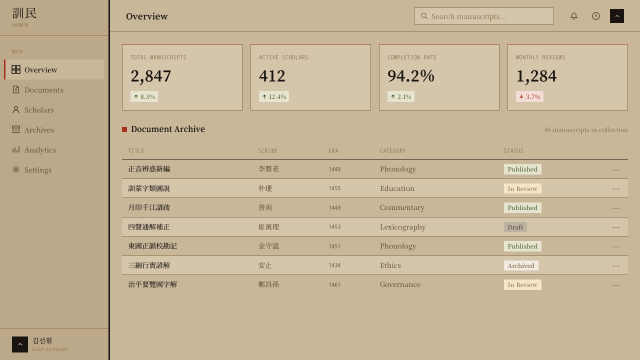
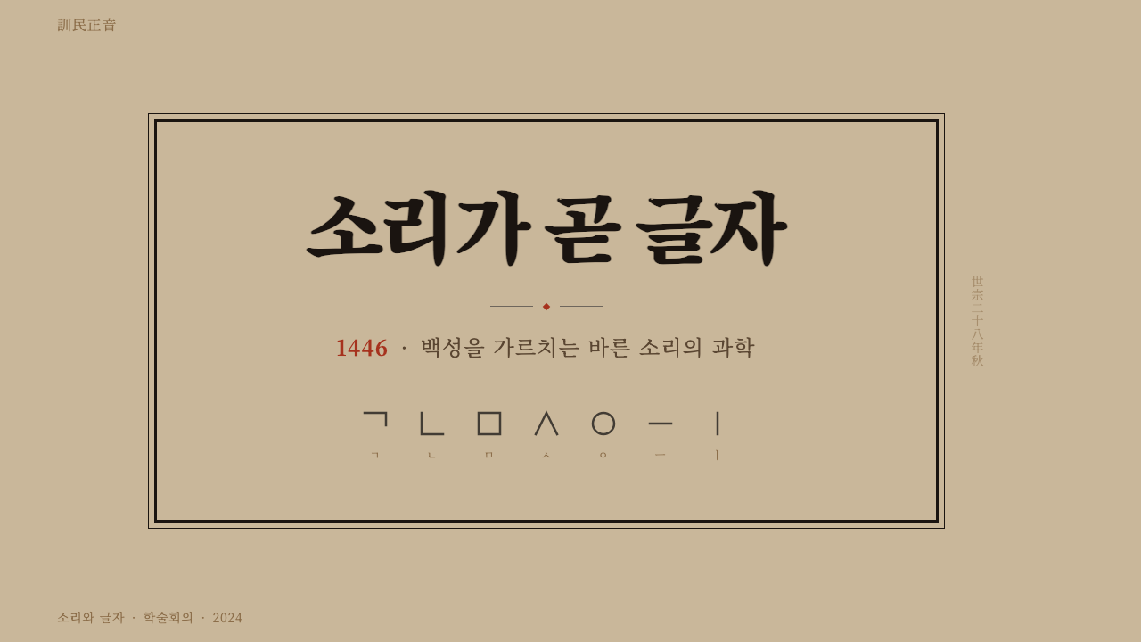
For presentation cover slides, the style rewards a single large column of vertical-feeling type — or a genuinely vertical title treatment where the platform allows it — set inside a ruled black frame against the tea-brown ground, with perhaps one small vermilion mark doing the work of an entire accent palette. Content and data slides should resist the urge to modernize: keep body text in tight, serif-set blocks separated by black rule lines rather than colored dividers or icon bullets, and if a chart is required, render it as a diagram bounded by the same ruled frame rather than as a colorful modern chart component — a simple bordered table of figures will often suit the system better than a bar chart.
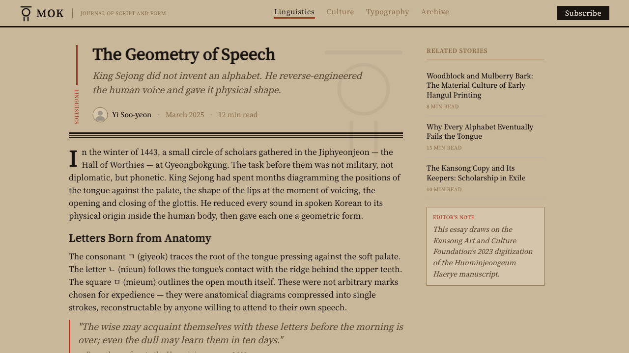
For web UI — dashboards and pricing pages in particular — the system's column-and-frame logic translates well to a structure of ruled, bordered panels on a warm off-white or parchment-toned background, with black serif type carrying almost all of the hierarchy and a single vermilion accent reserved for one primary action or one critical status indicator. Resist filling cards with color; the system's entire visual force comes from how little of it is used.
For editorial and marketing layouts, the style is well-suited to long-form cultural or historical content, language-learning products, or brands that want to signal heritage and deliberate craft rather than speed or novelty. A strong application sets a pull-quote or headline in the vertical-column convention as a visual anchor, keeps supporting body copy in a conventional horizontal serif block for readability, and uses a single vermilion rule or mark to separate sections — never a full-color banner.
The most common mistake is over-decorating: adding gradient washes to suggest paper texture, using red as a background field rather than a mark, or introducing a second accent color for 'balance.' The system has exactly three working values — paper, ink, rubrication — and its authority depends on never quietly adding a fourth.
Hangul 訓民正音 — FAQ
Is Hangul 訓民正音 the same as 'Korean design' generally?
No. This system depicts one specific historical artifact — the 1446 Hunminjeongeum Haerye woodblock edition — not the broad, contemporary visual culture of Korea, which spans everything from K-pop graphic design to minimalist Seoul branding. The vertical black-frame column grid, the tea-brown aged-paper ground, and the restrained rubrication are all specific to Joseon-era xylograph printing. Applying this system means committing to that specific print discipline, not to a general sense of 'Korean-ness.'
Why does the system read right-to-left and top-to-bottom instead of the modern left-to-right convention?
Because that is the literal structure of the source artifact. Classical East Asian book printing, including the Haerye edition, set text in vertical columns read top to bottom, with successive columns proceeding from right to left across the page — a convention rooted in how columns were carved and arranged on woodblocks. Preserving this reading direction is not a stylistic affectation; it is one of the clearest signals that a layout is honoring the actual historical print format rather than applying a superficial color-and-texture skin to a conventional modern grid.
How much red should actually appear in a layout using this style?
Very little, and always as a mark rather than a field. In the source artifact, vermilion functions the way rubrication has functioned across many manuscript and print traditions: punctuation dots, tonal notation, occasional scholarly emphasis, added by hand after the black ink was printed. A layout that uses red for a background, a large banner, or a filled button is working against the system's logic. The correct instinct is to ask, for each vermilion mark, whether a Joseon-era annotator would plausibly have made that exact mark by hand — if the answer is that it's a color fill for visual interest, it does not belong.
Can this style work for a modern, non-historical product like a SaaS dashboard?
Yes, provided the product's positioning benefits from signaling heritage, deliberate craft, or scholarly authority rather than speed or novelty — language-learning platforms, cultural archives, publishing tools, or brands built around Korean heritage are natural fits. The column-and-frame grid actually maps cleanly onto data-dense interfaces: ruled panels on a warm parchment ground, black serif type carrying hierarchy, one vermilion accent reserved for a single critical status or action. It struggles in contexts that want to feel fast, playful, or futuristic, where the system's formality and restraint will read as friction rather than authority.
What is the relationship between the hangul letterforms and the page they sit on?
A deliberately understated one. The letterforms themselves were a genuine invention — consonants modeled on the shape of the vocal organs mid-articulation, vowels built from strokes representing heaven, earth, and person — but the printed page around them makes no visual fuss about that novelty. Hangul and hanja share the same column grid, the same stroke weight register, the same black ink. The system's discipline is precisely this: radical content, conservative container. A layout that tries to make the letterforms 'pop' with extra color or scale contrast misreads the source material, where the innovation is entirely internal to the shapes and never performed by the page.
Related design styles
 Honeybee Anatomy PlateAn 1886 beekeeping manual, reopened. Amber wash over engraved anatomy, letter…
 Audubon Birds of AmericaAged natural history breathes. Buff rag paper, sepia rules, and italic binomi…
 Caslon English Text SerifWarm authority, pressed into paper. Caslon capitals and engraved rules comman…
 ClockpunkInventive antiquity. Walnut vellum, Cinzel capitals, brass orrery rings, and…
 Cree SyllabicsPlain ink has authority. Carbon columns and red rubrication sit on rag-grey p…
 Gambian Griot Kora (21-string)Oral history feels tactile. Calabash beige, indigo bands, and 21 brass string…