What is TeX Academic Paper?什么是 TeX Academic Paper?
TeX academic typography is Donald Knuth's 1978 act of engineering rage — a complete typesetting system built from scratch because no existing tool was good enough for mathematics.TeX 学术排版是 Donald Knuth 1978 年的工程师式愤怒之作——因为没有任何现成工具足以胜任数学排版,他便从零造出了整套系统。
TeX Academic Paper in briefTeX Academic Paper 速览
TeX academic paper style is a typographic discipline that grew out of Donald Knuth's TeX system and Leslie Lamport's LaTeX macro layer. Its visual language — warm off-white paper, a classical serif typeface engineered glyph by glyph, a tight two-column layout divided by a hairline vertical rule, centered display equations with flush-right numbering, and no decoration of any kind — has become the universal signal of mathematical rigor across physics, computer science, and pure mathematics.TeX 学术论文风格是一套排版规范,由 Donald Knuth 的 TeX 系统与 Leslie Lamport 的 LaTeX 宏包共同孕育而来。它的视觉语言——温暖的米白纸色、逐字形精密设计的经典衬线字体、以发丝竖线分隔的紧凑双栏布局、居中的展示公式配以右顶的编号、以及绝无任何装饰——已成为物理学、计算机科学与纯数学领域中数学严谨性的通用视觉信号。
The aesthetic is defined as much by what it refuses as by what it does. No display typefaces, no colors beyond a single restrained accent for hyperlinks, no ornamentation at margins or headers, no drop shadows, no gradient backgrounds. What remains is a document whose every spacing decision was derived from optical geometry rather than convention, and whose authority rests entirely on the precision of its glyph construction and the exactness of its equation typesetting.这套美学的定义,有一半来自它所拒绝的东西。无展示字体,除用于超链接的一处克制色彩外无其他颜色,页边与页眉无任何装饰,无投影,无渐变背景。留下的是一份文档——其每一处间距决定都源自光学几何而非惯例,其权威性完全建立在字形构造的精密程度与公式排版的精确性之上。
Because arXiv — the preprint server that distributes nearly every significant paper in mathematics, physics, and theoretical computer science — defaults to TeX output, this aesthetic has become one of the most widely read typographic systems in the world. A generation of researchers encounters it daily, and its conventions — the theorem-proof-remark rhythm, the bracketed citation, the equation number in parentheses at the right margin — carry the authority of an entire scientific tradition.由于 arXiv——向数学、物理及理论计算机科学领域几乎所有重要论文提供分发服务的预印本服务器——默认输出 TeX 格式,这套美学已成为世界上被阅读最广泛的排版系统之一。一代又一代研究者每天与之相遇,它的排版惯例——定理-证明-注记的节奏、方括号引用、右侧括号内的公式编号——承载着整个科学传统的权威。
See the TeX Academic Paper design system查看 TeX Academic Paper 完整设计系统
Where does TeX Academic Paper come from?TeX Academic Paper 从何而来?
The story begins in 1977 when Donald Knuth, one of the foundational figures of computer science, received galley proofs for the second volume of his landmark work 'The Art of Computer Programming.' The proofs were typeset using phototypesetting technology that had replaced the older hot-metal Monotype system, and Knuth was appalled by the result. Equations that had looked crisp and authoritative in the first edition now appeared degraded — the spacing relationships that give mathematical notation its legibility had been destroyed. Knuth, characteristically, decided the correct response was to write a new typesetting system from scratch.故事始于 1977 年。计算机科学奠基人之一 Donald Knuth 收到了他的里程碑著作《计算机程序设计艺术》第二卷的校样。这些校样使用当时取代了旧式热金属 Monotype 系统的照相排版技术制作,结果令 Knuth 深感震惊。曾在第一版中显得清晰而权威的公式,如今看来已然劣化——赋予数学符号易读性的间距关系被彻底破坏。Knuth 以他一贯的风格,决定正确的应对方式是从零开始写一套新的排版系统。
He spent the next decade building TeX — first released as TeX78 in 1978 and refined into its stable form in 1982 — along with the Computer Modern typeface family, a set of serif and mathematics fonts designed according to metafont, Knuth's parametric font description language. Computer Modern was not adapted from any existing typeface; it was specified mathematically, with every glyph defined by a system of geometric parameters. The result is a face that reads as classical and authoritative but whose underlying construction is unlike anything produced by earlier punchcutters or phototypesetting designers.接下来的十年,他构建了 TeX——1978 年以 TeX78 首次发布,1982 年精炼为稳定版本——以及 Computer Modern 字体家族,这是一套按照 Knuth 的参数化字体描述语言 Metafont 设计的衬线与数学字体集。Computer Modern 并非对任何现有字体的改编;它是被数学性地规定出来的,每一个字形都由一套几何参数定义。结果是一套读来古典而权威的字体,但其底层构造与任何早期刻字师或照相排版设计师的产物都截然不同。
Leslie Lamport introduced LaTeX in 1984, building a document markup layer on top of Knuth's TeX engine. Where TeX required authors to manage low-level typographic primitives directly, LaTeX provided semantic markup — commands like 'theorem,' 'proof,' 'bibliography' — that automated the structural conventions of academic paper formatting. The combination of TeX's engine and LaTeX's document model rapidly displaced competing systems in physics, mathematics, and eventually computer science, partly because it produced visibly superior equation rendering and partly because it was free.Leslie Lamport 于 1984 年推出 LaTeX,在 Knuth 的 TeX 引擎之上构建了一个文档标记层。TeX 要求作者直接管理底层排版原语,而 LaTeX 则提供了语义标记——如「定理」、「证明」、「参考文献」等命令——自动化了学术论文格式的结构惯例。TeX 引擎与 LaTeX 文档模型的组合迅速取代了物理学、数学、乃至计算机科学领域中的竞争系统,部分因为它产生了明显更优的公式渲染效果,部分因为它是免费的。
The style's reach expanded dramatically in 1991 when Paul Ginsparg established arXiv, initially as a physics preprint server at Los Alamos National Laboratory. Scientists uploading papers submitted TeX source files; arXiv compiled them. As arXiv grew to encompass mathematics, computer science, economics, and quantitative biology, the TeX visual language traveled with it. By the early 2000s, the two-column article class with its warm white background and Computer Modern text had become the default visual register of serious quantitative research — recognizable at a glance as a signal of intellectual content rather than visual performance.1991 年,Paul Ginsparg 在洛斯阿拉莫斯国家实验室建立了 arXiv(起初作为物理学预印本服务器),这套风格的影响力因此得到极大扩展。科学家上传论文时提交 TeX 源文件,arXiv 负责编译。随着 arXiv 扩展涵盖数学、计算机科学、经济学与定量生物学,TeX 的视觉语言也随之传播。到 2000 年代初期,以温暖白色背景和 Computer Modern 正文呈现的双栏文章格式,已成为严肃定量研究的默认视觉调性——一眼便可识别,是智识内容而非视觉表演的信号。
What defines the TeX Academic Paper look?TeX Academic Paper 的视觉特征是什么?
Paper Tone纸面色调
The background is not pure white but a warm, slightly yellowed off-white that recalls the surface of quality book paper. This warmth reduces the harshness of black text against background, allowing dense columns of mathematics and prose to be read for long stretches without eye fatigue. On screen, the effect is muted but present — a softness that distinguishes the style immediately from the cold white of modern web interfaces.背景并非纯白,而是一种温暖的、略带黄调的米白,令人联想到优质书纸的表面。这种温暖感降低了黑色文字与背景之间的刺目对比,使大段数学与文字内容可以长时间阅读而不令眼睛疲劳。在屏幕上,这种效果更为柔和但依然存在——一种柔润感,使这种风格与现代网页界面的冷白色立即区别开来。
Serif Typeface Engineering衬线字体工程
The text typeface central to this style is classical in overall impression — upright, balanced, with the optical refinements of a text face designed for sustained reading — but its origin is computational rather than calligraphic. Every glyph was specified through mathematical parameters rather than traced from historical models. The result reads as authoritative and legible at small sizes while carrying a slight mechanical regularity that distinguishes it from typefaces with calligraphic roots.这种风格核心的文本字体在整体印象上是古典的——直立、均衡,具有专为持续阅读设计的文本字体的光学修正——但其来源是计算性的,而非书法性的。每个字形通过数学参数规定,而非从历史范本中描摹。结果是一套在小字号下读来权威且易读的字体,同时带有轻微的机械规整性,将其与具有书法根源的字体区分开来。
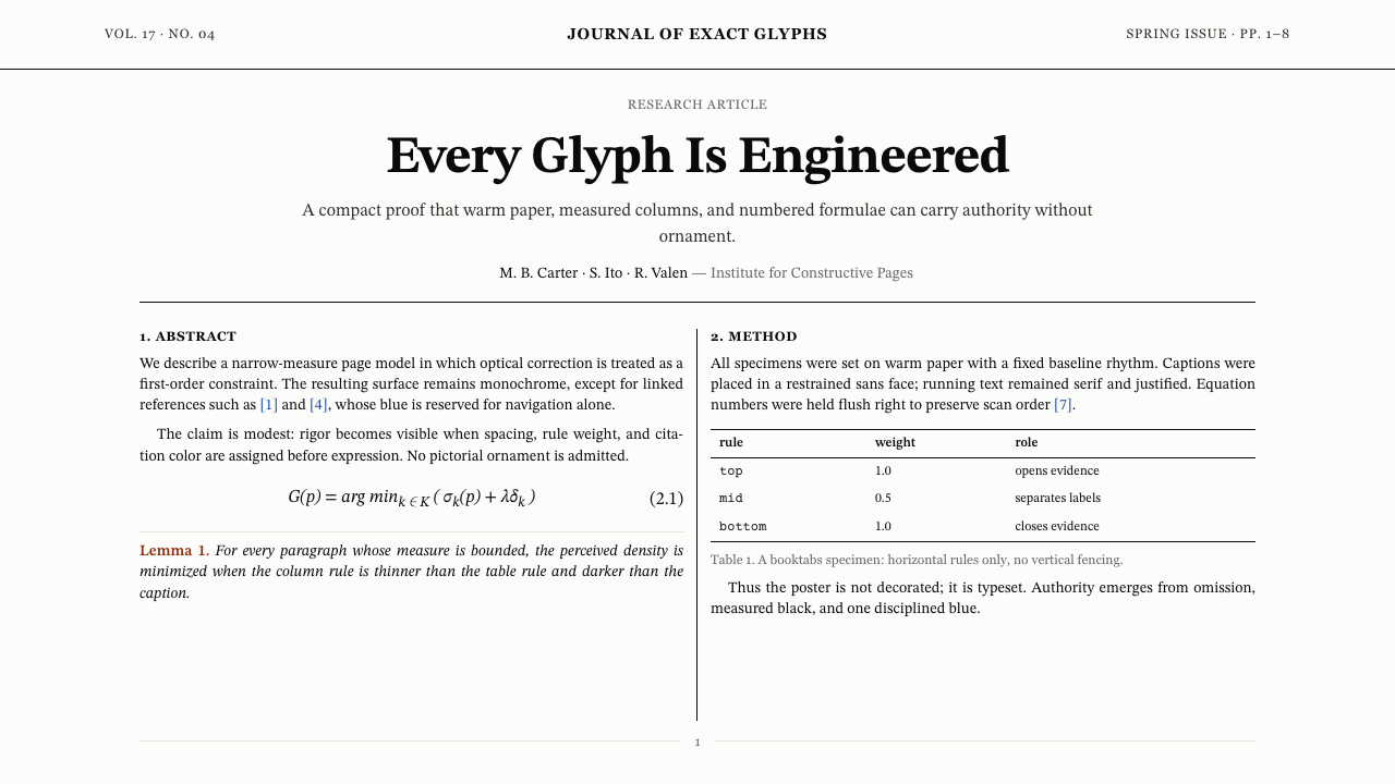
Two-Column Layout with Hairline Rule双栏布局与发丝栏线
The standard article format divides the page into two text columns of equal width, separated by a column rule so thin it is almost invisible — present as a structural marker rather than a decorative element. Wide margins frame the columns, providing space for the reader's eye to rest. This layout packs substantial content density onto each page while maintaining readability, and the narrow columns create a line length ideal for sustained mathematical reading.标准文章格式将页面划分为两栏等宽文本,栏间以极细的竖线分隔——细到近乎不可见,仅作为结构标记而非装饰元素存在。宽阔的页边空白将双栏框定,为读者的眼睛提供休憩空间。这种布局在每页上实现了相当的内容密度,同时维持了可读性,而较窄的栏宽也创造出适合持续阅读数学内容的行宽。
Display Equations展示公式
Equations that are too important or too complex to sit inline with prose are set on their own lines, centered within the column or spanning both columns, with the equation number parenthesized at the right margin. This treatment gives major results the visual weight they deserve and allows readers to scan a paper's mathematical spine without reading the surrounding prose. The equation environment is one of the most distinctive typographic signatures of the style.重要或复杂到无法内嵌于正文的公式被单独成行排印,在栏内居中或跨两栏排列,公式编号加括号置于右页边。这种处理赋予了重要结论应有的视觉分量,也使读者得以在不阅读周围文字的情况下浏览论文的数学骨干。公式环境是这种风格最具辨识度的排版特征之一。
Theorem Environments定理环境
Definitions, theorems, lemmas, propositions, corollaries, and remarks are each typeset in a named block with a consistent internal structure: a bold or small-caps label, a number, and body text that is often italicized to distinguish the formal statement from surrounding commentary. Proofs are marked with a closing filled square — the tombstone — at the right margin of the final line. This typographic ritual encodes the logical architecture of mathematical argument directly into the layout.定义、定理、引理、命题、推论与注记各自被排印在具有一致内部结构的具名区块中:粗体或小型大写字体的标签、编号,以及通常用斜体排印的正文——以区分正式陈述与周围注释。证明以右页边最后一行处的实心方块(墓碑符号)作为结束标记。这种排版仪式将数学论证的逻辑架构直接编码进版面之中。
Restrained Color: One Accent Only克制用色:唯一强调色
The entire document is black text on warm paper, with a single color permitted for hyperlinks and cross-references. This accent — a restrained, medium-toned blue — is the only chromatic element in an otherwise achromatic system. It functions purely as a navigational signal, never as decoration. In printed form, documents rendered in this style contain no color at all, which is not a limitation but a statement: the mathematics speaks for itself.整篇文档为米白底面上的黑色文字,仅允许一种色彩用于超链接与交叉引用。这处强调——一种克制的中调蓝——是这个否则为无彩色系统中唯一的色彩元素。它纯粹作为导航信号发挥作用,从不作为装饰。在印刷形式中,以这种风格呈现的文档完全不含色彩——这不是一种局限,而是一种表态:数学自己会说话。
Bibliographic Precision参考文献的精确性
Citations appear either as bracketed numbers — [14], [3, 7] — or in author-year form, and they are handled by a dedicated bibliographic processing tool that ensures consistent, machine-readable output. The reference list at the end of the document follows strict typographic conventions: author names in small caps or abbreviated first names, journal titles italicized, volume numbers in bold, year in parentheses. This discipline reflects the same philosophical commitment as the rest of the style: every element is placed where it is for a functional reason.引用以方括号数字——[14]、[3, 7]——或作者-年份形式出现,由专用参考文献处理工具统一管理,确保输出的一致性与机器可读性。文档末尾的参考文献列表遵循严格的排版惯例:作者姓名用小型大写字体或缩写名,期刊标题斜体,卷号加粗,年份加括号。这种规范与这种风格其余部分反映了同样的哲学承诺:每个元素出现在它所在位置,都有功能上的理由。
See the TeX Academic Paper design system查看 TeX Academic Paper 完整设计系统
Who shaped TeX Academic Paper?谁塑造了 TeX Academic Paper?
Knuth is the author of TeX and the Computer Modern typeface family, and the foundational figure of this entire aesthetic tradition. A professor emeritus at Stanford and the author of 'The Art of Computer Programming,' he developed TeX not as a design exercise but as an engineering response to a concrete problem: the degraded quality of mathematical typesetting in late-1970s phototypesetting. His decision to define typefaces through mathematical parameters rather than visual templates was unprecedented and shaped every aspect of the style's appearance. He declared TeX's version number asymptotically approaching pi as a statement that the system was essentially complete — a characteristic blend of mathematical humor and perfectionist commitment.Knuth 是 TeX 与 Computer Modern 字体家族的作者,也是这整个美学传统的奠基人物。身为斯坦福大学荣休教授及《计算机程序设计艺术》的作者,他开发 TeX 并非出于设计兴趣,而是对一个具体问题的工程性回应:1970 年代末照相排版技术对数学排版质量的破坏。他以数学参数而非视觉模板来定义字体的决定史无前例,塑造了这种风格外观的每一个方面。他宣布将 TeX 的版本号设定为渐近趋近于圆周率 π——这是数学幽默与完美主义承诺的典型混合。
Lamport is the architect of LaTeX, the document-preparation system built on top of TeX that made the style accessible to scientists who were not typographic programmers. His contribution was semantic: where Knuth's TeX exposed typographic machinery, Lamport's LaTeX introduced the concept of logical document structure — sections, theorems, figures, bibliographies as semantic units rather than raw formatting commands. LaTeX's article class defined the visual template that virtually every academic paper in physics and mathematics has followed since 1984. Lamport later received the Turing Award, though primarily for his work on distributed systems and the formal specification language TLA+.Lamport 是 LaTeX 的架构师,这个构建于 TeX 之上的文档准备系统使这种风格得以被非排版程序员的科学家所使用。他的贡献是语义性的:Knuth 的 TeX 暴露了排版机制,而 Lamport 的 LaTeX 引入了逻辑文档结构的概念——章节、定理、图表、参考文献作为语义单元而非原始格式命令。LaTeX 的文章文档类定义了自 1984 年以来几乎所有物理与数学学术论文所遵循的视觉模板。Lamport 后来获得了图灵奖,尽管主要是因为他在分布式系统与形式规约语言 TLA+ 方面的工作。
Zapf was one of the twentieth century's most celebrated type designers, and his influence on the TeX ecosystem is indirect but significant. Knuth consulted with Zapf when developing Computer Modern, and Zapf's typeface Palatino later became the basis for the widely used TeX typeface variant that brought a warmer, more humanist feel to academic documents. The availability of Palatino-derived variants within TeX demonstrated that the system's approach to typeface definition could accommodate classical designs alongside Knuth's geometrically specified originals, broadening the style's expressive range while preserving its structural rigor.Zapf 是二十世纪最受推崇的字体设计师之一,他对 TeX 生态的影响是间接但重要的。Knuth 在开发 Computer Modern 时曾与 Zapf 协商,而 Zapf 设计的 Palatino 字体后来成为 TeX 中广泛使用的字体变体的基础,为学术文档带来了更温暖、更具人文感的观感。Palatino 衍生变体在 TeX 中的可用性证明了这套系统的字体定义方法不仅能容纳 Knuth 几何规定的原创字体,也能容纳经典设计,在保持结构严谨性的同时拓展了这种风格的表达范围。
Ginsparg's contribution to this style's reach was logistical rather than typographic. When he founded arXiv in 1991 as a preprint distribution system for high-energy physics, he required submitters to upload TeX source files. This decision — made partly for storage efficiency and partly to ensure consistent rendering — meant that arXiv's expanding catalog became a vast archive of TeX-typeset documents. As arXiv grew beyond physics into mathematics, computer science, economics, and biology, the TeX aesthetic traveled with it, becoming the visual common language of quantitative academic communication worldwide.Ginsparg 对这种风格传播范围的贡献是后勤性的,而非排版性的。当他于 1991 年创建 arXiv 作为高能物理预印本分发系统时,他要求提交者上传 TeX 源文件。这一决定——部分出于存储效率的考量,部分是为了确保渲染一致性——意味着 arXiv 不断扩充的目录成为了 TeX 排版文档的庞大档案库。随着 arXiv 从物理学扩展至数学、计算机科学、经济学与生物学,TeX 美学也随之传播,成为全球定量学术交流的共同视觉语言。
How do you use TeX Academic Paper today?今天怎么用 TeX Academic Paper?
Applying the TeX academic paper style to contemporary design work requires understanding its underlying logic: every visual decision in this system exists because it serves the communication of dense, precise information to readers who will spend long periods with the document. The style is not a costume — it is a set of principles about information density, typographic hierarchy, and the suppression of decoration in service of content. Import those principles, not just the surface appearance.将 TeX 学术论文风格应用于当代设计工作,需要理解其底层逻辑:这套系统中的每一个视觉决策存在的理由,都是为了服务于向长时间伏案的读者传达密集、精确的信息。这种风格不是一套戏服——它是一套关于信息密度、排版层级,以及为服务内容而压制装饰的原则。应当移植这些原则,而不仅仅是表面外观。
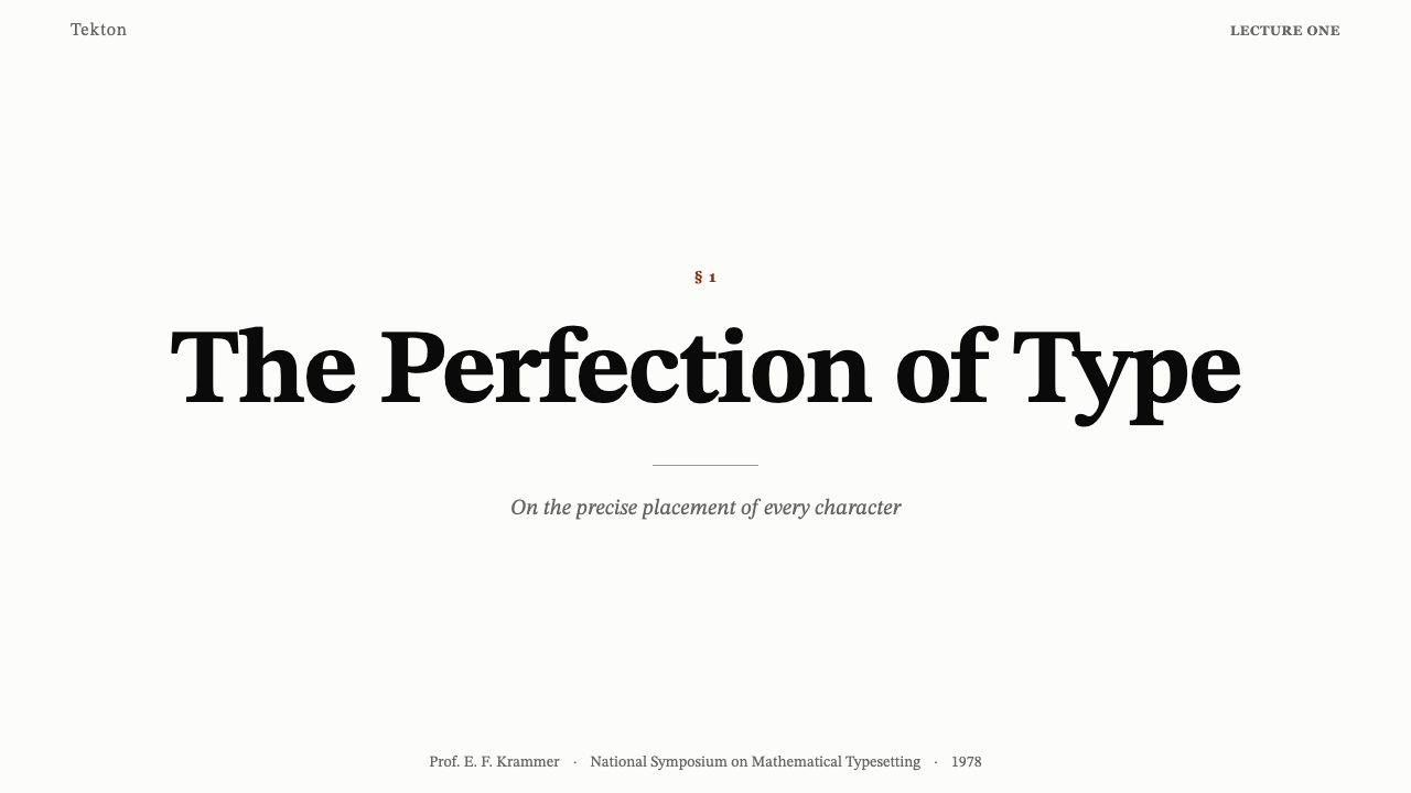
For presentation slides, the style translates most directly when the subject matter involves data, technical depth, or an audience of specialists who associate the aesthetic with intellectual credibility. A cover slide works best with a single, narrow column of text positioned with deliberate asymmetry against a warm off-white field — no full-bleed imagery, no decorative typefaces. Content slides should behave like typeset pages: a clear heading hierarchy established by size and weight alone, body text at a comfortable reading size, and equations or code blocks treated as display elements centered within their available space. Data slides should feel diagrammatic rather than polished: charts with thin axes, no rounded corners, no gradient fills on bars, annotation in a serif typeface that matches the running text.对于演示文稿,当主题涉及数据、技术深度,或面向将这种美学与智识可信度相关联的专家受众时,这种风格的转化最为直接。封面幻灯片最适合以单一、紧窄的文字栏,有意非对称地置于温暖米白底面上——无全幅图像,无展示字体。内容页应当像排版过的页面一样运作:仅以尺寸和字重建立清晰的标题层级,正文保持舒适的阅读字号,公式或代码块作为展示元素在可用空间内居中排布。数据页应当呈现示意图式的感觉,而非精致感:细线坐标轴的图表、无圆角、柱条无渐变填充,注释使用与正文匹配的衬线字体。
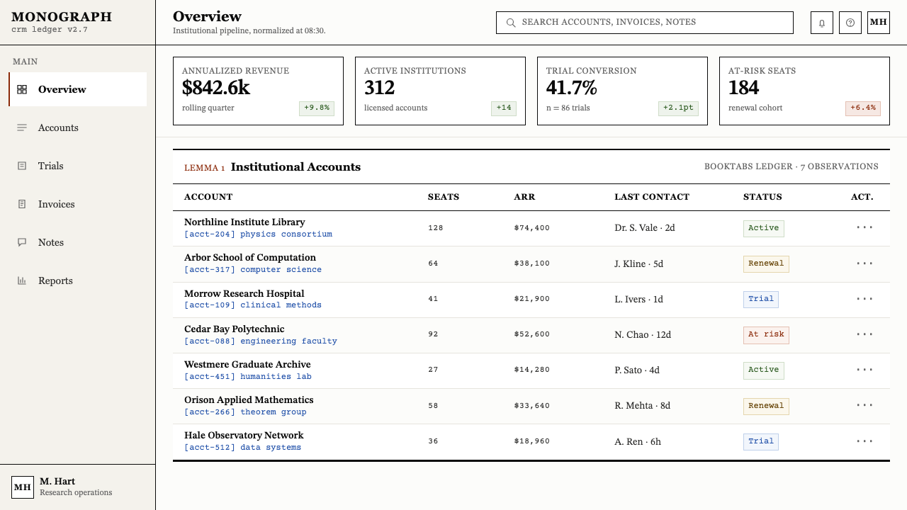
For web interfaces, the aesthetic is best suited to tools and platforms where the user is engaged in analytical, research-oriented, or technical work: dashboards for scientific or financial data, documentation sites, academic publication viewers, developer tools, or pricing pages for products aimed at technical buyers. The approach: a warm neutral background, a classical serif typeface for body text and headings, a strict column grid with generous margins, and a restrained single accent color reserved for links and active interface states. Navigation should be typographic, not icon-heavy. Interactive elements — buttons, inputs, tabs — should be bordered rather than ghost-styled, with no soft drop shadows.对于网页界面,这种美学最适合用户从事分析性、研究导向或技术性工作的工具与平台:科学或金融数据仪表板、文档站点、学术出版浏览器、开发者工具,或面向技术买家的产品定价页面。方法如下:温暖中性背景、正文与标题使用经典衬线字体、严格的分栏网格配以宽阔页边、单一克制的强调色仅用于链接与活动界面状态。导航应当是字体性的,而非图标密集型的。交互元素——按钮、输入框、标签页——应当是有边框的,而非幽灵样式,且无柔和投影。
For editorial and marketing applications, the style provides authority and seriousness that can distinguish a brand in categories prone to visual noise. A white-paper or research-report layout following these conventions — narrow text columns, wide outer margins for pull quotes and annotations, section breaks marked by a thin horizontal rule rather than large decorative headers — reads as substantive rather than promotional. Marketing pages can borrow the structural confidence of academic layout: a narrow centered text column for hero copy, display equations or data visualizations as anchor elements, and a tonal restraint that treats color as information rather than atmosphere.对于编辑与营销应用,这种风格提供的权威性和严肃感,能在视觉噪音泛滥的品类中使品牌脱颖而出。遵循这些惯例的白皮书或研究报告版面——窄文字栏、宽外页边用于引用语与注释、以细水平线而非大型装饰标题标记章节分隔——读来是实质性的,而非宣传性的。营销页面可以借用学术版面的结构自信:居中的窄文字栏用于主打文案,展示公式或数据可视化作为锚定元素,色调克制——将色彩视为信息而非氛围。
The most common mistake when applying this aesthetic is conflating 'academic' with 'boring' and compensating with elements the system explicitly rejects — background textures, display fonts, gradient accents, or oversized imagery. The style's authority comes precisely from its refusal to perform. A second common error is applying the two-column layout to screen widths where it produces line lengths too short or too long for comfortable reading; column count should always be driven by the available measure, not copied mechanically. The single accent color must remain singular — introducing a second accent color, however subtle, breaks the system's core logic and makes the result look like an imitation rather than an application of the style.应用这种美学时最常见的错误,是将「学术」与「枯燥」混为一谈,然后用这套系统明确拒绝的元素来补偿——背景纹理、展示字体、渐变强调色或超大图像。这种风格的权威性恰恰来自于它拒绝表演。第二个常见错误是将双栏布局应用于会产生行宽过短或过长的屏幕宽度,栏数始终应由可用行宽驱动,而非机械地照搬。单一强调色必须保持唯一——引入第二种强调色,无论多么微妙,都会打破这套系统的核心逻辑,使结果看起来像是对这种风格的模仿而非应用。
See the TeX Academic Paper design system查看 TeX Academic Paper 完整设计系统
TeX Academic Paper — FAQTeX Academic Paper · 常见问题
Is this style only appropriate for scientific or technical content?这种风格只适合科学或技术类内容吗?
Not exclusively, but it carries strong connotations of rigorous, evidence-based communication that should be considered before applying it outside technical contexts. The style works wherever the implicit message 'this content has been carefully derived and precisely stated' is an asset — legal documents, financial research, policy papers, data journalism, high-end developer tools. It works less well where warmth, sensory richness, or emotional connection are primary goals. A food brand, a children's platform, or a wellness application would likely find the style's severity counterproductive.并非只适合,但它承载着严谨、以证据为基础的传达的强烈内涵,在将其应用于技术语境之外时应当加以考量。这种风格适用于「此内容经过了精心推导与精确陈述」这一隐含信息具有价值的场景——法律文件、金融研究、政策文件、数据新闻、高端开发者工具。在温暖感、感官丰富性或情感联结是首要目标的场景中,它则表现欠佳。食品品牌、儿童平台或健康应用,大概会发现这种风格的严肃性适得其反。
How does TeX academic style relate to other clean, serif-based typographic systems?TeX 学术风格与其他简洁衬线字体排版系统有何关联?
The style is distinct from other classical serif systems in a specific way: it is engineered rather than calligraphic in its origins. Traditional book typography — whether English, French, or Dutch in tradition — traces its letterforms back through centuries of punchcutting and calligraphic precedent. The TeX style's typeface was specified computationally, producing a face with the visual rhythm of classical typography but a slight mechanical regularity that sets it apart. The style is also more functionally specialized than general book typography — it is designed for documents with heavy mathematical notation, not for continuous literary prose, and its layout conventions reflect that priority.这种风格与其他经典衬线系统的区别,在于一个特定之处:它的起源是工程性的,而非书法性的。传统书籍排版——无论是英式、法式还是荷兰式传统——其字形都可以追溯至数百年的刻字与书法传统。TeX 风格的字体是通过计算机规定而来的,产生了一套具有古典排版视觉节奏但带有轻微机械规整性的字体,使其与众不同。这种风格也比一般书籍排版更具功能专一性——它是为含有大量数学符号的文档而设计的,而非为连续的文学散文,其版面惯例反映了这一优先级。
Can this style work for dark-mode interfaces?这种风格能用于深色模式界面吗?
A dark inversion is technically possible but requires care, because several of the style's core qualities depend on the warm light-paper tone. The warm off-white background is not merely aesthetic — it reduces the harshness of long reading sessions in a way that pure white or dark backgrounds do not. An inverted dark version works best when the background remains warm in tone rather than cold and desaturated, when the text color is a warm near-white rather than pure white, and when the accent color is adjusted — a cool blue accent tends to read as cold against dark backgrounds where it read as neutral against light ones. The structural conventions — column layout, equation display, theorem environments — translate without modification.深色反转在技术上是可行的,但需要谨慎处理,因为这种风格的几个核心特质依赖于温暖的浅纸色调。温暖的米白背景不仅仅是美学选择——它以纯白或深色背景无法做到的方式,降低了长时间阅读的刺目感。反转的深色版本在以下情况下最为有效:背景保持温暖色调而非冷调去饱和;文字颜色是温暖的近白而非纯白;强调色经过调整——冷调蓝色强调色在深色背景上读来冷漠,而在浅色背景上则读来中性。结构性惯例——栏式版面、公式展示、定理环境——无需修改即可直接沿用。
Why does the style use a serif typeface when most modern interfaces use sans-serif?为什么这种风格使用衬线字体,而大多数现代界面使用无衬线字体?
The serif typeface in this style serves two distinct functions that modern sans-serif systems do not address in the same way. First, it provides superior rendering of mathematical notation — the stress variation and fine details of serif letterforms allow inline mathematical symbols to sit coherently alongside Latin text at the small sizes common in academic paper columns. Second, it carries a typographic signal: a document set in a well-made classical serif typeface reads as authored and deliberate, in contrast to the neutral efficiency of a sans-serif interface. The style's serif is not a heritage affectation — it is a functional decision that also communicates something about the seriousness of the content.这种风格中的衬线字体服务于两种现代无衬线系统无法以相同方式应对的功能。第一,它提供了更优的数学符号渲染——衬线字体的笔画粗细变化与精细细节,使内嵌数学符号能够在学术论文栏式版面常见的小字号下,与拉丁文本和谐并置。第二,它传递了一个排版信号:以精制经典衬线字体排印的文档读来是经过著作与深思熟虑的,与无衬线界面的中性效率形成对比。这种风格的衬线字体并非一种怀旧情结——它是一个功能性决定,同时也传达了关于内容严肃性的某种信息。
Does the style require actual TeX or LaTeX to produce correctly?要正确呈现这种风格,必须使用真正的 TeX 或 LaTeX 吗?
No — the style's visual principles can be applied in any design or layout tool. The key decisions are tonal (warm paper background, black text, single blue accent), structural (two-column grid, wide margins, display-centered equations), and typographic (a classical engineered serif for body text, restrained hierarchy). What TeX produces automatically — correct optical spacing in mathematical expressions, consistent kerning across glyph pairs, precise column alignment — requires more careful manual attention in other tools, but the visual result can be approached faithfully. The goal is to reason from the same principles Knuth reasoned from: every spacing decision should have a functional justification, and anything that cannot be justified should not appear.不需要——这种风格的视觉原则可以在任何设计或排版工具中应用。关键决策是色调性的(温暖纸色背景、黑色文字、单一蓝色强调),结构性的(双栏网格、宽阔页边、居中展示公式),以及排版性的(正文使用经典工程衬线字体,克制的层级关系)。TeX 自动产生的效果——数学表达式中正确的光学间距、字形对之间一致的字距调整、精确的栏对齐——在其他工具中需要更细心的手动处理,但视觉效果可以得到忠实的接近。目标是从 Knuth 推理的同样原则出发进行推理:每个间距决定都应有功能上的正当理由,无法被正当化的东西不应出现。
Related design styles相关设计风格
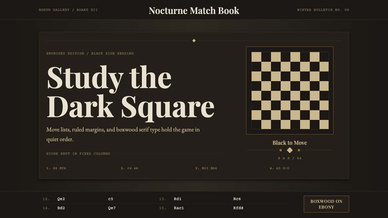 Chess TournamentQuiet intellect. Cream Playfair type, walnut rules, and notation glow on ebon…安静的智性:乌木底上乳白衬线、胡桃细线与记谱发光。
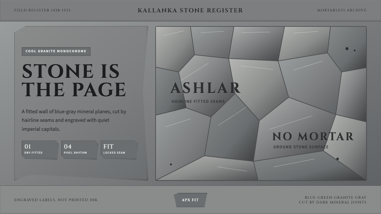 Inca Ashlar StoneworkStone becomes the page. Granite-gray planes lock into hairline ashlar seams.石墙即页面。花岗岩灰块面以发丝石缝咬合。
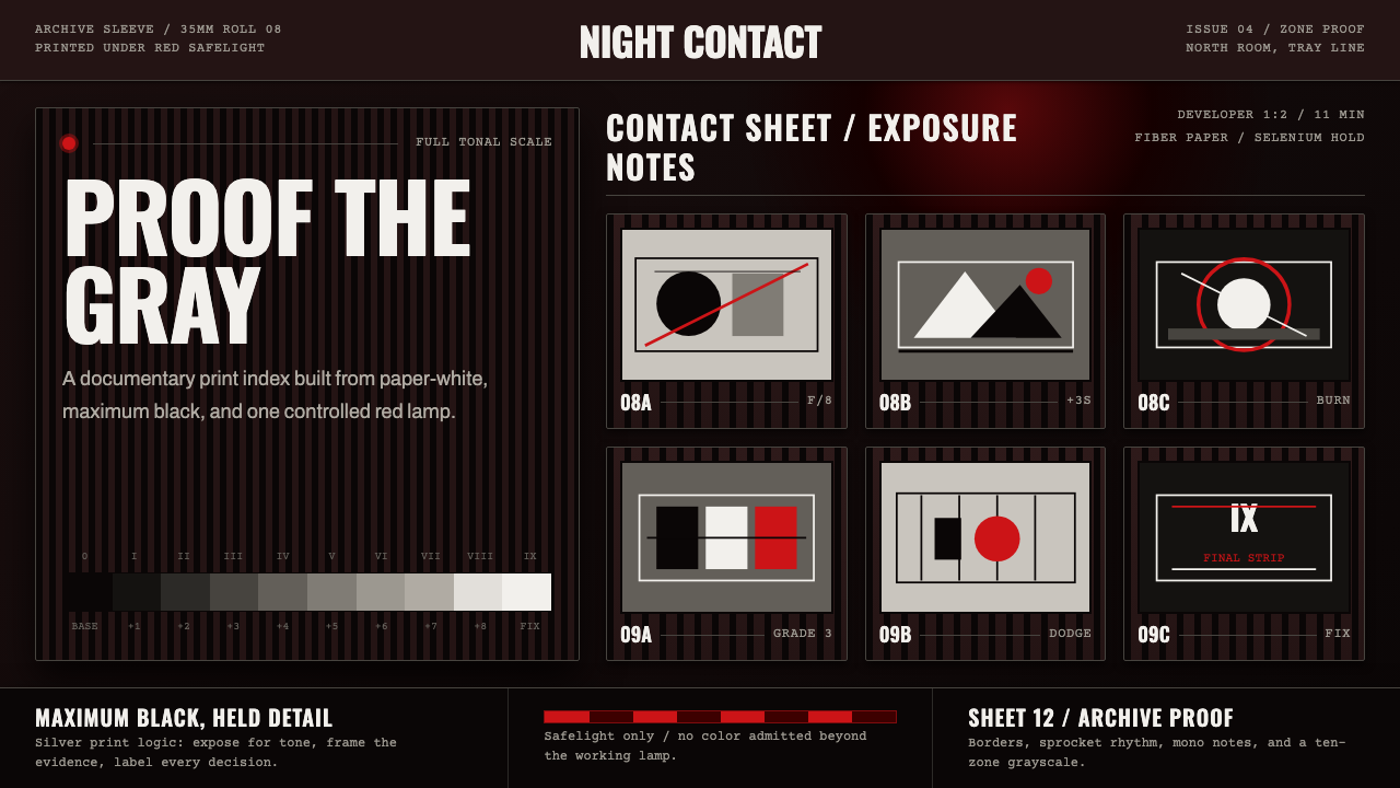 Silver Gelatin DarkroomTonality is the craft. Safelight red, contact grids, and ten-zone grays hold…影调即工艺。红色安全灯、接触网格与十区灰阶撑起暗房。
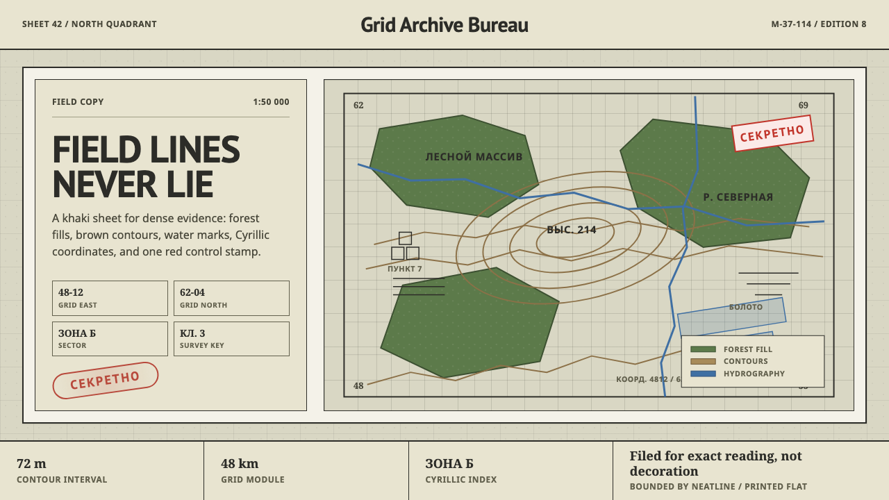 Soviet Classified MapAustere field intelligence. Khaki grid, forest green fills, brown contours, r…冷峻的野外情报感:卡其网格、森林绿块、棕色等高线与红印。
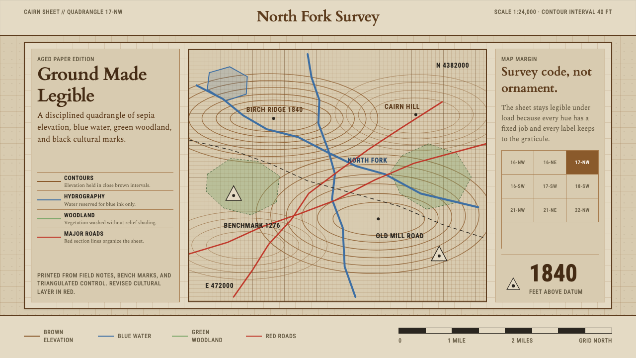 Topographic Survey MapMeasurement becomes beauty. Sepia contours and blue hydrography sit on aged m…测量即美:旧纸上的赭褐等高线与蓝色水系。
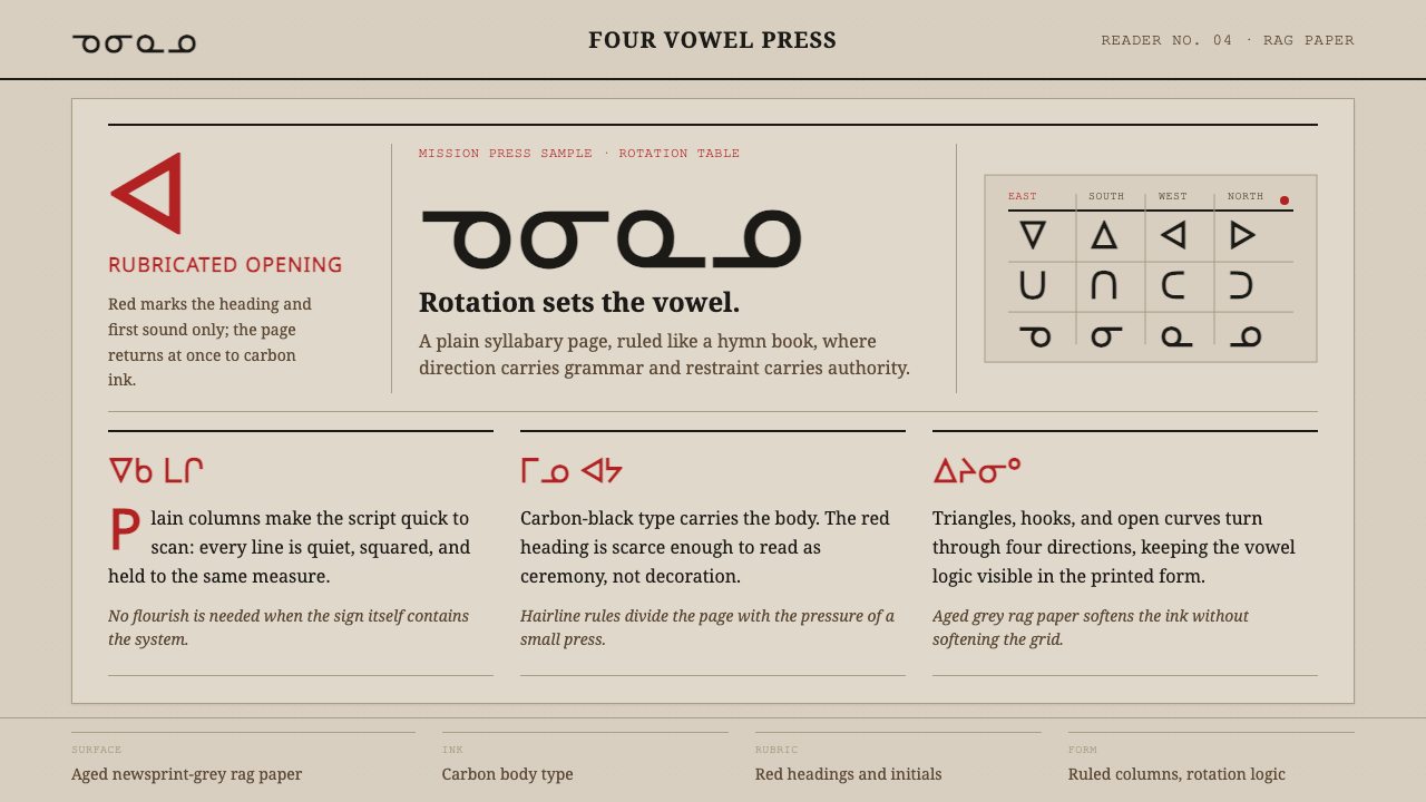 Cree SyllabicsPlain ink has authority. Carbon columns and red rubrication sit on rag-grey p…朴素墨色自有权威。炭黑栏文与朱红标题落在破布灰纸上。