What is Cycladic Santorini?
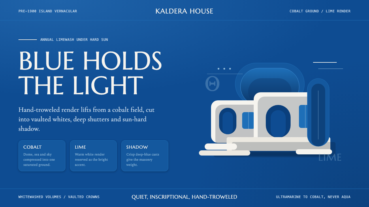
Cycladic Santorini is not a color scheme — it is a building tradition crystallized into a visual system: cobalt blue domes and deep-set shutters against hand-washed white lime, under the hardest sun in the European world. The ground is saturated blue, not white; the white is the accent.
Cycladic Santorini in brief
Cycladic Santorini is a vernacular architecture tradition from the Greek Cyclades archipelago, particularly the island of Santorini (Thira), which has been continuously refined over centuries through the practical constraints of island life: volcanic stone, scarce timber, blazing sunlight, and the annual ritual of lime-washing. What emerged is a tightly coherent visual system built from white lime render over rough masonry, cobalt-painted domes and door surrounds, deep-set window openings that cast hard shadows, and cubic volumes stacked against clifftop terrain.
The defining inversion of this aesthetic is that the cobalt of the domes and sea constitutes the dominant field color — not the white of the walls. The lime-washed surfaces function as the bright accent, not the ground. This is the opposite of how most Western design traditions use a light background with dark accents: here a saturated, near-black blue is the organizing visual field, against which white solids pop with almost aggressive clarity in the Aegean light.
Because this is a pre-industrial folk tradition rather than a designed movement, its visual principles were arrived at through constraint, climate, and collective practice rather than theory. The result is a system with remarkable internal consistency: high-contrast two-color palette, strong geometry, generous negative space, and a quality of weight and solidity that distinguishes it from the breezy, diluted beach-resort aesthetics that often claim to derive from it.
Where does Cycladic Santorini come from?
The Cyclades have been inhabited continuously since the Bronze Age, and the white-and-blue building tradition of Santorini traces its functional roots to practical necessity rather than aesthetic intention. Volcanic tufa and basalt — the dominant building materials of the Cyclades — were cut and stacked into thick-walled cubic structures that provided thermal mass against summer heat and winter wind. The lime render applied over these rough walls served a hygienic purpose: slaked lime is alkaline and kills bacteria, making annual re-application a public health measure as much as a visual one. The brilliant whiteness was a practical byproduct.
The signature cobalt blue — applied to domes, door frames, window shutters, and occasionally entire courtyard floors — has a more contested origin. One persistent account traces it to early twentieth-century directives from the Greek government or the Orthodox Church, which mandated blue-and-white as national colors in a program of visual unification. Another view holds that the blue came earlier, derived from indigo imported via trade routes or mixed with the lime wash from local copper oxide deposits. What is clear is that by the mid-twentieth century, the combination had become deeply naturalized as the defining visual identity of the islands, reinforced by decades of tourism photography.
The building forms themselves — the cave houses (hyposkafa) carved into the volcanic caldera cliff, the barrel-vaulted churches with their round blue domes, the cubic summer houses of Oia and Imerovigli — reflect the specific geology and settlement patterns of Santorini rather than any imported architectural style. The island's catastrophic volcanic eruption around 1600 BCE, which may have contributed to the decline of Minoan civilization, created the dramatic caldera landscape that defines the modern silhouette. The distinctive cluster-on-cliff composition is therefore not a design choice but a response to a geological event three and a half thousand years old.
The widespread global recognition of Cycladic Santorini as a distinct visual identity came largely through twentieth-century travel photography and, later, digital media. Images of the blue-domed church of Anastasis in Oia, or the stacked white houses of Fira against the caldera, became among the most reproduced architectural photographs in the world — so much so that the actual building tradition became inseparable from its image-reproduction history. The aesthetic now occupies an unusual position: it is both a living vernacular tradition, maintained by islanders through the annual lime-washing ritual, and a globally recognized brand identity appropriated by hospitality design, packaging, and marketing worldwide.
What defines the Cycladic Santorini look?
The Blue-Field Inversion
The most important structural principle of Cycladic Santorini is that saturated cobalt blue functions as the dominant field, with white as the accent rather than the ground. Most Western visual traditions place dark forms against a light background; this system inverts that relationship. The blue of the domes, shutters, and sea reads as the organizing backdrop, while white cubic volumes and lime-washed surfaces emerge from it as bright positive forms. Applying the palette in the conventional way — blue as highlight, white as background — produces something that looks like a beach resort, not a Cycladic village.
Hard Sun and Cast Shadow
The Aegean sun is nearly overhead for much of the year and casts shadows of extreme sharpness. Deep-set window openings, thick wall returns, and the geometry of cubic volumes against domed roofs all generate hard, clean shadow forms that are as visually active as the lit surfaces themselves. Shadow in this system is not diffuse or ambient — it is geometric and structural, functioning as a counterpoint to the illuminated white surfaces. Designs inspired by this tradition should treat shadow as a deliberate element: hard-edged, consistent in direction, and architecturally crisp rather than softened for comfort.
Cubic Geometry and Vaulted Form
The fundamental volumetric vocabulary of Cycladic architecture is the cube and the barrel vault. Cubic white boxes stack and interlocked across hillside terrain; barrel-vaulted roofs — painted cobalt — punctuate the composition. There are no pitched roofs, no triangular gables, no decorative cornices. The geometry is reductive to the point of abstraction: what the eye reads is a composition of solid white rectangles and saturated blue circles and domes. Rounded arches over doorways and courtyard gates soften the strict orthogonal massing without introducing complexity.
Generous Negative Space
The white walls of Cycladic buildings are largely unbroken — no applied ornament, no pattern, no surface modulation beyond the occasional window or door opening. The wall itself is the visual event, and its blankness is not a failure of decoration but an active compositional choice reinforced by centuries of practice. In translation to screen or print, this means committing to large areas of unmarked color — whether the deep blue field or the white accent surface — and resisting the impulse to fill space with texture, pattern, or secondary information.
Two-Color Discipline
The operative palette of Cycladic Santorini is effectively two colors: the deep cobalt and the lime white. Occasional earthy tones appear in stonework, terracotta pots, or wooden elements, but they are tertiary — background texture rather than system colors. This extreme restraint is not poverty of means but clarity of identity. The two-color constraint forces every compositional decision to be made through proportion, weight, and geometry rather than through the introduction of additional hues. A third color, when it appears in contemporary interpretations, typically signals the intrusion of resort branding rather than authentic vernacular logic.
Weight and Solidity
Cycladic buildings look heavy. The walls are thick — sometimes a meter or more — and the visual system communicates this mass through the contrast of light and shadow, the depth of window reveals, and the way cubic volumes sit against the hillside as if they have always been there. This quality of settledness and physical weight distinguishes the aesthetic from the airy, thin-walled lightness of contemporary minimalism. In applied design, achieving this quality requires forms that feel anchored: type set at substantial weight, layout elements that carry visual mass, compositional choices that do not float or feel provisional.
Pre-1900 Inscriptional Quality
The tradition predates mechanical reproduction, photography, and modern branding. Its visual language carries the quality of something hand-troweled, slowly accumulated, and maintained by ritual rather than by design revision. Typography paired with this aesthetic should reflect that inscriptional quality — classical proportions, generous spacing, restrained weight — rather than reaching for the dynamism of modernist sans-serifs. Marcellus, Cormorant, or similarly proportioned classical display faces read authentically within this register. The overall sensibility is quiet, slow, and confident in a way that has nothing to do with trend.
Who shaped Cycladic Santorini?
The visual system of Cycladic Santorini has no named author. It was produced collectively by generations of island masons — builders who worked with volcanic stone, slaked lime, and the specific demands of the Aegean climate. Their technical decisions — the thickness of the walls, the depth of window openings, the curve of the vault, the annual ritual of lime-washing — accumulated into a coherent visual language without any single directing intelligence. This anonymous collective authorship distinguishes vernacular traditions from designed movements and makes the Cycladic system unusually stable: it was never subject to the revisions of a single theorist.
The annual lime-washing of Santorini's buildings — typically performed each spring before the tourist season — is one of the few design rituals in the world that has been practiced continuously for centuries at a community scale. The people who carry out this work, often family members maintaining their own homes, are the living custodians of the aesthetic. The quality of the surface — slightly uneven, showing the movement of the brush or roller, picking up the texture of the masonry beneath — is not a defect but a defining feature. It is this hand-applied quality that distinguishes the authentic tradition from smooth-rendered contemporary imitations.
While no individual designed the Cycladic vernacular, the twentieth-century conservation and restoration of Santorini's building stock — particularly in Oia, which was devastated by the 1956 earthquake — involved a generation of local architects, government planners, and community builders who consciously chose to rebuild in the vernacular tradition rather than adopt modernist concrete construction. Their decisions, made in the 1960s and 1970s, are responsible for the visual coherence that visitors experience today. Without that post-earthquake reconstruction effort, much of the imagery that made Santorini globally recognizable might not exist.
No single building is more responsible for the global recognition of Cycladic Santorini aesthetics than the small Orthodox church of Anastasis in Oia. Its cluster of blue domes silhouetted against the caldera and the sunset has appeared on travel magazines, airline advertisements, and social media feeds more times than any architectural photograph. As an artifact, it is modest — a small nineteenth-century church of local construction methods. As an image, it became the primary vehicle through which the entire Cycladic visual system was transmitted to the world. Understanding this distinction between the living tradition and its image-reproduction history is important for anyone working with this aesthetic.
The Greek urban planner and architect Konstantinos Doxiadis (1913–1975), though not a Cycladic vernacular practitioner, produced influential academic documentation of Aegean settlement patterns and their underlying principles of human scale, climate response, and topographic sensitivity. His framework of 'ekistics' — the science of human settlements — helped articulate why Cycladic villages achieve the sense of rightness they do: buildings sized to human reach, streets scaled to foot traffic, orientation following light rather than land ownership. For designers approaching this aesthetic, Doxiadis's documentation offers a theoretical scaffold for understanding why the system works beyond its purely visual surface.
How do you use Cycladic Santorini today?
Cycladic Santorini is one of the most immediately recognizable aesthetics in contemporary design, and also one of the most misapplied. The common mistake is treating it as a cheerful Mediterranean color scheme — blue accents on a white background, some curves thrown in — and the result is invariably resort or travel branding rather than the weight and gravity of the actual tradition. Correct application starts with the structural inversion: the blue is the field, the white is the accent. Until that principle is in place, the palette will read as vacation rather than architecture.
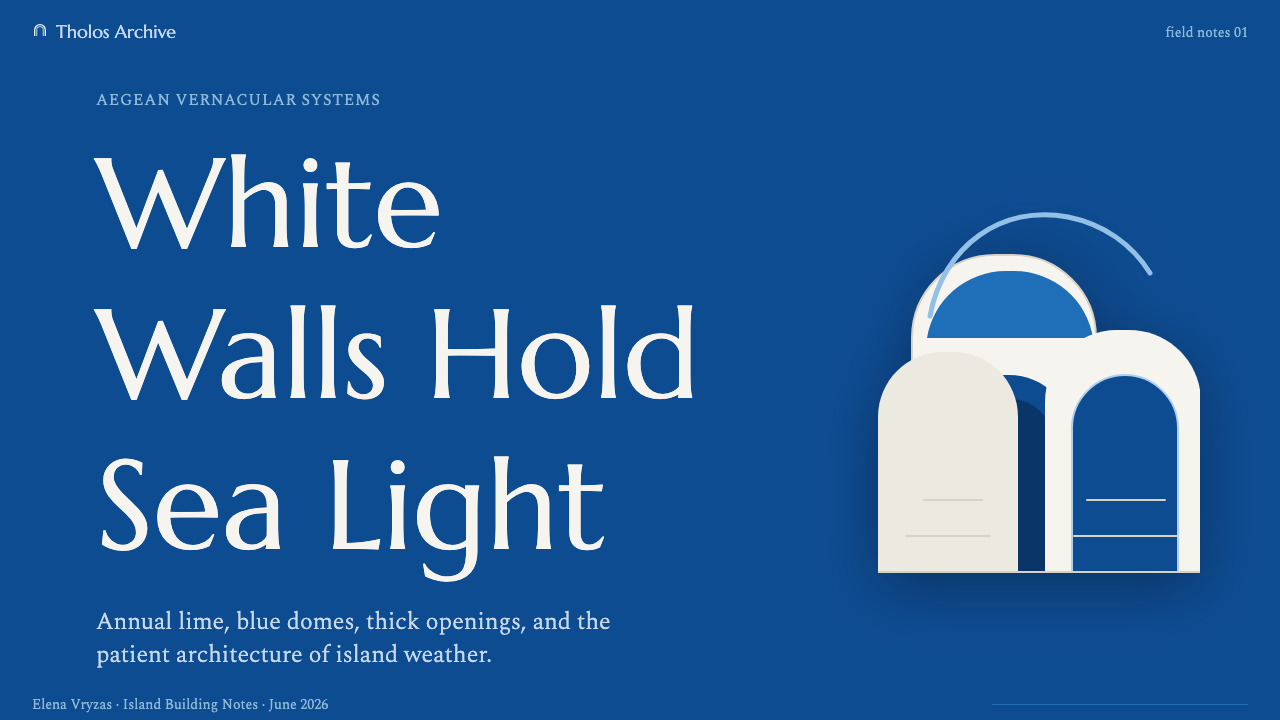
For presentation slides, Cycladic Santorini suits materials that need to project confidence, authority, and a sense of enduring quality. Cover slides work best as near-monochrome compositions in deep blue, with a single white headline set in a classical display face at generous scale. The title should feel inscribed rather than placed. Content slides benefit from the high-contrast two-color discipline: white text on deep blue, or black text on a near-white field with blue structural accents. Data slides should keep chart elements in the two-tone palette, relying on weight and value contrast rather than hue differentiation. Avoid gradient fills on any element — they immediately undercut the architectural solidity of the style.
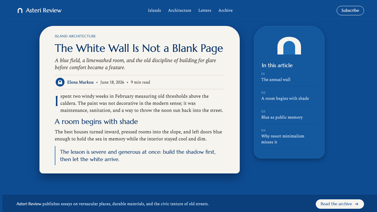
For web interfaces, the aesthetic is best suited to premium hospitality, luxury goods, cultural institutions, and any brand positioning itself around timelessness and quality rather than novelty. The structural approach: use the deep cobalt as the primary background or hero surface, with white type and elements as foreground. Interactive states and calls-to-action can be rendered as pure white elements on the blue ground. Rounded corners on containers — echoing the arch and dome — are authentic and distinct from the generic rounded-rect of contemporary UI; use them deliberately on primary containers rather than everywhere. Reserve any tertiary color for the rarest functional necessity.
For editorial and marketing work, the style functions well for cultural content, travel writing, food and wine, and luxury goods where a sense of place and slow time are desirable. Page compositions should have large areas of unmarked deep blue or lime white — resist filling every zone with content. Images, when used, work best as high-contrast photographs with strong geometry: architectural shots, still life with hard shadows, landscape with horizon lines. Avoid lifestyle photography with soft natural light; it fights the hard-sun quality that defines the tradition.
The most common mistake designers make when working with this aesthetic is diluting the cobalt. A pale, washed-out blue, a sky blue, or a teal reads as Mediterranean pastiche — beach resort or poolside wellness brand. The defining blue of Cycladic Santorini is deep and saturated, close to the color of the Aegean in late afternoon when the light goes flat. The second most common mistake is introducing a warm accent — coral, terracotta, gold — to 'lift' the palette. The tradition does not have a warm accent; the white is the accent. Any warm introduction reads as resort again. Trust the two-color system completely.
Cycladic Santorini — FAQ
Is Cycladic Santorini the same as general Mediterranean or Greek design?
No, and the distinction matters for application. 'Mediterranean design' covers an enormous range of vernacular and historical traditions — Moorish, Roman, Ottoman, Neapolitan, Provençal — and most of them share almost nothing visually with the Cycladic vernacular. Greek design itself spans Minoan frescoes, Byzantine iconography, neoclassical revival, and the Cycladic vernacular, which are entirely different systems. Cycladic Santorini is specifically the white-cubic-blue-dome tradition of the Aegean island chain. It is not transferable to mainland Greek, Italian, or Spanish design contexts without losing its defining qualities.
Can this style work for dark-mode interfaces?
Yes, and more naturally than most historical styles — because the defining blue of Cycladic Santorini is already a dark, deep field color. The authentic visual system is closer in logic to a dark interface than a light one: a deep saturated blue as the dominant surface, with white as the active foreground. A dark-mode implementation that uses deep cobalt as the background, white as primary text, and a slightly lighter or more saturated blue for surfaces and containers works within the tradition rather than against it. What to avoid: substituting a cool dark gray or black for the blue — that shifts the system toward generic dark UI and loses the specific quality of the Cycladic palette.
How do I use typography authentically in this system without it looking like a hotel brand?
The hotel-brand clichés associated with this aesthetic — thin script typefaces, stacked all-caps sans-serifs, excessive letter-spacing — are not part of the vernacular tradition. They are added by contemporary hospitality branding to signal luxury. The authentic typographic register of a pre-industrial island tradition is inscriptional and unhurried: classical serif or lapidary proportions, generous but not exaggerated spacing, and nothing that feels thin or fragile. Practically: use a classical display serif — Marcellus, IM Fell English, Cormorant Garamond — for headings, and a quiet humanist or transitional serif for body text. Set at comfortable but not excessive scale. Avoid condensed sans-serifs, script faces, and anything that reads as contemporary branding.
How is Cycladic Santorini different from Wabi-Sabi or Scandinavian minimalism that also uses restraint and natural materials?
The three traditions share restraint but achieve it through entirely different means and express entirely different values. Wabi-Sabi centers on impermanence, incompleteness, and the beauty of aging — its palette is warm and earthy, its textures deliberately imperfect, and its ideal form is something that looks as though time has worked on it. Scandinavian minimalism is functionalist and light-seeking, with pale wood tones, cool whites, and an emphasis on the quality of diffuse northern light. Cycladic Santorini, by contrast, is a response to excess: too much sun, too much heat, too much light. Its restraint is not seeking warmth or softness but is managing overpowering brightness. Its palette is hard-contrast, not gentle. Its geometry is massive and weighty, not light and airy. Of the three, it is the most confrontational.
What kinds of projects or brands should avoid this style?
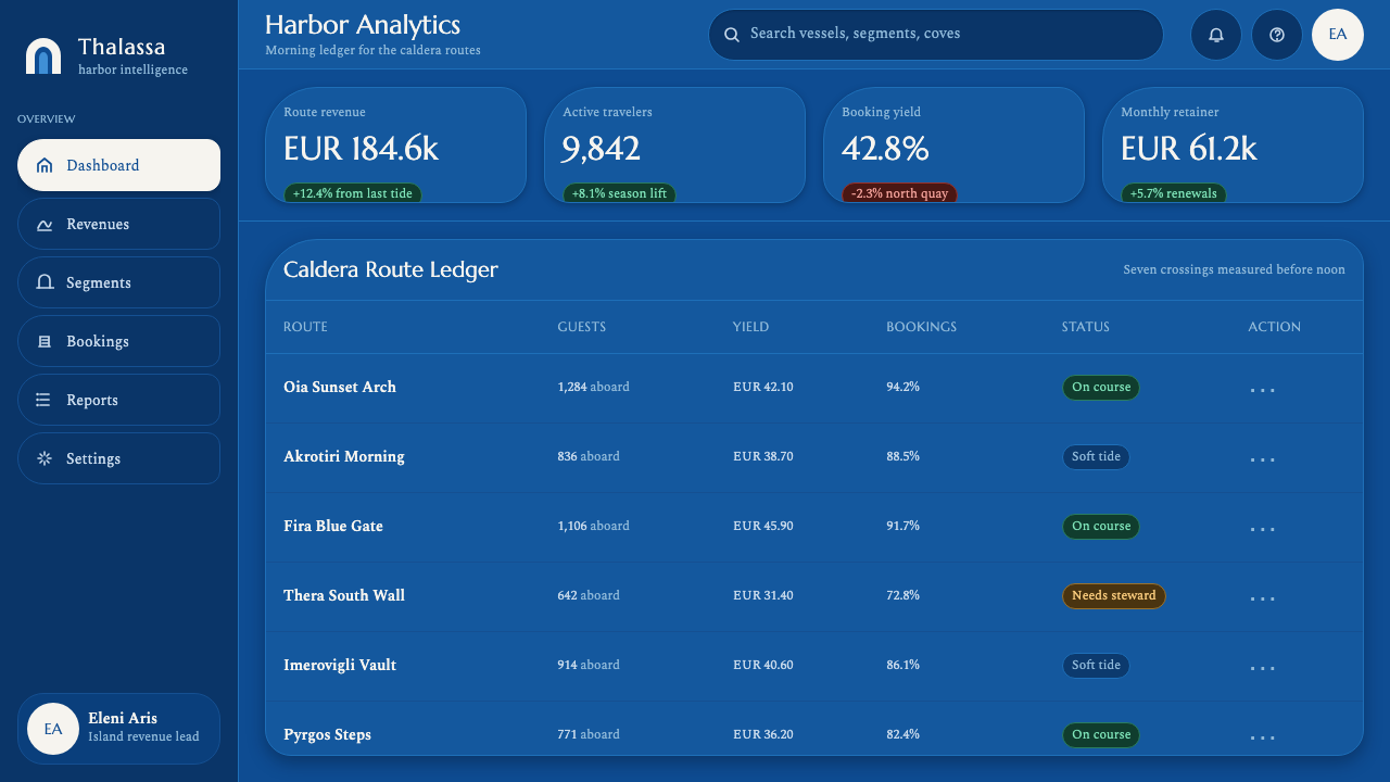
Cycladic Santorini works poorly for products that require warmth, approachability, or a sense of organic growth. Its high contrast and architectural solidity communicate permanence and authority, which is a liability for brands that need to feel friendly, local, or community-driven. Children's products, food brands in the accessible and everyday segment, mental health or emotional support applications, and anything that needs to communicate play, change, or lightness will struggle with this aesthetic. It also works poorly for highly technical or data-dense interfaces where the two-color discipline becomes a readability constraint rather than an asset. Choose it when the desired emotional register includes gravitas, timelessness, and a specific sense of Mediterranean place — and when your audience is comfortable with those associations.
Related design styles
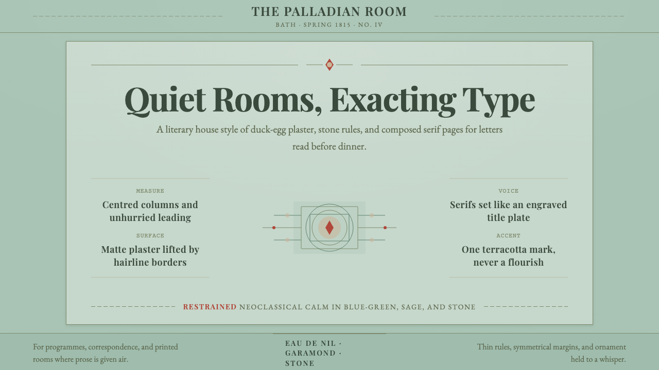 Regency EnglandCalm has authority. Duck-egg plaster, Garamond serifs, and hairline borders.
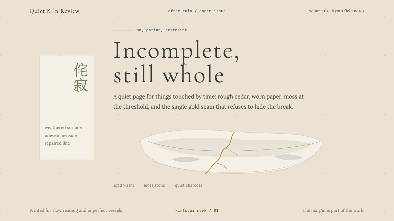 Wabi-SabiStillness makes imperfection whole. Washi beige, moss sage, and a spare gold…
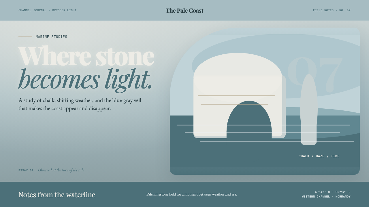 Étretat Chalk CliffsStone becomes light. Chalk-white forms dissolve through blue-gray mist and li…
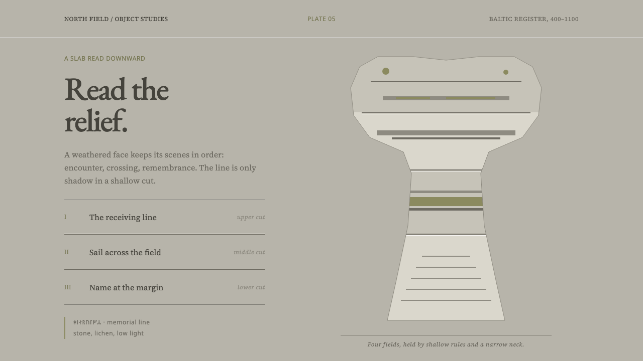 Gotland Picture StoneMeaning emerges slowly. Weathered limestone greys divide a story into shallow…
 Indigo ShiboriCloth before image. Bound cotton plunged into sukumo vats — raw-white resist…
 Leonardo — Mona Lisa (1503)Form emerges without edges. Ochre light dissolves into umber shadow and blue-…