What is Wabi-Sabi?什么是 Wabi-Sabi?
Wabi-sabi finds beauty where perfection ends — in the weathered, the asymmetric, and the quietly incomplete.侘寂在完美终结之处发现美——在风化的、不对称的与静默未尽的事物之中。
Wabi-Sabi in briefWabi-Sabi 速览
Wabi-sabi is a Japanese aesthetic philosophy rooted in Zen Buddhism and the culture of the tea ceremony. Its name fuses two originally distinct concepts: wabi, meaning rustic simplicity and the austere beauty of solitude, and sabi, meaning the patina that time bestows on objects — the bloom of rust on iron, the crack in a glaze, the moss slowly colonizing a garden stone. Together they describe a worldview in which imperfection, transience, and incompleteness are not flaws to be corrected but qualities to be honored.侘寂是植根于日本禅宗与茶道文化的美学哲学。其名称融合了两个起初各自独立的概念:侘(わび),意指朴素的简洁与孤寂之美;寂(さび),意指时间赋予物品的包浆——铁器上的锈晕、釉面上的裂纹、苔藓缓缓占领石头的过程。两者合并,描述了一种世界观:不完美、无常与未竟不是需要纠正的缺陷,而是值得尊重的品质。
Translated into visual design, wabi-sabi becomes a system governed by restraint and authenticity rather than polish and symmetry. Its palette draws from the natural world — the beige of handmade paper, the grey-green of moss and lichen, the warm brown of unfinished clay, the muted gold of kintsugi lacquer sealing a crack. Surfaces carry texture: the grain of wood, the slight irregularity of hand-thrown ceramics, the soft tooth of washi. Negative space — known in Japanese as ma (間) — is not empty but active, giving each element room to be perceived in silence.将侘寂引入视觉设计,便形成一套以克制与真实而非光洁与对称为核心的体系。其色板取自自然世界——手工纸的米白、苔藓与地衣的灰绿、未烧结陶土的暖棕、金缮漆封裂痕的哑金。表面承载质感:木材的纹理、手拉坯器物微小的不规整、和纸柔软的细齿。留白——日语称之为「间」(ま)——并非空洞,而是积极的存在,给予每个元素在静默中被感知的空间。
Unlike design systems built on rational grids and mechanical precision, wabi-sabi tolerates and even invites deviation. A headline that sits slightly off-center, a border whose weight varies faintly from one edge to the next, a background wash that is not quite uniform — these are not errors but evidence of the hand, and the hand is the point. The aesthetic asks that nothing appear too finished, too even, or too permanent, because permanence is itself a kind of dishonesty about how things actually are.与建立在理性网格和机械精度上的设计体系不同,侘寂容纳乃至邀请偏差。标题轻微偏离中心,边框的粗细从一边到另一边微微变化,背景晕染并不完全均匀——这些不是错误,而是手的痕迹,而手的痕迹正是要点所在。这种美学要求没有任何东西看起来过于完成、过于均匀或过于永久,因为永久本身就是对事物实际存在状态的一种欺骗。
Where does Wabi-Sabi come from?Wabi-Sabi 从何而来?
The roots of wabi-sabi reach into fourteenth and fifteenth-century Japan, when Zen Buddhism was reshaping aristocratic culture from within. Zen practice placed direct experience — the texture of a teabowl in the hand, the sound of water heating over coals — above doctrinal learning. Beauty, in this view, was not a property of objects that had been perfected but of attention brought fully to what was present. The word wabi originally carried connotations of poverty and deprivation; over the course of the fifteenth century, poets and monks transformed it into a term of praise, finding in simplicity and restraint a depth that ornament could not achieve.侘寂的根源延伸至日本十四、十五世纪,彼时禅宗正从内部重塑贵族文化。禅的修行将直接体验——茶碗握在手中的质感、炭火上水沸的声音——置于教义学习之上。在这一视角下,美不是已被完善的物品的属性,而是将注意力完整地带到当下所在之处的能力。「侘」这个词最初含有贫困与匮乏的意味;在十五世纪的演变过程中,诗人与僧侣将其转化为一个赞美性词汇,在简朴与克制中发现了装饰无法企及的深度。
The formal codification of wabi-sabi as a design philosophy came through the tea ceremony, known as chanoyu. The monk Murata Jukō (c. 1423–1502) is credited with turning the tea gathering from a display of imported Chinese luxury objects into a practice centered on humble, locally made implements — rough-surfaced bowls, bamboo whisks, plain iron kettles. Jukō argued that the asymmetry and rawness of Korean and Japanese provincial ceramics conveyed a spiritual depth that polished Chinese porcelain could not. He called this quality wabi, and its cultivation became the purpose of the tea gathering.侘寂作为设计哲学的正式系统化,经由茶道(chanoyu)完成。僧人村田珠光(约1423—1502年)被誉为将茶会从展示中国进口奢侈器物的场合,转变为一种以朴素的本地制器为中心的修行——粗糙质感的茶碗、竹制茶筅、素铁茶釜。珠光主张,朝鲜与日本地方陶瓷的不对称与原始性所传达的精神深度,是光洁的中国瓷器所无法企及的。他将这种品质称为「侘」,而对它的涵养成为茶会的目的。
Sen no Rikyū (1522–1591) brought this sensibility to its fullest expression. Rikyū was tea master to the ruler Toyotomi Hideyoshi, and under his guidance the tea room itself became a wabi-sabi object: low ceilings, rough plaster walls, an entrance so small that guests were forced to bow — stripping them of rank before they entered. Rikyū designed teabowls in partnership with a tile-maker named Chōjirō, producing the first Raku ware: hand-shaped rather than wheel-thrown, low-fired, slightly irregular, warm to the touch. These bowls defined the wabi aesthetic in material form and remain the canonical reference for the style.千利休(1522—1591年)将这种感性推向最充分的表达。利休是统治者丰臣秀吉的茶道宗师,在他的引导下,茶室本身成为一件侘寂之物:低矮的天花板,粗糙的灰泥墙,入口极小,客人被迫低头弯腰才能进入——在踏入之前脱去身份。利休与一位名叫长次郎的瓦匠合作设计茶碗,制作出最早的乐烧:以手捏塑而非转轮拉坯,低温烧制,略带不规整,握持时有温度。这些茶碗以物质形式确立了侘的美学,至今仍是这种风格的经典参照。
The twentieth century gave wabi-sabi a new audience and a new vocabulary. The American writer and designer Leonard Koren published Wabi-Sabi for Artists, Designers, Poets and Philosophers in 1994, offering the first systematic treatment of the concept in English and framing it as a counterpoint to Western modernism's pursuit of perfection, universality, and permanence. Koren identified wabi-sabi's three central qualities — impermanence, incompleteness, and imperfection — and showed how they produced a coherent visual language. Japanese industrial designer Naoto Fukasawa, though not writing about wabi-sabi explicitly, embodies many of its principles in his product work: objects that wear gracefully, that do not announce themselves, that feel as though they have always existed. The aesthetic continues to shape contemporary Japanese graphic design, packaging, and interior architecture, and its influence on Western digital design has grown substantially since the early 2000s.二十世纪为侘寂带来了新的受众与新的词汇。美国作家兼设计师伦纳德·科伦于1994年出版《侘寂:献给艺术家、设计师、诗人与哲学家》,提供了英语世界对这一概念的首次系统性阐释,并将其定位为西方现代主义追求完美、普遍性与永久性的对立面。科伦归纳出侘寂的三个核心品质——无常、未竟与不完美——并展示了它们如何产生一套连贯的视觉语言。日本工业设计师深泽直人虽未明确书写侘寂,却在其产品作品中体现了许多相关原则:器物优雅地老去,不自我宣扬,仿佛一直以来就在那里。这种美学持续塑造着当代日本平面设计、包装与室内建筑,自2000年代初以来对西方数字设计的影响也日益显著。
What defines the Wabi-Sabi look?Wabi-Sabi 的视觉特征是什么?
Muted Earth Palette哑光大地色板
The wabi-sabi palette is drawn entirely from natural, unprocessed materials — the off-white of handmade paper, the grey-green of weathered copper or lichen, the warm brown of raw clay, the deep near-black of iron. Colors are desaturated and slightly warm rather than pure or bright. No color competes for attention; each exists at a quieter register than the eye expects. Where accent appears, it arrives as the subdued gold of kintsugi or the occasional pale rust — a trace of something that has changed rather than been added.侘寂的色板完全取自自然、未经加工的材料——手工纸的米白、风化铜或地衣的灰绿、生陶土的暖棕、铁器的深近黑。色彩经过去饱和处理,略带暖意,而非纯粹或鲜亮。没有任何色彩争夺注意力;每一种都在比眼睛预期更安静的音调上存在。当强调色出现时,它以金缮的哑金或偶尔的淡锈呈现——那是某种已经改变而非被添加之物的痕迹。
Tactile Texture触觉质感
Wabi-sabi design carries the memory of the hand. Backgrounds suggest the fibrous tooth of washi or the irregular surface of hand-applied plaster; type may sit on a wash that is not quite flat. These textures are not decorative patterns imposed over a clean layer; they are the ground itself, suggesting that the surface has a history. In digital contexts, this quality is achieved through photographic texture overlays of genuine natural materials — not procedurally generated noise — handled with enough restraint that the texture reads as atmosphere rather than effect.侘寂设计承载着手的记忆。背景令人联想到和纸纤维的细齿或手工抹灰的不规则表面;文字可能坐落于并不完全均匀的晕染之上。这些质感不是叠加在干净图层上的装饰图案,而是底面本身,暗示表面拥有历史。在数字语境中,这种品质通过真实自然材料的摄影质感叠加来实现——而非程序生成的噪点——以足够的克制处理,使质感读取为氛围而非特效。
Asymmetry and Deliberate Imbalance不对称与刻意失衡
Where Bauhaus achieves balance through weight and tension between geometric opposites, wabi-sabi pursues something looser: a composition that feels settled rather than resolved. A large area of empty space on one side is not balanced by an equivalent mass on the other — it simply is, and the object within it occupies its position as though it grew there. Layouts tend to be off-center, with generous breathing room on one axis and a single weighted element anchoring the composition. Nothing lines up too precisely; the grid, if it exists, is felt rather than measured.包豪斯通过几何对立体之间的重量与张力实现平衡,侘寂则追求更为松弛的东西:一种感觉已落定而非已解决的构图。一侧大面积的空旷并不以另一侧等量的实体来平衡——它就那样存在,其中的物体占据着仿佛在那里自然生长的位置。版面倾向于偏心,在一个轴向上留有充裕的呼吸空间,以单个有重量的元素锚定构图。没有任何东西排列得过于精确;网格如果存在,是被感知到的而非被测量出来的。
Negative Space as Presence作为存在的留白
Ma (間) — the Japanese concept of negative space — is not the absence of content but a full participant in the composition. In wabi-sabi design, the space around a single line of text, the silence between two visual elements, the unmarked expanse of a slide background: these are not voids to be filled but spaces in which meaning accumulates. A layout that feels sparse by Western standards may feel exactly right in wabi-sabi terms. The discipline is in resisting the impulse to fill — to trust that the pause is as expressive as the mark.「间」(ま)——日本的留白概念——不是内容的缺席,而是构图中完全的参与者。在侘寂设计中,单行文字周围的空间,两个视觉元素之间的静默,幻灯片背景上未经标记的大片空旷:这些不是待填充的虚空,而是意义在其中积累的空间。以西方标准看来稀疏的版面,在侘寂语境中可能恰到好处。这种纪律在于抵抗填满的冲动——相信停顿与标记同样富有表现力。
Organic and Irregular Line有机而不规则的线条
Wabi-sabi does not prize the perfectly straight line or the mechanically uniform stroke. Dividers and borders carry a slight variation in weight; illustrative marks suggest a brush rather than a vector pen. Where geometric forms appear, they are softened — a circle that is nearly but not quite round, a rectangle whose corners carry the faintest irregularity. This is not clumsiness but a studied quality: the trace of process left visible. The imperfect line acknowledges that it was made, and making is part of the meaning.侘寂不崇尚完美的直线或机械均匀的笔触。分割线和边框带有轻微的粗细变化;插图性的标记令人联想到毛笔而非矢量钢笔。当几何形出现时,它们被软化——一个几乎但不完全是圆的圆,一个角落带有最微弱不规整感的矩形。这不是笨拙,而是一种经过研究的品质:过程留下的可见痕迹。不完美的线条承认它是被制作出来的,而制作本身就是意义的一部分。
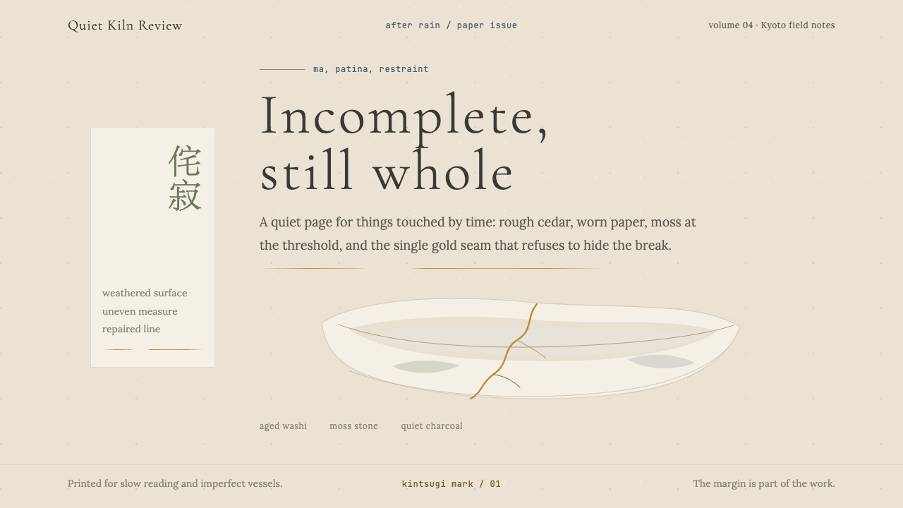
Kintsugi as Visual Principle金缮作为视觉原则
Kintsugi — the Japanese art of repairing broken ceramics with gold-dusted lacquer — is both a historical practice and a conceptual key to wabi-sabi design. It declares that the history of an object, including its damage and repair, is more beautiful than an unmarked surface would be. In design terms, this translates to an acceptance of visible joins, of contrast between old and new, of the seam as a feature. A fine line of warm gold threading through a muted composition, a subtle contrast between two adjacent textures — these are kintsugi thinking applied to layout.金缮——以金粉调和漆料修复破损陶瓷的日本工艺——既是一种历史实践,也是理解侘寂设计的概念钥匙。它宣告:一件器物的历史,包括它的损伤与修复,比未经标记的表面更为美丽。在设计语境中,这转化为对可见接缝的接受,对新旧之间对比的接受,对缝合线作为特征的接受。一条细细的暖金线穿过哑色构图,两种相邻质感之间微妙的对比——这些都是金缮思维在版面上的应用。
Quietude and Restraint静默与克制
Every element in a wabi-sabi composition earns its place through necessity rather than decoration. There are no flourishes added for visual interest, no gradients applied for depth, no multiple competing typefaces, no busy patterned backgrounds. What remains after everything inessential is removed is not emptiness but concentration: the one thing present is more fully present for the absence of competition. This restraint is closest in spirit to Zen calligraphy — the single practiced brushstroke that contains all the training that preceded it.侘寂构图中的每个元素以必要性而非装饰性赢得其位置。没有为视觉趣味添加的花饰,没有为制造深度施加的渐变,没有多种竞争性字体,没有繁杂的图案背景。去除一切非必要之物后剩下的不是空洞而是专注:唯一存在的事物因竞争的缺席而更充分地存在。这种克制在精神上最接近禅宗书法——那一笔经过修炼的笔触,包含了它之前所有的训练。
Who shaped Wabi-Sabi?谁塑造了 Wabi-Sabi?
Murata Jukō (c. 1423–1502) is credited as the founder of the wabi tea ceremony, transforming the tea gathering from a display of Chinese luxury into a practice of cultivated simplicity. A student of Zen under the master Ikkyū, Jukō argued that rough-surfaced Korean and Japanese provincial pottery carried a spiritual depth absent from polished imported ware. He articulated the quality of this plainness using the word wabi, giving the aesthetic philosophy its name and its original design rationale. Without Jukō's revaluation, the objects that define wabi-sabi — the Raku teabowl, the bamboo whisk, the plain iron kettle — would have no framework of meaning to inhabit.村田珠光(约1423—1502年)被誉为侘茶的创始人,将茶会从展示中国奢侈品的场合转变为一种修炼简朴的实践。作为禅师一休的弟子,珠光主张粗糙质感的朝鲜与日本地方陶器承载着光洁进口器物所缺乏的精神深度。他用「侘」这个词来阐明这种朴素的品质,赋予这一美学哲学其名称与最初的设计理据。若无珠光的重新估值,定义侘寂的器物——乐烧茶碗、竹制茶筅、素铁茶釜——将无意义框架可以栖居。
Sen no Rikyū (1522–1591) is the figure who fixed wabi-sabi as both aesthetic and ethical commitment. As tea master to Toyotomi Hideyoshi, he had authority to shape the material culture of the most powerful court in Japan, and he used it to insist on radical plainness. His tea rooms were small, deliberately asymmetric, and built from rough natural materials. His collaboration with the tile-maker Chōjirō produced Raku ware — hand-shaped, low-fired teabowls whose uneven surfaces and warm weight set a standard for wabi design that has not been superseded. Rikyū was eventually ordered to commit suicide by Hideyoshi in a dispute whose exact causes remain debated, but his aesthetic principles survived intact and continue to govern the way the tea ceremony is practiced and understood.千利休(1522—1591年)是将侘寂确立为审美与伦理承诺的人物。作为丰臣秀吉的茶道宗师,他有权塑造日本最强盛宫廷的物质文化,他将这种权力用于坚持彻底的朴素。他的茶室狭小、刻意不对称,以粗糙的自然材料建造。他与瓦匠长次郎的合作产生了乐烧——以手捏塑、低温烧制的茶碗,其不均匀的表面与温热的重量为侘寂设计树立了至今未被超越的标准。利休最终因一场原因仍存争议的冲突被秀吉命令切腹,但他的美学原则完整地延续下来,持续规范着茶道的修行方式与理解。
Leonard Koren is the American writer and artist who introduced wabi-sabi to English-speaking designers as a coherent design philosophy rather than a vague cultural mood. His 1994 book Wabi-Sabi for Artists, Designers, Poets and Philosophers identified the aesthetic's three foundational attributes — impermanence, incompleteness, and imperfection — and provided a comparative framework against Western modernism. Koren's analytical clarity made wabi-sabi legible to designers who had no access to its Japanese cultural sources, and the book became a touchstone for the wave of Japanese-influenced minimalism that swept graphic design, product design, and interior architecture from the late 1990s onward.伦纳德·科伦是将侘寂作为一种连贯的设计哲学(而非模糊的文化氛围)引介给英语世界设计师的美国作家兼艺术家。他1994年的著作《侘寂:献给艺术家、设计师、诗人与哲学家》归纳出这一美学的三个基本属性——无常、未竟与不完美——并提供了与西方现代主义相对照的分析框架。科伦的分析清晰度使侘寂对那些无法直接接触日本文化来源的设计师变得可读,这本书成为从1990年代末起席卷平面设计、产品设计与室内建筑的日本影响极简主义浪潮的重要参照。
Naoto Fukasawa is the Japanese industrial designer whose product work is among the most direct contemporary expressions of wabi-sabi values, though he rarely uses the term explicitly. His designs — wall-mounted CD players, simple kitchen appliances, tableware — share a quality of quiet inevitability: they appear to have always existed in their final form. Surfaces are unhurried and tactile; shapes are familiar enough to be overlooked but precise enough to feel considered. Fukasawa's concept of design dissolving into behavior — objects so natural that the user stops noticing them — is the closest contemporary analogue to the wabi principle of beauty that does not announce itself.深泽直人是日本工业设计师,其产品作品是当代侘寂价值最直接的体现之一,尽管他鲜少明确使用这个词。他的设计——壁挂式CD播放器、简洁的厨房电器、餐具——共享一种安静的必然性品质:它们看起来仿佛一直以其最终形态存在。表面从容而有触感;形状足够熟悉以至于被忽略,却又足够精准以至于令人感到经过深思。深泽直人关于设计消融进行为的概念——器物如此自然以至于使用者停止注意到它们——是对侘寂中不自我宣扬之美这一原则最接近的当代类比。
How do you use Wabi-Sabi today?今天怎么用 Wabi-Sabi?
Wabi-sabi is among the more demanding historical aesthetics to apply faithfully, because its authority rests entirely on restraint. A layout that removes too much can read as merely unfinished; one that retains too much decoration has simply not committed. The discipline required is not minimalism in the contemporary sense — it is specific: muted natural colors, texture that suggests material history, generous negative space, and a deliberate tolerance for irregularity. Understanding what each element is doing before adding it is more important here than in almost any other visual system.侘寂是较难忠实应用的历史美学之一,因为它的权威完全建立在克制之上。去除过多的版面会显得仅仅是未完成;保留过多装饰的版面则根本未曾真正投入。所需的纪律不是当代意义上的极简主义,而是具体的:哑光自然色彩、暗示材料历史的质感、充裕的留白,以及对不规整的刻意容纳。在添加每个元素之前理解它在做什么,在这里比几乎任何其他视觉系统都更为重要。
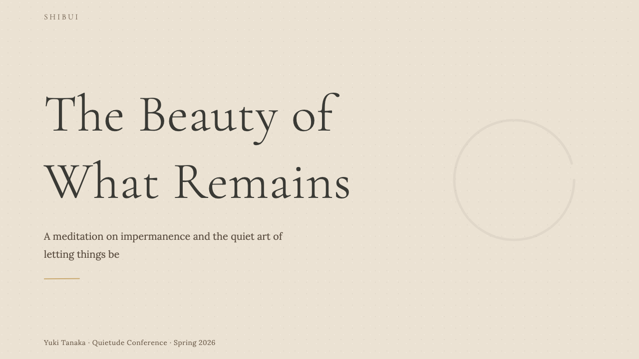
For presentation slides, wabi-sabi suits cover pages that make a single, quiet statement rather than announcing themselves loudly. A cover might carry one object — a teabowl photograph desaturated to near-monochrome, a single brushstroke character — against a large field of warm off-white, with the title set in an understated typeface at moderate size. Content slides benefit from the ma principle: one idea per slide, surrounded by space, with no bullet-point lists competing for attention. Data slides take on a contemplative rather than analytical quality — sparse charts in muted earth tones, with annotation set small and restrained, allowing the data itself to be the focal point rather than the visualization apparatus.对于演示文稿,侘寂适合以一种安静的陈述而非大声宣告自己的封面页。封面可能在大片温暖米白色的底面上承载单一物件——一张去饱和至近乎单色的茶碗照片,一个毛笔书写的单字——标题以低调的字体在适中的尺寸排列。内容页受益于「间」的原则:每页一个想法,被空间环绕,没有争夺注意力的项目符号列表。数据页呈现出沉思性而非分析性的品质——以哑光大地色调绘制的稀疏图表,注释文字小而克制,让数据本身成为焦点而非可视化装置。
For web interfaces, wabi-sabi is well-suited to contexts where trust, craftsmanship, and considered quality are the primary brand values: artisan product pages, studio portfolios, wellness platforms, cultural institutions. The approach centers on a textured or near-white background, a palette of two or three muted naturals, and generous spacing between all elements. Navigation should be typographic and understated. Hero sections carry one image and very little text. Card components avoid sharp drop shadows and hard borders — a subtle tonal shift or a faint hairline is enough to delineate space. Pricing pages and dashboards are possible but require care: the aesthetic can undermine scannability if spacing becomes too diffuse.对于网页界面,侘寂尤其适合信任感、工匠精神与审慎品质是主要品牌价值的场景:手工艺品页面、工作室作品集、健康平台、文化机构。方法以质感或近白色背景为核心,采用两到三种哑光自然色的色板,在所有元素之间保留充裕间距。导航应当以字体性方式呈现,低调克制。首屏区域承载一张图像和极少的文字。卡片组件避免明显的投影和硬边框——微妙的色调转变或一条细线已足以划定空间。定价页面和仪表板可行,但需要谨慎:如果间距变得过于弥散,这种美学可能损害可扫描性。
For editorial and marketing work, the style supports a particular kind of authority — the quietness of something that does not need to be loud to be noticed. An article layout using wabi-sabi principles might set body text in a humanist typeface at a comfortable measure, with generous leading and a wide outer margin reserved for pull quotes or sparse illustration. Section breaks are marked by a hairline rule or simply by space — never by decorative ornament. Marketing materials avoid testimonial grids and feature-badge layouts in favor of single full-width images paired with short, considered copy. The effect is closer to a well-designed book than a promotional page, and that restraint is itself the signal.对于编辑与营销内容,这种风格支持一种特定的权威感——某种不需要大声就能被注意到的安静。运用侘寂原则的文章版面可能将正文以舒适的行宽排印于人文主义字体中,配以充裕的行距和宽阔的外边距留给引文或稀疏的插图。段落分隔以细线或仅以空间标记——绝不以装饰性元素。营销材料避免证言网格和功能徽章版面,转而以单张全宽图像配以简短、经过深思的文案。效果更接近一本设计精良的书,而非一个推广页面,而这种克制本身就是信号。
A common and damaging mistake when applying wabi-sabi is aestheticizing poverty rather than honoring imperfection. Textures that look merely degraded, layouts that are sparse because nothing was designed rather than because the space was considered, colors that are muddy rather than quietly naturalistic — these produce work that reads as unresolved rather than wabi. The other frequent error is importing Japanese cultural signifiers — calligraphic characters, cherry blossom imagery, Mt. Fuji silhouettes — as surface decoration. Wabi-sabi is not a Japan-themed palette; it is a philosophy about the beauty of things that have aged, settled, and been honestly made. The discipline is in the system's values, not its symbols.应用侘寂时一个常见且有害的错误是将贫困审美化,而非尊重不完美。看起来仅仅是衰败的质感,因为什么都没有被设计而非因为空间被深思熟虑而显得稀疏的版面,泥浊而非安静自然主义的色彩——这些产生的作品读起来是未解决的,而非侘寂的。另一个频繁出现的错误是将日本文化符号——书法文字、樱花图像、富士山剪影——作为表面装饰引入。侘寂不是一个日本主题色板;它是一种关于已经老去、沉淀并被诚实制作的事物之美的哲学。这种纪律在于体系的价值观,而非其符号。
Wabi-Sabi — FAQWabi-Sabi · 常见问题
Is wabi-sabi the same as Japanese minimalism?侘寂与日本极简主义是同一回事吗?
They overlap but are not identical. Japanese minimalism, as practiced by designers influenced by the Zen aesthetic, tends toward clean surfaces, precise geometry, and the complete elimination of the unnecessary. Wabi-sabi goes further in a different direction: it not only tolerates imperfection but requires it. A perfectly smooth, precisely square, uniformly colored surface is antithetical to wabi-sabi even if it is very spare. Wabi-sabi needs the slight irregularity, the texture, the trace of time. Contemporary Japanese design brands like Muji occupy an interesting middle ground: minimalist in geometry but wabi-sabi in their celebration of natural, unprocessed materials and their explicit rejection of superficial finish.两者有重叠但并不相同。受禅宗美学影响的设计师所实践的日本极简主义,倾向于洁净的表面、精确的几何与对一切非必要之物的彻底消除。侘寂在不同方向上走得更远:它不仅容纳不完美,而且需要它。一个完全光滑、精确成方、色彩均匀的表面,即使非常简洁,也与侘寂背道而驰。侘寂需要轻微的不规整、质感、时间的痕迹。当代日本设计品牌如无印良品占据了一个有趣的中间地带:在几何上属于极简主义,但在对自然、未加工材料的推崇以及对表面光洁度的明确拒绝上属于侘寂。
Can wabi-sabi work in a digital product where users expect polished UI?侘寂能在用户期望精良UI的数字产品中发挥作用吗?
Yes, but it requires selective application. A full wabi-sabi UI — irregular forms, visible texture throughout, no crisp alignment — would fail usability standards and signal incompetence rather than intention. The productive approach is to apply wabi-sabi principles at the level of art direction and surface treatment while preserving functional precision where it matters. Backgrounds can carry subtle texture; spacing can be generous and slightly irregular; the color palette can be muted and naturalistic; illustrations can suggest a hand-made quality. Interactive elements — buttons, inputs, navigation — should remain legible and predictable. The aesthetic sets the emotional register; the engineering ensures the product works.可以,但需要选择性应用。一个完全的侘寂UI——不规则的形态、通篇可见的质感、没有清晰的对齐——将无法通过可用性标准,传达的是无能而非意图。有效的做法是在艺术指导与表面处理层面应用侘寂原则,同时在重要的地方保留功能性精准。背景可以承载微妙的质感;间距可以充裕而略带不规整;色板可以是哑光而自然主义的;插图可以暗示手工制作的品质。交互元素——按钮、输入框、导航——应当保持清晰可读和可预期。美学设定情感基调;工程确保产品正常运作。
How is wabi-sabi different from the Scandinavian hygge aesthetic?侘寂与斯堪的纳维亚的「hygge」美学有何不同?
Both share an appreciation for natural materials, warmth, and the pleasures of the understated, but their emotional registers diverge significantly. Hygge is fundamentally social and comforting — it centers on gathering, candlelight, soft textiles, and the feeling of safe enclosure. Wabi-sabi is more solitary and more austere: it contemplates the single object, the crack in the bowl, the moss on the stone. Hygge invites abundance within cosiness; wabi-sabi finds sufficiency in the irreducibly simple. In design terms, hygge tends toward warmer neutrals, rounder forms, and softer layering — it reads as welcoming. Wabi-sabi tends toward cooler earths, deliberate emptiness, and visible age — it reads as contemplative.两者都对自然材料、温度与低调之乐有所欣赏,但它们的情感基调差异显著。Hygge从根本上是社交性和令人慰藉的——它以聚会、烛光、柔软的纺织品和安全包裹的感觉为核心。侘寂更为孤独,也更为素朴:它凝视单一的物件、碗上的裂纹、石头上的苔藓。Hygge在舒适中邀请丰盛;侘寂在不可再减的简单中发现充足。在设计语境中,hygge倾向于更温暖的中性色、更圆润的形态与更柔和的分层——读起来令人感到受欢迎。侘寂倾向于更冷的大地色、刻意的空旷与可见的年岁——读起来令人感到沉思。
Does wabi-sabi require Japanese visual references to be authentic?侘寂需要日本视觉参照才能真实吗?
No — and importing Japanese visual signifiers without understanding the underlying philosophy tends to produce work that is superficial rather than authentic. A wabi-sabi composition made entirely from materials and references of another culture can be fully genuine if it embodies the actual principles: aged and natural rather than pristine and synthetic, incomplete rather than resolved, textured rather than smooth, quiet rather than declarative. A cracked Moroccan tile, a worn European linen, a weathered Australian eucalyptus surface — these carry wabi-sabi qualities without requiring a Japanese reference. The philosophy is about a relationship to time, imperfection, and material honesty, not about geography.不需要——在不理解底层哲学的情况下引入日本视觉符号,往往产生表面化而非真实的作品。完全由另一种文化的材料与参照构成的侘寂构图,如果它体现了真实的原则,完全可以是真实的:老旧自然而非原始合成,未竟而非已解决,有质感而非光滑,安静而非宣告性。一块裂纹摩洛哥瓷砖,一块磨损的欧洲亚麻布,一块风化的澳大利亚桉木表面——这些都承载侘寂的品质,无需日本参照。这种哲学关于的是与时间、不完美和材料诚实的关系,而非地理位置。
What kinds of projects are poorly suited to wabi-sabi?什么类型的项目不适合侘寂风格?
Wabi-sabi struggles wherever urgency, precision, or cheerful abundance are the required emotional registers. Financial technology products that need to convey security and reliability benefit from crisper, more rational systems. Children's educational tools require color energy and visual playfulness that wabi-sabi explicitly refuses. Fast-moving consumer goods — snacks, beverages, convenience products — depend on appetite appeal and shelf-standout that a muted, irregular aesthetic cannot deliver. Wabi-sabi is also poorly suited to data-heavy interfaces where dense information must be navigated rapidly: the style's deliberate pacing and generous spacing conflict with the need for information density. Knowing these limits is not a failure of the aesthetic — it is an acknowledgment that every visual system serves particular values, and wabi-sabi's values are those of contemplation, craft, and quiet endurance.在紧迫感、精准性或欢快丰盛是必要情感基调的地方,侘寂都会遭遇困境。需要传达安全性与可靠性的金融科技产品,受益于更清晰、更理性的系统。儿童教育工具需要色彩能量与视觉趣味性,而侘寂明确地拒绝这些。快速消费品——零食、饮料、便利产品——依赖食欲吸引力与货架醒目度,这是哑色不规整的美学无法提供的。侘寂也不适合需要快速浏览密集信息的数据重型界面:这种风格刻意的节奏与充裕的间距与信息密度的需求相冲突。了解这些局限不是美学的失败——它是对每种视觉体系都服务于特定价值观这一事实的承认,而侘寂的价值观是沉思、工艺与静默的持久。
Related design styles相关设计风格
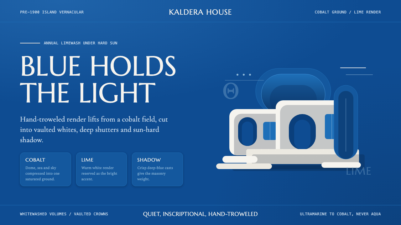 Cycladic SantoriniQuiet island gravity. Cobalt field, Marcellus capitals and white vaults hold…安静的海岛重力。钴蓝底、Marcellus大写与白色拱券承住烈日。
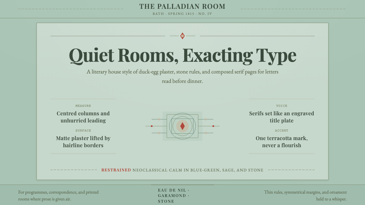 Regency EnglandCalm has authority. Duck-egg plaster, Garamond serifs, and hairline borders.沉静自有权威。鸭蛋青灰泥、Garamond 衬线与纤细边框。
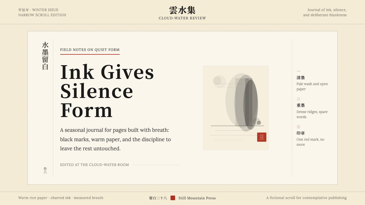 Chinese Ink Wash 水墨A thousand years of restraint. Six tones of ink on rice-paper warmth, a singl…千年单色绘画的精髓:墨分六彩、宣纸暖白底色、一抹印泥红作落款——留白即意。
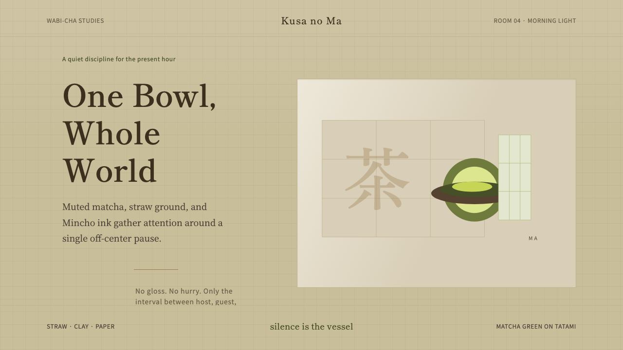 Japanese Tea CeremonyStillness has weight. Tatami straw, matcha green, and Mincho type leave room…静有重量:榻榻米稻草底、抹茶绿与明朝体,让留白呼吸。
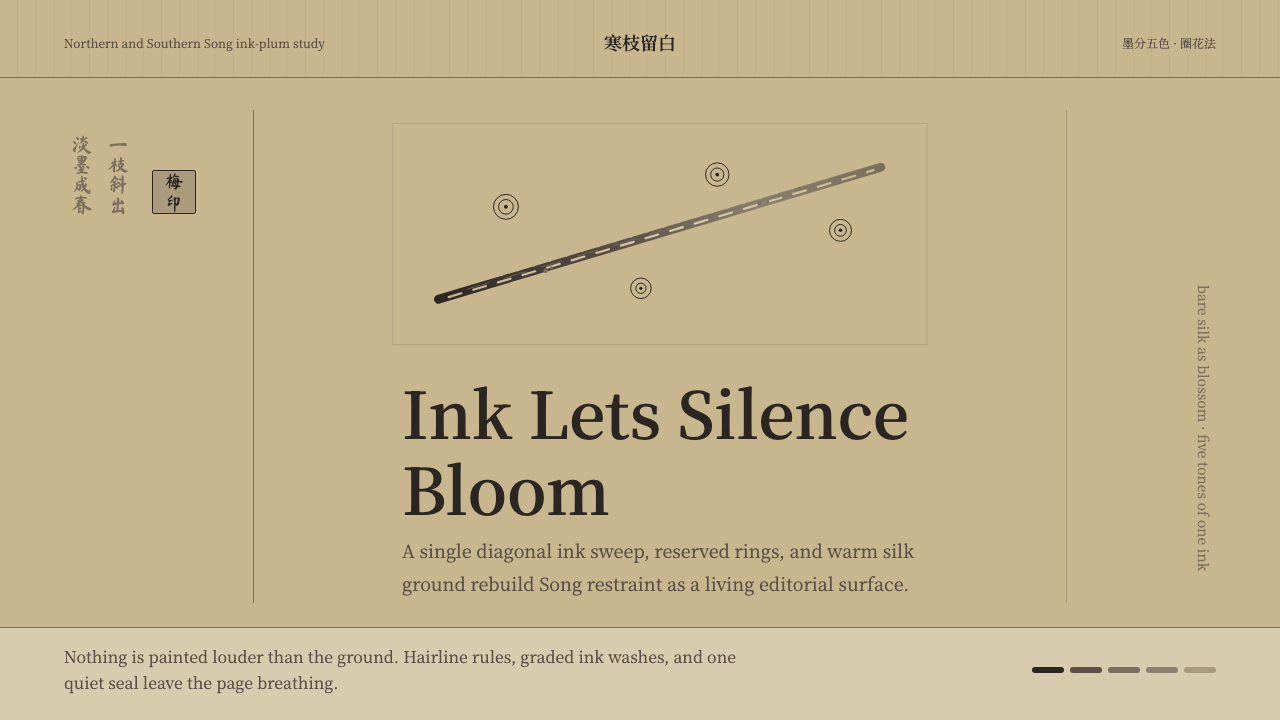 Plum Blossom Ink (宋)Silence carries the ink. Tea-tan ground, reserved blossoms, and one diagonal…静处见墨:茶褐绢底、留白梅花与一枝斜干。
 Sumi-e Ink WashRestraint carries weight. Washed black ink floats on oatmeal washi, anchored…克制自有重量:燕麦和纸上浮着水墨,一方朱印定住全局。