What is Sumi-e Ink Wash?
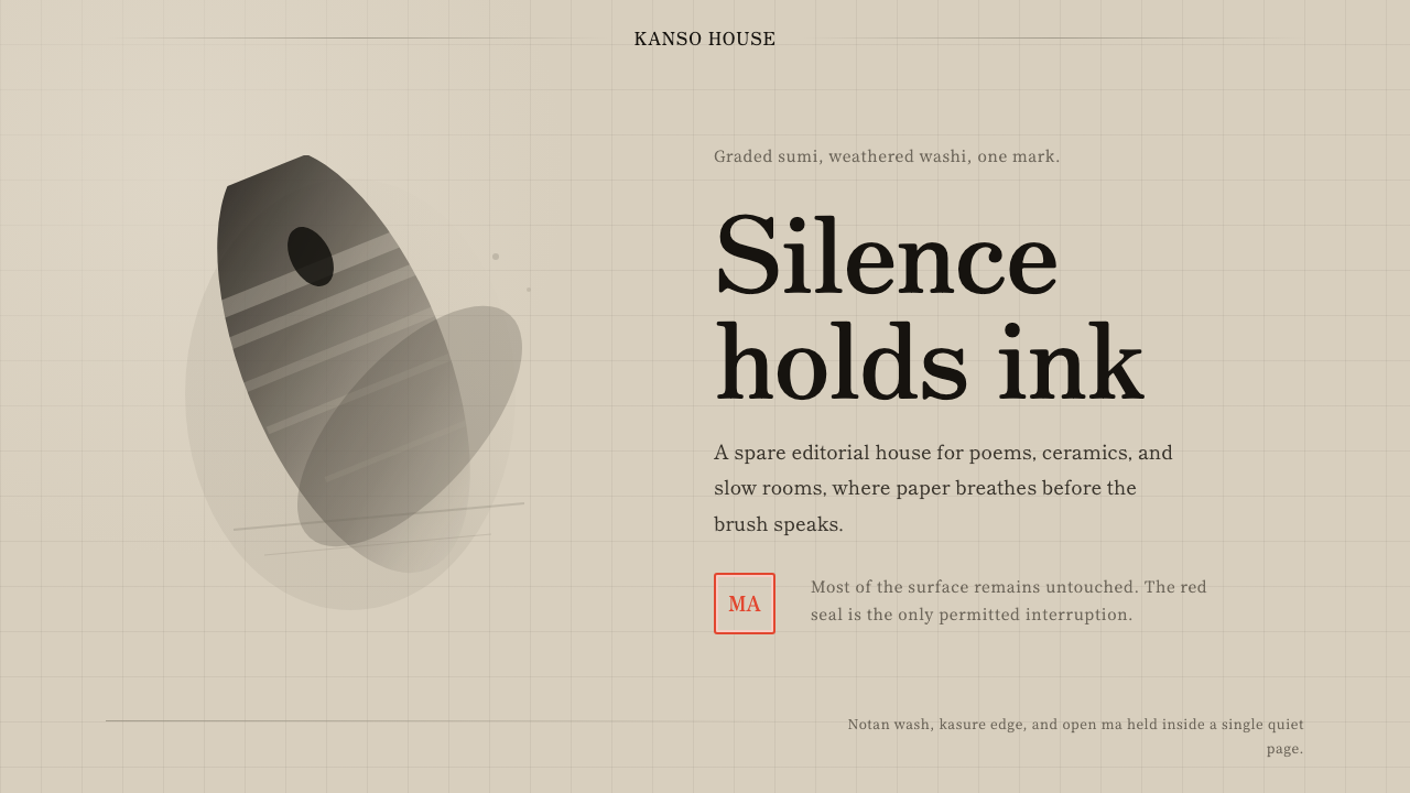
Sumi-e proves that a single color, most of a page left empty, and one small red mark can carry more weight than any amount of ornament.
Sumi-e Ink Wash in brief
Sumi-e Ink Wash is the design language of Japanese ink-wash painting, an art form built almost entirely from graded black ink diluted into tonal grays, applied to aged mulberry paper with a brush, and finished with a single small red seal. The palette could not be simpler — black ink, its tonal gradations, warm oatmeal-toned paper, and one point of vermilion — yet the tradition it draws from is one of the most disciplined and philosophically loaded painting practices in East Asian art.
The style's defining quality is what it leaves out rather than what it includes. Vast areas of the paper remain untouched, a concept the tradition calls ma — meaningful emptiness rather than unfinished space. Brushstrokes are often dry enough to leave visible gaps within a single stroke, called kasure or 'flying white,' a technique that turns the physical limits of ink and brush into an expressive device rather than a flaw to be hidden.
Everything in this system answers to a single question: does the brush need this? A stroke exists because it was necessary, not because the surface needed filling. The single red seal, by contrast, is the one deliberate exception to restraint — a small, dense, saturated mark that anchors an otherwise nearly empty composition and signals authorship, completing the work rather than decorating it.

Where does Sumi-e Ink Wash come from?
Ink-wash painting entered Japan from China, where monochrome ink painting had developed over centuries as a scholarly and Buddhist meditative practice, closely tied to calligraphy and often produced by the same hand and the same brush technique. Chinese ink masters such as Liang Kai and Mu Qi, working in the Song and Southern Song periods, developed the reductive, spontaneous approach — fast, confident brushwork capturing the essence of a subject rather than its literal detail — that would later become central to Japanese sumi-e.
The tradition took firm root in Japan during the Muromachi period, when Zen Buddhist monasteries became the primary centers of ink painting practice. Zen monks did not merely commission ink paintings as decoration; they practiced the brushwork itself as a form of meditation, believing that a spontaneous, unhesitating stroke revealed something true about the painter's state of mind at the moment of execution. This is why sumi-e is inseparable from Zen philosophy in most historical accounts — the painting technique and the spiritual discipline developed as a single practice, not as art illustrating philosophy from the outside.
Sesshū Tōyō, a Zen monk-painter of the fifteenth century who studied in China before returning to Japan, is often credited with fully naturalizing the Chinese ink tradition into a distinctly Japanese idiom, developing a haboku or 'flung ink' technique built on extremely reduced, almost abstract brushwork. Later masters, including Hasegawa Tōhaku in the sixteenth century, pushed the tradition's emphasis on empty space and atmospheric suggestion even further, producing screen paintings where mist and void occupy more of the composition than any depicted subject.
The single red seal that completes a sumi-e work descends from a much older East Asian tradition of artist and collector seals, carved from stone and pressed in a thick cinnabar-based paste. Functionally the seal authenticated a work and recorded its ownership history; aesthetically, over centuries of practice, it became an integral compositional element in its own right — the one point of saturated color permitted in an otherwise monochrome tradition, precisely because its rarity gave it weight.
What defines the Sumi-e Ink Wash look?
Color
The palette is reduced to graded black ink and its tonal variations, applied over warm, aged, oatmeal-toned paper rather than stark white. A single small area of vermilion red — the carved seal — is the only saturated color permitted, and its rarity is precisely what gives it visual and symbolic weight.
Notan — Tonal Gradation
Rather than relying on line alone, sumi-e builds form through notan, the graded relationship between diluted and concentrated ink — a single wash can move from near-transparent gray to dense black within one stroke. This tonal range, rather than color, is what gives the work its sense of depth and atmosphere.
Kasure — Flying White
When the brush runs dry, a stroke leaves visible gaps of untouched paper within its own path, a texture called kasure. Rather than treating this as a technical failure, the tradition embraces it as an expressive record of the brush's actual physical state, adding a sense of speed, dryness, and spontaneity that a fully saturated stroke could never convey.
Ma — Meaningful Emptiness
Unpainted paper is not treated as background or unfinished space but as an active compositional element, a concept called ma. The emptiness carries meaning — mist, distance, silence — and a skilled composition uses the proportion and placement of empty space as deliberately as it uses the placement of ink.
Brushwork as Gesture
A stroke in sumi-e is typically executed in a single confident motion rather than built up through correction or layering, reflecting the tradition's roots in calligraphic training and Zen meditative practice. The visible speed and pressure variation within one stroke is meant to record the painter's actual physical and mental state at the moment of execution.
Aged, Toned Ground
The paper is warm mulberry washi, toned by age to an oatmeal or ivory hue rather than presented as bright white. This warm ground softens the contrast between ink and paper compared to a stark white surface, giving the whole composition a quieter, more weathered feeling consistent with the tradition's aesthetic of impermanence.
The Single Seal
One small, densely saturated red seal, pressed near a corner or edge of the composition, is the sole point of intense color permitted anywhere in the system. Its placement is deliberate compositional weight, not an afterthought — it is often positioned to balance the visual mass of the ink strokes rather than simply marking authorship in a neutral spot.

Who shaped Sumi-e Ink Wash?
A fifteenth-century Zen monk-painter who studied ink painting in China before returning to Japan, Sesshū is widely credited with fully naturalizing the Chinese ink tradition into a distinctly Japanese idiom. He developed a highly reduced, near-abstract flung-ink technique, and his work remains one of the clearest historical demonstrations of restraint as an active artistic choice rather than a limitation.
A sixteenth-century painter whose large-scale screen works, particularly his depictions of pine forests in mist, pushed the tradition's emphasis on empty space and atmospheric suggestion to a monumental scale — vast areas of unpainted silk or paper standing in for fog and distance, with only a few confident strokes suggesting solid form.
A Chinese painter of the Southern Song period whose radically reductive, spontaneous brushwork — capturing a subject's essential gesture in a handful of strokes rather than literal detail — established a foundational approach that Japanese sumi-e painters would later absorb and develop within their own Zen-influenced context.
A Chinese Chan Buddhist monk-painter, roughly contemporary with Liang Kai, whose ink paintings of birds, persimmons, and landscapes were prized in Japan for their apparent spontaneity and spiritual directness. His work was collected and studied by Japanese Zen practitioners and profoundly shaped the aesthetic values that would define sumi-e.
How do you use Sumi-e Ink Wash today?
Sumi-e Ink Wash transfers powerfully to any context that wants to communicate calm authority, contemplation, or premium restraint rather than energy or abundance of information. Its central discipline — say less, and let the empty space do work — is directly applicable outside painting, but only if the underlying values of ma and kasure are respected rather than merely quoted as a monochrome color scheme.
For presentation slides, a cover page benefits enormously from committing to near-total emptiness: a single gestural mark or a small red seal-like accent in one corner, with the title set modestly and the vast majority of the frame left as toned, empty ground. Content slides should resist the instinct to fill space — one idea, minimal supporting text, and deliberate white space around it reads as considered rather than sparse. Data slides can borrow the tonal-gradation logic of notan, using graded gray values rather than a rainbow of category colors to distinguish data series.
For web interfaces, the aesthetic suits premium, wellness, or editorial-positioned products where calm and trust matter more than dense functionality — a pricing page with generous whitespace, muted ink-gray typography, and a single small accent-red call-to-action button reads immediately as considered and premium. Dashboards are a harder fit, since the style's low information density works against data-dense interfaces, but a settings or profile page can use the restraint effectively.
For editorial and marketing work, the style suits long-form writing about craft, mindfulness, or Japanese-influenced subject matter especially well — a pull-quote surrounded by generous empty space, marked at one corner with a small red accent, borrows the vocabulary convincingly. Marketing pages for premium or artisanal products benefit from the same restraint: fewer product shots, more space, one accent color used with real discipline.
The most common mistake is treating this as simply 'grayscale plus one red dot' without the underlying commitment to emptiness and gestural authenticity — filling most of the frame with content and then adding a red accent as decoration misses the point entirely. The style only works when restraint is structural: most of the space must actually stay empty, and the single point of color must feel earned rather than applied.

Sumi-e Ink Wash — FAQ
What is the difference between notan and kasure?
Notan refers to the graded relationship between light and dark within the ink itself — how a diluted wash moves toward a concentrated black to create tonal depth. Kasure refers to a specific brush technique where a dry brush leaves visible gaps of untouched paper within a single stroke, creating a textured, broken quality. Notan is about tonal range; kasure is about the physical trace of dryness and speed left by the brush's contact with the paper.
Why does the composition leave so much of the paper empty?
The empty space, called ma, is treated as an active part of the composition rather than unfinished background — it can represent mist, distance, silence, or simply give the painted elements room to be perceived individually rather than crowded together. This concept is rooted in Zen Buddhist philosophy, where emptiness is not absence but a meaningful presence in its own right, and the practice of leaving space deliberately is considered as disciplined as the act of painting itself.
Why is the seal always red when the rest of the work is monochrome?
The seal descends from an older East Asian tradition of artist and collector seals carved from stone and pressed in a thick vermilion-based paste, originally serving to authenticate a work and record its provenance. Over centuries, that single point of saturated color became an accepted, almost required compositional element precisely because everything else in the tradition is monochrome — its rarity is what gives it visual weight, and substituting any other color would break with the entire historical convention.
Is sumi-e purely a religious or meditative practice, or is it also a fine art discipline?
It is both, inseparably. In its historical development, particularly within Zen Buddhist monasteries during the Muromachi period, the physical act of painting was practiced as a form of meditation, where a spontaneous, unhesitating stroke was believed to reveal something true about the painter's state of mind. At the same time, sumi-e developed rigorous technical standards around brush control, ink dilution, and composition that are studied and judged as seriously as any other fine art painting tradition.
Where does this style struggle or feel out of place?
It struggles wherever content needs to feel energetic, colorful, or information-dense — entertainment products, data-heavy dashboards, or anything competing for attention with bold color will find the style's near-monochrome restraint and low visual density work against the desired effect. It can also feel affected or superficial when applied without genuine commitment to its underlying values — a design that keeps the muted palette but fills the frame with content misses the entire point of ma and ends up looking merely gray rather than considered.
Related design styles
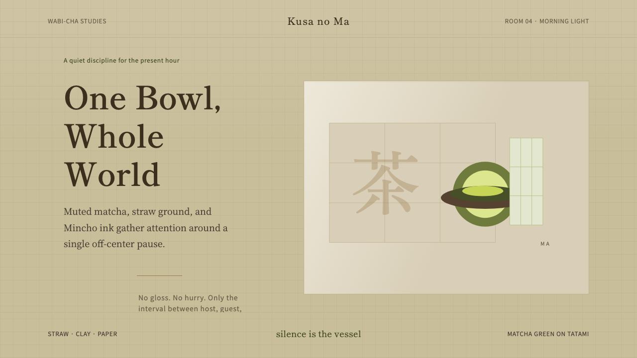 Japanese Tea CeremonyStillness has weight. Tatami straw, matcha green, and Mincho type leave room…
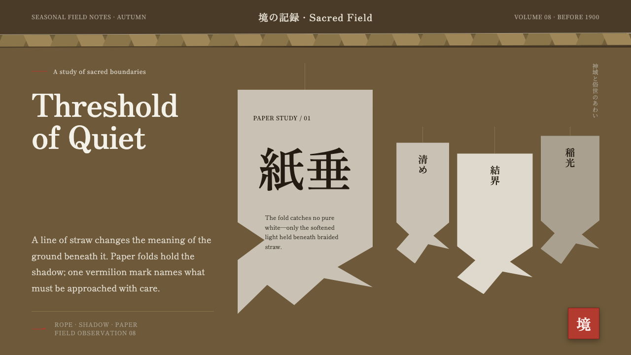 Shinto Shide Paper StreamerQuiet becomes sacred. Shadowed washi hangs from a straw-gold line, marked onc…
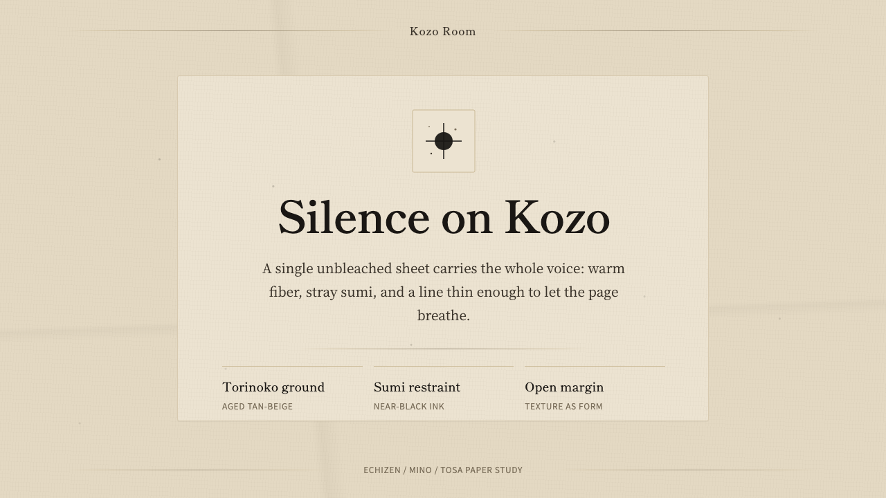 Washi Paper MinimalQuiet is material. Warm kozo grain, sumi specks, and hairline rules hold the…
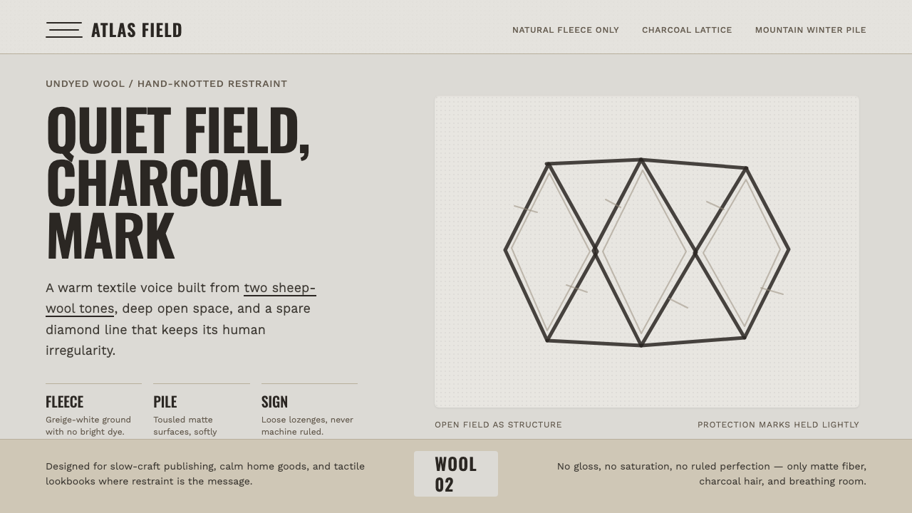 Beni Ourain Berber CarpetRestraint feels tactile. Greige wool field, Oswald type, and a loose charcoal…
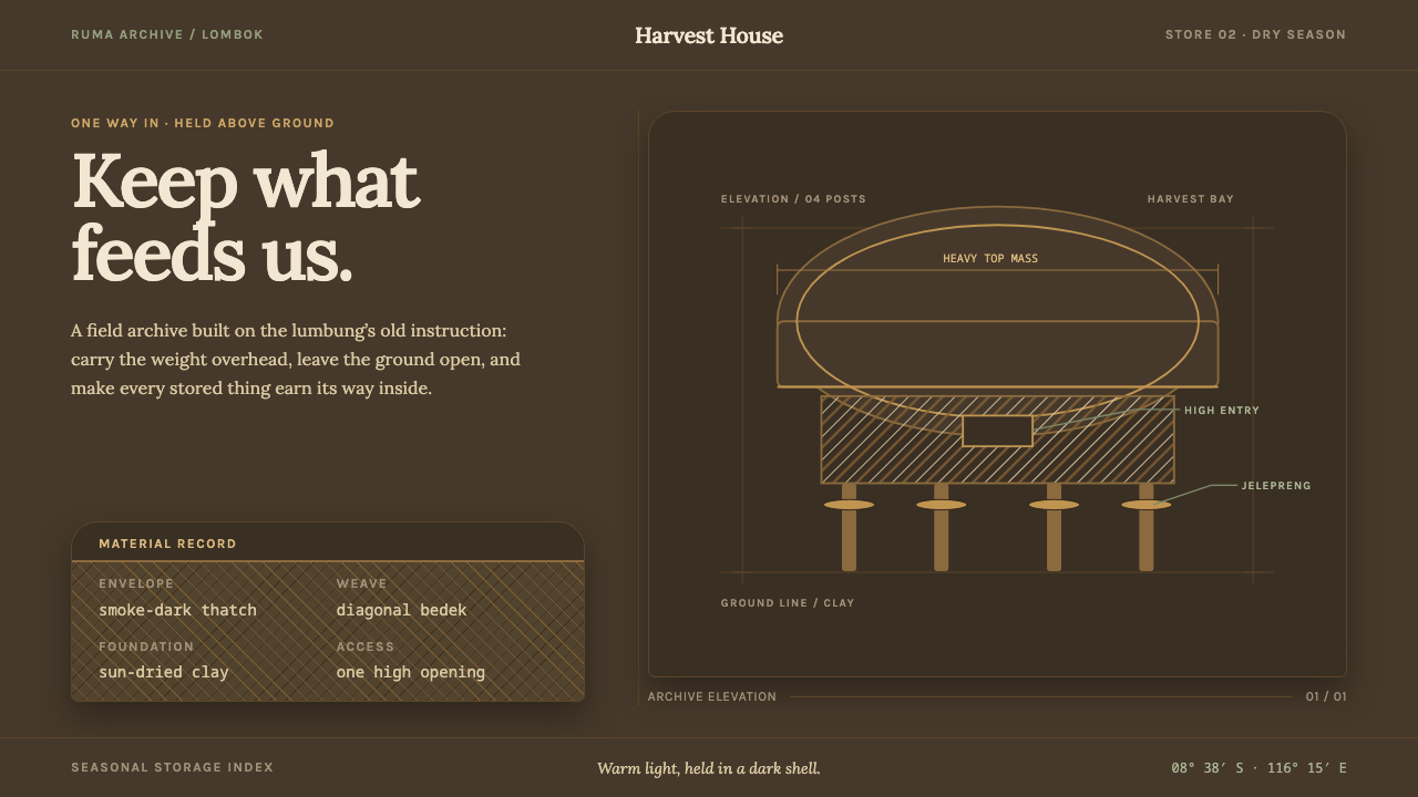 Sasak Lumbung GranaryStorage carries its weight. Smoke-dark ground, warm Lora type, and a four-pos…
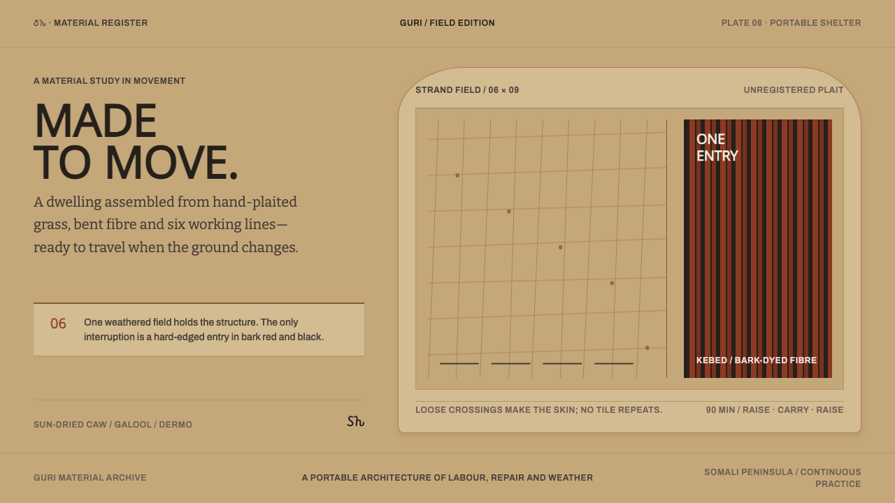 Somali AqalA house made to move. Sun-dried mat fields yield once to a bark-red, black en…