What is Washi Paper Minimal?
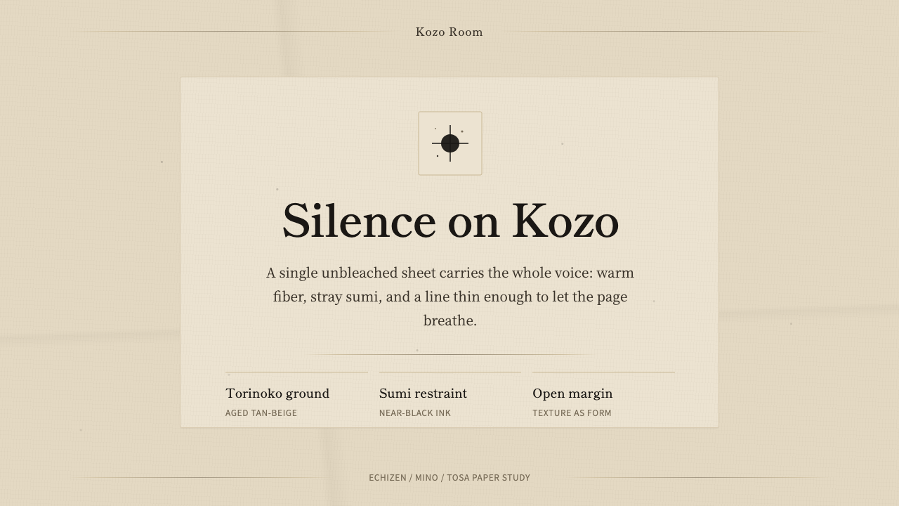
Washi Paper Minimal treats the emptiness of a page as the point — a warm, hand-made mulberry sheet where a few strokes of ink say everything that ornament never could.
Washi Paper Minimal in brief
Washi Paper Minimal is not a modern minimalist trend wearing a Japanese label — it is a direct rendering of a physical material: torinoko-gami, the premium kozo-fiber (paper mulberry) sheet that Japanese papermakers have hand-formed since well before the twentieth century. The visual language it produces is instantly distinct from Scandinavian or Silicon Valley minimalism. The ground is not clean white but an aged, unbleached tan-beige — warmer and noticeably darker than cream stationery — carrying visible fiber grain, the occasional fleck of sumi ink, and the soft memory of a fold crease.
The style's discipline comes from restraint applied to a living material rather than restraint applied to a blank canvas. Where a generic minimalist layout removes elements until nothing is left to remove, Washi Paper Minimal starts from a surface that already has quiet texture built into it, and then adds only what is necessary: a single subject, a hairline rule, near-black ink. Ornament is not trimmed away because it never belonged there to begin with.
This makes it one of the more materially specific styles in the library. It is not simply 'a beige background with thin lines' — it is a paper, with a history, a fiber structure, and a craft lineage, and every design decision in the system answers to that fact.
Where does Washi Paper Minimal come from?
Washi — a compound of the characters for 'Japan' (wa) and 'paper' (shi) — refers broadly to Japanese handmade paper, but Washi Paper Minimal draws specifically on torinoko-gami, literally 'egg-child paper', named for a pale, egg-like sheen historically prized in the finest sheets. The papermaking lineage itself (kamisuki, the craft of paper-forming by hand) traces back through the Nara period, when paper technology arrived in Japan from the Asian mainland and was gradually adapted to local fibers and local water. Over the centuries that followed, this craft matured into a distinctly Japanese practice, refined by generations of anonymous artisans working sheet by sheet rather than through industrial mass production.
Three regions became especially associated with the finest washi: Echizen, Mino, and Tosa. Each developed its own reputation and micro-tradition of fiber preparation, sheet-forming technique, and finish, but all three shared the same underlying material logic — kozo fiber, drawn from the inner bark of the paper mulberry, is long, strong, and takes on a warm, faintly golden cast when left in its natural, unbleached state. That warm cast is the torinoko-iro, or 'egg-child color', sometimes also called kinari (raw silk color) in textile contexts — the exact tan-beige that anchors this design system.
This paper was never meant to be stationery in the Western sense. It was — and still is — a working material for calligraphy, screens, lanterns, book covers, and formal documents, valued precisely because its imperfections (the visible fiber, the occasional embedded speck) were read as evidence of hand-craft rather than as flaws to be engineered out. That is the aesthetic root of wabi-sabi: beauty found in the transient, the imperfect, and the incomplete, rather than in polish and symmetry.
Washi Paper Minimal as a design style compresses this entire material and philosophical history into a small number of design decisions: an aged paper ground instead of a manufactured white, near-black sumi ink instead of saturated color, generous unused space instead of dense composition, and hairline structural lines instead of heavy borders. It asks a designer to treat the page the way a papermaker treats a sheet — as something already complete before a single mark is added.
What defines the Washi Paper Minimal look?
Ground Color
The foundational decision in this system is the ground itself: an aged, unbleached mulberry tan-beige, distinctly warmer and darker than any cream or off-white stationery tone. It should read as material, not as a neutral backdrop — the kind of surface you would want to touch to confirm it has grain. Pure white or cool gray grounds break the style immediately; the warmth of the tan is non-negotiable.
Texture and Grain
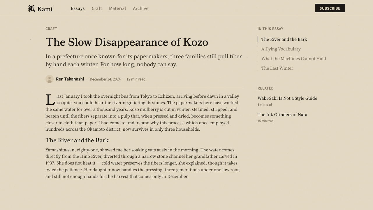
Visible fiber grain, scattered sumi ink specks, and soft fold creases carry the entire decorative load of the system — there is no separate ornament layer because the paper's own imperfections perform that role. The grain should feel organic and irregular rather than a repeating machine pattern; specks and creases are placed sparsely and asymmetrically, the way they would occur naturally on a hand-formed sheet, never as a symmetrical decorative border.
Ink and Contrast
All expressive work is done by near-black brush ink (sumi) set against the warm ground — never pure digital black, which would feel too flat and cold against the paper's warmth, and never a soft gray, which would sap the ink of its calligraphic authority. The contrast between ink and ground should feel deliberate and almost brushed, as though every mark had been placed by hand rather than rendered by a machine.
Composition and Space
Layouts favor a single subject per view and generous, unfilled space around it — the emptiness is not a lack of content but an active compositional choice, giving the eye room to rest and the material room to be seen. Crowding multiple focal points onto one surface, or filling space simply because it is available, works directly against the style's premise.
Lines and Structure
Where structure is needed — dividers, table rules, section markers — it is rendered as a hairline rule, thin enough to feel drawn rather than built. Heavy borders, boxed containers, or thick rules read as foreign to the material; structure should feel like a single brushed or scored line on paper, present but never assertive.
Absence of Ornament
There are no gradients, no drop shadows in the conventional sense, no decorative icon sets, and no pattern fills layered on top of the paper texture — the paper's own grain is the only texture the system permits. Any additional decorative layer competes with the material rather than supporting it, and immediately signals a pastiche rather than an authentic reading of washi.
Mood and Pace
The overall mood is unhurried and contemplative — closer to the pace of viewing a hanging scroll than scrolling a feed. Motion, where it exists at all, should be slow and settling rather than snappy or bouncy; anything that feels energetic or playful undercuts the quiet the material is meant to hold.
Who shaped Washi Paper Minimal?
The washi tradition has no single founder or signature designer in the way Western design movements often do — it was shaped over centuries by generations of unnamed papermakers (kamisuki, literally 'paper-forming') practicing the craft sheet by hand-formed sheet in regional workshops. Their collective refinement of fiber preparation, sheet-forming, and drying technique is what produced the specific tan-beige tone and visible grain that this design system renders. Attributing this style to an individual would misrepresent it; its authority comes from an anonymous, continuously repeated craft discipline rather than from a single creative signature.
These three regions of Japan are historically the most closely associated with the finest washi production, each maintaining its own micro-tradition of technique while sharing the same kozo-fiber material base. Their long-standing reputations for quality are part of why torinoko-gami became the premium benchmark sheet rather than just one option among many — centuries of concentrated regional expertise produced a level of consistency and refinement that isolated individual workshops elsewhere could not match.
This is less a person than a codified color tradition — the naming and recognition of the specific warm, pale-gold tan that unbleached, high-quality kozo paper naturally takes on. Giving this hue its own name (torinoko-iro, 'egg-child color', related to the textile term kinari) reflects a broader Japanese design habit of treating natural material color as a named, deliberate palette choice rather than an accident to be corrected with bleach or dye. This naming tradition is the direct ancestor of the ground tone at the center of Washi Paper Minimal.
How do you use Washi Paper Minimal today?
Washi Paper Minimal transfers best to contexts that can tolerate — and benefit from — an unhurried, material-forward mood, which makes it a deliberate choice rather than a default one. Applying it well starts with committing fully to the ground tone and texture before touching layout; a warm tan-beige surface with faint grain has to feel structurally load-bearing, not like a filter applied over a normal white layout.
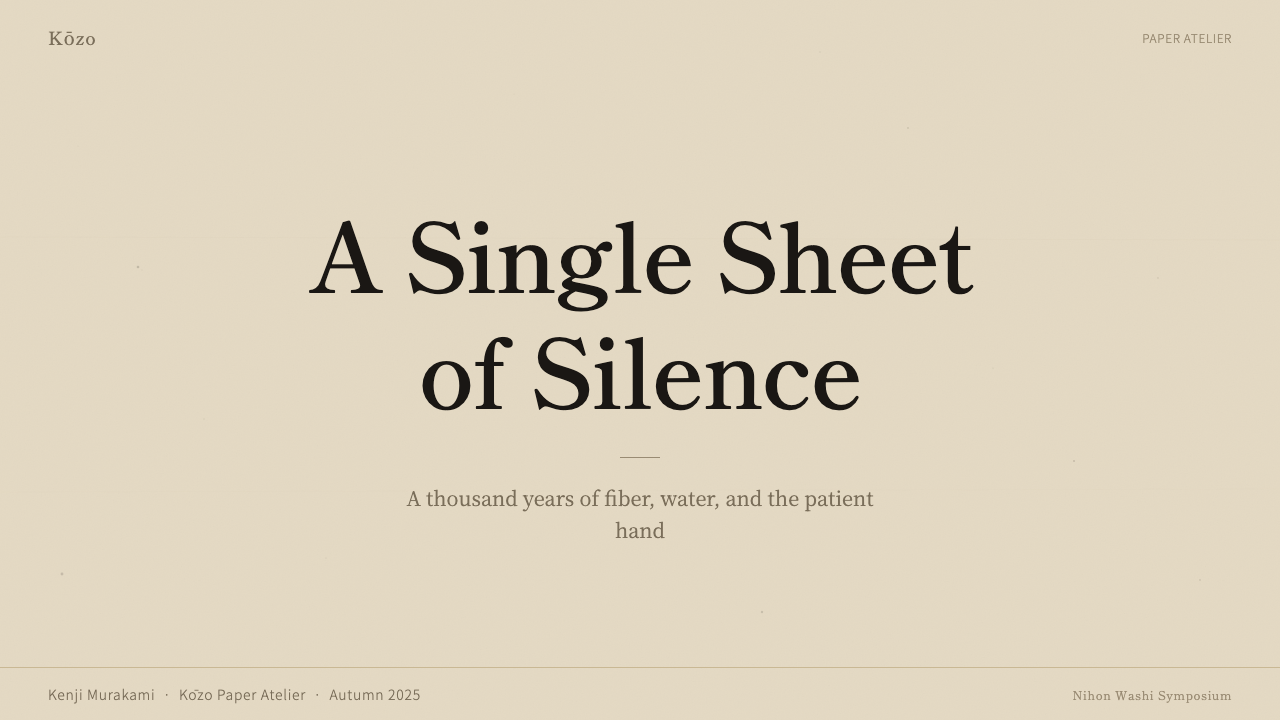
For presentation slides, this style suits cover slides and quiet section-break slides especially well: a single word or short title in near-black ink, placed off-center on a generously empty ground, does more work than a fully composed cover with logo lockups and taglines. Content and data slides need more restraint than usual — a chart or table should be rendered in ink-toned lines rather than colored bars, with the paper's warmth as the only 'color' in the room; anything that introduces saturated chart colors breaks the material illusion immediately.
For web interfaces, dashboards and pricing pages are workable but demanding contexts: the warm ground and hairline dividers can organize a pricing table beautifully, with tier names set in confident ink-black type and plan differences separated by thin rules rather than boxed cards, but the temptation to add colored badges, gradient buttons, or icon decoration has to be resisted completely, since any of those elements will read as a foreign material dropped onto handmade paper.
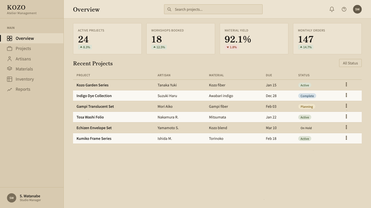
For editorial and marketing work, the style is a natural fit for long-form reading experiences — essays, brand narratives, and cultural or craft-adjacent marketing pages — where a single pull-quote in ink against wide paper margins can carry more weight than a fully illustrated spread. Marketing pages built in this style should let the paper ground itself be the hero image in places, rather than covering it with photography or dense copy blocks.
The most common mistake is treating this as generic beige minimalism and skipping the material specificity entirely — using a flat, uniform tan fill with no grain, no ink specks, no fold memory, and pairing it with ordinary gray body text instead of true near-black ink. Without the visible texture and the ink-on-paper contrast, the result reads as a washed-out neutral theme rather than washi, and loses the entire wabi-sabi premise the style is built on.
Washi Paper Minimal — FAQ
Is Washi Paper Minimal the same as generic 'beige minimalism'?
No, and this is the most important distinction to hold onto. Generic beige minimalism is a flat neutral color chosen for its unobtrusiveness. Washi Paper Minimal is a specific material — an aged, unbleached mulberry paper with visible fiber grain, occasional ink specks, and a warm tan-beige tone rooted in a named color tradition (torinoko-iro). The texture and the material history are load-bearing; strip them out and you are left with a different, much less specific style.
Can this style use color beyond ink-black and paper-tan?
Sparingly, and only if it respects the material logic. A single muted accent — the kind of soft vermillion used in a hanko seal stamp, for instance — can appear as a rare, deliberate mark, much the way a red seal appears once on an otherwise monochrome scroll. What breaks the style is a full secondary palette, multiple accent colors, or anything approaching the saturation of a typical modern UI color system. The paper and the ink should always remain the dominant visual event on the page.
Why does the ground need to be tan-beige rather than white or cream?
Because pure white and typical cream stationery tones are manufactured colors — the product of bleaching and industrial paper production — while the tan-beige of torinoko-gami is what kozo fiber looks like when it is deliberately left unbleached. That warmth is not a stylistic preference layered on top of a neutral; it is the visible evidence of the material's authenticity. A whiter or cooler ground immediately signals office stationery rather than handmade paper, and undercuts the wabi-sabi premise the whole style depends on.
How much empty space is 'enough' in this style?
More than feels comfortable at first. The rule of thumb is one subject per view with room around it to breathe — if a layout feels like it could absorb another element without becoming crowded, it likely still has room to remove something rather than add. The empty space is not passive padding; it is doing the same expressive work that the ink strokes are doing, and should be treated with equal deliberateness rather than filled reflexively because it is available.
Is this style limited to Japanese or East Asian branding contexts?
Not necessarily, though it carries an unmistakable cultural specificity that should be acknowledged rather than erased. It works well anywhere a brand wants to communicate quiet confidence, craft, and restraint — long-form editorial, cultural institutions, wellness and craft-adjacent products, or any context where a fast, loud digital aesthetic would feel dishonest. It is a poor fit for anything that needs to feel urgent, energetic, or maximalist; forcing this material language onto a context built for speed and density will fight the style at every turn.
Related design styles
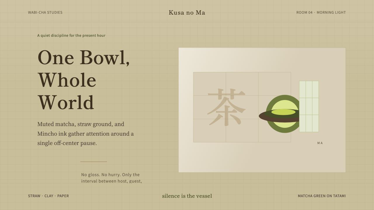 Japanese Tea CeremonyStillness has weight. Tatami straw, matcha green, and Mincho type leave room…
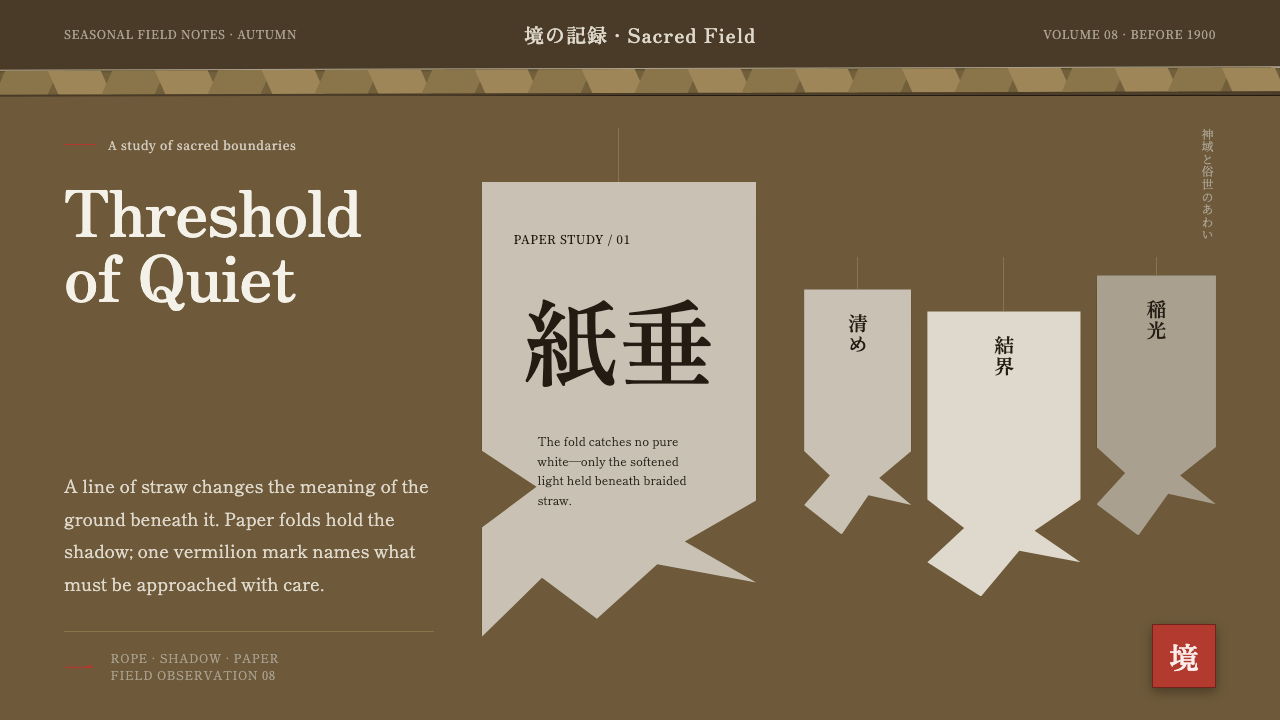 Shinto Shide Paper StreamerQuiet becomes sacred. Shadowed washi hangs from a straw-gold line, marked onc…
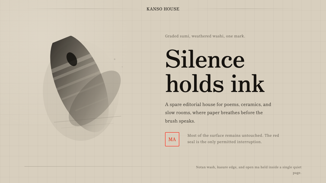 Sumi-e Ink WashRestraint carries weight. Washed black ink floats on oatmeal washi, anchored…
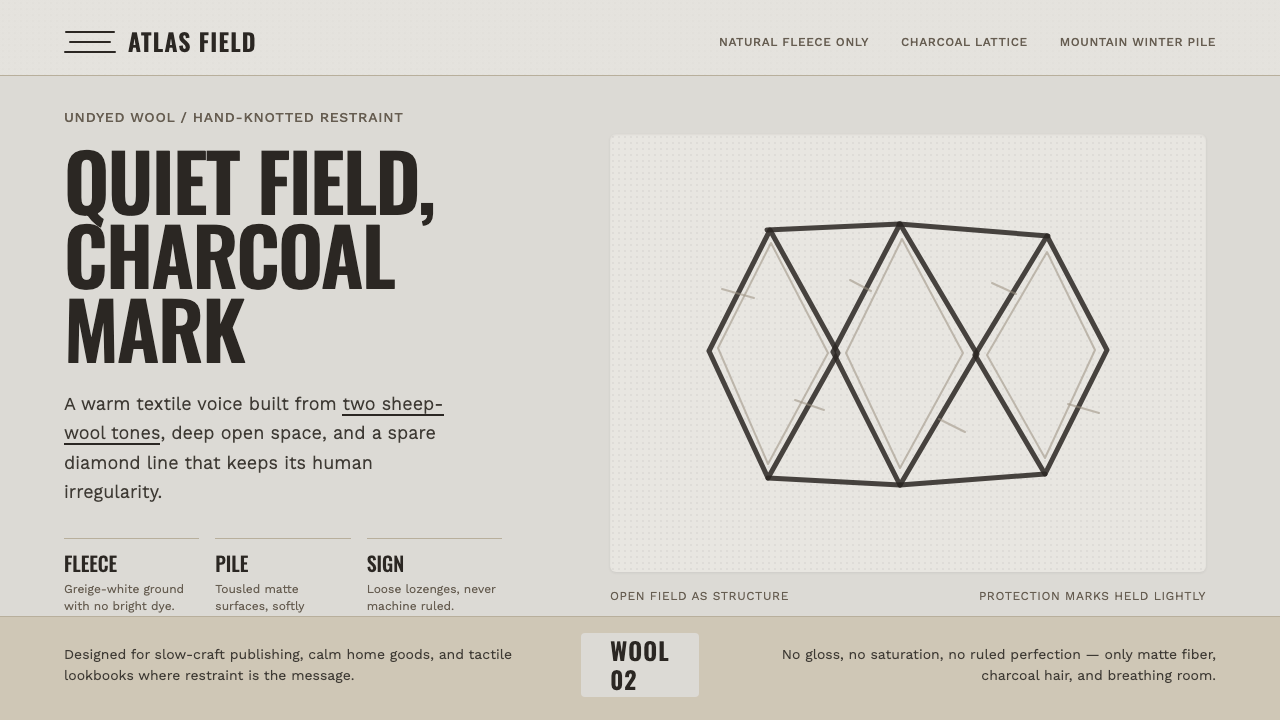 Beni Ourain Berber CarpetRestraint feels tactile. Greige wool field, Oswald type, and a loose charcoal…
 Wool FeltingHandmade stillness. Oatmeal-gray felt, humanist serifs, and soft rolled panel…
 Guérande Fleur de SelCrystal white is the exception. Mineral serif and hairline grids rise from we…