Design style guide设计风格指南
What is Syrian Aleppo Laurel Soap?什么是 Syrian Aleppo Laurel Soap?
Aleppo laurel soap — the world's oldest documented soap — pressed from olive groves and laurel forests into a design language of earth-cured cubes, stamped seals, and a palette that only reveals its true green when you cut it open.阿勒颇月桂皂——世界上有据可查的最古老肥皂——从橄榄林与月桂林中压制而来,化作一套以陈化皂块、匠人印章与切面才露出的月桂绿为语言的设计体系。
Syrian Aleppo Laurel Soap in briefSyrian Aleppo Laurel Soap 速览
Syrian Aleppo Laurel Soap is a design style rooted in the visual and material culture of Aleppo's ancient stone-workshop soapmaking tradition. For centuries, master soap-makers in the Bab Antakia and Jdeydeh quarters of Aleppo have pressed olive oil and laurel berry oil together, stacking the cured blocks in cathedral-like towers to age for nine months or longer. The design system distills this craft into a visual language: cubes arranged like ancient ashlar masonry, an olive-brown exterior that conceals a rich interior green, and the unmistakable authority of a stamped maker's seal.叙利亚阿勒颇月桂皂是一套植根于阿勒颇古代石砌作坊制皂传统的视觉与材料文化风格。数百年来,安塔基亚门与杰代德区的制皂大师将橄榄油与月桂油压制成型,把陈化皂块堆成教堂般高耸的塔柱,窖藏九个月乃至更久。这套设计体系将这门手艺提炼为一种视觉语言:皂块如古代砌石般排列,橄榄棕的外壳包裹着丰盈的内部绿意,匠人印章的权威气息无处不在。
What distinguishes this aesthetic from other craft-inspired styles is its refusal of softness. Spa aesthetics and modern wellness branding borrow earthy tones and round them into something gentle and approachable. Aleppo soap design does the opposite — its palette is earned, mineral, and slightly severe. The olive-brown crust is not warm or welcoming; it carries the weight of a nine-month cure in a stone warehouse. The laurel green that appears on the cut face is unexpected, almost medicinal, certainly ancient. Cream appears only in controlled doses, like the clean interior of a freshly sliced block.这一美学有别于其他手工艺风格之处,在于它对柔软的拒绝。水疗美学与现代健康品牌借用大地色调,将其柔化为温和可亲的样貌。阿勒颇皂设计恰恰相反——它的色板是经时间磨砺而来的,矿物质感,略带严峻。橄榄棕外壳不温暖、不亲切;它承载的是在石质仓库中陈化九个月的重量。切面露出的月桂绿出人意料,近乎药用,绝对古老。奶油色只出现在受控的剂量中,如同一块新切开皂块的洁净内芯。
As a design system, it operates through the visual grammar of workshop craft: the weight and proportion of a carved seal, the stacking geometry of cured cubes, the contrast between aged surface and revealed interior. Every element is stamped, pressed, or stacked — nothing is painted on for decoration. The result is a style that reads as both archaic and contemporary, at home in heritage branding, artisanal product packaging, and editorial design that values material honesty over trend-driven surface treatment.作为一套设计系统,它通过作坊手艺的视觉语法运作:刻印章的重量与比例,陈化皂块的堆叠几何,老化表面与暴露内芯之间的对比。每一个元素都是被压印、压制或叠放出来的——没有任何装饰是涂抹上去的。这使得它既显古朴又不失当代感,在传承品牌、手工产品包装,以及重视材料诚实而非追逐潮流表面处理的编辑设计中都能找到自己的位置。
See the Syrian Aleppo Laurel Soap design system →查看 Syrian Aleppo Laurel Soap 完整设计系统 →
Where does Syrian Aleppo Laurel Soap come from?Syrian Aleppo Laurel Soap 从何而来?
Aleppo soap's documented history reaches back to at least the twelfth century, though oral tradition and some historians place its origins considerably earlier, in the pre-Islamic Levantine world where olive cultivation and laurel forests overlapped in the hill country around Aleppo. The Crusaders who passed through the city in the eleventh and twelfth centuries encountered the soap and brought it back to Europe — it is widely credited as a forerunner of Marseille soap and Castile soap, both of which adopted the olive-oil base while dispensing with the laurel. Aleppo thus occupies a unique position in the history of Western personal care: not merely old, but generative.阿勒颇皂有据可查的历史至少可追溯至十二世纪,尽管口述传统与部分历史学家将其起源推得更早——在前伊斯兰时代的黎凡特,橄榄种植区与月桂林在阿勒颇周边丘陵地带重叠相交。十一至十二世纪途经阿勒颇的十字军接触到这种皂,并将其带回欧洲——它被普遍认为是马赛皂与卡斯蒂利亚皂的前身,后两者沿用了橄榄油基底,却舍去了月桂。阿勒颇皂因此在西方个人护理史上占据独特地位:不仅古老,更具有生成性。
The production method that defines the soap's character also defines its visual identity. Olive oil and laurel berry oil are cooked together in large stone vats, then poured across the floors of underground cellars where the liquid soap hardens into a solid slab. Workers then cut the slab into individual bars using long-handled tools and stack the bars in towering formations to cure. During curing, the exterior oxidizes to a deep olive-brown — sometimes nearly black — while the interior remains a vivid green. Each bar is stamped with the maker's seal before curing. The resulting object is not a commodity bar of soap; it is a document of time, craft, and regional identity.定义这种皂的特质的生产方式,同样定义了它的视觉身份。橄榄油与月桂油在大型石缸中共同熬煮,随后被倒入地下窖室的地面,液态皂在那里凝固成整块皂坯。工人随后用长柄工具将皂坯切成单块,堆砌成塔状进行陈化。陈化过程中,外表皮氧化为深橄榄棕——有时近乎黑色——而内芯则保持鲜亮的绿色。每块皂在陈化前都被压上匠人印章。这样得到的成品不是一块普通量产皂;它是时间、手艺与地域身份的一份文献。
The guild system that sustained Aleppo soapmaking through the Ottoman period produced specific family names synonymous with the trade. The Zanabili and Fansa families operated workshops in the Bab Antakia district for multiple generations. Adib Dada and Constantin Zanabili are among the master soap-makers whose names appear in twentieth-century accounts of the craft. The guild structure enforced quality standards: the ratio of laurel oil to olive oil — expressed as a percentage — became a mark of grade, with higher laurel content indicating higher quality and commanding a premium. This grading logic, written into the stamped seal itself, is one of the oldest forms of product certification in the world.在奥斯曼时期支撑阿勒颇制皂业的行会制度,产生了与这门行业同名的特定家族。扎纳比利(Zanabili)家族与范萨(Fansa)家族在安塔基亚门一带经营作坊,代代相传。阿迪布·达达(Adib Dada)与康斯坦丁·扎纳比利(Constantin Zanabili)是二十世纪手工艺记录中留名的制皂大师。行会制度执行质量标准:月桂油与橄榄油的比例——以百分比表示——成为等级标志,月桂含量越高代表品质越优,售价越贵。这一写入压印章纹的分级逻辑,是世界上最古老的产品认证形式之一。
The Syrian civil war, which began in 2011, devastated Aleppo's historic soapmaking districts. The ancient stone warehouses in Bab Antakia and Jdeydeh were damaged or destroyed. Many master soap-making families fled to Turkey, Lebanon, and further afield, attempting to continue production in exile. Some succeeded; others did not. What survives of Aleppo soapmaking today is geographically dispersed and institutionally fragile. The design tradition this style draws from is therefore not merely historical — it is actively endangered, which gives the aesthetic register a dimension of witness and memory that most craft-revival design systems do not carry.2011年爆发的叙利亚内战重创了阿勒颇历史制皂区。安塔基亚门与杰代德区的古老石仓遭到破坏乃至摧毁。许多制皂大师家族流亡至土耳其、黎巴嫩及更远处,试图在流离中延续生产。有人成功,有人未能。今日留存的阿勒颇制皂业地理上四散、制度上脆弱。这套风格所承继的设计传统因而不仅仅是历史——它正处于濒危之中,这赋予了这种美学基调一种大多数手工艺复兴设计系统所不具有的见证感与记忆维度。
What defines the Syrian Aleppo Laurel Soap look?Syrian Aleppo Laurel Soap 的视觉特征是什么?
Palette色彩
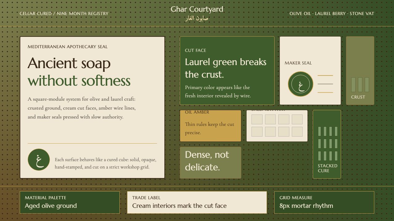
The color system is built around the life cycle of the cured bar. Aged olive-brown — sometimes tipping toward near-black — anchors the palette as the dominant surface tone, evoking the oxidized exterior of a nine-month-cured block. Laurel green, unexpected and slightly medicinal in character, serves as the primary accent, revealed only at cut edges or interior fields — never spread broadly. Cream is reserved for interior zones: card surfaces, text fields, inset panels. The palette refuses warm beige or spa green; its greens lean cool and botanical rather than friendly or soft.色彩体系围绕陈化皂块的生命周期构建。陈化橄榄棕——有时趋近于近黑色——作为主导表面色调锚定整体色板,唤起窖藏九个月后氧化外壳的质感。月桂绿出人意料,略带药用气质,作为主要强调色,只在切面边缘或内部区域显现——绝不大面积铺开。奶油色保留给内部区域:卡片表面、文本字段、内嵌面板。这套色板拒绝温暖米色或水疗绿;它的绿色偏冷而植物感,而非亲切或柔和。
Form and Geometry形态与几何
The dominant form is the cube and the rectangular block — not as an abstract modernist gesture, but as a direct reference to the stacked, cut bars of soap themselves. Layouts favor stacking and stratification: elements sit on top of one another with clear horizontal divisions rather than floating in open space. Circles appear specifically as the stamp motif — the pressed maker's seal — used as medallions, watermarks, or focal points rather than as general decorative shapes. Nothing rounds softly; corners are decided and straight.主导形态是正方体与长方块——不是抽象的现代主义姿态,而是对叠放、切割皂块本身的直接引用。版面偏好堆叠与层叠:元素一层压一层,以清晰的水平分割而非悬浮于开阔空间中。圆形专门作为印章母题出现——压制的匠人印章——用作徽章、水印或视觉焦点,而非一般装饰形状。没有柔和的圆角;转角是确定而笔直的。
Texture and Surface肌理与表面
The style acknowledges texture, but only as visual fact rather than decorative effect. The aged crust of the soap bar — rough, uneven, slightly mineral in its surface quality — informs the handling of background areas and container edges. This means surfaces may carry a faint grain or patina suggestion, but never a smooth, polished finish. The contrast between the rough exterior and the clean interior is the defining textural gesture of the style: outside is aged and worn; inside, once cut, is fresh.这种风格承认肌理,但只将其视为视觉事实而非装饰效果。皂块的老化外壳——粗糙、不均匀、表面略带矿物质感——影响背景区域与容器边缘的处理方式。这意味着表面可以带有隐约的颗粒感或包浆暗示,但绝不追求光滑、抛光的效果。粗糙外部与洁净内芯之间的对比,是这种风格最具定义性的肌理姿态:外面是陈化磨损的,内里一旦切开则是清新的。
Typography字体排印
Type in this system carries the weight and presence of carved or stamped letterforms — think inscriptions pressed into wax or cut into stone, not letterforms rendered for screen lightness. Serifs are appropriate and even preferred, particularly those with a classical or lapidary quality, though they should carry visible mass rather than delicacy. Arabic script, where used, draws from historical calligraphic traditions appropriate to the Levantine origin of the material. Type weight and size contrast is used to signal hierarchy, but always within a restrained range — nothing shouts, everything declares.这套系统中的文字承载着刻印或压印字形的重量与存在感——想想压入蜡面或凿入石面的铭文,而非为屏幕轻盈感设计的字形。衬线字体是合适的,甚至更受青睐,尤其是带有古典或碑刻气质的款式,但应具有可见的分量而非纤细感。若使用阿拉伯文字,应从与这一材料的黎凡特起源相适的历史书法传统中汲取。字重与字号对比用于标示层级,但始终在克制的范围内——没有喧哗,只有陈述。
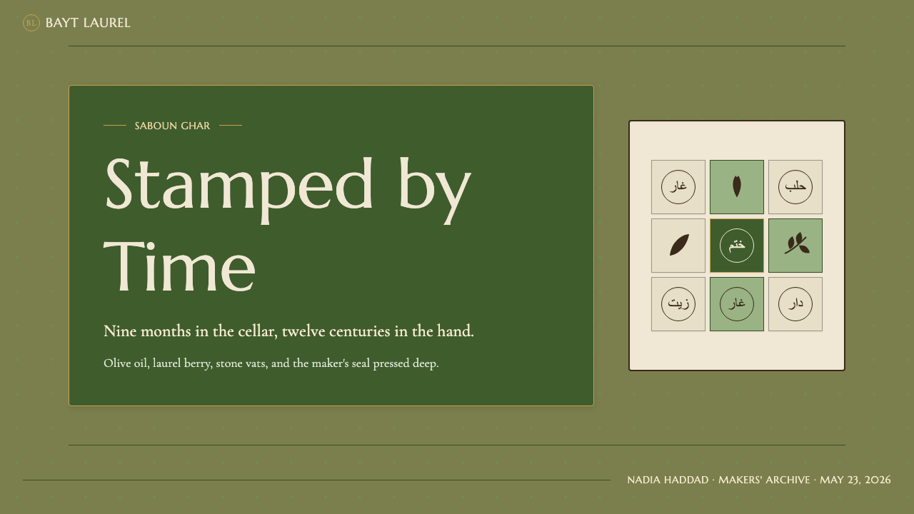
Stamp and Seal Motif印章与封印母题
The maker's seal is the system's most distinctive signature element. Every bar of authentic Aleppo soap carries a stamped circle or cartouche identifying the producer, the laurel-to-olive ratio, and often the year of production. Translated into design, this becomes a recurring circular badge — used for producer credits, quality marks, edition indicators, or simply as the visual anchor of a composition. The seal should feel pressed rather than printed: slightly imperfect at its edges, suggesting physical force, not digital rendering.匠人印章是这套系统最具辨识性的标志元素。每块正品阿勒颇皂都带有一个压印圆形或框形徽记,标明生产者、月桂油与橄榄油比例,通常还有生产年份。转化为设计语言,这成为反复出现的圆形徽章——用于生产者署名、品质标记、版次标识,或仅仅作为构图的视觉锚点。印章应当感觉是被压制出来的,而非被印刷出来的:边缘略带不完美,暗示物理力量,而非数字渲染。
Composition and Layering构图与层叠
Compositions in this style are layered vertically — like stacked soap bars — rather than spread horizontally or arranged in floating grids. The visual logic moves from exterior to interior: the frame or container is the aged crust, and the content within is the revealed green interior. Information hierarchy follows this logic: outer zones are darker and more textured, inner zones are lighter and cleaner. There is no visual breathing room achieved by floating elements in whitespace; instead, space is created by controlled stratification.这种风格的构图是纵向层叠的——如同堆放的皂块——而非横向展开或悬浮网格排列。视觉逻辑从外部走向内部:框架或容器是老化的外壳,其中的内容是暴露的绿色内芯。信息层级遵循这一逻辑:外部区域更暗、更具肌理感,内部区域更亮、更洁净。没有通过将元素悬浮于留白中获得的视觉呼吸感;空间感改由受控的层叠来制造。
Restraint Without Warmth克制而不温情
Perhaps the most important characteristic to internalize: this is not a cozy or inviting style. It shares material references with natural and artisanal design movements, but its emotional register is closer to old civic architecture than to a farmers' market aesthetic. The restraint is that of a centuries-old workshop, not a contemporary wellness brand. This means resisting the temptation to soften — to add a warmer cream, a rounder corner, a friendlier green. The severity is the point. When softened, the style collapses into generic earth-tone design and loses what makes it specific.也许最重要的一点是:这不是一种温馨或邀人的风格。它与自然主义和手工艺设计运动共享材料参照,但其情感基调更接近古老的市政建筑,而非农夫市集美学。这种克制属于一座百年作坊,而非当代健康品牌。这意味着要抵制软化的诱惑——加一点更温暖的奶油色、更圆润的转角、更亲切的绿色。严峻感正是重点所在。一旦软化,这种风格就会坍塌成通泛的大地色调设计,失去它的特殊性。
See the Syrian Aleppo Laurel Soap design system →查看 Syrian Aleppo Laurel Soap 完整设计系统 →
Who shaped Syrian Aleppo Laurel Soap?谁塑造了 Syrian Aleppo Laurel Soap?
The Zanabili family operated one of the most prominent soapmaking workshops in Aleppo's Bab Antakia district across multiple generations. Their name became synonymous with quality production in the region's guild system. Constantin Zanabili was among the master soap-makers documented in twentieth-century accounts of the craft, representing a lineage of production that spanned the Ottoman period through the modern era. The family's workshops exemplified the guild tradition of linking maker identity to product through the stamped seal.扎纳比利家族在阿勒颇安塔基亚门区经营了数代享有盛誉的制皂作坊。在当地行会制度中,他们的名字成为优质生产的同义词。康斯坦丁·扎纳比利是二十世纪手工艺记录中留名的制皂大师,代表着一条从奥斯曼时期延续至现代的传承谱系。这个家族的作坊是行会传统的典范——通过压印章纹将匠人身份与产品紧密相连。
Another of the great soap-making dynasties of Aleppo, the Fansa family maintained workshops in the historic quarters of the city through the Ottoman and modern periods. Their production contributed to Aleppo's reputation as the center of quality laurel soap manufacture in the Levant. The Fansa name appears in guild records and trade documentation that trace the transmission of recipe ratios, curing methods, and seal design from one generation to the next — demonstrating that the visual identity of the soap was as carefully maintained as its formula.范萨家族是阿勒颇另一个制皂世家,在奥斯曼时期及近现代一直在该市历史街区经营作坊。他们的生产为阿勒颇奠定了黎凡特月桂皂品质中心的声誉。范萨家族的名字出现在行会记录与贸易文献中,这些文献追溯了配方比例、陈化方法与印章设计代代相传的脉络——表明这种皂的视觉身份与其配方一样,都得到了精心守护。
Adib Dada is among the named master soap-makers whose craft was documented in twentieth-century records of Aleppo's soapmaking traditions. Figures like Dada represent the last fully trained generation of masters to have learned the craft within the intact guild system of pre-war Aleppo. Their practice carried the full vocabulary of Aleppo soap production — the timing of the cook, the ratio of oils, the geometry of the cut, the design of the stamped seal — and their displacement following the Syrian civil war placed that knowledge at acute risk of loss.阿迪布·达达是阿勒颇制皂传统在二十世纪记录中留名的制皂大师之一。像达达这样的人物代表着最后一代在阿勒颇战前完整行会制度下接受过全面训练的大师。他们的实践承载着阿勒颇制皂生产的完整词汇——熬煮时机、油脂比例、切割几何与印章设计——而叙利亚内战后他们的流离失所,使这些知识面临严峻的失传危机。
Rather than a single individual, the broader Levantine craft tradition of combining olive oil and laurel berry oil represents a collective authorship spanning centuries. This tradition — which gave rise not only to Aleppo soap but to its European descendants, Marseille soap and Castile soap — originated in a region where both crops grew in close proximity and where trade networks moved finished goods across the Mediterranean world. The design visual language of the style thus inherits from an entire regional craft ecology, not a single workshop or inventor.与其说是某一个人,不如说黎凡特将橄榄油与月桂油结合的更广泛手工艺传统,代表着跨越数百年的集体作者身份。这一传统——不仅孕育了阿勒颇皂,也孕育了它的欧洲后裔马赛皂与卡斯蒂利亚皂——起源于两种作物紧邻生长、贸易网络将成品输送至整个地中海世界的地区。这种风格的视觉设计语言因此继承自整个地区的手工艺生态,而非某一个作坊或发明者。
The historical connection between Aleppo soap and Marseille soap — the famous French soap whose visual and product identity became a global reference in the nineteenth and twentieth centuries — is design-historically significant. Marseille soap adopted the olive-oil base introduced by Levantine production but replaced laurel with fragrance and developed its own stamp-and-seal tradition, its own stacking visual, and its own earth-toned palette. Tracing this lineage helps clarify what is specifically Aleppo's: the laurel green, the oxidized crust, the maker's seal used as grade certification rather than mere branding.阿勒颇皂与马赛皂之间的历史渊源——后者在十九、二十世纪成为全球参照的法国名皂——在设计史上具有重要意义。马赛皂沿用了黎凡特生产引入的橄榄油基底,但以香料替代月桂,并发展出自己的印章传统、堆叠视觉与大地色调色板。梳理这一传承谱系,有助于厘清属于阿勒颇的独特性:月桂绿、氧化皂壳,以及作为品级认证而非单纯品牌标识的匠人印章。
How do you use Syrian Aleppo Laurel Soap today?今天怎么用 Syrian Aleppo Laurel Soap?
Applying the Aleppo laurel soap aesthetic correctly requires understanding its core tension: it is a heritage style that is also unusually austere. The visual reference points are ancient and artisanal, but the emotional register is not nostalgic or cozy — it is weighted, material, and slightly severe. Design work in this style should feel as though it has been pressed rather than assembled, cured rather than launched. The design decisions that flow from this understanding are specific: commit to the olive-brown and laurel-green palette without softening either into friendlier variants, use the stamp motif with purpose rather than decoration, and never allow the texture references to tip into generic craft-market aesthetics.正确应用阿勒颇月桂皂美学,需要理解其核心张力:这是一种同样异乎寻常地严峻的传承风格。视觉参照点古老而手工,但情感基调并不怀旧或温馨——它是沉重的、材料性的、略带严厉的。这种风格的设计作品应当给人一种被压制而非被拼装、被陈化而非被发布的感觉。由此流出的设计决策是具体的:不软化地使用橄榄棕与月桂绿色板,不将两者柔化为更亲切的变体;以目的而非装饰的方式使用印章母题;绝不让肌理参照滑入通泛的手工艺市集美学。
For presentation slides, the style works best for heritage brands, artisanal product launches, and cultural or documentary contexts where craft history and material provenance are central to the story. Cover slides benefit from the stacked-block compositional logic: a dominant olive-brown field anchored by a stamped circular seal, with the presentation title in weighty serif type. Content slides should be treated as stratified layers — darker header zones giving way to lighter content areas, like the exterior-to-interior reveal of a cut soap bar. Data slides can adopt the stacking metaphor directly: bar charts rendered as layered block forms in the olive-brown and laurel-green range, with cream as the neutral ground.对于演示文稿,这种风格最适合传承品牌、手工产品发布,以及手工艺史与材料来源是核心叙事的文化或纪录片语境。封面页受益于堆叠块状的构图逻辑:以压印圆形印章为锚点的主导橄榄棕底面,配以沉重衬线字体的演讲标题。内容页应作层叠处理——较暗的标题区过渡至较亮的内容区,如同切开皂块从外到内的揭示。数据页可以直接采用堆叠隐喻:柱状图以橄榄棕与月桂绿范围内的层叠块状形式呈现,以奶油色为中性底色。
For web interfaces and dashboards, the style is well-suited to heritage brand websites, artisanal e-commerce platforms, and cultural institution sites where gravitas and material honesty matter more than approachability. The grid should be tight and vertical rather than airy; cards use the exterior-interior contrast — darker outer shell, lighter inner content area — rather than the flat-on-white treatment of contemporary minimal design. The stamp motif functions naturally as a badge or certification mark in product listings, quality tier indicators, or producer attribution. Navigation should be typographic and slightly formal; icon use should be minimal and when present, should favor geometric or seal-like forms over friendly rounded pictograms.对于网页界面与仪表板,这种风格适合传承品牌官网、手工电商平台,以及庄重感与材料诚实比亲切度更重要的文化机构网站。网格应当紧凑而纵向,而非通透;卡片使用外壳与内芯的对比——较暗的外层,较亮的内容区——而非当代极简设计的白底平铺方式。印章母题在产品列表、品质等级标识或生产者署名中自然发挥徽章或认证标记的功能。导航应当是字体性的,略带正式感;图标使用应极为克制,若出现,应偏向几何形或印章形,而非亲切的圆润象形图。
For editorial and marketing design, this style suits contexts where the reference to craft, provenance, and durability is the primary message. A heritage brand's editorial layout might alternate full-width olive-brown fields — carrying large stamped-circle medallions or producer names in high-contrast type — with cream-ground content areas holding the detailed story. Marketing pages for artisanal products can use the crust-to-interior reveal as a structural metaphor: the hero section is dark and weighty, establishing the exterior character, and subsequent sections become progressively lighter as the content moves from atmosphere to detail to offer. The style pairs naturally with rich photography of the physical product — weathered surfaces, cut cross-sections, hands at work — when photography is handled as a geometric element cropped to block proportions rather than as a lifestyle scenic.对于编辑与营销设计,这种风格适合以工艺、来源与耐久性为核心信息的语境。传承品牌的编辑版面可以在全幅橄榄棕底面(承载大型压印圆形徽章或高对比度的生产者名称)与奶油底内容区(承载详细故事)之间交替。手工产品的营销页面可以将外壳到内芯的揭示作为结构隐喻:英雄区深沉有重量,确立外部气质,后续区块随内容从氛围移向细节再至转化点而逐渐变亮。当摄影以块状比例裁切的几何元素而非生活风景处理时,这种风格与产品实物的丰富摄影自然配合——风化表面、切面截面、劳作的双手。
The most common mistake when applying this style is defaulting to generic earth-tone aesthetics by softening the palette. Swapping the mineral olive-brown for warm terracotta, the cool laurel green for sage or avocado, or the cream interior for warm ivory produces a result that looks indistinguishable from dozens of contemporary wellness and natural-products brands. The distinctiveness of Aleppo soap design comes from the precision of its specific palette and the severity of its composition — not from a broad gesture toward earthiness. A second common mistake is treating the stamp motif decoratively rather than functionally, scattering circular seal shapes across a layout without the purpose they carry in the source tradition. Each seal in the original context carried specific information; in design, the stamp motif works only when it designates something.应用这种风格时最常见的错误,是通过软化色板而退回通泛的大地色调美学。将矿物橄榄棕换成温暖赭石色,将冷调月桂绿换成鼠尾草绿或牛油果绿,将奶油内芯色换成暖象牙色,结果会与数十个当代健康与自然产品品牌别无二致。阿勒颇皂设计的独特性来自其特定色板的精准与构图的严峻——而非对大地感的泛泛姿态。第二个常见错误是将印章母题当作装饰而非功能使用,把圆形印章形状随意散布于版面,而不具备它在源传统中所承载的目的。原始语境中的每枚印章都承载具体信息;在设计中,印章母题只有在标示某物时才起作用。
See the Syrian Aleppo Laurel Soap design system →查看 Syrian Aleppo Laurel Soap 完整设计系统 →
Syrian Aleppo Laurel Soap — FAQSyrian Aleppo Laurel Soap · 常见问题
How does this style differ from other Mediterranean or artisanal craft design aesthetics?这种风格与其他地中海或手工艺设计美学有何不同?
Most Mediterranean craft design aesthetics trend toward warmth and hospitality — terracottas, warm whites, rounded forms, and a generally inviting emotional register. Aleppo soap design is defined by its refusal of warmth. The olive-brown it draws from is specifically the oxidized, mineral-tinged crust of a nine-month cure, not a friendly earthenware brown. The green is cool and botanical, not the cheerful sage of a kitchen herb garden. The composition references ancient masonry and guild documentation, not open-air market abundance. When you soften any of these specific choices toward warmth, you leave the style and enter a generic Mediterranean craft aesthetic that has been thoroughly colonized by wellness branding.大多数地中海手工艺设计美学趋向温暖与好客——赭石色、暖白色、圆润形态,以及整体上邀人入内的情感基调。阿勒颇皂设计则由对温暖的拒绝来定义。它所汲取的橄榄棕,是窖藏九个月后氧化、带矿物色调的外壳,而非亲切的陶器棕。绿色是冷调而植物性的,而非厨房草本园那种欢快的鼠尾草绿。构图参照的是古代砌石与行会文献,而非露天市集的丰盛。当你将这些具体选择中的任何一个向温暖方向软化,你就离开了这种风格,进入了一种已被健康品牌全面占领的通泛地中海手工艺美学。
Is this style appropriate for digital products, or is it primarily suited to print and packaging?这种风格适合数字产品吗,还是主要适合印刷与包装?
The style translates well to digital contexts, but it requires specific adaptation. The texture references — aged surface, mineral grain — need to be handled with restraint in screen environments, where overuse of texture can read as visual noise rather than material character. The stamp motif works exceptionally well as a badge component in digital product UI. The exterior-to-interior compositional logic — darker outer container, lighter inner content — maps naturally onto card and modal design patterns. Where the style struggles in digital is in contexts that demand high interactivity density or micro-animation richness; the weighted, press-and-cure quality of the aesthetic is better served by stillness than by motion.这种风格能很好地迁移至数字语境,但需要特定的适配。肌理参照——老化表面、矿物颗粒——在屏幕环境中需要克制使用,过度使用肌理在数字界面中容易被读作视觉噪音而非材料特质。印章母题作为数字产品界面中的徽章组件效果出色。外壳到内芯的构图逻辑——较暗的外层容器,较亮的内部内容——自然映射到卡片与弹层的设计模式上。这种风格在数字语境中力不从心的场景,是需要高密度交互或丰富微动效的界面;这种美学沉重的、压制与陈化的气质,更适合以静止而非动感来呈现。
What is the significance of the laurel-to-olive ratio, and how does it translate into design?月桂与橄榄的比例有何意义?它如何转化为设计语言?
In traditional Aleppo soap, the percentage of laurel berry oil relative to olive oil is the primary quality indicator. Higher laurel content — which produces a greener, more medicinal soap — signals superior grade and commands a higher price. The ratio is typically stamped directly on the bar as a number. In design terms, this grading logic translates into the idea that the presence of laurel green is not arbitrary — it should signal something, be earned by context. A layout that uses laurel green sparingly and purposefully carries more authority than one that spreads it broadly. The color should appear where quality or distinction is being declared, not as a general accent.在传统阿勒颇皂中,月桂油相对于橄榄油的比例是首要品质指标。月桂含量越高——产生更绿、更具药用感的皂——代表等级越优,售价越高。这一比例通常以数字形式直接压印在皂块上。在设计语言中,这种分级逻辑转化为一个理念:月桂绿的出现不是任意的——它应当标示某物,应当在语境中被赋予。谨慎而有目的地使用月桂绿的版面,比大面积铺开它的版面更具权威感。这种颜色应当出现在宣告品质或区别性之处,而非作为一般强调色。
How should this style handle photography?这种风格应如何处理摄影图像?
Photography in this system should be treated as material evidence rather than lifestyle scenery. The most effective imagery is close-up and specific: the weathered surface of an aged soap bar, the cross-section of a freshly cut block revealing the color contrast between exterior crust and interior green, hands pressing a seal into soft soap, the geometry of stacked curing bars. This kind of photography should be cropped to block proportions and integrated into the compositional grid as geometric elements rather than used as full-bleed lifestyle backgrounds. Color-grading should lean toward the cool-mineral range of the palette, pulling saturation out of warm registers and emphasizing the olive-green and brown tones.这套系统中的摄影应当被当作材料证据,而非生活风景。最有效的图像是近距离且具体的:陈化皂块的风化表面,新切皂块揭示外壳与内芯色彩对比的截面,双手将印章压入柔软皂体,陈化中皂块堆叠的几何形态。这类摄影应当以块状比例裁切,作为几何元素整合进构图网格,而非用作满版出血的生活风景背景。调色应偏向色板的冷矿物区间,从暖调中抽出饱和度,强调橄榄绿与棕色调。
Does using this style carry any ethical or cultural responsibility given the current situation in Aleppo?鉴于阿勒颇目前的处境,使用这种风格是否带有道德或文化责任?
It does, and designers working in this aesthetic should be aware of the context. Aleppo soap is not a safely historical craft — it is a living tradition that was severely disrupted by the Syrian civil war beginning in 2011. Many of the workshops, families, and guild structures that defined this tradition have been damaged, displaced, or destroyed. Using the visual language of this craft without acknowledging its source is a form of cultural appropriation; using it while actively crediting the tradition — naming the specific workshops, the families, the geographic origin — is something closer to cultural amplification. The design system is most authentically applied when it carries the weight of its origin rather than wearing it as costume.确实如此,使用这种美学的设计师应当了解其背景。阿勒颇皂并非一门安全地属于历史的手艺——它是一种活着的传统,自2011年叙利亚内战爆发以来遭受了严重冲击。定义这一传统的许多作坊、家族与行会结构已遭破坏、流离或摧毁。使用这门手艺的视觉语言而不承认其来源,是一种文化挪用;在积极致敬这一传统的同时使用它——点名具体作坊、家族与地理起源——则更接近文化放大。当这套设计系统承载其起源的重量,而非将其穿戴为服装时,才是最真实的应用。
Related design styles相关设计风格
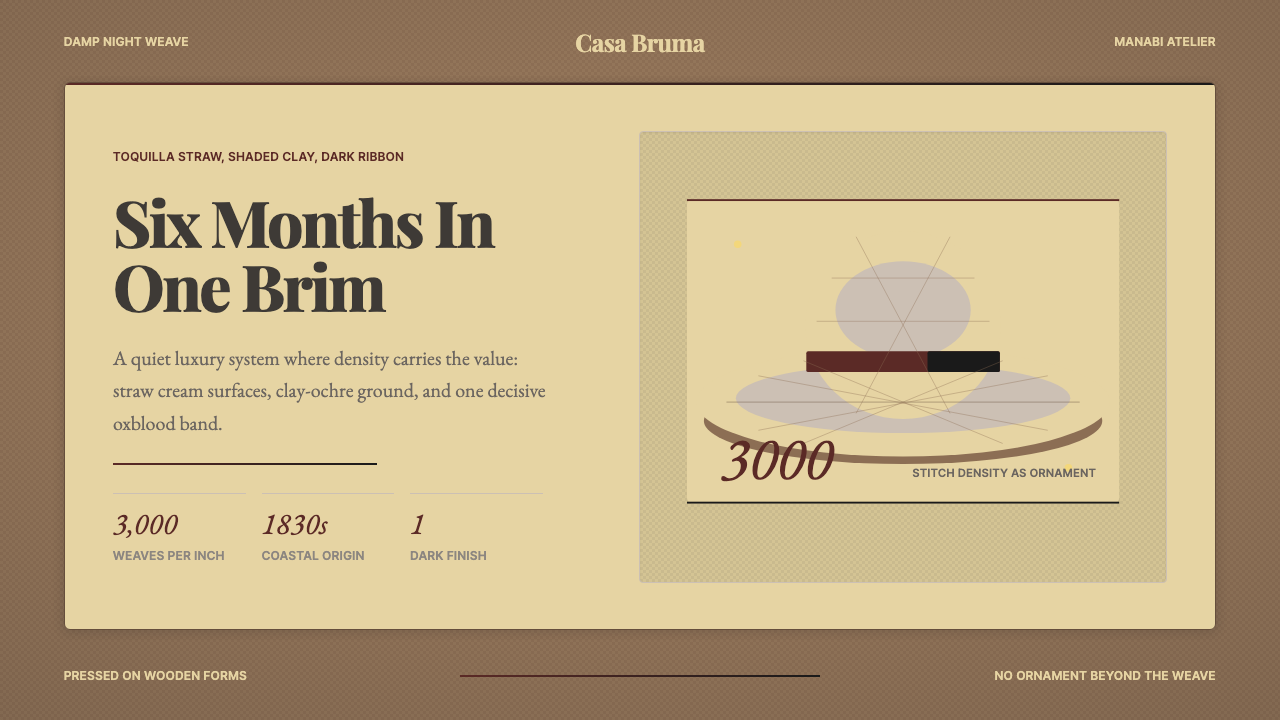 Ecuadorian Montecristi Panama HatLuxury disappears into density. Straw cream, clay ochre, and one oxblood ribb…奢华隐入密度:草色、陶土赭与一道牛血红帽带。
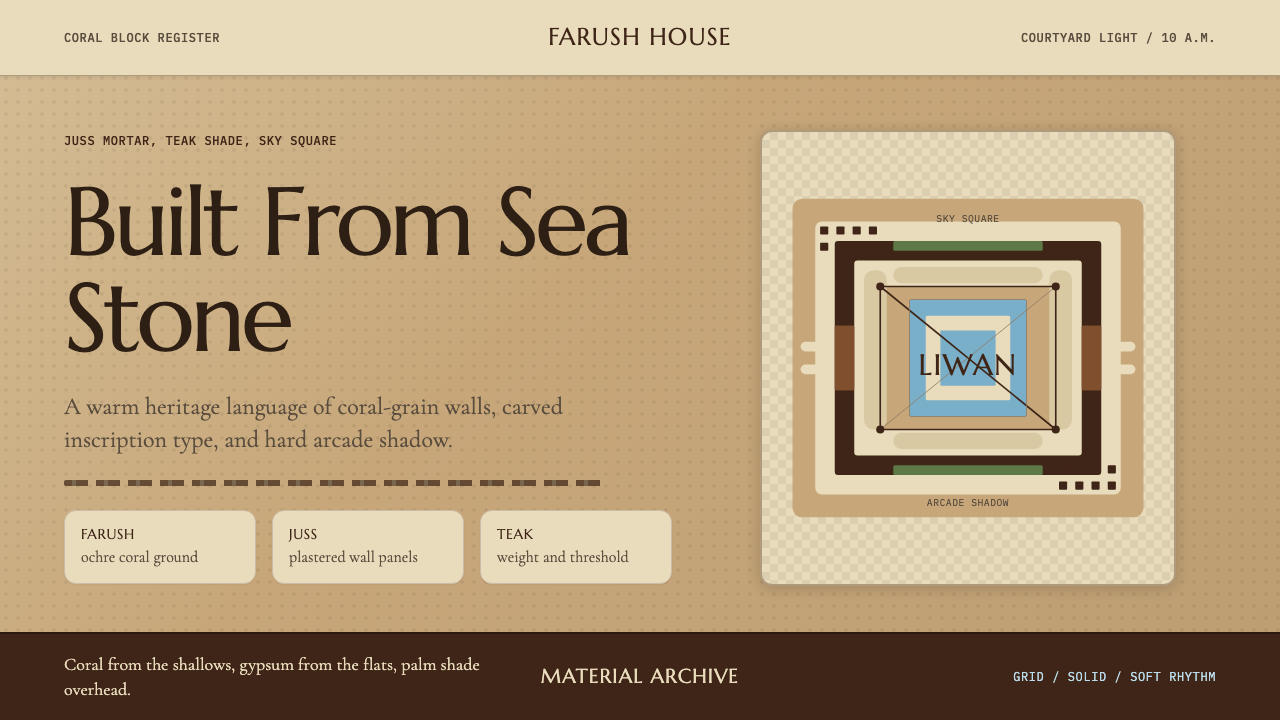 Emirati Bait Al Naboodah Coral HouseFeels built, not styled. Coral ochre, teak brown, and a sky-square courtyard…像被建造而非装饰。珊瑚赭、柚木棕与天井方格定调。
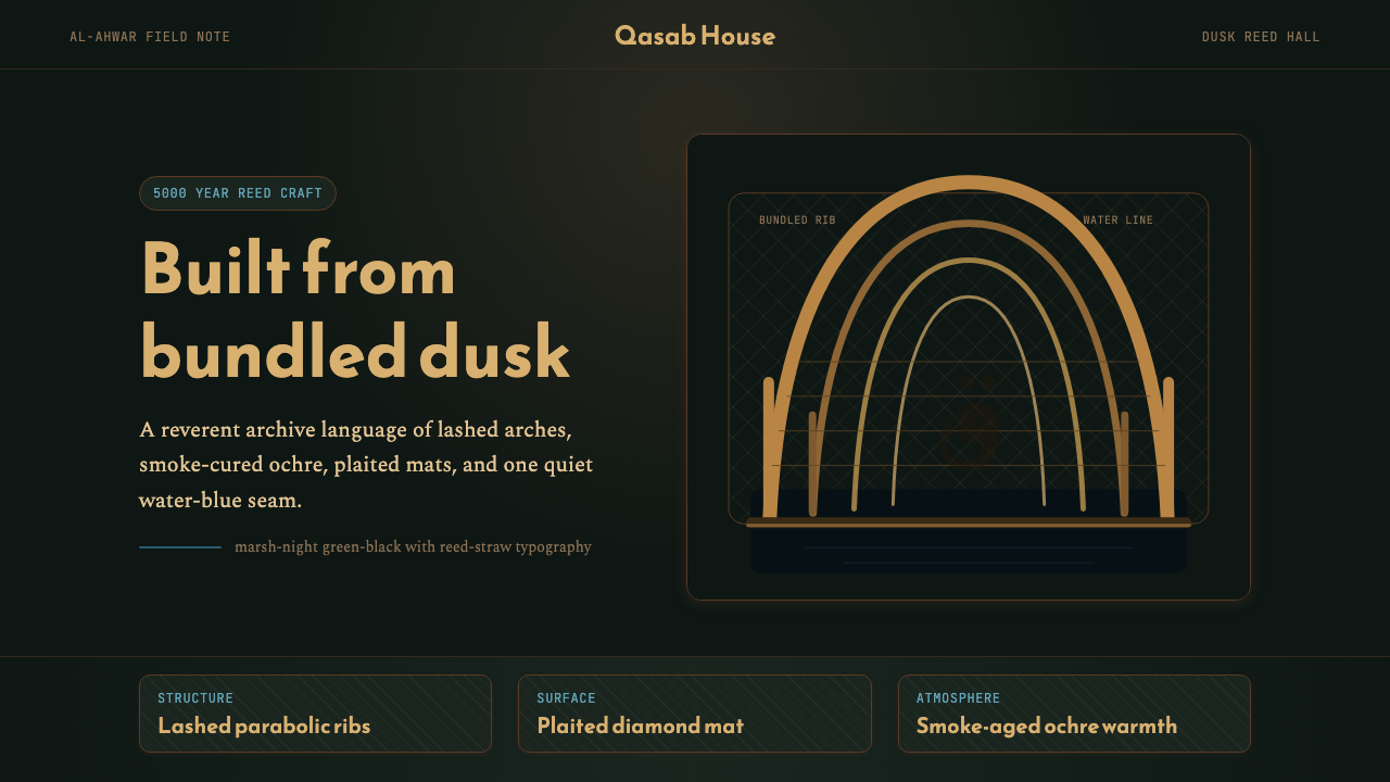 Iraqi Marsh Arab Mudhif ReedReverent reed darkness. Kufi arches, ochre lattice, and one water-blue line h…庄重的芦苇夜色。库菲拱线、赭黄格纹与一笔水蓝托住黄昏。
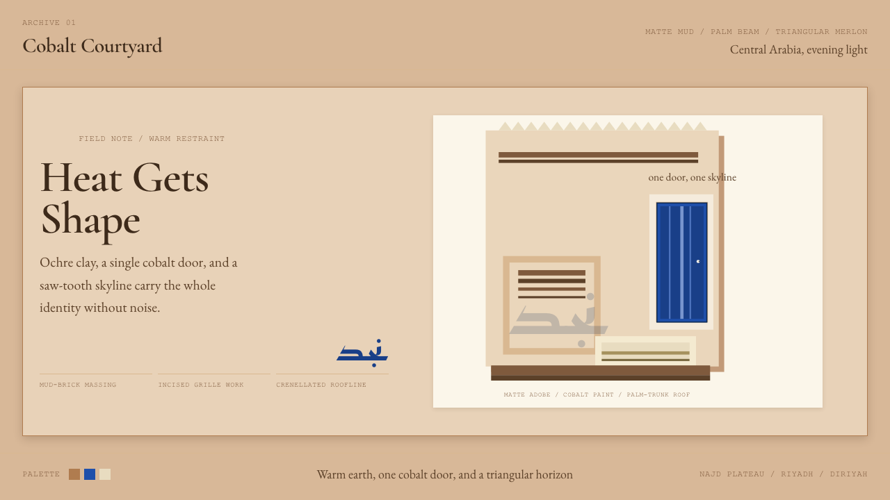 Saudi Najdi Vernacular ArchitectureHeat gets shape. Ochre clay, a single cobalt door, and a saw-tooth skyline.克制自成标志。赭土配钴蓝门,勾出锯齿天际线。
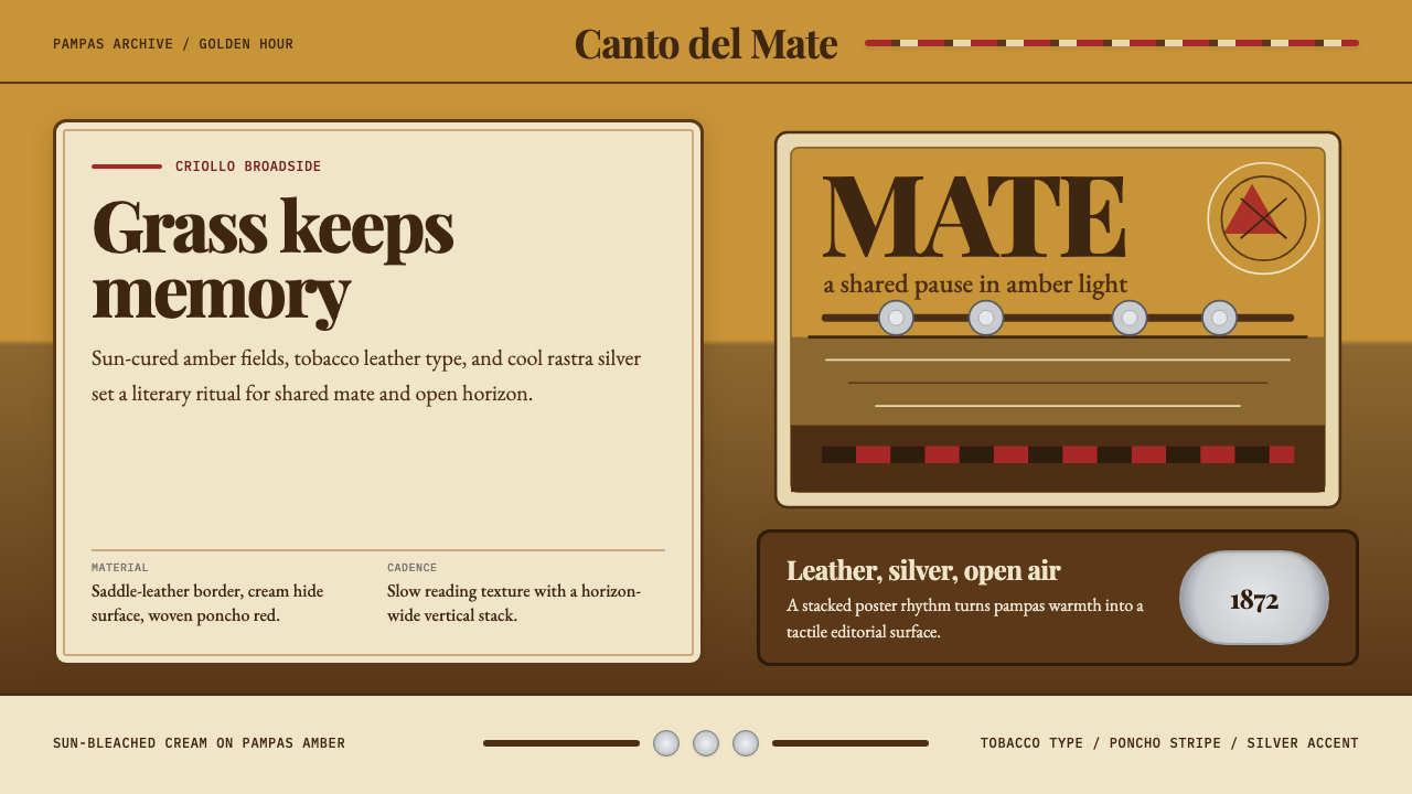 Argentine Gaucho (Pampas Mate Culture)Open grassland, printed warm. Amber fields, Playfair serif, and silver rastra…开阔草原的温热印刷:琥珀底、Playfair衬线与银色腰带几何。
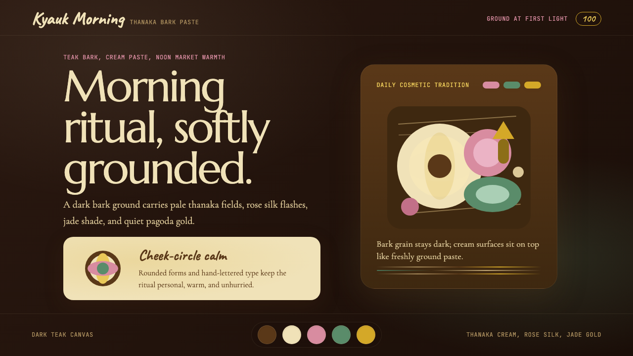 Burmese Shan Thanaka (Bark Paste)Handmade warmth on dark bark. Thanaka cream roundels soften rose, jade, and g…深色树皮上的手作暖意。特纳卡奶油圆斑柔化玫瑰、翡翠与金色。