What is Japanese Tea Ceremony?
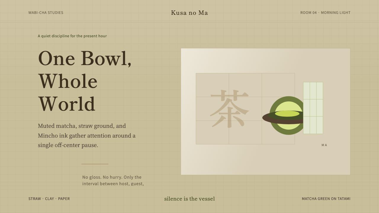
Chado dresses a screen the way a tea room dresses a guest: in muted earth greens, woven straw grounds, and a stillness so deliberate it becomes the whole point.
Japanese Tea Ceremony in brief
Japanese Tea Ceremony — Chado, 'the Way of Tea' — is a design system drawn not from a printed manifesto but from a centuries-old ritual of hospitality. Its visual language borrows directly from the physical tea room: the greenish-brown of whisked matcha, the pale gold of woven tatami straw, the soft grey of ash in a sunken hearth, and the near-white of paper stretched over a shoji frame. Ink black appears only for type and the thinnest structural lines, the way a single brushstroke might mark a scroll hung in the alcove.
The system's guiding conviction is that restraint is itself a form of generosity. Every choice — a wide margin, a heading set smaller than a Western eye expects, an image cropped to leave more emptiness than subject — exists to slow the viewer down and make the remaining element easier to receive. Nothing competes for attention, because in the tea room nothing is allowed to. The host who fusses over decoration has misunderstood the occasion; the guest who cannot sit with quiet has misunderstood it too.
Visually, this reads as an aesthetic of imperfection and asymmetry rather than polish and balance. Layouts favor off-center compositions over centered ones, uneven margins over mirrored ones, and materials that show their own grain over surfaces sanded to a uniform gloss. Serif type — set with the calm, slightly uneven rhythm of an inked brush rather than the mechanical regularity of a ruler — stands in for the disciplined hand of the tea master. Nothing is finished to a shine, because a shine would announce itself, and announcing itself is the one thing this style refuses to do.
Where does Japanese Tea Ceremony come from?
Chado's aesthetic was not invented by a single designer; it was distilled across generations of practice and then given its most influential codification by Sen no Rikyū in the sixteenth century, in the 1580s. Rikyū served as tea master to two of the most powerful men in Japan at the time, the warlords Oda Nobunaga and later Toyotomi Hideyoshi, presiding over gatherings that doubled as venues for diplomacy even as the ceremony itself insisted on humility and simplicity. This tension — a ritual of deliberate poverty performed for the most powerful people in the country — is part of what gives the style its enduring charge.
Rikyū did not start from nothing. He inherited and refined an approach already underway through two earlier tea masters, Murata Jukō in the fifteenth century and Takeno Jōō in the generation before his own. Where earlier tea culture in Japan had imported and prized expensive Chinese-made utensils as status objects, Jukō and then Jōō argued for a different value system, one that found beauty in modest, locally made, irregular objects — a rough clay bowl over a lacquered import. Rikyū pushed this to its logical end, shrinking the tea room to some of the smallest dimensions in its history and stripping the surrounding architecture and utensils to their barest, most essential forms.
The philosophical scaffolding beneath this practice is wabi-sabi, an aesthetic sensibility rooted in Zen Buddhism that finds beauty in transience, imperfection, and the visible passage of time — a cracked glaze, a fading pigment, a piece of wood left unvarnished so its grain can still be read. The specific tea-ceremony expression of this sensibility is sometimes called wabi-cha: a deliberate turn away from luxury and toward the modest, the handmade, and the quietly worn. Zen practice itself, transmitted to Japan from China and deeply entangled with the development of tea culture, supplied the underlying discipline of attention the ceremony asks of both host and guest.
What is striking is how little the aesthetic has drifted since Rikyū's era. The tea room he refined in the 1580s and the tea room still used for formal ceremony today share the same rush-straw floor, the same soft indirect light, the same conviction that one well-chosen object is worth more than a room full of good ones. This design system carries that four-centuries-old discipline directly onto a screen, treating a webpage or a slide the way Rikyū treated a tea room: a small, bounded space where every included element must earn its place, and the empty space around it does at least as much work as anything filled in.
What defines the Japanese Tea Ceremony look?
Color
The palette reads as if pulled from the tea room itself rather than mixed on a color wheel: the muted greenish-brown of whisked matcha, the pale warm gold of woven straw tatami, ash grey from a sunken hearth, and paper-toned near-whites standing in for shoji screens. These tones are deliberately desaturated and earthbound — nothing shouts, nothing is a pure saturated hue. Ink black is reserved for type and the thinnest of structural lines, used the way a calligrapher reserves black for the brush and lets everything else remain pale.
Typography
Serif letterforms carry the system's voice, chosen for a quality that reads like ink laid down by a brush rather than a mechanically ruled line — slightly uneven weight, a calm and unhurried rhythm across a line of text. This stands in deliberate contrast to the crisp geometric sans-serifs of a style like Bauhaus: where that system prizes mechanical precision, Chado prizes the trace of a hand. Headings stay modest in scale relative to how much space surrounds them; the emphasis falls on breathing room around the words rather than on the words shouting louder than their neighbors.
Emptiness and Asymmetry
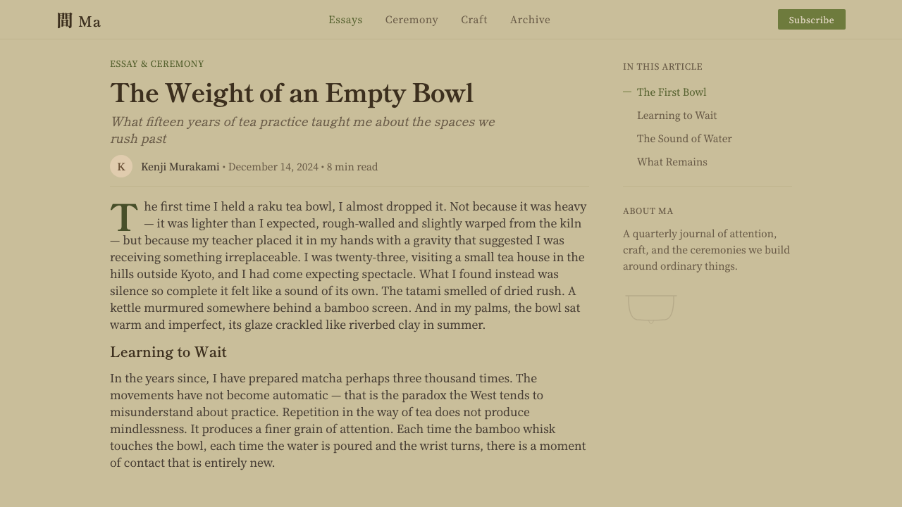
Ma — the Japanese concept of purposeful negative space — governs composition more than any grid rule does. A layout in this style routinely leaves far more area empty than a Western eye expects, and what remains is pushed off-center rather than balanced through mirroring. This mirrors the tea room itself, where a single scroll or a single flower is hung slightly off the room's true center, and where the emptiness surrounding that one object is understood to be doing active compositional work, not simply left over after the design was finished.
Texture and Material
Where a polished, gradient-heavy style aims for uniform gloss, this system aims for the opposite: the visible weave of straw matting, the grain of unvarnished wood, the slight irregularity of a hand-thrown ceramic surface. Backgrounds and surfaces are treated so their material origin stays legible rather than smoothed away — a direct translation of wabi-sabi's conviction that an object showing how it was made, and how time has touched it since, is more beautiful than one buffed to erase all trace of both.
Light and Shadow
Light in the tea room is famously soft and indirect, filtered through paper shoji screens rather than admitted through open glass. The system translates this into shadows that are diffuse and low-contrast rather than hard-edged — the opposite instinct from a style that treats shadow as a crisp, offset geometric shape. Depth is suggested gently, almost reluctantly, the way afternoon light might fall across a tatami floor: present, felt, but never insisted upon.
Asymmetric Composition
Balance in this style is never achieved by mirroring left against right. Instead, a single strong element — an image, a heading, a hearth-toned block of color — sits deliberately off to one side, counterweighted by nothing more than the emptiness around it. This is the compositional habit of the tokonoma, the small alcove reserved for a single hanging scroll or flower arrangement: one object, placed with intention, asked to hold an entire wall's worth of attention on its own.
Restraint as Discipline
Every decorative impulse here is treated with suspicion rather than indulgence. A border, a flourish, a gradient fill added purely for richness — each is measured against the question a tea master might ask of an extra utensil: does this earn its place, or does it merely fill a space better left empty? The restraint is not the absence of care; it is a great deal of care spent deciding what to leave out.
Who shaped Japanese Tea Ceremony?
Rikyū is the figure most responsible for codifying the aesthetic this system draws on, working in the 1580s as tea master to the warlords Oda Nobunaga and Toyotomi Hideyoshi. He pushed tea practice toward radical simplicity — smaller rooms, humbler materials, fewer objects — and gave wabi-cha its most influential and lasting form. His insistence that a single well-chosen, imperfect object could hold more meaning than a room full of treasures is the same conviction that governs this system's use of emptiness and restraint.
Working in the fifteenth century, before Rikyū, Jukō is generally credited as the founding figure of wabi-cha, the strand of tea practice that first turned away from prizing expensive imported Chinese utensils toward modest, locally made, irregular objects. He is often described as the first to bring a Zen sensibility explicitly into the tea gathering, laying groundwork that Rikyū would later refine to its sharpest point.
Jōō studied and extended Jukō's early wabi-cha principles a generation before Rikyū, and was himself Rikyū's teacher. He is credited with further refining the vocabulary of humble materials and simplified space that Rikyū would later take to its most extreme expression. The line from Jukō through Jōō to Rikyū is a steady, deliberate distillation, not a single sudden invention.
How do you use Japanese Tea Ceremony today?
Chado's core mechanism — using restraint and emptiness to make the remaining element more legible — transfers well beyond the tea room, but only if the emptiness is treated as intentional rather than unused leftover space. Applying the style correctly means resisting the urge to fill a quiet area just because it is available.
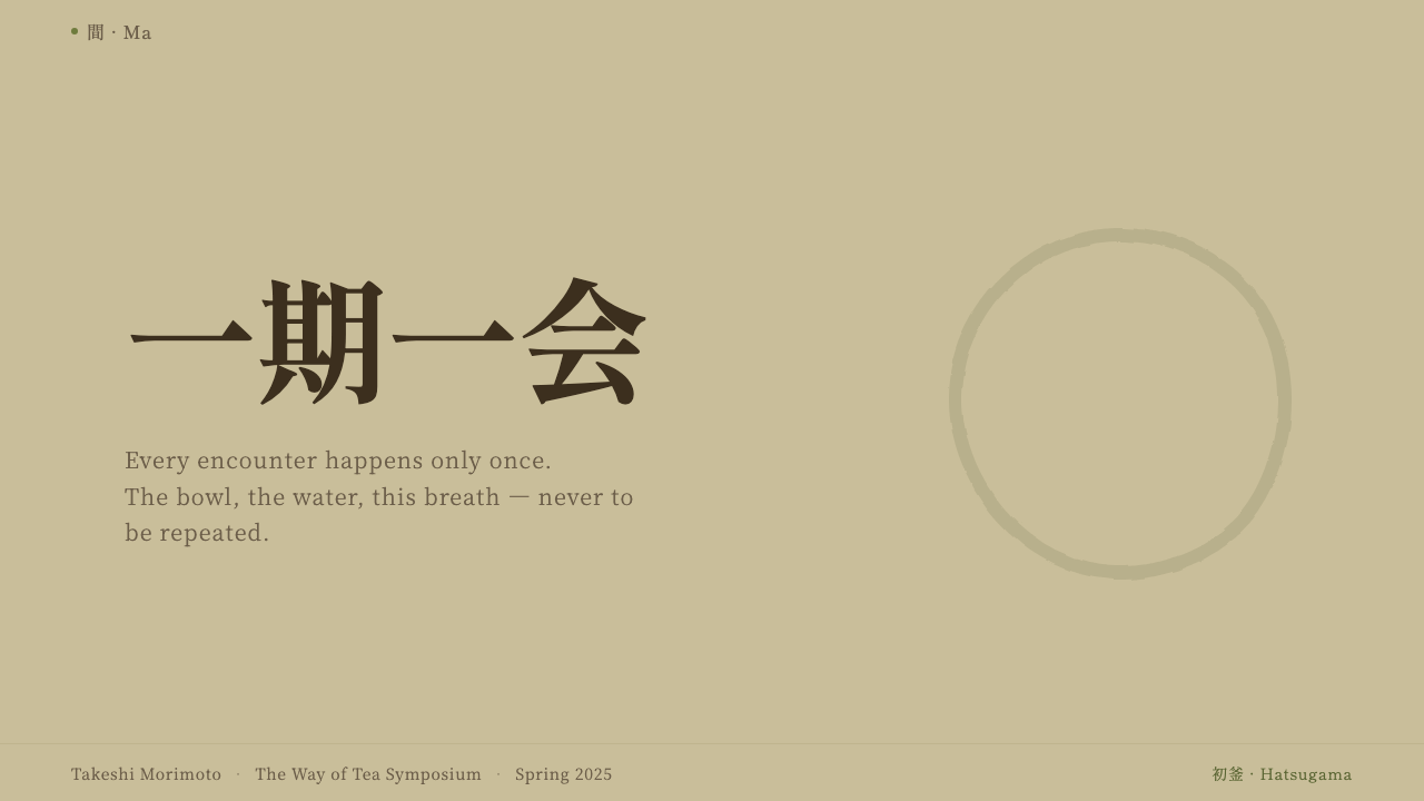
For presentation slides, this style rewards a cover page that behaves like a tokonoma alcove: one strong image or one line of title type, placed off-center, surrounded by far more empty ground than a typical cover would allow. Content and data slides should carry a single idea per slide rather than several bullet points competing for attention; data should render as plain, calm figures against generous paper-toned space rather than busy, colorful chart furniture. The instinct throughout is subtraction — if a slide feels incomplete, the correct response is usually to remove something else, not to add.
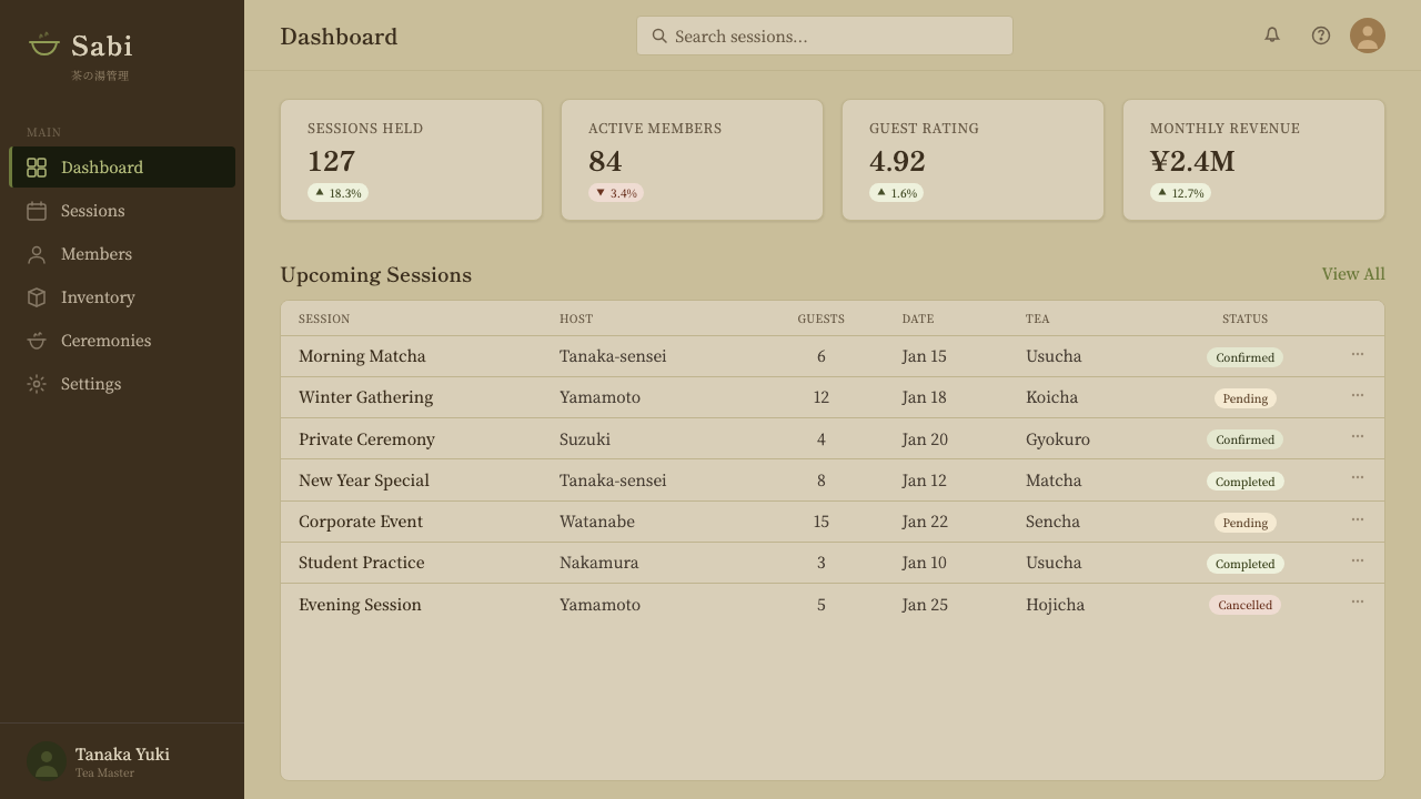
For web interfaces, dashboards and pricing pages benefit from the style's clarity of hierarchy: a muted, earth-toned background, generous spacing between sections, and a single accent reserved for the one action that matters on a given screen. A pricing table avoids competitive color-coding between tiers and instead lets spacing and a quiet serif hierarchy distinguish one plan from another. Interactive elements should feel considered rather than decorated — a border or soft shadow used sparingly, never a bright gradient fill.
For editorial and marketing work, the style suits long-form writing and brand storytelling especially well: a narrow measure for body text, wide margins allowed to stay empty, and section breaks marked by a shift in spacing rather than a decorative rule or icon. Marketing pages built in this idiom tend to slow the reader down deliberately, using one strong image and a great deal of surrounding space rather than a dense wall of competing offers.
The most common mistake when applying this style is confusing muted color with laziness and compensating with texture, gradients, or ornamental flourishes to make a layout feel more 'finished.' That impulse defeats the entire premise. A second common error is centering everything by default, reaching for Western symmetry as a resting state, when this style specifically asks for the tension of a considered, off-center placement instead.
Japanese Tea Ceremony — FAQ
Is this the same as generic 'Japanese minimalism' or Zen design?
They overlap but are not identical. 'Zen minimalism' as a design shorthand often just means very little on the page. Chado is more specific: it comes from a documented ritual with named historical figures, a material palette drawn from an actual physical room, and a governing concept — ma, purposeful emptiness — that dictates exactly how and where restraint should be applied, not just that there should be less of everything. A page can be sparse without being Chado; Chado is sparse in a particular, intentional way.
Can this style use bright or saturated colors anywhere?
Rarely, and only with great care. The palette is built to feel earthbound and muted — matcha green, straw gold, ash grey, paper white — precisely because a saturated color would behave like a shout in a room built for quiet. If an accent is needed to mark one important moment, it should be a single restrained tone rather than a bright, high-chroma color, appearing sparingly enough that its rarity is itself part of what makes it noticeable.
Why does the style leave so much empty space instead of filling it with content?
Because in the worldview this system comes from, empty space is not wasted space — it is doing active work. The Japanese concept of ma treats the pause between two notes of music, or the bare wall around a single hanging scroll, as meaningful in itself, not a gap waiting to be closed. Filling that space with more content would not add value; it would drown out the one thing the emptiness was framing. A layout that respects ma treats blank area as a deliberate ingredient, not a placeholder.
How does this style differ from a generic 'earth tone' or 'organic' design trend?
A generic earth-tone trend usually stops at color choice — swap in some greens and browns and call it organic. Chado is a complete system in which color, asymmetric composition, visible material texture, diffuse light, and typography all serve one governing idea: that a disciplined absence of ornament lets the one remaining element be truly seen. Copying only the palette while keeping symmetrical layouts, glossy surfaces, and hard geometric shadows produces something that looks vaguely 'natural' but misses the underlying discipline entirely.
Related design styles
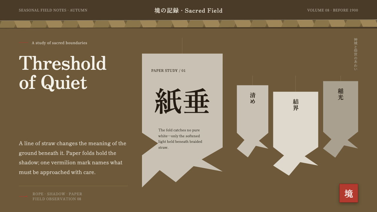 Shinto Shide Paper StreamerQuiet becomes sacred. Shadowed washi hangs from a straw-gold line, marked onc…
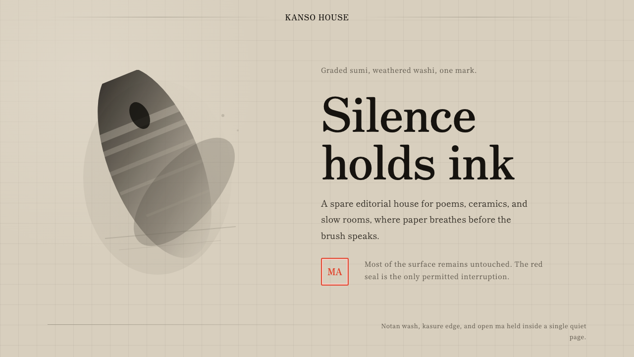 Sumi-e Ink WashRestraint carries weight. Washed black ink floats on oatmeal washi, anchored…
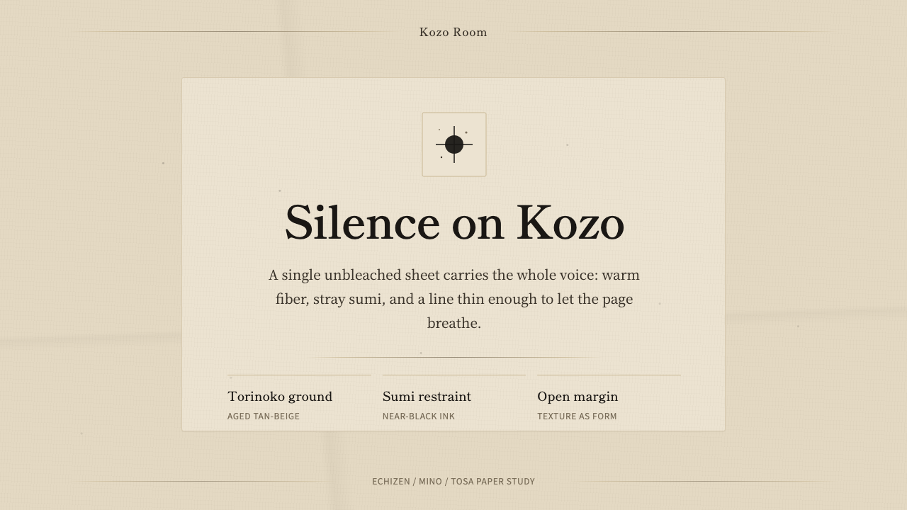 Washi Paper MinimalQuiet is material. Warm kozo grain, sumi specks, and hairline rules hold the…
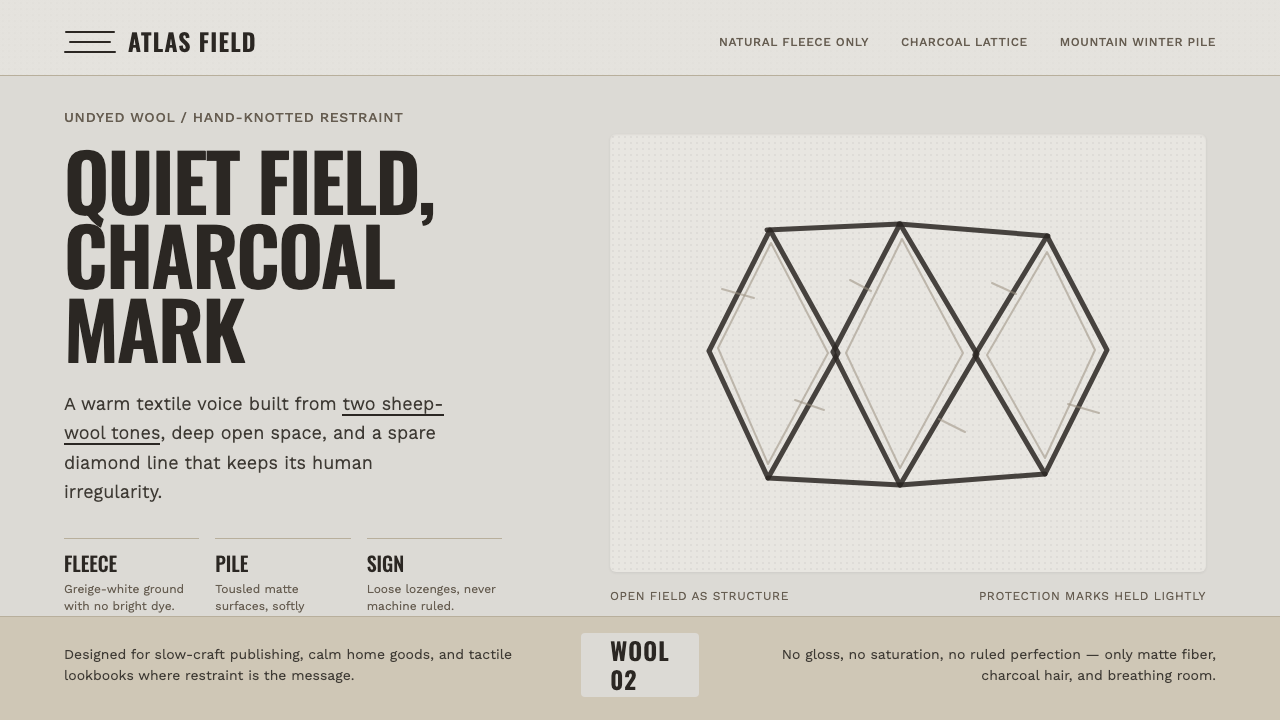 Beni Ourain Berber CarpetRestraint feels tactile. Greige wool field, Oswald type, and a loose charcoal…
 Wool FeltingHandmade stillness. Oatmeal-gray felt, humanist serifs, and soft rolled panel…
 Guérande Fleur de SelCrystal white is the exception. Mineral serif and hairline grids rise from we…