What is Sasak Lumbung Granary?
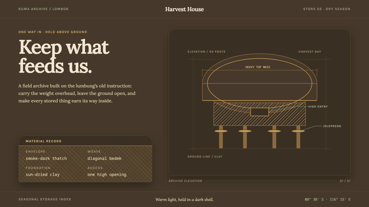
The Sasak lumbung is a granary that makes weight visible — a heavy, smoke-darkened crown held high on four posts, with a single small opening onto the harvest.
Sasak Lumbung Granary in brief
The bale lumbung is the rice granary of the Sasak people of Lombok, in eastern Indonesia: a deep bonnet of alang-alang thatch riding on four hardwood posts, closed in by a small plaited-bamboo body and entered through one high window. As a design style it reads as an architecture of storage — a visual language in which the heaviest mass sits at the top, the base is deliberately open, and everything valuable is held above the ground rather than set down on it.
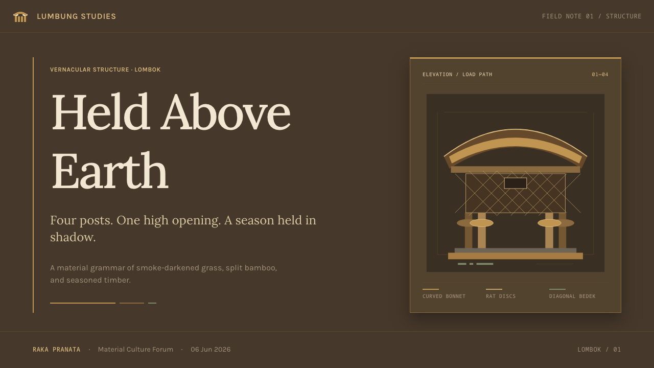
The look that results is dark, warm and vertical. A dim umber-grey field serves as the ground; content is carried above it as pale, warm light, the way stored grain sits inside a shadowed granary. Letterforms are soft and bookish rather than technical, structure is expressed through a small number of upright elements, and the one detail that must always remain visible — the flat disc collared around each post — gives the style its only recurring motif, which is not ornament at all but a working rat-guard.
Where many vernacular styles collapse into a surface texture, the lumbung is really a diagram of load and protection. The thatch is the roof, the sign of weight and shelter. The posts are the structure. The disc is the defence. The single opening is access control. A page built in this idiom gets its hierarchy almost for free: a crown on top, supports underneath, and one clear way in.
Where does Sasak Lumbung Granary come from?
The lumbung belongs to the Sasak villages of Central Lombok, in the province of West Nusa Tenggara, Indonesia. The source material points especially to the hamlets of Sade and Rambitan, in the Praya and Pujut areas, where these granaries are still built and kept in repair today. The tradition predates 1900 and has no single author: its makers are the village builders themselves, working from forms that each generation of a hamlet learned from the one before. That communal origin is part of the style's character — nothing about it is signed, branded or individually expressive.
Architecturally the lumbung sits in the broad family of Indonesian vernacular pile construction, the habit of lifting a structure off the ground on posts, and more narrowly in the bonnet-roofed rice barn family, in which the roof is conspicuously out of proportion to the body beneath it. Rice is the wealth of an agricultural village, and the granary is its bank; it makes sense that the building spends its largest gesture on protecting the contents from weather and from pests. Raising the store on posts keeps it clear of ground damp, and the disc collared on each post — the jelepreng — stops rats climbing up.
Every part of the building is a local material doing a defined job. The thick roof is alang-alang thatch. The four posts are hardwood. The body is bedek, split bamboo plaited on the diagonal. The floor is sun-dried clay mixed with buffalo dung and straw ash. There is only one opening, a high window, through which the harvest is taken in twice a year. Nothing is imported and nothing is decorative; each choice answers to climate, storage or security.
Time is also one of the materials. Decades of cooking smoke carry the thatch from straw-pale to a dark umber-grey, so the colour of an old lumbung is a record of use rather than a finish chosen from a catalogue. The Curio system borrows exactly that logic: a heavy top mass, an open base, a single way in, and light content held above a dark ground. It is a translation of reasoning, not a copy of appearance, and it is why the four posts and their discs have to stay visible in any layout — they are the whole point of the form.
What defines the Sasak Lumbung Granary look?
Heavy Crown, Open Base
The defining composition is top-weighted: the broadest, darkest mass sits at the top and the supporting structure beneath is slender and open. This inverts the usual habit of anchoring a layout at the bottom. Visual weight rests on thin verticals, which produces a quiet tension — the page feels loaded but not crushed, the way a thatch bonnet looks over its posts.
Four-Post Elevation
Structure is shown, not hidden. Four upright supports carry the content, and the space between them is left open so the eye can see through to the ground. In a layout this becomes a four-column rhythm of vertical elements with real air under the main block. The elevation is the style's way of saying that content is something to be held up and protected.
The Collared Disc
The jelepreng, a flat disc fitted around each post, is the one motif that must always be visible. It is plain, circular and functional: a barrier rather than a flourish. In an interface it can recur as a marker, a node or a stop on a line, but it should never be turned into decorative confetti. Its meaning comes from sitting at a specific height on a specific support.
Smoke-Dark Ground, Warm Light
The palette follows what decades of cooking smoke do to straw: from pale to a dark, slightly warm umber-grey. That dim field is the ground, and content sits on it in soft, warm, never cold light. There is no electric accent and no pure-white glare; the memory of pale straw is the highest note. The effect is of a lamp-lit interior rather than a screen.
Plaited Diagonal Texture
The granary body is bedek, split bamboo woven on the diagonal. That weave is a quiet source of pattern: a restrained diagonal rhythm that can inform dividers, backgrounds of secondary panels or small decorative bands. It works best as an echo of structure, used sparingly and low in contrast, never as wallpaper across the entire page.
Warm, Bookish Type
Type is a warm, softly shaped text face with a calm, literary tone, comfortable at length and gentle in light-on-dark settings. Headlines are modest in contrast and never shout. The voice is that of a keeper of records: unhurried and plain. Technical, geometric sans faces would break the sense that the content has been stored carefully by hand.
One Way In
The granary has one opening, high up, used twice a year. As a design rule this becomes a strong preference for a single, unmistakable entry point per view: one primary action, one door. Secondary routes are quiet or absent. The result is a calm, low-clutter interface where it is always obvious how to get at what is being kept.
Who shaped Sasak Lumbung Granary?
The builders of Sade, a Sasak hamlet in Central Lombok, are the first named custodians of the form in the source material. They are not individual authors but a community of makers who keep building and repairing granaries with local thatch, hardwood, bamboo and clay. Their work shows the style at its most direct, with function, climate and craft all visible in the finished structure.
Rambitan is the second hamlet named alongside Sade, and its builders belong to the same living tradition of pile-raised, bonnet-roofed granaries. That two separate communities are cited, rather than one celebrated workshop, underlines how widely the knowledge is shared and how stable the type has remained. The lumbung is a common solution, not an individual invention.
The surrounding villages of the Praya and Pujut areas form the cultural region in which the lumbung is understood and maintained. They matter to the design story as the context: an agricultural society organised around two harvests a year, for whom a granary is the centre of household security. The style inherits that seriousness about keeping and protecting what has been grown.
How do you use Sasak Lumbung Granary today?
The lumbung style suits content that is kept, catalogued or protected: archives, libraries, personal knowledge bases, note-taking tools, documentation for long-lived systems, heritage and food-related brands, and any product whose promise is that something precious is safely held. It is a dark-mode language by nature, so it fits naturally in interfaces meant for long, focused reading.
For presentation slides, a cover works well with a broad dark mass across the upper part of the frame and the title held beneath it, with a few slim vertical elements standing underneath like posts. Content slides can be built on a four-column structure in which each column carries one idea and the gaps between them stay open. Data slides can treat bars as posts: slender uprights with a small circular marker fixed at a consistent height, so the discs become a repeating, meaningful device instead of decoration.
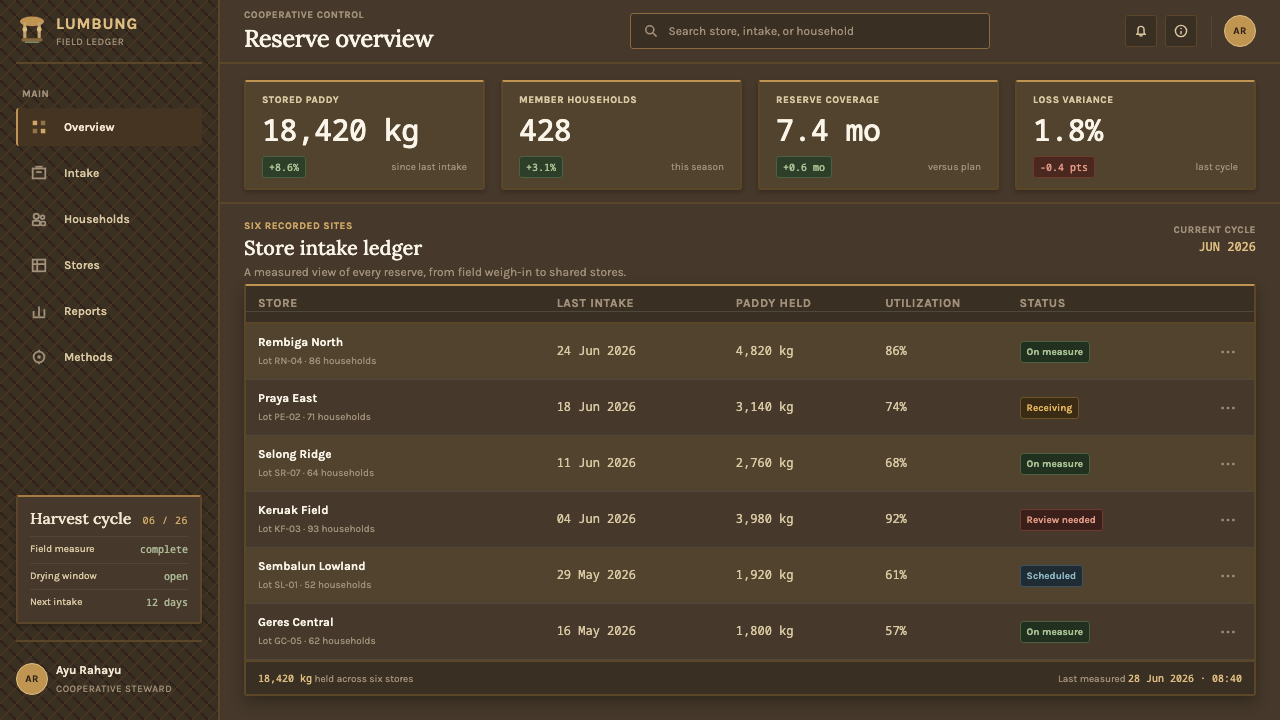
For web interfaces, dashboards and pricing pages gain from the single-door principle. A four-tier pricing layout maps neatly onto four posts, each plan raised above the ground with visible space beneath it, and one clear primary button per card. Keep the ground dark, keep text warm and soft rather than stark white, and let surfaces feel matte, like clay and straw ash, instead of glassy. Navigation should be calm and typographic, with at most one highlighted route at a time.
For editorial and marketing work, set long text in a narrow measure of the warm book face, light on a dark field, with generous line spacing so it reads like lamplight on paper. Marketing pages for craft, grain, preservation or storage products can use the heavy-crown composition for hero sections and let imagery sit quietly in muted, earthy tones. Photography should feel documentary and unhurried, never glossy or hyper-saturated.
The most common mistake is to treat the style as a rustic costume: a thatch-pattern wallpaper, bamboo textures on every card, and neon accents laid over a black background. That keeps the darkness but abandons the reasoning. The elements that carry the logic — the top-weighted mass, the open base, the visible posts and discs, and the single entry — have to survive; the texture is the least important part. A second mistake is making the base heavy, which undoes the elevation that defines the form.
Sasak Lumbung Granary — FAQ
What is a bale lumbung?
It is the traditional rice granary of the Sasak people of Lombok in Indonesia. A thick thatch roof sits on four hardwood posts, each fitted with a flat disc so rats cannot climb, over a plaited-bamboo body with a single high window. In design terms it is a style of top-heavy, open-based, dark-grounded layouts that hold light content above the page.
Why is the style dark?
Because the building itself darkens with use. Decades of cooking smoke carry the thatch from pale straw to a dark umber-grey, so the dark ground is a record of age and service, not an arbitrary choice. The pale straw colour survives as a memory in the lighter tones used for content, which is why the system keeps light content above a dark field.
What is the jelepreng and why does it matter in a design?
The jelepreng is the flat disc collared around each post, positioned so that rats cannot climb up. It matters because it is the one detail that makes the form instantly legible. In a design it should stay visible as a plain circular marker on a vertical support. If the discs are removed or turned into decoration, the layout loses the logic of protection that gives it meaning.
Can the lumbung style work with a light background?
It can, but it is not the natural form. The thatch begins pale and darkens over time, so a light variant could take its ground from the early straw tone and use deep umber for text and posts. The cost is that the idea of dark mass overhead and light content held beneath it is weakened. The dark version is the more faithful and more coherent expression of the system.
Where does the style struggle?
It struggles where energy, speed or playfulness are the main values: trading terminals, gaming dashboards, children's products or anything that depends on bright, high-saturation colour. Its calm, protective, slow-moving temperament also suits content that is meant to be kept rather than consumed in a hurry. Choose it when the message is care, storage and security, and look elsewhere when the message is excitement.
Related design styles
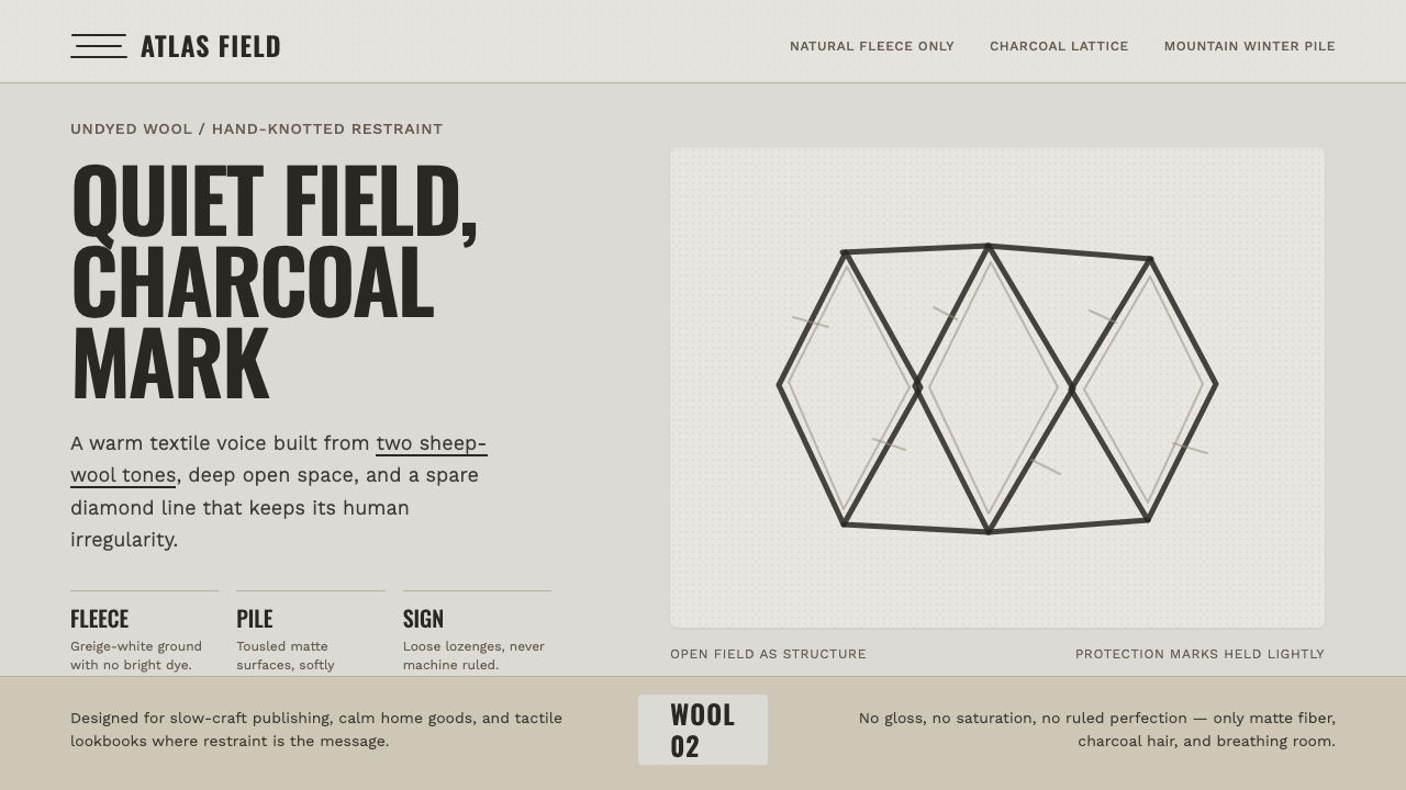 Beni Ourain Berber CarpetRestraint feels tactile. Greige wool field, Oswald type, and a loose charcoal…
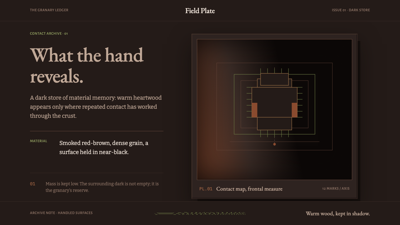 Ifugao BululTouch reveals the archive. Narra red breaks through near-black patina in a qu…
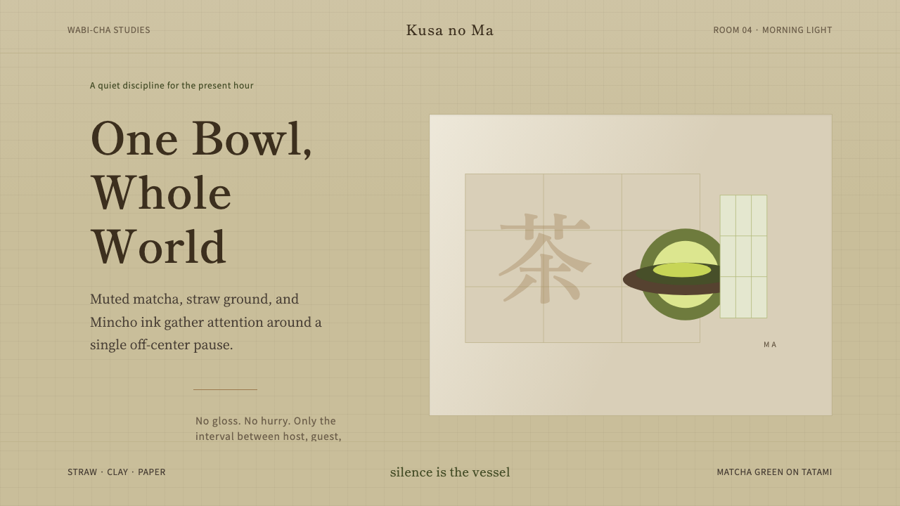 Japanese Tea CeremonyStillness has weight. Tatami straw, matcha green, and Mincho type leave room…
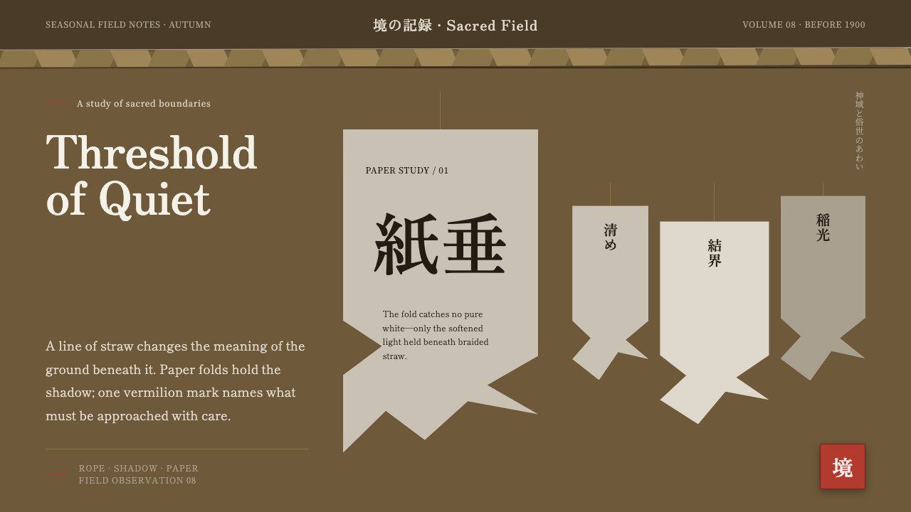 Shinto Shide Paper StreamerQuiet becomes sacred. Shadowed washi hangs from a straw-gold line, marked onc…
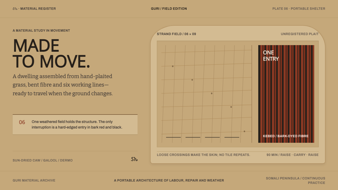 Somali AqalA house made to move. Sun-dried mat fields yield once to a bark-red, black en…
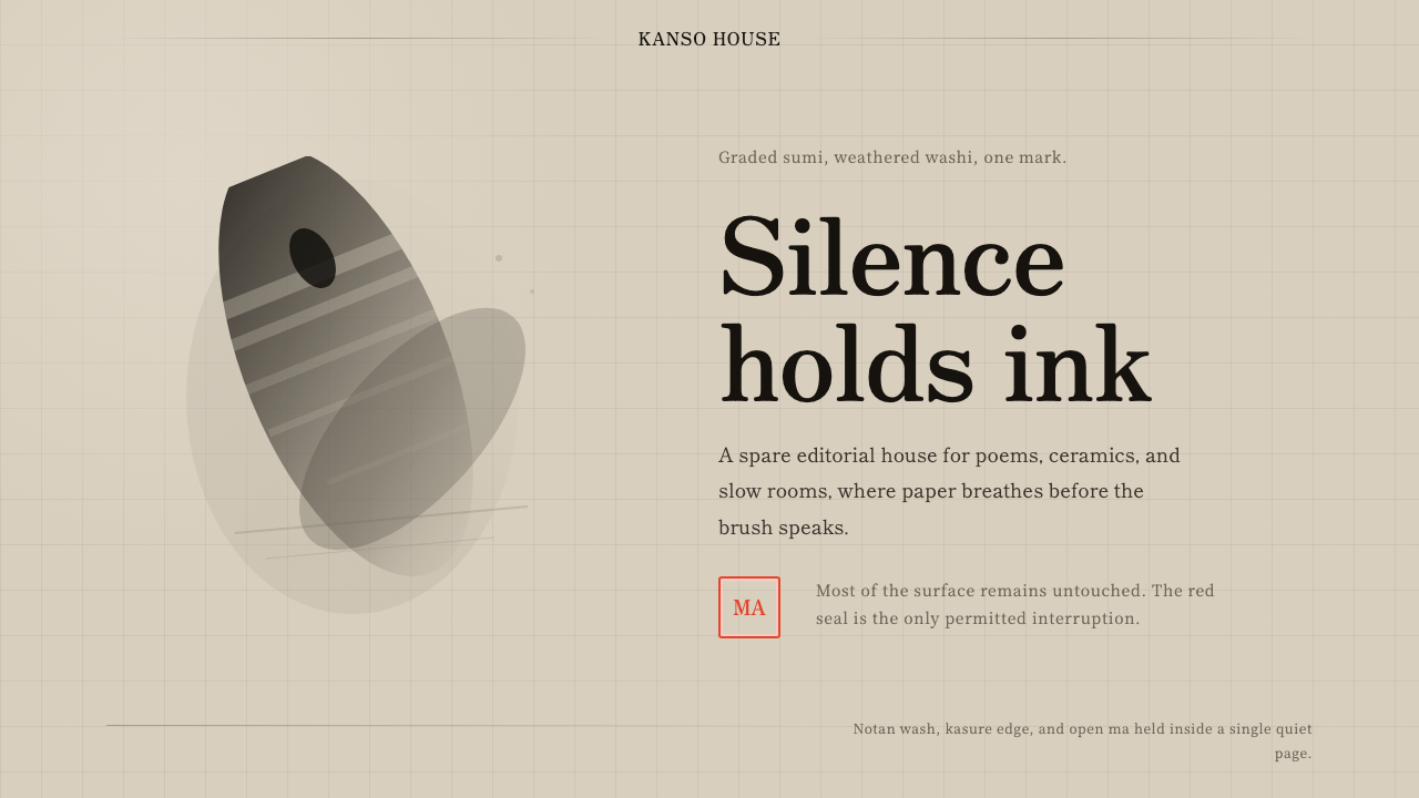 Sumi-e Ink WashRestraint carries weight. Washed black ink floats on oatmeal washi, anchored…