What is Labu Sayong Black Clay?
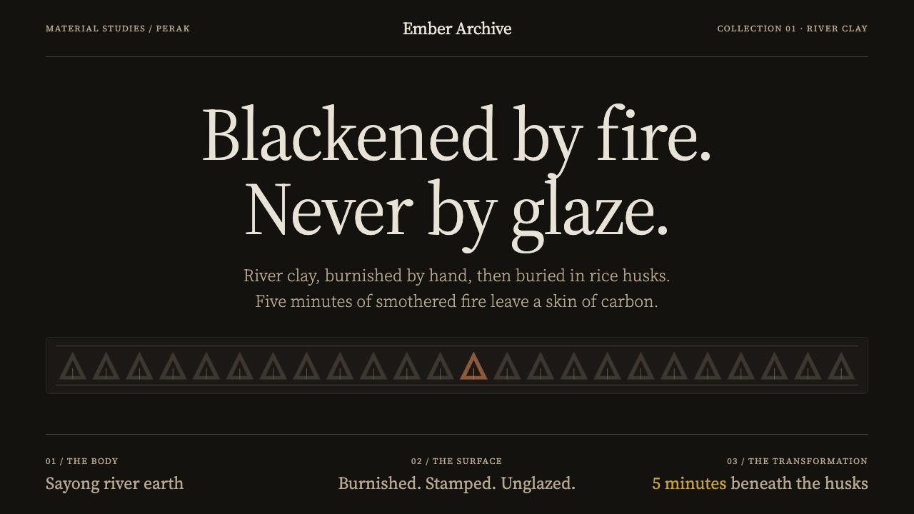
Labu Sayong Black Clay is a style that is black by fire, not glaze: matte carbon, warm clay showing through, and pressed motifs held in quiet horizontal bands.
Labu Sayong Black Clay in brief
Labu Sayong Black Clay is a dark, matte, quietly patterned design style drawn from the labu sayong, a gourd-shaped water pitcher made from Sayong river clay in a single village in Perak, Malaysia. The pitcher's black is not a glaze. It is a firing effect made repeatable: after a bisque firing, the still-hot pot is buried in rice husks, and within about five minutes the smothered fire lays carbon across its burnished skin.
The design system follows that logic closely. The ground is a matte carbon black, the colour of a surface that has been smoked rather than painted. A graphite sheen appears where the clay was polished before firing, and unsmoked clay breaks through in brown. Stamped motifs, pressed into the wet clay, are held in strict horizontal bands around the neck and shoulder. They are never scattered across the surface and never painted on, and the gourd's own silhouette governs the proportions of everything.
Together, these choices create a style that is calm, tactile and unusually coherent. It is dark without being heavy, ornamented without being busy, and handmade without being rough. For work that wants to feel grounded, material and unhurried, it offers a clear set of rules drawn from a craft that has been practised continuously for more than three hundred years.

Where does Labu Sayong Black Clay come from?
Labu Sayong comes from Sayong, in the Kuala Kangsar district of Perak, Malaysia. The pitcher takes its name from the village and its material from the river: the clay is dug from the Sayong river and thrown into a gourd shape, a slim neck above a swelling belly. The source describes a pre-1900 tradition that has run for more than three hundred years without a break and is still in production, which makes it a living craft and not a revived one.
The record credits the work to the women potters of Kampung Kepala Bendang. After throwing the pot, they press wooden stamps into the wet clay to make the motifs, among them bamboo-shoot, rice-flower and sun-breaking patterns, laid out in horizontal bands around the neck and shoulder. The surface is then burnished, or polished, before firing. That step matters because it decides where the finished pot will carry a sheen: the polished zones take the carbon differently from the rest, and they are the source of the style's graphite gleam.
The firing is the heart of the craft. The pot is first bisque-fired at a high heat, then allowed to cool to roughly half that heat. While it is still hot, it is buried in rice husks, and the heat ignites the husks. With little oxygen available, the fire smothers, and within about five minutes the carbon is laid across the burnished skin. The black is therefore a firing accident made repeatable, not a coating. Where the smoke does not reach, the clay stays unsmoked and breaks through in brown, so the pot is partly black and partly the colour of the river it came from.
The record places the craft within three connected frames: Malay pottery heritage, Perak state craft identity and rice-husk reduction firing. The first is the long tradition of earthenware in the Malay world. The second ties the pitcher to Perak as a marker of place. The third names the technique that produces the colour. The design system translates all three into a set of rules: a matte carbon ground, a graphite sheen where polishing is implied, unsmoked brown showing through, motifs held in horizontal bands and the gourd's outline governing proportion. The gourd's slim neck, its swelling belly and its single shoulder line, with a bottom rounder than the top and slightly uneven hand-made corners, are the silhouette the layout learns from.
What defines the Labu Sayong Black Clay look?
Matte Carbon Ground
The foundation is a deep carbon black with no gloss. It is the colour of a surface laid down by smoke, not by a coating, and it should look slightly soft and absorbent rather than hard and mirrored. Large areas of it carry the page. Because the black comes from the firing and not from paint, it is understated and uniform, a calm field against which the few other tones can register clearly.
Graphite Sheen
Where the clay was burnished before firing, the black takes on a quiet graphite sheen, a soft metallic lustre like pencil lead, rather than a bright shine. In the design system this becomes a subtle lightening on the shoulder line, on raised edges and on selected surfaces. It is the main tool for modelling form: the sheen suggests that the surface was polished by hand and gives a restrained sense of dimension without resorting to gloss or highlights.
Clay Breaking Through
Unsmoked clay breaks through the black in warm brown. This colour is the style's only real warmth, and it is used as the place where the process shows: near edges, at the base, in patches where the carbon did not reach. It should look accidental in placement but consistent in character. The brown is a reminder that the pot is made of river clay and that the black is a surface effect, which keeps the style honest and tactile.
Pressed Motifs in Horizontal Bands
Motifs are pressed into the wet clay with wooden stamps and arranged in strict horizontal bands round the neck and shoulder. Bamboo-shoot, rice-flower and sun-breaking patterns repeat in rows, often as triangles and small units, with each band occupying its own zone. They are never scattered across the surface and never look painted on. In layouts, this translates into bands of repeated impressions that run along the width of a section, header or card.
Gourd Silhouette
The outline of the gourd governs everything: a slim neck, a swelling belly, a single shoulder line, and a base rounder than the top. In design terms, proportions in the style move from narrow to full and from light to heavy as the eye travels downward. Containers, cards and illustrations gain a gentle bulge toward the lower half, and large masses sit low. This silhouette is the unseen grid that holds the style together.
Hand-Rounded Corners
Corners are rounded, but not with mechanical precision. They are slightly uneven, in the way a hand-thrown pot is never perfectly symmetrical. This is a deliberate quality, not a flaw. Shapes keep the generosity of rounded edges while allowing small variations between one element and the next, so that a row of cards or buttons feels made rather than stamped out by a machine.
No Glaze, No Gloss
The black is not a glaze, and the style refuses the surface effects that glaze implies. There are no glassy highlights, no wet reflections and no gradients that mimic a coating. Depth comes from the sheen where the clay was polished, from the brown showing through and from the shoulder line. The restraint gives the style its authority: surfaces look worked, not finished with a layer of shine.

Who shaped Labu Sayong Black Clay?
The source credits the labu sayong to the women potters of Kampung Kepala Bendang, who throw the pots from Sayong river clay, press the motifs into the wet surface and burnish the skin before firing. The craft has run for more than three hundred years and is still in production through their hands. Every rule in the design system, from band placement to the polished sheen, originates in work they do.
The record lists rice-husk reduction firing among the movements around the craft. It is the technique that turns a bisque pot into a black one: the hot pot is buried in rice husks, the fire is smothered and carbon enters the burnished surface within about five minutes. It is the reason the style's black is matte and uneven in a natural way, and it is why the colour is described as black by fire, not glaze.
Labu sayong is tied in the record to Perak's sense of its own craft identity. The pitcher is not just a regional ceramic but a marker of place, associated with the Sayong village in Kuala Kangsar. For anyone working with the style, this is a reminder to name Perak and Sayong when the style is used publicly, instead of presenting it as a generic dark-clay or Malay-inspired look.
How do you use Labu Sayong Black Clay today?
Labu Sayong Black Clay suits work that wants to feel grounded, tactile and unhurried. It is a dark style with very little contrast drama: a matte ground, a quiet sheen and a few warm clay tones. Applied correctly, it uses the gourd's proportions, horizontal bands of pressed motifs and the contrast between smoked and unsmoked clay, rather than decorating a dark page with pottery images.
For presentation slides, a cover works well on a matte carbon ground with a title set in calm, mid-weight type and a single horizontal band of repeated triangle or rice-flower impressions across the upper third, like the shoulder of the pot. Content slides can use the same band as a header or divider, with text blocks below. Data slides suit charts built from a restrained palette of carbon, graphite and clay brown, where the brown is reserved for the one series that matters.
For web interfaces, the style fits craft and ceramics marketplaces, food and tea brands, wellness and home goods, heritage and museum sites, and any product that benefits from a warm, handmade, low-key voice. Use the carbon ground for the page, a graphite sheen for hover and active states, and the clay brown for accents and highlights. Section headers can carry a pressed-motif band. Cards and buttons should have generous, slightly uneven rounded corners. Pricing pages can use bands to separate tiers and the clay colour to mark the recommended one. Avoid gloss and drop shadows entirely.
For editorial and marketing work, the style supports stories about craft, process, ritual, kitchens and tables, and brands that sell objects with provenance. Photography of unpolished clay, hands at work and smoke, and layouts built with bands of impressed pattern, give pages a consistent identity. When the subject is the pitcher itself, credit the women potters of Kampung Kepala Bendang and the village of Sayong in Perak, and describe the black as the result of rice-husk firing, not as a glaze.
The common mistake is to lose the logic of the firing. Glossy black, mirror-like highlights or a pure flat black with no clay colour showing through all read as generic dark mode. Another mistake is to scatter the motifs across the page as decoration rather than holding them in strict horizontal bands. A third is to make the corners perfectly geometric, which removes the hand-made quality. Finally, do not overuse the brown: it is the one warm note, and it works because it is rare.

Labu Sayong Black Clay — FAQ
Is the black in Labu Sayong a glaze?
No. The black is produced by firing, not by coating. After the bisque firing, the hot pot is buried in rice husks, the husks ignite and smother the fire, and within about five minutes carbon is laid across the burnished surface. The result is matte and slightly uneven, with a graphite sheen where the clay was polished. That is why the design system avoids gloss and why the style is described as black by fire, not glaze.
How should the pressed motifs be placed?
In strict horizontal bands, like the rows round the neck and shoulder of the pot. The bamboo-shoot, rice-flower and sun-breaking patterns repeat along the band and each band has its own zone. They should not be scattered across the page or used as a background pattern, and they should never look like painted decoration. A single band across a header, divider or card edge is usually enough.
What is the brown for, and how much should I use?
The brown is unsmoked clay breaking through the black, and it is the style's only real warmth. Use it sparingly, at the places where the process would show: edges, bases, highlights and the one data series or button that needs emphasis. If brown is used everywhere, the page stops reading as a smoked black pot with clay showing through and becomes a generic earth-tone palette.
Does the gourd shape matter if I am not drawing a pitcher?
Yes, as a proportion rather than a picture. The slim neck, swelling belly and single shoulder line suggest that compositions should be lighter and narrower above and fuller and heavier below, with a base rounder than the top. Cards, hero zones and illustrations can follow that curve without ever showing a gourd. The style asks the layout to behave like the pot.
Where does the style work best, and where does it struggle?
It works best for craft, ceramics, food, tea, home, wellness and heritage products, and for editorial about process and provenance. It struggles in contexts that need bright, high-energy or high-contrast interfaces, such as trading screens, entertainment or promotional campaigns, where its low-key, matte restraint would be at odds with the goal. It is a style for objects that are meant to be held and lived with.
Related design styles
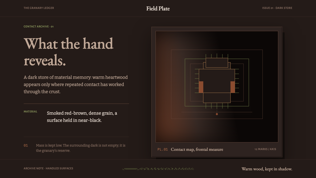 Ifugao BululTouch reveals the archive. Narra red breaks through near-black patina in a qu…
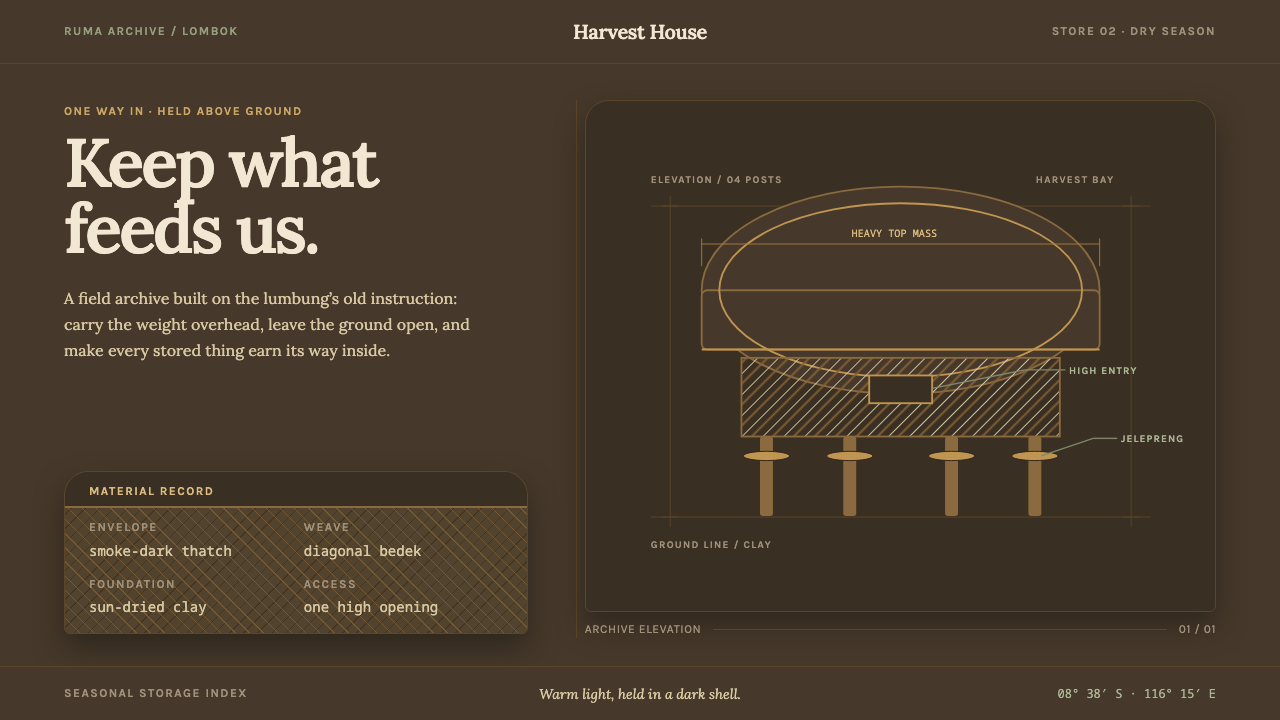 Sasak Lumbung GranaryStorage carries its weight. Smoke-dark ground, warm Lora type, and a four-pos…
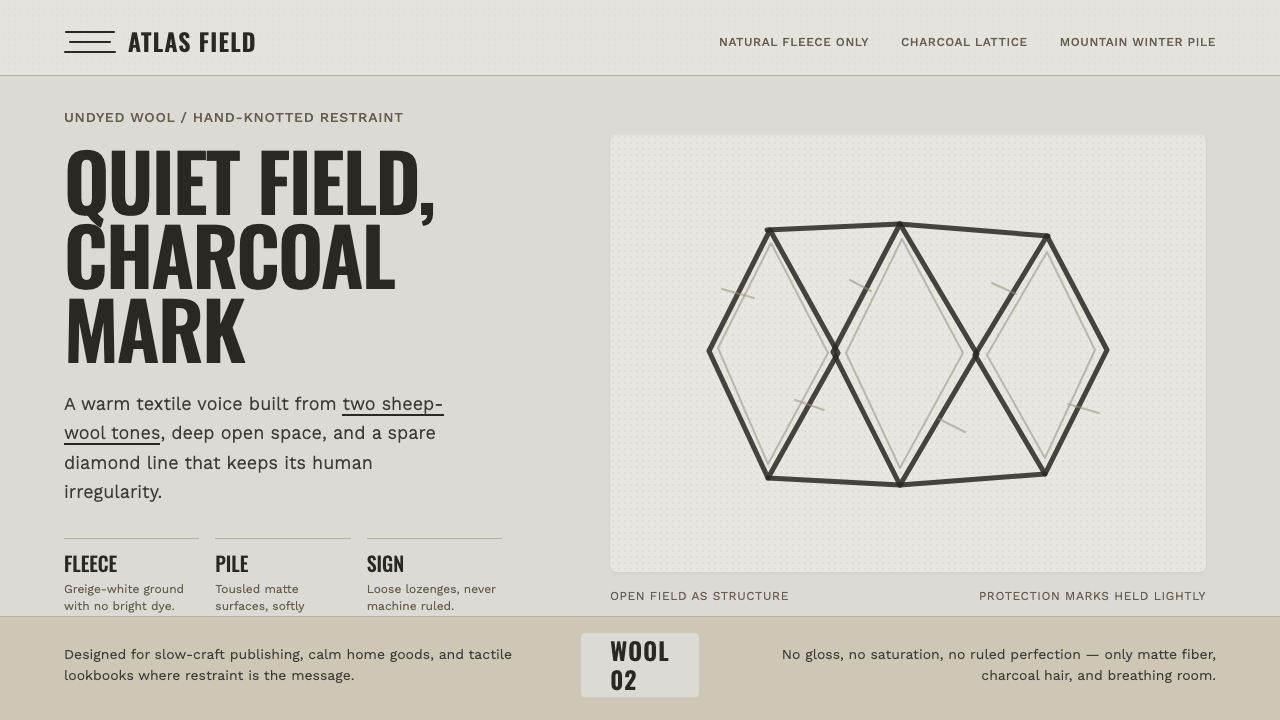 Beni Ourain Berber CarpetRestraint feels tactile. Greige wool field, Oswald type, and a loose charcoal…
 Japanese Tea CeremonyStillness has weight. Tatami straw, matcha green, and Mincho type leave room…
 Shinto Shide Paper StreamerQuiet becomes sacred. Shadowed washi hangs from a straw-gold line, marked onc…
 Somali AqalA house made to move. Sun-dried mat fields yield once to a bark-red, black en…