What is Bamboo Grove?
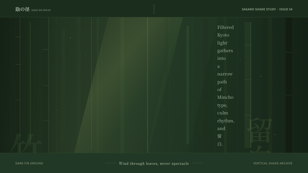
Bamboo Grove captures the specific, unrepeatable atmosphere of Arashiyama's Sagano path — not the bright postcard version, but the dim, green-saturated corridor of towering culms where filtered light barely reaches the forest floor and silence feels architectural.
Bamboo Grove in brief
Bamboo Grove is a dark, nature-derived Japanese design system rooted in the visual experience of Kyoto's Arashiyama district — specifically the Sagano bamboo forest, a centuries-old cultivated grove where the canopy is so dense that daylight arrives as scattered, dappled fragments rather than direct illumination. The system takes that experience as its organizing principle: a deep fir-green ground, vertical compositional rhythm, and the deliberate negative space of 留白 (ma, the Japanese concept of meaningful emptiness).
Where many Japanese-inspired design systems lean toward the refined minimalism of Zen garden raked gravel or the warm neutrals of washi paper, Bamboo Grove commits to darkness. The ground is not ink-black but the particular greenish dark of forest shadow — a color that reads as depth rather than void. Against it, lighter greens and warm amber glows punctuate the space like god-rays through a canopy, and Mincho-style serif letterforms carry the verticality and historical resonance of classical Japanese typography.
The core aesthetic values are restraint, verticality, and quiet. Every compositional choice favors the tall over the wide, the implied over the stated, and the held breath over the exclamation. It is a style rooted in place — not a generalized 'Japanese aesthetic' but the particular mood of standing inside a specific grove on a specific kind of overcast morning.
Where does Bamboo Grove come from?
The Sagano bamboo grove at Arashiyama, on the western edge of Kyoto, has been cultivated for centuries. Unlike the dramatic planted forests of the Japanese Alps, this grove was shaped by temple gardeners and court aesthetes who understood bamboo not primarily as a timber resource but as a living architectural material — its culms providing vertical rhythm, its canopy providing filtered enclosure, its rustling providing acoustic texture. The area's association with Zen Buddhism and classical Japanese poetry gave it a cultural weight that outlasted individual dynasties.
Arashiyama became a retreat destination for the Heian court aristocracy during the tenth and eleventh centuries, when the aesthetic movement known as mono no aware — the bittersweet sensitivity to impermanence, associated with autumn leaves, fading light, and the particular sadness of beauty that does not last — was being codified in literature. The bamboo grove absorbed this sensibility. Bamboo itself is paradoxically suited to mono no aware: it is evergreen and seemingly permanent, yet individual culms cycle through growth, maturity, and death within a few years, and the whole grove sways and sounds with every shift of wind, never quite still.
The concept of ma (間), roughly translated as negative space, pause, or interval, is fundamental to classical Japanese arts from ikebana flower arrangement to noh theater to garden design. In the bamboo grove, ma is not abstract — it is the actual space between culms, the gap of sky visible through the canopy, the silence between gusts of wind. The Bamboo Grove design system translates this into screen-based composition: generous empty areas that are not wasted space but structural breathing room that gives each element its weight.
Wabi-sabi, the Japanese aesthetic of finding beauty in imperfection and transience, informs the system's texture choices. The dappled gradients that suggest light filtered through leaves are not precise or geometric — they are irregular, variable, and slightly unpredictable, evoking the irreproducibility of natural light. This stands in contrast to Western design traditions where gradients tend toward smooth, mathematical transitions; the Bamboo Grove approach treats uneven distribution of light as a feature, not a flaw.
What defines the Bamboo Grove look?
Ground and Palette
The ground is a deep, desaturated green — not the vivid green of a sunlit leaf but the shadowed, almost neutral green that exists at the base of a dense forest. Against this dark field, lighter greens emerge in stepped tones suggesting the canopy at varying distances, while warm amber or gold accents evoke the scattered shafts of light that occasionally break through. The overall palette is cool-dominant but not cold — the underlying green warmth prevents the composition from reading as wintry or sterile.
Verticality and Rhythm
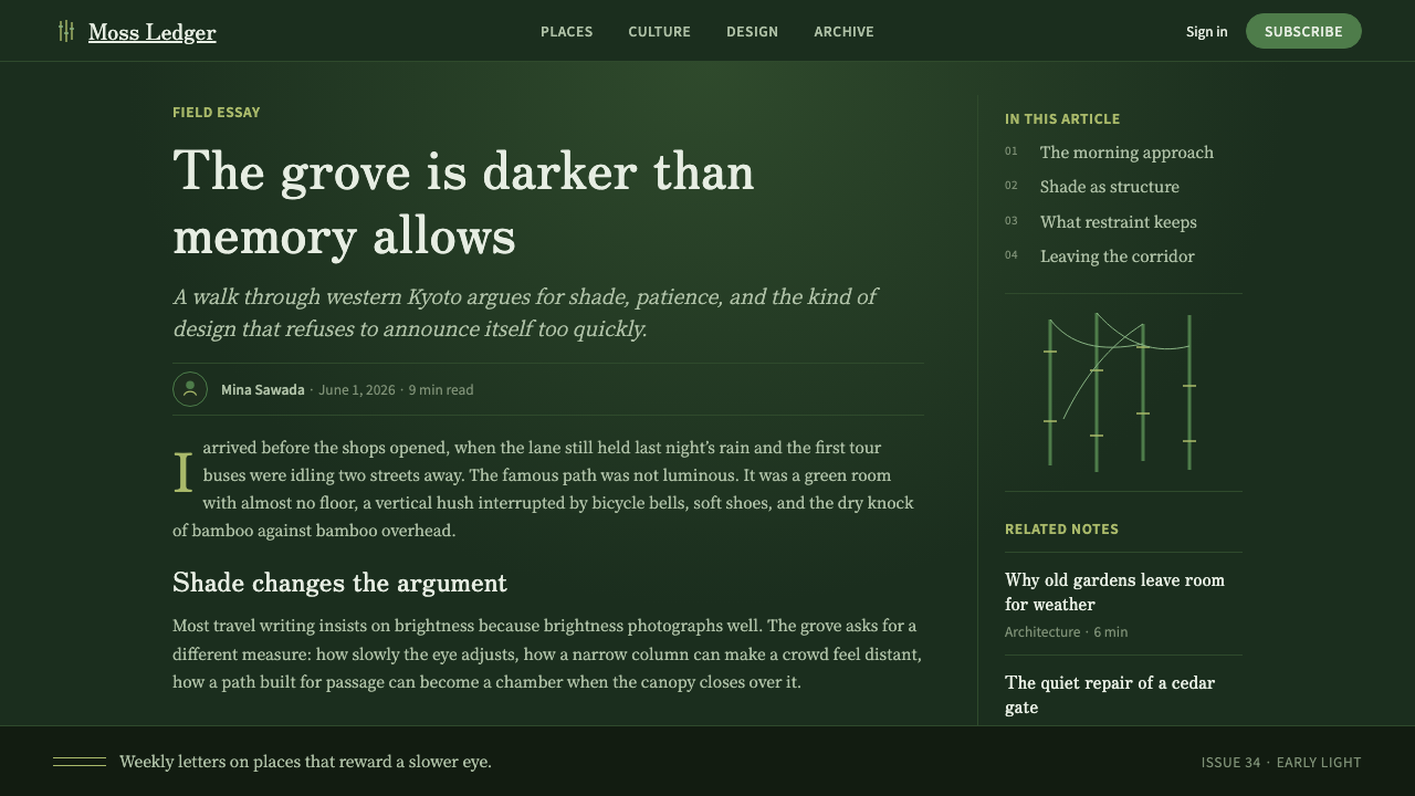
The dominant compositional axis is vertical. Structural dividers, type columns, decorative rules, and even negative-space gaps all tend to orient along the vertical plane — echoing the culms of bamboo that define the grove experience. This verticality is not stiff or regimented; it is rhythmic, like the irregular spacing of stems in a natural grove where no two culms are precisely equidistant. The system uses subtle variations in vertical spacing to create a breathing, organic feel rather than a mechanical grid.
Typography
Mincho-style typefaces — the Japanese serif tradition characterized by fine horizontal strokes, thick verticals, and bracketed terminals derived from ink brush calligraphy — are the typographic anchor. Mincho carries both historical weight and spatial efficiency: the structure of its letterforms aligns naturally with vertical text setting, and its ink-brush heritage gives it an organic quality that pure geometric sans-serif faces cannot replicate. Headlines lean tall and light; body text is set at generous line-height to allow each character room to breathe, mirroring the spacing of culms in the grove.
Dappled Light and Texture
The system's most distinctive surface quality is the dappled light effect — soft, irregular gradients that suggest light filtered through moving leaves rather than emanating from a defined source. These gradients are not smooth transitions between two endpoints but variable pools of warmth that shift in intensity across a darker field. Subtle textural overlays — suggesting the micro-roughness of bamboo culm surfaces or the soft grain of weathered wood — add tactility without competing with content. The overall effect is atmospheric rather than graphic.
Ma — Negative Space
Negative space in Bamboo Grove is not the absence of content but an active structural element. Wide margins, tall inter-section gaps, and unhurried spacing between typographic elements are all expressions of ma — the pause that gives meaning to what precedes and follows it. Unlike minimalism, which often treats whitespace as a signal of luxury or restraint, the bamboo grove tradition treats emptiness as the medium through which atmosphere is conveyed: what you cannot see defines the weight of what you can.
Restraint and Quietude
Bamboo Grove resists spectacle. There are no bold primary colors fighting for attention, no aggressive typographic scale contrasts, no decorative flourishes competing for eye time. The visual experience is cumulative — each element adds to a total atmospheric impression rather than announcing itself individually. This restraint extends to motion: where animation exists, it moves slowly, breathes rather than rushes, and always resolves to stillness. The style is suited to experiences where the user needs to settle rather than be activated.
Culm Lines as Structure
Fine vertical hairlines — echoing the segmented joints of bamboo culms — serve as subtle structural dividers throughout the system. These are not bold rules but whisper-thin strokes that create rhythm without asserting hierarchy. At intervals, a slightly heavier line marks a section boundary, analogous to the node between bamboo internodes where growth has been consolidated. This layered use of line weight creates a visual score that the eye can follow without being directed.
Who shaped Bamboo Grove?
The Sagano grove's aesthetic character was shaped not by a single designer but by generations of temple gardeners working primarily at Tenryu-ji and the surrounding Rinzai Zen compounds. These gardeners understood bamboo cultivation as an aesthetic and spiritual discipline — managing culm density, clearing competing undergrowth, and allowing the grove to frame specific views. Their decisions over centuries are the design decisions that Bamboo Grove as a visual system translates into screen-based work.
The aesthetics that suffuse the Bamboo Grove system — mono no aware (the pathos of impermanence), yugen (mysterious depth), and the compositional use of natural imagery — were articulated and refined by Heian-period writers including Murasaki Shikibu, author of The Tale of Genji, and the court poets of the Kokinshū anthology. Arashiyama appears repeatedly in classical verse as a site of beauty tinged with melancholy, and this association — beauty that is inseparable from transience — is the emotional register the design system inherits.
Wabi-sabi — the Japanese aesthetic of imperfection, incompleteness, and transience — is not associated with a single figure but with a centuries-long tradition that includes the tea master Sen no Rikyu (1522–1591), who defined the austere, irregular beauty of the tea ceremony aesthetic, and later practitioners who refined wabi-sabi as a counterpoint to perfected, symmetrical form. Bamboo Grove's tolerance for irregular light distribution, slightly unpredictable texture, and surfaces that read as aged rather than pristine is a direct expression of this tradition.
The Rinzai Zen tradition, headquartered at temples including Tenryu-ji and Daitoku-ji in Kyoto, developed the aesthetic principles of ma (interval), kanso (simplicity), and seijaku (stillness and serenity) that underpin the Bamboo Grove system. Zen garden design — with its careful manipulation of empty space, asymmetric composition, and the use of borrowed scenery (shakkei) to extend the designed space into the natural landscape — is a direct ancestor of the compositional logic the system employs.
The mid-twentieth century saw Japanese graphic designers including Kenya Hara and, earlier, Ikko Tanaka translate traditional Japanese spatial principles into modernist print and screen design. Hara's concept of 'emptiness' as a design medium — developed in his work for Muji and articulated in his book Designing Design — is a contemporary bridge between the classical Japanese aesthetic of ma and the demands of contemporary digital interfaces. Bamboo Grove draws on this lineage: it is not a historical costume but a living design tradition applied to contemporary screen contexts.
How do you use Bamboo Grove today?
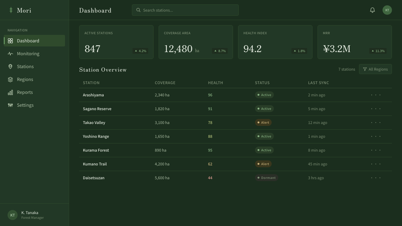
Bamboo Grove is best understood as an atmospheric system rather than a structural one. Its primary gift is mood — the sense of being in a specific, quiet place — and the most effective applications are those where establishing and sustaining that atmosphere serves the product's purpose. This means it works well for long-form content experiences, meditation or wellness applications, portfolio sites, and cultural or editorial platforms, but fits awkwardly with high-urgency interfaces like real-time dashboards or e-commerce checkout flows where speed and activation take precedence over contemplation.
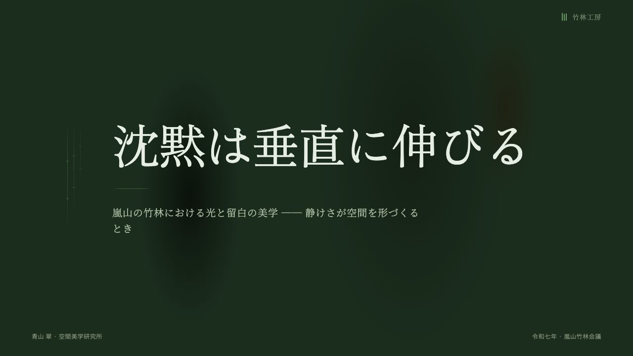
For presentation slides, the system rewards restraint in content density. Cover slides benefit from a single strong vertical composition: a tall, narrow image or textural zone on one side, the title in Mincho-type on the other, with generous margins on all sides letting the deep green ground breathe. Content slides should carry one idea per slide — not one slide per bullet point, but genuinely one thought per frame. Data slides are where the system most requires careful judgment: bamboo grove is not naturally suited to bar charts and dense tables; instead, favor large typographic callouts for key figures, with supporting data in smaller, understated text below.
For web interfaces, the system is most at home in reading-centered layouts: long-form articles, digital publications, documentation sites, or cultural institution websites where the user is expected to settle and read rather than scan and act. Apply the vertical rhythm consistently: column widths should feel tall and narrow rather than wide and horizontal. Navigation should be minimal and text-based, disappearing as the user scrolls into content rather than anchoring persistently at top. For interactive elements — buttons, links, form fields — warm amber or pale green accents on the dark ground provide affordance without breaking the atmospheric spell.
For editorial and marketing contexts, Bamboo Grove suits brand identities or campaigns for products associated with quality, contemplation, handcrafted care, or cultural depth: high-end tea brands, architectural practices, cultural institutions, or wellness products that position themselves as alternatives to urgency and noise. Marketing materials should lean into the system's poster-like vertical compositions — tall, unhurried, with text placed to guide the eye downward through the frame the way a gaze travels down a corridor of bamboo. Avoid wide horizontal banners and busy grid layouts; the style collapses when it is forced to cover too much ground.
The most common mistake when applying Bamboo Grove is importing brightness. Designers conditioned to see dark backgrounds as problematic — because they reduce accessibility contrast ratios when handled carelessly, or because they violate the default associations of digital surfaces — often add light elements to 'balance' the composition. The result breaks the atmospheric logic. This system requires committing to its darkness: contrasting elements should be lighter greens and warm amber within the same tonal family, not white or vibrant primaries imported from outside the palette. A related mistake is treating the style as generic 'Asian minimalism' and removing the vertical compositional axis in favor of more familiar horizontal or centered layouts — this erases the one structural feature that most directly evokes the source environment.
Bamboo Grove — FAQ
How is Bamboo Grove different from other Japanese design systems like Wabi-Sabi or Zen Minimalism?
All three draw on Japanese aesthetic philosophy, but they express very different things. Wabi-sabi centers on imperfection and age — it favors rough textures, asymmetry, and materials that show wear. Zen minimalism is typically lighter and more neutral, using near-white grounds and extreme reductive simplicity. Bamboo Grove is neither rough nor pale — it is dark, atmospheric, and specifically vertical. Its source is a particular landscape experience rather than a philosophical abstraction, and this groundedness gives it a specificity the other two lack. If wabi-sabi is about the beauty of a cracked tea bowl and Zen minimalism is about the silence of an empty room, Bamboo Grove is about the experience of standing inside a specific forest.
Does the dark ground create accessibility problems?
Not inherently — but it requires discipline. Dark backgrounds are accessible when the text placed on them meets contrast ratio requirements, which is achievable with light, warm-toned foreground type. Where Bamboo Grove creates risk is in its use of subtle tonal variations for decorative or textural elements: dappled light effects and graduated tones can reduce local contrast in ways that are difficult for some users to perceive. The practical rule is to treat all text and interactive elements as hard-contrast — light text or warm accent on dark ground — and reserve the atmospheric tonal variation for purely decorative surfaces that carry no information. Avoid placing small text on textured gradient zones.
Can Bamboo Grove work for a product that needs to feel modern or technological?
Yes, but the framing matters. The system's darkness and verticality can read as premium-modern — think of the dark interfaces adopted by high-end audio equipment brands or certain developer tools that deliberately position against the bright, chirpy defaults of consumer software. Where it struggles is in contexts that need to communicate speed, responsiveness, or forward-momentum — values the style's deliberate quietude works against. If the product's brand promise is contemplative excellence rather than reactive performance, Bamboo Grove can be technologically modern without feeling anachronistic. The key is to avoid adding tech-signaling elements — grid overlays, monospace code fonts, neon accent colors — that contradict the system's organic atmosphere.
How should Bamboo Grove handle color in data visualization?
Data visualization is the system's most challenging application because conventional chart design tends toward bright, saturated, clearly distinguishable colors — which is antithetical to Bamboo Grove's tonal restraint. The recommended approach is to treat data as another atmospheric element rather than imposing conventional chart aesthetics on the system. Use stepped greens and warm ambers as the categorical palette — enough tonal distinction to differentiate series without importing foreign colors. For emphasis, a single brighter warm accent can highlight the most important data point. Avoid conventional red-green diverging palettes; instead, use light-to-dark progressions within the system's existing green range for continuous data. The priority is maintaining atmospheric coherence over conventional chart clarity.
Is Bamboo Grove appropriate for interfaces used by Western audiences with no connection to Japanese culture?
The style is legible and effective for any audience when applied for its visual properties rather than as cultural signaling. What makes Bamboo Grove work — the dark atmospheric ground, the vertical rhythm, the breathing negative space — are properties that any user responds to at a perceptual level, regardless of whether they recognize the cultural source. The risk arises when the style is applied alongside explicit Japanese cultural symbols — cherry blossoms, kanji used as decoration, torii motifs — which can tip the system from culturally-inspired into cultural pastiche or appropriation. Used for its light, rhythm, and spatial logic alone, Bamboo Grove translates across cultural contexts without requiring the audience to decode its origins.
Related design styles
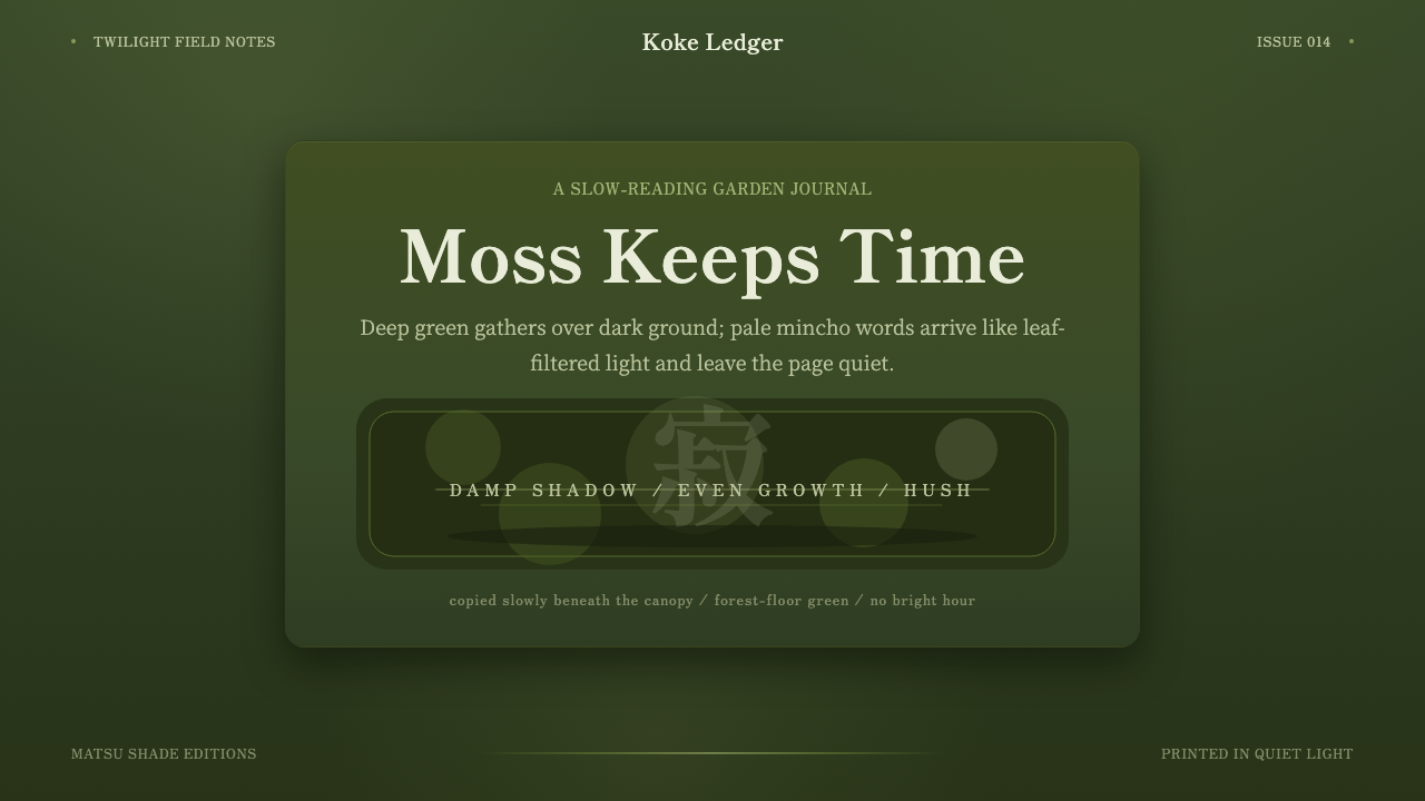 Kyoto Moss GardenStillness grows slowly. Deep moss greens, mincho serif, and dappled dark laye…
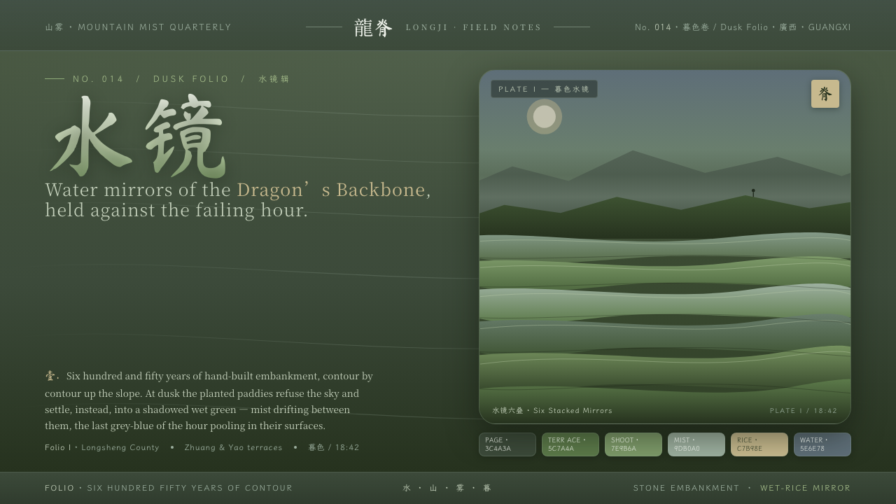 Rice TerraceRefuses the noon sky. Dusk paddy green ground, stacked water mirrors, brush c…
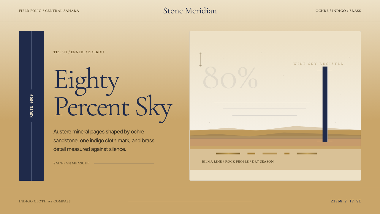 Chadian Toubou Saharan RouteRadical emptiness holds. Sandstone ochre, indigo serif, and one vertical mark…
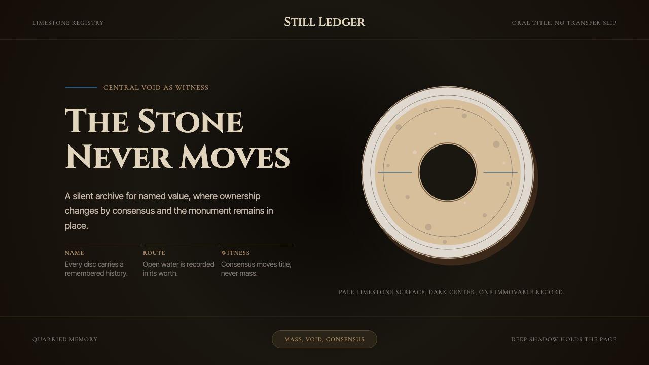 Yapese Stone Money (Micronesia)Monumental stillness. Limestone type and one circular void sit inside warm bl…
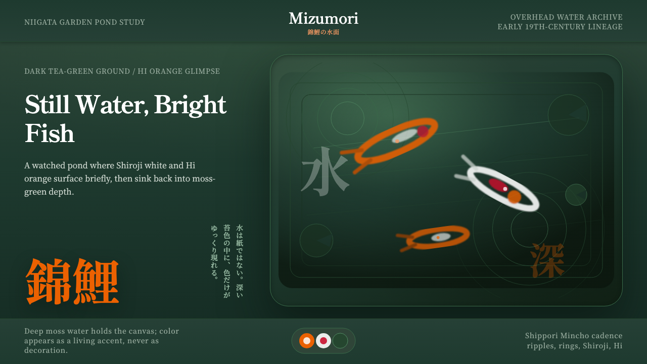 Koi PondQuiet water carries color. Moss depth, Mincho type, and orange koi flashes.
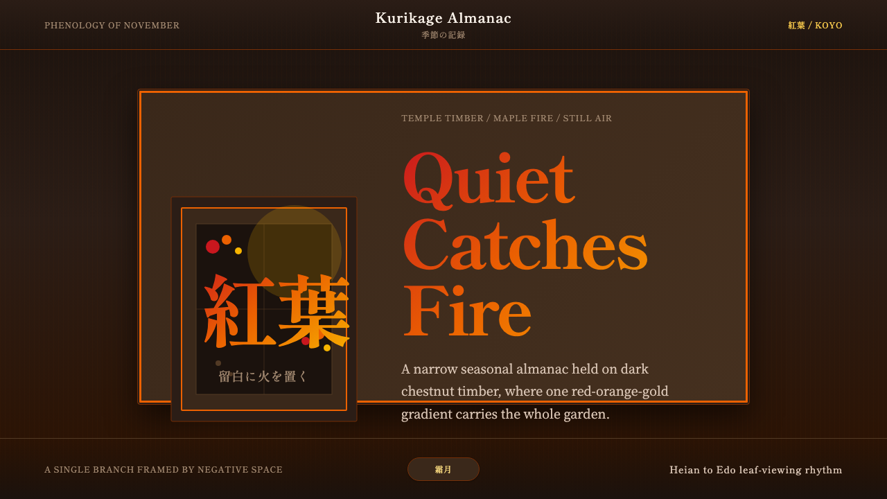 Autumn Momiji 紅葉Stillness catches fire. Momiji gradients burn against chestnut timber and wid…