About Bamboo Grove
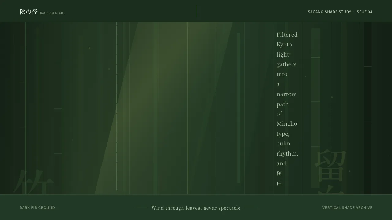
The Sagano bamboo path at Arashiyama is not the bright postcard people expect but a dim, green-saturated shade — a corridor of towering culms where filtered light never fully reaches the forest floor. This system translates that experience: a dark fir-green ground, vertical rhythm, and the deep negative space of 留白.
Mincho faces carry the period and the 竹林 mood; soft dappled gradients stand in for god-rays through the canopy. Every choice favors restraint, verticality, and quiet — wind through leaves rather than spectacle.
- Origin
- Arashiyama / Sagano, Kyoto, Japan
- Era
- pre-1900; centuries of cultivation, an enduring Kyoto landscape
- Key figures
- Kyoto temple gardeners · Sagano grove keepers
- Movements
- Japanese garden aesthetics · wabi-sabi · ma (間) negative space
Bamboo Grove design spec
Colors
Typography
The other 11 sections — buttons, cards, spacing, motion, techniques and more — open once you unlock. Download the DESIGN.md or send it to your AI in one click. Unlock once, yours forever.
Sign up nowStyles similar to Bamboo Grove
Also inspired by architecture & places, with a close feel.
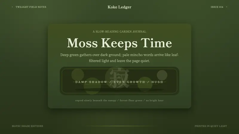 Kyoto Moss GardenStillness grows slowly. Deep moss greens, mincho serif, and dappled dark layers hush the page.
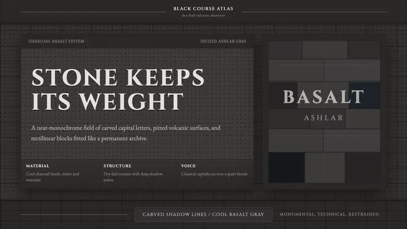 Hauran Basalt StoneMonolith refuses shine. Charcoal Cinzel capitals lock into dry-laid basalt grids.
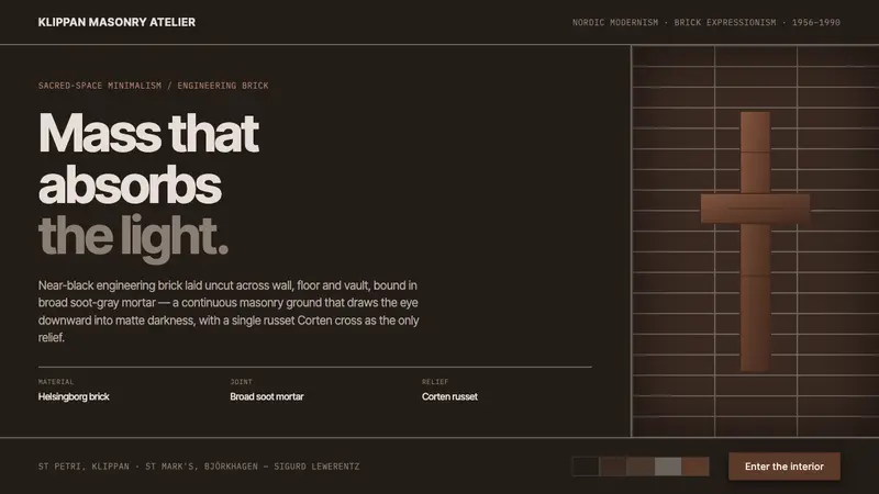 Lewerentz Dark BrickMass that absorbs light. Near-black engineering brick, broad soot mortar, one russet Corten cross.
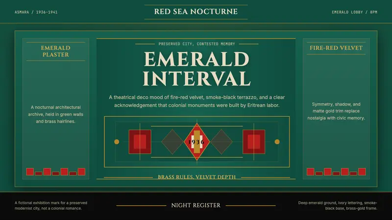 Eritrean Asmara Art Deco Cinema (1936)Nocturnal deco, critically lit. Emerald walls, fire red velvet, and brass rules hold the frame.