What is Kyoto Moss Garden?
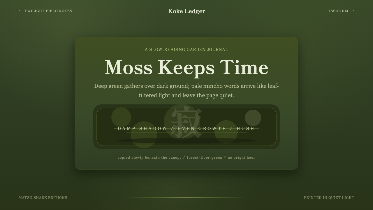
Kyoto Moss Garden takes its hush from a thousand-year-old temple ground where light falls through leaves instead of flooding a room, and asks a screen to hold that same twilight stillness.
Kyoto Moss Garden in brief
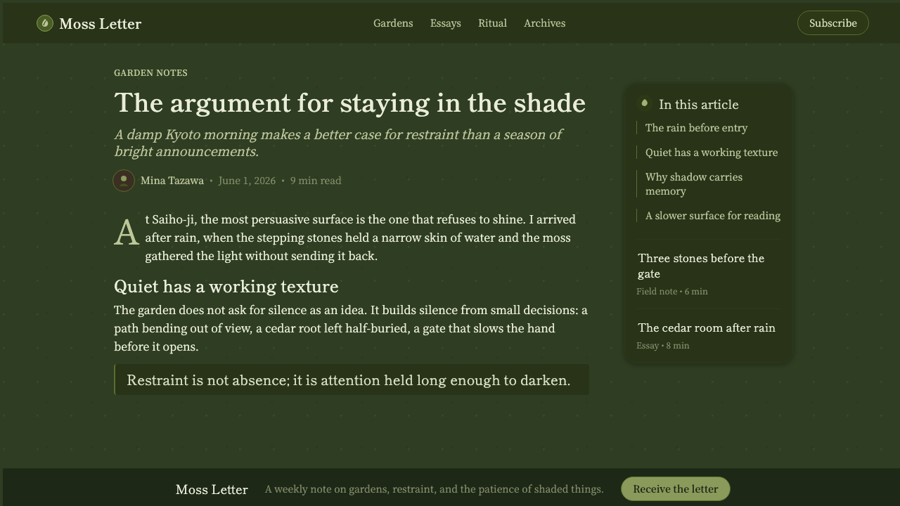
Kyoto Moss Garden is a design system built from the visual register of Saihō-ji, the Kyoto temple better known by its nickname Kokedera, the Moss Temple. The palette leans on a rich, saturated moss green sitting over a near-black forest-floor ground, with soft organic dappling standing in for the play of light through a shaded canopy. Wood tones stay muted rather than warm and golden. The overall effect is dim by design — a system that treats darkness as the resting state and lets small passages of green and warmth emerge from it the way moss catches whatever light reaches the ground.
The system is deliberately unhurried. Where many contemporary interfaces compete for attention with saturated accent colors and quick motion, this one asks for patience. Text is carried in a quiet mincho serif — the Japanese typographic tradition descended from Chinese Ming-dynasty print forms — which reads as calm and literary rather than commanding. Nothing in the system shouts; hierarchy is established through restraint and spacing rather than through loud contrast or scale jumps.
Underneath the visual choices is a governing idea borrowed directly from Japanese aesthetics: jaku, the quality of stillness or hushed quiet that appears in tea ceremony, garden design, and classical poetry alike. A system built on jaku does not perform emptiness as a fashionable minimalism; it treats quiet as the substance itself, the way silence is treated as part of the music in a slow piece rather than as the absence of it.
Where does Kyoto Moss Garden come from?
Saihō-ji sits in Matsuo, in the hills of western Kyoto, and is registered as a UNESCO World Heritage site as part of the Historic Monuments of Ancient Kyoto. Its popular name, Kokedera — literally 'Moss Temple' — refers to the roughly 120 species of moss that now blanket the grounds beneath a dense, shading canopy of maple and pine. That moss carpet was not part of the original design; it is the accumulated result of centuries of neglect and repair, flooding and regrowth, in a damp valley setting that happened to be ideal moss habitat. What reads today as a single, deliberate green tapestry is really the slow signature of time acting on a garden, part of why the site carries such weight in discussions of wabi-sabi, the aesthetic that finds beauty in transience and imperfection.
The garden's central redesign is credited to Musō Soseki, a Zen monk, poet, and garden designer of enormous influence in fourteenth-century Japan, who reworked the temple grounds around 1339. Musō was not primarily a horticulturalist in the modern sense; he was a Zen teacher who used garden design as a form of religious instruction, believing a carefully composed landscape could function the way a koan does — an object of contemplation that draws the mind toward enlightenment. His layout introduced what garden historians consider one of the earliest dry-landscape (karesansui) rock arrangements in Japan, making the temple a hinge point between older pond-strolling garden traditions and the rock-and-gravel dry gardens that would later define Zen temple design across Kyoto.
The temple's history since Musō's redesign has been anything but stable. Saihō-ji suffered repeated flood damage from the nearby river over the centuries, along with fires and periods of decline, and much of what visitors experience today — including the famous moss itself — developed gradually during the Edo period and afterward, well after Musō's original intervention. Rather than diminishing the garden's authority, this history is central to how it is understood: Saihō-ji is a living process rather than a fixed artifact, a place whose beauty is inseparable from the passage of time across it.
Because Saihō-ji draws heavy visitor interest, the temple has for decades required advance written application and a modest fee for entry, and it asks visitors to copy a sutra by brush — a practice called shakyō — before walking the garden. This entry ritual reinforces the garden's identity as a contemplative space rather than a sightseeing attraction: the moss is meant to be absorbed slowly, after the mind has already been asked to slow down.
What defines the Kyoto Moss Garden look?
Color
The palette centers on a deep, slightly desaturated moss green set against a ground so dark it reads as near-black rather than a conventional dark gray. This is not the bright, saturated green of a lawn or a tropical leaf; it is the muted, layered green of moss seen in shade, where light has already been filtered by a canopy before it reaches the surface. Warm wood and muted gold appear only sparingly, as small notes of relief rather than a competing palette, the way a single shaft of sunlight might catch one patch of a garden while the rest stays in shadow.
Typography
Text is set in a quiet mincho serif, the Japanese serif tradition whose stroke logic descends from Chinese Ming-dynasty movable type and woodblock printing. Mincho letterforms carry a literary, slightly formal calm that reads as considered rather than commercial — closer to the feeling of a printed book than a screen banner. The system avoids loud weight contrasts or oversized display type; hierarchy is built through careful spacing and modest scale steps rather than through dramatic jumps in size or boldness, which keeps the reading experience as unhurried as the rest of the system.
Darkness and Light
This is a system built around dimness as a positive quality rather than a constraint to be lit up. The governing image is light falling through leaves — filtered, patchy, and partial — rather than an evenly lit room. Bright elements are used the way a garden uses a single ray of sun: as a rare, meaningful event, not a baseline condition. Anything that would flood the composition with even brightness works against the system's intent; the goal is closer to standing beneath a dense canopy at midday than to walking into a well-lit hall.
Dappling and Texture
Surfaces carry a soft, organic mottling rather than flat, even fills — an echo of the way sunlight breaks into irregular patches on a mossy floor as it filters through moving leaves overhead. This dappling is gentle and low-contrast, never a busy pattern competing with content; it functions more like the grain of a material than a decorative texture, giving flat surfaces a sense of having been formed slowly rather than printed uniformly.
Stillness (Jaku)
The organizing principle behind pacing and hierarchy is jaku — a Japanese aesthetic term for hushed stillness that recurs across tea ceremony, garden design, and classical poetry. In practice this means generous negative space, unhurried transitions, and a reluctance to let any single element dominate through sheer visual noise. Stillness here is not an absence of content; it is treated as a quality with its own weight, the same way silence between notes is understood as structurally part of a slow piece of music rather than simply a gap.
Material Restraint
Wood tones appear muted rather than warm and honeyed, closer to aged or weathered timber seen in low light than to a bright, varnished surface. This restraint keeps the wood register consistent with the system's shaded, damp-garden atmosphere — a bright, golden wood tone would read as sunlit and cheerful in a way that breaks the twilight mood the rest of the palette is built to sustain.
Slowness as Structure
Where many systems use quick motion and sharp transitions to feel responsive, this one treats slowness itself as a structural choice, echoing the way moss develops over centuries rather than seasons. Transitions and reveals are built to feel patient and even rather than snappy, and the overall composition rewards lingering attention rather than a quick scan — a deliberate mismatch with the speed conventions of most digital interfaces, made on purpose rather than by neglect.

Who shaped Kyoto Moss Garden?
Musō Soseki was a Zen monk, poet, calligrapher, and garden designer whose fourteenth-century reworking of Saihō-ji, undertaken around 1339, is credited as the garden's foundational redesign. He treated garden-making as an extension of Zen teaching, believing a well-composed landscape could guide the mind toward stillness the way meditation practice does. His layout, which introduced an early dry-landscape rock arrangement on the hillside above the pond garden, positioned Saihō-ji as a bridge between older strolling-pond garden traditions and the rock-and-gravel Zen dry gardens that later spread across Kyoto.
Saihō-ji, the temple itself, functions as the living record of the garden's centuries of change — floods, fires, decline, and slow regrowth that produced the moss carpet visitors associate with it today. Its popular nickname, Kokedera, reflects how thoroughly the moss has come to define the site's identity, even though it developed long after Musō's original design. The temple's long-standing requirement that visitors submit a written request and copy a sutra before entering reinforces its identity as a place of practice rather than pure spectacle.
Wabi-sabi, the broader Japanese aesthetic tradition that finds beauty in transience, imperfection, and the visible passage of time, provides the philosophical frame for why a garden shaped largely by accident and decay is treated as more, not less, authoritative. Saihō-ji's moss carpet is frequently cited in wabi-sabi discussions precisely because it was never designed in the conventional sense — it accumulated, the way wabi-sabi asks viewers to find beauty in things that show the marks of age rather than things kept pristine and new.
How do you use Kyoto Moss Garden today?
Kyoto Moss Garden asks for restraint from whoever applies it, because its power comes from what it withholds rather than what it displays. Applying it well means resisting the urge to brighten it up for legibility's sake; the dimness and the dappled quiet are the point, not an obstacle to be corrected.
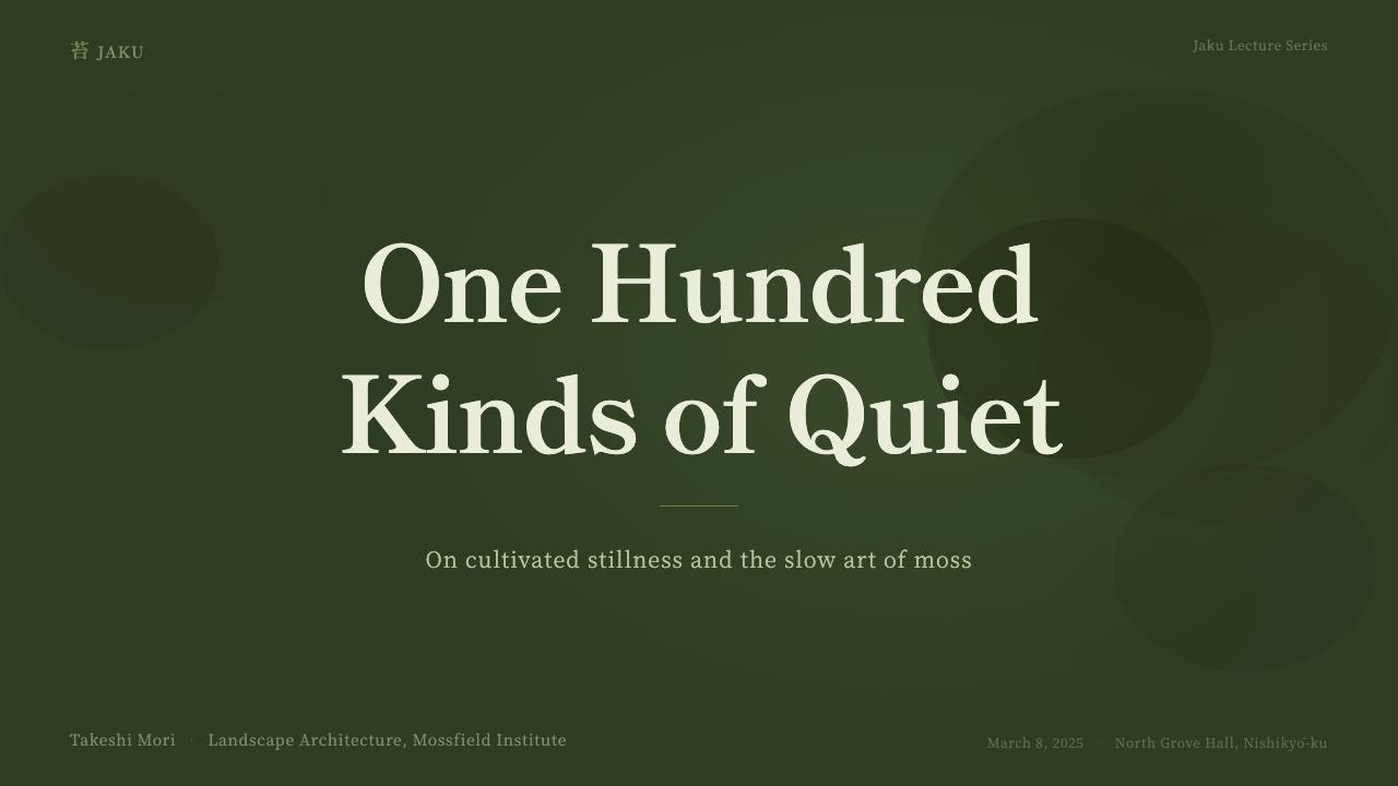
For presentation slides, this system rewards a slow build. A cover slide works best with a large expanse of the deep moss-on-dark ground and a small, quiet mincho title rather than a bold, oversized headline — the composition should feel like a single clearing glimpsed in a dense garden. Content and data slides should keep visual noise low: one muted accent per chart, dappled textures reserved for backgrounds rather than data-bearing elements, and generous space between sections so the audience is given time to settle into each idea rather than being rushed through a sequence.
For web interfaces such as dashboards and pricing pages, the system's dimness works in its favor if hierarchy is handled through spacing and subtle tonal shifts rather than bright accent colors. A dashboard in this register should let its darkest tones do most of the work, reserving moss green for a small number of meaningful states — success, active selection, a single highlighted metric — rather than scattering it across every element. Pricing pages benefit from the same discipline: the featured tier can be marked with a slightly lighter passage of moss and dappled texture rather than a loud border or badge.
For editorial and marketing contexts, the style suits long-form, contemplative content far better than urgent, high-conversion messaging. A magazine-style article or a brand story page can let paragraphs breathe inside wide margins, using the mincho serif at a comfortable reading size and reserving the dappled dark backgrounds for section breaks or full-bleed moments rather than continuous body copy, which needs enough contrast to stay legible over long reading sessions.
The most common mistake is treating this as simply 'a dark green theme' and pushing saturation or brightness up until it reads like a generic dark mode. That erases the filtered, patchy light of a damp, shaded garden and replaces it with a flat, uniformly dark surface with none of the texture or restraint the original register depends on. A second common mistake is over-brightening body text for accessibility contrast without adjusting the surrounding palette to match, which breaks the twilight mood; if brighter text is required, the surrounding dappling and ground tone should be adjusted together rather than raising only the text.
Kyoto Moss Garden — FAQ
Is Kyoto Moss Garden just a 'dark green theme,' or is there more to it?
It is considerably more specific than a generic dark-green palette. The system is built around a particular quality of filtered, dappled light seen in a shaded, damp garden — not an evenly saturated green surface. That means the dappling, the near-black rather than neutral-gray ground, the muted rather than golden wood tones, and the unhurried mincho typography are all load-bearing parts of the effect. Strip any of those out and what remains reads as a generic dark mode rather than the specific stillness the system is drawing on.
Why does the system favor mincho serif type instead of a sans-serif?
Mincho carries a literary, book-like calm that fits a system built around stillness and contemplation rather than speed or urgency. Its stroke logic, descended from Chinese Ming-dynasty print traditions, reads as considered and unhurried in a way that many contemporary sans-serifs — designed for maximum legibility at speed, on screens, at small sizes — do not. Using a sans-serif in this system would import a briskness that works against the deliberately slow pacing everything else is built around.
Can this style work in a bright, high-key interface, or does it require staying dark?
The system's identity is built specifically around dimness as a positive quality — light filtering through a canopy rather than flooding a room — so pushing it toward a bright, high-key composition removes the core idea it is drawing on. It is possible to use isolated elements, such as the mincho typography or the dappled texture treatment, in a lighter context, but at that point it stops being a faithful expression of the Kyoto Moss Garden register and becomes a more distant reference to it. If a brighter interface is the goal, this is not the right system to reach for.
Where does this style fit best, and where does it struggle?
It suits contexts that reward patience and reflection: contemplative brand stories, long-form editorial content, wellness products, cultural and heritage projects, and any dashboard whose audience values calm authority over urgency. It struggles wherever fast scanning, high-energy calls to action, or bright, cheerful consumer branding is the goal — a flash sale banner or a children's product would fight everything the system is built to convey. It also struggles wherever strict, bright-background accessibility conventions cannot be adapted, since the system depends on its darkness being read as intentional rather than as low contrast.
Related design styles
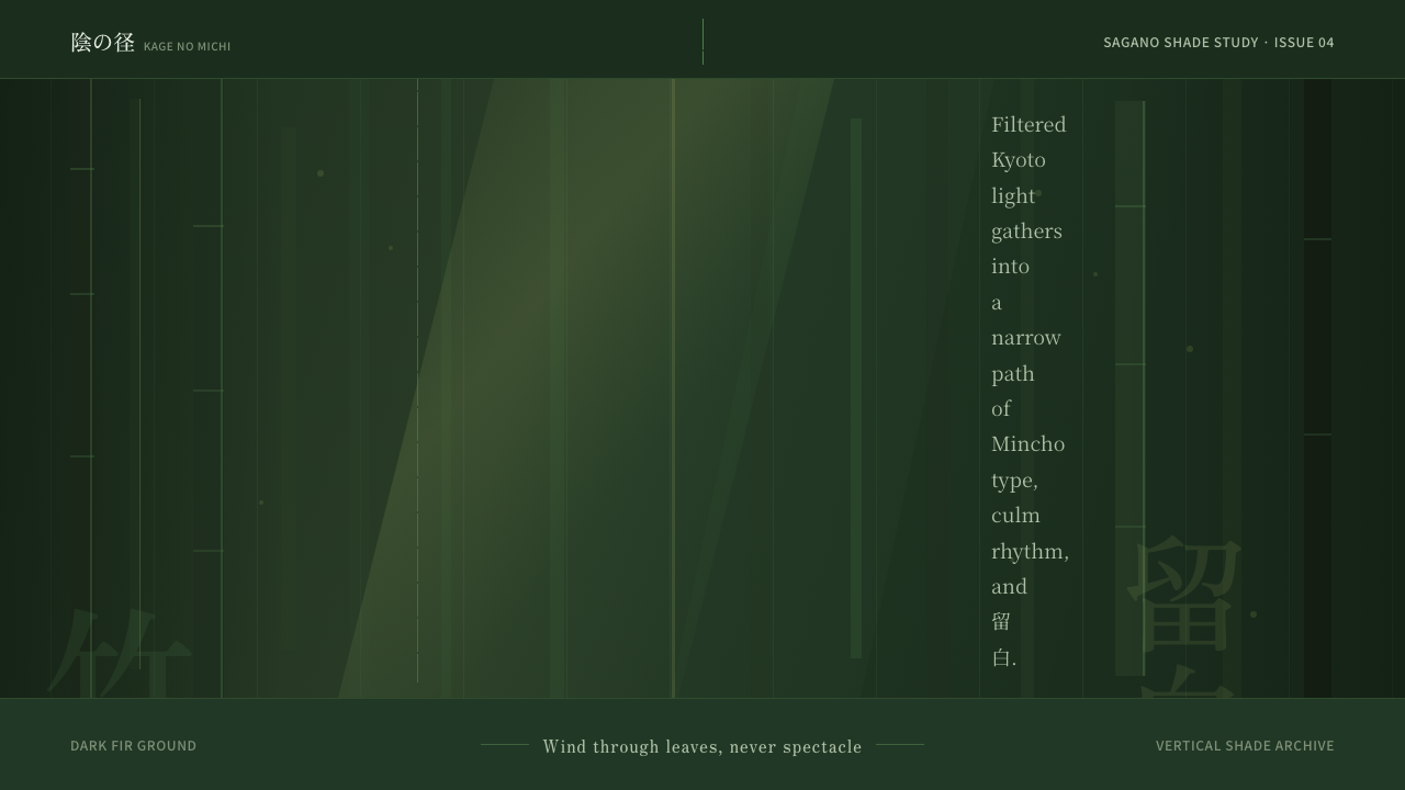 Bamboo GroveQuiet goes vertical. Fir green, Mincho type, and dappled culm rules create de…
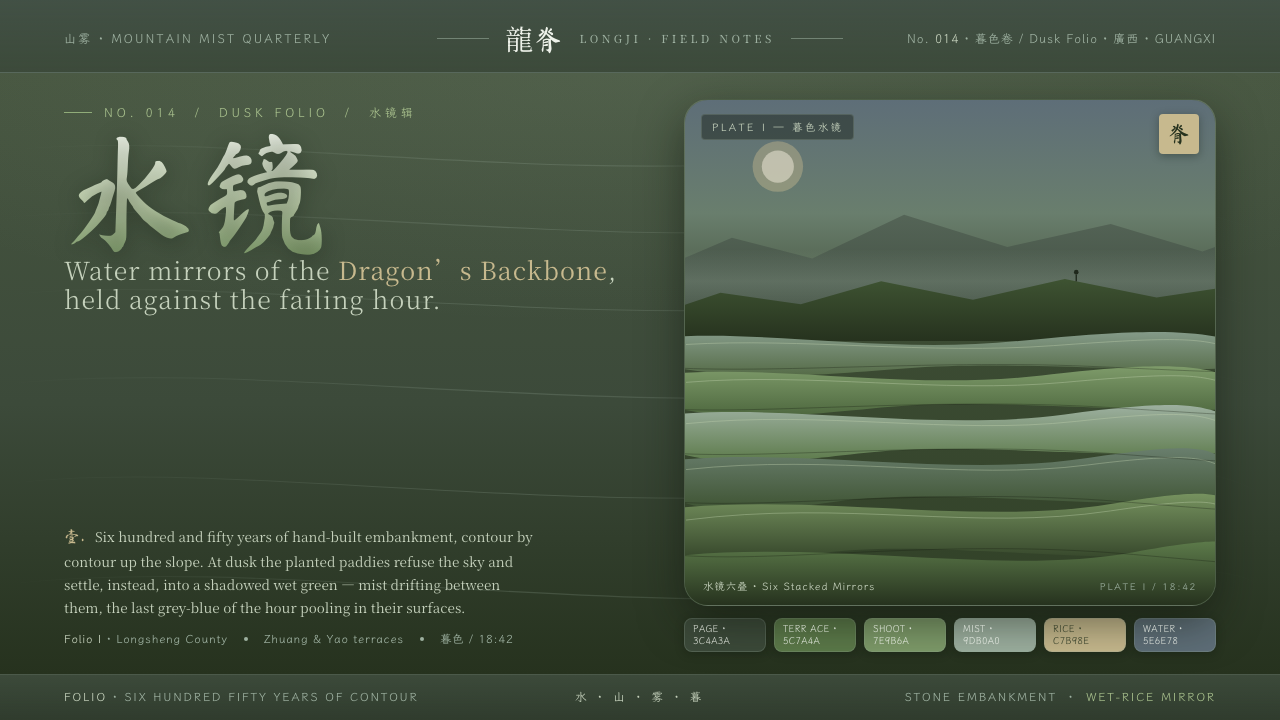 Rice TerraceRefuses the noon sky. Dusk paddy green ground, stacked water mirrors, brush c…
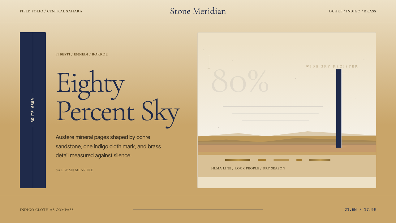 Chadian Toubou Saharan RouteRadical emptiness holds. Sandstone ochre, indigo serif, and one vertical mark…
 Yapese Stone Money (Micronesia)Monumental stillness. Limestone type and one circular void sit inside warm bl…
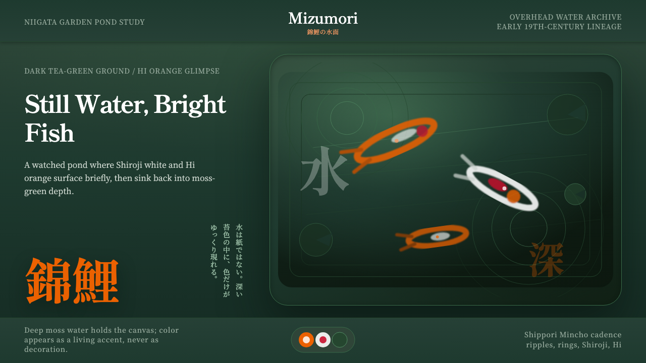 Koi PondQuiet water carries color. Moss depth, Mincho type, and orange koi flashes.
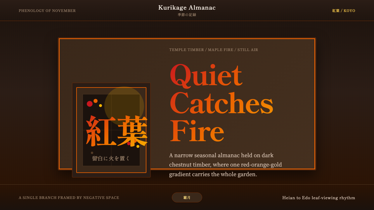 Autumn Momiji 紅葉Stillness catches fire. Momiji gradients burn against chestnut timber and wid…