What is Whistler Nocturne Tonalism?什么是 Whistler Nocturne Tonalism?
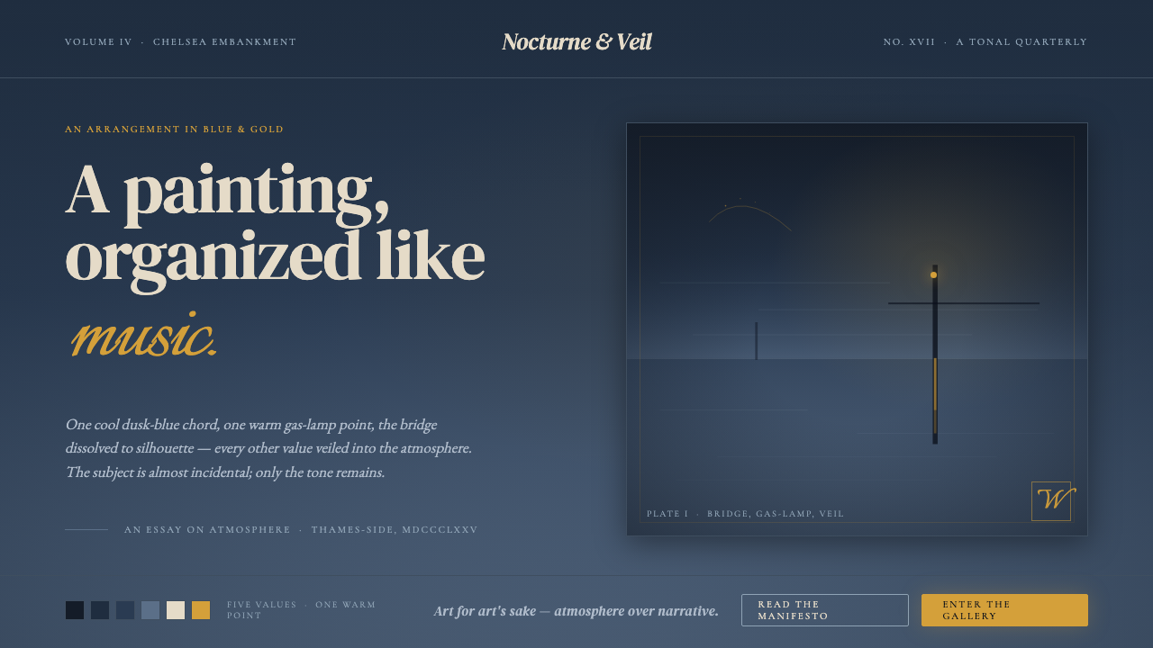
Whistler proved that a painting — and by extension any designed surface — could be organized like a musical chord: one cool tonal field, one warm point of light, and silence everywhere else.惠斯勒证明了一幅画——乃至任何被设计的平面——可以像一个音乐和弦那样被编排:一片冷调色域,一个温暖光点,其余尽是静默。
Whistler Nocturne Tonalism in briefWhistler Nocturne Tonalism 速览
Whistler Nocturne Tonalism is a visual discipline derived from the Nocturne series painted by James McNeill Whistler between roughly 1872 and 1878. Its governing principle is tonal unity: an entire composition is built from a single closely related family of values — almost always a cool dusk-blue or blue-grey — with no more than four or five distinct tones across the whole surface. Into this near-monochrome field, a single warm accent intrudes: the halo of a gas lamp, the ember-glow of a distant firework, a candle behind a curtain.惠斯勒《夜曲》调性派是一套源自詹姆斯·麦克尼尔·惠斯勒约在1872至1878年间创作的《夜曲》系列的视觉纪律。其核心原则是调性统一:整幅构图由一组紧密相关的同类色值构建——几乎总是冷调的暮蓝或蓝灰——全画面不超过四五个明确色阶。在这片近乎单色的色域中,一个温暖的强调色侵入:煤气灯的晕圈、远处烟火的余烬、帘后的烛光。
The discipline demands that subject matter be subordinate to atmosphere. Whistler famously titled his canvases after musical forms — Nocturne in Blue and Gold, Nocturne in Black and Gold — not after the bridges, barges, and fogbanks they nominally depicted. The subject is almost incidental; what the work is actually organizing is the emotional register of a particular quality of light. Negative space is not empty: it is the primary material, typically occupying sixty to eighty percent of each composition.这套纪律要求主题服从于氛围。惠斯勒著名地以音乐形式为画作命名——《蓝与金的夜曲》、《黑与金的夜曲》——而非以画面名义上描绘的桥梁、驳船和雾霭命名。主题几乎无关紧要;作品真正编排的,是某种特定光线品质的情绪频率。负空间并非虚空:它是首要的创作材料,通常占据每幅构图面积的六到八成。
Applied to contemporary design, Whistler Nocturne Tonalism becomes a system for achieving depth and atmosphere through restraint rather than complexity. Where most visual systems build richness by adding — more colors, more textures, more elements — this one builds it by subtracting until only the essential tonal relationships remain. The result reads as quiet authority: sophisticated, nocturnal, and deliberately unhurried.应用于当代设计,惠斯勒《夜曲》调性派成为一套通过克制而非复杂性来获得深度与氛围的系统。大多数视觉系统通过叠加来构建丰富感——更多色彩、更多质感、更多元素——这套系统则通过减法,直到只剩下本质的调性关系。结果呈现为一种沉静的权威:精致、夜晚性质的,故意不紧不慢。
See the Whistler Nocturne Tonalism design system查看 Whistler Nocturne Tonalism 完整设计系统
Where does Whistler Nocturne Tonalism come from?Whistler Nocturne Tonalism 从何而来?
James McNeill Whistler was an American-born painter who spent most of his working life in London and Paris. By the late 1860s he had absorbed the influence of Japanese woodblock prints — their flat color fields, radical cropping, and compositional emptiness — and was applying these principles to the Thames at dusk. The Nocturne series emerged from nightly observations of Battersea Bridge, Chelsea Embankment, and the working river, made at the hour when industrial London dissolved into atmosphere and the gas lamps began to compete with the failing light.詹姆斯·麦克尼尔·惠斯勒是一位出生于美国的画家,职业生涯的大部分时间在伦敦和巴黎度过。1860年代末,他已充分吸收了日本木版画的影响——其平涂色域、激进的裁切方式与构图上的空旷——并将这些原则应用于黄昏中的泰晤士河。《夜曲》系列正是从每晚对巴特西桥、切尔西河堤和运转中的河流的观察中生长出来的,那个时刻,工业伦敦在大气中消融,煤气灯开始与衰竭的天光竞争。
The word 'nocturne' was suggested to Whistler by his patron Frederick Leyland, a Liverpool shipping magnate with musical interests. Whistler adopted it immediately and gratefully: it made explicit what he had been attempting all along, which was to treat painting as an art of pure sensation rather than representation or narrative. In a letter of 1878 he wrote that he sought 'an arrangement of line, form and colour first — the subject being of secondary importance.' This was a radical statement in an era when Victorian painting was still largely governed by anecdote, moral instruction, and literal description.「夜曲」这个词是惠斯勒的赞助人弗雷德里克·利兰——一位来自利物浦、对音乐抱有浓厚兴趣的航运大亨——向他建议的。惠斯勒立刻欣然采纳:这个词让他一直以来的追求变得一目了然,即把绘画作为纯粹感官的艺术,而非再现或叙事的艺术。1878年的一封信中他写道,他寻求的是「首先是线条、形态与色彩的安排——主题是次要的」。在维多利亚绘画仍大体受轶事、道德训诫与字面描述支配的时代,这是一个激进的宣言。
The movement existed within the broader Aestheticism that flourished in London through the 1870s and 1880s — the circle around Oscar Wilde, Algernon Swinburne, and Dante Gabriel Rossetti that held 'art for art's sake' as its creed. Whistler was its most technically rigorous practitioner. He was also deeply influenced by Japonisme, the European fascination with Japanese visual culture that had intensified after Japan's forced opening to Western trade in the 1850s. Japanese woodblocks taught him that vast areas of un-worked surface could carry more visual weight than a densely painted one, and that a single acute diagonal could organize an entire composition.这一运动存在于1870至80年代在伦敦盛开的更广泛的唯美主义运动之中——以奥斯卡·王尔德、阿尔杰农·斯温伯恩和但丁·加布里埃尔·罗塞蒂为核心的圈子,奉「为艺术而艺术」为信条。惠斯勒是其中技术上最严谨的实践者。他还深受日本主义(Japonisme)的影响——这场欧洲对日本视觉文化的迷恋,在1850年代日本被迫向西方开放贸易后愈发强烈。日本木版画让他明白,大片未经描绘的表面可以承载比密集绘制的画面更大的视觉重量,而一条单一的锐利对角线足以组织整幅构图。
The movement's defining crisis was the libel trial of 1878. The critic John Ruskin, reviewing Nocturne in Black and Gold: The Falling Rocket at the Grosvenor Gallery, accused Whistler of 'flinging a pot of paint in the public's face' and implied that two hundred guineas was an outrageous price for what amounted to an unfinished sketch. Whistler sued for libel and won — but was awarded only a farthing in damages and was ruined by the legal costs. He was forced into bankruptcy and sold his Chelsea house. The trial, however, made the Nocturnes internationally famous and crystallized the argument about what a painting was for: sensation and arrangement, or description and moral instruction. Whistler won the argument even as he lost the financial war. The tonal discipline he established went on to influence the American Tonalist movement of the 1890s and 1900s, and its visual logic — one chord, one accent, vast silence — has proven durably applicable in every subsequent medium from poster design to digital interface.这一运动的决定性危机是1878年的诽谤官司。批评家约翰·罗斯金在评论格罗夫纳画廊展出的《黑与金的夜曲:坠落的烟火》时,指责惠斯勒「将一罐颜料扔进了公众的脸」,并暗示以两百几尼购买这幅近乎未完成的草图实属荒唐。惠斯勒以诽谤罪起诉并获胜——但赔偿金仅为一个法寻,诉讼费却将他拖入破产,他不得不出售切尔西的房子。然而,这场官司使《夜曲》系列在国际上声名大噪,也将关于绘画意义的争论推向焦点:究竟是感官与安排,还是描述与道德训诫。惠斯勒赢得了论辩,即便输掉了经济战。他所建立的调性纪律继续影响了1890至1900年代的美国调性派运动,而其视觉逻辑——一个和弦、一个强调色、广袤的静默——在此后的每一种媒介中都被证明持久适用,从海报设计到数字界面,莫不如此。
What defines the Whistler Nocturne Tonalism look?Whistler Nocturne Tonalism 的视觉特征是什么?
The Single Tonal Chord单一调性和弦
The entire ground of a Whistler Nocturne composition belongs to one family of closely related tones — typically a cool blue-grey or deep dusk-blue that ranges from near-black at its darkest to a pale, misted mid-value at its lightest. These tones share the same underlying hue and differ only in value and the degree of atmospheric softening. The discipline is to hold this chord absolutely: no competing hue enters the background, no warm neutral compromises the cool unity.惠斯勒《夜曲》构图的整片底色属于一个紧密相关的同类调性家族——通常是冷调的蓝灰或深暮蓝,从最深处接近黑色,到最亮处化为淡薄、雾气弥漫的中间色值。这些色调共享同一底色,仅在明度和大气柔化程度上有所差异。纪律在于绝对守住这个和弦:没有竞争性的色相进入背景,没有暖中性色破坏冷调的统一。
The Single Warm Accent单一暖色强调
Against the cool ground, exactly one warm note is permitted: the amber halo of a gas lamp, the golden reflection dragged across still water, the orange-white burst of a distant firework. This accent is small — it may occupy only a fraction of the total surface — but because it is the only warm element in a field of cool, it carries disproportionate visual weight. In design application, this translates to one golden, amber, or warm cream element used as the focal point within an otherwise cool-toned composition.在冷调底色的衬托下,仅允许一个暖色音符存在:煤气灯的琥珀晕圈、拖曳在静水上的金色倒影、远处烟火的橙白爆裂。这个强调色体量极小——可能只占总面积的极小部分——但因为它是一片冷域中唯一的暖元素,所以承载着与其面积不成比例的视觉重量。应用于设计,这意味着在一个整体偏冷的构图中,以一个金色、琥珀色或暖奶油色元素作为焦点。
Atmospheric Dissolution大气消融
Edges in a Whistler Nocturne are not edges in the conventional sense. Forms — a bridge, a barge, a treeline — emerge from the tonal ground and dissolve back into it. Transitions are soft and graded rather than hard and decisive. This atmospheric quality is achieved by keeping the value difference between figure and ground small enough that the eye reads them as belonging to the same world rather than as a figure placed against a background. In design, this technique manifests as intentionally softened transitions between sections, elements that share the ground value rather than contrasting sharply with it, and a general avoidance of hard outlines.惠斯勒《夜曲》中的边缘并非传统意义上的边缘。形体——桥梁、驳船、树线——从调性底色中浮现,又消融回其中。过渡是柔和渐进的,而非硬朗决断的。这种大气品质通过保持图形与底色之间足够小的明度差来实现,使眼睛将它们解读为同属一个世界,而非将图形置于背景之上。在设计中,这一技法体现为:各部分之间刻意柔化的过渡,与底色共享色值而非与之形成强烈对比的元素,以及对硬轮廓线的整体回避。
Dominant Negative Space主导性负空间
The most structurally important feature of the Nocturne system is what it chooses not to fill. Negative space — the misted mid-tone field of sky, water, and fog — typically occupies more than half and often two-thirds or more of the total composition. This is not emptiness but active material: it creates the silence that makes the warm accent audible, and it establishes the mood of contemplative stillness that defines the style. Overcrowding — adding elements to reduce the sense of emptiness — is the most common failure mode when applying this approach.《夜曲》系统在结构上最重要的特征,是它选择不填充的部分。负空间——天空、水面和雾霭的雾质中调色域——通常占据总构图面积的一半以上,往往达到三分之二甚至更多。这不是虚空,而是主动的材料:它制造了让暖色强调得以被「听见」的静默,也奠定了定义这种风格的沉思静止的情绪。过度填充——为减少空旷感而添加元素——是应用这一方法时最常见的失败模式。
Value Compression色值压缩
The entire tonal range of a Nocturne composition is compressed into the middle and lower values — darks and mid-tones, with almost no pure white or near-white anywhere in the composition except in the immediate halo of the warm accent. This compression is what gives the style its characteristic nocturnal weight and depth. Expanding the range toward bright whites or introducing high-key areas immediately breaks the mood, because it implies daylight or artificial floodlighting rather than the specific quality of dusk transitioning into night.《夜曲》构图的全部调性范围被压缩在中低色值区间——暗调与中调,整幅画几乎没有纯白或接近白色的区域,除了暖色强调点的直接晕圈。这种压缩正是赋予这种风格其特有的夜晚质感与深度的原因。将色值范围向明亮的白色扩展,或引入高调区域,会立即打破情绪,因为这暗示着日光或人工泛光灯,而非黄昏向夜晚过渡的那种特定光线品质。
The Butterfly Signature and Compositional Asymmetry蝴蝶花押与构图不对称
Whistler replaced his conventional artist's signature with a butterfly monogram — a design that evolved over the years and was placed with deliberate compositional intent, typically in a lower corner, acting as a final visual anchor rather than merely an attribution. This detail reflects the broader compositional logic of the style: asymmetric placement, considered negative space, and the treatment of functional elements as integral parts of the visual composition rather than afterthoughts. In design application, this means that credits, labels, and navigational elements are positioned with the same tonal and spatial care as primary content.惠斯勒以蝴蝶花押取代了惯常的艺术家签名——这个图案历经多年演变,被以审慎的构图意图置于画面中,通常在某个下角,作为最终的视觉锚点,而不仅仅是归属标注。这一细节反映了这种风格更广泛的构图逻辑:不对称的布置,经过考量的负空间,以及将功能性元素作为视觉构图不可分割的部分而非事后补充来处理。在设计应用中,这意味着署名、标签和导航元素的定位与主要内容享有同等的调性与空间关怀。
Musicality and Mood as Primary Goal音乐性与情绪作为首要目标
More than any other historical style, Whistler Nocturne Tonalism subordinates all visual decisions to a single overriding aim: the creation of a sustained emotional mood. Color, tone, composition, and detail are chosen not for their individual merits but for their contribution to the overall sensory register — the feeling of standing at the waterfront after dark, of ambient sound muffled by fog, of time suspended. This makes it unusual as a design system: the question is not 'does this element communicate clearly?' but 'does this element contribute to or disturb the chord?'在所有历史风格中,惠斯勒《夜曲》调性派最彻底地将全部视觉决策从属于一个单一的压倒性目标:营造一种持续的情绪氛围。色彩、调性、构图与细节的选择,不是因为各自的个别优点,而是因为它们对整体感官频率的贡献——站在入夜后的河边、雾气压低环境声响、时间静止悬停的感觉。这使它在设计系统中独树一帜:问题不是「这个元素是否传达清晰?」而是「这个元素是增益了还是干扰了这个和弦?」
See the Whistler Nocturne Tonalism design system查看 Whistler Nocturne Tonalism 完整设计系统
Who shaped Whistler Nocturne Tonalism?谁塑造了 Whistler Nocturne Tonalism?
Whistler (1834–1903) trained in Paris before settling in London, where he became simultaneously one of the most celebrated and most controversial painters of the Victorian era. His rejection of literary and moral content in painting — articulated most forcefully in his Ten O'Clock Lecture of 1885 — placed him in direct conflict with the dominant critical establishment, personified by Ruskin. Despite the bankruptcy that followed the 1878 trial, Whistler's reputation steadily grew; his Venice etchings and pastels, made during a financially motivated stay of 1879–1880, extended the Nocturne aesthetic into printmaking and became some of the most influential works of the late nineteenth century.惠斯勒(1834—1903年)在巴黎接受训练后定居伦敦,成为维多利亚时代最著名也最具争议的画家之一。他在1885年的《十点钟讲座》中最有力地阐述了对绘画中文学与道德内容的拒绝,由此与以罗斯金为代表的主流批评机构直接冲突。尽管1878年官司引发的破产使其一度困顿,惠斯勒的声誉仍持续增长;他在1879至1880年出于经济动机旅居威尼斯期间创作的铜版画与粉彩画,将《夜曲》美学延伸至版画领域,成为十九世纪末最具影响力的作品之列。
Ruskin (1819–1900) was the most influential art critic in Victorian Britain, whose multi-volume Modern Painters established the interpretive framework through which most educated Victorians understood landscape and painting. His attack on Whistler's Falling Rocket was not merely a personal dispute but a clash of two incompatible theories of art: Ruskin's conviction that painting must engage with the moral and natural world, and Whistler's that it need answer only to sensation and formal arrangement. The trial's outcome — a pyrrhic legal victory for Whistler — effectively ended Ruskin's critical authority and marked a turning point in the acceptance of purely aesthetic values in Western art.罗斯金(1819—1900年)是维多利亚时代英国最具影响力的艺术批评家,其多卷本《现代画家》确立了大多数维多利亚时代受教育者理解风景与绘画的阐释框架。他对惠斯勒《坠落的烟火》的攻击不仅仅是个人恩怨,而是两种不相容的艺术理论之间的冲突:罗斯金坚信绘画必须与道德和自然世界相关联,而惠斯勒则认为绘画只需对感官与形式安排负责。官司的结果——惠斯勒的惨胜——实际上终结了罗斯金的批评权威,标志着纯粹美学价值在西方艺术中被接受的转折点。
Leyland (1831–1892) was a Liverpool shipping magnate and the most important patron of Whistler's middle career. He commissioned several major works and provided the financial support that allowed Whistler to develop the Nocturne series without immediate commercial pressure. The relationship ended catastrophically when Whistler, given permission to make minor adjustments to Leyland's dining room while displaying his Peacock Room decorations, transformed the entire interior into an elaborate blue-and-gold mural without Leyland's consent — a project Whistler titled Harmony in Blue and Gold: The Peacock Room. The falling-out destroyed the patronage relationship but produced one of the nineteenth century's most remarkable decorative interiors, now preserved at the Freer Gallery in Washington.利兰(1831—1892年)是一位来自利物浦的航运大亨,也是惠斯勒中期职业生涯中最重要的赞助人。他委托了数件重要作品,提供的经济支持使惠斯勒能够在没有即时商业压力的情况下发展《夜曲》系列。这段关系以灾难告终:利兰允许惠斯勒在展示其孔雀室装饰时对餐室作小幅调整,而惠斯勒未经同意将整个室内改造成一幅精细的蓝与金壁画——惠斯勒将这个项目命名为《蓝与金的和声:孔雀室》。这次决裂毁掉了赞助关系,却产生了十九世纪最非凡的装饰室内之一,现保存于华盛顿的弗里尔美术馆。
Wilde (1854–1900) was the most prominent literary advocate for Aestheticism and a close associate of Whistler in London's art circles through the late 1870s and 1880s. His critical writings articulated in prose what Whistler was demonstrating in paint: that art's purpose is to intensify sensation and that beauty requires no moral justification. The two men's relationship was famously competitive — Whistler was known to resent Wilde's facility for popularizing ideas that Whistler considered his own — but together they defined the cultural moment in which the Nocturne's values became legible to a wider public. Wilde's aphorism 'The only excuse for making a useless thing is that one admires it intensely' is perhaps the best one-sentence gloss on what the Nocturne series was actually arguing.王尔德(1854—1900年)是唯美主义最重要的文学倡导者,1870年代末至1880年代间在伦敦艺术圈与惠斯勒过从甚密。他的批评文章用散文表达了惠斯勒用绘画所展示的东西:艺术的目的是强化感官,美无需道德上的正当性。两人的关系以竞争著称——惠斯勒据说对王尔德将他认为属于自己的思想普及化的能力心存芥蒂——但他们共同定义了一个文化时刻,在那个时刻,《夜曲》的价值观对更广泛的公众变得可读。王尔德的格言「制造无用之物的唯一借口是对它深深仰慕」,或许是对《夜曲》系列真正在论辩什么的最佳一句话注脚。
Tryon (1849–1925) was among the most accomplished practitioners of American Tonalism, the movement that carried Whistler's principles into United States landscape painting from the 1890s onward. Working primarily in Connecticut and Cape Cod, Tryon developed a variant of the Nocturne discipline applied to dawn and twilight pastoral scenes: the same tonal compression, the same dominant negative space, the same suppression of detail in favor of atmosphere, but transposed from the industrial Thames to the American countryside. His work demonstrates how the Nocturne visual logic generalizes across subjects and geographies while remaining formally coherent.特里昂(1849—1925年)是美国调性派最杰出的实践者之一——这一运动从1890年代起将惠斯勒的原则带入美国风景绘画。主要在康涅狄格州和科德角创作的特里昂,发展出一种将《夜曲》纪律应用于黎明与黄昏田园场景的变体:相同的调性压缩、相同的主导性负空间、相同的细节压制以服务于氛围,但从工业化的泰晤士河移调至美国乡村。他的作品证明了《夜曲》视觉逻辑如何在保持形式连贯性的同时,跨越主题与地理得以普适化。
How do you use Whistler Nocturne Tonalism today?今天怎么用 Whistler Nocturne Tonalism?
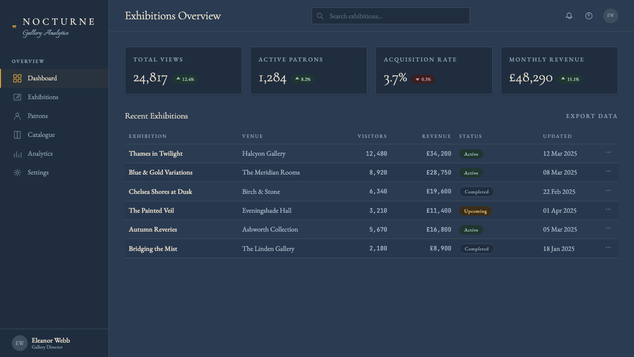
Whistler Nocturne Tonalism is one of the few historical styles that translates directly to dark-mode digital design without forcing or pastiche. Its native ground is already deep and nocturnal; its logic of one cool tonal field plus one warm accent maps cleanly onto the design problem of creating depth and hierarchy on a dark-background interface. The key discipline when applying it is understanding that the 'single warm accent' rule is absolute: one focal warm element per composition, not a warm accent per component or per section. When every card or every feature block has its own warm highlight, the system ceases to function as a nocturne and becomes merely a dark theme with gold trim.惠斯勒《夜曲》调性派是为数不多能够直接转化为深色模式数字设计而无需强行改造或流于仿制的历史风格之一。它的原生底色本就是深邃夜晚性质的;一片冷调色域加一个暖色强调的逻辑,可以清晰地映射到在深色背景界面上创造深度与层级这一设计问题。应用时的关键纪律是理解「单一暖色强调」规则的绝对性:每幅构图一个焦点暖元素,而非每个组件或每个区块各有自己的暖色高光。当每张卡片或每个特性区块都拥有自己的暖色高亮时,这套系统便不再作为夜曲运作,而沦为仅仅是带金色装饰的深色主题。
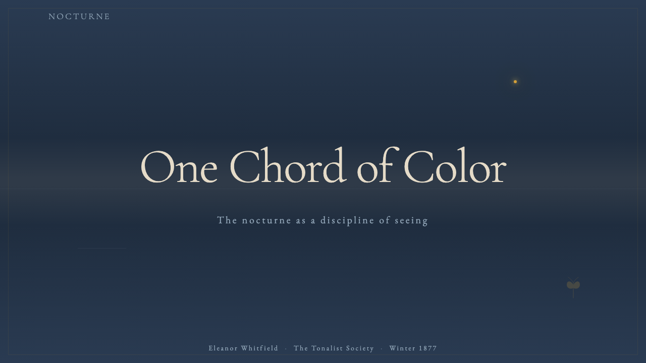
For presentation slides, the Nocturne approach works powerfully on both cover and content pages, with meaningfully different applications for each. A cover slide should commit entirely to the tonal chord: a deep, cool, atmospheric ground — blue-grey, slate, or near-black with blue undertone — with the title appearing in a value only slightly lighter than the background, and a single warm element (a monogram, a small device, a horizontal rule in warm gold) serving as the sole focal point. This restraint reads as confident authority rather than underdesign. Content slides use the same tonal ground but introduce a very limited light value for body text, keeping the warm accent for the single most important data point, call-out, or section label on the page.对于演示幻灯片,《夜曲》方法在封面页与内容页上都具有强大效果,但各有其意义不同的应用方式。封面页应当完全投入调性和弦之中:深邃、冷调、大气的底色——蓝灰、板岩色或带蓝色底调的接近黑色——标题以仅比背景略亮的色值出现,而一个单一的暖元素(花押、小型图形元素、暖金色的水平线)作为唯一焦点。这种克制读来是自信的权威,而非设计不足。内容页使用相同的调性底色,但为正文引入极为有限的浅色色值,将暖色强调留给页面上最重要的单一数据点、引文或章节标签。
For data visualization and dashboards, the Nocturne palette has specific strengths and constraints. Its strength is depth and legibility at a glance: a cool-toned ground makes a single warm data series or alert state immediately visible without requiring high contrast across the whole chart. The constraint is that it is inherently a low-saturation system — pure, vivid secondary colors read as violations of the tonal unity. Data series should be differentiated through value shifts within the cool family (dark slate, mid-blue-grey, lighter blue-mist) with only the primary series or the alert state rendered in the warm accent. Grid lines, axis labels, and supporting text should remain within the cool-toned family and at low contrast against the ground.对于数据可视化和仪表板,《夜曲》色板有其特定的优势与限制。优势在于一目了然的深度与可读性:冷调底色使单一暖色数据系列或告警状态立即可见,无需在整张图表中维持高对比度。限制在于它本质上是一个低饱和度系统——纯正、鲜艳的间色读来是对调性统一的侵犯。数据系列应通过冷调家族内的色值偏移加以区分(深板岩色、中蓝灰、较浅蓝雾色),仅将主要系列或告警状态以暖色强调色呈现。网格线、坐标轴标签和辅助文字应保持在冷调家族内,并对底色维持低对比度。
For editorial and marketing work, the Nocturne aesthetic suits contexts that need to communicate depth, sophistication, and a certain unhurried confidence — luxury goods, cultural institutions, premium financial services, and any brand positioning itself as thoughtful rather than urgent. Full-width sections that hold a single statement headline with generous surrounding silence are more effective than dense feature grids. A marketing page built on this system alternates between near-black cool grounds with warm-accented headlines, and deep cool-grey grounds with lighter cool-toned body text — never breaking into high-key whites or pure-black sections that would pierce the atmospheric coherence. Photography, when used, should be treated as another tonal element: desaturated or blue-filtered, cropped to emphasize sky and mist over detail, and never placed at full contrast against the ground.对于编辑与营销内容,《夜曲》美学适合需要传达深度、精致与某种不紧不慢的自信的场景——奢侈品、文化机构、高端金融服务,以及任何将自身定位为深思熟虑而非紧迫急切的品牌。持有单一陈述性标题且周围留有充裕静默的全宽区块,比密集的特性网格更为有效。基于这套系统构建的营销页面,在近黑色冷调底色配暖色调标题、与深冷灰底色配较浅冷调正文文字之间交替——绝不突破进入高调白色或纯黑区块,那会刺穿大气的连贯性。摄影图像若被使用,应被作为另一个调性元素处理:去饱和或蓝色滤镜处理,裁切时强调天空与雾气而非细节,且绝不与底色形成全对比度对置。
The most common mistake when applying Whistler Nocturne Tonalism is confusing it with generic dark-mode design or with gothic/dark luxury aesthetics. Generic dark mode typically uses high-contrast white text on near-black grounds, which is the opposite of the value compression this style requires. Gothic dark luxury tends toward gold-on-black at high saturation, which violates the single-accent rule and reads as ornamental rather than atmospheric. The genuine Nocturne application is quieter than both: mid-value cool text on a slightly darker cool ground, with the warm accent used only once and used small. If a layout feels moody but not restrained, or rich but not quiet, the tonal discipline has been lost. The test is simple: cover the warm accent element — if the remaining composition still holds together as a complete, coherent whole, the tonal chord is working correctly.应用惠斯勒《夜曲》调性派时最常见的错误,是将其与通用深色模式设计或哥特式暗黑奢华美学混淆。通用深色模式通常在接近黑色的底色上使用高对比度白色文字,这与这种风格所要求的色值压缩恰恰相反。哥特式暗黑奢华倾向于在纯黑底上高饱和度地使用金色,违反了单一强调色规则,读来是装饰性的而非大气性的。真正的《夜曲》应用比两者都更安静:中等色值的冷调文字置于略深的冷调底色上,暖色强调仅使用一次且体量小。若一个版面感觉有情绪却不克制,或富有质感却不安静,那么调性纪律已经丢失。检验方法很简单:遮住暖色强调元素——若剩余的构图仍然作为一个完整连贯的整体成立,调性和弦便运作正确。
See the Whistler Nocturne Tonalism design system查看 Whistler Nocturne Tonalism 完整设计系统
Whistler Nocturne Tonalism — FAQWhistler Nocturne Tonalism · 常见问题
Is Whistler Nocturne Tonalism the same as generic dark mode?惠斯勒《夜曲》调性派与通用深色模式是一回事吗?
No, and the difference is fundamental. Generic dark mode is primarily a contrast convention: white or very light text on a near-black background, usually to reduce eye strain in low-light conditions. Whistler Nocturne Tonalism is a tonal system: the ground, the text, and all supporting elements occupy a compressed range of closely related cool values, with only minimal contrast between layers. The effect is atmospheric and immersive rather than high-contrast and legible. Generic dark mode prioritizes readability; the Nocturne system prioritizes mood. In practice, a genuine Nocturne application will use text at a noticeably lower value contrast against the background than dark mode guidelines recommend — a deliberate choice, not an accessibility oversight.不,而且差异是根本性的。通用深色模式主要是一种对比度惯例:近黑色背景上的白色或极浅色文字,通常是为了在低光环境下减轻眼睛疲劳。惠斯勒《夜曲》调性派则是一套调性系统:底色、文字和所有辅助元素占据一个压缩的同类冷调色值区间,各层之间只有极小的对比度。效果是大气沉浸式的,而非高对比度的可读式。通用深色模式优先考量可读性;《夜曲》系统优先考量情绪。在实践中,真正的《夜曲》应用会使文字对背景的色值对比度明显低于深色模式指南所建议的水平——这是刻意的选择,而非无障碍设计的疏漏。
Can this style work in a light-background or daytime context?这种风格能在浅色背景或日间语境中使用吗?
The style can be transposed to a pale ground — a pale grey-blue, a misted lavender-grey, a cool near-white — but it requires careful handling. The defining element is not darkness per se but tonal compression and cool unity. A light Nocturne variant should hold the same low-contrast, close-value relationships between ground and elements, and should still admit only one warm accent. What it cannot do is introduce the warm brightness, high contrast, and full tonal range that characterize daylight. If the result begins to read as airy or crisp, the tonal chord has dissolved. Light-ground Tonalism tends to look more like quiet Scandinavian minimalism than like Whistler specifically — related in spirit but distinct in character.这种风格可以被移调至浅色底色上——浅灰蓝、雾质薰衣草灰、冷调的接近白色——但需要审慎处理。定义性元素并非暗色本身,而是调性压缩与冷调统一。浅色《夜曲》变体应在底色与元素之间保持相同的低对比度、接近色值的关系,且仍应只允许一个暖色强调。它不能做的是引入表征日光的暖亮度、高对比度和完整调性范围。若结果开始读来通透或清朗,调性和弦便已消融。浅色底调性派往往看起来更像安静的斯堪的纳维亚极简主义,而非特指惠斯勒——精神上相关,但性格上截然不同。
How is Whistler Nocturne Tonalism different from other dark aesthetic styles like noir, gothic, or moody luxury?惠斯勒《夜曲》调性派与黑色电影、哥特或忧郁奢华等其他暗色美学风格有何不同?
The distinguishing feature is restraint and atmospheric dissolution rather than drama or ornament. Noir typically relies on hard light sources, sharp shadows, and high contrast between dark and light areas — the opposite of the Nocturne's value compression. Gothic aesthetics use black as a saturated, expressive absolute and typically incorporate ornamental elements — texture, pattern, decorative typography — that the Nocturne system excludes. Moody luxury often pairs deep grounds with gold at high saturation, which reads as opulent but violates the single-accent rule and the tonal unity. The Nocturne is quieter, more atmospheric, and more abstract than any of these; its closest relatives are Japanese ink wash painting and the hushed interiors of certain Scandinavian design traditions — stillness rather than drama.区分性特征是克制与大气消融,而非戏剧性或装饰性。黑色电影通常依赖强光源、硬边投影以及暗区与亮区之间的高对比度——与《夜曲》的色值压缩恰恰相反。哥特美学将黑色用作饱和的表达性绝对,并通常融入《夜曲》系统所排除的装饰性元素——质感、图案、装饰性字体。忧郁奢华常将深色底色与高饱和度金色配对,读来华贵但违反了单一强调色规则与调性统一。《夜曲》比所有这些都更安静、更大气、更抽象;它最近的亲属是日本水墨画和某些斯堪的纳维亚设计传统中那种静谧的室内——是宁静而非戏剧。
What kinds of products or brands should not use this style?哪些类型的产品或品牌不应使用这种风格?
Whistler Nocturne Tonalism is unsuited to products whose value proposition depends on energy, clarity, accessibility, or warmth. Consumer apps that need to feel approachable and immediate — social platforms, food delivery, children's education, fitness tracking — will read as cold or mysterious under this system rather than inviting. Products requiring high accessibility compliance will find the low-contrast, value-compressed approach structurally incompatible with legibility standards. Brands that need to signal openness, transparency, or corporate friendliness should use systems with more tonal range and warmer grounds. The style is best reserved for contexts where the user's relationship to the product is contemplative and unhurried: premium cultural content, archival or research tools, high-end portfolio presentations, and experiential luxury.惠斯勒《夜曲》调性派不适合其价值主张依赖能量感、清晰度、易达性或温暖感的产品。需要感觉亲和、即时的消费类应用——社交平台、外卖、儿童教育、健身追踪——在这套系统下会读来冷漠或神秘,而非亲切邀请。需要高无障碍合规的产品,会发现低对比度、色值压缩的方法在结构上与可读性标准不相容。需要传达开放性、透明度或企业友好性的品牌,应使用调性范围更宽、底色更温暖的系统。这种风格最宜保留给用户与产品关系是沉思而非急切的场景:高端文化内容、档案或研究工具、高端作品集展示,以及体验式奢华。
How literally should the 'one warm accent' rule be interpreted in a complex multi-page design system?在复杂的多页面设计系统中,「单一暖色强调」规则应当被多字面地理解?
The rule applies at the composition level, not at the system level. In a multi-page design system, the warm accent can recur across pages — it may appear consistently as the primary call-to-action color, the active state indicator, or the brand accent — but within each individual view or composition, it should appear in only one location or serve only one function. The mistake is not having a warm accent color in the system; the mistake is deploying it simultaneously in multiple competing locations within a single composition. A dashboard that uses warm amber for the primary metric, for alert states, for active navigation items, and for data highlights has dissolved the tonal unity even if each individual use seems justified. Pick one role for the warm accent per composition and let everything else remain within the cool family.这条规则适用于构图层面,而非系统层面。在多页面设计系统中,暖色强调可以跨页面重复出现——它可能作为主要行动号召色、激活状态指示符或品牌强调色一致地出现——但在每个单独的视图或构图内,它应当只出现在一个位置或只服务于一个功能。错误不在于系统中存在暖色强调色;错误在于在单幅构图内将其同时部署在多个相互竞争的位置。一个将暖琥珀色用于主要指标、告警状态、激活导航项和数据高亮的仪表板,即便每个单独的用法看起来都合理,也已经瓦解了调性统一。为每幅构图中的暖色强调选定一个角色,让其余一切保持在冷调家族之内。
Related design styles相关设计风格
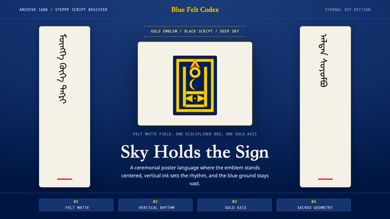 Mongolian SoyomboReverent geometry. Gold Soyombo on Tengri blue, with vertical black-script rh…几何而虔敬:金色索永布立于腾格里蓝,竖排墨韵定轴。
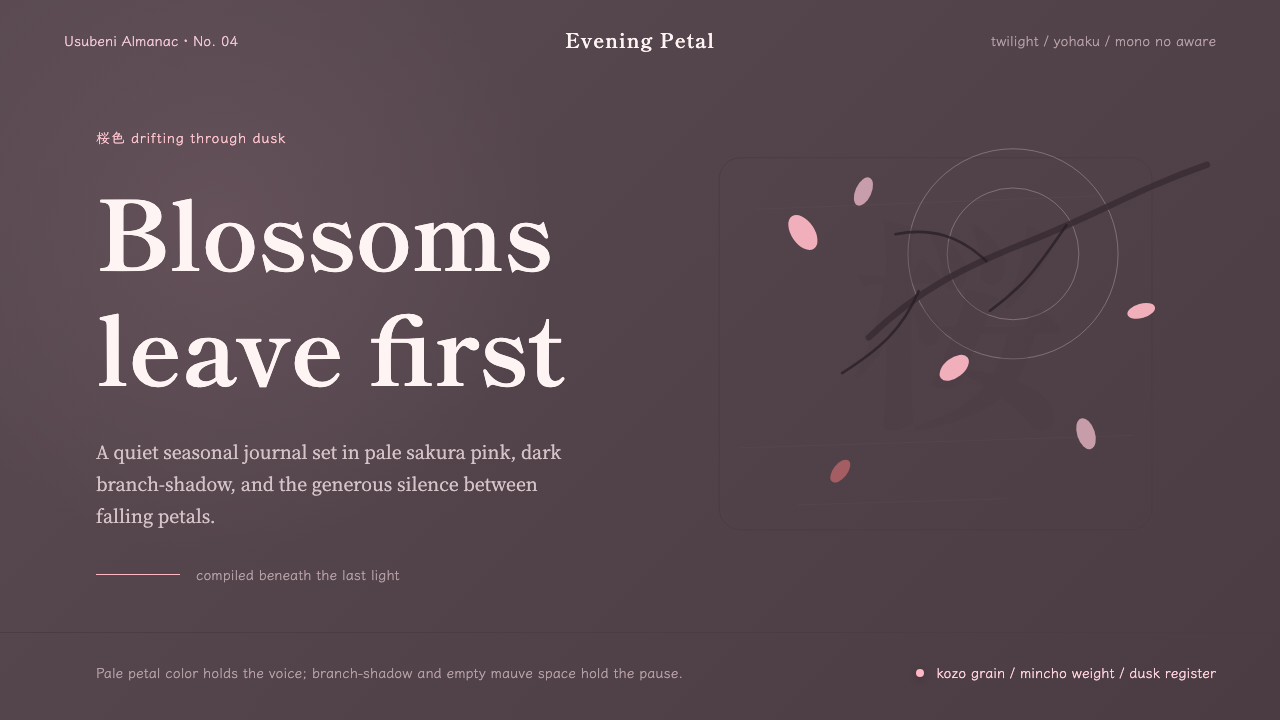 Cherry Blossom HanamiTenderness arrives in dusk. Sakura pink, branch-shadow, and Mincho type leave…暮色里的温柔:樱粉、枝影与明朝体,在大片留白中生出物哀。
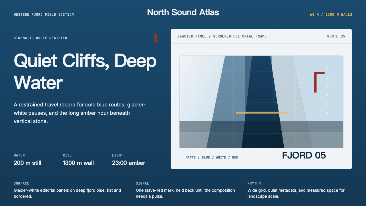 Norwegian Fjord TourismMonumental, not loud. Fjord blue, glacier-white panels, and one stave-red acc…壮阔但克制。峡湾蓝、冰川白面板和一处木教堂红点题。
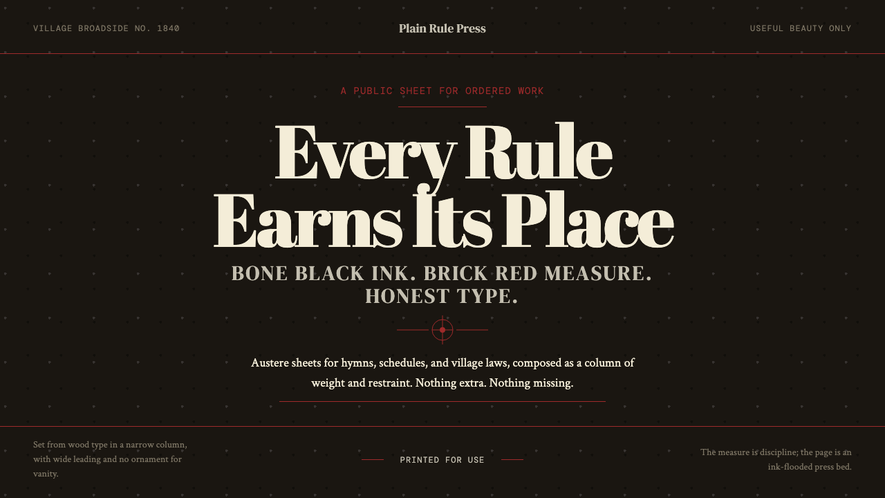 Shaker Broadside PrintAustere by conviction. Bone-black ground, brick rules, and wood-type hierarch…克制即信念:骨黑底、砖红线与木活字层级完成全部表达。
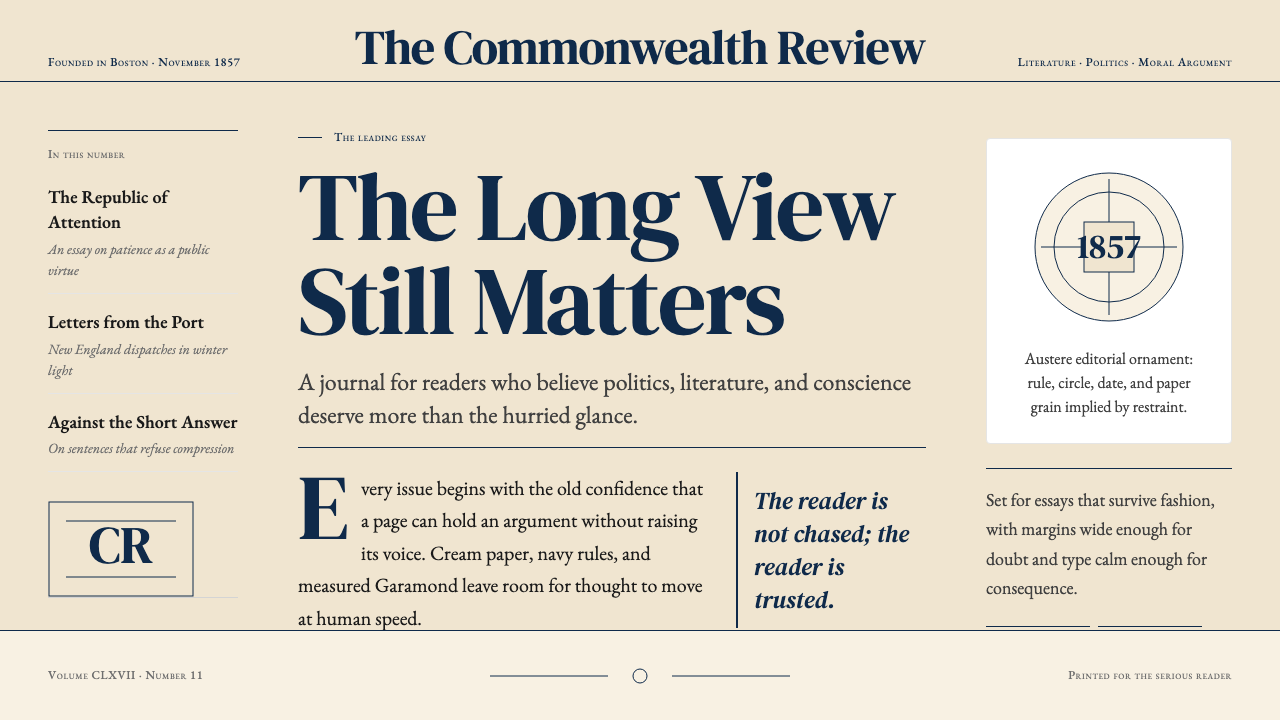 The Atlantic MonthlyAuthority slows down. Navy Garamond on warm cream, ruled like an essay page.权威主动放慢:米色纸底、海军蓝Garamond与细栏线。
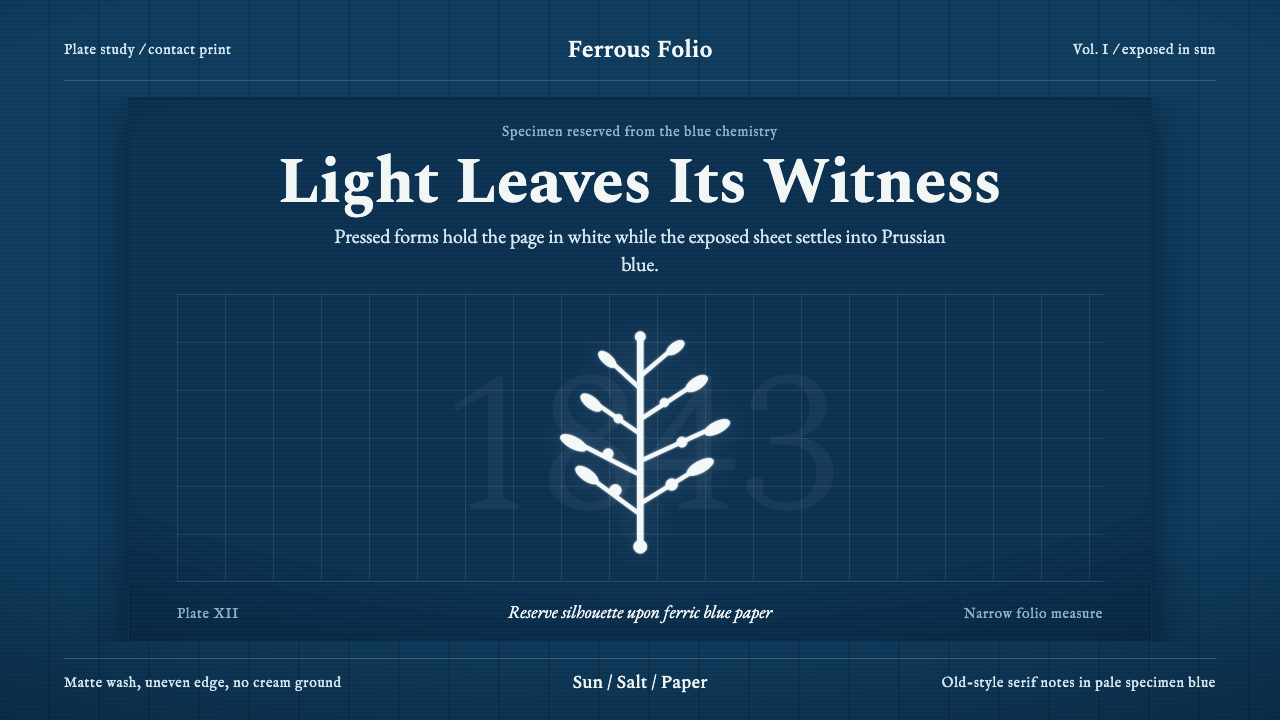 Anna Atkins CyanotypeScience turns spectral. Prussian blue ground, white reserves, Victorian serif…科学显影成幽灵:普鲁士蓝底、白色留影、维多利亚衬线宽边。