What is Mongolian Soyombo?
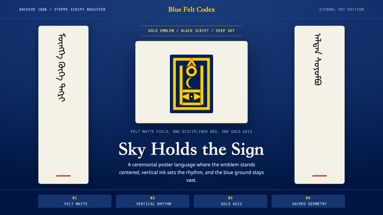
Mongolian Soyombo binds sky, script, and emblem into one reverent geometry — gold symbol on eternal blue, with black brush ink running in vertical rhythm down the page.
Mongolian Soyombo in brief
Mongolian Soyombo is a design system built from three sacred registers of steppe culture rather than a single decorative motif: the eternal blue sky associated with Tengri, the sky-god of traditional Mongolian belief; the gold Soyombo glyph, a symbol devised in the late seventeenth century that now crowns the national flag; and the vertical flow of black brush-written script, read top to bottom in columns rather than left to right in lines.
The system treats these three elements as inseparable rather than interchangeable — the deep sky-blue ground is not simply 'a blue background,' it is a specific reference to a specific cosmological idea; the gold emblem is not generic ornament but a precise, symmetrical glyph with its own construction rules; and the vertical script is not a stylistic flourish but the actual historical direction Mongolian writing has run in for centuries.
The result is geometric and reverent rather than decorative or exoticized. Symmetry, disciplined vertical rhythm, and clean emblematic form carry the visual voice. Nothing is rendered in neon or cartoonish 'nomad warrior' cliché; the Soyombo glyph is treated with the same formal seriousness a national flag or a religious emblem demands, because that is precisely what it is.
Where does Mongolian Soyombo come from?
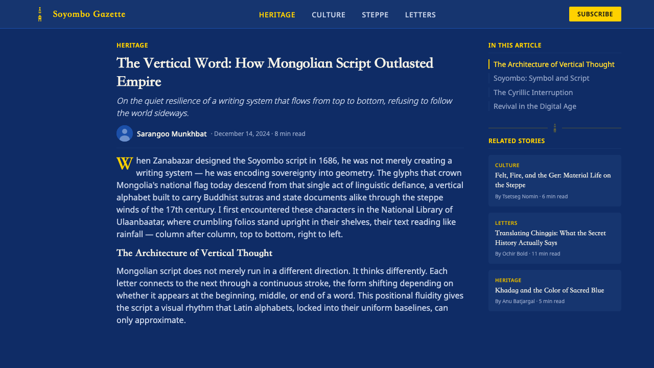
The Soyombo script was devised around 1686 by Öndör Gegeen Zanabazar, the first Jebtsundamba Khutuktu — the highest-ranking figure of Tibetan Buddhism in Mongolia at the time — who was also renowned as a sculptor, scholar, and polymath. Zanabazar designed the script as a versatile alphabet capable of transcribing Mongolian, Tibetan, and Sanskrit, intending it primarily for rendering Buddhist religious texts with a single unified writing system rather than switching between scripts borrowed from neighboring traditions.
While the full Soyombo alphabet saw limited everyday use compared to the older vertical Mongolian script, its very first character — a vertically stacked composite symbol combining a flame, sun and moon disks, and a set of geometric bars — took on an independent life as an emblem in its own right. That single glyph, now generally referred to simply as 'the Soyombo,' came to represent ideas of eternal existence, prosperity, and sovereignty, and it was adopted onto the Mongolian national flag in the twentieth century, where it remains the country's most recognizable visual symbol.
The vertical script tradition that Soyombo design work draws on separately predates Zanabazar by centuries: traditional Mongolian script, adapted from the Old Uyghur alphabet around the thirteenth century, is written in vertical columns running left to right across the page, a direction distinct from nearly every other major writing system still in active use. This vertical flow is a defining structural feature of Mongolian visual culture independent of the Soyombo glyph itself, and the two are combined in the modern design system because both are genuinely native to the same written tradition.
The blue that anchors the system's palette carries its own long lineage, tied to Tengrism, the sky-centered belief system of the historical steppe in which the 'eternal blue sky' was venerated as the supreme cosmological principle — a concept still closely associated with Mongolian national identity today, sometimes rendered in the phrase describing Mongolia as the land of the eternal blue sky. Pairing that sky-blue with gold, felt-ivory tones, and a single disciplined red draws on the material culture of the steppe itself — the felt of the traditional ger, or nomadic dwelling, and the sparing use of red as a ceremonial rather than everyday color.
What defines the Mongolian Soyombo look?
Color
The palette pairs a deep sky-blue ground — a direct reference to the eternal blue sky of Tengrism — with a gold Soyombo emblem and ivory-felt highlights drawn from the material culture of the nomadic ger. A single disciplined red is permitted, used sparingly and ceremonially rather than as a field color, echoing red's traditional role as a ritual accent rather than an everyday hue.
The Soyombo Glyph
The Soyombo itself is a vertically stacked, strictly symmetrical composite symbol combining flame, sun and moon disks, and geometric bars, and it is treated in this system with the formal seriousness of a national or religious emblem rather than as a decorative motif to be resized or recolored casually. Its proportions and internal symmetry are preserved rather than reinterpreted.
Vertical Script Rhythm
Black brush-written text runs in vertical columns rather than horizontal lines, reflecting the genuine historical direction of traditional Mongolian script. This vertical flow becomes a structural organizing principle for the whole composition, not just a typographic detail — columns of text can anchor a layout the way a grid anchors a Western page.
Symmetry
Compositions favor a strict, often centered symmetry, echoing the internal symmetry of the Soyombo glyph itself. This is a deliberate departure from the asymmetric balance common in many modern design systems — symmetry here signals order, permanence, and emblematic authority rather than dynamism.
Emblematic Geometry
Beyond the Soyombo glyph itself, supporting graphic elements — dividers, marks, small icons — are kept clean and geometric, built from simple disks, bars, and flame-like forms rather than intricate pattern. This restraint keeps every element legible as an emblem rather than dissolving into decorative texture.
Reverent Restraint
The system deliberately avoids neon color, cartoonish 'nomad warrior' cliché, or any treatment that would read as costume rather than emblem. The Soyombo is handled with the same seriousness a national flag or a religious symbol demands — restraint is what signals respect for the source.
Who shaped Mongolian Soyombo?
The first Jebtsundamba Khutuktu and a renowned sculptor and polymath, Zanabazar devised the Soyombo script around 1686 as a unified alphabet for Mongolian, Tibetan, and Sanskrit Buddhist texts. Its first character became the independent Soyombo glyph that anchors this entire design system.
The generations of scribes who maintained the vertical Mongolian script tradition — writing in columns running left to right across the page — preserved the structural writing direction that this design system borrows as its organizing rhythm, independent of the Soyombo glyph itself.
The twentieth-century adoption of the Soyombo glyph onto the national flag transformed a religious and philosophical symbol into the country's foremost civic emblem, cementing the gold-on-blue pairing and the glyph's precise proportions as a matter of national symbolism rather than private design choice.
How do you use Mongolian Soyombo today?
Mongolian Soyombo is an emblem-first, reverent system, and applying it well means treating the Soyombo glyph itself with real restraint rather than as a freely resizable decorative icon. The sky-blue ground, the gold emblem, and the vertical text rhythm should be understood as a linked set — using one without the discipline of the others tends to flatten the system into generic 'ethnic' decoration.
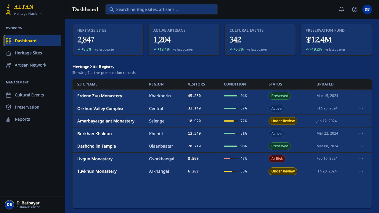
For presentation slides, a cover works well with the Soyombo-inspired geometric mark placed with strict symmetry against the deep sky-blue ground, paired with a vertical column of title text rather than a horizontal headline. Content slides should preserve the vertical rhythm as an organizing device — a column of key points read top to bottom — while keeping supporting graphics simple, geometric, and gold-or-ivory rather than multicolored.
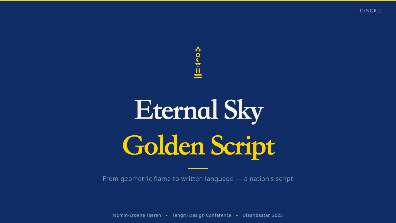
For web interfaces, the system suits cultural, institutional, and heritage-focused sites more naturally than dense commercial dashboards, since its core strength is dignity and symbolic weight rather than information density. A hero section built around a centered, symmetrical emblematic mark against sky-blue, with a single disciplined red used only for a primary action, captures the system's restraint.
For editorial and marketing work, the style rewards calm, symmetrical layouts: a masthead centered rather than left-aligned, pull quotes framed by simple geometric dividers rather than ornate borders, and imagery treated with the same reverence as the glyph itself rather than as decorative filler. Marketing pages benefit from generous sky-blue fields that let the gold emblem or vertical text carry full visual weight.
A common mistake is treating this system as license for generic 'exotic steppe' decoration — fur textures, cartoon horses, warrior clichés — none of which belong to the actual visual grammar here. A second common mistake is resizing or recoloring the Soyombo glyph casually, or mixing it with unrelated bright colors; the glyph's authority depends on its proportions and its specific gold-on-blue context being preserved exactly.
Mongolian Soyombo — FAQ
Is the Soyombo glyph the same thing as the Soyombo script?
Not exactly. Zanabazar created the Soyombo script as a full alphabet capable of transcribing Mongolian, Tibetan, and Sanskrit. The Soyombo glyph that appears on the national flag and anchors this design system is specifically the script's very first character, a composite symbol that took on an independent symbolic life of its own, distinct from the alphabet's everyday use in writing full texts.
Why does the text run vertically instead of horizontally?
Vertical, top-to-bottom columns running left to right across the page are the genuine historical direction of traditional Mongolian script, adapted from Old Uyghur script centuries before the Soyombo alphabet existed. This system preserves that authentic structural feature rather than treating vertical text as a stylistic novelty.
Why is blue so central to the palette rather than another color?
The blue references Tengrism, the sky-centered belief system of the historical steppe in which the eternal blue sky was venerated as a supreme cosmological principle — a concept still tied closely to Mongolian national identity. It is not a generic cool-toned choice; it is a specific reference that the gold Soyombo emblem is meant to sit against.
Can this style be used decoratively without referencing its cultural meaning?
It can be applied to other contexts, but doing so responsibly means preserving the restraint and formal seriousness the source material demands rather than treating the Soyombo glyph as a generic exotic motif. The style's entire visual argument is that this symbol deserves the same gravity as a national flag — stripping that gravity away while keeping the imagery misrepresents the source.
Does the single red accent have a specific meaning, or is it just a contrast color?
It is closer to a ceremonial accent than a purely functional contrast color. Red appears sparingly in traditional Mongolian material culture, used for ritual or special-occasion elements rather than everyday surfaces, and the system preserves that scarcity — a single disciplined use of red rather than a color available for general decoration.
Related design styles
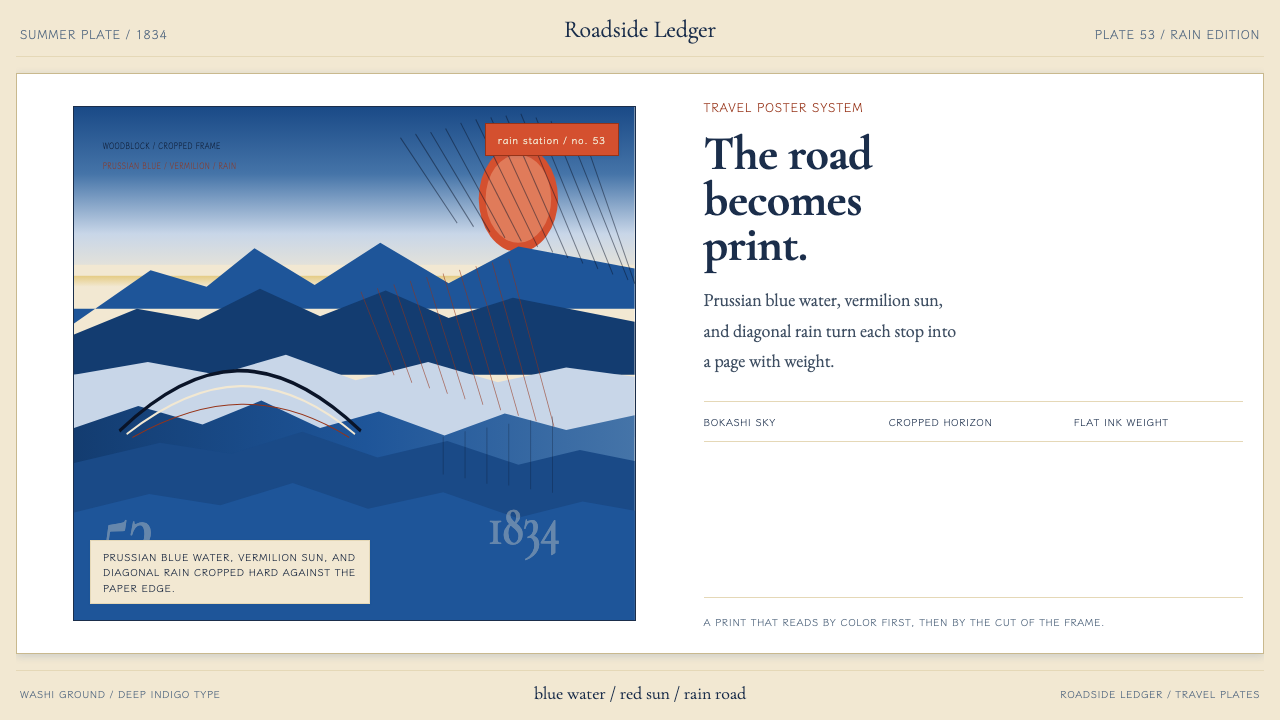 Hiroshige — Tokaido RoadA road print in motion. Prussian blue blocks, vermilion cartouches, diagonal…
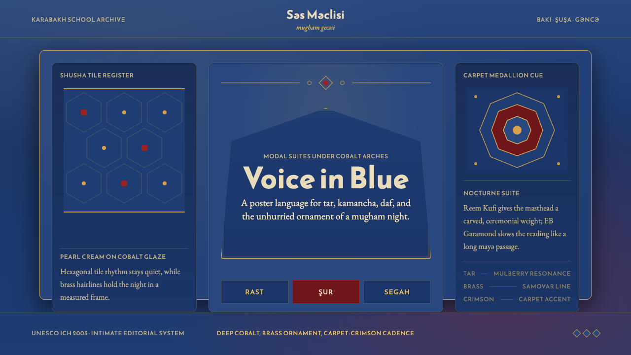 Azerbaijani Mugham Saz BlueMugham night, deeply tiled. Cobalt ground, brass hairlines, arched editorial…
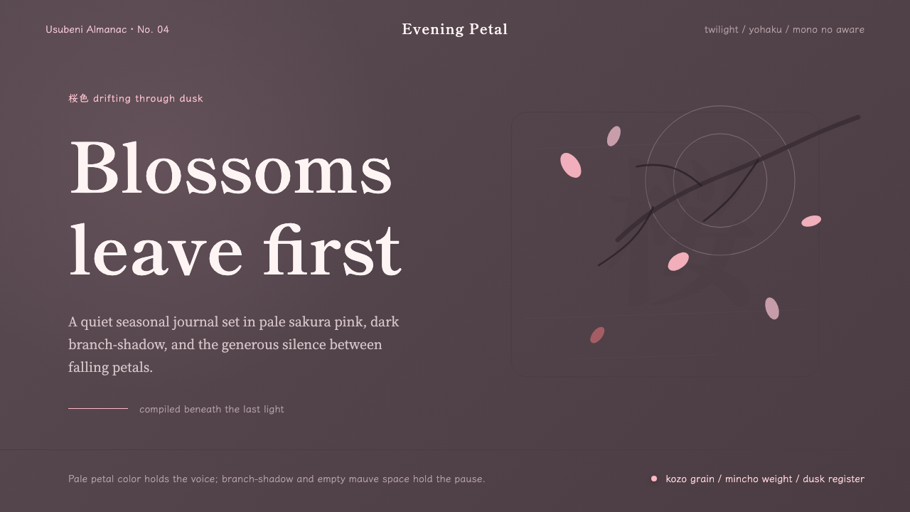 Cherry Blossom HanamiTenderness arrives in dusk. Sakura pink, branch-shadow, and Mincho type leave…
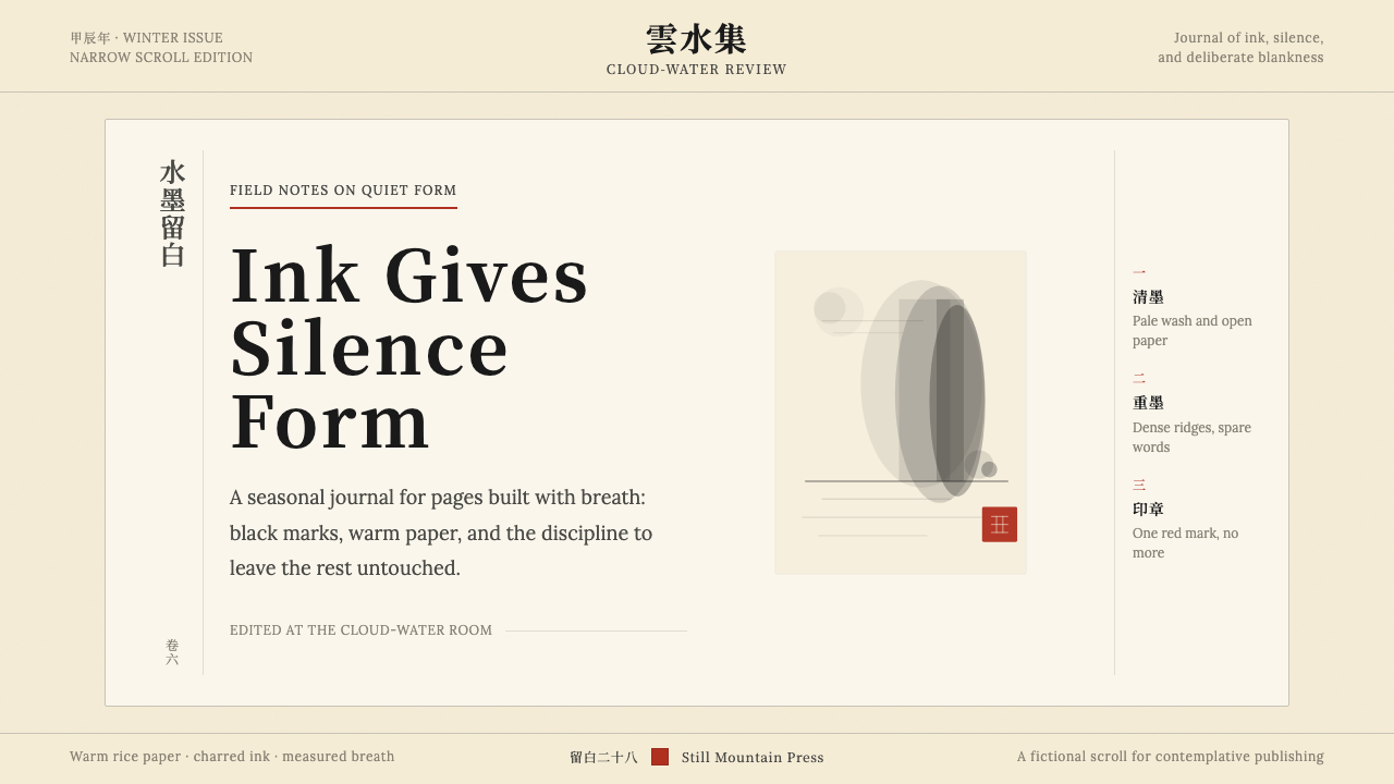 Chinese Ink Wash 水墨A thousand years of restraint. Six tones of ink on rice-paper warmth, a singl…
 Étretat Chalk CliffsStone becomes light. Chalk-white forms dissolve through blue-gray mist and li…
 Flamsteed Atlas CoelestisMeasurement wears mythology. Ivory engravings and gilt stars cross a deep ind…