Design style guide设计风格指南
What is Norwegian Fjord Tourism?什么是 Norwegian Fjord Tourism?
Norwegian fjord tourism's visual language turns raw geological scale into a design system — glacier-white silence, deep cold blue, and a single red accent borrowed from medieval stave churches.挪威峡湾旅游的视觉语言,将原始的地质尺度转化为一套设计系统——冰川白的静默、深冷的峡湾蓝,以及一抹借自中世纪木板教堂的点睛之红。
Norwegian Fjord Tourism in briefNorwegian Fjord Tourism 速览
Norwegian fjord tourism design is the visual identity language built over two decades by Visit Norway, Hurtigruten, and the National Tourist Routes program. It translates the UNESCO-listed western fjords — Geirangerfjord, Sognefjord, Nærøyfjord — into a repeatable graphic system: a palette pulled directly from the landscape, cinematic photography held to a disciplined framing, and enough negative space that cliff walls and open water carry the composition rather than being decorated over.挪威峡湾旅游设计,是挪威旅游局、海达路德邮轮和国家旅游路线项目历经二十年共同构建的视觉识别语言。它将联合国教科文组织世界遗产西部峡湾——盖朗厄尔峡湾、松恩峡湾、纳柔依峡湾——转化为一套可复用的视觉体系:直接取自地景的色彩、经过严格取景训练的电影感摄影,以及足够充裕的留白,让峭壁与开阔水面主导构图,而非被装饰所覆盖。
The style belongs to a broader tradition of Scandinavian modernism — the same lineage as Nordic product design and Finnish graphic arts — but it is specifically rooted in the tourism infrastructure that Norway built to manage and communicate its extraordinary natural heritage. Where many national tourism aesthetics default to folk ornament or historic architecture, the Norwegian fjord identity chose restraint: let the landscape speak, and give the eye nothing to compete with it.这一风格隶属斯堪的纳维亚现代主义的广阔传统——与北欧产品设计和芬兰平面艺术同源——但它扎根于挪威为管理和传播其卓越自然遗产而建立的旅游基础设施之中。许多国家旅游美学默认援引民俗纹样或历史建筑,而挪威峡湾识别语言选择了克制:让地景自己说话,不给视线添加任何竞争者。
The result is a design register that reads as monumental without being loud. A travel poster in this style does not shout. It holds open a vast quantity of cold blue space, anchors a horizon line, and places a single stave-red detail — a kayak, a lighthouse, a church spire — at the edge of the frame. The viewer does the rest.结果是一种读来壮阔却不喧嚣的设计基调。这种风格的旅游海报不会大声叫嚷——它敞开大量冷蓝色空间,锚定一条地平线,然后在画框边缘放置一处木板教堂红的细节:一艘皮艇、一座灯塔、一根教堂尖顶。其余的,由观者自行完成。
See the Norwegian Fjord Tourism design system →查看 Norwegian Fjord Tourism 完整设计系统 →
Where does Norwegian Fjord Tourism come from?Norwegian Fjord Tourism 从何而来?
Visit Norway was established in 1984 as the state tourism promotion agency, but the visual language that now defines Norwegian fjord tourism took shape much later, during the international tourism boom of the 2000s. Norway's western fjords received UNESCO World Heritage status in 2005, which coincided with a rapid expansion in cruise tourism and a growing global appetite for 'wild' destinations. The challenge for Visit Norway's brand team at Innovation Norway was to create an identity that could compete internationally without reducing the landscape to spectacle.挪威旅游局成立于1984年,作为国家旅游推广机构,但如今定义挪威峡湾旅游的视觉语言,要晚得多才真正成形——那是在2000年代国际旅游繁荣期间。挪威西部峡湾于2005年获得联合国教科文组织世界遗产认定,恰与邮轮旅游的迅速扩张和全球对「野性」目的地的日益渴望同步。挪威创新局旗下品牌团队面临的挑战,是创造一套能在国际上竞争的识别语言,同时不把地景降格为纯粹的奇观。
The National Tourist Routes program, launched in 1994 and significantly expanded after 2004, was the infrastructure project that most directly shaped the aesthetic. The program commissioned leading Scandinavian architects — among them Snøhetta, the firm behind the Oslo Opera House — to design rest stops, observation platforms, and service facilities along eighteen scenic road routes across the country. Snøhetta's interventions in particular established a visual vocabulary: raw Corten steel, unfinished concrete, and dark stained timber set against the landscape rather than competing with it. This architectural language fed back into the graphic identity — the same material restraint, the same sense that human presence should be legible but minimal.1994年启动、2004年后大规模扩展的国家旅游路线项目,是最直接塑造这一美学的基础设施工程。该项目委托斯堪的纳维亚顶尖建筑师——其中包括奥斯陆歌剧院背后的事务所Snøhetta——沿全国十八条风景公路设计休息站、观景台和服务设施。尤其是Snøhetta的介入,确立了一套视觉词汇:生锈的耐候钢、未经修饰的混凝土、深色染木,以融入地景而非与其竞争的姿态存在。这种建筑语言反哺了平面识别——同样的材料克制感,同样的「人的存在应当可辨但轻盈」的信念。
Hurtigruten, the coastal voyage operator with routes dating to 1893, contributed a parallel strand of the identity. Its brand evolution through the 2000s and 2010s moved toward deep navy, glacier-white, and matte finishes — a shipboard translation of the fjord palette that distinguished it sharply from the saturated Caribbean cruise aesthetic. The Hurtigruten identity team treated the coastline not as a backdrop but as the product itself, and their photography and editorial approach — spare, deliberate, unhurried — became a template for how the broader Norwegian tourism sector communicated.航线可追溯至1893年的海达路德邮轮,贡献了这一识别语言的另一支脉。其品牌在2000至2010年代的演变,走向深海军蓝、冰川白与哑光质感——一种在船上对峡湾色板的翻译,使其与饱和鲜艳的加勒比邮轮美学截然有别。海达路德的品牌团队将海岸线视为产品本身而非背景,其摄影与编辑方式——简洁、克制、不急不慌——成为挪威旅游业更广泛传播方式的样板。
The single stave-red accent that now reads as the style's signature detail comes from Norway's medieval wooden stave churches, of which fewer than thirty survive. The most visited are along the western fjord routes: Borgund, Urnes, Hopperstad. Their dark-tarred timber and soaring spires appear in virtually every canonical Visit Norway image as a point of human scale and cultural depth — a device that anchors the landscape in history without requiring text or caption. The incorporation of Sámi indigenous design elements, led in part by the artist Máret Ánne Sara, brought another dimension of cultural specificity to the northern Norway branch of the aesthetic, particularly in imagery from Tromsø and the Lofoten Islands.如今被视为这一风格标志性细节的单一木板教堂红,来自挪威现存不足三十座的中世纪木板教堂。最具代表性的几座沿西部峡湾路线分布:博尔贡、乌内斯、霍珀斯塔德。它们被黑色焦油浸透的木构与高耸尖顶,出现在几乎所有经典挪威旅游图像中,充当人类尺度与文化深度的锚点——一种无需文字或说明便能将地景植入历史的装置。萨米族原住民设计元素的融入——部分由艺术家玛蕾·安娜·萨拉推动——为挪威北部美学(尤其是特罗姆瑟和罗弗敦群岛的影像)带来了另一层文化特殊性。
What defines the Norwegian Fjord Tourism look?Norwegian Fjord Tourism 的视觉特征是什么?
The Three-Tone Palette三色基调
The palette is built around three sources: the deep cold blue of glacially carved fjord water, the white of snowfields and glacier faces, and the dark, warm red-brown of stave-church timber and traditional Norwegian painted architecture. These three tones — cold blue, pure white, and a concentrated red accent — form a near-exhaustive system. Other colors enter sparingly: the grey-green of coastal lichen, the ochre of autumn birch. The palette reads immediately as Nordic because it is derived from the specific optical conditions of western Norway — low-angle northern light, high-reflectance snow, and the saturation of cold deep water.这套色板围绕三个来源构建:冰川侵蚀的峡湾深冷蓝、雪原与冰川面的纯白,以及木板教堂木材与挪威传统彩绘建筑的深暖红棕。这三种色调——冷蓝、纯白与浓缩的红色点缀——构成一套近乎完整的系统。其他颜色仅偶尔介入:海岸地衣的灰绿、秋日桦树的赭黄。这套色板一眼便能识别为北欧风,因为它源自挪威西部特定的光学条件——低角度的北方光线、高反射率的积雪,以及深冷水体的饱和感。
Cinematic Restraint in Photography摄影的电影式克制
Fjord tourism photography favors wide-angle and ultra-wide framing that allows landscape to dominate the image. Drone perspectives — looking straight down a fjord corridor, or catching the reflection of cliff walls on still water — are used not for spectacle alone but to reveal the scale relationship between human-made elements and geological form. A critical rule is horizon placement: the horizon sits low, giving the sky its full weight, or high, collapsing the fjord into a graphic band of color. Mid-horizon compositions that divide the frame in half are avoided. Human figures, when they appear, are always small relative to the surrounding landscape.峡湾旅游摄影偏好广角和超广角取景,让地景主导画面。无人机视角——俯视峡湾走廊,或捕捉悬崖在静水中的倒影——不仅为了奇观,更用于揭示人造物与地质形态之间的尺度关系。一条关键规则是地平线位置:地平线放低,让天空拥有全部分量;或放高,将峡湾压缩为一条色带。将画面对半分割的中位地平线构图会被刻意回避。画面中出现人物时,相对于周围地景,人物始终显得渺小。
Matte Surfaces and Textural Honesty哑光质感与材料诚实
Informed by the National Tourist Routes architectural vocabulary, the design system has an implicit preference for matte rather than glossy surfaces — in print, in digital interfaces, and in physical wayfinding. This preference mirrors the material choices made by Snøhetta and related architects: unfinished concrete, weathered steel, darkened timber. Glossy or highly reflective finishes are associated with international luxury tourism; the Norwegian fjord aesthetic deliberately moves away from that register toward a rawer, more Northern European material sensibility.受国家旅游路线建筑语汇的影响,这套设计系统对哑光而非光泽表面有一种内在偏好——无论在印刷品、数字界面还是实体导视中。这种偏好映照了Snøhetta及相关建筑师的材料选择:未经修饰的混凝土、风化的钢铁、深色处理的木材。光泽或高反射率的表面与国际奢华旅游联系在一起;挪威峡湾美学刻意远离那种调性,走向更为粗粝、更具北欧材料感的方向。
Generous Negative Space充裕的留白
Perhaps the most transferable characteristic of the style is its use of negative space — not as emptiness to be filled, but as the primary compositional element. A fjord vista is largely water, sky, and cliff face with a narrow inhabited margin. The design system reflects this ratio: wide margins, light text loading, and a deep reluctance to cover the ground color with additional graphic elements. This generous negative space is what gives the style its sense of monumentality and stillness.这一风格最具可移植性的特征,或许是它对留白的运用——留白不是待填满的空白,而是首要的构图元素。峡湾景观在很大程度上是水面、天空和崖壁,有人居住的边缘极为窄薄。设计系统反映了这一比例:宽阔边距、轻量文字布局,以及一种对在底色上叠加更多图形元素的深切抗拒。这种充裕的留白,赋予了这一风格壮阔而静谧的气质。
The Stave-Red Accent as Focal Point木板教堂红作为焦点
The single concentrated red accent — drawn from the red ochre pigment historically used on Norwegian stave churches and traditional wooden buildings — functions as the visual system's only high-saturation color. Its role is not decoration but orientation: in a composition dominated by cool neutrals, a small area of stave red draws the eye and establishes the focal point. The accent is used sparingly; its power depends on being surrounded by the full weight of the blue-white palette.这一单一的浓缩红色点缀——源自挪威木板教堂和传统木建筑历史上使用的红赭石颜料——是整套视觉系统中唯一高饱和度的色彩。它的作用不是装饰,而是定向:在由冷色中性调主导的构图中,一小块木板教堂红牵引视线、确立焦点。这一点缀被节制地使用——它的力量依赖于被蓝白色板的全部重量所包围。
Understated Typography Rooted in Scandinavian Modernism扎根于斯堪的纳维亚现代主义的低调字体排印
Type in the Norwegian fjord tourism system is deliberately quiet relative to the imagery. Clean, geometrically grounded sans-serif faces — the same broad family as other Nordic design systems — are preferred, with weight used to distinguish headline from body rather than decorative variation. Text is often set in white against dark photography or in near-black against white, maintaining maximum legibility without competing with the landscape for visual dominance. Ornamental scripts, serif revival faces, and compressed display types are all avoided.挪威峡湾旅游系统中的文字排印,相对于图像刻意保持低调。干净的几何无衬线字体——与其他北欧设计系统同属一个广泛家族——是首选,以字重而非装饰性变体来区分标题与正文层级。文字通常设为白色叠于深色摄影之上,或深近黑色叠于白底,在保持最佳可读性的同时不与地景争夺视觉主导权。装饰性草书体、衬线复古字体和压缩展示字体一概回避。
Sámi and Indigenous Visual Integration萨米族及原住民视觉的融入
In northern Norway — particularly in imagery associated with Tromsø, the Lofoten Islands, and Finnmark — the aesthetic incorporates Sámi indigenous design elements: geometric patterns derived from traditional duodji craft, references to reindeer herding culture, and the distinctive color register of Sámi formal dress. This integration, championed by artists including Máret Ánne Sara, adds cultural depth and prevents the aesthetic from being purely a landscape-photography exercise. It also signals that Norwegian tourism identity is multiple rather than singular, and that indigenous northern culture is part of the country's contemporary self-presentation.在挪威北部——尤其是与特罗姆瑟、罗弗敦群岛和芬马克相关的影像中——这一美学融入了萨米族原住民设计元素:源自传统杜奥吉手工艺的几何纹样、对驯鹿牧养文化的指涉,以及萨米族正式服饰独特的色彩基调。这种融合由玛蕾·安娜·萨拉等艺术家推动,为美学增添了文化深度,防止其沦为纯粹的风景摄影练习。它也传递出一个信号:挪威旅游身份是多元而非单一的,原住民北方文化是这个国家当代自我呈现的一部分。

See the Norwegian Fjord Tourism design system →查看 Norwegian Fjord Tourism 完整设计系统 →
Who shaped Norwegian Fjord Tourism?谁塑造了 Norwegian Fjord Tourism?
Innovation Norway is the government agency that owns the Visit Norway brand and has been responsible for its international direction since the 1990s. The brand team's core contribution was the decision to resist spectacle: rather than leading with superlatives or crowd statistics, the Visit Norway visual identity was built around patience and proportion. Their editorial guidelines established the principle that imagery should always give the landscape more space than it gives human subjects — a rule that sounds simple but requires sustained discipline across hundreds of partner vendors and content creators.挪威创新局是挪威旅游局品牌的政府主管机构,自1990年代以来主导其国际化方向。品牌团队的核心贡献在于一个决定:拒绝奇观化。挪威旅游局视觉识别体系不以最高级词汇或游客数量作为引领,而是建立在耐心与比例感之上。其编辑准则确立了一条原则:图像必须给地景留出比给人物更多的空间——这条规则听来简单,却需要在数百家合作商和内容创作者之间持续贯彻的纪律。
Snøhetta is the Oslo and New York-based architecture and design practice that has had the most direct influence on the visual vocabulary of Norwegian fjord tourism. Their work on the National Tourist Routes — observation platforms, visitor centers, and rest stops designed between the mid-1990s and the 2010s — established the material grammar that the graphic identity then translated: raw concrete, weathering steel, dark timber, and the consistent principle that built structures should serve as frames for landscape rather than as attractions in themselves. Their Trollstigen National Tourist Route facility and the Aurland lookout platform Stegastein are among the most reproduced images in Norwegian tourism media.Snøhetta是总部位于奥斯陆和纽约的建筑与设计事务所,对挪威峡湾旅游视觉词汇影响最为直接。他们在1990年代中期至2010年代承接的国家旅游路线项目——观景台、游客中心和休息站——确立了平面识别随后转化的材料语法:原始混凝土、耐候钢、深色木材,以及「建筑构筑物应作为地景的取景框而非景点本身」的一贯原则。他们设计的巨魔之路国家旅游路线设施和奥尔兰观景台Stegastein,是挪威旅游媒体中被引用最多的图像之一。
Hurtigruten — the coastal voyage operator founded in 1893 whose name means 'the fast route' — underwent a significant brand evolution in the 2000s and 2010s that aligned its visual identity closely with the fjord tourism aesthetic. The identity team's decision to anchor the brand around deep navy, glacier-white, and matte materials was a deliberate departure from the saturated, resort-inflected look of Caribbean cruise operators. Their approach treated the Norwegian coastline as a product to be presented with the same seriousness as a museum collection rather than as exotic scenery to be hyped. This editorial restraint influenced how the broader Norwegian tourism industry communicated across print, digital, and environmental media.海达路德——这家1893年创立的沿海航运公司,其名字意为「快速航线」——在2000至2010年代经历了显著的品牌演进,使其视觉识别与峡湾旅游美学高度契合。品牌团队将品牌锚定于深海军蓝、冰川白与哑光材质的决定,是对加勒比邮轮运营商那种饱和度高、度假区风格刻意背离的结果。他们的方法将挪威海岸线视为一件需要如博物馆藏品般严肃呈现的产品,而非需要大力渲染的异域风景。这种编辑克制影响了挪威旅游业在印刷品、数字媒体和环境导视中更广泛的传播方式。
Máret Ánne Sara is a Sámi artist and activist from Finnmark whose work has been instrumental in bringing indigenous visual culture into the mainstream representation of northern Norway. Her textile and installation work draws on the geometric patterning of duodji — traditional Sámi craft — and on the political and ecological realities of Sámi reindeer herding communities. Her presence in Norwegian cultural and tourism contexts has helped ensure that the aesthetic of 'northern Norway' is not simply a projection of fjord landscape photography onto an empty stage, but a representation that acknowledges the living culture of the region's indigenous people.玛蕾·安娜·萨拉是来自芬马克的萨米族艺术家和社会活动家,她的工作对将原住民视觉文化带入挪威北部主流呈现发挥了重要作用。她的纺织品与装置作品借鉴了杜奥吉——萨米族传统手工艺——的几何纹样,以及萨米族驯鹿牧养社区的政治与生态现实。她在挪威文化和旅游语境中的存在,有助于确保「挪威北部」的美学不只是将峡湾风景摄影投射到一个空洞舞台上,而是承认该地区原住民活态文化的呈现。
How do you use Norwegian Fjord Tourism today?今天怎么用 Norwegian Fjord Tourism?
Norwegian fjord tourism design translates well beyond its original context precisely because its principles are proportional rather than decorative. Applying it correctly means understanding what the style is actually doing: subordinating all graphic elements to a single dominant impression (the landscape, or its analogue in your context), using color as a sparse, meaningful system rather than a rich palette, and letting negative space do structural work. The most common failure mode is treating the style as a color reference while ignoring its compositional logic — using the cold blue and stave-red on a dense, graphic-heavy layout produces neither fjord tourism nor anything coherent.挪威峡湾旅游设计之所以能超越其原始语境被广泛移植,正是因为它的原则是比例性而非装饰性的。正确运用意味着理解这一风格实际上在做什么:将所有图形元素置于单一主导印象(地景,或在你语境中的类比物)之下,将色彩作为一套稀疏而有意义的系统而非丰富的色板来使用,并让留白承担结构性工作。最常见的失败模式,是将这一风格当作色彩参考,同时忽视其构图逻辑——在一个密集、图形元素繁多的版面上使用冷蓝和木板教堂红,既无法产生峡湾旅游效果,也无法产生任何连贯的东西。
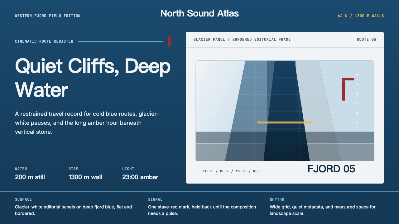
For presentation slides, the style works particularly well on full-bleed photography covers. A wide-angle landscape image set with the horizon low or high — not centered — gives the cover its essential character. The title should sit in one quiet corner, set in a clean geometric sans-serif in white or near-white, small enough that the image still dominates. Content slides should be treated as open fields: a single large image or a generous white ground, hierarchical type in two sizes, and no decorative dividers. Data slides benefit from the style's visual patience — bar charts and diagrams in the palette's cold blue, with the stave-red reserved for the single most important data point. Gradient fills in charts are inconsistent with the aesthetic.对于演示文稿,这一风格在满版摄影封面上特别有效。一张地平线放低或放高——而非居中——的广角地景图像,赋予封面其本质性格。标题应当置于一个安静的角落,以干净的几何无衬线字体设为白色或近白色,字号足够小,以让图像仍占主导。内容页应被当作开阔的场地处理:一张大图或充裕的白色底面,两个尺寸的层级文字,没有装饰性分割线。数据页受益于这一风格的视觉耐心——以色板的冷蓝做柱状图和图表,木板教堂红仅留给最重要的单一数据点。图表中的渐变填充与这一美学相悖。
For web interfaces, the Norwegian fjord approach is well matched to premium travel brands, outdoor equipment companies, environmental organizations, and any product positioned around natural materials or considered craft. The practical translation: a near-white or light grey ground, deep navy or cold grey for type, photography given generous allocation in the layout with minimal text overlay, and the red accent used only for primary calls to action or critical alerts — never as a decoration. The matte preference translates to flat card components, flat button styling, and an avoidance of both drop shadows and inner glows.对于网页界面,挪威峡湾风格与高端旅行品牌、户外装备公司、环境机构,以及任何定位于天然材料或精心工艺的产品高度契合。实际转化方式:近白或浅灰底面,深海军蓝或冷灰用于文字,摄影在版面中获得充裕分配且文字叠加最少,红色点缀仅用于主要行动号召或关键提示——绝不作为装饰。哑光偏好转化为平面卡片组件、平面按钮样式,以及对投影和内发光的双重回避。
For editorial and marketing work, the style supports storytelling at scale. A long-form editorial layout in this register uses a wide measure for full-bleed images, a narrower measure for body text, and lets sections breathe with generous spacing between them. Pull quotes should appear in the cold blue rather than in colored highlight boxes. Marketing pieces — event invitations, capability statements, campaign headers — benefit from extreme restraint: one strong image, the minimum necessary text, and the stave-red accent in at most one location per page. The style does not support busy collage layouts or multi-column grids with competing visual weights.对于编辑和营销工作,这一风格支持大尺度的叙事。这种基调的长篇编辑版面,为满版图像使用宽幅,为正文使用较窄幅,让各段落之间以充裕间距呼吸。引用语应以冷蓝色而非彩色高亮框显示。营销物料——活动邀请函、能力陈述、活动头图——受益于极度克制:一张强有力的图像,最少必要的文字,每页至多一处木板教堂红点缀。这一风格不支持繁忙的拼贴版面或多栏目视觉权重相互竞争的网格。
The most common mistake when applying this style is overcrowding the stave-red accent. Its power depends entirely on being used once, or at most twice, in a composition surrounded by the cold blue and white palette. When red appears in multiple locations — navigation links, icon fills, decorative borders, and a button — it stops functioning as a focal device and collapses into background noise. The second most common mistake is substituting a warm or vibrant blue for the specific cold blue of glacial water. A warm mid-blue gives the composition a Mediterranean character entirely at odds with the Northern European register the style depends on.应用这一风格时最常见的错误,是过度使用木板教堂红。它的力量完全依赖于在整个被冷蓝和白色包围的构图中只出现一次、至多两次。当红色出现在多个位置——导航链接、图标填充、装饰性边框和按钮——它便不再发挥焦点作用,而是消融为背景噪音。第二个最常见的错误,是用暖色调或鲜艳的蓝色替代冰川水的特定冷蓝。一抹温暖的中蓝给构图带来地中海气质,与这一风格所依赖的北欧基调完全背道而驰。
See the Norwegian Fjord Tourism design system →查看 Norwegian Fjord Tourism 完整设计系统 →
Norwegian Fjord Tourism — FAQNorwegian Fjord Tourism · 常见问题
Is Norwegian fjord tourism design the same as generic Scandinavian minimalism?挪威峡湾旅游设计和通用的斯堪的纳维亚极简主义是同一回事吗?
Related but distinct. Generic Scandinavian minimalism — the design language associated with Swedish furniture brands, Finnish kitchenware, or Danish graphic design — shares the preference for restraint, negative space, and clean typography, but its palette is typically warm-neutral: off-white, birch, warm grey, dusty rose. Norwegian fjord tourism design is specifically cold: the blues are glacial rather than sky-blue, the whites are polar rather than creamy. The stave-red accent and the explicit connection to landscape photography also distinguish it from the interior-design-adjacent version of Scandinavian minimalism.相关但截然不同。通用的斯堪的纳维亚极简主义——与瑞典家具品牌、芬兰厨具或丹麦平面设计相关的设计语言——同样偏好克制、留白和干净的字体排印,但其色板通常是暖中性调:米白、桦木色、温暖灰、尘玫瑰。挪威峡湾旅游设计则特别寒冷:蓝色是冰川蓝而非天蓝,白色是极地白而非奶油白。木板教堂红点缀以及与风景摄影的明确关联,也将其与斯堪的纳维亚极简主义的室内设计版本区别开来。
Can this style work for urban or non-landscape brands?这一风格适用于城市或非地景品牌吗?
Yes, with appropriate adaptation. The style's structural principles — cold palette, generous negative space, single warm accent, matte surfaces, photography-led composition — are transferable to any brand that wants to communicate spaciousness, considered restraint, and a certain Northern European seriousness. Architecture firms, premium outdoor apparel, high-end hospitality, and environmental-data products have all used adjacent aesthetics effectively. The adaptation requires finding the brand's equivalent of the fjord: the single visual element that the composition will be built around. Without that organizing focal point, the style loses its essential logic and becomes merely cold and sparse.可以,但需要适当调适。这一风格的结构性原则——冷色板、充裕留白、单一暖色点缀、哑光表面、以摄影为主导的构图——可移植到任何希望传达空旷感、深思熟虑的克制与某种北欧严肃性的品牌。建筑事务所、高端户外服装、精品款待业和环境数据产品都曾有效地运用过相近的美学。这种调适需要找到品牌自身的峡湾等价物:构图将围绕其建立的那个单一视觉焦点。缺少这个组织性焦点,这一风格便失去其本质逻辑,沦为仅仅冷漠而疏旷。
How is this style different from other national tourism identities?这一风格与其他国家旅游识别语言有何不同?
Many national tourism identities lean heavily on folk ornament, historical architecture, or vivid local color as their primary visual signature. Norwegian fjord tourism is unusual in that it largely removes cultural decoration from the frame and lets geological and natural scale do the primary work. The New Zealand tourism identity, for comparison, uses similar wide-landscape photography but with warmer greens and the cultural presence of Māori design. Japanese tourism identity uses a very different register — precision, cultural layering, seasonal color symbolism. The Norwegian approach is among the most stripped-back: culture enters mostly through the stave-church accent and the Sámi design thread in northern imagery, rather than through surface ornament.许多国家旅游识别语言大量借助民俗纹样、历史建筑或鲜艳的地方色彩作为主要视觉标志。挪威峡湾旅游的不寻常之处在于,它在很大程度上将文化装饰从画面中移除,让地质与自然尺度完成主要工作。以新西兰旅游识别为对比:同样使用宽幅地景摄影,但色调更暖绿,并有毛利设计的文化存在感。日本旅游识别走向截然不同的基调——精准、文化层叠、季节性色彩象征。挪威的方式是最为精简的之一:文化主要通过木板教堂红点缀和北部影像中的萨米设计线索介入,而非通过表面装饰。
What time period does this style reflect, and does it feel dated?这一风格反映了哪个时代,它是否显得过时?
The current form of the style was consolidated roughly between 2005 and 2015, during the peak of international attention to Nordic design and the UNESCO-driven growth in fjord tourism. Because the style's foundation is a landscape palette rather than a trend palette — cold blue and glacier white are not subject to fashion cycles the way millennial pink or early-2010s teal were — it has aged more gracefully than many tourism identities from the same era. The drone photography conventions that the style helped popularize have become generic, which means imagery that relies too heavily on the straight-down fjord aerial without additional compositional thought can now read as stock. The solution is the same discipline the style always required: fewer elements, more space, the single accent placed deliberately.这一风格的当前形态大致在2005至2015年间确立,正值国际社会对北欧设计关注的高峰期,以及联合国教科文组织认定推动峡湾旅游增长的时期。由于这一风格的基础是地景色板而非流行色板——冷蓝和冰川白不像千禧粉或2010年代初的蓝绿色那样受时尚周期支配——它比同时代许多旅游识别语言老得更优雅。这一风格帮助普及的无人机摄影惯例已变得泛滥,这意味着过于依赖直俯峡湾航拍而缺乏额外构图思考的影像,如今可能会显得像图库素材。解决方案与这一风格始终要求的纪律相同:更少的元素,更多的空间,单一点缀被刻意放置。
How should the stave-red accent be introduced in a design that has no obvious Norwegian reference?在没有明显挪威参照的设计中,应如何引入木板教堂红?
The accent does not need to carry a Norwegian reference to function; it needs to function as a warm focal point in a cold composition. The practical question is: what is the single most important element the viewer's eye should reach first? That element receives the accent. In a slide deck, it might be the one statistic that changes everything. In a website, it might be the primary call-to-action button. In an editorial layout, it might be the opening pull quote. What the accent cannot do is appear in multiple roles simultaneously — it loses its power the moment it becomes a system color rather than a decisive, singular mark.这一点缀无需携带挪威参照才能发挥作用;它需要作为冷构图中的暖焦点发挥作用。实际问题是:视线应当最先抵达哪个单一元素?那个元素获得点缀色。在演示文稿中,它可能是改变一切的那个数据。在网站中,它可能是主要的行动号召按钮。在编辑版面中,它可能是开篇引用语。这一点缀不能做的,是同时出现在多个角色中——它一旦成为系统色而非决定性、单一的标记,便立即失去力量。
Related design styles相关设计风格
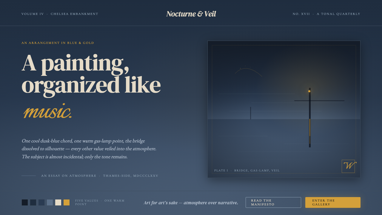 Whistler Nocturne TonalismA painting organized like music. One dusk-blue chord, one warm gas-lamp point…如音乐般编排的画面:一组冷暮蓝和弦、一点煤气灯金,其余尽数消融为雾。
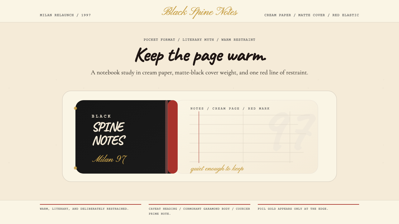 Moleskine Sketchbook (1997)Quietly literary. Cream paper, matte black, and a red elastic stripe do the w…安静而文学。奶油纸、哑黑封面与红色松紧带构成画面。
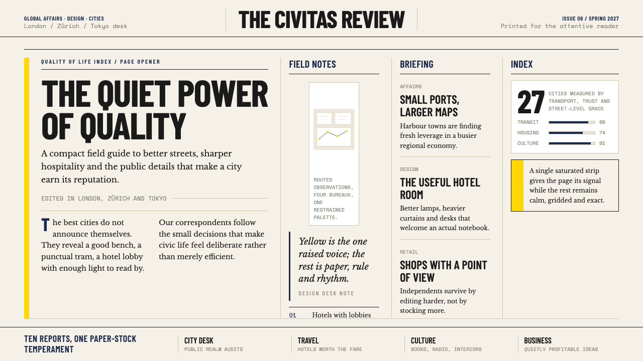 Monocle MagazineQuiet authority. Yellow spine, warm paper and dense ruled columns speak at li…安静的权威。黄色书脊、暖纸色与密集栏线,低声建立品味。
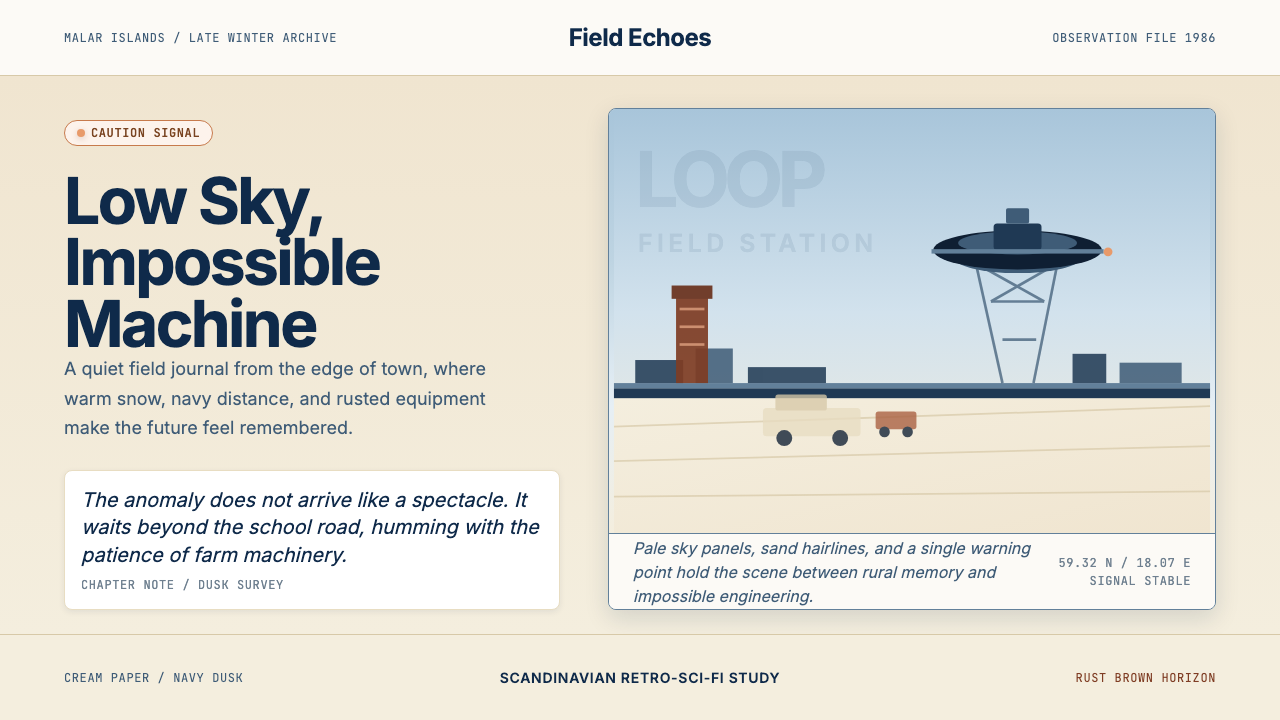 Simon Stålenhag — Tales from the LoopMelancholy makes the future quiet. Cream snow, low sky panels, navy type, one…未来安静而忧郁:奶油雪、低天空面板、海军蓝字与一盏橙灯。
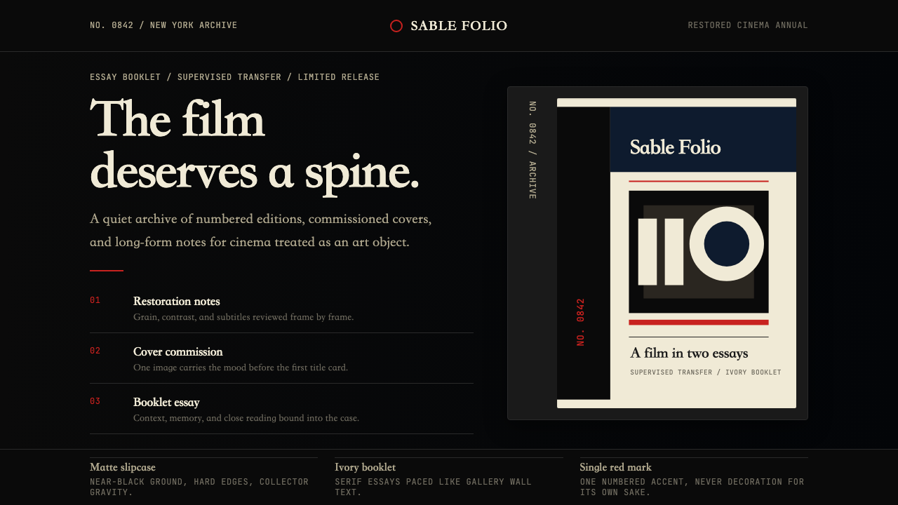 Criterion CollectionMuseum-grade cinema. Matte black, ivory serif, and one red numbered spine set…博物馆级电影感:哑黑底、象牙衬线与一枚红色编号书脊定调。
 Kanye — 808s & HeartbreakGrief in restraint. Cream paper, one red heart, yellow heat, and a black hair…克制承载悲伤:奶油纸、红心、热黄与黑色细线。