What is Simon Stålenhag — Tales from the Loop?什么是 Simon Stålenhag — Tales from the Loop?
Simon Stålenhag planted impossible machines in the cream snow of a Swedish suburb, and the light has never quite left.Simon Stålenhag 将不可思议的机器埋入瑞典郊区的奶油色积雪,那道光从此再未完全散去。
Simon Stålenhag — Tales from the Loop in briefSimon Stålenhag — Tales from the Loop 速览
Simon Stålenhag's visual world — crystallized in the art books Tales from the Loop (2014), Things from the Flood (2016), and The Electric State (2017) — is one of the most influential aesthetic systems to emerge from contemporary digital painting. It is not a movement in the institutional sense but a singular vocabulary: warm cream snow, low Scandinavian skies pressing down like a ceiling, rusting mechanical giants half-buried at the edge of wheat fields, and children walking home through a landscape that is simultaneously ordinary and utterly wrong. The emotional register is one of quiet dread inflected with nostalgia — a past that never existed, remembered with perfect melancholy.Simon Stålenhag 的视觉世界——凝结于艺术书籍《Tales from the Loop》(2014)、《Things from the Flood》(2016)与《The Electric State》(2017)——是当代数字绘画领域最具影响力的美学体系之一。它不是机构意义上的运动,而是一套独特的词汇:温暖的奶油色积雪、低矮的北欧天空像天花板般压下来、锈迹斑斑的机械巨物半埋在麦田边缘,孩子们走在归家路上,穿越一片既普通又彻底不对劲的风景。情感基调是安静的惶恐,浸透着乡愁——一段从未真实存在过的过去,以近乎完美的忧郁被铭记。
As a design language, the Stålenhag palette has been translated far beyond its painted origins. The interface interpretation retains the atmosphere while converting it into typographic and compositional decisions: cream paper grounds, deep navy or charcoal type, sky-panel asides rendered in the muted grey of a Swedish winter overcast, and one carefully rationed saturated-orange accent that functions like a caution lamp at a field's edge — present, unmistakable, slightly unsettling. The visual effect is editorial restraint at the service of an unmistakable mood.作为设计语言,Stålenhag 的色彩体系早已超越其绘画起源,被广泛转译。界面版本保留了那种氛围,并将其转化为字体与构图上的决策:奶油纸面底色、深海军蓝或炭黑色文字、以瑞典阴天那种消沉灰色呈现的天空灰面板,以及一抹经过精确配给的饱和橙强调色——其功能如同田野尽头一盏警示灯,存在感强烈,无法忽视,带着一丝令人不安的气息。整体视觉效果是编辑式的克制,服务于一种无可替代的情绪。
What distinguishes this aesthetic from other retro-science-fiction styles is its emphasis on the pastoral scale. The machines in Stålenhag's paintings are enormous, but they are almost never the subject — they are background, context, weather. The human figures are small, quotidian, and only faintly aware that anything is unusual. This compositional proportion — the anomalous enormous behind the mundane small — translates into interface work as hierarchy through scale contrast and the deliberate use of negative space to isolate the thing that should unsettle the eye.与其他复古科幻风格相比,这套美学的独特之处在于对田园尺度的强调。Stålenhag 画作中的机器体型巨大,但它们几乎从来不是主角——它们是背景、语境、天气。画中的人物渺小而日常,对周围的异常只有隐约的感知。这种构图比例——庞大的异常藏在平凡的渺小之后——转译进界面设计时,体现为以尺度对比建立层级,以及刻意使用留白来隔离那个应当让视线停顿的元素。
Where does Simon Stålenhag — Tales from the Loop come from?Simon Stålenhag — Tales from the Loop 从何而来?
Simon Stålenhag was born in Stockholm in 1984 and grew up in the Swedish countryside during the decade when the Cold War was ending and Sweden's landscape was being threaded with power lines, antenna arrays, and the first generation of industrial wind turbines. He studied at the Royal Institute of Art in Stockholm and worked as a concept artist and game designer before the Tales from the Loop art book — self-published and funded through Swedish arts grants — reached a global audience via the internet in 2014. The timing coincided with a widespread appetite for exactly this combination: analog-era aesthetics, wide-open suburban melancholy, and the creeping presence of technology that is understood to be powerful but not quite understood to be controlled.Simon Stålenhag 于 1984 年生于斯德哥尔摩,在冷战结束的那个十年里于瑞典乡间长大。那时,高压电线、天线阵列与第一代工业风机正在被织入瑞典的地貌之中。他就读于斯德哥尔摩皇家艺术学院,曾担任概念艺术家与游戏设计师。2014 年,《Tales from the Loop》艺术书以自费出版形式问世——资金来自瑞典艺术资助——并通过互联网触达全球读者。时机恰到好处:彼时,人们对这种组合的渴望正盛——模拟年代的美学,宽阔空旷的郊区忧郁,以及那种被理解为强大却未必被理解为可控的技术的悄然渗透。
The key imaginative premise of Tales from the Loop is that a particle physics research facility — the Loop — has been built beneath the Swedish lakeland, and its energetic byproducts have leaked strange phenomena into the surrounding countryside. Gravity anomalies. Mechanical animals. Machines that move on their own long after their operators have left. Stålenhag populated this setting with images from his own 1980s childhood: Swedish red wooden houses, the particular amber of late-afternoon winter light on birch bark, the unlit gas stations and half-frozen lakes of the Stockholm archipelago. The result was not nostalgia for technology but nostalgia filtered through technology — a rusted machine crying in a field is as sad as the field itself.《Tales from the Loop》的核心想象前提是:一座粒子物理研究设施——The Loop——建在瑞典湖区地下,其能量副产物将奇异现象泄漏进了周边的乡野:重力异常、机械动物、在操作者离去很久之后仍自行运动的机器。Stålenhag 以自己 1980 年代的童年记忆填充了这片场景:瑞典的红色木屋、白桦树皮上冬日午后那种特定的琥珀光线,以及斯德哥尔摩群岛上未亮的加油站与半封冻的湖面。结果不是对技术的乡愁,而是透过技术过滤的乡愁——一台在田野里哭泣的锈烂机器,与田野本身一样令人悲伤。
The Amazon Prime television adaptation of Tales from the Loop in 2020, produced with Stålenhag serving as executive producer and visual consultant, brought the aesthetic to a mass audience and cemented its influence on production design, game art, and advertising. The show's color grading — muted warm tones, sky-dominant compositions, a restrained use of saturated color for emphasis — translated the paintings' grammar into cinematography and expanded the vocabulary's reach into motion and time-based media.2020 年,亚马逊 Prime 对《Tales from the Loop》的电视剧改编由 Stålenhag 担任执行制片人与视觉顾问,将这套美学带给了大众观众,并巩固了它对制作设计、游戏艺术与广告领域的影响。剧集的调色——柔和的暖色调、以天空为主的构图、克制地使用饱和色作为强调——将画作的语法转译进电影摄影,并将这套词汇的触角延伸至动态与时间性媒介。
Beyond the Loop books, The Electric State (2017) transported the same atmosphere into an alternate 1990s American Southwest, replacing Swedish lakeland with Nevada desert and juniper scrubland, while retaining the same compositional logic: vast derelict machines, small human figures, a sky that goes on forever and says nothing comforting. This geographic expansion demonstrated that the aesthetic was portable — it was not tied to Sweden or the 1980s but to a specific emotional relationship between scale, technology, and human smallness. The vocabulary had become a grammar, and the grammar was independent of its original setting.超越 Loop 系列,《The Electric State》(2017)将同样的氛围移植至一个架空的 1990 年代美国西南部——以内华达沙漠与杜松灌木丛替换瑞典湖区,却保留着同样的构图逻辑:庞大的废弃机器、渺小的人类身影,以及一片永无止境却没有任何安慰的天空。这次地理上的扩张证明了这套美学具有可移植性——它并不依附于瑞典或 1980 年代,而是依附于一种特定的情感关系:关于尺度、技术与人类渺小之间的关系。这套词汇已成为一套语法,而语法独立于其原始语境而存在。
What defines the Simon Stålenhag — Tales from the Loop look?Simon Stålenhag — Tales from the Loop 的视觉特征是什么?
Cream and Cool Ground奶油底与冷调底色
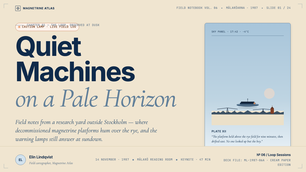
The foundational ground is almost never pure white. Stålenhag's snowfields read as warm cream, and his skies as a desaturated grey-blue that sits somewhere between overcast and dusk. In interface translation, this produces a background that is slightly warm where white would feel clinical, and slightly cool where grey would feel inert — a narrow thermal band that reads as naturalistic without being photographic. The warmth of the ground and the coolness of the sky palette create a subtle chromatic tension that keeps surfaces from feeling flat.底色几乎从不是纯白。Stålenhag 画中的雪地呈现为暖奶油色,天空则是一种介于阴天与黄昏之间的去饱和蓝灰。在界面转译中,这产生了一种特殊的背景色:在白色会显得临床冷硬的地方稍带温度,在灰色会显得呆滞沉闷的地方稍带清凉——一个窄小的温度区间,读来自然却不失为摄影般的真实感。底色的暖意与天空调色板的清冷制造出微妙的色温张力,使页面表面不至于显得平板。
Deep Navy and Charcoal Type深海军蓝与炭黑字体
Text and strong structural elements take on a deep navy or near-black charcoal rather than pure black. The distinction is subtle but meaningful: navy carries a slightly maritime, slightly melancholic quality that harmonizes with the cool sky palette, while pure black would feel like a different visual register entirely — too graphic, too assertive for the atmospheric quietness the style is built on. Headlines, navigation, and body text all inhabit this dark-cool end of the spectrum, providing contrast against cream without the harshness of absolute black.文字与强结构性元素采用深海军蓝或近黑色的炭黑,而非纯黑。区别微妙却意义深远:海军蓝带有一丝海洋气质与忧郁感,与清冷的天空调色板和谐共鸣,而纯黑则会产生截然不同的视觉质感——对于这种风格所建立的大气安静感而言,显得太图形化、太咄咄逼人。标题、导航与正文均占据这个暗冷端的光谱位置,在奶油底上提供对比度,却没有绝对黑色的刺眼锐度。
The Single Orange Accent唯一的橙色强调
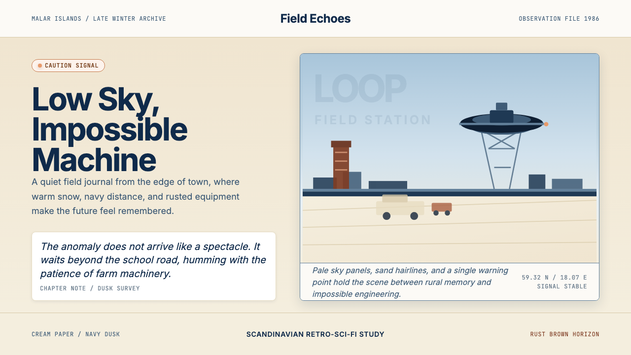
Saturated warm orange — the color of an industrial caution lamp, a safety vest at dusk, a sodium streetlight through winter fog — is the sole high-saturation element in the palette, and its use is strictly rationed. In Stålenhag's paintings, such warm-orange lights appear as isolated points in predominantly cool, desaturated compositions; they function as emotional anchors and compositional focal points simultaneously. In interface work, this means orange is reserved for a single active state, a single call-to-action category, or a single alert tier — never diffused across the layout as a general highlight color.饱和的暖橙色——工业警示灯的颜色、黄昏时的安全背心色、冬雾中的钠灯暖光——是整个调色板中唯一的高饱和元素,其使用受到严格控制。在 Stålenhag 的画作中,这类暖橙色光点作为孤立的焦点出现于以冷色调、低饱和为主的构图中,同时发挥情感锚点与视觉焦点的双重功能。在界面设计中,这意味着橙色只保留给单一的活跃状态、单一的行动号召类别或单一的警示等级——绝不作为通用高亮色弥散于整个版面。
Sky-Panel Horizontal Bands天空灰横向色块
One of the most recognizable compositional features of Stålenhag's work is a low horizon line, with sky occupying the upper half to two-thirds of the canvas. The sky zone is desaturated and slightly lighter than the snow, often carrying faint atmospheric gradation from a cool near-white at the horizon to a deeper grey-blue toward the zenith. Translated into interface layout, this becomes a recurring panel or section background in desaturated cool grey — a sky-tone stripe that signals a shift in register, a side-panel background, or a data-context aside. It is not decorative but atmospheric: it changes the emotional temperature of content without introducing a new color.Stålenhag 作品中最具辨识度的构图特征之一是低地平线——天空占据画布上方二分之一到三分之二的面积。天空区域去饱和,略亮于雪地,通常从地平线附近的冷近白色向顶部更深的灰蓝色呈现出隐约的大气层次感。转译至界面布局时,这成为去饱和冷灰的面板或分区背景——一条天空色调的色带,用于暗示内容基调的转变,作为侧面板背景或数据语境的旁注区域使用。它不是装饰性的,而是大气性的:在不引入新色彩的情况下,改变内容的情感温度。
Scale Contrast and Anomalous Scale尺度对比与异常尺度
A defining tension in Stålenhag's work is the relationship between human scale and machine scale. Children are painted with realistic proportions while the structures looming behind them are rendered at a scale that quietly violates the rules of perspective — they are simply too large, too present, too far from any human logic of size. This produces a persistent unease that is never fully resolved. In interface terms, this translates to deliberate scale contrast: a number or statistic rendered at a size that commands the page while surrounding metadata recedes to near-illegibility, or a hero image that extends beyond the container implied by the grid. The contrast is not accidental but structural.Stålenhag 作品中一个决定性的张力是人的尺度与机器尺度之间的关系。孩子以写实比例绘制,而身后矗立的结构则以一种悄然违背透视法则的尺度呈现——它们太巨大、太在场,远离任何人类对大小的理性认知。这制造出一种持续的不安感,始终未能完全消解。在界面语境中,这转译为刻意的尺度对比:一个数字或统计数据以支配整个页面的大小呈现,而周边的元数据退缩至近乎不可辨读;或是一张主视觉图延伸超出网格所暗示的容器边界。这种对比不是偶然的,而是结构性的。
Editorial Quietness编辑式安静感
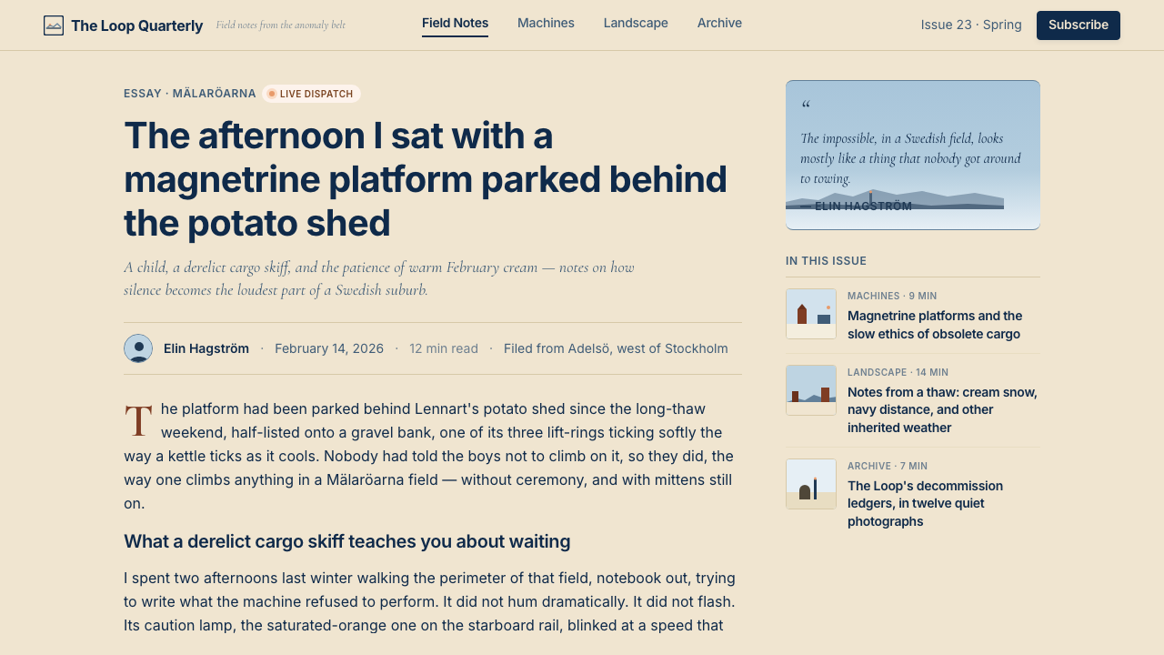
Stålenhag's books are not poster art; they are image-and-text narratives, paced like a novel, with passages of prose set in a typeface that suggests a literary rather than commercial register. The design of the books — wide margins, unhurried text setting, image and prose given equal weight — is a direct precedent for the interface translation. Typography is restrained and editorial: proportional spacing, generous leading, column widths that prioritize readability over information density. The overall impression is of a printed journal from the early 1990s, set with care by someone who believed the words mattered as much as the pictures.Stålenhag 的书不是海报艺术,而是图文叙事,节奏如同小说,散文段落以一种暗示文学而非商业气质的字体排版。书籍的设计——宽裕的页边距、不慌不忙的文字设置、图像与文字获得同等分量——为界面转译提供了直接的先例。字体排印克制而具编辑感:等比间距、慷慨的行间距、以可读性而非信息密度为优先的栏宽。整体印象是 1990 年代初的一份印刷期刊,由某个相信文字与图像同等重要的人用心排版。
Rust and Weathered Surface锈蚀与风化质感
The machines in Stålenhag's paintings are almost never pristine. They are rusting, cracking, half-reclaimed by vegetation or snow. This weathered quality is central to the emotional register — it suggests time, entropy, and the indifference of a landscape that will outlast any technology. In interface work this does not mean applying literal rust textures, which would be illustrative decoration, but rather embracing a slightly worn quality in surface treatment: aged parchment rather than fresh stock, slightly softened borders rather than razor-sharp rules, and a general preference for warmth and imperfection over sterile precision.Stålenhag 画作中的机器几乎从未保持崭新。它们在锈蚀、开裂,被植物或积雪半掩半吞。这种风化品质是其情感基调的核心——它暗示着时间、熵,以及一片将比任何技术都更长寿的风景的漠然。在界面设计中,这并不意味着应用字面意义上的锈迹纹理(那将成为说明性装饰),而是在材质处理上拥抱一种微微磨损的质感:泛黄的羊皮纸而非刚出厂的纸张,略微柔和的边框而非锋利如刀的线条,以及对温度与不完美的整体偏好,而非对无菌精确性的追求。
Who shaped Simon Stålenhag — Tales from the Loop?谁塑造了 Simon Stålenhag — Tales from the Loop?
Stålenhag is the sole originator and continuing practitioner of this aesthetic. Born in Stockholm in 1984, he developed his signature style through digital painting that combined photographic reference, painterly atmosphere, and narrative concept art. His self-published books became international bestsellers after spreading through design, gaming, and speculative fiction communities online. As executive producer and visual consultant on the Amazon adaptation, he ensured that the television translation remained faithful to the compositional and atmospheric principles of the original work rather than simply borrowing its surface imagery. His ongoing publishing output — including The Labyrinth (2023) — continues to develop and extend the vocabulary.Stålenhag 是这套美学的唯一创始人与持续实践者。他于 1984 年生于斯德哥尔摩,通过将摄影参考、绘画性氛围与叙事概念艺术相结合的数字绘画,发展出自己的标志性风格。他的自费出版书籍在设计、游戏与思辨小说社区线上传播后,成为国际畅销书。担任亚马逊改编剧集执行制片人与视觉顾问期间,他确保了电视转译忠实于原作的构图与氛围原则,而非仅仅借用其表面图像。他持续的出版产出——包括《The Labyrinth》(2023)——仍在不断发展与延伸这套词汇。
The art direction and book design of the original Tales from the Loop volume established the typographic and layout conventions that have since become part of the visual system's grammar. The wide-margin, image-forward layout — treating the paintings as primary documents with prose commentary rather than illustrated text — set a precedent for how the aesthetic transfers into page and screen design. The book design is not commonly attributed in public discourse but is integral to understanding how the painted aesthetic became a design system.最初《Tales from the Loop》书籍的艺术指导与书籍设计,确立了此后成为这套视觉系统语法一部分的字体排印与版面惯例。宽页边距、以图像为主的布局——将画作视为主要文件,配以散文注释,而非配图文字——为这套美学如何转化至页面与屏幕设计树立了先例。书籍设计在公开讨论中鲜少被单独提及,却是理解绘画美学如何成为设计系统的不可或缺的一环。
Romanek's direction of the Amazon Prime series — particularly its pilot episode — translated Stålenhag's painted compositions into cinematographic language. His background in music video and film (One Hour Photo, Never Let Me Go) gave him the tools to handle the series's dominant emotional register: long takes, static or very slowly moving camera, compositions that leave vast amounts of negative space around small human figures. The show's visual grammar became an important reference point for motion designers and video producers working in the aesthetic, demonstrating how the still-image principles adapt to duration.Romanek 对亚马逊 Prime 剧集的执导——尤其是首集——将 Stålenhag 的绘画构图转译进电影摄影语言。他在音乐录影带与剧情片领域的背景(《一小时照片》《别让我走》)为他提供了处理这部剧集主导情感基调的工具:长镜头、静止或极缓慢移动的摄影机、在渺小人物身周留出大量负空间的构图。剧集的视觉语法成为动态设计师与在这套美学中工作的影片制作人的重要参照,展示了静态图像原则如何适应时间维度。
The Swedish tabletop role-playing company Free League Publishing produced the official Tales from the Loop RPG in 2017, which became one of the most awarded tabletop games of the decade and introduced the aesthetic to a large global gaming audience. Free League's adaptation required developing a full graphic design system from Stålenhag's paintings — rulebook layout, character sheet design, supplementary materials — and in doing so produced one of the most thorough documented translations of the visual vocabulary into applied design. Their subsequent games set in the same world (Things from the Flood RPG, The Electric State RPG) extended and refined the design language further.瑞典桌游公司 Free League Publishing 于 2017 年推出了官方《Tales from the Loop》角色扮演游戏,该游戏成为这十年间获奖最多的桌游之一,并将这套美学介绍给了全球大量游戏玩家。Free League 的改编要求从 Stålenhag 的画作中发展出一套完整的平面设计系统——规则书版面、角色卡设计、补充材料——由此产生了迄今为止将这套视觉词汇转化为应用设计最为完整的文献记录之一。他们此后设定于同一世界的游戏(《Things from the Flood RPG》《The Electric State RPG》)进一步延伸与精炼了这套设计语言。
How do you use Simon Stålenhag — Tales from the Loop today?今天怎么用 Simon Stålenhag — Tales from the Loop?
The Stålenhag aesthetic transfers well to any designed artifact that needs to carry emotional weight without visual noise. The key discipline is restraint in the use of the orange accent — which functions as a warning light, not a decoration — and faithfulness to the cream-and-navy ground, which provides the atmospheric base that makes everything else cohere. Applying this style means committing to the mood before the layout: the question is not where to put the orange but whether the overall composition reads as quiet, unhurried, and slightly melancholy.Stålenhag 美学适合任何需要在不增加视觉噪音的情况下承载情感重量的设计产物。关键纪律在于克制使用橙色强调——它的功能是警示灯,而非装饰——以及忠实于奶油底加海军蓝的基础色调,正是这一基础提供了使一切连贯的大气底色。应用这种风格意味着在构图之前先确立情绪:问题不是把橙色放在哪里,而是整体构图读来是否安静、不慌不忙,带着一丝忧郁。
For presentation slides, the style works powerfully on both cover and chapter-break pages. A cover benefits from a compositional structure borrowed from the paintings: a large desaturated image or illustration occupying the upper two-thirds of the slide, with title and subtitle set in deep navy at the lower third on a cream ground. The orange accent, if used at all, should be confined to a single word, a line rule, or a symbol. Content slides should be treated as pages from a well-designed journal — generous margins, text hierarchies distinguished purely by scale and weight, no decorative dividers. Data slides gain authority when charts are rendered in the navy-and-cream palette with orange reserved for a single data series of special significance.在演示文稿中,这种风格在封面与章节分隔页上效果强劲。封面适合借鉴画作中的构图结构:一张去饱和图像或插图占据幻灯片上方三分之二,标题与副标题在奶油底的下方三分之一处以深海军蓝排版。若使用橙色强调,应将其限制于单个词语、一条线规或一个符号。内容页应当被当作设计精良的期刊页面处理——慷慨的页边距,纯以尺度与字重区分的文字层级,无装饰性分割线。数据页在使用海军蓝与奶油的调色板渲染图表、并将橙色保留给唯一具有特殊意义的数据系列时,会获得应有的权威感。
For web interfaces — dashboards, pricing pages, editorial platforms, and portfolio sites — the system provides a strong typographic foundation. The approach: establish a warm cream or near-white background for primary content areas, use cool grey sky-tone panels for secondary or supporting content zones, set all body text in deep navy for contrast and mood, and allow orange to appear only in interactive states, active navigation indicators, or primary call-to-action elements. Card components benefit from soft outer shadows rather than hard borders, approximating the gentle separation between foreground and background in the paintings. Avoid the temptation to use gradients — the atmosphere should come from color temperature contrast, not from blending.对于网页界面——仪表板、定价页、编辑平台与作品集网站——这套体系提供了坚实的字体排印基础。方法如下:为主要内容区域建立温暖的奶油色或近白色背景,为次级或辅助内容区域使用冷灰天空色调面板,所有正文设为深海军蓝以同时提供对比度与情绪感,仅允许橙色出现在交互状态、活跃导航指示器或主要行动号召元素中。卡片组件使用柔和外阴影而非硬边框,近似画作中前景与背景之间的温和分离。避免使用渐变的诱惑——氛围感应当来自色温对比,而非色彩混融。
For editorial and marketing design — book covers, magazine spreads, campaign materials, and social cards — the style provides immediate visual distinctiveness in a contemporary landscape dominated by either hypersaturated maximalism or sterile white minimalism. A Stålenhag-derived editorial layout uses a wide-margin structure, sets images to bleed or float in large negative-space fields, and limits accent color to a single repeating element across the spread — a column rule, a pull-quote container, a running folio line. Marketing pages translate the paintings' compositional logic directly: full-width scene-setting images in the cool-cream palette alternate with text sections, building a slow narrative rhythm rather than an aggressive pitch.对于编辑与营销设计——书籍封面、杂志跨页、活动素材与社交卡片——这种风格在当代视觉景观中能立即形成视觉辨识度,因为当下主导风格要么是过度饱和的最大主义,要么是无菌的白色极简主义。Stålenhag 衍生的编辑版面采用宽页边距结构,将图像设置为出血或浮于大片留白区域,并将强调色限制于整个跨页中单一的重复元素——一条栏线、一个引用文字容器,或一条连续的页码线。营销页面直接转译画作的构图逻辑:以冷奶油调色板拍摄的全宽场景图与文字区块交替出现,建立缓慢的叙事节奏,而非咄咄逼人的推销。
A common mistake when applying this aesthetic is over-using the orange accent until it loses its warning-light quality and simply becomes a warm-colored design element competing with the navy for attention. Once orange appears more than twice per screen or spread, the carefully maintained tension between the cool atmospheric ground and the isolated warm signal collapses, and the result feels generically warm-retro rather than specifically melancholic. The other common error is substituting a pure cool blue for the sky-panel grey — the sky in Stålenhag's world is desaturated and complex, not the clean medium blue of a clear day, and using a pure blue creates a completely different mood. When in doubt, desaturate further.应用这套美学时最常见的错误,是过度使用橙色强调,直至它失去警示灯的品质,沦为与海军蓝争夺注意力的暖色调设计元素。一旦橙色在单个屏幕或跨页中出现两次以上,冷调大气底色与孤立暖色信号之间精心维持的张力便会崩溃,结果只是显得笼统的暖复古感,而非特定的忧郁感。另一个常见错误是以纯正的冷蓝色替代天空灰面板——Stålenhag 世界里的天空是去饱和的、复杂的,而非晴天的干净中蓝,使用纯蓝会创造出截然不同的情绪。若有疑问,请进一步降低饱和度。
Simon Stålenhag — Tales from the Loop — FAQSimon Stålenhag — Tales from the Loop · 常见问题
How is the Stålenhag aesthetic different from other retro-sci-fi styles like synthwave or vaporwave?Stålenhag 美学与 synthwave 或 vaporwave 等其他复古科幻风格有何不同?
Synthwave and vaporwave are both built on the neon-saturated, high-contrast, purple-and-cyan palette of 1980s commercial aesthetics — arcade games, VHS graphic intros, pop music. They are maximalist and urban. The Stålenhag aesthetic is their opposite: rural, desaturated, subdued, built on the palette of the natural world rather than artificial light. Where synthwave is warm and energetic, the Loop aesthetic is cool and melancholy. Where vaporwave is ironic and nostalgic about consumerism, Stålenhag is earnest and nostalgic about nature, childhood, and the uncanny. They share an era but draw from entirely different source materials.Synthwave 与 vaporwave 都建立在 1980 年代商业美学的霓虹饱和、高对比、紫青调色板上——街机游戏、VHS 图形片头、流行音乐。它们是最大主义的、都市的。Stålenhag 美学与之相反:乡村的、去饱和的、低调的,建立在自然世界而非人工光源的调色板上。Synthwave 是温暖而充满能量的,Loop 美学则是清冷而忧郁的。Vaporwave 对消费主义带着反讽式的乡愁,而 Stålenhag 对自然、童年与怪异感带着真诚的乡愁。它们共享一个时代,却从完全不同的源材料中汲取养分。
Can this style work without photographic or illustrative imagery?这种风格在没有摄影或插图图像的情况下能起效吗?
Yes, and the typographic-only variant is one of its most useful applications for digital product design. Without images, the atmosphere is carried entirely by color temperature — the cream ground, sky-grey panels, navy type, and rationed orange — plus the editorial pacing of the layout. A text-heavy dashboard or document interface can still read as Stålenhag-derived if the color relationships are correct and the typographic spacing is generous and unhurried. The absence of illustration actually emphasizes the quiet quality the style is known for, as long as the temptation to fill negative space with decorative elements is resisted.可以,纯字体排印变体是这种风格在数字产品设计中最实用的应用之一。没有图像时,氛围完全由色温承载——奶油底色、天空灰面板、海军蓝文字与经过配给的橙色——加上版面的编辑节奏。一个文字密集的仪表板或文档界面,只要色彩关系正确、字体间距慷慨而不慌不忙,仍然可以读出 Stålenhag 的气质。只要能抵制用装饰性元素填满留白的诱惑,没有插图反而会强调这种风格所以著称的安静品质。
Why is the orange accent described as 'rationed' rather than simply used as a standard accent color?为什么橙色强调被描述为「配给制的」,而不是简单地作为标准强调色使用?
Because the orange's emotional effect in Stålenhag's paintings depends entirely on its isolation. A single orange caution lamp in a grey winter field is alarming and beautiful because it is alone. Two orange lamps are a parking lot. The same principle applies in interface design: orange used sparingly, at one location per screen, in a composition that is otherwise cool and quiet, carries the full weight of the original paintings' signal-in-the-noise quality. Orange used as a standard secondary palette color — headers, link underlines, hover states, icon fills — becomes decoration and loses its affective power entirely. Ration it as if it were a consumable.因为橙色在 Stålenhag 画作中的情感效果完全依赖于它的孤立性。一盏橙色警示灯伫立在灰色冬日田野中,令人警觉而美丽,正因为它是孤独的。两盏橙色灯就是一个停车场。同样的原则适用于界面设计:橙色若使用节制,在每个屏幕中只出现于一个位置,在一个其余部分清冷而安静的构图中,它会承载原始画作那种噪音中的信号的全部力量。橙色若作为标准次级调色板色使用——标题、链接下划线、悬停状态、图标填充——就会沦为装饰,完全失去其情感力量。像对待消耗品一样配给它。
Is this aesthetic suitable for dark-mode interfaces?这种美学适合深色模式界面吗?
A direct dark inversion is possible but requires careful recalibration. The original palette is fundamentally a light-ground system — cream and sky grey are its atmospheric anchors. Inverting to a dark background risks losing both the warmth (cream becomes charcoal, which reads as tech-industrial rather than pastoral) and the cool-warm tension (the navy type disappears into a dark ground, leaving only the orange as a surviving accent). A more successful dark variant works by treating the night sky as the new ground: very deep navy-black, with cream used for primary text and sky grey for secondary text, and orange retained in its same rationed role. The result reads as moonlit field rather than inverted palette.直接深色反转是可能的,但需要仔细重新校准。原始调色板从根本上是一套浅色底色系统——奶油色与天空灰是其大气锚点。反转至深色背景的风险在于同时失去温暖感(奶油色变成炭黑,读来像科技工业感而非田园感)和冷暖张力(海军蓝文字消融进深色底,只留下橙色作为唯一幸存的强调色)。更成功的深色变体是将夜空作为新的底色:非常深的海军黑,以奶油色用于主要文字,天空灰用于次要文字,橙色保留其同样的配给角色。结果读来像月光下的田野,而非反转调色板。
What kinds of products or brands should avoid this style?哪类产品或品牌应该避免使用这种风格?
The Stålenhag aesthetic is fundamentally a style of melancholy and quiet dread — it is beautiful but it is not cheerful, warm in the human sense, or optimistic. Brands that depend on communicating happiness, energy, approachability, or cultural celebration will find it works against them. Children's products, food and beverage brands, fitness applications, community platforms, and anything positioning itself around joy, health, or social connection should look elsewhere. Similarly, products that need to communicate speed, urgency, or real-time dynamism — trading platforms, sports applications, live event technology — will find the style's deliberate slowness and atmospheric quietness a liability. The aesthetic rewards patience and fits contexts where users are expected to linger, read carefully, and sit with complex feelings.Stålenhag 美学从根本上是一种忧郁与安静惶恐的风格——它美丽,但它不欢快,不温暖(人文意义上的温暖),也不乐观。依赖传达幸福、能量、亲和力或文化庆典感的品牌会发现它适得其反。儿童产品、食品饮料品牌、健身应用、社区平台,以及任何围绕喜悦、健康或社交连接定位自身的产品,都应另寻他法。同样,需要传达速度、紧迫感或实时动态感的产品——交易平台、体育应用、现场活动技术——会发现这种风格刻意的缓慢感与大气安静感是一种负担。这套美学回报耐心,适合那些预期用户会停留、仔细阅读、与复杂情感共处的语境。
Related design styles相关设计风格
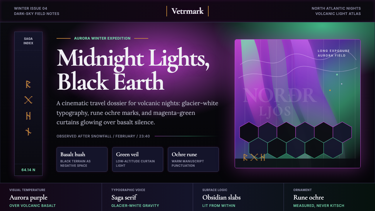 Icelandic Aurora TourismMidnight tourism turns mythic. Basalt black, aurora magenta-green, saga serif…午夜旅游变得神话。玄武岩黑、极光紫绿与萨迦衬线。
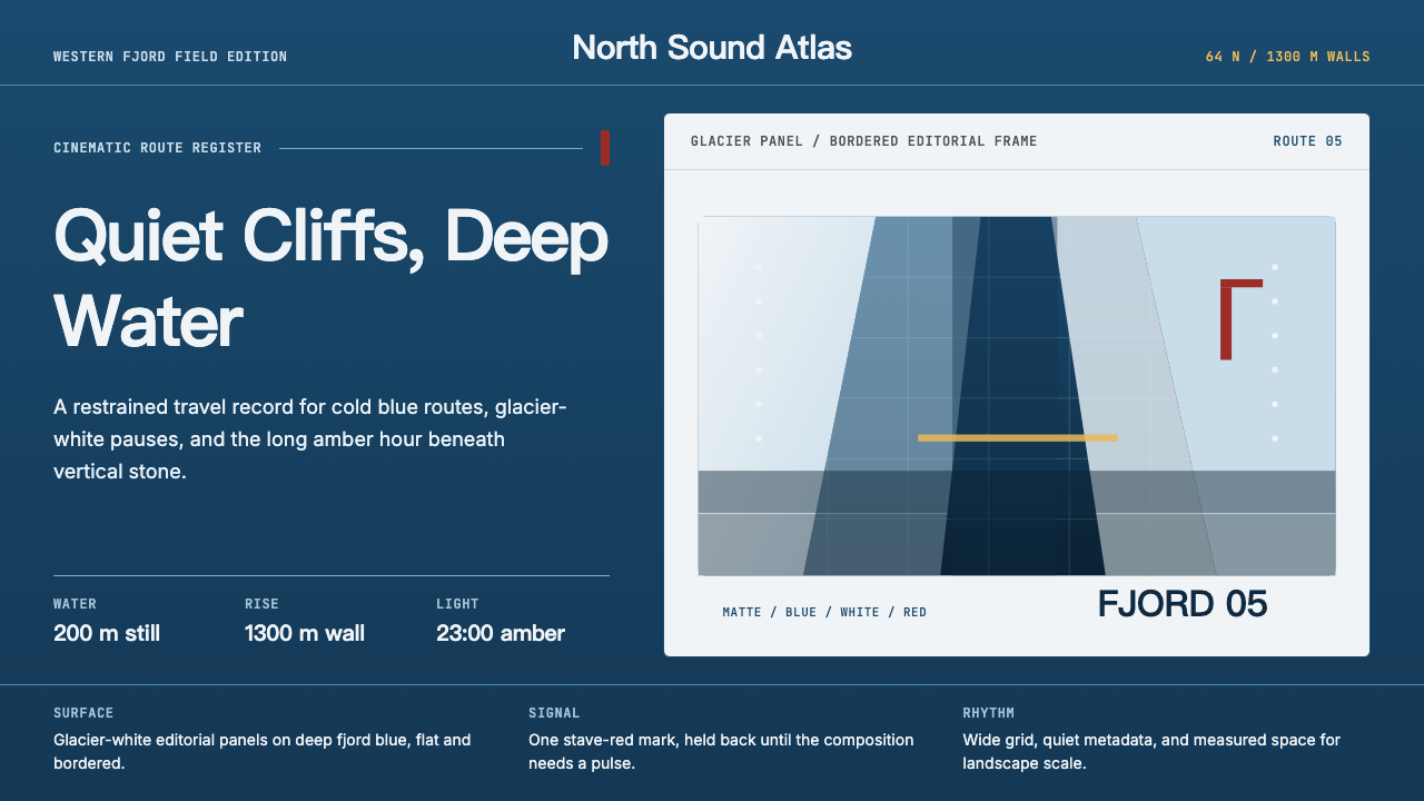 Norwegian Fjord TourismMonumental, not loud. Fjord blue, glacier-white panels, and one stave-red acc…壮阔但克制。峡湾蓝、冰川白面板和一处木教堂红点题。
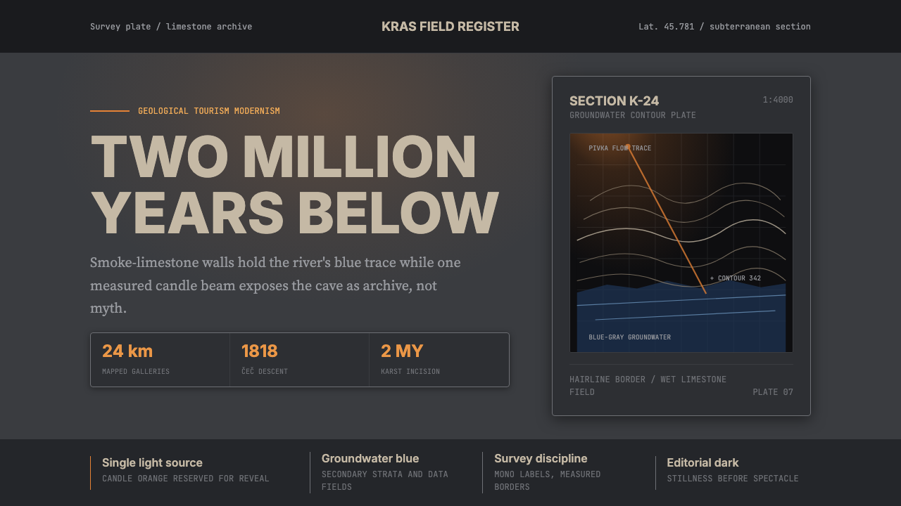 Slovenian Postojna Cave (Karst)Serious geology. Limestone gray, groundwater blue, and Inter type cut by one…严肃地质感:石灰岩灰、地下水蓝与Inter字,被一束烛光切开。
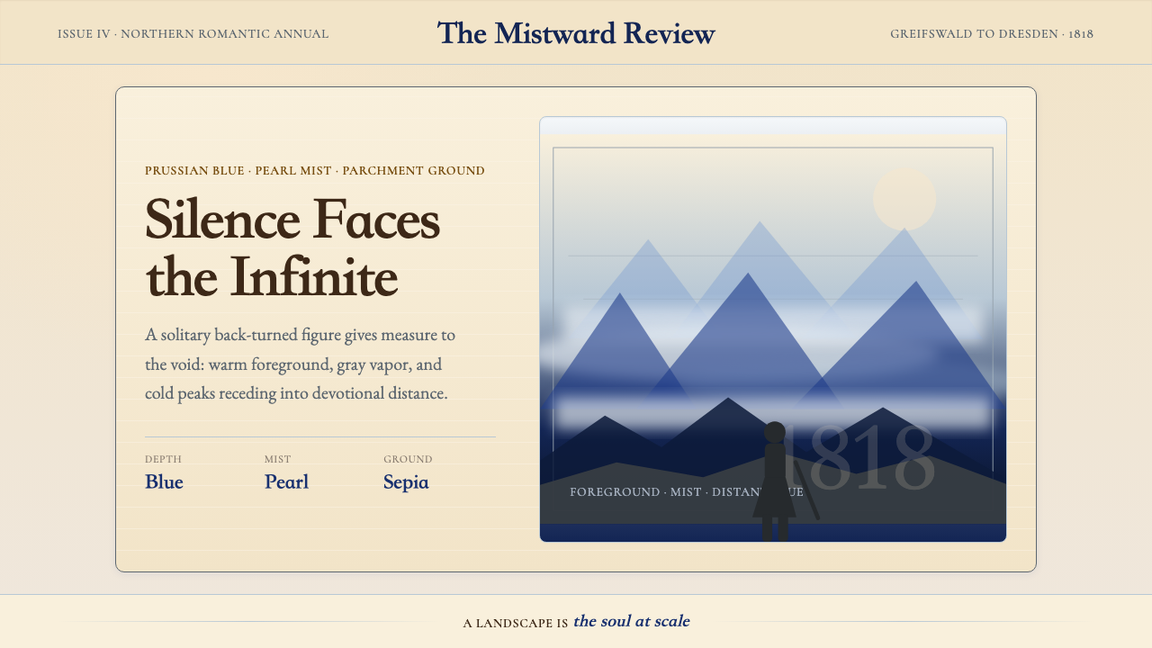 Caspar David FriedrichSilence becomes vast. Prussian blue depth, pearl mist, and parchment framing…寂静变得辽阔:普鲁士蓝纵深、珍珠雾与羊皮纸框层层后退。
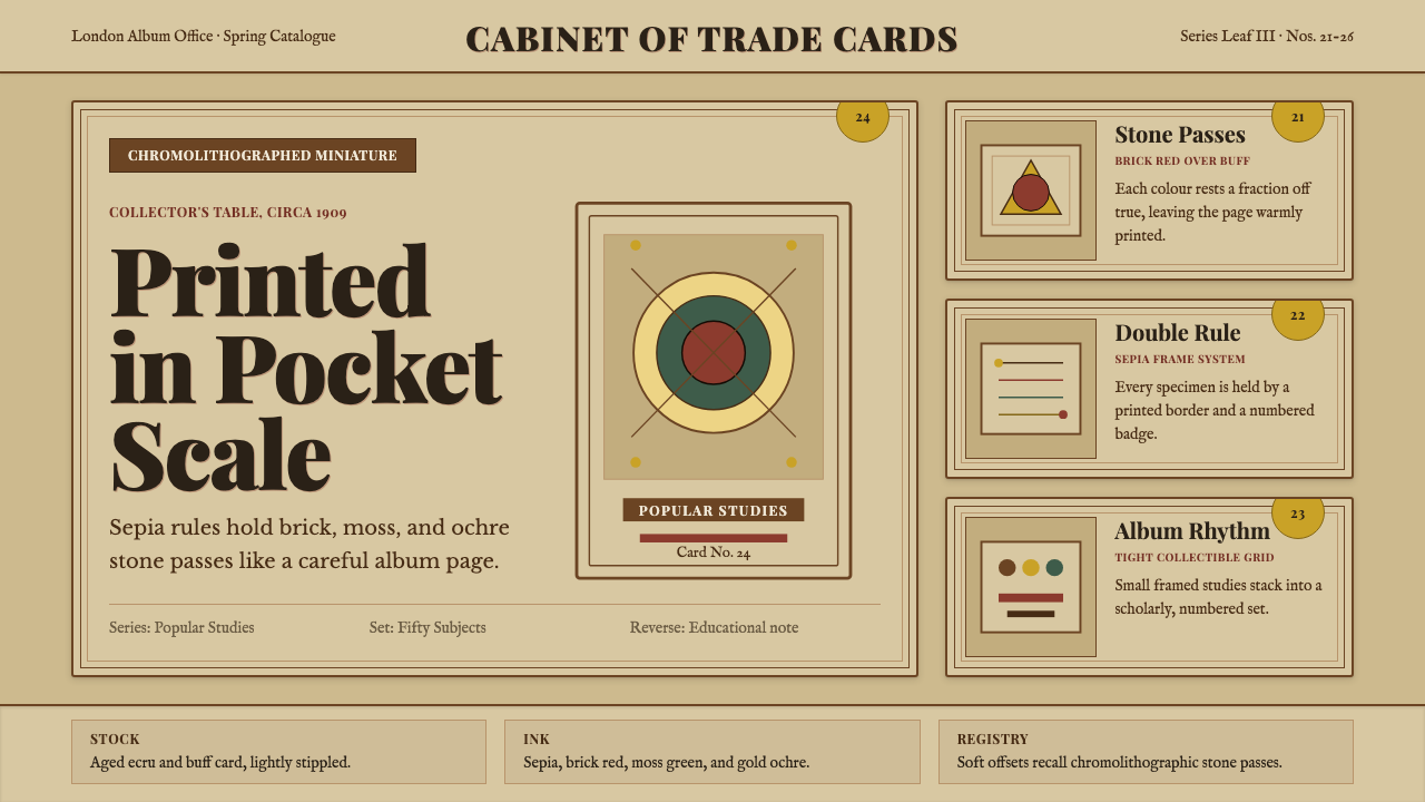 Cigarette Card SetCollectible scholarship. Sepia double-rules, buff stock, and ochre badges fra…收藏级学者气:赭褐双线、米黄卡纸与金赭编号构成套卡秩序。
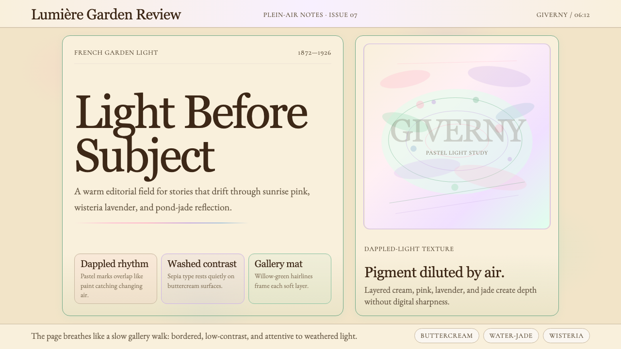 Claude Monet ImpressionistLight becomes the subject. Buttercream, pastel dapples, and Cormorant serif s…光成为主题。奶油底、粉彩斑点与Cormorant衬线柔化画面。