What is Slovenian Postojna Cave (Karst)?
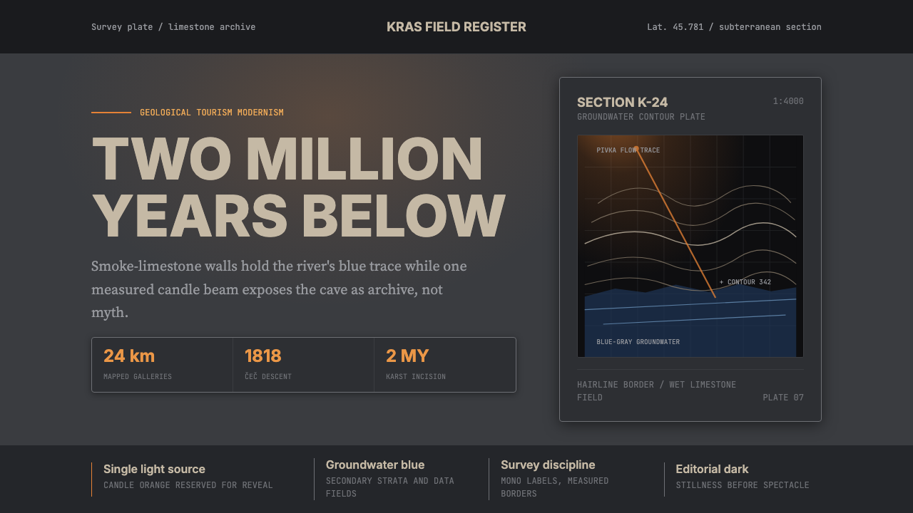
Postojna Cave gave the world the word 'karst' — and its design language brings twenty-four kilometers of geological time to the surface through smoke-limestone gray, deep groundwater blue, and a single candlelight beam splitting the dark.
Slovenian Postojna Cave (Karst) in brief
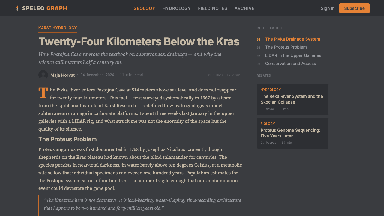
Slovenian Postojna Cave (Karst) is a design style rooted in the geological identity of one of Europe's most extraordinary underground landscapes. Postojna Cave in southwestern Slovenia is the type-locality of karst — the scientific term for landscapes shaped by the dissolution of soluble rock, which entered global geology textbooks from the Kras plateau above this very cave system. Its visual language draws not from fantasy or myth but from the rigorous graphic culture of speleological science: survey plates, bathymetric cross-sections, specimen documentation, and the sober illustration traditions of nineteenth-century natural history.
The palette is deliberately narrow. Smoke-limestone gray — the color of damp calcite walls seen by torchlight — provides the dominant ground. Against it sits deep groundwater blue, the saturated hue of subterranean lakes and aquifer pools that have never seen daylight. A single candlelight orange functions as the system's only warm note, referencing the moment of first descent into darkness: not dramatic flare, but the concentrated glow of a flame held steady in still underground air. Black occupies structure and type. Together these four tones produce an atmosphere that is simultaneously scientific and sublime.
What distinguishes this style from generic dark-theme design is its conceptual discipline. Every formal decision traces back to the cave environment: the asymmetry of stalactite formations, the horizontal layering of geological strata, the precise linework of survey cartography. It is geology rendered as graphic language — not decoration borrowing cave imagery, but a system whose internal logic mirrors the conditions that shaped the original landscape.
Where does Slovenian Postojna Cave (Karst) come from?
The story of Postojna Cave as a designed cultural object begins on April 14, 1818, when a Slovenian cave guide named Luka Čeč, preparing lanterns for an official visit, pushed further than any previous explorer along the banks of the underground Pivka river and discovered the vast gallery system that would become the cave's main attraction. Within a decade, the cave had received tens of thousands of visitors — it was among the earliest sites in Europe to be developed as a tourist attraction on an industrial scale, complete with carved pathways, illumination, and eventually (in 1872) a narrow-gauge railway that still carries visitors today.
The word 'karst' itself entered scientific vocabulary through Jovan Cvijić, the Serbian geographer who conducted systematic fieldwork across the Kras plateau in the 1890s and published his doctoral thesis on the karst phenomenon in 1893. Cvijić's work — the first comprehensive scientific treatment of dissolution-cave systems — transformed a regional Slovenian toponym into universal geological terminology. The Kras plateau above Postojna became, in effect, the reference landscape for an entire class of geological formation found on every inhabited continent. This scientific centrality gives the Postojna design system an unusual quality: it carries real epistemic weight, not merely aesthetic character.
The distinctive creature most associated with Postojna Cave is Proteus anguinus, the olm — a blind, depigmented cave salamander first formally described by the naturalist Johann Weikhard von Valvasor in 1689 and later studied intensively by Marko Aljančič and Boris Sket at the Institute of Biology in Ljubljana. The olm's extraordinary biology — it can survive without food for years, live more than a century, and navigate entirely by electromagnetic and chemical sensation — made it a nineteenth-century sensation across Europe, where it was nicknamed 'the human fish' (človeška ribica) for its pale, elongated, almost limbless form. In the design system, the olm appears not as decorative mascot but as a conceptual anchor: a symbol of precision adaptation to extreme conditions, of life persisting without light.
Modern Postojna Cave's visual identity emerged gradually through the twentieth century and crystallized in the contemporary era around the identity work of the public company Postojnska jama d.d., which manages the site. The brand draws on Slovenian geological-tourism modernism — a tradition that prizes scientific authority, restrained elegance, and a distinctly Central European sense of heritage rather than spectacle. The 2010s redesign leaned into the authentic palette of the cave experience itself: the gray of limestone, the blue of underground water, the orange of lamplight. This is not a reconstructed historical style but a living institutional identity with geological roots.
What defines the Slovenian Postojna Cave (Karst) look?
Color
The palette is built around three precisely purposeful tones. Smoke-limestone gray — somewhere between the warmth of damp calcite and the cool of bare concrete — dominates as ground and structural surface. Deep groundwater blue, a saturated and slightly cool mid-dark hue, carries the system's primary accent weight, referencing the color of subterranean lakes seen by electric lamp rather than daylight. Candlelight orange — concentrated, amber-warm, never garish — appears sparingly as the single warm accent: the human element, the flame in darkness. Black provides type and hard structure. The system avoids any color that could read as natural daylight, tropical, or bright — the palette is always underground.
Typography
Type treatment draws from the precision of scientific documentation — geological survey plates, specimen catalogs, stratigraphic legends. Text is set with the clarity of technical notation rather than editorial warmth: generous line spacing, consistent column measure, careful hierarchical differentiation between heading, subheading, label, and body. Labels and captions carry significant visual weight because the reference genre is scientific annotation, where precision of attribution matters as much as the primary text. The typographic voice is authoritative and lean, never decorative.
Layering and Depth
The visual logic of geological strata — horizontal layers accumulated over geological time — informs how elements sit in relation to one another. Surfaces are stacked rather than floating; there is always a sense of substrate beneath every element, like rock below sediment. Depth is conveyed through tonal progression from lighter to darker rather than through drop shadows or glows. The system prefers recessive layering — an element that sits deeper reads as older, more geological — over the aggressive floating-card depth conventions of contemporary UI.
Line and Contour
Fine, precise linework is the system's primary decorative vocabulary — but 'decorative' here means something closer to cartographic than ornamental. The reference is the survey plate: contour lines, cross-section boundaries, measurement annotations, bathymetric grids. Lines are thin and consistent in weight, drawn with the discipline of technical illustration. They define territory, mark depth, and annotate structure. A curving stalactite profile rendered in thin line is simultaneously scientific notation and visual texture.
Texture and Surface
Where texture appears, it references geological material rather than digital convention. The roughness of cave wall, the granularity of karst rock, the slight luminescence of calcite crystal — these material qualities inform surfaces that appear neither flat nor skeuomorphic, but rather mineralogical. Noise is used selectively, not as a default digital effect but as a specific evocation of rock surface or photographic grain from deep-cave documentation. Clean fields exist alongside subtly textured ones, creating alternation between survey precision and material presence.
Asymmetry and Formation
Layouts avoid bilateral symmetry, taking their compositional logic from the organic asymmetry of speleothem growth — the way stalactites and stalagmites form independently, according to local water-flow patterns, producing landscapes that are balanced in overall impression but never mirrored in detail. Visual weight is distributed across a composition the way mass distributes in a cave chamber: nothing forces the eye to the center; the gaze is invited to move, to discover, to trace a path through the composition as one would navigate a gallery passage.
Light and Darkness
The system treats darkness not as void but as positive material — the deep black of absolute absence of light, which is the geological default of the cave. Light is scarce and purposeful: a concentrated warm beam that illuminates specific areas and leaves others intentionally unresolved. This is the opposite of the ambient, even-fill lighting assumed by most design systems. Contrast ratios are high; the eye is directed by where light falls rather than by structural borders. Elements that emerge from darkness carry more presence than elements that float on a lit field.

Who shaped Slovenian Postojna Cave (Karst)?
Čeč was the cave guide whose 1818 exploration pushed beyond the known sections of Postojna Cave and revealed the vast gallery network that would transform the site into one of Europe's foremost tourist destinations. Though not a scientist, his act of exploration — pushing a torch further into darkness on the eve of an official visit — is the founding moment of the modern cave's cultural identity. He is commemorated today at the site, and his name recurs in the institutional storytelling around Postojna Cave's discovery.
Cvijić was the Serbian geographer who, through his 1893 doctoral thesis and subsequent fieldwork on the Kras plateau, transformed 'karst' from a Slovenian regional toponym into a global geological term. His systematic study of dissolution-cave systems, sinkholes, and underground drainage patterns gave Postojna and its surrounding landscape an outsized scientific significance. Every geological survey in the Postojna visual system implicitly references the tradition of scientific observation that Cvijić formalized and which continues in karst research today.
Aljančič was among the leading researchers of Proteus anguinus, the olm cave salamander endemic to the Dinaric karst and most closely associated with Postojna Cave. His work at the Institute of Biology in Ljubljana, in collaboration with Boris Sket, produced foundational knowledge of the olm's biology, longevity, and sensory adaptations. The olm's scientific study represents the deeper intellectual register of the Postojna Cave design system — precision observation of life in conditions of extreme darkness, applied over decades of patient documentation.
Sket, a zoologist at the University of Ljubljana, conducted extensive research into the biodiversity of Slovenian cave systems, with particular focus on Proteus anguinus and the broader cave-fauna communities of the Postojna-Planina cave system — one of the richest cave ecosystems known to science. His work established the Postojna system not merely as a geological spectacle but as a living biological laboratory, where evolution proceeds in the absence of light across timescales that dwarf human history. This biological dimension informs the style's sense of deep time.
Valvasor was a seventeenth-century Carniolan polymath whose encyclopedic work 'The Glory of the Duchy of Carniola' (1689) provided the first systematic written description of Proteus anguinus and documented numerous karst features of the region that would later give the world the term 'karst'. His combination of scientific curiosity and humanist scholarship — bringing rigorous observation to bear on the natural phenomena of his homeland — established an intellectual model for the Slovenian geological-heritage tradition that Postojna Cave embodies.
How do you use Slovenian Postojna Cave (Karst) today?
Slovenian Postojna Cave (Karst) is a demanding style to apply well because its authority comes from conceptual coherence rather than surface glamour. The cave palette is dramatic, but the drama is earned by restraint: too many accents, too much warmth, and the geological austerity collapses into generic dark-mode design. Every design decision should be traceable to the cave environment — if you cannot justify an element by reference to geological survey, cave photography, or specimen documentation, it probably does not belong.
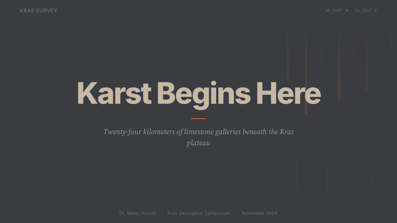
For presentation slides, the style is most effective when used for scientific, technical, or high-stakes institutional contexts. A cover slide benefits from a single bold compositional gesture: a fine-line survey contour overlaid on deep gray, with the title set in precise type alongside a candlelight-orange accent element. Content slides should read like annotated survey plates — clean grid, generous white (or gray) space, labeled elements, minimal prose, strong visual hierarchy. Data visualizations translate naturally into the system: charts and graphs rendered in the groundwater-blue and limestone-gray palette, with orange reserved for the single most important data point or threshold.
For web interfaces, the style is best suited to contexts where authority, scientific credibility, and the communication of deep complexity are primary values. Science platforms, heritage institutions, geological services, documentation portals, and premium educational tools all benefit from the system's combination of rigor and atmosphere. Dashboard layouts should use dark grounds with tonal layering to convey data depth; typography should lean toward the precise and the spare rather than the editorial and the expressive. Avoid dropdowns and overlays that interrupt the subterranean visual logic — interactions should feel like navigation through a passage, not pop-up surfaces interrupting the environment.
For editorial and marketing work, the style supports long-form visual journalism, institutional reports, and high-production print work. The candlelight-orange accent functions particularly well as a highlighting mechanism for key findings or pull quotes — it draws the eye with the selective force of a torchbeam rather than the even emphasis of a highlighter. Marketing uses of the style should resist the temptation to brighten or warm the palette for approachability; the style's power is precisely its refusal of approachability in favor of depth. If the brand message is about discovery, complexity, or the long view, the cool austerity serves it well.
The most common mistake when applying this style is importing surface-level cave imagery — stalactite silhouettes, bat icons, dripping water — without engaging the underlying design logic. The style is not about speleological illustration; it is about the formal qualities of geological documentation: precision, stratification, the purposeful use of darkness, and the extreme selectivity of illumination. A layout that uses stalactite clip-art against a gray background is not using this system — it is using Halloween. The correct application asks: does this composition have the measured authority of a survey plate? Does light fall where it has earned the right to fall?
Slovenian Postojna Cave (Karst) — FAQ
What makes this style 'geological' rather than simply dark and minimal?
The distinction is conceptual. A generic dark minimal style treats darkness as a contemporary aesthetic choice — the elimination of light as a form of sophistication. The Postojna Cave system treats darkness as the geological default: the state of the world before human illumination arrives. This changes everything. Light in a dark-minimal system is ambient and even; light in the Postojna system is scarce and directional, a torch or lamp in an otherwise lightless environment. Layering in a dark-minimal system is about floating cards and soft elevation; layering in the Postojna system is about geological strata, the horizontal accumulation of time. Every formal element has a geological referent, not just a stylistic preference.
How should the candlelight orange be used — as a primary color or a reserve accent?
Firmly as a reserve accent. The orange is the human element in a geological system: the single warm note in an otherwise cool, mineralogical palette. Its power comes entirely from sparsity. If orange appears on every interactive element, every heading, every decorative detail, it loses its referential quality — it becomes arbitrary warmth rather than the specific warmth of lamplight in darkness. The correct application is close to theatrical spotlighting: reserve the orange for the single most important element in any given composition, and let everything else remain in the cool gray-blue register.
Is the style suited to bright, daylight-facing contexts like outdoor campaigns or consumer apps?
Rarely, and with significant modification. The Postojna Cave palette is fundamentally subterranean — it references an environment defined by the absence of sunlight. On outdoor signage, in sunlit print materials, or in consumer contexts that rely on warmth and approachability, the palette's strengths become liabilities: the groundwater blue becomes muddy rather than luminous, the smoke gray loses its atmospheric quality and simply reads as neutral, and the candlelight orange is overpowered by ambient light. If a lighter adaptation is needed, the conceptual logic should be preserved — geological precision, selective illumination, horizontal stratification — while the palette is shifted toward its lighter analogues. But that is a different system, not a Postojna Cave system in daylight.
How does the Proteus anguinus — the cave olm — relate to the design system?
The olm is not a design element to be used decoratively; it is a conceptual model. Proteus anguinus is the most famous inhabitant of the Postojna Cave system, notable for being perfectly adapted to a lightless environment — it is depigmented, eyeless in the conventional sense, and navigates entirely by electromagnetic and chemical sensation. In design terms, the olm represents the principle of precise adaptation to extreme constraint: when an environment imposes severe limitations (no light, no visual cues, extreme scarcity), the organisms that survive do so through extraordinary specialization rather than generalization. The Postojna design system operates under analogous constraints — a narrow palette, scarce illumination, restricted warmth — and its quality comes from mastery within those constraints rather than from working around them.
What is the difference between applying this style and applying a generic cave or underground aesthetic?
A generic cave aesthetic reaches for the dramatic — dark backgrounds, dripping rock textures, glowing crystals, bioluminescent blues, Gothic connotations of mystery and danger. The Postojna Cave system comes from the opposite tradition: the scientific survey, the institutional record, the geological monograph. Its reference genre is not adventure but documentation. The distinction shows most clearly in how texture is used: a generic cave aesthetic layers on rock and moisture textures for atmospheric effect; the Postojna system uses texture sparingly and purposefully, in the way a geological cross-section uses hatching to indicate rock type. One borrows imagery for mood; the other borrows logic for structure.
Related design styles
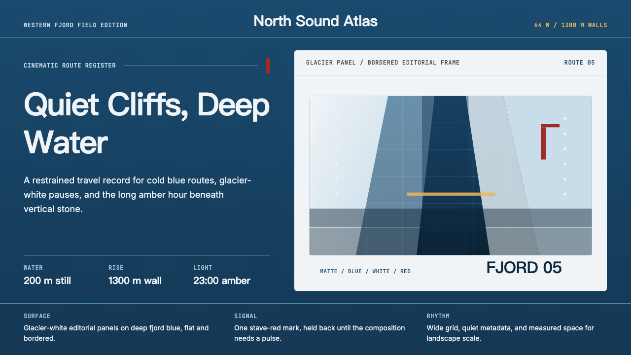 Norwegian Fjord TourismMonumental, not loud. Fjord blue, glacier-white panels, and one stave-red acc…
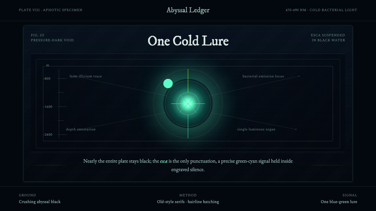 Anglerfish Lure BioluminescenceLight is scarce. Old serifs and hairline rules frame one cold green-cyan lure.
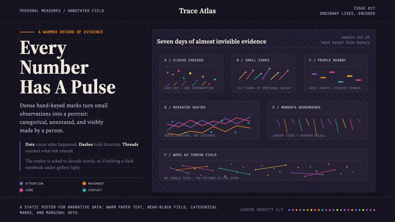 Data Humanism (Lupi)Data feels authored. Near-black fields carry serif notes and categorical hand…
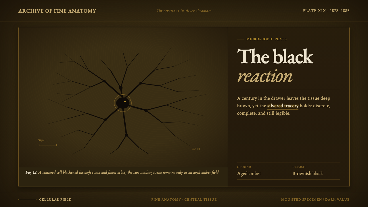 Golgi Neuron Silver StainA century-darkened specimen. Near-black dendrites branch across an aged amber…
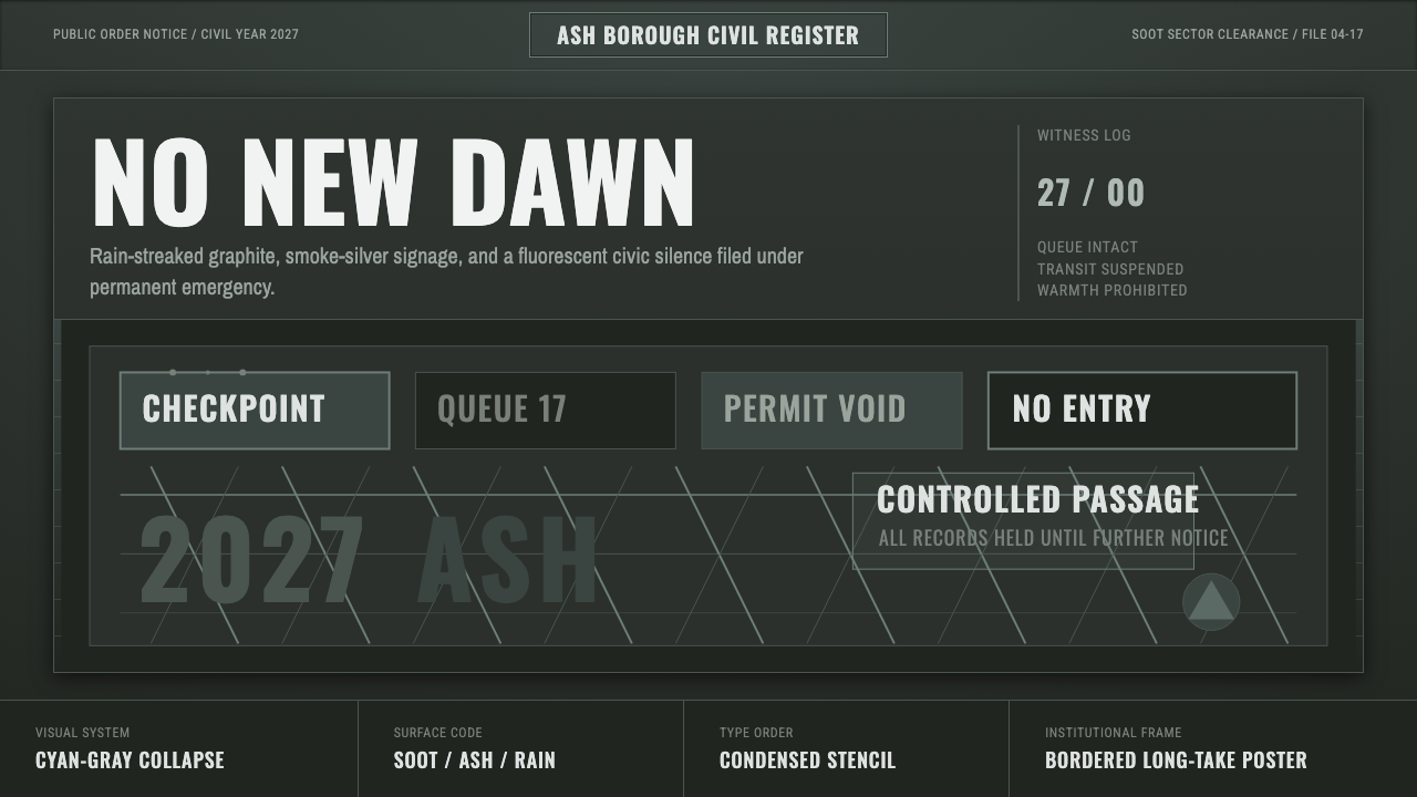 Children of MenHope drains out. Soot-green fields, smoke-silver type, and checkpoint rules h…
 Control — Oldest HouseConcrete becomes menace. Brutalist gray grids are cut by one violent red sign…