What is Control — Oldest House?
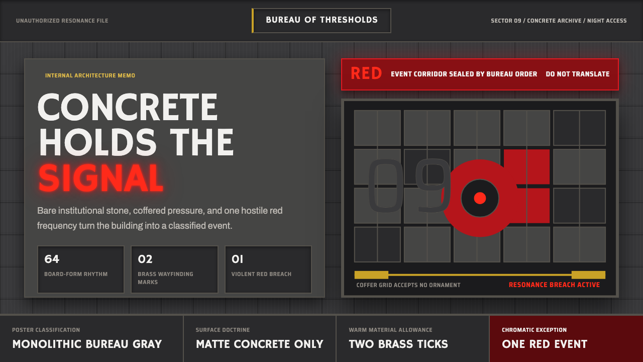
Remedy's Control distilled brutalism to its rawest signal — concrete mass and supernatural red in absolute opposition, a visual language where bureaucratic weight and paranormal menace become the same force.
Control — Oldest House in brief
Control — Oldest House Brutalist is the visual design system derived from Remedy Entertainment's 2019 action game Control, specifically the aesthetic of the Oldest House: the shapeshifting Federal Bureau of Control headquarters. Its foundation is board-formed concrete — raw, texture-heavy surfaces rendered in deep institutional grays with coffered ceilings and monolithic volumes that evoke mid-century American federal architecture. Against this immovable stone ground, a single chromatic violence intrudes: the Hiss, a supernatural red glow that marks corruption, danger, and the paranormal bleeding into the mundane.
The system's power comes from its radical restraint. Two poles — gray concrete mass and hot red signal — carry the entire visual burden. No secondary palette softens the tension. No ornament distracts from the weight of each surface. Typography is spare and quasi-institutional, recalling government signage of the 1960s: capitals, wide tracking, forms that convey classification rather than invitation. Every design decision reinforces the sensation that the space you are in has authority over you.
Unlike most game-derived aesthetics that borrow surface qualities, Control's visual system is architecturally coherent. Its rules derive directly from brutalism's core doctrine — that materials should appear as what they are, that structure should be visible, that mass should be felt. The supernatural red does not decorate this system; it ruptures it. That rupture, controlled and deliberate, is what gives the aesthetic its distinctive psychological charge.
Where does Control — Oldest House come from?
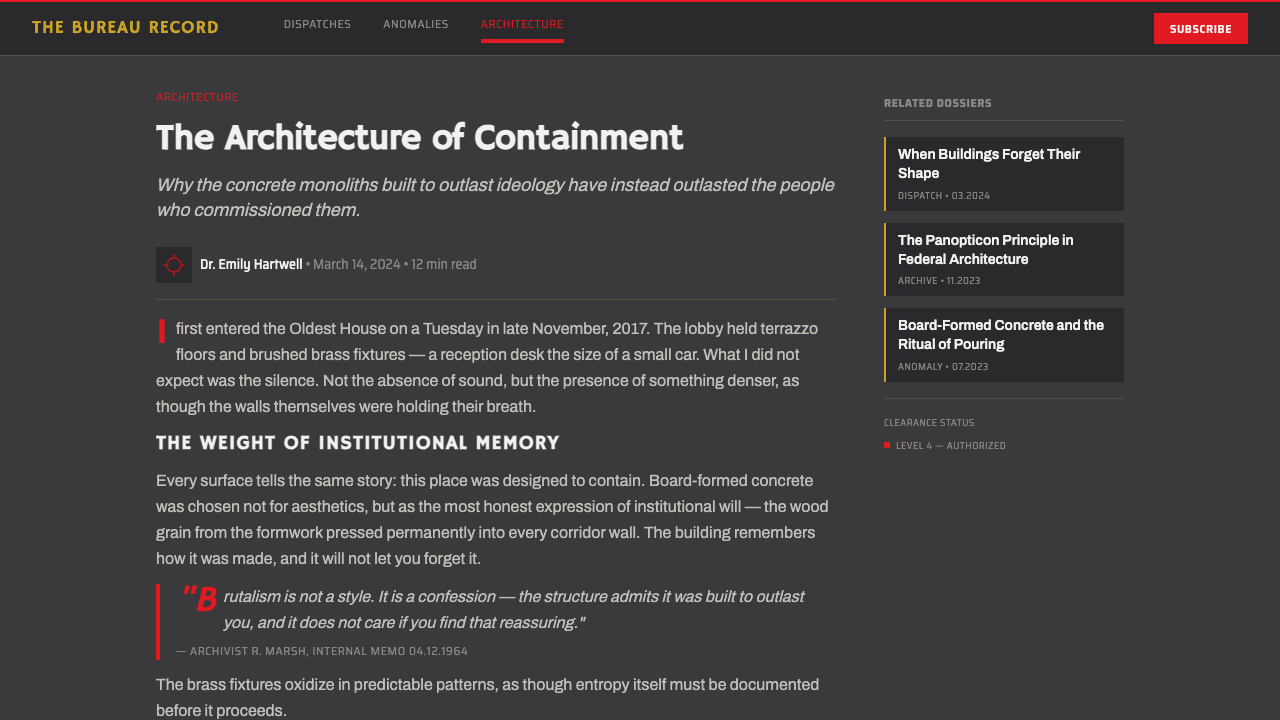
Brutalism as an architectural doctrine emerged in postwar Britain and Europe, reaching its fullest institutional expression in the United States during the 1960s and early 1970s. The term derives from béton brut — French for raw concrete, a phrase Le Corbusier used to describe the deliberately unfinished, board-marked concrete surfaces of his Unité d'Habitation in Marseille (1952). American federal architecture absorbed this language during the Great Society era: the J. Edgar Hoover Building in Washington DC, the Boston City Hall, and hundreds of regional government buildings all deployed the same vocabulary of exposed aggregate, deep window reveals, and weighty overhanging volumes. It was precisely this tradition — government buildings as monuments to institutional permanence — that Remedy's art directors cited as source material for the Oldest House.
Sam Lake and the Remedy art team, based in Espoo, Finland, developed the visual language of Control over several years of pre-production research. They studied the work of Brutalist architects associated with the New York federal campus tradition, including Kallmann McKinnell and Knowles, whose Boston City Hall (1968) became something of a reference touchstone. The Oldest House is deliberately designed to feel like a building that has always existed, that predates the institution housed within it, and that exceeds the comprehension of anyone who works there. This required a visual idiom that carried genuine architectural authority — not a pastiche, but a forensic reconstruction of how those spaces actually felt.
The supernatural layer — the Hiss and its associated red luminescence — draws on a different tradition: the visual grammar of 1970s and 1980s horror and paranormal cinema, where colored light sources (the red of Suspiria, the green of The Thing's creature effects) were used to signal that the laws of the ordinary world no longer applied. In Control, the red is structurally contrasted against the gray; it does not belong to the same material world as the concrete. This deliberate ontological gap between the two visual systems — one of mass and inertia, one of light and violation — is what gives the aesthetic its destabilizing quality.
By the time Control was released in 2019, brutalism had undergone significant cultural rehabilitation. Once despised as inhuman and oppressive, the style had become newly compelling to a generation of designers and cultural critics who saw in its monumental scale and material honesty a kind of aesthetic integrity absent from contemporary architecture. Control arrived at exactly this moment of re-evaluation and offered a version of brutalism that acknowledged both its authority and its menace — a design system that felt genuinely governmental and genuinely supernatural simultaneously.
What defines the Control — Oldest House look?
Chromatic Dualism
The entire palette reduces to two opposing forces: the gray of raw institutional concrete and the red of supernatural contamination. Gray carries weight, permanence, and bureaucratic authority; red signals rupture, danger, and the intrusion of something that should not exist. No tertiary colors mediate this opposition. Secondary environments may shift the gray toward cooler or warmer neutrals, but the fundamental binary — matter versus light, institution versus paranormal — is never diluted. This extreme chromatic economy makes every red element carry maximum visual and psychological charge.
Material Brutality
Surfaces in this system are not smoothed or polished. Board-formed concrete shows its formwork texture — the grain of the wood panels that were pressed against the wet mix and then stripped away. Ceilings are coffered not for decorative effect but because the structural geometry demanded it. Aggregate is exposed, not hidden behind plaster or paint. This material honesty — things appearing as what they physically are — is the aesthetic's ethical spine. Applied to digital design, it translates to no false textures, no skeuomorphic depth, no material simulation: what you see should behave like a structural decision, not a decorative choice.
Monumental Scale and Compression
Brutalist architecture achieves psychological effect through scale disproportion — ceilings are higher than necessary, corridors longer than functional requirements demand, volumes heavier than structural logic alone would require. This compression of the human figure against vast institutional surface is central to the Control aesthetic. In design applications, this translates to generous negative space not for elegance but for weight: text is small against large fields of concrete gray, elements are given room not to breathe but to feel isolated. The emptiness is not relief — it is pressure.
Institutional Typography
Type in this system carries the register of government classification — not corporate branding, not editorial warmth, but the cold efficiency of bureaucratic communication. Uppercase letterforms dominate, often with wide tracking that spreads words across horizontal fields. Type hierarchies are functional: category labels, section identifiers, warning designations. Display type is structural rather than expressive. There is no invitation in the lettering — only designation. The styling evokes mid-century government signage, military documentation, and the kind of filing system that extends beyond any individual's ability to read its full scope.
Controlled Light and Shadow
Light in this system is cold, institutional, and directionless — the kind of overhead fluorescent illumination that flattens volume and makes space feel both exposed and somehow unreadable. Shadows are deep and angular, falling in ways that suggest structural geometry rather than natural illumination. The red of the Hiss is light as rupture: it emanates from within surfaces rather than falling on them, violating the physical logic of the neutral gray world. This distinction — reflective light versus emanating light — is what separates the two systems and keeps the supernatural element visually uncanny even in prolonged exposure.
Geometric Severity
Forms in this system are rectilinear, heavy, and without curvature that would suggest organic life or decorative intent. Corners are hard. Overhangs are deep. The building elements that define the visual — slabs, piers, coffers, and reveals — are all expressions of structural geometry with no softening transition. In two-dimensional design work, this severity translates to layout decisions that refuse to round corners, that use borders rather than shadows to define space, and that treat every margin and padding as a structural quantity rather than a comfort affordance. The visual vocabulary has no gentleness.
Paranormal Accent Logic
The red accent in this system does not function like a standard brand color or a call-to-action highlight. It functions like an alarm — its appearance signals that something has changed in the underlying order of things. This means the accent must be used with maximum restraint so that its presence retains urgency. In design applications, the red should appear only where something genuinely requires immediate attention or marks an irreversible state change: errors, active dangers, critical confirmations, corrupted states. Used on navigation, marketing copy, or decorative elements, the accent loses its charge and the system collapses into generic dark-theme design.

Who shaped Control — Oldest House?
Sam Lake is the creative director at Remedy Entertainment who conceived and directed Control. He developed the game's core premise — a government bureau housed in a supernatural brutalist building — and was responsible for the overall art direction philosophy, including the decision to use the Hiss's red as a single, precisely controlled chromatic violation against the institutional gray. Lake's sensibility drew on both Nordic noir visual culture and his deep familiarity with American genre cinema of the 1970s and 1980s, resulting in a visual system that feels simultaneously European in its austerity and American in its paranoia.
The American architectural firm responsible for Boston City Hall (1968), one of the most scrutinized brutalist buildings in the United States. Boston City Hall's exposed concrete structure, monumental entrance plaza, and weighty overhanging council chamber became influential reference points for the Remedy art team when constructing the visual logic of the Oldest House. The building's capacity to project governmental authority while simultaneously feeling oppressive and labyrinthine captures precisely the psychological duality that Control sought to render in a game environment.
Though not a direct source for the game, Le Corbusier's Unité d'Habitation in Marseille (1952) established the formal vocabulary — béton brut, board-formed concrete, deep structural overhangs, repetitive cellular units organized by a visible framework — that all subsequent brutalist buildings, including American federal architecture, inherited. Understanding Corbusier's rationale for raw concrete (honesty about material, rejection of applied finish, the aesthetic dignity of structural necessity) is essential for applying the Control aesthetic with integrity rather than surface mimicry.
The Italian horror director whose use of saturated, non-naturalistic colored light — most famously the vivid reds and blues of Suspiria (1977) — established the visual grammar of colored light as paranormal signal in genre cinema. The Hiss's red in Control belongs to this tradition: a color used not to illuminate but to designate, to mark the presence of something that violates the rules of ordinary perception. Argento demonstrated that a single saturated color applied to an otherwise realistic interior could completely transform the ontological register of a space.
Art director at Remedy during the development of Control, Mäkinen led the practical translation of the game's conceptual references into actionable visual standards. His team was responsible for the specific calibration of the concrete texture rendering, the precise quality of the red emanation effects, and the overall consistency of the institutional aesthetic across the game's many environments. The detail work — how the coffered ceilings repeat, how fluorescent fixtures are spaced, how the brutalist geometry shifts as the Oldest House reshapes itself — was executed under his oversight.
How do you use Control — Oldest House today?
The Control brutalist system is one of the few game-derived aesthetics with genuine structural coherence, which means it transfers to real design contexts without becoming a costume. The key principle: the gray is not neutral — it is active, heavy, and authoritative. Treating it as a simple dark background will produce generic dark-mode design. Treating it as the primary visual material — something with texture, mass, and institutional association — produces work that carries genuine weight.
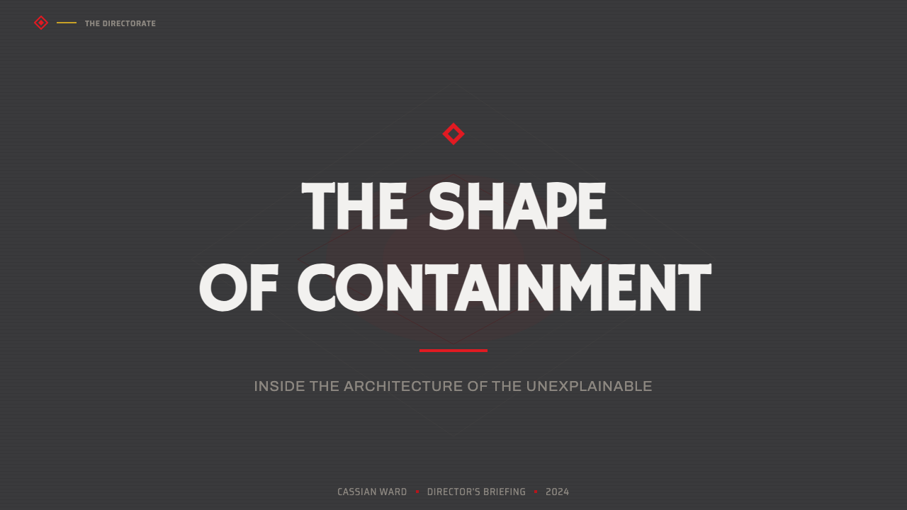
For presentation slides, this system works best when the subject matter itself has institutional, technical, or high-stakes qualities: security briefings, infrastructure proposals, product launches for tools that solve serious problems, internal communications at organizations with genuine authority. Cover slides should be treated as facades: large areas of deep gray, minimal text in institutional capitals with wide tracking, and no more than one element in red — if any. Content slides should use the gray as field, text as structure, and reserve red exclusively for critical data points or alerts. Avoid using red for decorative emphasis; if everything is alarming, nothing is.
For web interfaces and dashboards, the aesthetic excels at surfaces that need to convey authority and seriousness — security operations centers, infrastructure monitoring tools, compliance platforms, government-adjacent products. The layout logic: use the heaviest possible borders and structural lines to define space, avoid rounded corners entirely, and apply the red accent only to error states, critical thresholds, or active incidents. Navigation should feel like building wayfinding — categorical, uppercase, functional. Avoid any design pattern that suggests warmth, approachability, or consumer ease.
For editorial and marketing applications, the style suits brands that want to position themselves as serious, unconventional, or operating in domains where stakes are genuinely high. Magazine covers, poster design, brand identity for cybersecurity firms, critical infrastructure, or scientific institutions are natural fits. The approach: lead with the gray as ground, use the red for one element only — a date, a classification badge, a category label — and let the proportional relationship between mass and accent do all the communicative work. Resist the urge to add visual variety; the system's power comes from its refusal.
The most common mistake when applying the Control aesthetic is treating the red as a standard accent color and using it liberally across interactive elements, hover states, and decorative details. This destroys the system's core logic: the red is not a brand color, it is a rupture. A second common mistake is failing to commit to the gray's materiality — using a generic dark background without the surface texture implications the system requires. The result looks like any other dark-mode interface. To apply this aesthetic correctly, the gray must feel weighty and the red must feel wrong.
Control — Oldest House — FAQ
Is this style only appropriate for dark or horror-adjacent content?
No — but it requires subject matter with genuine gravitas. The aesthetic's institutional weight and paranormal tension work when the product or message itself operates in a domain where seriousness, authority, or high stakes are intrinsic: security, infrastructure, compliance, government, scientific research, or products solving problems with real consequences. Applying it to content that is fundamentally casual, warm, or consumer-friendly produces a tonal mismatch that no amount of visual craft can resolve. The question to ask is not 'does this look cool in dark gray and red?' but 'does this brand's relationship with its users include the dimension of authority that this aesthetic communicates?'
How does this differ from standard dark mode or noir design?
Generic dark mode uses dark backgrounds as a user preference accommodation — the design is essentially the same layout as a light-mode version with colors inverted. Noir design typically relies on high contrast, angular light, and atmospheric shadow to create mood, often with photographic or illustrative elements. The Control brutalist system is neither. It is architecturally derived: the dark gray carries connotations of raw concrete, institutional permanence, and governmental weight. The red does not create atmosphere — it creates rupture. The system is not moody; it is structural. This distinction matters in practice: a successful implementation feels like being inside a building, not like looking at a designed artifact.
Can the red accent be replaced with another color for a different brand?
Structurally yes, but the substitution requires understanding why red works in this specific context. Red functions as a paranormal signal because it is physiologically alarming — the eye treats it as a warning before the brain processes its meaning. It also sits at maximum chromatic contrast against the neutral gray field. If replacing red with another color, the replacement must retain both of these properties: it must be a high-saturation, physiologically activating hue, and it must contrast sharply against the gray without blending into it. Electric blue, acidic yellow, or vivid amber could work. Pastel, muted, or earth-tone substitutions will not — they domesticate the rupture and the system loses its charge.
How should texture be handled in digital applications of this style?
This is the most technically sensitive aspect of the system. The brutalist concrete texture is implied rather than literally reproduced in most digital applications — a concrete photograph overlaid at very low opacity on a dark background can suggest material weight without crossing into literal illustration. The risk is either too much texture (the interface becomes decorative and the architectural logic collapses) or too little (it becomes indistinguishable from generic dark mode). The calibration point: texture should be perceivable when a user's attention is drawn to a surface, but not so prominent that it competes with functional elements. In UI contexts, this usually means applying subtle noise or grain at the background level only, never to interactive components.
Does this aesthetic work for brands that want to feel futuristic rather than historical?
Interestingly, yes — because brutalism's temporal logic is ambiguous. Mid-century federal concrete feels simultaneously like the past and like a version of the future that never quite arrived. The Oldest House in Control exploits this ambiguity deliberately: the building could be from 1965 or from a parallel timeline or from a dimension where time does not apply. Brands in speculative technology, defense-adjacent industries, advanced research, or any context where the product is at the boundary of what is currently understood can use this temporal uncanniness productively. The key is not to resolve the ambiguity — do not add retro-futurist elements that date it, do not add sleek contemporary glossiness that makes it feel trendy. Hold the material gravity and let the viewer's imagination complete the temporal picture.
Related design styles
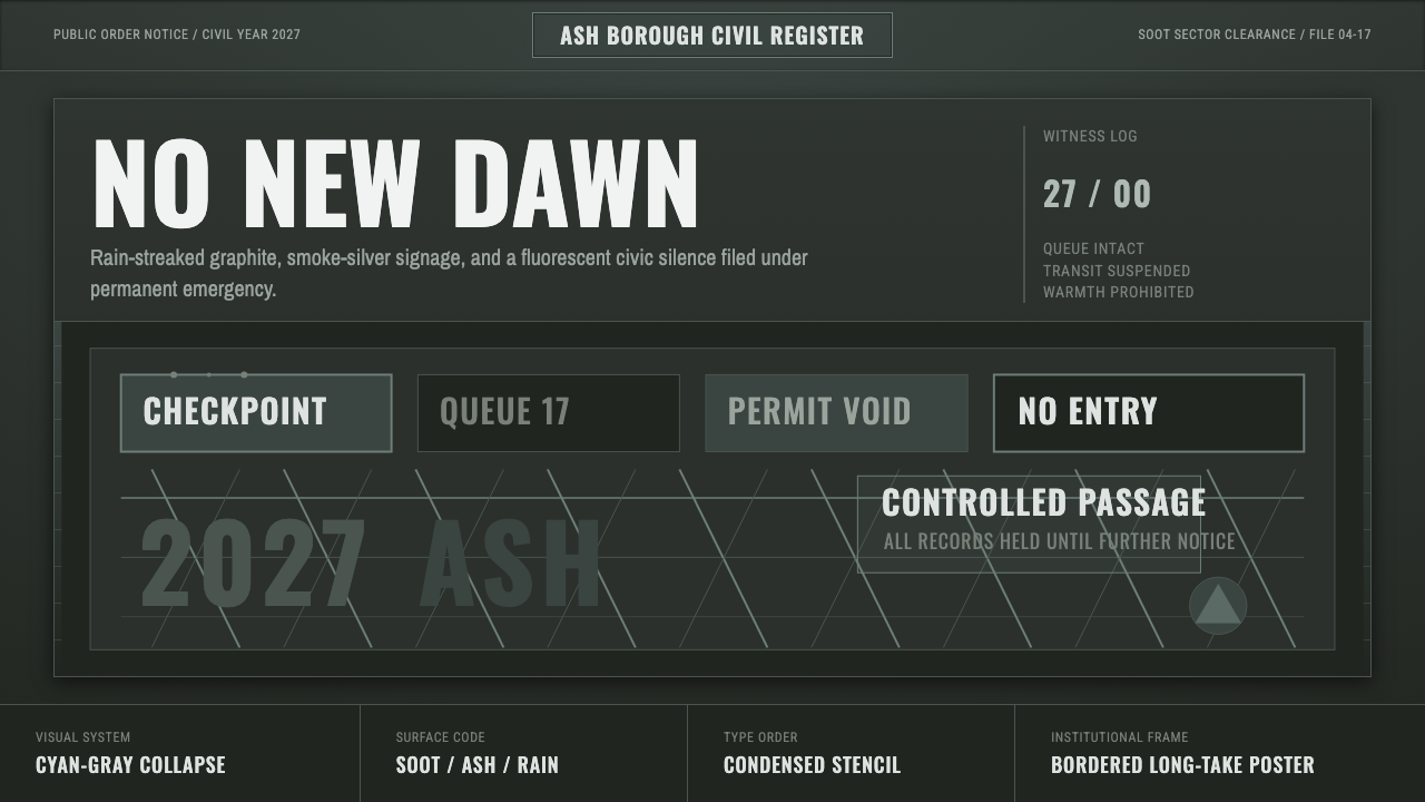 Children of MenHope drains out. Soot-green fields, smoke-silver type, and checkpoint rules h…
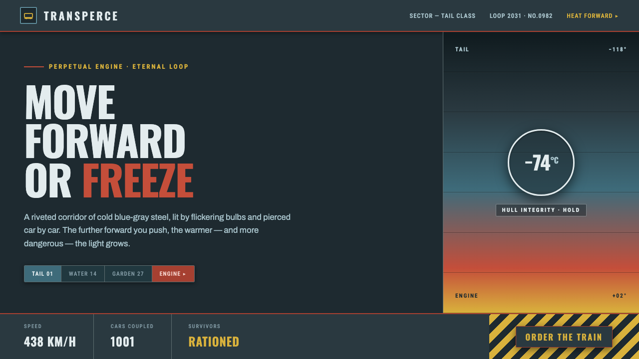 SnowpiercerMove forward or freeze. Cold blue-gray steel pierced by front-car red, conden…
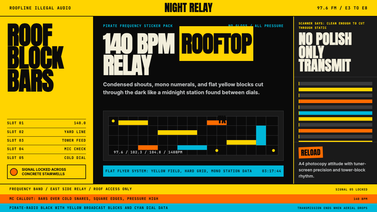 Grime London Pirate Radio (2003)Pirate signal, flat and urgent. Yellow blocks, mono FM numerals, hard flyer g…
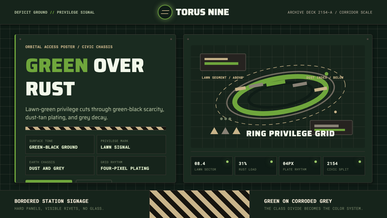 Elysium OrbitalClass divide made visible. Lawn green cuts through green-black plating and du…
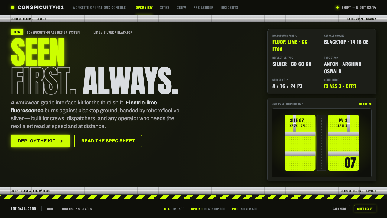 Hi-Vis Safety VestEngineered to be seen. Fluorescent lime on blacktop, silver reflective bands,…
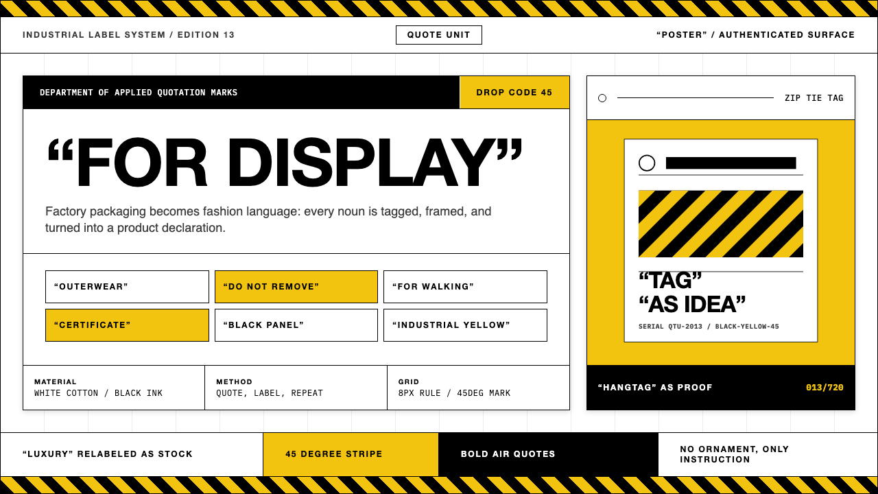 Off-White (Virgil Abloh era)Industrial irony, labeled. Yellow stripes and Helvetica quotes turn luxury in…