What is Vexillology Flag Design?
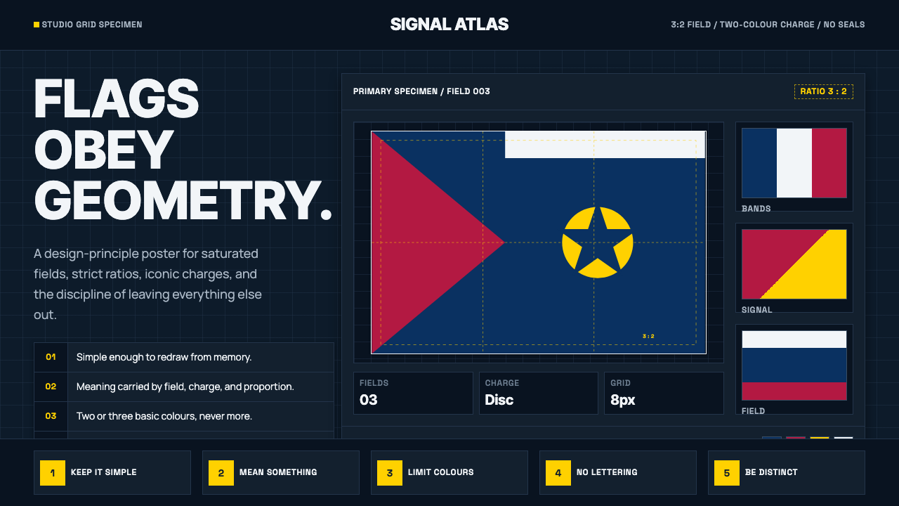
Vexillology takes the discipline of flag design and turns it into a visual system — flat, saturated color fields governed by rules as strict as a style guide.
Vexillology Flag Design in brief
Vexillology is, literally, the study of flags — but the internet-era design movement that borrows its name is something more specific: the treatment of flag design as a teachable, rule-bound discipline rather than a matter of heraldic tradition or committee compromise. Its visual language is instantly legible. Flat, saturated color fields sit against a clean, usually dark, studio backdrop. Proportion guides and construction grids are treated as part of the aesthetic rather than hidden scaffolding. Iconic charges — a star, a stripe, a simple silhouette — appear once, at full confidence, with nothing competing for attention around them.
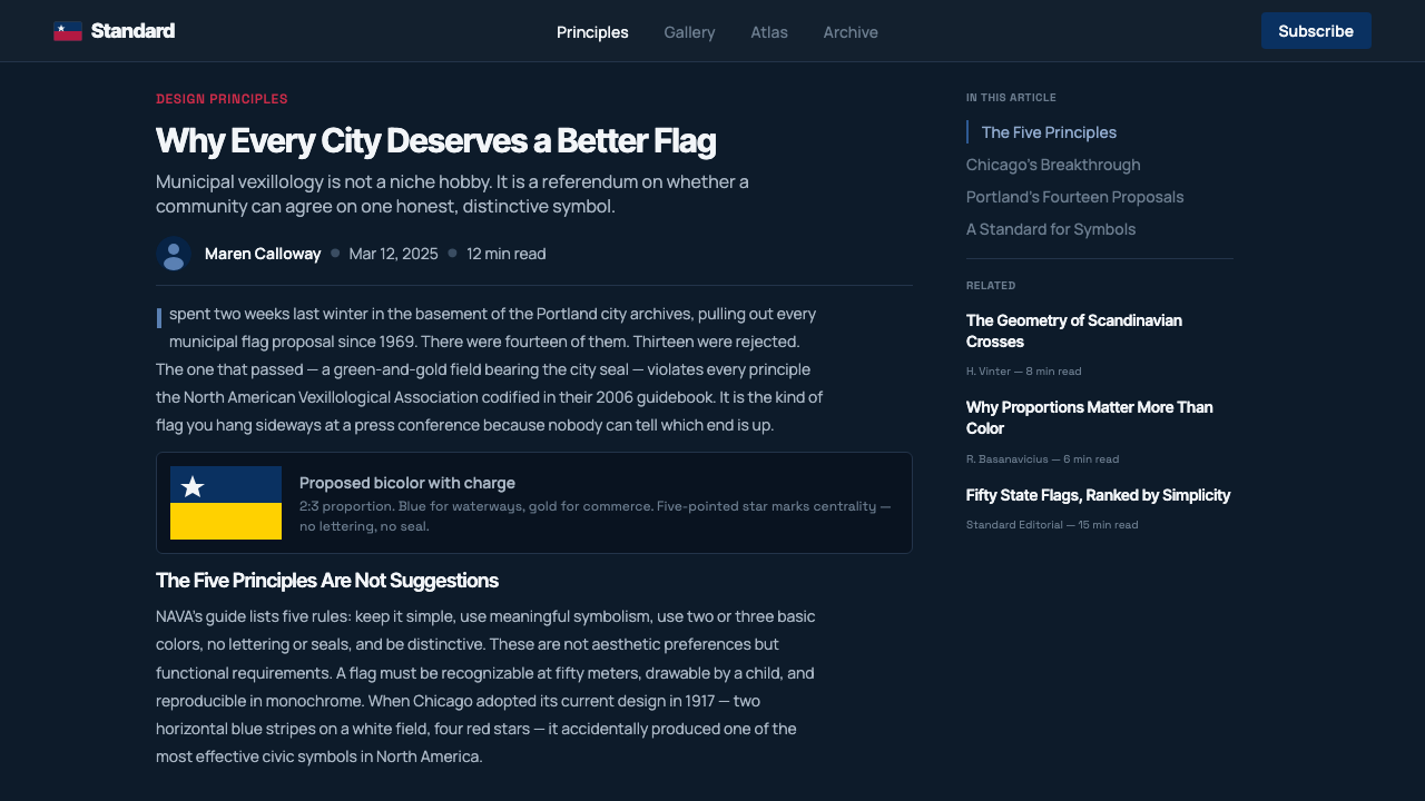
The movement's entire visual grammar traces back to a single, widely circulated text: the North American Vexillological Association's pamphlet 'Good Flag, Bad Flag,' which distills flag design into five rules — keep it simple, use meaningful symbolism, stick to two or three basic colors, no lettering or seals, and be distinctive. What makes this interesting as a design style is that the rules were written for civic flags, but the visual result reads as a general theory of graphic reduction: strip a symbol down until only the load-bearing elements remain, then present those elements with total confidence and zero apology.
Because the source material is inherently instructional — flags are, after all, meant to be recognized at a distance, in wind, in low light — the resulting aesthetic doubles as the visual language of the design-principle diagram itself. It looks like a slide explaining a rule, because in its original context, it often was one.
Where does Vexillology Flag Design come from?
The word 'vexillology' was coined in 1957 by the American scholar Whitney Smith, from the Latin vexillum, a Roman military standard — a square flag hung from a horizontal crossbar, carried by cavalry units and standard-bearers. Smith, then a teenager with an obsessive interest in flags, wanted a name serious enough to justify the field as an academic pursuit rather than a hobby. The word stuck, and over the following decades vexillology grew into a genuine discipline with journals, conferences, and international congresses, sitting somewhere between design, history, and political symbolism.
For most of that history, vexillology was a descriptive and historical field — cataloguing flags, tracing their lineages, explaining why a particular canton held a particular emblem. The prescriptive turn — vexillology as a design methodology you could actually follow — arrived later and far more narrowly. In 2001, the North American Vexillological Association published Ted Kaye's 'Good Flag, Bad Flag,' a short pamphlet distilling decades of vexillologist griping about bad municipal flag design into five portable rules. It was written for city councils and civic committees, the people actually responsible for commissioning flags, most of whom had never thought about design principles at all.
The pamphlet might have stayed a niche piece of civic-administration advice if not for the internet. Through the 2010s, a wave of online communities — explainer videos, flag-design forums, redesign contests for unpopular municipal flags — turned 'Good Flag, Bad Flag' into something closer to a design meme. Amateur designers began redrawing bad city flags according to its five rules, and the redesigns were shared and compared at scale. The pamphlet's plain, quotable rules suited this kind of comparison-driven discourse well: it is easy to hold up two flags side by side and ask which one follows the rules.
What emerged from that decade of online activity was not just better municipal flags — a genuine reform movement did produce several redesigns that were formally adopted — but a recognizable aesthetic, adopted well beyond actual flags. The dark studio backdrop, the proportion guides left visible, the single confident charge: these became a way of presenting any reductive, rule-governed design decision, flags or otherwise, as authoritative and considered rather than arbitrary.
What defines the Vexillology Flag Design look?
Color
The palette is deliberately narrow: two or three flat, highly saturated colors per composition, drawn from a restrained civic register — a deep confident blue, a strong red, a clean gold or yellow, occasionally a stark white. Colors are never blended, gradated, or textured; each field is a single, unmodulated hue functioning as a distinct shape. Against the dark studio ground, these colors read with poster-like intensity, each one clearly separable from its neighbors at a glance, which is precisely the point — a flag has to be identifiable at a distance and a discussion diagram has to make its point instantly.
Typography
Because flags themselves famously carry no lettering — one of the five core rules is literally 'no lettering or seals' — typography in this system stays firmly in a supporting role. Labels, captions, and annotations are set in a plain, geometric sans, kept small and neutral so it never competes with the color fields for attention. When type does need emphasis, the move is scale and weight, not ornament: a short, bold caption sitting quietly beneath or beside the flag it describes, functioning more like a museum wall label than a headline.
Geometry and the construction grid
Where most graphic styles hide their underlying grid, this one displays it as a feature. Proportion guides — the ratios that define where a canton sits, how wide a stripe runs, where a central charge is centered — are drawn as thin, visible lines overlaying the flag itself, exactly as they appear in a vexillologist's construction sheet. This turns every composition into a diagram of its own logic: the viewer sees not just the finished symbol but the reasoning that produced it, which is a large part of why the style reads as authoritative rather than decorative.
The single charge
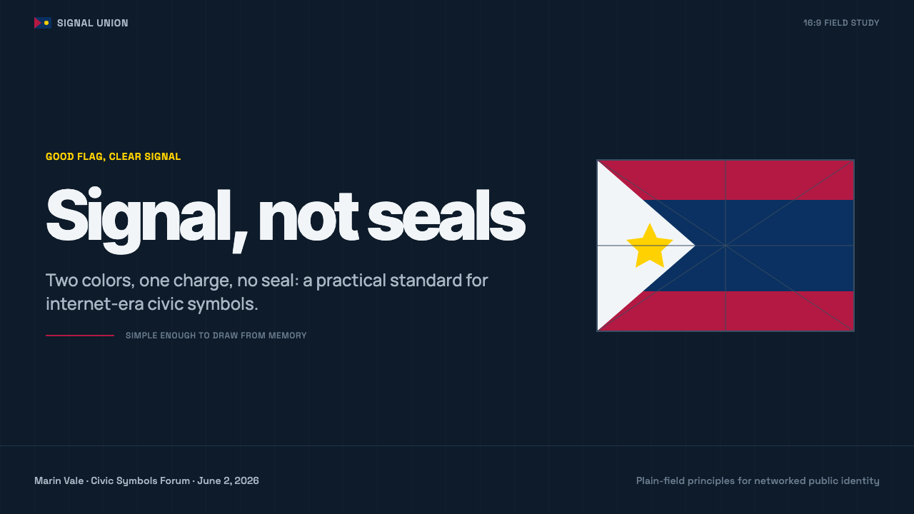
One of the five rules — 'be distinctive' — translates visually into extreme restraint around iconography. A composition carries at most one central charge: a star, a simple silhouette, a bold geometric emblem. It sits alone, usually centered or placed according to a clear proportional rule, with no secondary ornament competing for the eye. This is the opposite instinct from crest-and-seal heraldry, which tends to accumulate detail; here, every additional mark has to justify its presence, and most don't survive the edit.
Dark studio ground
The characteristic backdrop is a near-black or deep charcoal field, functioning the way a photographer's studio backdrop functions: it neutralizes context so the subject — the flag, the color relationship, the emblem — is the only thing being judged. This is a departure from how flags are actually displayed, which is against sky, cloth texture, and motion; the dark studio ground is a deliberately artificial, analytical staging, closer to a product shot than a photograph of a flagpole.
Flatness and no simulated cloth
Despite depicting an object that is, in reality, fabric moving in wind, this style refuses any illusion of drape, fold, or fluttering motion. There is no simulated wrinkle, no fabric shadow, no wind-blown curve to the silhouette. Every flag is rendered as a flat rectangle of color, edge to edge, exactly as it would appear in an official construction diagram. This flatness is the clearest signal that the composition is functioning as a specification, not an illustration — it is showing you the rule, not a photograph of the rule in the wild.
Restraint as the whole argument
Underneath the individual rules sits one governing idea: a flag has to work as a small, distant, wind-distorted image, so anything that only reads well up close — fine detail, subtle color transitions, small text — is a design failure before it's even a stylistic choice. The aesthetic that results treats restraint not as minimalism for its own sake but as a direct consequence of the object's real-world function, which is exactly why it transfers so cleanly to any context where a symbol needs to be understood instantly and at a glance.

Who shaped Vexillology Flag Design?
Smith coined the term 'vexillology' in 1957 as a teenager and spent the following decades building it into a recognized academic field, co-founding the Flag Research Center and helping establish the discipline's journals and international congresses. His insistence on rigorous terminology and classification gave later prescriptive work, including the design-rule movement, a serious scholarly foundation to build on rather than starting from folklore.
Kaye authored 'Good Flag, Bad Flag' for the North American Vexillological Association in 2001, distilling decades of vexillologist observation about civic flag failures into five short, memorable rules. The pamphlet's plainspoken, non-academic tone is what allowed it to travel far beyond its original audience of city councils, becoming the de facto style guide behind the internet-era flag-redesign movement.
NAVA has, since the 1960s, functioned as the discipline's central institution in North America — running annual meetings, publishing research, and periodically surveying public opinion on the best- and worst-designed city and state flags in the United States and Canada. Its surveys, especially the widely cited 2004 city-flag ranking, gave the reform movement concrete, embarrassing examples to point to and concrete, celebrated examples to imitate.
Though not designers in the modern sense, the Roman military units who carried the vexillum — the square banner hung from a crossbar that gave the discipline its name — established the basic idea that a simple, high-contrast symbol carried at a distance needs to communicate allegiance and identity instantly, without close reading. That functional requirement, nearly two thousand years old, is still the load-bearing logic behind every rule in the modern movement.
How do you use Vexillology Flag Design today?
For presentation cover slides, this style produces an unusually confident, high-contrast opening. A single flat emblem — a star, a simple geometric charge, a bold stripe arrangement — sits centered or off-center against a near-black field, with the deck title set in small, restrained type well away from the emblem, never overlapping it. The effect works especially well for decks about principles, rules, or frameworks, since the visual language itself already reads as 'this is the essential version, everything unnecessary has been removed.'
Content and data slides benefit from the construction-grid habit at the center of the style: keep proportion guides or a light structural grid visible rather than hidden, and let a small number of flat, saturated color blocks carry the data rather than a broad palette. A bar chart or simple comparison table rendered in two or three of the style's core colors, against the dark ground, with thin guide-lines left visible, reads as authoritative and deliberate rather than default-template. Resist the urge to add a fourth color 'for variety' — the discipline is the entire point.
In web UI, the style suits dashboards and pricing pages that want to communicate precision and restraint. A pricing page built this way uses one saturated accent color per tier, flat cards with no gradient or soft shadow, and a dark or near-black base so each tier's color reads with poster clarity. Dashboards can use the same logic for status indicators and key metrics: one color per state, flat and unambiguous, so a glance tells the whole story the way a flag is meant to.
For editorial and marketing work, the style's poster-like confidence transfers well to campaign pages and brand statements built around a single symbol or a small, fixed set of colors — anything that wants to say 'we thought hard about reducing this to its essentials and stopped exactly there.' It is a poor fit for content that needs warmth, texture, or a wide, varied palette; imposing this system on a lifestyle or food brand will read as cold and clinical rather than confident.
The most common mistake is treating the dark studio backdrop as mere decoration and then filling it with more than two or three colors, or adding a second competing emblem 'for balance.' The discipline only reads as authoritative when the restraint is total — one story, told once, at full confidence. As soon as a third saturated color or a second charge enters the frame, the composition stops looking like a rule and starts looking like clutter.
Vexillology Flag Design — FAQ
Is vexillology flag design the same thing as traditional heraldry?
No, and the difference is central to the style. Traditional heraldry tends to accumulate meaning — quarterings, supporters, mottoes, seals — building up detail to encode lineage and status. The modern vexillology movement, by contrast, is a reaction against exactly that accumulation: its core text is literally titled around the idea of a 'bad flag' being one with too much detail, including seals and lettering. Heraldry is additive; this style is subtractive.
Why do these designs always show construction lines and proportion guides?
Because in the vexillologist's actual working process, a construction sheet — the diagram specifying exact proportions, so any workshop anywhere can reproduce the flag identically — is the authoritative document, arguably more important than any single rendered image. Showing those guides visibly, rather than hiding them behind a finished-looking graphic, signals that the composition is being presented as a specification rather than a one-off illustration, which is exactly the credibility the style is going for.
Why is the palette always just two or three colors?
This comes directly from one of the five core rules — use two or three basic colors — which itself derives from a practical constraint: historically, flags were dyed or sewn from a limited range of stable, colorfast fabrics, and a flag has to remain identifiable at a distance, in poor light, and in motion. A palette of two or three high-contrast colors is the minimum that reliably survives all three conditions. The design style preserves that constraint even when the practical reason for it — fabric and distance — no longer strictly applies.
Can this style work with a light or white background instead of dark?
It can, but it changes the effect considerably. The dark studio ground is what gives the flat colors their poster-like intensity and creates the sense of an isolated, analytical display rather than an in-context photograph. On a white ground, the same flat colors read as softer and more editorial, closer to a printed reference chart than a studio specimen. If the goal is the confident, high-contrast 'this is the rule' feeling the style is known for, the dark ground is doing real work and shouldn't be dropped casually.
Does this style work for anything other than actual flags?
Yes — arguably better than it works for flags themselves, since actual civic flag commissions are rare. The style's real transferability is to any context that wants to present a reductive design decision as principled and authoritative: rule explainers, brand-guideline slides, icon or logomark studies, and any comparison format that benefits from a 'before is cluttered, after is disciplined' framing. It works poorly wherever warmth, texture, or a broad color story is the actual goal, since the entire aesthetic is built around subtraction, not richness.
Related design styles
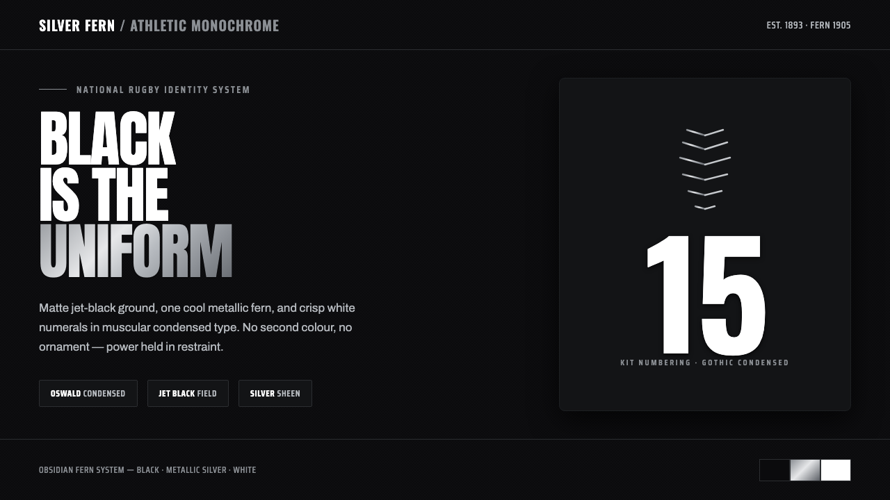 All Blacks Silver FernOne colour, total force. Jet-black field, a single metallic-silver fern, whit…
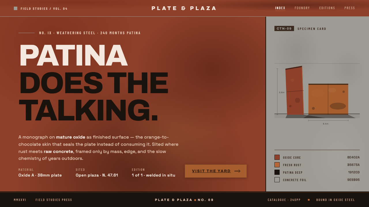 Corten Rust SculpturePatina does the talking. Saturated rust-oxide planes hard against raw concret…
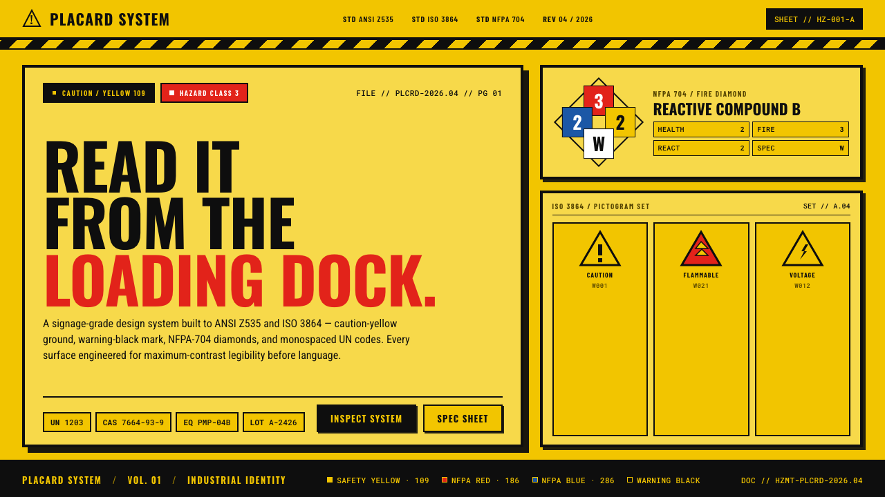 Hazmat SignageRead it from the loading dock. Caution-yellow ground, NFPA diamonds, monospac…
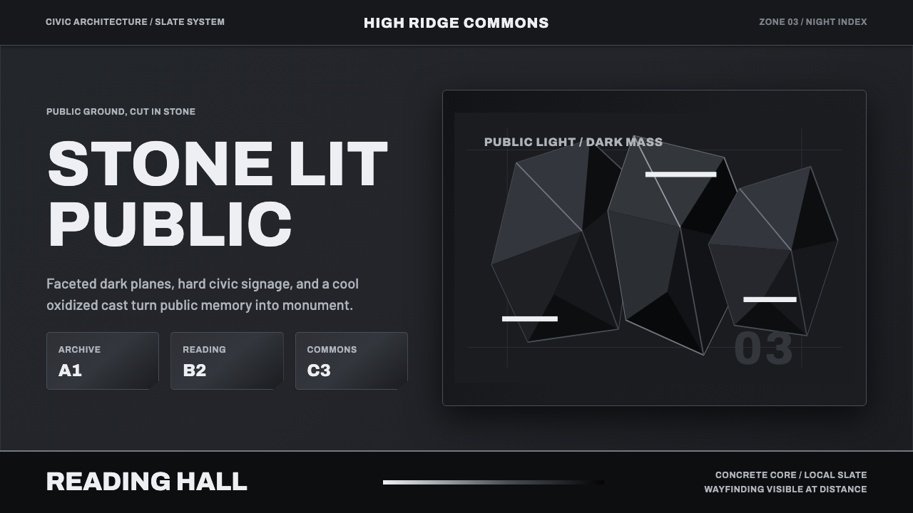 Medellín Library ParkCivic gravity in slate. Near-black planes, cool grey hairlines, and bold wayf…
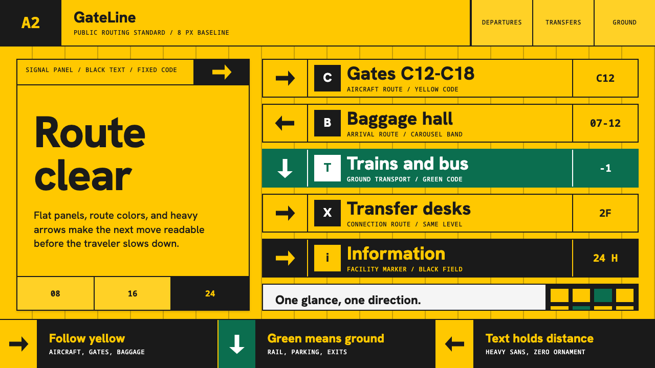 Airport Wayfinding GeometricLegibility becomes command. Signal yellow, black sans, and green route bands…
 Calatrava White RibsArchitecture becomes blueprint. Bone-white ribs cut through deep Valencian sk…