What is Mirror's Edge Clean City?
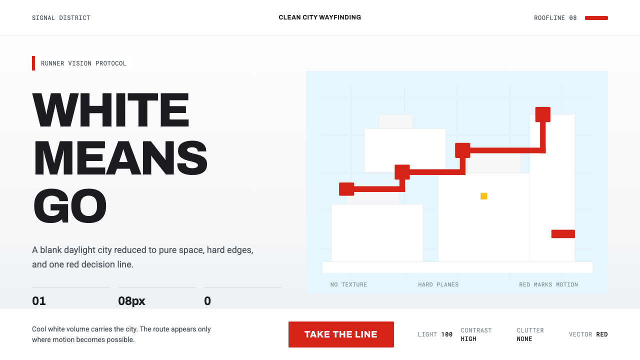
Mirror's Edge Clean City turns an entire skyline into a blank canvas — cool daylight on hard white planes, with a single signal-red route the only thing allowed to move the eye.
Mirror's Edge Clean City in brief
This style reproduces the visual language of Mirror's Edge, the 2008 action game developed by EA DICE in Stockholm, which imagined an authoritarian city rendered almost entirely in stark white. It is a design system built on total discipline: one dominant neutral (white, lit by cool daylight), one single vivid accent (signal red), and a strict rule about what each is allowed to mean.
The core idea, called 'Runner Vision' in the original game, is functional color-coding taken to its most extreme, minimal form: white surfaces are simply space — walls, rooftops, architecture to move through — while red marks the one thing that matters in that space, whether a pipe to grab, a door to open, or a path to follow. No other color is permitted to compete with this signal, which means the game's entire city, however large or complex, reads instantly and without ambiguity.
Applied as an interface style, this translates into a design language obsessed with legibility through elimination rather than addition. Surfaces are flat, cool, and hard-edged rather than textured or warm; shadows are crisp rather than soft; and the discipline of reserving color exclusively for a single, functional purpose is the entire mechanism that makes the system feel clean, fast, and weightless rather than merely white and empty.
Where does Mirror's Edge Clean City come from?
Mirror's Edge was released in 2008, developed by EA DICE, the Stockholm-based studio best known before this project for large-scale military shooter games. The game represented a deliberate creative departure — a first-person parkour title set in an unnamed, dystopian city where surveillance and control are near-total, and where the protagonist, a courier called a Runner, moves across rooftops and through buildings to evade a watching authority.
The game's art direction, credited significantly to concept artists including Robert Briscoe alongside the broader DICE team led under Owe Bergsten's production, made a specific narrative and mechanical choice: the city is rendered in stark, sterile white specifically because the authoritarian regime governing it wants total visual control and total surveillance, an environment scrubbed of the visual noise, advertising, and clutter of a real city. The whiteness itself is a form of oppression made visible — a city with nowhere to hide.
Against this white, the game introduced 'Runner Vision', a design and gameplay mechanic that tints usable objects — the exact ledges, pipes, and doors a player needs to interact with to progress — in saturated red. This was as much a functional necessity as an artistic choice: parkour gameplay across rooftops demanded that players understand, at a glance and at speed, exactly what was traversable, and the strict red-versus-white color logic solved this problem elegantly without cluttering the screen with icons or markers.
The style's roots trace conceptually to Swiss and International Typographic Style design principles — grid-based clarity, restrained color, functional hierarchy — scaled up from a printed page or a poster to the size of an entire fictional skyline. Critics and designers who studied the game afterward frequently noted this lineage explicitly: Mirror's Edge took the disciplined, function-first color logic long associated with mid-century Swiss graphic design and applied it, almost unmodified in spirit, to architecture and environmental design at city scale.
What defines the Mirror's Edge Clean City look?
Color
The palette is radically reduced: a dominant near-white neutral, lit with a cool daylight cast, and a single saturated signal red used exclusively as a functional marker. No secondary or tertiary colors are permitted — introducing even a muted third hue undermines the absolute clarity the system depends on. The red is never decorative; every instance of it means 'this is usable, go here.'
Flat Hard-Edged Planes
Surfaces are rendered as clean, flat, geometric planes with crisp, hard edges rather than rounded corners or soft transitions. Nothing feels soft, plush, or organic; every wall, ledge, and surface reads as a precise architectural plane, reinforcing the sense of a clinical, engineered environment.
Cool Daylight Lighting
Light throughout the system is cool and clinical rather than warm — closer to overcast daylight or diffused sunlight on white concrete than to golden hour or interior lamplight. This coolness reinforces the sense of a sterile, controlled environment and keeps the white ground from ever reading as cozy or inviting.
Signal-Based Hierarchy
Visual hierarchy is established entirely through the presence or absence of the red signal color, rather than through size, position, or secondary color coding. An element either carries the signal color, meaning it demands attention and action, or it does not, meaning it recedes into the white field regardless of its physical size or prominence.
Weightlessness
Despite depicting solid architecture, the overall composition avoids anything that suggests heaviness — deep shadow, dense texture, or visual clutter. The white ground and cool light combine to make even large architectural forms feel light, open, and permeable, supporting a sense of speed and movement rather than mass and weight.
Absolute Restraint
The system tolerates no ornamental detail, no decorative pattern, and no secondary visual interest competing with the white-versus-red logic. This is Swiss-style minimalism taken to its most extreme conclusion — not merely simplified, but stripped to the point where the environment itself becomes a functional interface.
Environmental Scale
Unlike most minimalist design systems, which operate at the scale of a page, screen, or product, this style's discipline is applied at the scale of an entire built environment — a skyline, a city block, a full architectural space. This scale is part of what makes the restraint feel so striking: the same rules that would govern a single printed page are applied without exception across an entire world.

Who shaped Mirror's Edge Clean City?
The Stockholm-based studio developed Mirror's Edge as a deliberate departure from its earlier large-scale military shooter work, committing as a team to the stark white-and-red visual language and the first-person parkour mechanics that depended on it.
Bergsten led production on Mirror's Edge at DICE, overseeing the studio's commitment to the game's distinctive minimalist visual approach at a time when the broader industry favored more visually dense, texture-heavy environments.
A concept artist central to establishing Mirror's Edge's visual identity, Briscoe helped define the stark white architecture and signal-red functional color language that became the game's most recognizable and widely referenced design contribution.
How do you use Mirror's Edge Clean City today?
This style carries a mood of clinical clarity, speed, and controlled tension, which makes it most effective wherever a product needs to communicate absolute focus — one clear action, one clear path — rather than a rich or warm emotional register. It rewards extreme restraint: the moment more than one accent color or decorative element is introduced, the system's core logic collapses.
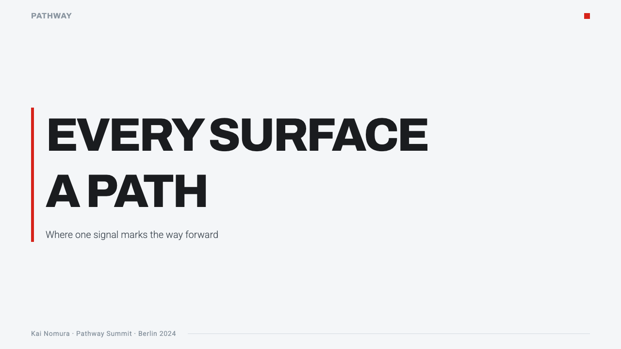
For presentation slides, the style is powerful for cover pages and single-focus content slides where one idea, number, or call to action needs total, unambiguous attention: a white or near-white field with a single red-highlighted element reads instantly as 'this is the point.' It works less well for dense, information-heavy slides, since the system depends on having very little competing for attention.
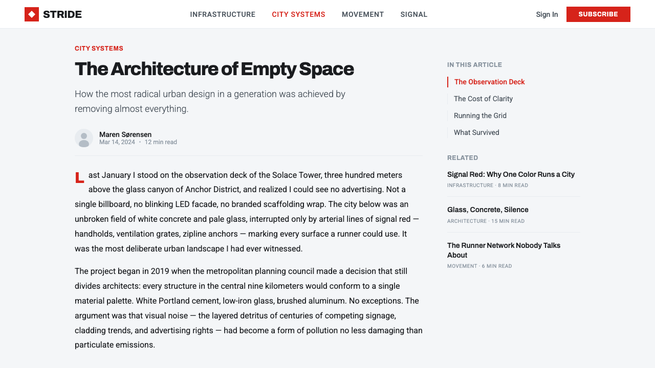
For web interfaces, the style suits products built around a single critical action or state — onboarding flows, safety-critical alerts, primary call-to-action buttons on an otherwise minimal page. A dashboard can use the white-and-cool-light ground for all structural chrome, reserving the signal red exclusively for the one button, alert, or status that requires immediate user action, exactly as the original game reserved red for exactly what a player needed to interact with.
For editorial and marketing work, the style pairs well with content about speed, precision, minimalism, or technology positioned as clean and modern — a masthead using a stark white field with one red architectural or graphic element reproduces the tension of the source material without needing any literal game or city imagery. It is particularly effective for hero sections meant to direct a viewer's eye toward exactly one call to action.
The most common mistake is treating the white ground as merely 'light mode' and adding secondary neutral tones, subtle shadows, or a second accent color for variety — doing so immediately breaks the absolute binary logic the style depends on. A second common mistake is using red too often across a layout; if red appears in more than one or two places, it stops functioning as a signal and starts reading as ordinary brand color, losing the urgency that defines the style.
Mirror's Edge Clean City — FAQ
Can this style use any accent color, or does it have to be red specifically?
The underlying logic — one neutral field, one single reserved signal color used exclusively for actionable elements — can technically work with a different accent hue. But red carries specific associations with urgency and immediate action that closely match the style's original purpose, and most applications that depart from red end up needing to reintroduce some of that same visual urgency through other means, which adds complexity the system is designed to avoid.
How much of a layout should be red versus white?
Red should occupy a very small proportion of the overall composition — ideally limited to a single element or a small handful of related elements per screen or slide. The style's entire power comes from red being rare and unmistakable; if it grows to occupy a large area, it stops reading as a functional signal and starts reading as a background color choice.
Does this style work for content-heavy or data-dense products?
It struggles in these contexts. The system depends on having very little visual competition, so a genuinely dense dashboard or long-form article will tend to overwhelm the white-and-red discipline unless the layout is restructured to surface only one critical element at a time. It is much better suited to focused moments — a single decision point, alert, or call to action — than to comprehensive information display.
How does this differ from generic Swiss-style minimalism?
Swiss International Typographic Style typically works at page or poster scale, uses a broader (if still restrained) color range including photography, and organizes content through a mathematical grid. This style narrows that discipline down to an absolute binary — one neutral, one signal color — and applies it at the scale of an entire environment rather than a printed page, making it more extreme and more single-purpose than general Swiss-style work.
Is this style only appropriate for gaming or entertainment products?
No. While it originates from a specific video game, the underlying logic — extreme visual restraint paired with a single functional signal color — transfers cleanly to any product where absolute clarity about one required action matters more than visual richness: safety and alert systems, onboarding flows, or any minimalist brand that wants a genuinely singular focal point rather than a busy hierarchy of competing elements.
Related design styles
 Aperture ScienceSterile authority. Cool panel seams, Archivo signage, and sparse orange-blue…
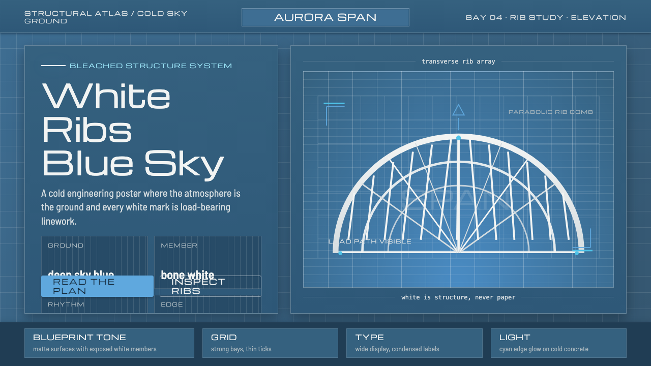 Calatrava White RibsArchitecture becomes blueprint. Bone-white ribs cut through deep Valencian sk…
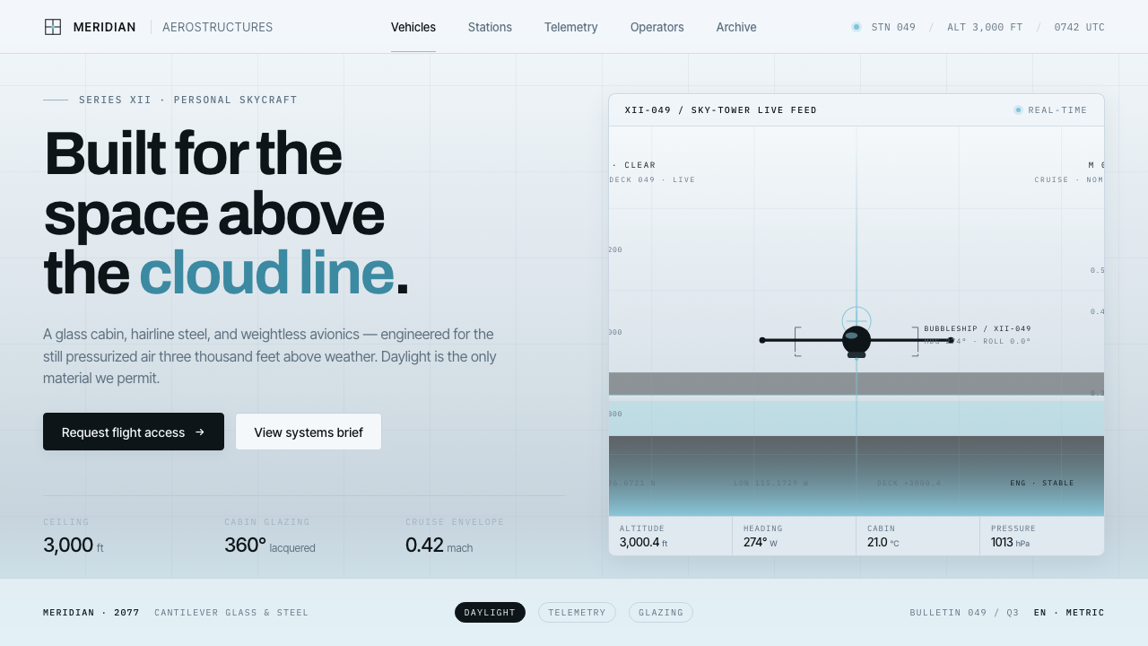 Oblivion Sky TowerSterile daylight futurism. Cool sky-grey glass, hairline steel mullions, a si…
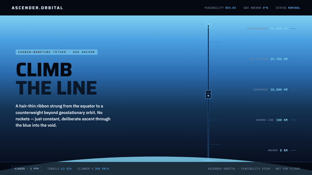 Space ElevatorClimb the line, no rockets. Carbon ribbon rises through atmosphere blue into…
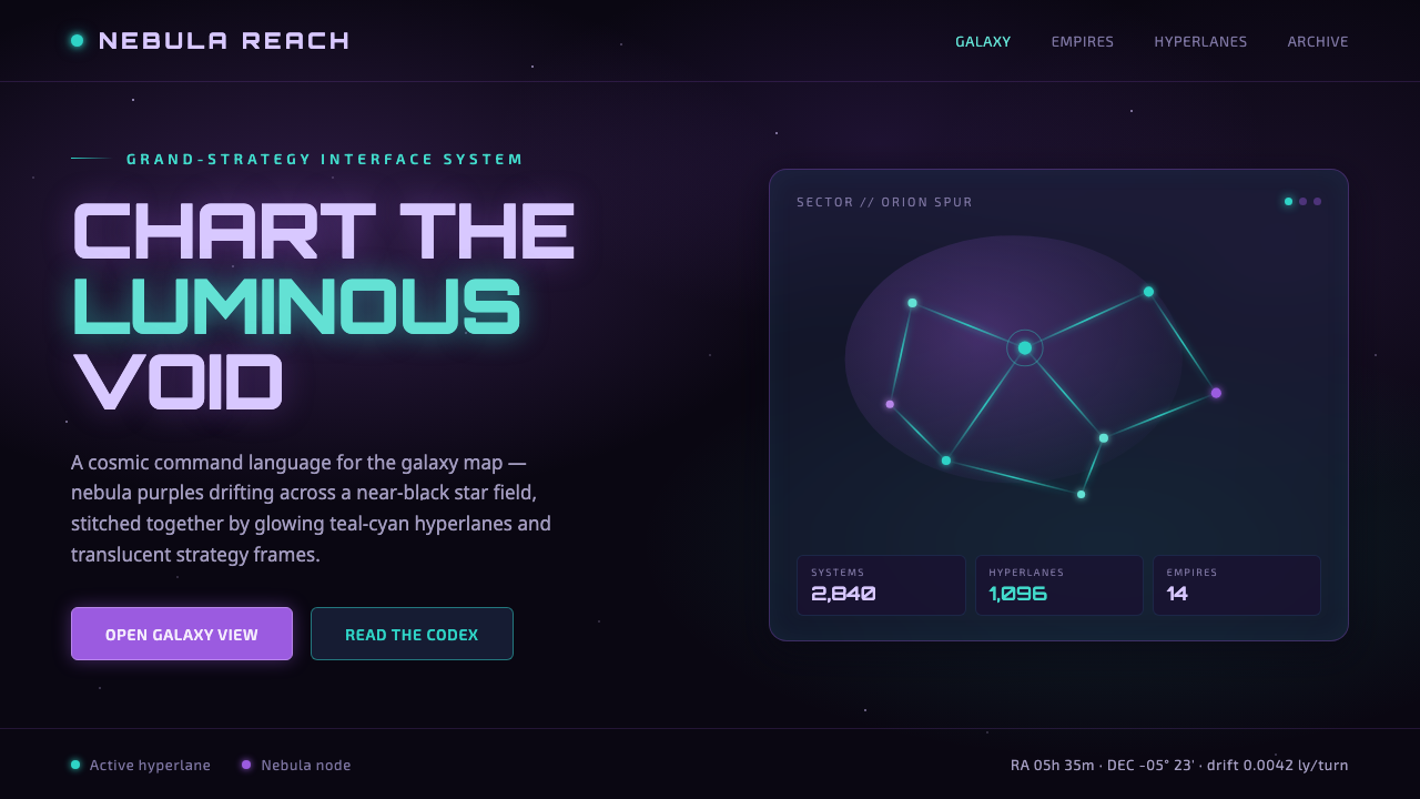 StellarisQuietly grand cosmic command UI. Nebula purples on near-black void, teal-cyan…
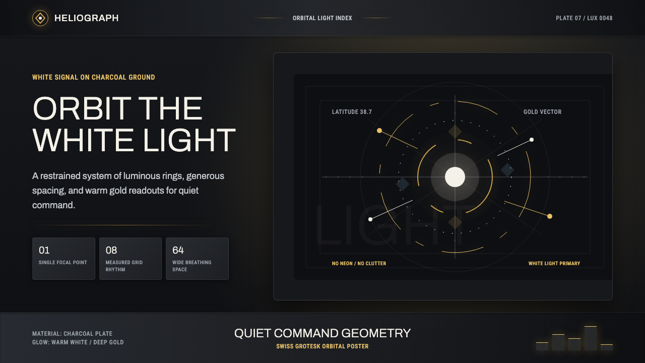 DestinyLuminous restraint. White-gold rings orbit charcoal plates in clean grotesk t…