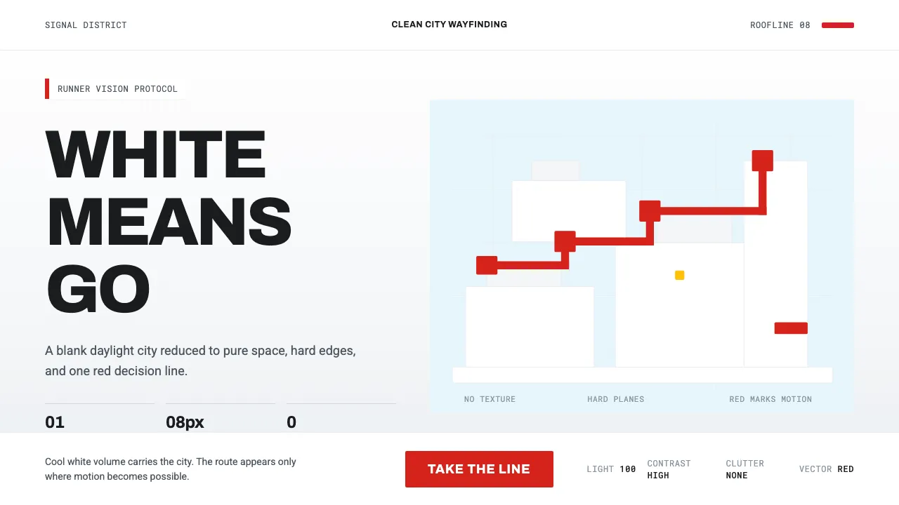
About Mirror's Edge Clean City
Mirror's Edge (2008) by EA DICE turned a city into a blank white canvas. Cool daylight floods hard flat planes; a single vivid signal red — "Runner Vision" — flags every pipe, door, and zipline you can use.
The discipline is total: white means space, red means go. Nothing competes with the signal. It is Swiss minimalism rendered at the scale of an entire skyline, clinical and weightless and built for motion.
- Origin
- Stockholm, Sweden
- Era
- 2008 (game released); art language ~1990–2010
- Key figures
- EA DICE · Owe Bergsten · Robert Briscoe
- Movements
- Swiss / International Typographic Style · minimalist parkour dystopia
Mirror's Edge Clean City design spec
Colors
Background
Surface
Primary
Secondary
Accent
Text
Typography
ArchivoHeadings
RobotoBody
Roboto MonoMono
Unlock for 1 credit
The other 11 sections — buttons, cards, spacing, motion, techniques and more — open once you unlock. Download the DESIGN.md or send it to your AI in one click. Unlock once, yours forever.
Sign up nowHave an account? Sign in
Styles similar to Mirror's Edge Clean City
Also inspired by film, games & music, with a close feel.
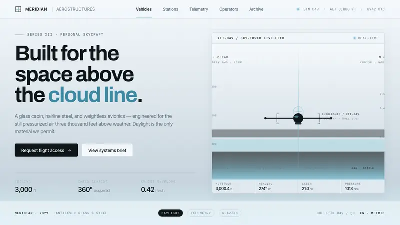 Oblivion Sky TowerSterile daylight futurism. Cool sky-grey glass, hairline steel mullions, a single cloud-cyan glow.
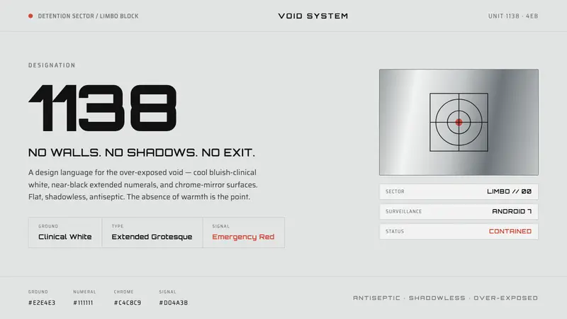 THX 1138Conformity as over-exposed void. Bluish-clinical white, black extended numerals, one emergency red.
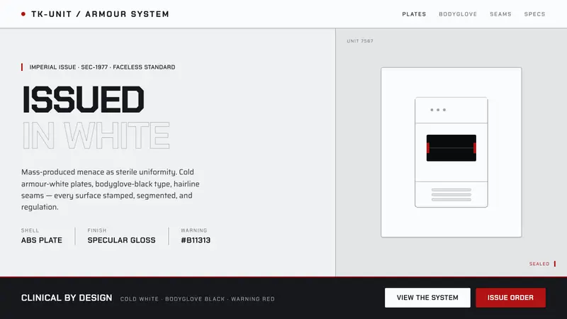 Stormtrooper Imperial WhiteMass-produced menace, sterile. Cold armour-white plates, bodyglove-black stencil, lone warning-red.
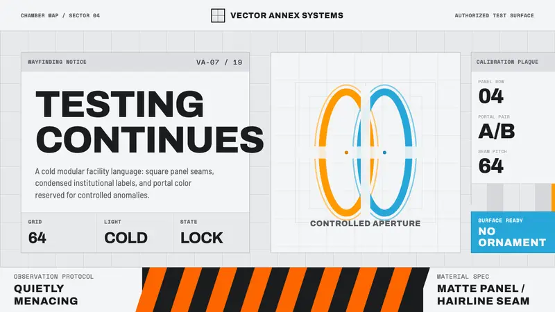 Aperture ScienceSterile authority. Cool panel seams, Archivo signage, and sparse orange-blue rings.